OK, first off a true confession. I hate it when some wise acre analyst acts like they are so smart and that everyone else is an idiot. Its offensive and off-putting – not to mention arrogant. And still in this case, all I can say is “Hi, my name is Jay.”
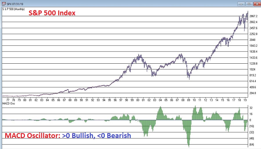
A lot of attention has been paid lately to the fact that AAPL is essentially swallowing up the whole world in terms of market capitalization. As you can see in Figure 1, no single S&P 500 Index stock has ever had a higher market cap relative to the market cap of the entire Russell 2000 small-cap index.
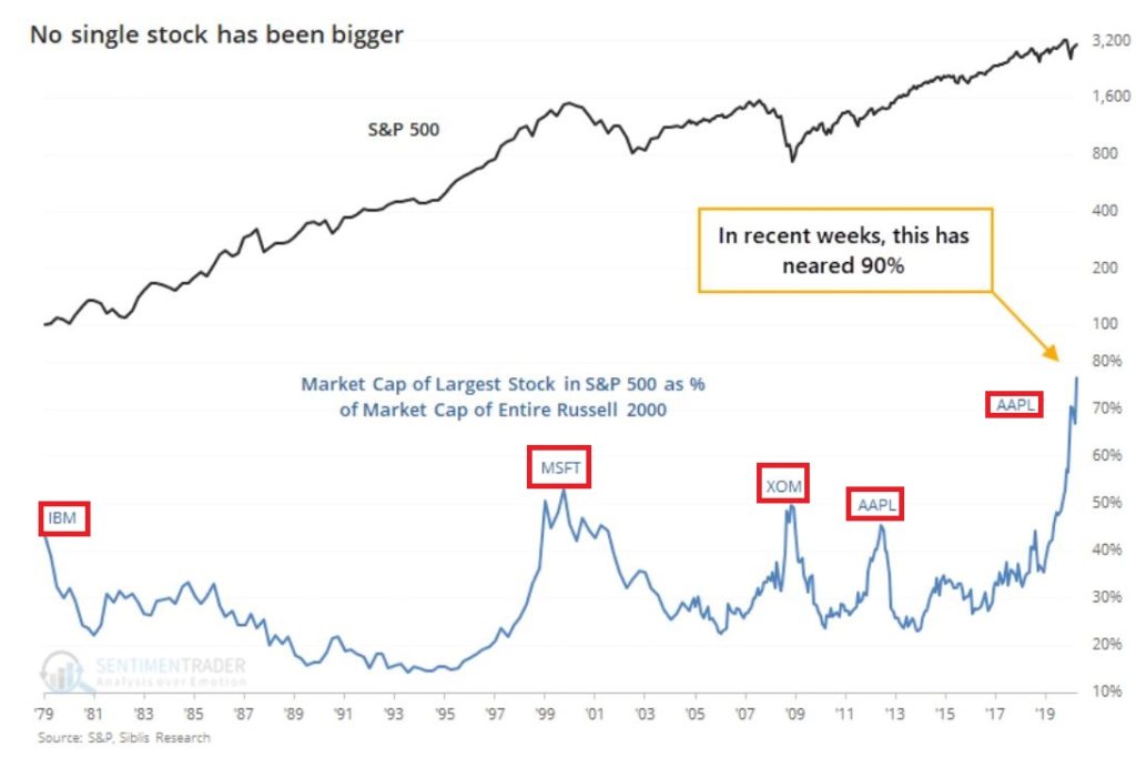
Figure 1 – Largest S&P 500 Index stock as a % of entire Russell 200 Index (Courtesy Sentimentrader.com)
So of course, the easiest thing in the world to do is to be an offensive, off-putting and arrogant wise acre and say “Well, this can’t last.” There, I said it. With the caveat that I have no idea how far AAPL can run “before the deluge”, as a student of (more) market history (than I care to admit) I cannot ignore this gnawing feeling that this eventually “ends badly.” Of course, I have been wrong plenty of times before and maybe things (Offensive, Off-Putting and Arrogant Trigger Warning!) “really will be different this time around.” To get a sense of why I bring this all up, please keep reading.
In Figure 1 we also see some previous instances of a stock becoming “really large” in terms of market cap. Let’s take a closer look at these instances.
IBM – 1979
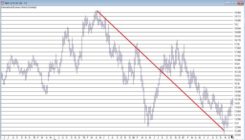
Figure 2 – IBM (Courtesy AIQ TradingExpert)
MSFT – 1999
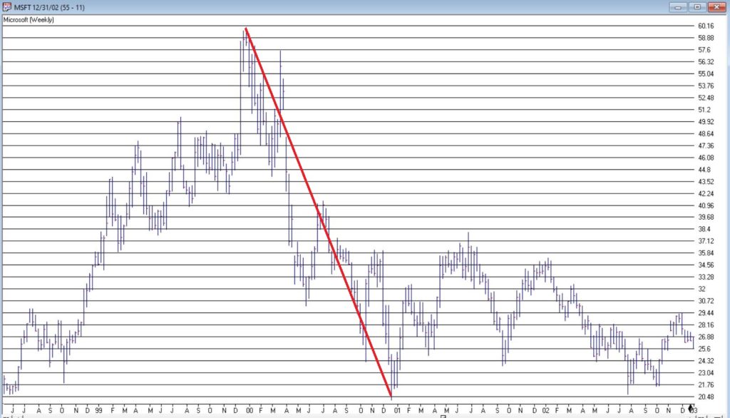
Figure 3 – MSFT (Courtesy AIQ TradingExpert)
XOM – 2008
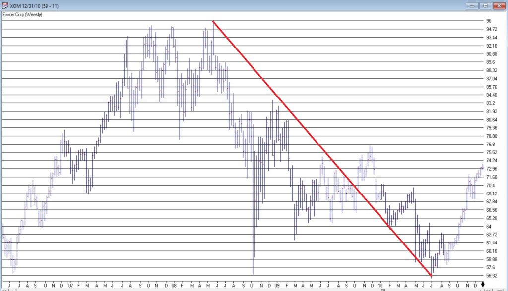
Figure 4 – XOM (Courtesy AIQ TradingExpert)
AAPL – 2012
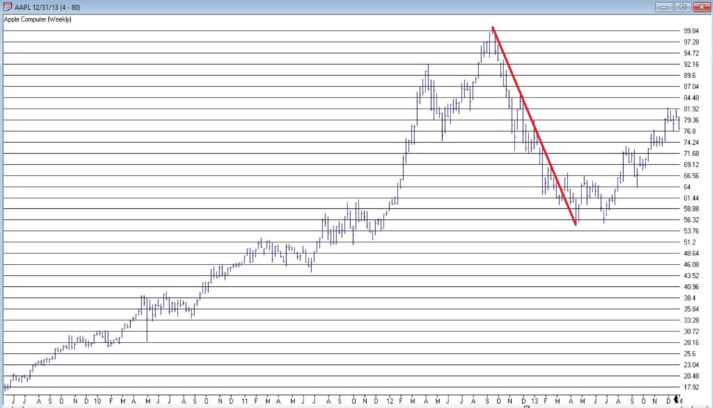
Figure 5 – AAPL (Courtesy AIQ TradingExpert)
AAPL – 2020
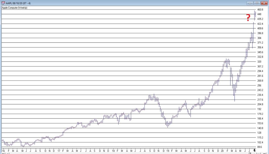
Figure 6 – AAPL (Courtesy AIQ TradingExpert)
Summary
Small sample size? Yes.
Could AAPL continue to run to much higher levels? Absolutely
Do I still have that offensive, off-putting and slightly arrogant gut feeling that somewhere along the way AAPL takes a huge whack?
Sorry. It’s just my nature.
Jay Kaeppel
Disclaimer: The information, opinions and ideas expressed herein are for informational and educational purposes only and are based on research conducted and presented solely by the author. The information presented represents the views of the author only and does not constitute a complete description of any investment service. In addition, nothing presented herein should be construed as investment advice, as an advertisement or offering of investment advisory services, or as an offer to sell or a solicitation to buy any security. The data presented herein were obtained from various third-party sources. While the data is believed to be reliable, no representation is made as to, and no responsibility, warranty or liability is accepted for the accuracy or completeness of such information. International investments are subject to additional risks such as currency fluctuations, political instability and the potential for illiquid markets. Past performance is no guarantee of future results. There is risk of loss in all trading. Back tested performance does not represent actual performance and should not be interpreted as an indication of such performance. Also, back tested performance results have certain inherent limitations and differs from actual performance because it is achieved with the benefit of hindsight.