In this 45-minute session, Steve Hill, CEO of AIQ Systems, will show you how to create and save customized scans in AIQ, how to sort through scan results using key metrics and how to apply filters to “snipe” the best trading setups quickly.
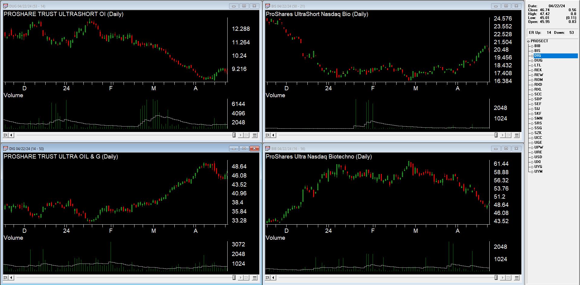
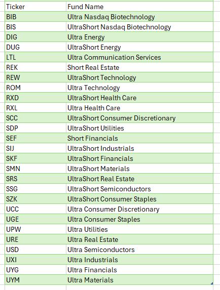
There are many ETF families in the market today, and of course, the oldest and most popular ETF, SPY has been around since 1993. Ultra ProShares Exchange Traded Funds (ETFs) developed by Profunds and traded on the AMEX. are one of the most actively traded areas of the markets. With $billions pouring into the UltraShort QQQ ETF, QID, it’s evident that it’s become one of the most actively traded ETFs globally.
Whether you’re a trader or investor, these Ultra ETFs serve as valuable tools capable of enhancing returns while mitigating risks.
Ultra bullish and UltraShort ETFs on broad market indices expanded some years ago to include leveraged bullish and bearish Sector and International ETFs. These additions enable investors to hedge or amplify sector exposure effortlessly. Moreover, these Ultra and UltraShort ETFs are compatible with IRAs or retirement accounts, where shorting or margin trading is typically restricted.
From a trader’s perspective, the liquidity and leverage of Ultra Bullish and UltraShort ETFs, which move two times the underlying index or inversely track it, offer a simpler and less risky alternative to options, futures, or shorting stocks.
For day traders, the highly liquid QQQ ETFs, QLD and QID, along with S&P500 ETFs, SDS and SSO, have become favored vehicles. The volatility of these ETFs presents opportunities for swift gains.
For investors and portfolio managers, ProShares ETFs offer a plethora of risk management tactics and asset allocation strategies. They provide flexibility to hedge against market risk or capitalize on market fluctuations. Furthermore, leveraging Ultra ETFs in asset allocation frees up capital for further diversification, allowing for strategic positioning across various sectors and markets. Sectors, in particular, have gained importance in recent times, with ProShares Sector ETFs offering exposure to Dow Jones Sectors.
For further leveraging the leverage, listed options on Ultra ETFs bring new possibilities for creative strategies. Covered call writes on bearish ETFs or options on Ultra ETFs provide avenues for managing risk and capitalizing on market movements with added leverage.
Given these ‘options on steroids’ move so quickly, only spend as much as you can afford to lose keeping in mind the thought “Have a hunch – buy a bunch. Hunch is wrong – bunch is gone”. While using Puts or Calls on Ultra Short and Ultra ETF’s requires some upside down and out-of-the-box thinking they add are few arrows to the trader’s quiver.
In conclusion, the Ultra ProShares ETFs have revolutionized trading and investing, offering opportunities previously inaccessible to individual investors.
In the late 1980’s, Japan seemed destined to “rule the financial world”. But when it comes to the financial markets – things don’t always pan out as they appear destined to. The Nikkei Index topped out in late 1989, didn’t bottom out until February 2009 and has yet to return to its 1989 peak.
But it sure is trying. This past week the Nikkei reached its highest level 1991. So, hooray for the Japanese. Back here in the US of A there may be a slightly different take. For as we will discuss in a moment, what is good for Japanese stocks is (apparently) bad for US bonds.
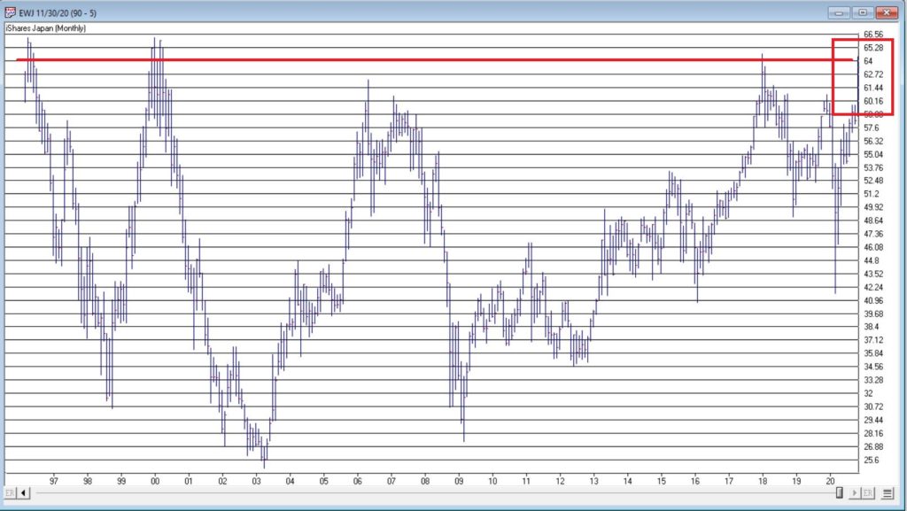
Ticker EWJ
As our proxy for Japanese stocks we will use ticker EWJ (iShares Japan). In Figure 1 you can the monthly action since the ETF started trading in 1996.
Since 1996 EWJ has broken in the $60 a share range on 5 previous occasions, only to be rebuffed. You can see the latest upward thrust at the far right. Will this be the time it breaks through? It beats me and in fact that is not really the focus of this article. The real question posed here is “what about U.S. treasury bonds?” Huh? Consider Figure 2.
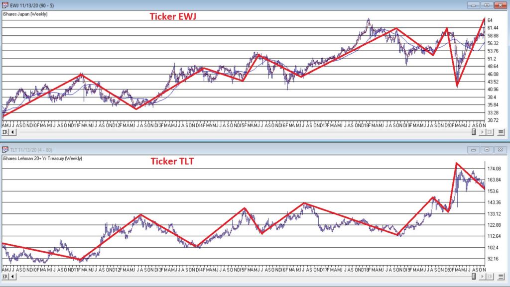
The top clip of Figure 2 displays a weekly chart of EWJ with a 5-week and 30-week moving average drawn. The bottom clip displays a weekly chart of ticker TLT – the iShares ETF that tracks the long-term U.S. treasury bond.
Note that – using highly technical terms – when one “zigs”, the other “zags.”
The thing to note is the inverse correlation between the two – i.e., when Japanese stocks advance, US treasuries tend to decline and vice versa. For the record (and for you fellow numbers geeks out there) the correlation coefficient in the last 2 years is -0.45 (1 means they trade exactly the same, -1 means they trade exactly inversely).
For my purposes:
*EWJ 5-week MA < EWJ 3-week MA = BULLISH for US treasuries
*EWJ 5-week MA > EWJ 3-week MA = BEARISH for US treasuries
Any real merit to this?
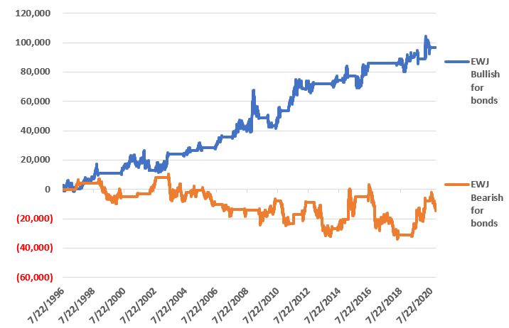
*The blue line in Figure 3 displays the cumulative $ +(-) achieved by holding a long position in t-bond futures ($1,000 a point) when the EWJ indicator is BULLISH (for U.S. bonds)
*The orange line in Figure 3 displays the cumulative $ +(-) achieved by holding a long position in t-bond futures ($1,000 a point) when the EWJ indicator is BEARISH (for U.S. bonds)
Figure 3 – $ + (-) for Treasury Bond Futures when EWJ indicator is BULLISH for bonds (blue) or BEARISH for bonds (orange)
Summary
Bond investors might keep a close eye on Japanese stocks for a while. If the latest thrust higher follows through and becomes the move that finally breaks out to the upside, the implication would appear to be negative for U.S. long-term treasury bonds. On the flip side, if Japanese stocks fail once again to break through and reverse to the downside, then things might look a whole lot better for the 30-year US treasury.
Jay Kaeppel
Disclaimer: The information, opinions and ideas expressed herein are for informational and educational purposes only and are based on research conducted and presented solely by the author. The information presented represents the views of the author only and does not constitute a complete description of any investment service. In addition, nothing presented herein should be construed as investment advice, as an advertisement or offering of investment advisory services, or as an offer to sell or a solicitation to buy any security. The data presented herein were obtained from various third-party sources. While the data is believed to be reliable, no representation is made as to, and no responsibility, warranty or liability is accepted for the accuracy or completeness of such information. International investments are subject to additional risks such as currency fluctuations, political instability and the potential for illiquid markets. Past performance is no guarantee of future results. There is risk of loss in all trading. Back tested performance does not represent actual performance and should not be interpreted as an indication of such performance. Also, back tested performance results have certain inherent limitations and differs from actual performance because it is achieved with the benefit of hindsight.
In this article, dated 7/10/2020, I noted that my “Stuff” Index was coming on strong and that its performance may be a “shot across the bow” that some changes may be coming to the financial markets. Since then, the trend has accelerated.
STUFF vs. FANG vs. QQQ
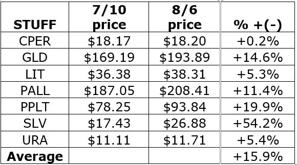
Figure 1 displays the performance of STUFF components since 7/10
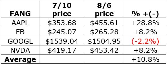
Figure 2 displays the performance of FANG components since 7/10
Figure 1 – Price performance of Jay’s STUFF Index components since 7/10
Figure 2 – Price performance of FANG stocks since 7/10
For the record, the “high-flying” Nasdaq 100 Index (using ticker QQQ as a proxy investment) is up +4.0% during the same time.
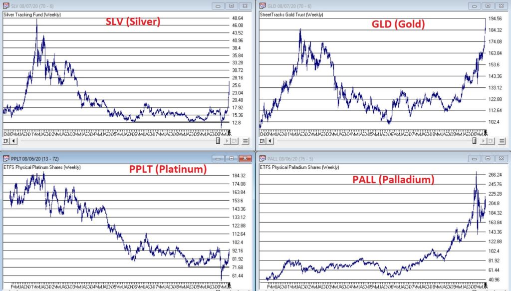
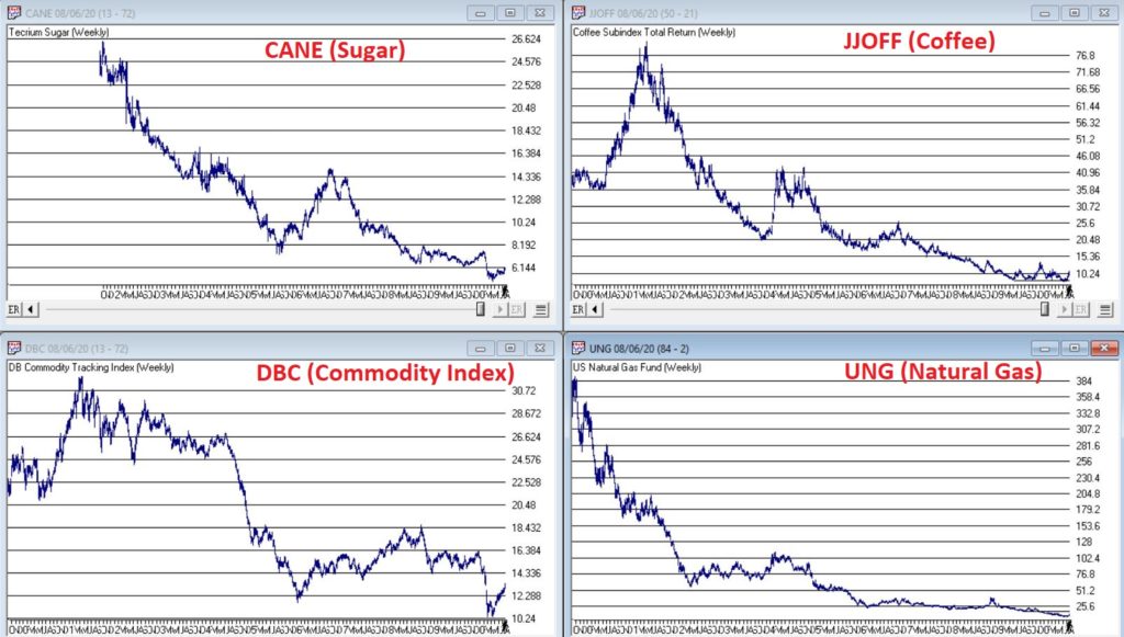
Is this a trend – or a blip? Unfortunately, I can’t answer that question. But it certainly appears that there is something afoot in “Stuff”, particularly the metals. Figure 3 displays the weekly charts for ETFs tracking Silver, Gold, Palladium and Platinum (clockwise from upper left).
When it comes bull markets in metals, the typical pattern historically goes something like this:
*Gold leads the way (check)
*Eventually silver comes on strong and often ends up outperforming gold (check)
*The other metals rise significantly “under the radar” as everyone focus on – literally in this case, ironically – the “shiny objects” (gold and silver)
Again, while I had inklings that a bull market in metals was forming (and have held positions in them for several years, and still hold them), I certainly did not “predict” the recent explosion in gold and silver prices.
Two things to note:
*Gold and silver are obviously very “overbought”, so buying a large position here entails significant risk
*Still it should be noted that both SLV and PPLT would have to double in price from their current levels just to get back to their previous all-time highs of 2011
So, don’t be surprised if “Stuff” enjoys a continued resurgence. Note in Figure 4 that a number of commodity related ETFs are way, way beaten down and could have a lot of upside potential if a resurgence actually does unfold.
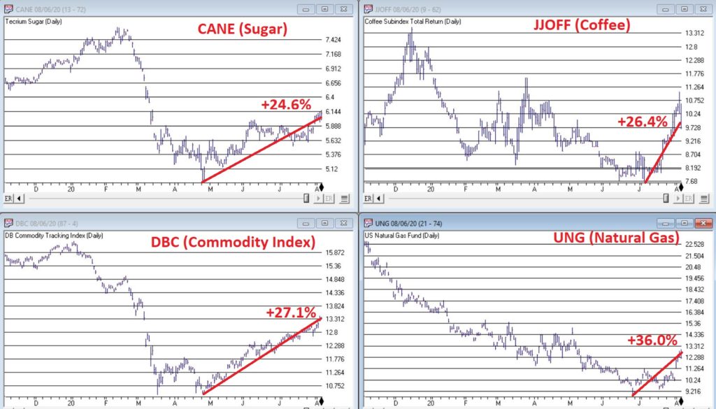
What is interesting – and almost not visible to the naked eye – is the action in the lower right hand corner of these four charts. To highlight what is “hiding in plain sight”, Figure 5 “zooms in” on the recent action of same four tickers as Figure 4, but in a daily price format rather than a monthly price format.
Despite the ugly pictures painted in Figure 4, it is interesting to note in Figure 5 that all four of these commodity related ETFs have rallied sharply of late. There is of course, no guarantee this will continue. But if the rally in “Stuff” – currently led by metals – spreads to the commodity sector as a whole, another glance in Figures 3 and 4 reveals a lot of potential upside opportunity.
Time will tell. In the meantime, keep an eye on the “shiny objects” (gold and silver) for clues as to whether or not the rally in “Stuff” has staying power.
See also Jay Kaeppel Interviewin July 2020 issue of Technical Analysis of Stocks and Commodities magazine
Disclaimer: The information, opinions and ideas expressed herein are for informational and educational purposes only and are based on research conducted and presented solely by the author. The information presented represents the views of the author only and does not constitute a complete description of any investment service. In addition, nothing presented herein should be construed as investment advice, as an advertisement or offering of investment advisory services, or as an offer to sell or a solicitation to buy any security. The data presented herein were obtained from various third-party sources. While the data is believed to be reliable, no representation is made as to, and no responsibility, warranty or liability is accepted for the accuracy or completeness of such information. International investments are subject to additional risks such as currency fluctuations, political instability and the potential for illiquid markets. Past performance is no guarantee of future results. There is risk of loss in all trading. Back tested performance does not represent actual performance and should not be interpreted as an indication of such performance. Also, back tested performance results have certain inherent limitations and differs from actual performance because it is achieved with the benefit of hindsight.
I hope all of you are keeping healthy in this pandemic. Some of you may have had the COVID-19 virus or have a family member who may have contracted it, but for the most part as a whole, we are working together to get through this and doing okay.
RECAP:
Last month I illustrated the previous time we have a virus that was similar to the Coronavirus, and that was the Spanish Flu back in 1918. It was a horrible time where more than 51 million and some estimates are up to 100 million people died. More than 675,000 people died from the Spanish flu in the U.S. It infected more than 50 million people worldwide and was a disaster. There was very little anyone could do during that time, and there was little medicinal relief. The Spanish Flu is called the most significant medical holocaust in history. And yet the stock markets in this country fell 34% from the beginning of the flu to the lowest part in the stock market. A year later, it went up 80% approximately from its low to its high. Am I saying this will happen again? No, I’m not planning on it, but if the world recovered from a 50 million person loss and a massive pandemic it had when the world population was much smaller, then we should recover and move beyond this as well.
Over the last month, the stock and bond markets, especially the NASDAQ, have soared with the NASDAQ now up 1.66% for the year. The reason is that with most people confined to their homes, stocks like Amazon, Google, Netflix, Facebook, Microsoft, Zoom, DocuSign, and more are being used, contributing to their earnings and revenues dramatically. Stocks like Airlines, cruise ships, restaurants, manufacturing, and many more are not doing well. That is why you will see below that the sectors in terms of which areas are declining and which are growing are very different.
CURRENT TRENDS:
The growth sector has done relatively well, but only a few large companies have contributed. These few large companies are why the Equal Weighted S&P 500 is -16.2% but the regular S&P is down 9%. I continue to like the large tech and health care companies, the NASDAQ is nearing the end of its game, and it is not much below its high it hit in February. The Midcaps are down 18-23% this year, and particular issues have more of a potential move upward, in my opinion. A year or two out from this point, I think this sector and the markets should be nicely higher. Can it go down from here into the fall and winter if we have a second wave down? Absolutely, but it is an excellent time to add money to your equity side in a diversified portfolio over the next 6 months. Many people are doubling up their contributions on a monthly basis. If you are more than five years before retirement, you may want to think about doing something similar. If stocks are cheap then isn’t it smart to buy when they are reasonably priced if over the long term the market should be higher?
Have we gone down this much over the last 50 years? Yes, many times. Has it recovered each time? Yes. Because capitalism works and good companies over the long term make money, we are all in this together.
Some of the INDEXES of the markets both equities and interest rates are below. The source is Morningstar.com up until May 8, 2020. These are passive indexes. Dow Jones -14.0% S&P 500 -9.0% EQUAL WEIGHTED S&P 500 -16.1% NASDAQ Aggressive growth +1.66% I Shares Russell 2000 ETF (IWM) Small cap -20% Midcap stock funds -18-23% International Index (MSCI – EAFE ex USA -19.0% Financial stocks -27% Energy stocks -34% Healthcare Stocks -.50%
Moderate Mutual Fund Investment Grade Bonds (AAA) Long duration -8.5% High Yield Merrill Lynch High Yield Index -9.4% Floating Rate Bond Funds -7.3% Short Term Bond -3.52% Fixed Bond Yields (10 year) .68% Yield As you see above, the only index doing well is Large tech. You should have this sector, but most everything else is starting to recover.
Classicalprinicples.com and Robert Genetskis Excerpts:
After soaring a week ago, stock prices turned mixed. The Nasdaq and Nasdaq 100 were up 1% and 4%, while the S&P 500 and Dow fell 1%, and small caps were down 2% to 4%.
The economic collapse in April has led forecasters to revise downward estimates of the decline in output, employment, and profits. Last week I expected the economy would begin to recover in May. It will. Unfortunately, ongoing restrictions from Governors and the stimulus bill will limit the initial stage of the recovery. Due to these current restrictions, means the economy will not show signs of a meaningful recovery until June at the earliest.
As a result, the financial damage to the economy in terms of lost output, jobs, wages and salaries, profits and debt will continue for another month
While several technology companies are holding up well, non-tech companies are suffering. And few companies are willing to guide earnings.
The 800-pound gorilla continues to be the outlook for the virus. Containing the spread of the virus remains a crucial problem.
Some countries and states succeed without a lockdown, while others are less successful. Due to the differing results, it raises the near-term uncertainties over how quickly the economy can recover. If setbacks occur, stocks will be vulnerable.
Despite a 15%+ unemployment rate in April and probably higher in May, the stock prices continue to anticipate better times and a recovery in the markets. I am optimistic longer term for the stock markets, although the short term could be more volatile.
Dr. Genetski’s opinion is that every person and circumstance is different. There are no guarantees expressed or implied in any part of this correspondence. Source: Classical Principles.com
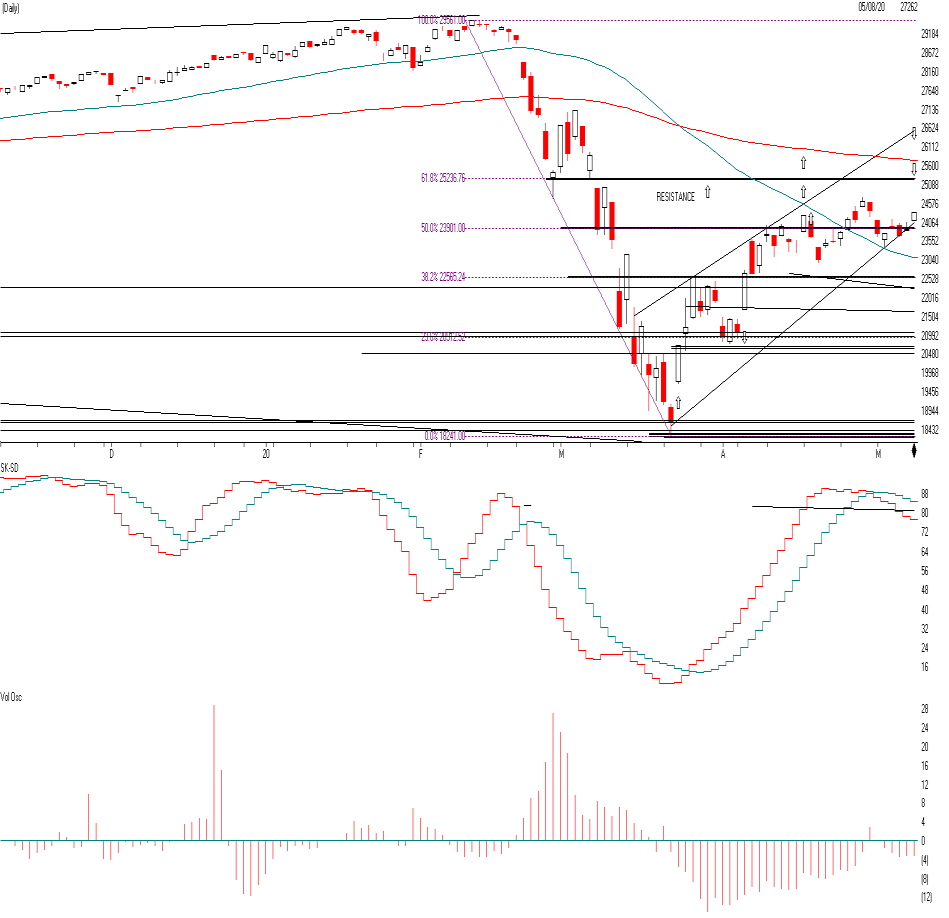
DOW JONES
As you can see the Dow went down to the 18,300 level and has risen to the 50% Fibonacci Level at 23,901. In other words when markets decline, they tend to retrace much of the decline at the 23.8%, the 50% the 61.8% and the 78.6% level and stall and reverse. Notice at the 23901 level the Dow tended to hang around there for a couple of weeks and tried to go up to the next level at the 25236 level. This is the next level where the Dow Jones could stall if it keeps rising. The Dow Jones is made up of a lot of large industrial, and value stocks that have really not participating in the rally as much as the NASDAQ tech stocks seen on the next page. Watch for a trend line break of 23901 to confirm another down leg to the 22565 if it is on big volume. This is short term. Long term I am still positive over the next 2 years or so, when we get a vaccine and a treatment, and more herd immunity.
The SK-SD stochastics model. If it is above the 88 level like it is now the market is a little over bought and this means don’t buy now short term. Volume over the last month or so the market has been rising on low volume. This means people are afraid to commit and there may not be a lot of conviction on the rally.
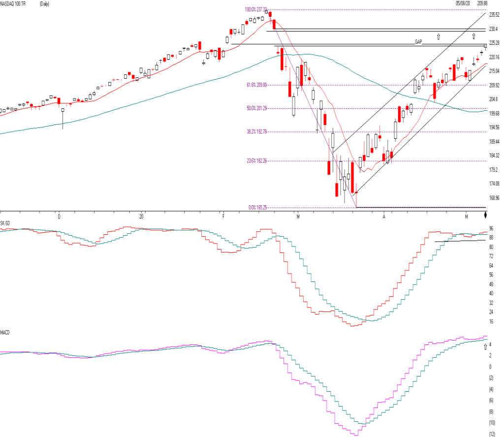
NASDAQ QQQ
The true Champ this year again has been the NASDAQ. These stocks include, Facebook, Amazon, Docusign, Paypal, Mcrosoft, Netflix, etc. All of the stocks that benefit by you and your businesses being home. This QQQ are the top 100 NASDAQ stocks and is now up 3% plus for the year while everything else in the normal world is down 16-38%. The QQQ is now getting a little OVERBOUGHT so I would not go out and buy a bunch of tech stocks here. In fact, the QQQ is approaching a pretty substantial resistance level. The first is a gap fill and could bring the QQQ to 230.55 and reverse or it could reach its old high of 237 and reverse. Longer term I think it will break through the old high, but we are now getting to a point I think the QQQ has gone up as far as it should. So watch the 230.55 to fill the gap and reverses or the old high of 237 area.
The SK-SD Stochastics is overbought just like it was in the Dow Jones. The Momentum indicator gave a Buy signal at the blue arrow as it as the pink crossed the blue line, if it crosses the blue lien going down it is a SELL. This large tech area is still long term bullish, but short term I would take a few chips off the table as an index. The midcap, small cap and large cap value sector has a lot more to recover.
If the QQQ falls or closes below 216.8 or breaks the trend line I am getting Cautious to very Cautious.
SUPPORT LEVELS:
Support levels on the S&P 500 area are 2882, 2796, 2649, and 2500. These might be accumulation levels, especially 2649, or 2500. 2936 and 3015 is resistance. Support levels on the NASDAQ are 9036, 8612, and 7856 Topping areas 9323 to 9573. On the Dow Jones support is at 23,901, 22,569, and 20912. Topping areas 25,236 and 27,077. These may be safer areas to get into the equity markets on support levels slowly on the accumulation areas.
THE BOTTOM LINE:
The market has rebounded nicely over the last month mainly on the NASDAQ tech stocks that benefit from people staying at home and using all of the tech companies to their benefits. This stay “at home” policy has increased demand for technology, and why the internet stocks have done so well. The other part of the markets from the financial to energy and other value stocks are still down from 18-33%. It is all about the growth sector that is benefiting the most. Over the long term, I am very bullish on the market, but over a short time, I can see a topping or sideways to down on the large growth companies as they are now reasonably priced. If the market continues to do well, I would expect the Midcaps to start to outperform. But there is a caveat. There are trend-line right below the markets, and if they are broken and close below those areas, then the markets could start a correction again. Trend-lines are essential to hold. If they don’t hold, then there could be a setback to support the levels stated above. I still like the USA market better than the international one.
Best to all of you,
Joe Bartosiewicz, CFP® Investment Advisor Representative 5 Colby Way Avon, CT 06001 860-940-7020 or 860-404-0408
SECURITIES AND ADVISORY SERVICES OFFERED THROUGH SAGE POINT FINANCIAL INC., MEMBER FINRA/SIPC, AND SEC-REGISTERED INVESTMENT ADVISOR.
Charts provided by AIQ Systems:
Technical Analysis is based on a study of historical price movements and past trend patterns. There is no assurance that these market changes or trends can or will be duplicated shortly. It logically follows that historical precedent does not guarantee future results. Conclusions expressed in the Technical Analysis section are personal opinions: and may not be construed as recommendations to buy or sell anything.
Disclaimer: The views expressed are not necessarily the view of Sage Point Financial, Inc. and should not be interpreted directly or indirectly as an offer to buy or sell any securities mentioned herein. Securities and Advisory services offered through Sage Point Financial Inc., Member FINRA/SIPC, and an SEC-registered investment advisor.
Past performance cannot guarantee future results. Investing involves risk, including the potential loss of principal. No investment strategy can guarantee a profit or protect against loss in periods of declining values. Please note that individual situations can vary. Therefore, the information presented in this letter should only be relied upon when coordinated with individual professional advice. *There is no guarantee that a diversified portfolio will outperform a non-diversified portfolio in any given market environment. No investment strategy, such as asset allocation, can guarantee a profit or protect against loss in periods of declining values. It is our goal to help investors by identifying changing market conditions. However, investors should be aware that no investment advisor can accurately predict all of the changes that may occur in the market. The price of commodities is subject to substantial price fluctuations of short periods and may be affected by unpredictable international monetary and political policies. The market for commodities is widely unregulated, and concentrated investing may lead to Sector investing may involve a greater degree of risk than investments with broader diversification. Indexes cannot be invested indirectly, are unmanaged, and do not incur management fees, costs, and expenses.
Dow Jones Industrial Average: A weighted price average of 30 significant stocks traded on the New York Stock Exchange and the NASDAQ. S&P 500: The S&P 500 is an unmanaged indexed comprised of 500 widely held securities considered to be representative of the stock market in general.
NASDAQ: the NASDAQ Composite Index is an unmanaged, market-weighted index of all over the counter common stocks traded on the National Association of Securities Dealers Automated Quotation System (IWM) I Shares Russell 2000 ETF: Which tracks the Russell 2000 index: which measures the performance of the small capitalization sector of the U.S. equity market.
A Moderate Mutual Fund risk mutual has approximately 50-70% of its portfolio in different equities, from growth, income stocks, international and emerging markets stocks to 30-50% of its portfolio in different categories of bonds and cash. It seeks capital appreciation with a low to moderate level of current income.
The Merrill Lynch High Yield Master Index: A broad-based measure of the performance of non-investment grade US Bonds
MSCI EAFE: the MSCI EAFE Index (Morgan Stanley Capital International Europe, Australia, and Far East Index) is a widely recognized benchmark of non-US markets. It is an unmanaged index composed of a sample of companies’ representative of the market structure of 20 European and Pacific Basin countries and includes reinvestment of all dividends. Investment grade bond index: The S&P 500 Investment-grade corporate bond index, a sub-index of the S&P 500 Bond Index, seeks to measure the performance of the US corporate debt issued by constituents in the S&P 500 with an investment-grade rating. The S&P 500 Bond index is designed to be a corporate-bond counterpart to the S&P 500, which is widely regarded as the best single gauge of large-cap US equities.
Floating Rate Bond Index is a rule-based, market-value weighted index engineered to measure the performance and characteristics of floating-rate coupon U.S. Treasuries, which have a maturity greater than 12 months.
Money Flow; The Money Flow Index (MFI) is a momentum indicator that measures the flow of money into and out of a security over a specified period. It is related to the Relative Strength Index (RSI) but incorporates volume, whereas the RSI only considers SK-SD Stochastics. When an oversold stochastic moves up through its MA, a buy signal is produced. Furthermore, Lane recommends that the stochastic line be smoothed twice with three-period simple moving averages: SK is the three-period simple moving average of K, and SD is the three-period simple moving average of SK
Rising Wedge; A rising wedge is a technical indicator, suggesting a reversal pattern frequently seen in bear markets. This pattern shows up in charts when the price moves upward with pivot highs and lows converging toward a single point known as the apex