Category Archives: back testing

AIQ Expert Ratings How Best to Use Them

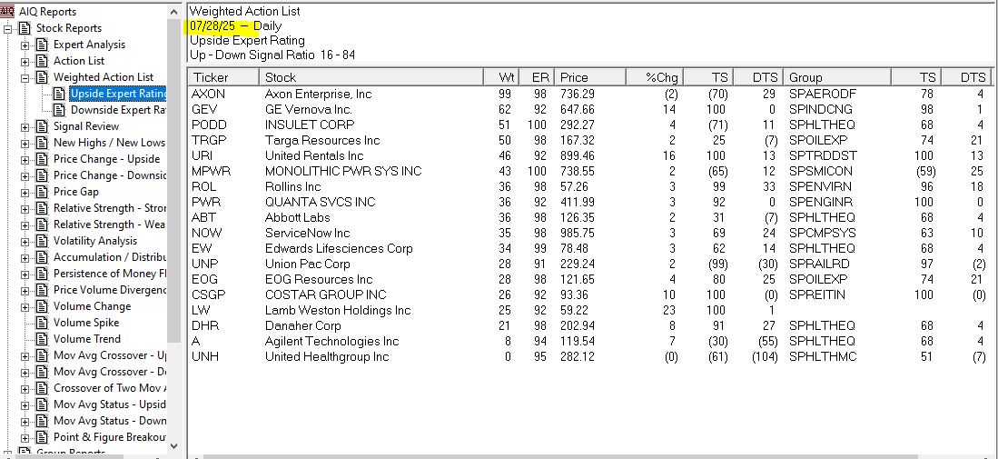
Recording of an hour-long session with Steve Hill, CEO of AIQ Systems. It’s one of the longest-running AI-based systems in the world. Like any AI it isn’t perfect. In this session, Steve covered leveraging these ratings for effective trading decisions. Includes an EDS file that scans for unusual rating patterns of 11-59, 16-56, and 76-5.

https://aiqeducation.com/downloads/16561159.EDS

https://aiqeducation.com/downloads/11591656705.edp

https://aiqeducation.com/downloads/16561159%20all2.edp

https://aiqeducation.com/downloads/11591656.edp

Download these 4 files to your /wintes32/EDS Strategies folder. Open EDS and open the file c:/wintes32/EDS Strategies/16561159.eds

Detecting High-Volume Breakouts

The importable AIQ EDS file based on Markos Katsanos’ article in the April issue of Stocks & Commodities, “Detecting High-Volume Breakouts,” can be obtained on request via email to info@TradersEdgeSystems.com.

Excerpt “Is there anything more satisfying for a trader than capturing a huge breakout? The usual practice for breakout entries is to simply buy new highs. This method, when used in isolation, will often result in false breakouts. It is, therefore, better to wait for volume confirmation before entering the trade, as high-volume breakouts usually last much longer. In this article, I will show you how to detect breakouts using only volume, sometimes even before price breaks out, by introducing a new volume breakout indicator. “

The code is also available here:

 
!Detecting High-Volume Breakouts !Author: Markos Katsanos, TASC April 2021 !Coded by: Richard Denning, 02/18/2021
!INPUTS:
period is 30.
smoLen is 3.
vpnCrit is 10.
maLen is 30.
V is [volume].

!FORMULAS:
MAVol is simpleavg(V,period).
MAV is iff(MAVol>0,MAVol,1).
Avg is ([High]+[Low]+[Close])/3.
MF is Avg - valresult(Avg,1).
ATR is simpleavg(max( [high]-[low],max(val([close],1)-[low],[high]-val([close],1))),period).
MC is 0.1*ATR.
VMP is iff(MF > MC, V, 0).
VP is sum(VMP,period).
VMN is iff(MF < -MC, V, 0).
VN is sum(VMN,period).
VPN is (expavg(((VP - VN) / MAV / period),smoLen))*100.
MAVPN is simpleavg(VPN,maLen).

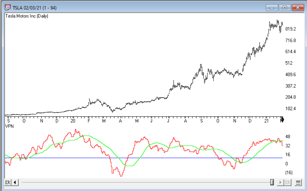
Code for the VPN indicator is set up in the AIQ code file. Figure 9 shows the indicator on a chart of Tesla Motors Inc (TSLA).

Sample Chart

FIGURE 9: AIQ. The VPN indicator is shown on a chart of Tesla Motors Inc. (TSLA).

—Richard Denning
info@TradersEdgeSystems.com
for AIQ Systems

The Calm Before the Bond Storm?

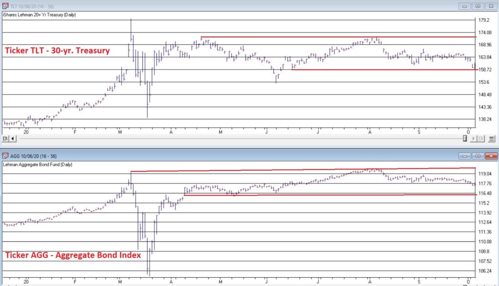
The bond market was very quiet in the 3rd quarter.  Figure 1 displays ticker IEF (7-10 year treasuries ETF) in the to clip and ticker AGG (Aggregate Bond Index ETF) in the bottom clip. 

Figure 1 – Tickers IEF and AGG in narrow ranges (Courtesy AIQ TradingExpert)

Essentially the entire bond market has been flat since early June.  The market seems to be assuming that “the Fed will take of everything” and keep interest rates low and stable for the foreseeable future so…..ZZZZZZZZ.

But this type of activity often breeds complacency.  I am not making any predictions here but I do want to raise a question that investors might wish to ponder, i.e., “what would be more shocking that a spike in interest rates?”  OK, yes, I realize it is 2020 and it is pretty much hard to be shocked by anything anymore.  But still, on a relative basis how many investors are even thinking about the potential risk of higher interest rates at the moment?

Could it Happen?

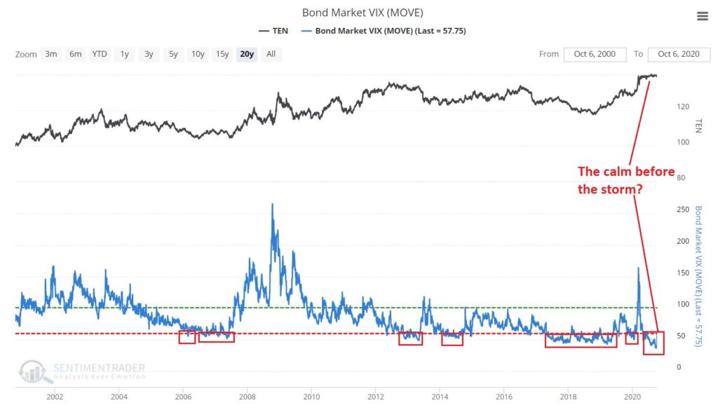
The Bond Market VIX (ticker MOVE) recently fell to its lowest level ever (before spiking sharply higher on 10/5/20).  As you can see in Figure 2 this type of “quietness” often precedes a significant move in the bond market.  For the record, low readings in MOVE can be followed by large up moves in price as easily as large down moves in price.  So, a low MOVE reading is not “bearish” per se, but rather merely suggests that we are experiencing the “calm before the storm.”

Figure 2 – Bond Market VIX hit an all-time low (Courtesy Sentimentrader.com)

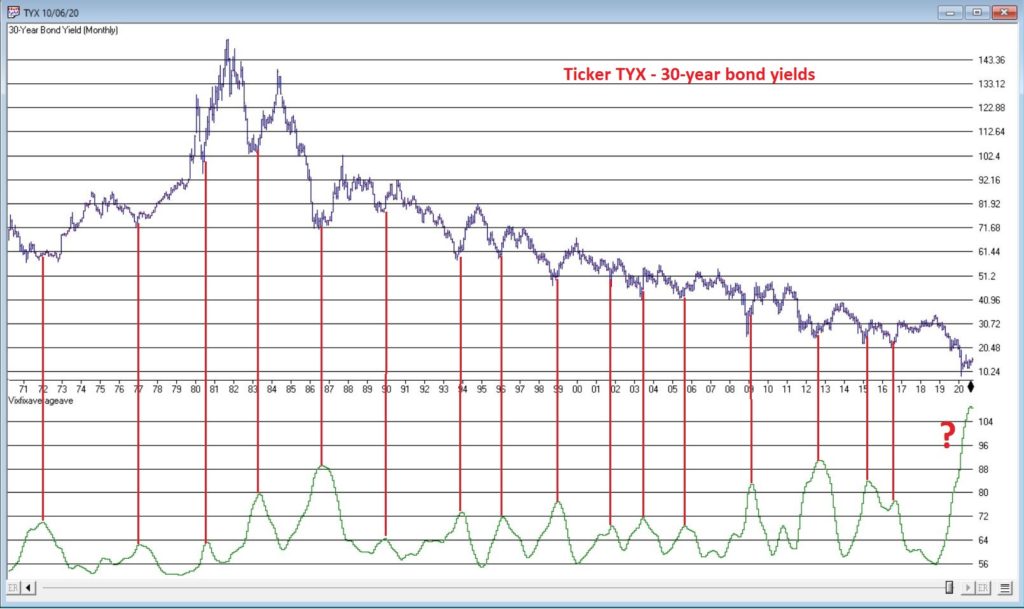
So why is my “Spidey sense” tingling?  Figure 3 displays the yield on 30-year treasuries (ticker TYX) on the bottom and an indicator I refer to as VFAA on the bottom (the calculation appears at the end of this piece).  VFAA is a derivative on a Larry William’s indicator he calls VixFix.

Figure 3 – 30-year treasury yields with VFAA suggesting a potential bottoming area (Courtesy AIQ TradingExpert)

As you can see in Figure 3, peaks in the VFAA indicator often occur near intermediate term lows in bond yields (reminder: bond prices move inversely to yield, so a bottom in interest rates indicates a top in bond prices).  As you can also see on the far-right hand side, the stage clearly appears to be set for “the next go round.”

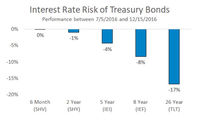
Why does this matter?  If interest rates do rise in the months ahead bond prices – particularly long-term bond prices can get hit hard.  To illustrate the potential risks, Figure 4 displays the action of treasury security ETFs of various maturity during a 5-month rise in rates back in 2016.

Figure 4 – Bond ETF action during rate rise in 2016

Summary

It is possible for long and short-term bonds to “de-couple”.  In other words, the possibilities are:

*Short-term rates remain stable (as the Fed keeps pumping) while long-term rates rise (as inflation fears arise as a result of all the Fed pumping)

*Short-term rates remain stable while long-term rates plummet (if the economy appears to be weakening).  This would result in gains for long-term bonds only

*None of the above

The bottom line: Bonds have fallen asleep – but DO NOT fall asleep on bonds. 

VFAA Formula

Below is the code for VFAA

VixFix is an indicator developed many years ago by Larry Williams which essentially compares the latest low to the highest close in the latest 22 periods (then divides the difference by the highest close in the latest 22 periods).  I then multiply this result by 100 and add 50 to get VixFix.

*Next is a 3-period exponential average of VixFix

*Then VFAA is arrived at by calculating a 7-period exponential average of the previous result (essentially, we are “double-smoothing” VixFix)

Are we having fun yet?  See code below:

hivalclose is hival([close],22).

vixfix is (((hivalclose-[low])/hivalclose)*100)+50.

vixfixaverage is Expavg(vixfix,3).

vixfixaverageave is Expavg(vixfixaverage,7).

VFAA = vixfixaverageave

Jay Kaeppel

Disclaimer: The information, opinions and ideas expressed herein are for informational and educational purposes only and are based on research conducted and presented solely by the author.  The information presented represents the views of the author only and does not constitute a complete description of any investment service.  In addition, nothing presented herein should be construed as investment advice, as an advertisement or offering of investment advisory services, or as an offer to sell or a solicitation to buy any security.  The data presented herein were obtained from various third-party sources.  While the data is believed to be reliable, no representation is made as to, and no responsibility, warranty or liability is accepted for the accuracy or completeness of such information.  International investments are subject to additional risks such as currency fluctuations, political instability and the potential for illiquid markets.  Past performance is no guarantee of future results.  There is risk of loss in all trading.  Back tested performance does not represent actual performance and should not be interpreted as an indication of such performance.  Also, back tested performance results have certain inherent limitations and differs from actual performance because it is achieved with the benefit of hindsight.

Whither Apple?

OK, first off a true confession.  I hate it when some wise acre analyst acts like they are so smart and that everyone else is an idiot.  Its offensive and off-putting – not to mention arrogant.  And still in this case, all I can say is “Hi, my name is Jay.”

A lot of attention has been paid lately to the fact that AAPL is essentially swallowing up the whole world in terms of market capitalization.  As you can see in Figure 1, no single S&P 500 Index stock has ever had a higher market cap relative to the market cap of the entire Russell 2000 small-cap index. 

Figure 1 – Largest S&P 500 Index stock as a % of entire Russell 200 Index (Courtesy Sentimentrader.com)

So of course, the easiest thing in the world to do is to be an offensive, off-putting and arrogant wise acre and say “Well, this can’t last.”  There, I said it.  With the caveat that I have no idea how far AAPL can run “before the deluge”, as a student of (more) market history (than I care to admit) I cannot ignore this gnawing feeling that this eventually “ends badly.”  Of course, I have been wrong plenty of times before and maybe things (Offensive, Off-Putting and Arrogant Trigger Warning!) “really will be different this time around.”  To get a sense of why I bring this all up, please keep reading.

In Figure 1 we also see some previous instances of a stock becoming “really large” in terms of market cap.  Let’s take a closer look at these instances.

IBM – 1979

Figure 2 – IBM (Courtesy AIQ TradingExpert)

MSFT – 1999

Figure 3 – MSFT (Courtesy AIQ TradingExpert)

XOM – 2008

Figure 4 – XOM (Courtesy AIQ TradingExpert)

AAPL – 2012

Figure 5 – AAPL (Courtesy AIQ TradingExpert)

AAPL – 2020

Figure 6 – AAPL (Courtesy AIQ TradingExpert)

Summary

Small sample size? Yes.

Could AAPL continue to run to much higher levels? Absolutely

Do I still have that offensive, off-putting and slightly arrogant gut feeling that somewhere along the way AAPL takes a huge whack?

Sorry.  It’s just my nature.

Jay Kaeppel

Disclaimer: The information, opinions and ideas expressed herein are for informational and educational purposes only and are based on research conducted and presented solely by the author.  The information presented represents the views of the author only and does not constitute a complete description of any investment service.  In addition, nothing presented herein should be construed as investment advice, as an advertisement or offering of investment advisory services, or as an offer to sell or a solicitation to buy any security.  The data presented herein were obtained from various third-party sources.  While the data is believed to be reliable, no representation is made as to, and no responsibility, warranty or liability is accepted for the accuracy or completeness of such information.  International investments are subject to additional risks such as currency fluctuations, political instability and the potential for illiquid markets.  Past performance is no guarantee of future results.  There is risk of loss in all trading.  Back tested performance does not represent actual performance and should not be interpreted as an indication of such performance.  Also, back tested performance results have certain inherent limitations and differs from actual performance because it is achieved with the benefit of hindsight.

The Rally in “Stuff” Rolls On

In this article, dated 7/10/2020, I noted that my “Stuff” Index was coming on strong and that its performance may be a “shot across the bow” that some changes may be coming to the financial markets.  Since then, the trend has accelerated.

STUFF vs. FANG vs. QQQ

Figure 1 displays the performance of STUFF components since 7/10

Figure 2 displays the performance of FANG components since 7/10

Figure 1 – Price performance of Jay’s STUFF Index components since 7/10

Figure 2 – Price performance of FANG stocks since 7/10

For the record, the “high-flying” Nasdaq 100 Index (using ticker QQQ as a proxy investment) is up +4.0% during the same time.

Is this a trend – or a blip?  Unfortunately, I can’t answer that question. But it certainly appears that there is something afoot in “Stuff”, particularly the metals.  Figure 3 displays the weekly charts for ETFs tracking Silver, Gold, Palladium and Platinum (clockwise from upper left). 

Figure 3 – The metals components of the Stuff Index (Courtesy AIQ TradingExpert)

When it comes bull markets in metals, the typical pattern historically goes something like this:

*Gold leads the way (check)

*Eventually silver comes on strong and often ends up outperforming gold (check)

*The other metals rise significantly “under the radar” as everyone focus on – literally in this case, ironically – the “shiny objects” (gold and silver)

Again, while I had inklings that a bull market in metals was forming (and have held positions in them for several years, and still hold them), I certainly did not “predict” the recent explosion in gold and silver prices. 

Two things to note:

*Gold and silver are obviously very “overbought”, so buying a large position here entails significant risk

*Still it should be noted that both SLV and PPLT would have to double in price from their current levels just to get back to their previous all-time highs of 2011

So, don’t be surprised if “Stuff” enjoys a continued resurgence.  Note in Figure 4 that a number of commodity related ETFs are way, way beaten down and could have a lot of upside potential if a resurgence actually does unfold.

Figure 4 – Four commodity ETFs weekly (Courtesy AIQ TradingExpert)

What is interesting – and almost not visible to the naked eye – is the action in the lower right hand corner of these four charts. To highlight what is “hiding in plain sight”, Figure 5 “zooms in” on the recent action of same four tickers as Figure 4, but in a daily price format rather than a monthly price format.

Figure 5 – Four commodity ETFs daily (Courtesy AIQ TradingExpert)

Despite the ugly pictures painted in Figure 4, it is interesting to note in Figure 5 that all four of these commodity related ETFs have rallied sharply of late.  There is of course, no guarantee this will continue.  But if the rally in “Stuff” – currently led by metals – spreads to the commodity sector as a whole, another glance in Figures 3 and 4 reveals a lot of potential upside opportunity.

Time will tell.  In the meantime, keep an eye on the “shiny objects” (gold and silver) for clues as to whether or not the rally in “Stuff” has staying power.

See also Jay Kaeppel Interviewin July 2020 issue of Technical Analysis of Stocks and Commodities magazine

See also Jay’s “A Strategy You Probably Haven’t Considered” Video

See also Video – The Long-Term…Now More Important Than Ever

Jay Kaeppel

Disclaimer: The information, opinions and ideas expressed herein are for informational and educational purposes only and are based on research conducted and presented solely by the author.  The information presented represents the views of the author only and does not constitute a complete description of any investment service.  In addition, nothing presented herein should be construed as investment advice, as an advertisement or offering of investment advisory services, or as an offer to sell or a solicitation to buy any security.  The data presented herein were obtained from various third-party sources.  While the data is believed to be reliable, no representation is made as to, and no responsibility, warranty or liability is accepted for the accuracy or completeness of such information.  International investments are subject to additional risks such as currency fluctuations, political instability and the potential for illiquid markets.  Past performance is no guarantee of future results.  There is risk of loss in all trading.  Back tested performance does not represent actual performance and should not be interpreted as an indication of such performance.  Also, back tested performance results have certain inherent limitations and differs from actual performance because it is achieved with the benefit of hindsight.

A Simple Way To Trade Seasonality


In “A Simple Way To Trade Seasonality” in the September 2019 Stocks & Commodities, author Perry Kaufman describes methods he uses for measuring the seasonality in markets and approaches he uses for trading these patterns

Editors note: The full article can be obtained from Stocks & Commodities magazine at
http://technical.traders.com/sub/sublog2.asp#Sep the system rules are from the article and are based on these rules

1. Average the monthly frequency of the past 4 years.

2. Find the last occurrence of the highest frequency and the last occurrence of the lowest frequency using the average frequency in step 1. That is, if both March and April have a frequency of 70, we use April.

3. Only trade if the high frequency is 75% or greater and the low frequency is 25% or lower.

4. If the high frequency comes first, sell short at the end of the month with the high frequency. Cover the short at the end of the month with the low frequency.

5. If the low frequency comes first, buy at the end of the month with the low frequency. Sell to exit at the end of the month with the high frequency

The importable AIQ EDS file and Excel spreadsheet for Perry Kaufman’s article can be obtained on request via email to info@TradersEdgeSystems.com. The code is also shown below

!A Simple Way to Trade Seasonality
!Author: Perry Kaufman, TASC September 2019
!Coded by: Richard Denning, 07/21/2019
!www.TradersEdgeSystem.com

C is [close].
year is 2019.
len is 4000.
OSD is offsettodate(month(),day(),year()).
FirstDate is firstdatadate().

EOM1 if Month()=2 and valresult(month(),1)=1 and year()=year.
EOMos1 is scanany(EOM1,len) then OSD+1.
EOMc1 is valresult(C,^EOMos1).
EOM2 if Month()=3 and valresult(month(),1)=2 and year()=year.
EOMos2 is scanany(EOM2,len) then OSD+1.
EOMc2 is valresult(C,^EOMos2).
EOM3 if Month()=4 and valresult(month(),1)=3 and year()=year.
EOMos3 is scanany(EOM3,len) then OSD+1.
EOMc3 is valresult(C,^EOMos3).
EOM4 if Month()=5 and valresult(month(),1)=4 and year()=year.
EOMos4 is scanany(EOM4,len) then OSD+1.
EOMc4 is valresult(C,^EOMos4).
EOM5 if Month()=6 and valresult(month(),1)=5 and year()=year.
EOMos5 is scanany(EOM5,len) then OSD+1.
EOMc5 is valresult(C,^EOMos5).
EOM6 if Month()=7 and valresult(month(),1)=6 and year()=year.
EOMos6 is scanany(EOM6,len) then OSD+1.
EOMc6 is valresult(C,^EOMos6).
EOM7 if Month()=8 and valresult(month(),1)=7 and year()=year.
EOMos7 is scanany(EOM7,len) then OSD+1.
EOMc7 is valresult(C,^EOMos7).
EOM8 if Month()=9 and valresult(month(),1)=8 and year()=year.
EOMos8 is scanany(EOM8,len) then OSD+1.
EOMc8 is valresult(C,^EOMos8).
EOM9 if Month()=10 and valresult(month(),1)=9 and year()=year.
EOMos9 is scanany(EOM9,len) then OSD+1.
EOMc9 is valresult(C,^EOMos9).
EOM10 if Month()=11 and valresult(month(),1)=10 and year()=year.
EOMos10 is scanany(EOM10,len) then OSD+1.
EOMc10 is valresult(C,^EOMos10).
EOM11 if Month()=12 and valresult(month(),1)=11 and year()=year.
EOMos11 is scanany(EOM11,len) then OSD+1.
EOMc11 is valresult(C,^EOMos11).
EOM12 if Month()=1 and valresult(month(),1)=12 and valresult(year(),1)=year.
EOMos12 is scanany(EOM12,len) then OSD+1.
EOMc12 is valresult(C,^EOMos12).
YEARavg is (EOMc1+EOMc2+EOMc3+EOMc4+EOMc5+EOMc6+EOMc7+EOMc8+EOMc9+EOMc10+EOMc11+EOMc12)/12.

AR1 is (EOMc1 / YEARavg-1)*100.
AR2 is (EOMc2 / YEARavg-1)*100.
AR3 is (EOMc3 / YEARavg-1)*100.
AR4 is (EOMc4 / YEARavg-1)*100.
AR5 is (EOMc5 / YEARavg-1)*100.
AR6 is (EOMc6 / YEARavg-1)*100.
AR7 is (EOMc7 / YEARavg-1)*100.
AR8 is (EOMc8 / YEARavg-1)*100.
AR9 is (EOMc9 / YEARavg-1)*100.
AR10 is (EOMc10 / YEARavg-1)*100.
AR11 is (EOMc11 / YEARavg-1)*100.
AR12 is (EOMc12 / YEARavg-1)*100.

EOMc if firstdate < makedate(1,20,2019-20).
AR if EOMc.

The EDS code is not a trading system but a way to get the data needed into an Excel spreadsheet to enable you to make the seasonal calculations. The EDS file should be run on a date after the end of the year being calculated. Each year for which data is needed must be run separately by setting the “year” variable. Multiple symbols can be run at the same time by using a list of the desired symbols. Each time a year is run, the “AR” report must be saved as a “.csv” file. Once all the years needed have been run and saved to separate “.csv” files, they all should be cut and pasted to a single Excel sheet. They then can be sorted by symbol and each symbol can be copied and pasted to a tab for that symbol.

Figure 6 shows the rolling four-year frequency for the S&P 500 ETF (SPY) and Figure 7 shows the annual trades resulting from applying the seasonal rules to the frequency data.

Sample Chart

FIGURE 6: AIQ. Shown here is the rolling four-year frequency for the SPY.

Sample Chart

FIGURE 7: AIQ. Shown here are the annual trades resulting from applying the seasonal rules to the frequency data for SPY.

—Richard Denning
info@TradersEdgeSystems.com
for AIQ Systems

Backtesting A Mean-Reversion Strategy In Python

The importable AIQ EDS file based on Anthony Garner’s article in May 2019 Stocks & Commodities “Backtesting A Mean-Reversion Strategy In Python,” can be obtained on request via email to info@TradersEdgeSystems.com. The code is also shown below.

I backtested the author’s mean-reversion system (MeanRev.eds) using both the EDS module, which tests every trade on a one-share basis, and also via the Portfolio Manager, which performs a trading simulation.

The short side strategy showed a loss overall in the EDS test so I tested only the long side in the Portfolio Manager. I selected trades using the z-score, taking the lowest values.

For capitalization, I used max of three trades per day with a max total of 10 open trades at one time, 10% allocated to each position. I did not deduct slippage but did deduct commissions. I used a recent list of the NASDAQ 100 stocks to run the test. The equity curve and account statistics report are shown in Figure 7.

Sample Chart

FIGURE 7: AIQ. This shows the equity curve (blue line) from long-only trading the NASDAQ 100 list of stocks from 1999 to March 15, 2019. The red line is the NDX index.

!Backtesting a Mean-Reversion Strategy In Python !Author: Anthony Garner, TASC May 2019 !Coded by: Richard Denning 3/14/19 !www.TradersEdgeSystems.com 

!ABBREVIATIONS:
C is [close].

!INPUTS:
meanLen is 10.
longZmult is -1.
shortZmult is 1.
meanMult is 10.

!FORMULAS:

SMA is simpleavg(C,meanLen).
LMA is simpleavg(C,meanLen*meanMult).
STD is sqrt(variance(C,meanLen)).
zScore is (C - SMA) / STD.

!TRADING SIGNALS & EXITS:

buyLong if zScore < longZmult and SMA > LMA.
sellShort if zScore > shortZmult and SMA < LMA.
exitLong if valresult(zScore,1) < -0.5 and zScore > 0.5.
exitShort if valresult(zScore,1) > 0.5 and zScore < -0.5.

showValues if 1.

—Richard Denning
info@TradersEdgeSystems.com
for AIQ Systems

The Agony and Ecstasy of Trend-Following

Let’s face it, many investors have a problem with riding a trend.  When things are going well they fret and worry about every blip in interest rates, housing starts, earnings estimates and the price of tea in China, which often keeps them from maximizing their profitability.  Alternatively, when things really do fall apart they suddenly become “long-term investors” (in this case “long-term” is defined roughly as the time between the current time and the time they “puke” their portfolio – just before the bottom).

Which reminds me to invoke:

Jay’s Trading Maxim #6: Human nature is a detriment to investment success and should be avoided as much as, well, humanly possible.

So, it can help to have a few “go to” indicators, to help one objectively tilt to the bullish or bearish side.  And we are NOT talking about “pinpoint precision timing” types of things here. Just simple, objective clues.  Like this one.

Monthly MACD

1

Figure 1 displays the S&P 500 index monthly chart with the monthly MACD Indicator at the bottom.Figure 1 – Monthly S&P 500 Index with MACD (Courtesy AIQ TradingExpert)

The “trading rules” we will use are pretty simple:

*If the Monthly MACD closes a month above 0, then hold the S&P 500 Index the next month

*If the Monthly MACD closes a month below 0, then hold the Barclays Treasury Intermediate Index the next month

*We start our test on 11/30/1970.

*For the record, data for the Barclays Treasury Intermediate Index begins in January 1973 so prior to that we simply used an annual interest rate of 1% as a proxy.

Figure 2 displays the equity curves for:

*The strategy just explained (blue line)

*Buying and holding the S&P 500 Index (orange) line

2

Figure 2 – Growth of $1,000 using MACD System versus Buy-and-Hold

Figure 3 displays some “Facts and Figure” regarding relative performance.

3

Figures 3 – Comparative Results

For the record:

*$1,000 invested using the “System” grew to $143,739 by 6/30/2019

*$1,000 invested using buy-and-hold grew to $102,569 by 6/30/2019

*The “System” experienced a maximum drawdown (month-end) of -23.3% and the Worst 5-year % return was +7.3% (versus a maximum drawdown of -50.9% and a Worst 5-year % return of -29.1% for Buy-and-Hold)

So, from the chart in Figure 2 and the data in Figure 3 it is “obvious” that using MACD to decide when to be in or out of the market is clearly “better” than buy-and-hold.  Right?  Here is where it “gets interesting” for a couple of reasons.

First off, the MACD Method outperforms in the long run by virtue of missing a large part of severe bear markets every now and then.  It also gets “whipsawed” more often than it “saves your sorry assets” during a big bear market.  So, in reality it requires ALOT of discipline (and self-awareness) to actually follow over time.

Consider this: if you were actually using just this one method to decide when to be in or out of the market (which is NOT what I am recommending by the way) you would have gotten out at the end of October 2018 with the S&P 500 Index at 2,711.74.  Now nine months later you would be sitting here with the S&P 500 Index flirting with 3,000 going “what the heck was I thinking about!?!?!?”  In other words, while you would have missed the December 2018 meltdown, you also would have been sitting in treasuries throughout the entire 2019 rally to date.

Like I said, human nature, it’s a pain.

To fully appreciate what makes this strategy “tick”, consider Figures 4 and 5. Figure 4 displays the growth of equity when MACD is > 0 (during these times the S&P 500 Index is held).

4

Figure 4 – Growth of $1,000 invested in S&P 500 Index when MACD > 0.

Sort of the “When things are swell, things are great” scenario.

Figure 5 displays the growth of $1,000 for both intermediate-term treasuries AND the S&P 500 Index during those times when MACD > 0.

5

Figure 5 – Growth of $1,000 invested in Intermediate-term treasuries (blue) and the S&P 500 (orange) when MACD < 0.

Essentially a “Tortoise and the Hare” type of scenario.

Summary

Simple trend-following methods – whether they involve moving average using price, trend lines drawn on charts or the MACD type of approach detailed herein – can be very useful over time.

*They can help an investor to reduce that “Is this the top?” angst and sort of force them to just go with the flowing while the flowing is good.

*They can also help an investor avoid riding a major bear market all the way to the bottom – which is a good thing both financially and emotionally.

But everything comes with a cost.  Trend-following methods will never get you in at the bottom nor out at the top, and you WILL experience whipsaws – i.e., times when you sell at one price and then are later forced to buy back at a higher price.

Consider it a “cost of doing business.”

Jay Kaeppel

Disclaimer:  The data presented herein were obtained from various third-party sources.  While I believe the data to be reliable, no representation is made as to, and no responsibility, warranty or liability is accepted for the accuracy or completeness of such information.  The information, opinions and ideas expressed herein are for informational and educational purposes only and do not constitute and should not be construed as investment advice, an advertisement or offering of investment advisory services, or an offer to sell or a solicitation to buy any security.

Where We Are

One of the best pieces of advice I ever got was this: “Don’t tell the market what it’s supposed to do, let the market tell you what you’re supposed to do.”

That is profound.  And it really makes me wish I could remember the name of the guy who said it.  Sorry dude.  Anyway, whoever and wherever you are, thank you Sir.

Think about it for a moment.  Consider all the “forecasts”, “predictions” and “guides” to “what is next for the stock market” that you have heard during the time that you’ve followed the financial markets.  Now consider how many of those actually turned out to be correct.  Chances are the percentage is fairly low.

So how do you “let the market tell you what to do?”  Well, like everything else, there are lots of different ways to do it.  Let’s consider a small sampling.

Basic Trend-Following

Figure 1 displays the Dow Industrials, the Nasdaq 100, the S&P 500 and the Russell 2000 clockwise form the upper left.  Each displays a 200-day moving average and an overhead resistance point.

1

Figure 1 – Dow/NDX/SPX/RUT (Courtesy AIQ TradingExpert)

The goal is to move back above the resistance points and extend the bull market.  But the real key is for them to remain in an “uptrend”, i.e.,:

*Price above 200-day MA = GOOD

*Price below 200-day MA = BAD

Here is the tricky part.  As you can see, a simple cross of the 200-day moving average for any index may or may not be a harbinger of trouble.  That is, there is nothing “magic” about any moving average.  In a perfect world we would state that: “A warning sign occurs when the majority of indexes drop below their respective 200-day moving average.”

Yet in both October 2018 and May 2019 all four indexes dropped below their MA’s and still the world did not fall apart, and we did not plunge into a major bear market.  And as we sit, all four indexes are now back above their MA’s.  So, what’s the moral of the story?  Simple – two things:

  1. The fact remains that major bear markets (i.e., the 1 to 3 year -30% or more variety) unfold with all the major averages below their 200-day moving averages.  So, it is important to continue to pay attention.
  2. Whipsaws are a fact of life when it comes to moving averages.

The problem then is that #2 causes a lot of investors to forget or simply dismiss #1.

Here is my advice: Don’t be one of those people.  While a drop below a specific moving average by most or all the indexes may not mean “SELL EVERYTHING” now, it will ultimately mean “SEEK SHELTER” eventually as the next major bear market unfolds.  That is not a “prediction”, that is simply math.

The Bellwethers

I have written in the past about several tickers that I like to track for “clues” about the overall market.  Once again, nothing “magic” about these tickers, but they do have a history of topping out before the major averages prior to bear markets.  So, what are they saying?  See Figure 2.

2

Figure 2 – SMH/Dow Transports/ZIV/BID (Courtesy AIQ TradingExpert)

The bellwethers don’t look great overall.

SMH (semiconductor ETF): Experienced a false breakout to new highs in April, then plunged.  Typically, not a good sign, but it has stabilized for now and is now back above its 200-day MA.

Dow Transports: On a “classic” technical analysis basis, this is an “ugly chart.” Major overhead resistance, not even an attempt to test that resistance since the top last September and price currently below the 200-day MA.

ZIV (inverse VIX ETF): Well below it’s all-time high (albeit well above its key support level), slightly above it’s 200-day MA and sort of seems to be trapped in a range.  Doesn’t necessarily scream “SELL”, but the point is it is not suggesting bullish things for the market at the moment.

BID (Sotheby’s – which holds high-end auctions): Just ugly until a buyout offer just appeared.  Looks like this bellwether will be going away.

No one should take any action based solely on the action of these bellwethers.  But the main thing to note is that these “key” (at least in my market-addled mind) things is that they are intended to be a “look behind the curtain”:

*If the bellwethers are exuding strength overall = GOOD

*If the bellwethers are not exuding strength overall = BAD (or at least not “GOOD”)

A Longer-Term Trend-Following Method

In this article I detailed a longer-term trend-following method that was inspired by an article written by famed investor and Forbes columnist Ken Fisher.  The gist is that a top is not formed until the S&P 500 Index goes three calendar months without making a new high.  It made a new high in May, so the earliest this method could trigger an “alert” would be the end of August (assuming the S&P 500 Index does NOT trade above it’s May high in the interim.

Jay Kaeppel

Disclaimer:  The data presented herein were obtained from various third-party sources.  While I believe the data to be reliable, no representation is made as to, and no responsibility, warranty or liability is accepted for the accuracy or completeness of such information.  The information, opinions and ideas expressed herein are for informational and educational purposes only and do not constitute and should not be construed as investment advice, an advertisement or offering of investment advisory services, or an offer to sell or a solicitation to buy any security.

What the Hal?

Some industries are cyclical in nature.  And there is not a darned thing you – or they – can do about it.  Within those industries there are individual companies that are “leaders”, i.e., well run companies that tend to out earn other companies in that given industry and whose stock tends to outperform other companies in that industry.

Unfortunately for them, even they cannot avoid the cyclical nature of the business they are in.  Take Halliburton (ticker HAL) for example.  Halliburton is one of the world’s largest providers of products and services to the energy industry.  And they do a good job of it. Which is nice.  It does not however, release them from the binds of being a leader in a cyclical industry.

A Turning Point at Hand?

1

A quick glance at Figure 1 clearly illustrates the boom/bust nature of the performance of HAL stock.Figure 1 – Halliburton (HAL) (Courtesy AIQ TradingExpert)

Which raises an interesting question: is there a way to time any of these massive swings?  Well here is where things get a little murky.  If you are talking about “picking timing tops and bottoms with uncanny accuracy”, well, while there are plenty of ads out there claiming to be able to do just that, in reality that is not really “a thing”.  Still, there may be a way to highlight a point in time where:

*Things are really over done to the downside, and

*For a person who is not going to get crazy and “bet the ranch”, and who understands how a stop-loss order works and is willing to use one…

..there is at least one interesting possibility.

It’s involves a little-known indicator that is based on a more well-known another indicator that was developed by legendary trader Larry Williams roughly 15 or more years ago.  William’s indicator is referred to as “VixFix” and attempts to replicate a VIX-like indicator for any market.  The formula is pretty simple, as follows  (the code is from AIQ Expert Design Studio):

*hivalclose is hival([close],22).

*vixfix is (((hivalclose-[low])/hivalclose)*100)+50.

In English, it is the highest close in the last 22-periods minus the current period low, which is then divided by the highest close in the last 22-periods. The result then gets multiplied by 100 and 50 is added.

Figure 2 displays a monthly chart of HAL with William’s VixFix in the lower clip.  In a nutshell, when price declines VixFix rises and vice versa.

2

Figure 2 – HAL Monthly with William’s VixFix (Courtesy AIQ TradingExpert)

Now let’s go one more step as follows by creating an exponentially smoothed version as follows (the code is from AIQ Expert Design Studio):

*hivalclose is hival([close],22).

*vixfix is (((hivalclose-[low])/hivalclose)*100)+50. <<<Vixfix from above

*vixfixaverage is Expavg(vixfix,3).  <<<3-period exponential MA of Vixfix

*Vixfixaverageave is Expavg(vixfixaverage,7). <<<7-period exp. MA

I refer to this as Vixfixaverageave (Note to myself: get a better name) because it essentially takes an average of an average.  In English (OK, sort of), first Vixfix is calculated, then a 3-period exponential average of Vixfix is calculated (vixfixaverage) and then a 7-period exponential average of vixfixaverage is calculated to arrive at Vixfixaverageave (got that?)

3

Anyway, this indicator appears on the monthly chart for HAL that appears in Figure 3.Figure 3 – HAL with Vixaverageave (Courtesy AIQ TradingExpert)

So here is the idea:

*When Vixfixaverageave for HAL exceeds 96 it is time to start looking for a buying opportunity.

OK, that last sentence is not nearly as satisfying as one that reads “the instant the indicator reaches 96 it is an automatic buy signal and you can’t lose”.  But it is more accurate.  Previous instances of a 96+ reading for Vixfixaverageave for HAL appear in Figure 4.

4

Figure 4 – HAL with previous “buy zone” readings from Vixfixaverageave (Courtesy  AIQ TradingExpert)

Note that in previous instances, the actual bottom in price action occurred somewhere between the time the indicator first broke above 96 and the time the indicator topped out.  So, to reiterate, Vixfixaverageave is NOT a “precision timing tool”, per se.  But it may be useful in highlighting extremes.

This is potentially relevant because with one week left in May, the monthly Vixfixaverageave value is presently above 96.  This is NOT a “call to action”.  If price rallies in the next week Vixfixaverageave may still drop back below 96 by month-end.  Likewise, even if it is above 96 at the end of May – as discussed above and as highlighted in Figure 4, when the actual bottom might occur is impossible to know.

5

Let me be clear: this article is NOT purporting to say that now is the time to buy HAL.  Figure 5 displays the largest gain, the largest drawdown and the 12-month gain or loss following months when Vixfixaverageave for HAL first topped 96.  As you can see there is alot of variation and volatility.  

Figure 5 – Previous 1st reading above 96 for HAL Vixfixaverageave

So HAL may be months and/or many % points away from an actual bottom.  But the main point is that the current action of Vixfixaverageave suggests that now is the time to start paying attention.

Jay Kaeppel

Disclaimer:  The data presented herein were obtained from various third-party sources.  While I believe the data to be reliable, no representation is made as to, and no responsibility, warranty or liability is accepted for the accuracy or completeness of such information.  The information, opinions and ideas expressed herein are for informational and educational purposes only and do not constitute and should not be construed as investment advice, an advertisement or offering of investment advisory services, or an offer to sell or a solicitation to buy any security.

A Different Kind of Bond Barbell

The “barbell” approach to bond investing typically involves buying a long-term bond fund or ETF and a short-term bond fund or ETF.  The idea is that the long-term component provides the upside potential while the short-term component dampens overall volatility and “smooths” the equity curve.  This article is not intended to examine the relative pros and cons of this approach.  The purpose is to consider an alternative for the years ahead.

The Current Situation

Interest rates bottomed out several years ago and rose significantly from mid-2016 into late 2018.  Just when everyone (OK, roughly defined as “at least myself”) assumed that “rates were about to establish an uptrend” – rates topped in late 2018 and have fallen off since.  Figure 1 displays ticker TYX (the 30-year treasury yield x 10) so you can see for yourself.

1

Figure 1 – 30-year treasury yields (TNX) (Courtesy AIQ TradingExpert)

2

In terms of the bigger picture, rates have showed a historical tendency to move in 30-year waves.  If that tendency persists then rates should begin to rise off the lows in recent years in a more meaningful way.  See Figure 2.Figure 2 – 60-year wave in interest rates (Courtesy: www.mcoscillator.com)

Will this happen?  No one can say for sure.  Here is what we do know:  If rates decline, long-term treasuries will perform well (as long-term bonds react inversely to the trend in yields) and if rates rise then long-term bond holders stand to get hurt.

So here is an alternative idea for consideration – a bond “barbell” that includes:

*Long-term treasuries (example: ticker VUSTX)

*Floating rate bonds (example: ticker FFRAX)

Just as treasuries rise when rates fall and vice versa, floating rate bonds tend to rise when rates rise and to fall when rates fall, i.e., (and please excuse the use of the following technical terms) when one “zigs” the other “zags”.  For the record, VUSTX and FFRAX have a monthly correlation of -0.29, meaning they have an inverse correlation.

3

Figure 3 displays the growth of $1,000 invested separately in VUSTX and FFRAX since FFRAX started trading in 2000.  As you can see the two funds have “unique” equity curves.

Figure 3 – Growth of $1,00 invested in VUSTX and FFRAX separately

Now let’s assume that every year on December 31st we split the money 50/50 between long-term treasuries and floating rate bonds.  This combined equity curve appears in Figure 4.

4

Figure 4 – Growth of $1,000 50/50 VUSTX/FFRAX; rebalanced annually

Since 2000, long-treasuries have made the most money.  This is because interest rates declined significantly for most of that period.  If interest rise in the future, long-term treasuries will be expected to perform much more poorly.  However, floating rate bonds should prosper in such an environment.

Figure 5 displays some relevant facts and figures.

5

Figure 5 – Relevant performance Figures

The key things to note in Figure 5 are:

*The worst 12-month period for VUSTX was -13.5% and the worst 12-month period for FFRAX was -17.1%.  However, when the two funds are traded together the worst 12-month period was just -5.0%.

*The maximum drawdown for VUSTX was -16.7% and the maximum drawdown for FFRAX was -18.2%.  However, when the two funds are traded together the worst 12-month period was just -8.6%.

Summary

The “portfolio” discussed herein is NOT a recommendation, it is merely “food for thought”.  If nothing else, combining two sectors of the “bond world” that are very different (one reacts well to falling rates and the other reacts well to rising rates) certainly appears to reduce the overall volatility.

My opinion is that interest rates will rise in the years ahead and that long-term bonds are a dangerous place to be.  While my default belief is that investors should avoid long-term bonds during a rising rate environment, the test conducted here suggests that there might be ways for holders of long-term bonds to mitigate some of their interest rate risk without selling their long-term bonds.

Like I said, food for thought.

Jay Kaeppel

Disclaimer:  The data presented herein were obtained from various third-party sources.  While I believe the data to be reliable, no representation is made as to, and no responsibility, warranty or liability is accepted for the accuracy or completeness of such information.  The information, opinions and ideas expressed herein are for informational and educational purposes only and do not constitute and should not be construed as investment advice, an advertisement or offering of investment advisory services, or an offer to sell or a solicitation to buy any security.

Weekly & Daily Stochastics

The AIQ code based on Vitali Apirine’s article in the September issue of Stocks and Commodities, “Weekly and Daily Stochastics, is provided below

Using Apirine’s weekly and daily stochastic indicators and a moving average to determine trend direction, I created an example system (long only) with the following rules:

Enter long next bar at open when all of the following are true:

  1. The 200-day simple average of the NDX is greater than the day before
  2. The 200-day simple average of the stock is greater than the day before
  3. Both the weekly and daily stochastic indicators have been below 20 in the last five days
  4. Both the weekly and daily stochastic indicators are greater than the day before.

I tested three exits. Figure 8 shows a 21-day hold then exit. Figure 9 shows a three-moving-average trend-following exit. Figure 10 shows an exit using only the weekly &amp; daily stochastic, once both are lower than the day before.

Sample Chart

FIGURE 8: AIQ, BUY and HOLD. Here is the sample equity curve (blue) compared to the NDX (red) for the test using a 21-day hold exit.

Sample Chart

FIGURE 9: AIQ, TREND-FOLLOWING EXIT. Here is the sample equity curve (blue) compared to the NDX index (red) for the test using a trend-following exit.

Sample Chart

FIGURE 10: AIQ, W and D STOCHASTIC EXIT. Here is the sample equity curve (blue) compared to the NDX index (red) for the test using the weekly and daily stochastic indicators.

The 21-day hold test showed a 11.2% return with a maximum drawdown of 29.3%. The trend-following exit test showed a 17.6% return with a maximum drawdown of 28.8%. The test using an exit based on only the weekly and daily stochastic indicators showed a return of 2.9% with a maximum drawdown of 32.5%. All the tests used the same entry rule and were run on an old 2016 list of the NASDAQ 100 stocks with the stocks that are no longer trading deleted.

!WEEKLY AND DAILY STOCHASTIC
!Author: Vitali Apirine, TASC Sept 2018
!Coded by: Richard Denning 7/7/2018
!www.TradersEdgeSystems.com

!INPUTS:
Periods is 14.
Periods1 is 3.
Pds is 70. 
Pds1 is 3.
smaLen1 is 70.
exitType is 1.

!ABBREVIATIONS:
C is [close].
H is [high].
L is [low].

!INDICATOR CODE:
STOCD is (C-LOWRESULT(L,Periods))/(HIGHRESULT(H,Periods)-LOWRESULT(L,Periods))*100. 
SD is Simpleavg(Stocd,Periods1).
StocW is (C-LOWRESULT(L,Pds))/(HIGHRESULT(H,Pds)-LOWRESULT(L,Pds))*100.
SW is Simpleavg(Stocw,Pds1).
HD if hasdatafor(1000) &gt;= 500.
SMA200 is simpleavg(C,200).
SMA200ndx is tickerUDF("NDX",SMA200).

!SYSTEM CODE:
Buy if SMA200ndx &gt; valresult(SMA200ndx,1)
          and SMA200 &gt; valresult(SMA200,1)
          and SW &gt; valresult(SW,1) 
          and SD &gt; valresult(SD,1) 
          and countof(SW &lt; 20,5)&gt;=1 
          and countof(SD &lt; 20,5)&gt;=1 
          and HD.
smaLen2 is smaLen1*2.
smaLen3 is smaLen1*4.
SMA1 is simpleavg(C,smaLen1).
SMA2 is simpleavg(C,smaLen2).
SMA3 is simpleavg(C,smaLen3).
PD is {position days}.

!EXIT TYPE 1 USES THE INDICATOR ONLY
!EXIT TYPE 2 IS TREND FOLLOWING
Sell if (SD &lt; valresult(SD,1) and SW &lt; valresult(SW,1) and exitType=1)
       or (exitType = 2 
           and ((Valresult(C,PD)valresult(SMA1,PD) And Cvalresult(SMA2,PD) And Cvalresult(SMA3,PD) And C 250)).

RSS is C/valresult(C,120).
RSL is C/valresult(C,240).

—Richard Denning

info@TradersEdgeSystems.com

for AIQ Systems

When to Buy Energy Stocks

Crude oil and pretty much the entire energy sector has been crushed in recent months. This type of action sometimes causes investors to wonder if a buying opportunity may be forming.

The answer may well be, “Yes, but not just yet.”

Seasonality and Energy

Historically the energy sector shows strength during the February into May period.  This is especially true if the November through January period is negative.  Let’s take a closer look.

The Test

If Fidelity Select Energy (ticker FSENX) shows a loss during November through January then we will buy and hold FSENX from the end of January through the end of May.  The cumulative growth of $1,000 appears in Figure 1 and the yearly results in Figure 2.

1

Figure 1 – Growth of $1,000 invested in FSENX ONLY during Feb-May ONLY IF Nov-Jan shows a loss

2

Figure 2 – % + (-) from holding FSENX during Feb-May ONLY IF Nov-Jan shows a loss

Figure 3 displays ticker XLE (an energy ETF that tracks loosely with FSENX).  As you can see, at the moment the Nov-Jan return is down roughly -15%.

3

Figure 3 – Ticker XLE (Courtesy AIQ TradingExpert)

All of this suggests remaining patient and not trying to pick a bottom in the fickle energy sector. If, however, the energy sector shows a 3-month loss at the end of January, history suggests a buying opportunity may then be at end.

Summary

Paraphrasing here – “Patience, ah, people, patience”.

Jay Kaeppel

Disclaimer:  The data presented herein were obtained from various third-party sources.  While I believe the data to be reliable, no representation is made as to, and no responsibility, warranty or liability is accepted for the accuracy or completeness of such information.  The information, opinions and ideas expressed herein are for informational and educational purposes only and do not constitute and should not be construed as investment advice, an advertisement or offering of investment advisory services, or an offer to sell or a solicitation to buy any security.

Portfolio Strategy Based On Accumulation/Distribution

The AIQ code based on Domenico D’Errico’s article in the August issue of Stocks &amp; Commodities magazine, “Portfolio Strategy Based On Accumulation/Distribution,” is shown below.

“Whether you are an individual trader or an asset manager, your main goal in reading a chart is to detect the intentions of major institutions, large operators, well-informed insiders, bankers and so on, so you can follow them. Here, we’ll build an automated stock portfolio strategy based on a cornerstone price analysis theory.”

!Portfolio Strategy Based on Accumulation/Distribution
!Author: Domenic D'Errico, TASC Aug 2018
!Coded by: Richard Denning 6/10/18
!www.TradersEdgeSystem.com
!Portfolio Strategy Based on Accumulation/Distribution
!Author: Domenic D'Errico, TASC Aug 2018
!Coded by: Richard Denning 6/10/18
!www.TradersEdgeSystem.com

!SET TO WEEKLY MODE IN PROPERTIES
!ALSO VIEW CHARTS IN WEEKLY MODE

!INPUTS:
rLen is 4.
consolFac is 75. ! in percent
adxTrigger is 30.
volRatio is 1.
volAvgLen is 4.
volDelay is 4.

!CODING ABREVIATIONS:
H is [high].
L is [low].
C is [close].
C1 is valresult(C,1).
H1 is valresult(H,1).
L1 is valresult(L,1).

!RANGE ACCUMULATION/DISTRIBUTION:
theRange is hival([high],rLen) - loval([low],rLen).
Consol if theRange < consolFac/100 * valresult(theRange,rLen).
rRatio is theRange/valresult(theRange,4)*100.

!AVERAGE TRUE RANGE ACCUMULATION/DISTRIBUTION:
avgLen is rLen * 2 - 1.	
TR  is Max(H-L,max(abs(C1-L),abs(C1-H))).
ATR  is expAvg(TR,avgLen).

ConsolATR if ATR < consolFac/100 * valresult(ATR,rLen). atrRatio is ATR / valresult(ATR,4)*100. !ADX ACCUMULATION/DISTRIBUTION: !ADX INDICATOR as defined by Wells Wilder rhigh is (H-H1). rlow is (L1-L). DMplus is iff(rhigh > 0 and rhigh > rlow, rhigh, 0).
DMminus is iff(rlow > 0 and rlow >= rhigh, rlow, 0).
AvgPlusDM is expAvg(DMplus,avgLen).
AvgMinusDM is expavg(DMminus,avgLen).           	
PlusDMI is (AvgPlusDM/ATR)*100.	
MinusDMI is AvgMinusDM/ATR*100.	
DIdiff is PlusDMI-MinusDMI. 		
Zero if PlusDMI = 0 and MinusDMI =0.
DIsum is PlusDMI+MinusDMI.
DX is iff(ZERO,100,abs(DIdiff)/DIsum*100).
ADX is ExpAvg(DX,avgLen).

ConsolADX if ADX < adxTrigger. !CODE FOR ACCUMULATIOIN/DISTRIBUTION RANGE BREAKOUT: consolOS is scanany(Consol,250) then offsettodate(month(),day(),year()). Top is highresult([high],rLen,^consolOS). Top0 is valresult(Top,^consolOS) then resetdate(). Bot is loval([low],rLen,^consolOS). AvgVol is simpleavg([volume],volAvgLen). Bot12 is valresult(Bot,12). BuyRngBO if [close] > Top
and ^consolOS <= 5 and ^consolOS >= 1
and Bot > Bot12
and valresult(AvgVol,volDelay)>volRatio*valresult(AvgVol,volAvgLen+volDelay).
EntryPrice is [close].

Sell if [close] < loval([low],rLen,1).
ExitPrice is [close].

Figure 9 shows the summary backtest results of the range accumulation breakout system using NASDAQ 100 stocks from December 2006 to June 2018. The exits differ from the author’s as follows: I used two of the built-in exits — a 20% stop-loss and a profit-protect of 40% of profits once profit reaches 10%.

Sample Chart

FIGURE 9: AIQ. Here are the summary results of a backtest using NASDAQ 100 stocks.

Figure 10 shows a color study on REGN. The yellow bars show where the range accumulation/distribution shows a consolidation.

Sample Chart

FIGURE 10: AIQ. This color study shows range consolidation (yellow bars).

—Richard Denning

info@TradersEdgeSystems.com

for AIQ Systems

A Technical Method For Rating Stocks

The AIQ code based on Markos Katsanos’ article in this issue, “A Technical Method For Rating Stocks,” is shown below.
Synopsis from Stocks & Commodities June 2018
I’s it possible to create a stock rating system using multiple indicators or other technical criteria? If so, how does it compare with analyst ratings? Investors around the world move billions of dollars every day on advice from Wall Street research analysts. Most retail investors do not have the time or can’t be bothered to read the full stock report and rely solely on the bottom line: the stock rating. They believe these ratings are reliable and base their investment decisions at least partly on the analyst buy/sell rating. But how reliable are those buy/sell ratings? In this article I will present a technical stock rating system based on five technical criteria and indicators, backtest it, and compare its performance to analyst ratings.
!A TECHNICAL METHOD FOR RATING STOCKS
!Author: Markos Katsanos, TASC June 2018
!Coded by: Richard Denning, 4/18/18
!www.TradersEdgeSystems.com

!INPUTS:
  MAP is 63. 
  STIFFMAX is 7. 
  VFIPeriod is 130. 
  MASPY is 100. 
  MADL is 100.
  SCORECRIT is 5.
  W1 is 1.
  W2 is 1.
  W3 is 1.
  W4 is 1.
  W5 is 2.
 
!VFI FORMULA: 
  COEF is 0.2.
  VCOEF is 2.5.
  Avg is ([high]+[low]+[close])/3.
  inter is ln( Avg ) - ln( Valresult( Avg, 1 ) ). 
  vinter is sqrt(variance(inter, 30 )).
  cutoff is Coef * Vinter * [Close].
  vave is Valresult(simpleavg([volume], VFIPeriod ), 1 ).
  vmax is Vave * Vcoef.
  vc is Min( [volume], VMax ).
  mf is Avg - Valresult( Avg, 1 ).
  vcp is iff(MF > Cutoff,VC,iff(MF < -Cutoff,-VC,0)).
  vfitemp is Sum(VCP , VFIPeriod ) / Vave.
  vfi is expavg(VFItemp, 3 ).

!STIFFNESS 
  ma100 is Avg. 
  CLMA if [close] < MA100.
  STIFFNESS is countof(CLMA,MAP).

!CONDITIONS:
 ! MONEY FLOW:
   COND1 is iff(VFI>0,1,0). 
 !SIMPLEAVG:
    SMA is simpleavg([close],MADL).                              
    COND2 is iff([close]>SMA,1,0).  
 !SIMPLEAVG DIRECTION:                       
    COND3 is iff(SMA>valresult(SMA,4),1,0).  
!STIFFNESS:                          
    COND4 is iff(STIFFNESS<= STIFFMAX,1,0).  
!MARKET DIRECTION:
    SPY is TickerUDF("SPY",[close]).
    COND5 is iff(EXPAVG(SPY,MASPY)>= 
 valresult(EXPAVG(SPY,MASPY),2),1,0).            

SCORE is  W1*COND1+W2*COND2+W3*COND3+
   W4*COND4+W5*COND5.

 buy if Score>=SCORECRIT and hasdatafor(300)>=268. 
Figure 11 shows the summary results of a backtest using NASDAQ 100 stocks during a generally bullish period from April 2009 to April 2018. Figure 12 shows the backtest using the same list of NASDAQ 100 stocks during a period that had two bear markets (April 1999 to April 2009). The average results are similar except that there are fewer trades during the period that contained the two bear markets. Both backtests use a fixed 21-bar exit.
Sample Chart

FIGURE 11: AIQ, BULL MARKET. Here are the summary results of a backtest using NASDAQ 100 stocks during a generally bullish period from April 2009 to April 2018.
Sample Chart

FIGURE 12: AIQ, BEAR MARKET. Here are the summary results of a backtest using NASDAQ 100 stocks during a period from April 1999 to April 2009 that contained two bear markets.
—Richard Denning info@TradersEdgeSystems.com for AIQ Systems

A Candlestick Strategy With Soldiers And Crows

ndle reversal patterns—a bullish one white soldier and a bearish one black crow—that requ

The Expert Design Studio code for Jerry D’Ambrosio and Barbara Star’s article, “A Candlestick Strategy With Soldiers And Crows,” in Stocks & Commodities October 2018 issue is shown below.”Among the more well-known candlestick reversal patterns are soldiers and crows. These occur in a three-candle pattern such as three white soldiers or three black crows. Recently, on the website Candlesticker.com, we learned of two other candle reversal patterns—a bullish one white soldier and a bearish one black crow—that require fewer candles. ”

!A CANDLESTICK STRATEGY WITH SOLDIERS AND CROWS
!Author: Jerry D'Ambrosio & Barbara Star, TASC Oct 2017
!Coded by: Richard Denning 8/05/2017
!www.TradersEdgeSystems.com

!CODING ABBREVIATIONS:
O is [open].
O1 is valresult(O,1).
C is [close].
C1 is valresult(C,1).
C2 is valresult(C,2).
H is [high].
L is [low].
V is [volume].

!INPUTS:
minPriceBull is 1.
minPriceBear is 10.
minVolume is 1000. !in hundreds
volAvgLen is 50.
dayCount is 5.
longExitBars is 7.
shortExitBars is 1.

okToBuy if simpleavg(C,50) > simpleavg(C,200) or CminPriceBull and simpleavg(V,volAvgLen)>minVolume.
BullWS if C1C1 and C>O1 and O= longExitBars.

okToSell if simpleavg(C,50) < simpleavg(C,200) or C>simpleavg(C,200)*1.1.
okToSellMkt if TickerRule("SPX",okToSell).
PVfilterBear if C>minPriceBear and simpleavg(V,volAvgLen).
BearBC if C1>C2 and C1>O1 
     and OO1 
     and countof(C1>C2,dayCount)=dayCount
     and PVfilterBear and okToSellMkt.
ExitShort if {position days} >= shortExitBars.
I ran several backtests using the NASDAQ 100 list of stocks over the period from 8/04/2000 to 8/04/2017. I varied the following inputs to find the optimum set of parameters for the candlestick patterns. For longs, the “dayCount” = 5 with an “longExitBars” = 7 produced the best results, which is shown in Figure 5. For shorts, the “dayCount” = 5 with a “shortExitBars” = 1 produced the best results, which is shown in Figure 6. Neither commission nor slippage were subtracted from the results.

Sample Chart

FIGURE 5: WINWAY. EDS summary report for longs only.

Sample Chart

FIGURE 6: WINWAY. EDS summary report for shorts only.
—Richard Denning
info@TradersEdgeSystems.com
for TradingExpert Pro

ire fewer candles. “

System Development Using Artificial Intelligence

The AIQ code based on Domenico D’Errico and Giovanni Trombetta’s article in August 2017 Stock & Commodities issue, “System Development Using Artificial Intelligence,” is shown here. You can also download the EDS file from here

Are humans or computers better at trading? This question has been around on many fronts since the era of punch cards, and as technology advances, you question whether machines have limits. It’s the same with trading, and here’s an algorithm that may shed some light on which performs better…

!ARTIFICAL INTELLIGENCE FOR SYSTEM DEVELOPMENT
!Authors: Domenico D'Errico & Giovanni Trombetta, TASC August 2017
!Coded by: Richard Denning, 6/08/2017
!www.TradersEdgeSystems.com

!INPUTS:
O is [open].
C is [close].
H is [high].
L is [low].
exitBars is 8.
exitBarsP is 6.
enterGap is -0.08.

!CODE:
AvgP is (O+C+H+L)/4.
MedP is (H+L)/2.
MedB is (O+C)/2.

AvgP1 is valresult(AvgP,1).
AvgP2 is valresult(AvgP,2).
AvgP3 is valresult(AvgP,3).

MedP1 is valresult(MedP,1).
MedP2 is valresult(MedP,2).
MedP3 is valresult(MedP,3).
MedP4 is valresult(MedP,4).

MedB1 is valresult(MedB,1).
MedB2 is valresult(MedB,2).
MedB3 is valresult(MedB,3).
MedB4 is valresult(MedB,4).

!ENTRY & EXIT RULESl
Gandalf if 
  (AvgP1exitBars-1)
 or ({position days}>=exitBars-1)
 or ({position days}>=exitBarsP-1 and (C-{position entry price}>0)).

EntryPr is min(val([low],1) + enterGap,[open]).

Buy if Gandalf and [low] <= EntryPr.

See Figure 10 for how to set up the pricing in a backtest.
Sample Chart

FIGURE 10: AIQ. This shows the EDS backtest settings for entry pricing.
—Richard Denning
info@TradersEdgeSystems.com
for AIQ Systems

Detecting Swings

The AIQ code based on Domenico D’Errico’s article in the May 2017 issue of Stocks & Commodities issue, “Detecting Swings,” is provided here.

I tested the author’s four systems using the NASDAQ 100 list of stocks on weekly bars, as did the author, from 3/16/2005 through 3/14/2017. Figure 7 shows the comparative metrics of the four systems using the four-week exit. The results were quite different than the author’s, probably due to a different test portfolio and also a 10-year test period rather than the author’s 20-year period. In addition, my test results show longs only, whereas the author’s results are the average of both the longs and shorts.

Sample Chart

FIGURE 7: AIQ. As coded in EDS, this shows the metrics for the author’s four systems run on NASDAQ 100 stocks (weekly bar data) over the period 3/16/2005 to 3/14/2007.

The Bollinger Band (Buy2) system showed the worst results, whereas the author’s results showed the Bollinger Band system as the best. The pivot system (Buy1) showed the best results, whereas the author’s results showed the pivot system as the worst. I am not showing here the comparative test results for the Sell1 thru Sell4 rules, as all showed an average loss over this test period.

!DECTECTING SWINGS
!Author: Domenico D'Errico, TASC May 2017
!Coded by: Richard Denning, 3/15/17
!www.TradersEdgeSystems.com

!Set to WEEKLY in properties

Low is  [low].
Low1  is valresult(Low,1).
Low2  is valresult(Low,2). 
High is [high].
High1  is valresult(High,1).
High2  is valresult(High,2). 
PivotLow if Low1 &lt; Low2  and Low1 &lt; Low.
PivotHigh if High1 &gt; High2  and High1 &gt; High.

Buy1 if  PivotLow.  
Sell1 if  PivotHigh.    

!Set parameter for bollinger bands to 12 with 2 sigma (weekly) in charts:
Buy2 if [close] &gt; [Lower BB] and valrule([close] &lt;= [Lower BB],1).
Sell2 if [close] &lt; [Upper BB] and valrule([close] &gt;= [Upper BB],1).

!Set parameter for Wilder RSI to 5 (weekly) in charts:
Buy3 if [RSI Wilder] &gt; 40 and valrule([RSI Wilder] &lt;= 40,1).
Sell3 if [RSI Wilder] &lt; 60 and valrule([RSI Wilder] &gt;= 60,1).

Buy4 if [RSI Wilder] &lt; 40  And Low &gt; Low1.
Sell4 if [RSI Wilder] &gt; 60  And High &lt; High1.    

Exit if {position days} &gt;= 4.

The code and EDS file can be downloaded from http://aiqsystems.com/detectingswings.EDS

—Richard Denning

info@TradersEdgeSystems.com

for AIQ Systems

One Good Reason NOT to Pick a Bottom in DIS

A better title for this article might be “How to Avoid Losing 98% in Disney.”
The recent dip in the price of Disney stock may ultimately prove to be a buying opportunity.  But for reasons detailed below I am going to let this one pass.
If you have read my stuff in the past you know that I look a lot at seasonal trends.  This is especially true for sectors and commodities – which in some cases can be tied to recurring fundamental factors.  I have occasionally looked at individual stocks (here and here and here), but tend to think that an individual company’s fundamentals can change so drastically over time that a persistent seasonal trend is less likely.
It appears that there are exceptions to every rule.
In Figure 1 below we see that after a strong run up from its 2009 low, Disney finally topped out in August of 2015. Since that time it’s been a string of large moves up and down – with the latest being down. This might prompt one to consider the latest dip as a buying opportunity.  And in fact, maybe it is. But I won’t be making that play myself based simply on a seasonal trend in DIS stock that was highlighted by Brooke Thackray in his book Thackray’s 2017 Investor’s Guide.
0Figure 1 – Is latest dip in DIS a buying opportunity?  Maybe, but history suggests we look elsewhere….(Courtesy AIQ TradingExpert)
When NOT to Own Disney Stock
In his book, Thackray highlights the period from June 5th through the end of September as an “unfavorable” period for DIS stock.  He also listed a specific “favorable” period that I’ll not mention here.  For purposes of this article I made the following changes:
*The “unfavorable” period begins at the close on the 5th trading day of June and ends at the close on the last trading day of September.
*The rest of the year – i.e., end of September until the close on the 5th trading day of June – is considered the “favorable” period.
Also, the test uses price data only.  No dividends are included nor is any interest assumed to be earned while out of DIS stock.
The results are fairly striking.  From the end of 1971 through the end of 2016:
*$1,000 invested in DIS on a buy-and-hold basis grew +8,042% to $81,422 (average annual +/- = +15.8%)
*$1,000 invested in DIS only during the “favorable” period grew +430,874% to $4,309,735 (average annual +/- = +25.0%)
*$1,000 invested in DIS only during the “unfavorable” period declined -98% to $18.89 (average annual +/- = (-6.9%))
It’s sort of hard to ignore the difference between +430,784% and -98%.
Figure 1 displays the cumulative performance during the unfavorable period from 1971 through 2016.
1
Figure 1 – Growth of $1,000 invested in DIS only from close of June Trading Day #5 through the end of September (1971-2016)
Figure 2 displays the growth of $1,000 during the favorable period (blue line) versus a buy-and-hold approach (red line).
2
Figure 2 – Growth of $1,000 invested in DIS only from the end of September through June Trading Day #5 (blue) versus Buy-and-Hold (red); 1971-2016
*The favorable period showed a net gain in 39 out of 45 years (87%)
*The unfavorable period showed a net gain in only 13 out of 45 years (29%)
*Buy-and-hold showed a net gain in 28 out of 45 years (62%)
Figure 3 displays year-by-year results.
Year Favorable Unfavorable Buy/Hold
1972 78.1 (3.5) 71.9
1973 (53.5) (12.0) (59.1)
1974 4.4 (56.4) (54.4)
1975 175.6 (12.4) 141.5
1976 5.2 (6.9) (2.0)
1977 (28.2) 19.1 (14.4)
1978 4.6 (3.3) 1.2
1979 1.2 10.5 11.9
1980 20.8 (5.8) 13.8
1981 42.8 (28.7) 1.9
1982 16.0 4.4 21.1
1983 (5.7) (11.6) (16.7)
1984 25.6 (9.6) 13.6
1985 94.4 (3.3) 88.0
1986 98.3 (23.0) 52.8
1987 14.6 20.1 37.6
1988 4.2 6.5 10.9
1989 32.7 28.3 70.3
1990 28.4 (29.4) (9.3)
1991 14.4 (1.5) 12.8
1992 51.3 (0.7) 50.2
1993 16.0 (14.5) (0.8)
1994 23.2 (12.4) 7.9
1995 27.7 0.3 28.0
1996 18.4 0.0 18.4
1997 43.3 (0.9) 41.9
1998 36.9 (33.6) (9.1)
1999 15.8 (15.8) (2.5)
2000 4.0 (4.8) (1.1)
2001 23.6 (42.1) (28.4)
2002 12.6 (30.1) (21.3)
2003 50.9 (5.2) 43.0
2004 28.9 (7.6) 19.2
2005 (2.5) (11.6) (13.8)
2006 41.8 0.8 43.0
2007 (6.2) 0.4 (5.8)
2008 (24.4) (7.0) (29.7)
2009 29.1 10.1 42.1
2010 16.1 0.2 16.3
2011 30.4 (23.4) (0.0)
2012 15.9 14.6 32.8
2013 54.3 (0.6) 53.4
2014 17.2 5.2 23.3
2015 20.4 (7.3) 11.6
2016 5.0 (5.6) (0.8)
2017 ? ? ?
# Years UP 39 13 28
# Years DOWN 6 32 17
Average % +/- 25.0 (6.9) 15.8
Figure 3 – Year-by-Year Results
Summary
Brooke Thackray found an extremely interesting and robust “unfavorable” seasonal trend in DIS stock.  Of course none of the data above guarantees that DIS stock is doomed to languish and/or decline in the months ahead.  But I for one do not intend to “buck the odds” and play the long side of DIS for a while.
Jay Kaeppel  Chief Market Analyst at JayOnTheMarkets.com and AIQ TradingExpert Pro http://www.aiqsystems.com) client. 
Disclaimer:  The data presented herein were obtained from various third-party sources.  While I believe the data to be reliable, no representation is made as to, and no responsibility, warranty or liability is accepted for the accuracy or completeness of such information.  The information, opinions and ideas expressed herein are for informational and educational purposes only and do not constitute and should not be construed as investment advice, an advertisement or offering of investment advisory services, or an offer to sell or a solicitation to buy any security.

Detecting Swings

The AIQ code based on Domenico D’Errico’s article in the May 2017 issue of Stoks Commodities, “Detecting Swings,” is provided below.

I tested the author’s four systems using the NASDAQ 100 list of stocks on weekly bars, as did the author, from 3/16/2005 through 3/14/2017. Figure 7 shows the comparative metrics of the four systems using the four-week exit. The results were quite different than the author’s, probably due to a different test portfolio and also a 10-year test period rather than the author’s 20-year period. In addition, my test results show longs only, whereas the author’s results are the average of both the longs and shorts.

Sample Chart
 
FIGURE 7: AIQ. As coded in EDS, this shows the metrics for the author’s four systems run on NASDAQ 100 stocks (weekly bar data) over the period 3/16/2005 to 3/14/2007.

The Bollinger Band (Buy2) system showed the worst results, whereas the author’s results showed the Bollinger Band system as the best. The pivot system (Buy1) showed the best results, whereas the author’s results showed the pivot system as the worst. I am not showing here the comparative test results for the Sell1 thru Sell4 rules, as all showed an average loss over this test period.

!DECTECTING SWINGS
!Author: Domenico D'Errico, TASC May 2017
!Coded by: Richard Denning, 3/15/17
!www.TradersEdgeSystems.com

!Set to WEEKLY in properties

Low is  [low].
Low1  is valresult(Low,1).
Low2  is valresult(Low,2). 
High is [high].
High1  is valresult(High,1).
High2  is valresult(High,2). 
PivotLow if Low1 < Low2  and Low1 < Low.
PivotHigh if High1 > High2  and High1 > High.

Buy1 if  PivotLow.  
Sell1 if  PivotHigh.    

!Set parameter for bollinger bands to 12 with 2 sigma (weekly) in charts:
Buy2 if [close] > [Lower BB] and valrule([close] <= [Lower BB],1).
Sell2 if [close] < [Upper BB] and valrule([close] >= [Upper BB],1).

!Set parameter for Wilder RSI to 5 (weekly) in charts:
Buy3 if [RSI Wilder] > 40 and valrule([RSI Wilder] <= 40,1).
Sell3 if [RSI Wilder] < 60 and valrule([RSI Wilder] >= 60,1).

Buy4 if [RSI Wilder] < 40  And Low > Low1.
Sell4 if [RSI Wilder] > 60  And High < High1.    

Exit if {position days} >= 4.
—Richard Denning
info@TradersEdgeSystems.com
for AIQ Systems
Editor note: The code and EDS file can be downloaded from http://aiqsystems.com/Detecting_Swings_TASC_May_2017.EDS