Category Archives: jay kaeppel

Keeping a Wary Eye on the “Scary Stuff”

In many ways the markets imitate life.  For example, the trend is your friend.  You may enjoy your friendship with the trend for an indefinite length of time.  But the moment you ignore it – or just simply take it for granted that this friendship is permanent, with no additional effort required on your part – that’s when the trouble starts.

For the stock market right now, the bullish trend is our friend.  Figure 1 displays the 4 major indexes all above their respective – and rising – long-term moving averages.  This is essentially the definition of a “bull market.” 
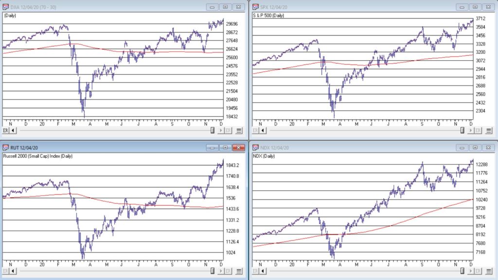
Figure 1 – 4 Major Indexes in Bullish Trends (Courtesy AIQ TradingExpert)

In addition, a number of indicators that I follow have given bullish signals in the last 1 to 8 months.  These often remain bullish for up to a year.  So, for the record, with my trusted trend-following, oversold/thrust and seasonal indicators mostly all bullish I really have no choice but to be in the bullish camp.

Not that I am complaining mind you.  But like everyone else, I try to keep my eyes open for potential signs of trouble.  And of course, there are always some.  One of the keys to long-term success in the stock market is determining when is the proper time to actually pay attention to the “scary stuff.”  Because scary stuff can be way early or in other cases can turn out to be not that scary at all when you look a little closer. 

So, let’s take a closer look at some of the scary stuff.

Valuations

Figure 2 displays an aggregate model of four separate measures of valuation.  The intent is to gain some perspective as to whether stocks are overvalued, undervalued or somewhere in between.
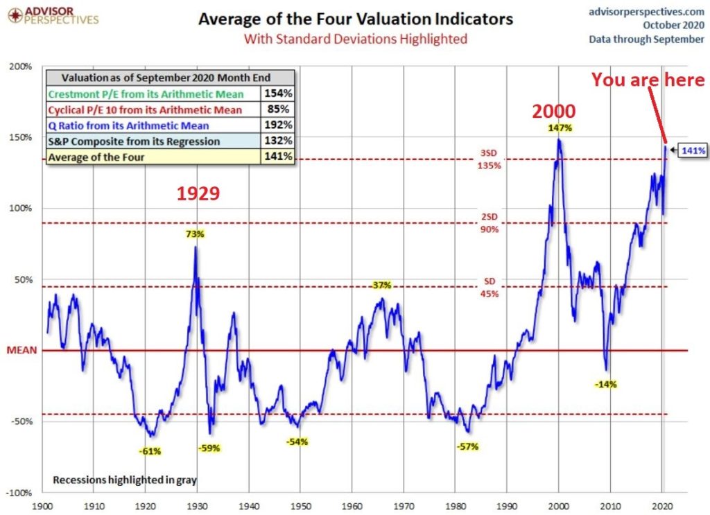
Figure 2 – Stock Market valuation at 2nd highest level ever (Courtesy: www.advisorperspectives.com)

Clearly the stock market is “overvalued” if looked at from a historical perspective.  The only two higher readings preceded the tops in 1929 (the Dow subsequently lost -89% of its value during the Great Depression) and 2000 (the Nasdaq 100 subsequently lost -83% of its value). 

Does this one matter?  Absolutely.  But here is what you need to know:

*Valuation IS NOT a timing indicator.  Since breaking out to a new high in 1995 the stock market has spent most of the past 25 years in “overvalued” territory.  During this time the Dow Industrials have increased 700%.  So, the proper response at the first sign of overvaluation should NOT be “SELL.”

*However, ultimately valuation DOES matter. 

Which leads directly to:

Jay’s Trading Maxim #44: If you are walking down the street and you trip and fall that’s one thing.  If you are climbing a mountain and you trip and fall that is something else.  And if you are gazing at the stars and don’t even realize that you are climbing a mountain and trip and fall – the only applicable phrase is “Look Out Below”.

So, the proper response is this: instead of walking along and staring at the stars, keep a close eye on the terrain directly in front of you.  And watch out for cliffs.

Top 5 companies as a % of S&P 500 Index

At times through history certain stocks or groups of stocks catch “lightning in a bottle.”  And when they do the advances are spectacular, enriching anyone who gets on board – unless they happen to get on board too late.  Figure 3 displays the percentage of the S&P 500 Index market capitalization made up by JUST the 5 largest cap companies in the index at any given point in time. 
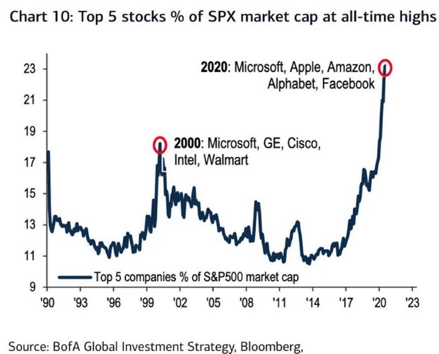
Figure 3 – Top 5 stocks as a % of S&P 500 Index market cap (Courtesy: www.Bloomberg.com)

The anecdotal suggestion is pretty obvious.  Following the market peak in 2000, the five stocks listed each took a pretty significant whack as shown in Figure 4.
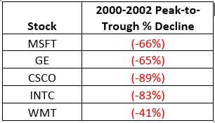
Figure 4 – Top Stocks after the 2000 Peak

Then when we look at how far the line in Figure 3 has soared in 2020 the obvious inference is that the 5 stocks listed for 2020 are due to take a similar hit.  And here is where it gets interesting.  Are MSFT, AAPL, AMZN, GOOGL and FB due to lose a significant portion of their value in the years directly ahead?

Two thoughts:

*There is no way to know for sure until it happens

*That being said, my own personal option is “yes, of course they are”

But here is where the rubber meets the road: Am I presently playing the bearish side of these stocks?  Nope.  The trend is still bullish.  Conversely, am I keeping a close eye and am I willing to play the bearish side of these stocks?  Yup.  But not until they – and the overall market – actually starts showing some actual cracks.

One Perspective on AAPL

Apple has been a dominant company for many years, since its inception really.  Will it continue to be?  I certainly would not bet against the ability of the company to innovate and grow its earnings and sales in the years ahead. Still timing – as they say – is everything.  For what it is worth, Figure 5 displays the price-to-book value ratio for AAPL since January 1990.
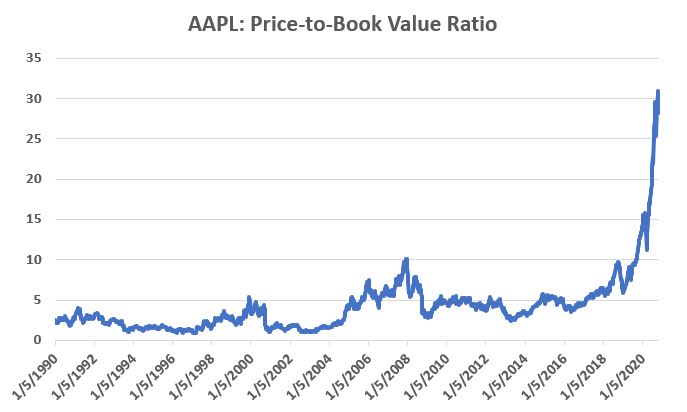
Figure 5 – AAPL price-to-book value ratio (Data courtesy of Sentimentrader.com)

Anything jump out at you?

Now one can argue pretty compellingly that price-to-book value is not the way to value a leading technology company.  And I probably agree – to a point.  But I can’t help but look at Figure 5 and wonder if that point has possibly been exceeded.

Summary

Nothing in this piece is meant to make you “bearish” or feel compelled to sell stocks.  For the record, I am still in the bullish camp.  But while this information DOES NOT constitute a “call to action”, IT DOES constitute a “call to pay close attention.” 

Bottom line: enjoy the bull market but DO NOT fall in love with it. 

Jay Kaeppel

Disclaimer: The information, opinions and ideas expressed herein are for informational and educational purposes only and are based on research conducted and presented solely by the author.  The information presented represents the views of the author only and does not constitute a complete description of any investment service.  In addition, nothing presented herein should be construed as investment advice, as an advertisement or offering of investment advisory services, or as an offer to sell or a solicitation to buy any security.  The data presented herein were obtained from various third-party sources.  While the data is believed to be reliable, no representation is made as to, and no responsibility, warranty or liability is accepted for the accuracy or completeness of such information.  International investments are subject to additional risks such as currency fluctuations, political instability and the potential for illiquid markets.  Past performance is no guarantee of future results.  There is risk of loss in all trading.  Back tested performance does not represent actual performance and should not be interpreted as an indication of such performance.  Also, back tested performance results have certain inherent limitations and differs from actual performance because it is achieved with the benefit of hindsight.
Good for Japan, Bad for US (Bonds)?

In the late 1980’s, Japan seemed destined to “rule the financial world”.  But when it comes to the financial markets – things don’t always pan out as they appear destined to.  The Nikkei Index topped out in late 1989, didn’t bottom out until February 2009 and has yet to return to its 1989 peak.

But it sure is trying.  This past week the Nikkei reached its highest level 1991.  So, hooray for the Japanese.  Back here in the US of A there may be a slightly different take.  For as we will discuss in a moment, what is good for Japanese stocks is (apparently) bad for US bonds.

Ticker EWJ

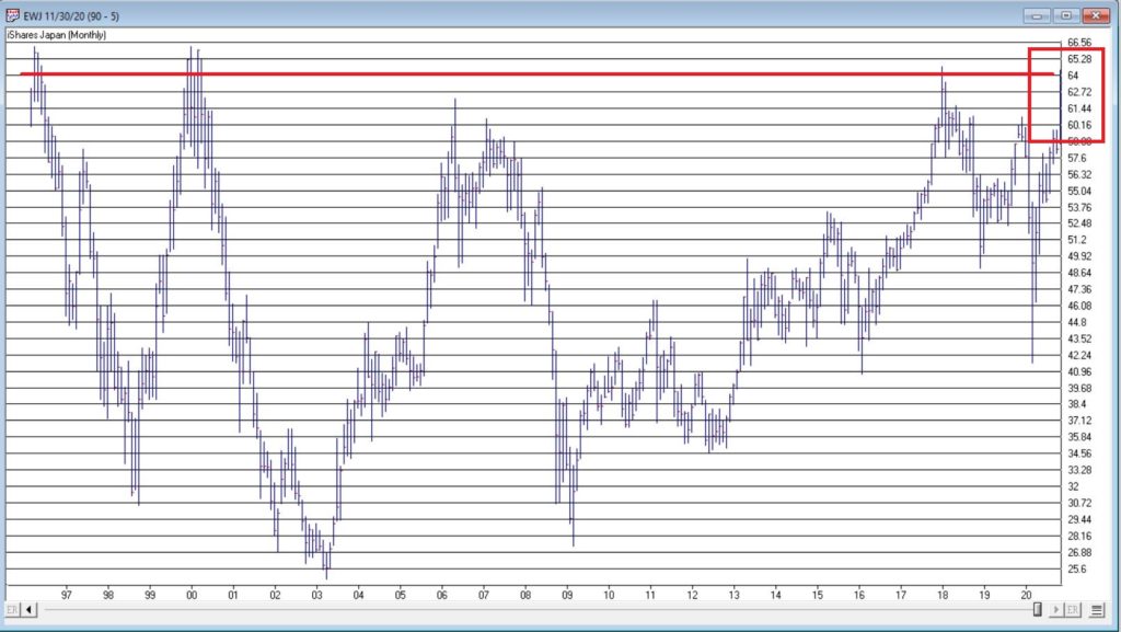
As our proxy for Japanese stocks we will use ticker EWJ (iShares Japan).  In Figure 1 you can the monthly action since the ETF started trading in 1996. 

Figure 1- Ticker EWJ monthly (Courtesy AIQ TradingExpert)

Since 1996 EWJ has broken in the $60 a share range on 5 previous occasions, only to be rebuffed.  You can see the latest upward thrust at the far right.  Will this be the time it breaks through?  It beats me and in fact that is not really the focus of this article.  The real question posed here is “what about U.S. treasury bonds?”  Huh?  Consider Figure 2. 

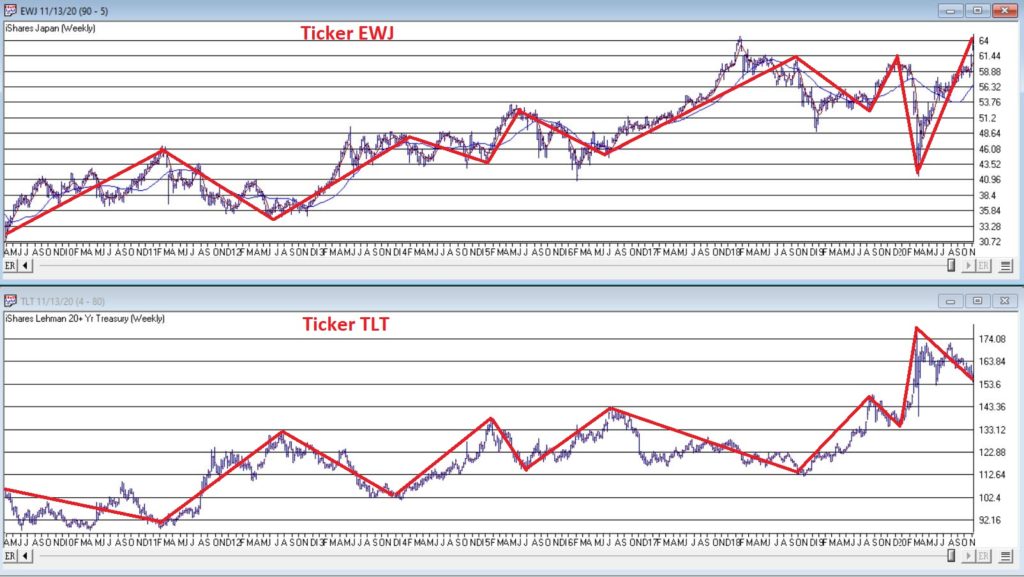
The top clip of Figure 2 displays a weekly chart of EWJ with a 5-week and 30-week moving average drawn.  The bottom clip displays a weekly chart of ticker TLT – the iShares ETF that tracks the long-term U.S. treasury bond. 

Note that – using highly technical terms – when one “zigs”, the other “zags.”

Figure 2 – EWJ vs. TLT (Courtesy AIQ TradingExpert)

The thing to note is the inverse correlation between the two – i.e., when Japanese stocks advance, US treasuries tend to decline and vice versa.  For the record (and for you fellow numbers geeks out there) the correlation coefficient in the last 2 years is -0.45 (1 means they trade exactly the same, -1 means they trade exactly inversely).

For my purposes:

*EWJ 5-week MA < EWJ 3-week MA = BULLISH for US treasuries

*EWJ 5-week MA > EWJ 3-week MA = BEARISH for US treasuries

Any real merit to this? 

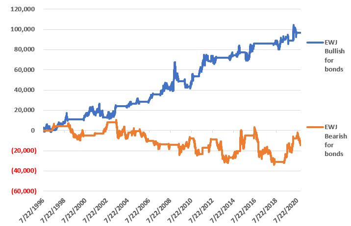
*The blue line in Figure 3 displays the cumulative $ +(-) achieved by holding a long position in t-bond futures ($1,000 a point) when the EWJ indicator is BULLISH (for U.S. bonds)

*The orange line in Figure 3 displays the cumulative $ +(-) achieved by holding a long position in t-bond futures ($1,000 a point) when the EWJ indicator is BEARISH (for U.S. bonds)

Figure 3 – $ + (-) for Treasury Bond Futures when EWJ indicator is BULLISH for bonds (blue) or BEARISH for bonds (orange)

Summary

Bond investors might keep a close eye on Japanese stocks for a while.  If the latest thrust higher follows through and becomes the move that finally breaks out to the upside, the implication would appear to be negative for U.S. long-term treasury bonds.  On the flip side, if Japanese stocks fail once again to break through and reverse to the downside, then things might look a whole lot better for the 30-year US treasury.

Jay Kaeppel

Disclaimer: The information, opinions and ideas expressed herein are for informational and educational purposes only and are based on research conducted and presented solely by the author.  The information presented represents the views of the author only and does not constitute a complete description of any investment service.  In addition, nothing presented herein should be construed as investment advice, as an advertisement or offering of investment advisory services, or as an offer to sell or a solicitation to buy any security.  The data presented herein were obtained from various third-party sources.  While the data is believed to be reliable, no representation is made as to, and no responsibility, warranty or liability is accepted for the accuracy or completeness of such information.  International investments are subject to additional risks such as currency fluctuations, political instability and the potential for illiquid markets.  Past performance is no guarantee of future results.  There is risk of loss in all trading.  Back tested performance does not represent actual performance and should not be interpreted as an indication of such performance.  Also, back tested performance results have certain inherent limitations and differs from actual performance because it is achieved with the benefit of hindsight.
Looking for Ideas “Off the Beaten Path”

For the record, I am an avowed “trend-follower.”  But I also know that no trend lasts forever.  So, while I have gotten pretty good at “riding along”, I do – like most people – like to “look ahead” since I do know that the landscape will forever be changing.

So, with the caveat that none of what follows should be considered a “call to action”, only as a “call to pay attention”, let’s venture out “into the weeds.”

AIROIL

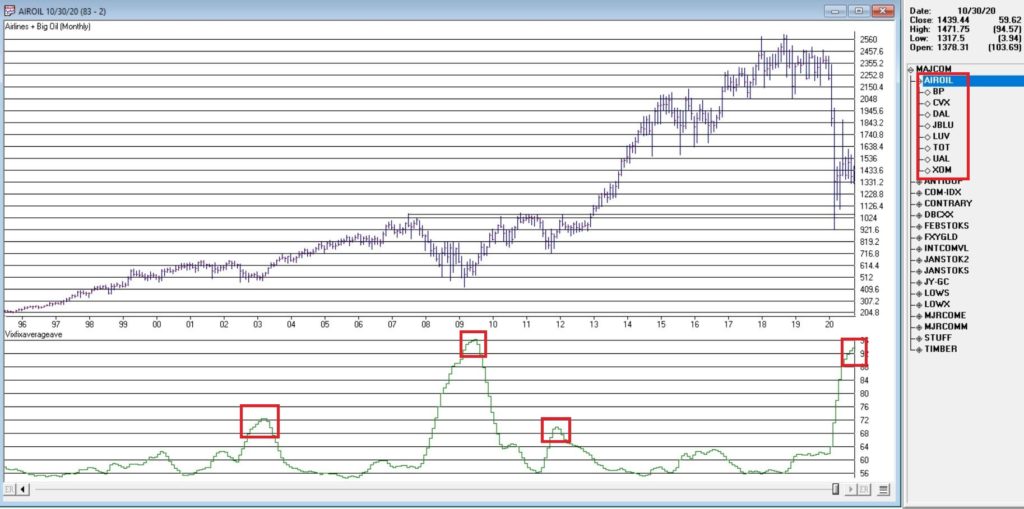
Here is an ugly pairing – airline stocks and traditional energy stocks – yikes!  In Figure 1 you see an index that I created and followed call AIROIL comprised of three airline stocks and five “Big Oil” stocks.  During the pandemic meltdown this index fell to a level not seen since 2007 before “bouncing”. 

Editors Note: 

Jay's AIROIL Index is built using the AIQ Data Manager by creating a list andcreating a group ticker (in this case AIROIL).  Stocks are inserted under the ticker and the index is then computed using  Compute Group/Sector indices. 

Figure 1 – Jay’s AIROIL Index (Courtesy AIQ TradingExpert)

In the bottom clip you see an indicator I call VFAA.  Note that when VFAA tops out and rolls over, meaningful advances in the index tend to follow.  In addition, VFAA is at a high level seen only once before in 2009. Following that reversal, the index rose almost 500% over the next 9 years.

So, is now a great time to pile into airlines and big oil?  One would have to be a pretty hard-core contrarian to pound the table on this one.  The airlines are in terrible shape due to the pandemic and vast uncertainty remains regarding when things might improve.  And “Big Oil” is about as unloved as any sector has ever been. 

So, am I suggesting anyone “load up” on airlines and oil?  Nope.  What I am saying is that I am watching this closely and that if and when VFAA “rolls over” I may look to commit some money to these sectors on a longer-term contrarian basis.

International/Commodities/Value

Also known of late as “the barking dogs”.  If you have had money committed to any or all of these asset classes in recent years you are shaking your head right about now.  These areas have VASTLY underperformed a simple “buy-and-hold the S&P 500 Index” approach for a number of years.

Is this state of affairs going to change anytime soon?  Regarding “anytime soon” – it beats me.  However, I am on the record as arguing that at some point this WILL change.  History makes one thing very clear – no asset class has a permanent edge.  So, given that the S&P 500 Index has beaten these above mentioned by such a wide margin for such a long time (roughly a decade or more) I am confident that one day in the next x years, the “worm will turn.”

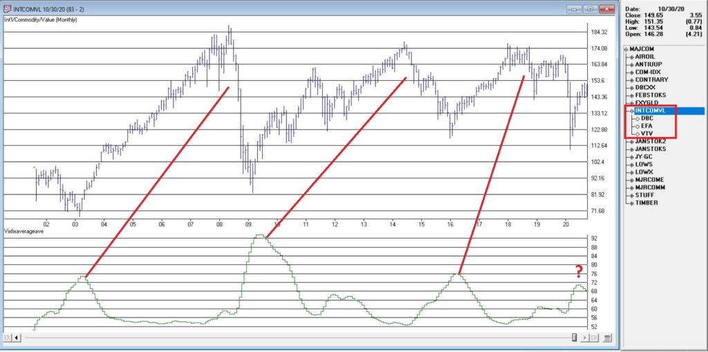
Figure 2 displays an index that I created and follow that tracks an international ETF, a commodity ETF and a value ETF.  The VFAA indicator appears in the bottom clip. 

Figure 2 – Jay’s INTCOMVAL Index (Courtesy AIQ TradingExpert)

Now if history is a guide, then the recent “rollover” by VFAA suggests that this particular grouping of asset classes should perform well in the coming years.  Two things to note:

1. There is no guarantee

2. There is absolutely no sign yet that “the turn” – relative to the S&P 500 – is occurring

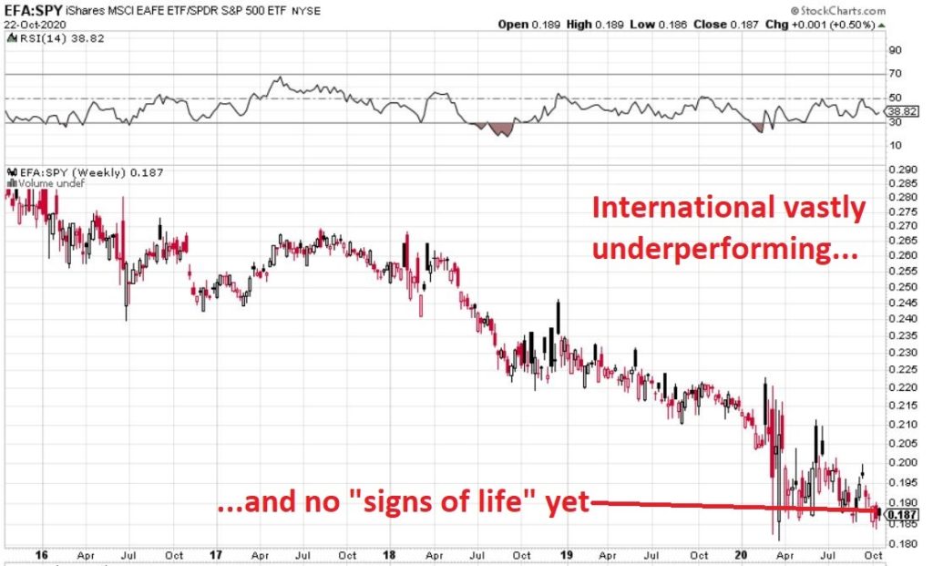
Figure 3, 4 and 5 are “relative strength” charts from www.StockCharts.com.  They DO NOT display the price of any security; they display the performance of the first ETF list compared to the second ETF listed.  So, Figure 3 displays the performance of ticker EFA (iShares MSCI EAFE ETF which tracks a broad index of stocks from around the globe, excluding the U.S.) relative to the S&P 500 Index.

When the bars are trending lower it means EFA is underperforming SPY and vice versa.  The trend in Figure 3 is fairly obvious – international stocks continue to lose ground to U.S. large-cap stocks. 

Figure 3 – Ticker EFA relative to ticker SPY (Courtesy: www.StockCharts.com)

If your goal is to pick a bottom, have at it.  As for me, I am waiting for some “signs of life” in international stocks relative to U.S. stocks before doing anything.

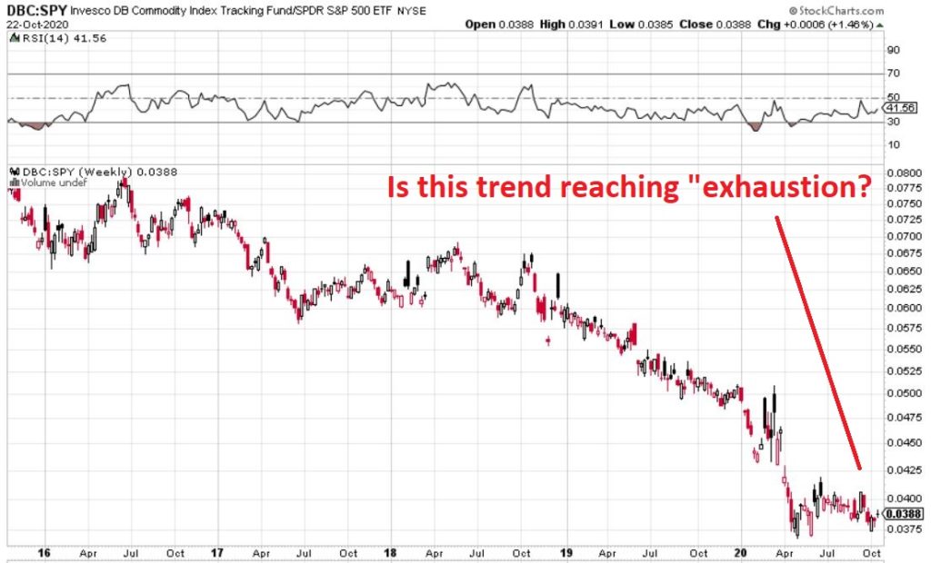
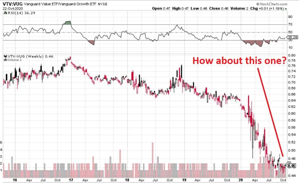
Figure 4 displays ticker DBC (a commodity-based ETF) versus SPY and Figure 5 displays ticker VTV (Vanguard Value ETF) versus ticker VUG (Vanguard Growth ETF). Both tell the same tale as Figure 3 – unless you are an avowed bottom-picker there is no actionable intelligence.  Still, both these trends are now extremely overdone, so a significant opportunity may be forming. 

Figure 4 – Ticker DBC relative to ticker SPY (Courtesy: www.StockCharts.com)

Figure 5 – Ticker VTV relative to ticker VUG (Courtesy: www.StockCharts.com)

Summary

Two key points as succinctly as possible:

*Nothing is happening at the moment with everything displayed above…

*…But something will (at least in my market-addled opinion) – so pay close attention.

Jay Kaeppel

Disclaimer: The information, opinions and ideas expressed herein are for informational and educational purposes only and are based on research conducted and presented solely by the author.  The information presented represents the views of the author only and does not constitute a complete description of any investment service.  In addition, nothing presented herein should be construed as investment advice, as an advertisement or offering of investment advisory services, or as an offer to sell or a solicitation to buy any security.  The data presented herein were obtained from various third-party sources.  While the data is believed to be reliable, no representation is made as to, and no responsibility, warranty or liability is accepted for the accuracy or completeness of such information.  International investments are subject to additional risks such as currency fluctuations, political instability and the potential for illiquid markets.  Past performance is no guarantee of future results.  There is risk of loss in all trading.  Back tested performance does not represent actual performance and should not be interpreted as an indication of such performance.  Also, back tested performance results have certain inherent limitations and differs from actual performance because it is achieved with the benefit of hindsight.
The Calm Before the Bond Storm?

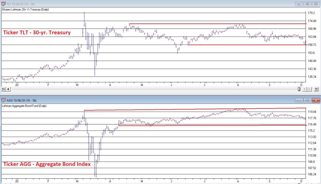
The bond market was very quiet in the 3rd quarter.  Figure 1 displays ticker IEF (7-10 year treasuries ETF) in the to clip and ticker AGG (Aggregate Bond Index ETF) in the bottom clip. 

Figure 1 – Tickers IEF and AGG in narrow ranges (Courtesy AIQ TradingExpert)

Essentially the entire bond market has been flat since early June.  The market seems to be assuming that “the Fed will take of everything” and keep interest rates low and stable for the foreseeable future so…..ZZZZZZZZ.

But this type of activity often breeds complacency.  I am not making any predictions here but I do want to raise a question that investors might wish to ponder, i.e., “what would be more shocking that a spike in interest rates?”  OK, yes, I realize it is 2020 and it is pretty much hard to be shocked by anything anymore.  But still, on a relative basis how many investors are even thinking about the potential risk of higher interest rates at the moment?

Could it Happen?

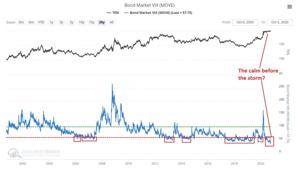
The Bond Market VIX (ticker MOVE) recently fell to its lowest level ever (before spiking sharply higher on 10/5/20).  As you can see in Figure 2 this type of “quietness” often precedes a significant move in the bond market.  For the record, low readings in MOVE can be followed by large up moves in price as easily as large down moves in price.  So, a low MOVE reading is not “bearish” per se, but rather merely suggests that we are experiencing the “calm before the storm.”

Figure 2 – Bond Market VIX hit an all-time low (Courtesy Sentimentrader.com)

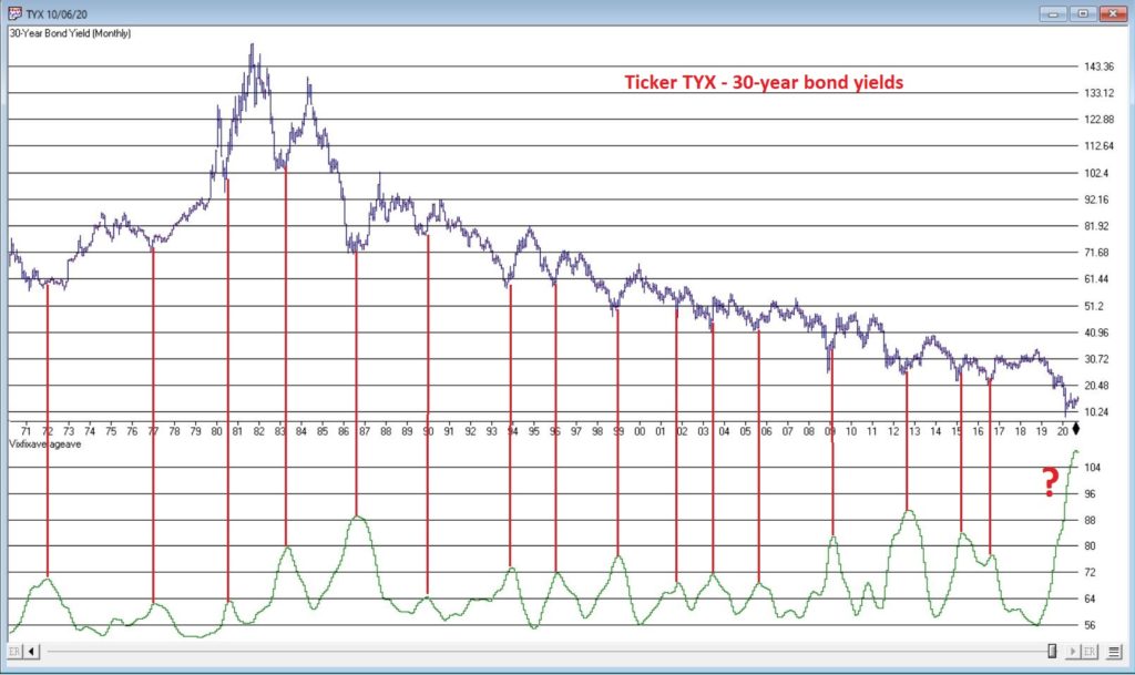
So why is my “Spidey sense” tingling?  Figure 3 displays the yield on 30-year treasuries (ticker TYX) on the bottom and an indicator I refer to as VFAA on the bottom (the calculation appears at the end of this piece).  VFAA is a derivative on a Larry William’s indicator he calls VixFix.

Figure 3 – 30-year treasury yields with VFAA suggesting a potential bottoming area (Courtesy AIQ TradingExpert)

As you can see in Figure 3, peaks in the VFAA indicator often occur near intermediate term lows in bond yields (reminder: bond prices move inversely to yield, so a bottom in interest rates indicates a top in bond prices).  As you can also see on the far-right hand side, the stage clearly appears to be set for “the next go round.”

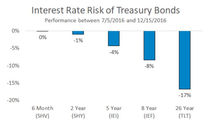
Why does this matter?  If interest rates do rise in the months ahead bond prices – particularly long-term bond prices can get hit hard.  To illustrate the potential risks, Figure 4 displays the action of treasury security ETFs of various maturity during a 5-month rise in rates back in 2016.

Figure 4 – Bond ETF action during rate rise in 2016

Summary

It is possible for long and short-term bonds to “de-couple”.  In other words, the possibilities are:

*Short-term rates remain stable (as the Fed keeps pumping) while long-term rates rise (as inflation fears arise as a result of all the Fed pumping)

*Short-term rates remain stable while long-term rates plummet (if the economy appears to be weakening).  This would result in gains for long-term bonds only

*None of the above

The bottom line: Bonds have fallen asleep – but DO NOT fall asleep on bonds. 

VFAA Formula

Below is the code for VFAA

VixFix is an indicator developed many years ago by Larry Williams which essentially compares the latest low to the highest close in the latest 22 periods (then divides the difference by the highest close in the latest 22 periods).  I then multiply this result by 100 and add 50 to get VixFix.

*Next is a 3-period exponential average of VixFix

*Then VFAA is arrived at by calculating a 7-period exponential average of the previous result (essentially, we are “double-smoothing” VixFix)

Are we having fun yet?  See code below:

hivalclose is hival([close],22).

vixfix is (((hivalclose-[low])/hivalclose)*100)+50.

vixfixaverage is Expavg(vixfix,3).

vixfixaverageave is Expavg(vixfixaverage,7).

VFAA = vixfixaverageave

Jay Kaeppel

Disclaimer: The information, opinions and ideas expressed herein are for informational and educational purposes only and are based on research conducted and presented solely by the author.  The information presented represents the views of the author only and does not constitute a complete description of any investment service.  In addition, nothing presented herein should be construed as investment advice, as an advertisement or offering of investment advisory services, or as an offer to sell or a solicitation to buy any security.  The data presented herein were obtained from various third-party sources.  While the data is believed to be reliable, no representation is made as to, and no responsibility, warranty or liability is accepted for the accuracy or completeness of such information.  International investments are subject to additional risks such as currency fluctuations, political instability and the potential for illiquid markets.  Past performance is no guarantee of future results.  There is risk of loss in all trading.  Back tested performance does not represent actual performance and should not be interpreted as an indication of such performance.  Also, back tested performance results have certain inherent limitations and differs from actual performance because it is achieved with the benefit of hindsight.
Good Companies, Troubled Stocks and Potential Opportunity

Truth be told I am not much of a “stock picker”. Oh, I can pick ‘em alright just like anyone else.  They just to don’t go the right way as often as I’d like.  I also believe that the way to maximize profitability is to follow a momentum type approach that identifies stocks that are performing well and buying them when they breakout to the upside (ala O’Neil, Minervini, Zanger, etc.) and then riding them as long as they continue to perform.  Unfortunately, I’m just not very good at it. 

Back when I started out, there was such a thing as a “long-term investor.”  People would try to find good companies selling at a decent price and they would buy them and hold them for, well, the long-term.  Crazy talk, right? As I have already stated, I am not claiming that that is a better approach. I am just pointing out that it was “a thing.”

An Indicator

There is an indicator (I will call it VFAA, which is short for vixfixaverageave, which – lets face it – is a terrible name) that I follow that was developed as an extension of Larry William’s VixFix Indicator.  There is nothing magic about it.  Its purpose is to identify when price has reached an exceptionally oversold level and “may” be due to rally.  The code for this indicator appears later.

For the record, I DO NOT systematically use this indicator in the manner I am about to describe, nor am I recommending that you do.  Still, it seems to have some potential value, so what follows is merely an illustration for informational purposes only.

The Rules

*We will look at a monthly bar chart for a given stock

*A “buy signal” occurs when VFAA reaches or exceeds 80 and then turns down for one month

*A “sell (or exit) signal” occurs when VFAA subsequently rises by at least 0.25 from a monthly closing low

Seeing as how this is based solely on monthly closes it obviously this is not going to be a “precision market timing tool.”

Some “Good Companies” with “Troubled Stocks”

So now let’s apply this VFAA indicator to some actual stocks.  Again, I AM NOT recommending that anyone use this approach mechanically.  The real goal is merely to try to identify situations where a stock has been washed out, reversed and MAY be ready to run for a while.

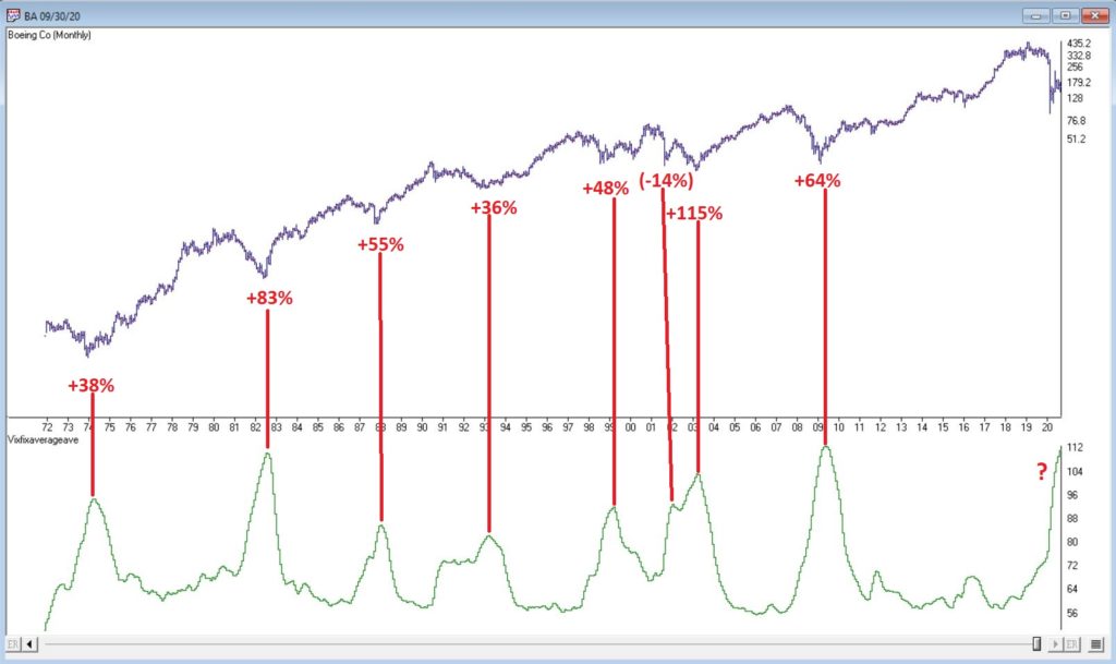
Ticker BA

Figure 1 displays a monthly chart for Boeing (BA) with VFAA at the bottom.  The numbers on the chart represent the hypothetical + (-) % achieved by applying the rules above (although once again, to be clear I am not necessarily suggesting anyone use it exactly this way). 

Figure 1 – Ticker BA with VFAA (Courtesy AIQ TradingExpert)

From March 2019 into March 2020 BA declined -80%.  It has since bounced around and VFAA has soared to 110.88.  VFAA has yet to rollover on a month-end basis, so nothing to do here except exhibit – what’s that word again – oh right, “patience.”

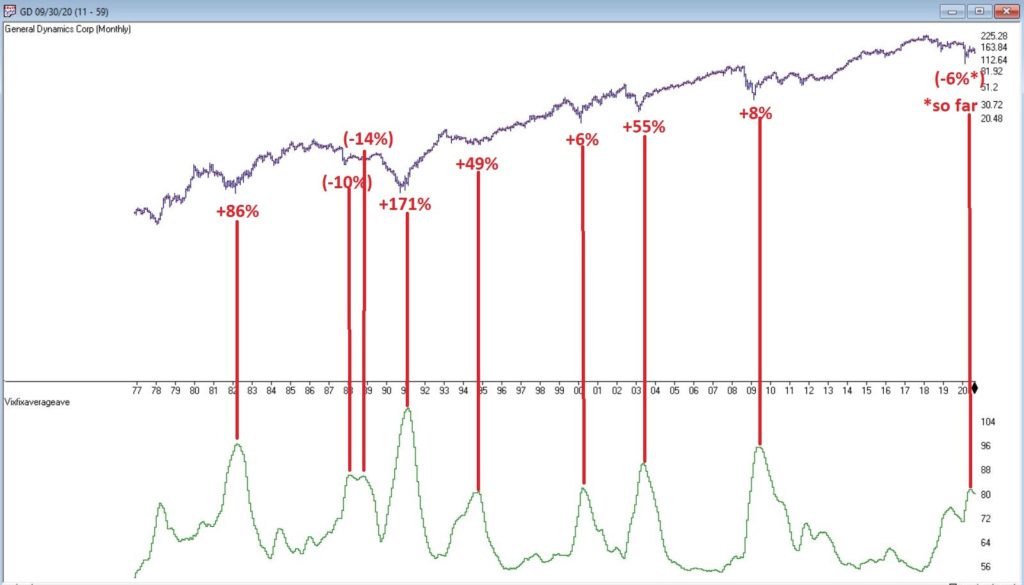
Ticker GD

Figure 2 displays a monthly chart for General Dynamics (GD) with VFAA at the bottom. 

Figure 2 – Ticker GD with VFAA (Courtesy AIQ TradingExpert)

Are these “world-beating numbers”?  Not really.  But in terms of helping to identify potential opportunities, not so bad. VFAA gave a “buy signal” for GD at the end of July. So far, not so good as the stock is down about -6%.

Ticker WFC

Figure 3 displays a monthly chart for Wells Fargo (WFC) with VFAA at the bottom. 

Figure 3 – Ticker WFC with VFAA (Courtesy AIQ TradingExpert)

There are not many “signals” but the ones that occurred have been useful. Between 2018 and 2020 WFC declined -65%.  It has since bounced around and VFAA has soared to 102.44.  VFAA has yet to rollover on a month-end basis. But at some point it will, and a potential opportunity may arise.

VFAA Formula

Below is the code for VFAA

VixFix is an indicator developed many years ago by Larry Williams which essentially compares the latest low to the highest close in the latest 22 periods (then divides the difference by the highest close in the latest 22 periods).  I then multiply this result by 100 and add 50 to get VixFix.

*Next is a 3-period exponential average of VixFix

*Then VFAA is arrived at by calculating a 7-period exponential average of the previous result (essentially, we are “double-smoothing” VixFix)

Are we having fun yet?  See code below:

hivalclose is hival([close],22).

vixfix is (((hivalclose-[low])/hivalclose)*100)+50.

vixfixaverage is Expavg(vixfix,3).

vixfixaverageave is Expavg(vixfixaverage,7).

VFAA = vixfixaverageave

EDITORS NOTE: The AIQ Expert Design Studio code for the indicator is available to download from here. Save this file to your /wintes32/EDS Strategies folder https://aiqeducation.com/VFAA.EDS

Summary

One thing to note is that VFAA “signals” on a monthly chart don’t come around very often.  So, you can’t really sit around and wait for a signal to form on your “favorite company”.  You have to look for opportunity wherever it might exist.

One last time let me reiterate that I am not suggesting using VFAA as a standalone systematic approach to investing. But when a signal does occur – especially when applied to quality companies that have recently been “whacked”, it can help to identify a potential opportunity.

Jay Kaeppel

Disclaimer: The information, opinions and ideas expressed herein are for informational and educational purposes only and are based on research conducted and presented solely by the author.  The information presented represents the views of the author only and does not constitute a complete description of any investment service.  In addition, nothing presented herein should be construed as investment advice, as an advertisement or offering of investment advisory services, or as an offer to sell or a solicitation to buy any security.  The data presented herein were obtained from various third-party sources.  While the data is believed to be reliable, no representation is made as to, and no responsibility, warranty or liability is accepted for the accuracy or completeness of such information.  International investments are subject to additional risks such as currency fluctuations, political instability and the potential for illiquid markets.  Past performance is no guarantee of future results.  There is risk of loss in all trading.  Back tested performance does not represent actual performance and should not be interpreted as an indication of such performance.  Also, back tested performance results have certain inherent limitations and differs from actual performance because it is achieved with the benefit of hindsight.
Whither Apple?

OK, first off a true confession.  I hate it when some wise acre analyst acts like they are so smart and that everyone else is an idiot.  Its offensive and off-putting – not to mention arrogant.  And still in this case, all I can say is “Hi, my name is Jay.”

A lot of attention has been paid lately to the fact that AAPL is essentially swallowing up the whole world in terms of market capitalization.  As you can see in Figure 1, no single S&P 500 Index stock has ever had a higher market cap relative to the market cap of the entire Russell 2000 small-cap index. 

Figure 1 – Largest S&P 500 Index stock as a % of entire Russell 200 Index (Courtesy Sentimentrader.com)

So of course, the easiest thing in the world to do is to be an offensive, off-putting and arrogant wise acre and say “Well, this can’t last.”  There, I said it.  With the caveat that I have no idea how far AAPL can run “before the deluge”, as a student of (more) market history (than I care to admit) I cannot ignore this gnawing feeling that this eventually “ends badly.”  Of course, I have been wrong plenty of times before and maybe things (Offensive, Off-Putting and Arrogant Trigger Warning!) “really will be different this time around.”  To get a sense of why I bring this all up, please keep reading.

In Figure 1 we also see some previous instances of a stock becoming “really large” in terms of market cap.  Let’s take a closer look at these instances.

IBM – 1979

Figure 2 – IBM (Courtesy AIQ TradingExpert)

MSFT – 1999

Figure 3 – MSFT (Courtesy AIQ TradingExpert)

XOM – 2008

Figure 4 – XOM (Courtesy AIQ TradingExpert)

AAPL – 2012

Figure 5 – AAPL (Courtesy AIQ TradingExpert)

AAPL – 2020

Figure 6 – AAPL (Courtesy AIQ TradingExpert)

Summary

Small sample size? Yes.

Could AAPL continue to run to much higher levels? Absolutely

Do I still have that offensive, off-putting and slightly arrogant gut feeling that somewhere along the way AAPL takes a huge whack?

Sorry.  It’s just my nature.

Jay Kaeppel

Disclaimer: The information, opinions and ideas expressed herein are for informational and educational purposes only and are based on research conducted and presented solely by the author.  The information presented represents the views of the author only and does not constitute a complete description of any investment service.  In addition, nothing presented herein should be construed as investment advice, as an advertisement or offering of investment advisory services, or as an offer to sell or a solicitation to buy any security.  The data presented herein were obtained from various third-party sources.  While the data is believed to be reliable, no representation is made as to, and no responsibility, warranty or liability is accepted for the accuracy or completeness of such information.  International investments are subject to additional risks such as currency fluctuations, political instability and the potential for illiquid markets.  Past performance is no guarantee of future results.  There is risk of loss in all trading.  Back tested performance does not represent actual performance and should not be interpreted as an indication of such performance.  Also, back tested performance results have certain inherent limitations and differs from actual performance because it is achieved with the benefit of hindsight.
The Rally in “Stuff” Rolls On

In this article, dated 7/10/2020, I noted that my “Stuff” Index was coming on strong and that its performance may be a “shot across the bow” that some changes may be coming to the financial markets.  Since then, the trend has accelerated.

STUFF vs. FANG vs. QQQ

Figure 1 displays the performance of STUFF components since 7/10

Figure 2 displays the performance of FANG components since 7/10

Figure 1 – Price performance of Jay’s STUFF Index components since 7/10

Figure 2 – Price performance of FANG stocks since 7/10

For the record, the “high-flying” Nasdaq 100 Index (using ticker QQQ as a proxy investment) is up +4.0% during the same time.

Is this a trend – or a blip?  Unfortunately, I can’t answer that question. But it certainly appears that there is something afoot in “Stuff”, particularly the metals.  Figure 3 displays the weekly charts for ETFs tracking Silver, Gold, Palladium and Platinum (clockwise from upper left). 

Figure 3 – The metals components of the Stuff Index (Courtesy AIQ TradingExpert)

When it comes bull markets in metals, the typical pattern historically goes something like this:

*Gold leads the way (check)

*Eventually silver comes on strong and often ends up outperforming gold (check)

*The other metals rise significantly “under the radar” as everyone focus on – literally in this case, ironically – the “shiny objects” (gold and silver)

Again, while I had inklings that a bull market in metals was forming (and have held positions in them for several years, and still hold them), I certainly did not “predict” the recent explosion in gold and silver prices. 

Two things to note:

*Gold and silver are obviously very “overbought”, so buying a large position here entails significant risk

*Still it should be noted that both SLV and PPLT would have to double in price from their current levels just to get back to their previous all-time highs of 2011

So, don’t be surprised if “Stuff” enjoys a continued resurgence.  Note in Figure 4 that a number of commodity related ETFs are way, way beaten down and could have a lot of upside potential if a resurgence actually does unfold.

Figure 4 – Four commodity ETFs weekly (Courtesy AIQ TradingExpert)

What is interesting – and almost not visible to the naked eye – is the action in the lower right hand corner of these four charts. To highlight what is “hiding in plain sight”, Figure 5 “zooms in” on the recent action of same four tickers as Figure 4, but in a daily price format rather than a monthly price format.

Figure 5 – Four commodity ETFs daily (Courtesy AIQ TradingExpert)

Despite the ugly pictures painted in Figure 4, it is interesting to note in Figure 5 that all four of these commodity related ETFs have rallied sharply of late.  There is of course, no guarantee this will continue.  But if the rally in “Stuff” – currently led by metals – spreads to the commodity sector as a whole, another glance in Figures 3 and 4 reveals a lot of potential upside opportunity.

Time will tell.  In the meantime, keep an eye on the “shiny objects” (gold and silver) for clues as to whether or not the rally in “Stuff” has staying power.

See also Jay Kaeppel Interviewin July 2020 issue of Technical Analysis of Stocks and Commodities magazine

See also Jay’s “A Strategy You Probably Haven’t Considered” Video

See also Video – The Long-Term…Now More Important Than Ever

Jay Kaeppel

Disclaimer: The information, opinions and ideas expressed herein are for informational and educational purposes only and are based on research conducted and presented solely by the author.  The information presented represents the views of the author only and does not constitute a complete description of any investment service.  In addition, nothing presented herein should be construed as investment advice, as an advertisement or offering of investment advisory services, or as an offer to sell or a solicitation to buy any security.  The data presented herein were obtained from various third-party sources.  While the data is believed to be reliable, no representation is made as to, and no responsibility, warranty or liability is accepted for the accuracy or completeness of such information.  International investments are subject to additional risks such as currency fluctuations, political instability and the potential for illiquid markets.  Past performance is no guarantee of future results.  There is risk of loss in all trading.  Back tested performance does not represent actual performance and should not be interpreted as an indication of such performance.  Also, back tested performance results have certain inherent limitations and differs from actual performance because it is achieved with the benefit of hindsight.
When “Perfection” Meets “The Real World”

In this article I wrote about a signal called “Bull Market Thrust”.  The upshot is that since 1991 it has identified 8 “bullish periods”.  The start and end dates of those periods – and the price performance of several indexes during each period – appear in Figure 1.

Figure 1 – “Bull Market Thrust” bullish periods

One key thing to note is that – focusing solely on the Nasdaq 100 Index – 100% of the “bullish periods” witnessed a gain, i.e., “perfection.”  The average gain was +40%.

So that looks pretty good and pretty darned encouraging going forward since there was a new buy signal on June 8th of this year.  And indeed, if history is a guide the outlook for the Nasdaq (and the stock market as a whole) is favorable in the next year.  But there is one thing to keep in mind….

Jay’s Trading Maxim #33: When you have actual money on the line, the chasm between theory and reality can be a mile wide.

The bottom line is that even during “bullish periods” the market fluctuates.  And if one is focused on “news” there is plenty of opportunity to feel angst no matter how strong the market “should be.”  So, in an effort to “mange expectations”, the charts below display the price action of the Nasdaq 100 during each “bullish period” displayed in Figure 1.

Nasdaq 100 during “Bullish Periods” based on Bull Market Thrust signals

*All charts below are (Courtesy AIQ TradingExpert)

*Each chart displays one of the “Bullish Periods” from Figure 1. 

*Each chart contains one or more red boxes highlighting a period of “market trouble”

THE POINT: the key thing to ponder is how easily it would be to allow yourself to get “shaken out” if you were focused on what the “news of the day” is telling you, rather than what the market itself is telling you.

Figure 2 – NDX: 1/29/91 – 2/28/93

Figure 3 – NDX: 6/5/2003-6/4/2004

Figure 4 – NDX: 3/23/2009-3/1/2011

Figure 5 – NDX: 7/7/2011-7/6/2012

Figure 6 – NDX: 7/9/13-7/15/2014

Figure 7 – NDX: 2/26/2016-11/17/2017

Figure 8 – NDX: 1/8/2019-1/17/2020

Figure 9 – 6/8/2020-?

The bottom line is that:

*Sometimes the market “took off” after the signal

*Sometime the market sold off shortly after the signal (see 2011 signal)

*In every case there was a drawdown of some significant somewhere along the way

The purpose of paying attention to things like “Bull Market Thrust” buy signals is not to “pick bottoms with uncanny accuracy.” 

In the real word, the purpose is to help strengthen our resolve in riding the exceptional opportunities.

See also Jay Kaeppel Interview in July 2020 issue of Technical Analysis of Stocks and Commodities magazine

See also Jay’s “A Strategy You Probably Haven’t Considered” Video

See also Video – The Long-Term…Now More Important Than Ever

Jay Kaeppel

Disclaimer: The information, opinions and ideas expressed herein are for informational and educational purposes only and are based on research conducted and presented solely by the author.  The information presented represents the views of the author only and does not constitute a complete description of any investment service.  In addition, nothing presented herein should be construed as investment advice, as an advertisement or offering of investment advisory services, or as an offer to sell or a solicitation to buy any security.  The data presented herein were obtained from various third-party sources.  While the data is believed to be reliable, no representation is made as to, and no responsibility, warranty or liability is accepted for the accuracy or completeness of such information.  International investments are subject to additional risks such as currency fluctuations, political instability and the potential for illiquid markets.  Past performance is no guarantee of future results.  There is risk of loss in all trading.  Back tested performance does not represent actual performance and should not be interpreted as an indication of such performance.  Also, back tested performance results have certain inherent limitations and differs from actual performance because it is achieved with the benefit of hindsight.
How to Know When to Worry About Inflation

Inflation was a big deal – back in the late 70’s and early 80’s.  Since then it has been the subject of a whole lot of “the boy crying wolf” scenarios.  Take a look at Figure 1.  The red line displays the 12-month rate-of-change in the Consumer Price Index (i.e., the annual rate of inflation) since 1913.

Figure 1 – The Consumer Price Index (1913-2020)

Things to note, focusing on 1930 forward to the present:

*In the 1930’s we had deflation (actually much worse than inflation as the economy essentially spirals lower and slower) with the CPI reaching almost -10%

*There were peaks in the 15% range in the late 1940’s and late 70’s/early 80’s

*As you can see in the black box to the right hand side, inflation has been less than 5% annually for most of the last 35 years

As a result, most investors have been conditioned to not fret too much about inflation.  And any time spent actually worrying about inflation in the past several decades has been a waste of good anxiety.

But nothing lasts forever.  Especially in the financial markets, where things tend to move in a cyclical nature over long periods of time.  To illustrate this point with a random, yet related example, consider Figure 2 which displays the yield on 30-year treasury bonds since 1942.

Figure 2 – 30-year treasury bond yield (1942-2020) (Courtesy: www.StockCharts.com)

Since the early 1980’s, investors have been nicely rewarded for holding bonds – especially long-term bonds.  But from the mid 1950’s into 1980 the experience was much different (rising yields equate to lower bond prices).  Presumably someday rates will rise again and an entire generation of bond investors will have no idea what is happening to their investments (see hereherehere and here).  But for now, we are focusing on inflation.

How to Know When to Worry About Inflation

I’ll give you three things to follow. 

#1. Gold

In a recent paper co-authored by legendary trader Paul Tudor Jones (see here) the authors laid out the case for higher inflation in the years ahead and suggested gold bullion could reach $2,400 an ounce.  Is this a possibility?  Absolutely. 

Figure 3 displays from 2005 through 2012:

*ticker GLD (an ETF that tracks the price of gold bullion)

*my own index called ANTIGLD3 (components highlighted on right) with a Front Weighted Moving Average and a 55-week exponential moving average)

The ANTIGLD3 Index is a contrarian trend-following tool, i.e., when this index is in a downtrend it is bullish for gold and vice versa.

Figure 3 – Ticker GLD versus Jay’s ANTIGLD3 Index (2005-2012) (Courtesy AIQ TradingExpert)

Figure 4 displays the same tickers from 2012 into 2020

Figure 4 – Ticker GLD versus Jay’s ANTIGLD3 Index (2012-2020) (Courtesy AIQ TradingExpert)

The key thing to note in Figure 4 is that after several years of whipsaws the two trend-following indicators applied to ANTIGLD3 are in a clear downtrend (since this is a contrarian index that means it is purportedly bullish for gold). 

So, is it off to the races for gold?  I can’t say for sure. But it appears to be trying. Also note that gold can rally significantly in price for reasons other than inflation (see 2005-2011 rally)

I have positions in gold and gold stocks but not huge ones.  For whatever reason, so far, I am “not feeling it.”  As you will see in a moment, some inflation trend-following “things” that I watch have yet to confirm that inflation is an imminent threat at this exact moment.

But I am holding my positions just in case gold itself is the actual “leading indicator” in this story.

#2. The Aussie Dollar versus its 24-month moving average

I covered this in detail here so will not get too in-depth here.  But you can get the gist of it pretty simply from Figure 5. The top chart is ticker FXA with a 24-month exponential moving average and the bottom chart is ticker GSG which tracks the Goldman Sachs Commodity Index.

Figure 5 – Ticker FXA (top) and ticker GSG (bottom) (Courtesy AIQ TradingExpert)

Long story short, commodities – or “hard assets”, are typically a good place to be during a period of sharply rising and/or high inflation – perform better when FXA is in an uptrend (i.e., above the 24-month EMA) than when below.  As of early July FXA has just moved above its 24-month EMA.  For the record, I usually only consider this at month-end.  So, check back after 7/31. 

If FXA establishes an uptrend, the likelihood of higher prices for commodities – including gold – rises. Thus, an uptrend for FXA would be another potential warning sign of impending inflation.

#3. TIPs versus Long-Term Treasuries

TIPs bonds are Treasury Inflation Protected securities, i.e., the principal can rise as inflation (based on the Consumer Price Index) rises (see here).  In other words, a TIP bond can gain value as inflation rises. Long-term treasuries on the other hand are the securities most likely to get hurt by a rise in inflation (as the rate of return is fixed once you buy the bond and a rise in inflation can reduce the future value and/or purchasing power of that fixed return). 

So, in a low inflationary period we typically see TIPs fall relative to long-term treasuries and during rising inflation we would expect to see TIPS rise relative to long-term bonds. 

Figure 6 displays the chart of ticker TIP relative to ticker TLT on a weekly basis (with a 200-wekk moving average) from www.StockCharts.com.

Figure 6 – Ticker TIP relative to ticker TLT (weekly) still trending lower (Courtesy: www.StockCharts.com)

The bottom line: While gold itself is attempting to breakout to the upside and the Aussie Dollar is trying to establish an uptrend, the TIP:TLT relationship is not presently indicating any meaningful inflationary concerns. 

Summary

Inflation has been low for about 35 years.  But as they say, “don’t go to sleep on it.” 

If you want to be objectively prepared, keep an eye on:

*Gold bullion (in an uptrend, confirmed by a downtrend in my “anti-gold index”)

*The Aussie Dollar (No trend at the moment, but trying to establish an uptrend)

*Ticker TIP versus ticker TLT (Nowhere close to an uptrend right now)

So one up, one down and one sideways.  But pay close attention going forward.

If and when all three establish uptrends, the game we’ve all been playing for several decades will likely change dramatically.

See also Jay Kaeppel Interview in July 2020 issue of Technical Analysis of Stocks and Commodities magazine

See also Jay’s “A Strategy You Probably Haven’t Considered” Video

See also Video – The Long-Term…Now More Important Than Ever

Jay Kaeppel

Disclaimer: The information, opinions and ideas expressed herein are for informational and educational purposes only and are based on research conducted and presented solely by the author.  The information presented represents the views of the author only and does not constitute a complete description of any investment service.  In addition, nothing presented herein should be construed as investment advice, as an advertisement or offering of investment advisory services, or as an offer to sell or a solicitation to buy any security.  The data presented herein were obtained from various third-party sources.  While the data is believed to be reliable, no representation is made as to, and no responsibility, warranty or liability is accepted for the accuracy or completeness of such information.  International investments are subject to additional risks such as currency fluctuations, political instability and the potential for illiquid markets.  Past performance is no guarantee of future results.  There is risk of loss in all trading.  Back tested performance does not represent actual performance and should not be interpreted as an indication of such performance.  Also, back tested performance results have certain inherent limitations and differs from actual performance because it is achieved with the benefit of hindsight.
The Ridiculous Seasonality of AMD

Don’t you hate it when some analyst analyzes historical data and then purports to find some “order” in the historical chaos?  Hi, my name is Jay.  And…it’s just kind of what I do.  Sorry, it’s just my nature.  Take for instance the ridiculous case of AMD.

Advanced Micro Devices – Ticker AMD

According to “Adjusted Close” price data from www.finance.yahoo.com ticker AMD advanced from $3.15 a share in March of 1980 to $56.39 by May 20, 2020.  Given that the stock has risen +1,693% on a buy-and-hold basis, it is not exactly a revelation that – particularly with the huge benefit of perfect hindsight – there was some money to be made by holding the stock.

But that is only part of the story.  For as it turns out, AMD is one of the most consistently “cyclical” stocks you may ever find.  Figure 1 displays the average annual price trend for AMD from 3/17/1980 through 12/31/1999.  In other words, period 1 along the bottom of the chart is January Trading Day #1, and so on, through the last trading day of December.

Figure 1 – Annual Seasonal Price Trend for AMD (1980-1999)

As you can see, the stock tended to rally sharply through the end of May, from mid-July through about late August, and from late October through the end of the year (or more accurately, through the end of the next May).

Declines typically occurred between about June 1st and late July and again during September into late October.

Ah, sweet hindsight.

But what are the odds that any of this was meaningful after 1999?  I’m glad you asked.  Because that’s where the ridiculous part comes in. 

2000-2020

Figure 2 plots the same 1980-1999 annual seasonal price trend for AMD along with the annual seasonal trend for AMD from 2000-2019.  Notice any similarities? 

Figure 2 – Annual Seasonal Price Trend for AMD; 1980-1999 and 2000-2020

So, let’s make the ridiculous (there’s that word again) assumption that some (lucky) investor had started trading in and out of AMD on an annual basis the following seasonal calendar

Figure 3 – Annual Seasonal Bullish and Bearish Periods

Some how did the “walk forward” period of 2000 into late May-2020 compare to the “hindsight” period of 1980-1999?  Well there is good news and bad news.

The bad news is that results for each period was not quite as good during 2000-2020 as they were during 1980-1999.  The good news is that the 2000-2020 results were still pretty darn compelling.

Figure 4 – AMD performance during Bullish and Bearish Periods

The bottom line: The “bullish” periods have to continued to be quite bullish and the “bearish” periods continue to be quite bearish.

For the record, between March 1980 and May 2020:

*$1,000 in AMD on a buy-and-hold basis grew to $17,925

*$1,000 in AMD ONLY during the two “bullish” period discussed grew to $587,558,351

Let’s face it, these are – here I go again – ridiculous numbers.  And it should be pointed out that an investor holding AMD only during the “Bullish” periods would have suffered 4 separate drawdowns in excess of -50%, including a -79%(!) drawdown in 2008-2009.  See Figure 5.  So, don’t anybody get “stars in their eyes.”

Figure 5 – Drawdowns during Bullish Periods

At the same time, it is still better than the drawdown racked up during the “bearish” periods, which checks in at a cool -99.9867%.  See Figure 6.

Figure 6 – Drawdowns during Bearish Periods

Where We Are

AMD has been in a “bullish” period since the 19th trading day of October 2019, and this period will last until the close on 5/29/2020.  Through 5/20/2020 AMD is up +73% during the current bullish period (i.e., pandemic, schmandemic).  See Figure 7.

Figure 7 – AMD during recent “Bullish” period (Courtesy AIQ TradingExpert)

The next “bearish” period will last from the close on 5/29/2020 through the close on 7/23/2020.

Summary

So, in hindsight, the annual seasonal pattern for AMD tracked very closely with the annual seasonal pattern for the previous 20 years.  But what about the next 20 years?  Ah, there’s the rub. Despite the fact that the annual seasonal trend for the past 20 years very closely mirrored the annual seasonal trend for the prior 20 years, it is not possible to state with any certainty what the next 20 years hold. 

Still, if I decide to trade AMD I will probably consult my calendar first.

See also Jay’s “A Strategy You Probably Haven’t Considered” Video

Jay Kaeppel

Disclaimer: The information, opinions and ideas expressed herein are for informational and educational purposes only and are based on research conducted and presented solely by the author.  The information presented represents the views of the author only and does not constitute a complete description of any investment service.  In addition, nothing presented herein should be construed as investment advice, as an advertisement or offering of investment advisory services, or as an offer to sell or a solicitation to buy any security.  The data presented herein were obtained from various third-party sources.  While the data is believed to be reliable, no representation is made as to, and no responsibility, warranty or liability is accepted for the accuracy or completeness of such information.  International investments are subject to additional risks such as currency fluctuations, political instability and the potential for illiquid markets.  Past performance is no guarantee of future results.  There is risk of loss in all trading.  Back tested performance does not represent actual performance and should not be interpreted as an indication of such performance.  Also, back tested performance results have certain inherent limitations and differs from actual performance because it is achieved with the benefit of hindsight.
Financials – Danger or Opportunity? Or Both?

To say that there is has been and remains a great deal of angst in the financial markets is a bit of an understatement. This is especially true when it comes to the financial sector.  The financial sector has a fairly high correlation to treasury yields (ticker FSRBX – Fidelity Select Banking Portfolio has a 0.52 correlation to ticker TNX – which tracks 10-year treasury yields).  As yields have plummeted so has the financial sector.  During the recent decline, FSRBX plunged -51% from its December 2019 peak.  With little expectation of higher rates anytime soon a lot of investors are understandably wary of diving into this sector.

But much like with the energy sector, the old adage that the time to buy is when there is “blood in the streets”, should give one pause before they turn their back completely on the financial sector.  For the time being I am keeping my eye on a little-known indicator called “Vixfixaverageave” (yes, I agree it is a really bad name).  The calculations for this indicator appear at the end of this article.  The reason I am watching it right now is that it recently reached a very oversold level that has helped to highlight some useful buying opportunities for financials in the past.

Ticker FSRBX

Figure 1 displays a monthly chart for FSRBX in the top clip and the Vixfixaverageave indicator in the bottom clip.  Note that the indicator rose above 72 at the end of April 2020.  As you can see there have been four previous occasions when this indicator, a) exceeded 72 and then b) reversed lower for one month.  For arguments sake we will call that a buy signal.

Figure 1 – Ticker FSRBX with indicator Vixfixaverageave (Courtesy AIQ TradingExpert)

Figure 2 displays the 1 to 5 year % + (-) for FSRBX following the four previous signals.  As you can see, they all proved to be exceptional buying opportunities.

Figure 2 – FSRBX returns 1 to 5 years after signal

Now for the disappointing news: if you are thinking that all we have to do is wait for this indicator to finally top out and that big profits are “guaranteed” to roll in, you are making a mistake.  As they say, “past performance is no guarantee of future results.”  (Sorry, I don’t make the rules).  So, when the Vixfixaverageave monthly reading for FSRBX does finally roll over, the proper course of action would be to:

*Decide if you really want to act based on the signal

*Decide how much capital you are willing to commit

*Decide how much of that capital you are actually willing to risk – i.e. will you stop out if a loss exceeds x%, or do you plan to simply hold it for 1 to 5 years regardless?

Summary

There are a million and one ways to trigger an entry signal.  The one discussed herein is just one more.  What really separates the winners from the losers is the answers to the three questions just posed.

Vixfixaverageave Calculations 

EDITTORS NOTE: The code sections can be copied and pasted into AIQ EDS or you can download the indicator code in an EDS file from here and save it to your /wintes32/EDS Strategies folder.

This indicator is based on another indicator called VixFix which was developed many years ago by Larry Williams.

hivalclose is hival([close],22).  <<<<<The high closing price in that last 22 periods

vixfix is (((hivalclose-[low])/hivalclose)*100)+50. <<<(highest closing price in last 22 periods minus current period low) divided by highest closing price in last 22 periods (then multiplied by 100 and 50 added to arrive at vixfix value)

vixfixaverage is Expavg(vixfix,3). <<< 3-period exponential average of vixfix

vixfixaverageave is Expavg(vixfixaverage,7). <<<7-period exponential average of vixfixaverage

Jay Kaeppel

Disclaimer: The information, opinions and ideas expressed herein are for informational and educational purposes only and are based on research conducted and presented solely by the author.  The information presented represents the views of the author only and does not constitute a complete description of any investment service.  In addition, nothing presented herein should be construed as investment advice, as an advertisement or offering of investment advisory services, or as an offer to sell or a solicitation to buy any security.  The data presented herein were obtained from various third-party sources.  While the data is believed to be reliable, no representation is made as to, and no responsibility, warranty or liability is accepted for the accuracy or completeness of such information.  International investments are subject to additional risks such as currency fluctuations, political instability and the potential for illiquid markets.  Past performance is no guarantee of future results.  There is risk of loss in all trading.  Back tested performance does not represent actual performance and should not be interpreted as an indication of such performance.  Also, back tested performance results have certain inherent limitations and differs from actual performance because it is achieved with the benefit of hindsight.
The Ultimate Ugly Contrarian Play

They always say you should buy when there is “blood in the street.”  They also say, “buy them when nobody wants them.”  So, let’s consider today what could be the most unloved, bombed out, everybody hates it “thing” in the world – coal.

Ugh, just the mention of the word coal elicits a recoiling response.  “Dirty energy!”  “Climate change inducing filth!” “Ban coal!”.  And so and so forth.  And maybe they have a point.  But “they” also say “facts are stubborn things” (OK, for the record, I think it’s a different “they” who says that but never mind about that right now).

So here is a stubborn fact: coal supplies about a quarter of the world’s primary energy and two-fifths of its electricity.  As I write, two of the fastest growing economies (at least they were as of a few months ago) – China and India – are not only heavily reliant upon coal for energy, but are still building more and more coal-fired plants.  Now I am making no comment on whether this is a good thing or a bad thing but the point is, it most definitely is a “thing.”

So however one feels about coal, the reality is that it is not going to go away anytime soon.  Does this mean it will “soar in value” anytime soon – or even ever for that matter?  Not necessarily.  But as an unloved commodity it’s sure is hard to beat coal.  And as “they” (they sure are a bunch of know it all’s they?) say, “opportunity is where you find it.” 

Ticker KOL is an ETF that invests in coal industry related companies.  And what a dog it has been.  Figure 1 displays a monthly chart of price action.  Since peaking in June 2008 at $60.80 a share, it now stands at a measly $6.29 a share, a cool -89.6% below its peak.  And like a lot of things it has been in a freefall of late.

Figure 1 – Ticker KOL Monthly chart (Courtesy AIQ TradingExpert)

So, is this a great time to buy KOL?  That’s not for me to say.  But for argument’s sake, Figure 2 displays a weekly chart of KOL with an indicator I call Vixfixaverageave (I know, I know), which is a version of an indicator developed a number of years ago by Larry Williams (Indicator code is at the end of the article).

Figure 2 – KOL weekly chart with Vixfixaverageave indicator (Courtesy AIQ TradingExpert)

Note that Vixfixaverageave is presently above 90 on the weekly chart.  This level has been reached twice before – once in 2008 and once in 2016.  Following these two previous instances, once the indicator actually peaked and ticked lower for one week, KOL enjoyed some pretty spectacular moves. 

To wit:

*Following the 12/19/08 Vixfixaverageave peak and reversal KOL advanced +252% over the next 27.5 months

*Following the 2/19/16 Vixfixaverageave peak and reversal KOL advanced +182% over the next 23.5 months

When will Vixfixaverageave peak and reverse on the weekly KOL chart?  There is no way to know.  One must just wait for it to happen.  And will it be time to buy KOL when this happens?  Again, that is not for me to say.  None of this is meant to imply that the bottom for KOL is an hand nor that a massive rally is imminent.

Still, if there is anything at all to contrarian investing, its hard to envision anything more contrarian that KOL.

Vixfixaverageave Calculations

hivalclose is hival([close],22).  <<<<<The high closing price in that last 22 periods

vixfix is (((hivalclose-[low])/hivalclose)*100)+50. <<<(highest closing price in last 22 periods minus current period low) divided by highest closing price in last 22 periods (then multiplied by 100 and 50 added to arrive at vixfix value)

vixfixaverage is Expavg(vixfix,3). <<< 3-period exponential average of vixfix

vixfixaverageave is Expavg(vixfixaverage,7). <<<7-period exponential average of vixfixaverage

Jay Kaeppel

Disclaimer: The information, opinions and ideas expressed herein are for informational and educational purposes only and are based on research conducted and presented solely by the author.  The information presented does not represent the views of the author only and does not constitute a complete description of any investment service.  In addition, nothing presented herein should be construed as investment advice, as an advertisement or offering of investment advisory services, or as an offer to sell or a solicitation to buy any security.  The data presented herein were obtained from various third-party sources.  While the data is believed to be reliable, no representation is made as to, and no responsibility, warranty or liability is accepted for the accuracy or completeness of such information.  International investments are subject to additional risks such as currency fluctuations, political instability and the potential for illiquid markets.  Past performance is no guarantee of future results.  There is risk of loss in all trading.  Back tested performance does not represent actual performance and should not be interpreted as an indication of such performance.  Also, back tested performance results have certain inherent limitations and differs from actual performance because it is achieved with the benefit of hindsight.
Thoughts on the Energy Sector (just in case we ever leave our homes again)

In a few recent articles (for example here) I suggested that one day we would look back on this period as a terrific buying opportunity for energy related issues.  At the same time, I still have yet to become comfortable “pulling the trigger”.  Thank goodness for small favors.

Anyway, the overall sentiment still holds.  Energy is dirt cheap as are shares of most energy related stocks/ETFs etc.  Again, that doesn’t necessarily mean that now is the exact moment to “load up”.  To say that there is a wee bit of uncertainty regarding the future would be about the greatest understatement one could presently make.  Still, it is important to plan ahead and to be prepared when the time comes.  So, what follows should be considered “food for thought” and not “an immediate call to action.”

A Few Things Energy

Ticker TAN

According to conventional wisdom, the future is “green”.  I’ll be candid – I am all for green energy, as long as when I flip the switch the lights come on AND when I look at my energy bill I don’t faint.  So, let’s start with a “green” play.

Turth be told, ticker TAN (Invesco Solar Energy ETF) has never been much of a performer.  Still, its in the solar business which people keep telling me is “the future.”  In reality the primary thing it has going for it is that it hasn’t completely cratered to the same degree as just about every other stock in the energy sector.  As you can see in Figure 1, TAN actually bottomed out at $12.60 in 2012 and – despite a near 50% decline during the recent panic – is presently trading around $26 a share.  Not necessarily a screaming buy signal, but a nice relative performance as we will see in a moment.

Figure 1 – Ticker TAN (Courtesy AIQ TradingExpert)

Ticker UGA

In a sure “Sign of the Times”, the Good News is that gasoline prices are at their lowest levels in year, while the Bad News is that we don’t have anywhere to drive to except the grocery store.  Figure 2 displays the chart for ticker UGA – the United States Gasoline Fund, and ETF that tracks the price of gasoline.

While attempting to “pick a bottom” is a fool’s errand, the primary point is that it is not that hard to envision the price of this ETF being significantly higher at some point in the years ahead.  Whether an investor has the fortitude to weather whatever the short-term uncertainty and the patience to see how the long-term plays out are the primary issues associated with contemplating this ticker at the moment.

Figure 2 – Ticker UGA (Courtesy AIQ TradingExpert)

Ticker XLE

Ticker XLE is a play on the broad (mostly fossil fuel related) energy sector.  As you can see in Figure 3, XLE has plunged to price levels not since 2004. In addition, it presently yields roughly 8.8%.  That being said, an investor has to realistically expect that dividend payments in the hard-hit energy sector will see some significant cuts as things play out in the months ahead. 

With an oil price war in full swing, not to mention a sharp decline in demand for the foreseeable future due to the coronavirus pandemic, the fundamentals for this sector are unlikely to improve soon.  Nevertheless, the reality is that – at least for the time being – the world runs on crude oil.  As a result, the current price range may one day be looked back upon as a once-in-a-generation buying opportunity.

Figure 3 – XLE (Courtesy ProfitSource by HUBB)

Ticker PAGP

OK, let’s throw in one obscure, totally speculative – yet fundamentally intriguing – thought for consideration.  Ticker PAGP (Plains GP Holdings, L.P.).  Here is what they do (straight from their website):

“Plains engages in the transportation, storage, terminalling, and marketing of crude oil and refined products, as well as in the storage of natural gas, and the processing, transportation, fractionation, storage, and marketing of natural gas liquids.

Assets include:

*17,965 miles of active crude oil and NGL pipelines and gathering systems (emphasis mine as these things will continue to function as long as crude and NG need to be moved – which they do)

*50 barges and 20 transport tugs

*109 million barrels of storage capacity

*1,600+ trucks and trailers

*9,100 rail cars”

The bottom line is that as long as crude oil and natural gas needs to be moved, PAGP has a niche in which to operate.  For the record, at $6.35 a share the stock’s present dividend comes to a yield of 22.7%.  Certainly, the prospect of a significant dividend cut is a Signiant risk associated with this stock.  But for the moment anyway the price is near an all-time low and the dividend yield is attractive.

Figure 4 – Ticker PAGP (Courtesy ProfitSource by HUBB)

Summary

As allows, DO NOT look upon what I have written as “recommendations.”  Particularly in the current environment.  They are simply “food for thought.”

Given current fundamentals:

*An ongoing oil price war (making drilling and refining unprofitable for many companies)

*An economy on shutdown (which cripples demand)

*An existential struggle between “green” energy and “traditional” fossil fuel-based sources (which creates uncertainty about future expectations)

All combine to make the energy sector a giant question mark at the present time.  But if the old adage that the time to buy is when there is “blood in the streets”, than investors might be well served in the long run to start thinking now about how much capital they might be willing to commit to energy, and what type of catalyst might prompt them to actually “take the plunge.”

Jay Kaeppel

Disclaimer: The information, opinions and ideas expressed herein are for informational and educational purposes only and are based on research conducted and presented solely by the author.  The information presented does not represent the views of the author only and does not constitute a complete description of any investment service.  In addition, nothing presented herein should be construed as investment advice, as an advertisement or offering of investment advisory services, or as an offer to sell or a solicitation to buy any security.  The data presented herein were obtained from various third-party sources.  While the data is believed to be reliable, no representation is made as to, and no responsibility, warranty or liability is accepted for the accuracy or completeness of such information.  International investments are subject to additional risks such as currency fluctuations, political instability and the potential for illiquid markets.  Past performance is no guarantee of future results.  There is risk of loss in all trading.  Back tested performance does not represent actual performance and should not be interpreted as an indication of such performance.  Also, back tested performance results have certain inherent limitations and differs from actual performance because it is achieved with the benefit of hindsight.
Houston, We Have a Parabola

Everybody likes it when an asset that they hold goes up in price.  In fact, the more the better.  But only to a point as it turns out.  When price gets carried away to the upside – we trader types typically refer to it as a “going parabolic”, i.e., a situation when prices are essentially rising straight up – it almost invariably ends very badly.  We have seen a couple of examples recently.

Palladium

Palladium is a metal that according to Bloomberg’s “About 85% of palladium ends up in the exhaust systems in cars, where it helps turn toxic pollutants into less-harmful carbon dioxide and water vapor. It is also used in electronics, dentistry, medicine, hydrogen purification, chemical applications, groundwater treatment, and jewelry. Palladium is a key component of fuel cells, which react hydrogen with oxygen to produce electricity, heat, and water.”

And it was pretty hot stuff for some time.  At least until it wasn’t.  As a proxy we will look at the ETF ticker symbol PALL, which attempts to track the price of palladium. 

*From January 2016 into January 2018, PALL rose +139%

*In the next 7 months it declined by -26%

*And then the fun really began – Between August 2018 and February 2020 PALL rose +245%, with a +110% gain occurring in the final 5+ months of the advance

What a time it was.  Until it wasn’t anymore.

Since peaking at $273.16 a share on 2/27/2020, PALL plunged -50% in just 12 trading days.  To put it another way, it gave back an entire year’s worth of gains in just 12 trading days.

Was there any way to see this coming?  Maybe. In Figure 1 we see a monthly chart with an indicator called “RSI32” in the bottom clip.  This indicator is derived by taking the 2-month average of the standard 3-month Relative Strength Index (RSI). 

Figure 1 – PALL with RSI32 (Courtesy AIQ TradingExpert)

Notice that historically when the RSI32 indicator gets above 96, trouble tends to follow pretty quickly.  See Figure 2

Figure 2 – PALL: Peaks in RSI32 and the subsequent maximum drawdown (Courtesy AIQ TradingExpert)

T-Bonds

During the panic sell-off in the stock market in recent weeks, treasury bonds became very popular as a “safe haven” as investors piled out of stocks and into the “safety” of U.S. Treasuries.  What too many investors appeared to forget in their haste was that long-term treasury can be extremely volatile (for the record, short and intermediate term treasuries are much less volatile than long-term bonds and are much better suited to act as a safe haven).  Likewise – just an opinion – buying a 30-year bond paying 1% per year is not entirely unlike buying a stock index fund when the market P/E Ratio is over 30 – there just isn’t a lot of underlying value there. So you are essentially betting on a continuation of the current trend and NOT on the ultimate realization of the underlying value – because there really isn’t any.

Anyway, Figure 3 displays a monthly chart of ticker TLT – an ETF that tracks the long-term treasury – with the RSI32 indicator in the bottom clip. 

Figure 3 – TLT with RSI32 (Courtesy AIQ TradingExpert)

Bond price movement is typically not as extreme and volatile as Palladium, so for bonds a RSI32 reading above 80 typically indicates that potential trouble may lie ahead. 

As of the close of 3/17/20, TLT was almost -15% off of its high in just 6 trading days. We’ll see where it goes from here.

Tesla (Ticker TSLA)

Anytime you see what is essentially a manufacturing company – no matter how “hot”, “hip”, or “cool” the product they build – go up 200% in 2 months’ time, the proper response is NOT giddy delight.  The proper response is:

*If you DO own the stock, either set a trailing stop or take some profits immediately and set a trailing stop for the rest

*If you DO NOT own the stock, DO NOT allow yourself to get sucked in

Take TSLA in Figure 4 for instance. By February 2020 TSLA was up almost 200% in 2 months and almost 450% in 8 months.  The RSI32 indicator was above 96 – a stark warning sign. 

19 trading days after making its closing high, TSLA is down -59%.

Figure 4 – TSLA with RSI32 (Courtesy AIQ TradingExpert)

Summary

Simply remember this.  Parabolic price moves are:

*Exciting while they are unfolding

*Disastrous when they end

Typically, the security in question gives back months – or in some case, years – worth of gains in a shockingly short period of time.

Beware the parabola.

Jay Kaeppel

Disclaimer: The information, opinions and ideas expressed herein are for informational and educational purposes only and are based on research conducted and presented solely by the author.  The information presented does not represent the views of the author only and does not constitute a complete description of any investment service.  In addition, nothing presented herein should be construed as investment advice, as an advertisement or offering of investment advisory services, or as an offer to sell or a solicitation to buy any security.  The data presented herein were obtained from various third-party sources.  While the data is believed to be reliable, no representation is made as to, and no responsibility, warranty or liability is accepted for the accuracy or completeness of such information.  International investments are subject to additional risks such as currency fluctuations, political instability and the potential for illiquid markets.  Past performance is no guarantee of future results.  There is risk of loss in all trading.  Back tested performance does not represent actual performance and should not be interpreted as an indication of such performance.  Also, back tested performance results have certain inherent limitations and differs from actual performance because it is achieved with the benefit of hindsight.
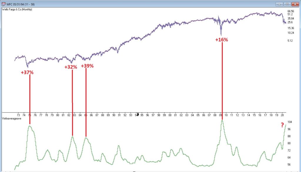
March and April to the Rescue?

Well that got ugly quick.  For the record, if you have been in the markets for any length of time you have seen this kind of action plenty of times.  An index, or stock, or commodity or whatever, trends and trends and trend steadily and relentlessly higher over a period of time.  And just when it seems like its going to last forever – BAM.  It gives back all or much of its recent rally gains very quickly.  Welcome to the exciting world of investing.

I make no claims of “calling the top” – because I never have actually (correctly) called one and I don’t expect that I ever will.  But having written Part I and Part II of articles titled “Please Take a Moment to Locate the Nearest Exit” in the last week, I was probably one of the least surprised people at what transpired in the stock market in the last few sessions. 

Of course the question on everyone’s lips – as always in this type of panic or near panic situation – is, “where to from here?”  And folks if I knew the answer, I swear I would tell you.  But like everyone else, I can only assess the situation, formulate a plan of action – or inaction, as the case may be – and act accordingly.  But some random thoughts:

*Long periods of relative calm followed by extreme drops are more often than not followed by periods of volatility.  So, look for a sharp rebound for at least a few days followed by another downdraft and so on and so forth, until either:

a) The market bottoms out and resumes an uptrend

b) The major indexes (think Dow, S&P 500, Nasdaq 100, Russell 2000) drop below their 200-day moving averages.  As of the close on 2/25 both the Dow and the Russell 2000 were below their 200-day moving average.  That would set up another a) or b) scenario.

If the major indexes break below their long-term moving averages it will either:

a) End up being a whipsaw – i.e., the market reverses quickly to the upside

b) Or will be a sign of more serious trouble

The main point is that you should be paying close attention in the days and weeks ahead to the indexes in Figure 1.

Figure 1 – Major indexes with 200-day moving averages (Courtesy AIQ TradingExpert)

One Possible Bullish Hope

One reason for potential optimism is that the two-month period of March and April has historically been one of the more favorable two-month periods on an annual basis.  Figure 2 displays the cumulative price gain achieved by the S&P 500 Index ONLY during March and April every year since 1945.  The long-term trend is unmistakable, but year-to-year results can of course, vary greatly.

Figure 2 – S&P 500 cumulative price gain March-April ONLY (1945-2019)

For the record:

S&P 500 March-AprilResult
Number of times UP55 (73%)
Number of times DOWN20 (27%)
Average UP%+5.0%
Average DOWN%(-3.4%)

Figure 3 – Facts and Figures

Will March and April bail us out?  Here’s hoping.

As an aside, this strategy is having a great week so far.

Jay Kaeppel

Disclaimer: The information, opinions and ideas expressed herein are for informational and educational purposes only and are based on research conducted and presented solely by the author.  The information presented does not represent the views of the author only and does not constitute a complete description of any investment service.  In addition, nothing presented herein should be construed as investment advice, as an advertisement or offering of investment advisory services, or as an offer to sell or a solicitation to buy any security.  The data presented herein were obtained from various third-party sources.  While the data is believed to be reliable, no representation is made as to, and no responsibility, warranty or liability is accepted for the accuracy or completeness of such information.  International investments are subject to additional risks such as currency fluctuations, political instability and the potential for illiquid markets.  Past performance is no guarantee of future results.  There is risk of loss in all trading.  Back tested performance does not represent actual performance and should not be interpreted as an indication of such performance.  Also, back tested performance results have certain inherent limitations and differs from actual performance because it is achieved with the benefit of hindsight.

Please Take a Moment to Locate the Nearest Exit (Part II)

To put this piece in context please refer to Part I here.

Part I detailed the Good News (the stock market is still very much in a bullish trend and may very well continue to be for some time) and touched on one piece of Bad News (the market is overvalued on a long-term valuation basis).

The Next Piece of Bad News: The “Early Lull”

In my book, Seasonal Stock Market Trends, I wrote about something called the Decennial Pattern, that highlights the action of the stock market in a “typical” decade. 

The Four Parts of the “Typical Decade” are:

The Early Lull: Market often struggles in first 2.5 years of a decade

The Mid-Decade Rally: Market typically rallies in the middle of a decade – particularly between Oct 1 Year “4” and Mar 31 Year “6”

The 7-8 Decline: Market often experiences a sharp decline somewhere in the Year “7” to Year “8” period

The Late Rally: Market often rallies strongly into the end of the decade.

Figure 1 – 1980-1989 (Courtesy AIQ TradingExpert)

Figure 2 – 1990-1999 (Courtesy AIQ TradingExpert)

Figure 3 – 2000-2009 (Courtesy AIQ TradingExpert)

Figure 4 – 2010-2019 (Courtesy AIQ TradingExpert)

We are now in the “Early Lull” period.  This in no way “guarantees” trouble in the stock market in the next two years.  But it does offer a strong “suggestion”, particularly when we focus only on decades since 1900 that started with an Election Year (which is where we are now) – 1900, 1920, 1940, 1960, 1980, 2000.

(See this article for a more detailed discussion)

As you can see in Figures 5 and 6, each of these 6 2.5-year decade opening periods witnessed a market decline – -14% on average and -63% cumulative.  Once again, no guarantee that 2020 into mid 2022 will show weakness, but….. the warning sign is there

Figure 5 – Dow price performance first 2.5 years of decades that open with a Presidential Election Year (1900-present)

Figure 6 – Cumulative Dow price performance first 2.5 years of decades that open with a Presidential Election Year (1900-present)

Summary

Repeating now: the trend of the stock market is presently “Up”. 

Therefore:

*The most prudent thing to do today is to avoid all of the “news generated” worry and angst and enjoy the trend. 

*The second most prudent thing to do is to acknowledge that this up trend will NOT last forever, and to prepare – at least mentally – for what you will do when that eventuality transpires, i.e., take a moment to locate the nearest exit.

Stay tuned for Part III

Jay Kaeppel

Disclaimer: The information, opinions and ideas expressed herein are for informational and educational purposes only and are based on research conducted and presented solely by the author.  The information presented does not represent the views of the author only and does not constitute a complete description of any investment service.  In addition, nothing presented herein should be construed as investment advice, as an advertisement or offering of investment advisory services, or as an offer to sell or a solicitation to buy any security.  The data presented herein were obtained from various third-party sources.  While the data is believed to be reliable, no representation is made as to, and no responsibility, warranty or liability is accepted for the accuracy or completeness of such information.  International investments are subject to additional risks such as currency fluctuations, political instability and the potential for illiquid markets.  Past performance is no guarantee of future results.  There is risk of loss in all trading.  Back tested performance does not represent actual performance and should not be interpreted as an indication of such performance.  Also, back tested performance results have certain inherent limitations and differs from actual performance because it is achieved with the benefit of hindsight.

Please Take a Moment to Locate the Nearest Exit (Part I)

Well that sounds like a pretty alarming headline, doesn’t it?  But before you actually take a moment to locate the nearest exit please note the important difference between the words “Please locate the nearest exit” and “Oh My God, it’s the top, sell everything!!!”

You see the difference, right?  Good.  Let’s continue.  First, a true confession – I am not all that great at “market timing”, i.e., consistently buying at the bottom and/or selling at the top (I console myself with the knowledge that neither is anyone else).  On the other hand, I am reasonably good at identifying trends and at recognizing risk.  Fortunately, as it turns out, this can be a pretty useful skill.

So, while I may not be good at market timing, I can still make certain reasonable predictions.  Like for example, “at some point this bull market will run out of steam and now is as good a time as any to start making plans about how one will deal with this inevitable eventuality – whenever it may come”.  (Again, please notice the crucial difference between that sentence and “Oh My God, it’s the top, sell everything!!”)

First the Good News

The trend in the stock market is bullish.  Duh.  Is anyone surprised by that statement?  Again, we are talking subtleties here.  We are not talking about predictions, forecasts, projected scenarios, implications of current action for the future, etc.  We are just talking about pure trend-following and looking at the market as it is today.  Figure 1 displays the S&P 500 Index monthly since 1971 and Figure 2 displays four major indexes (Dow, S&P 500, Nasdaq 100, Russell 2000) versus their respective 200-day moving averages.

Figure 1 – S&P 500 Monthly  (Courtesy AIQ TradingExpert)

Figure 2 – Dow, S&P 500, Nasdaq 100, Russell 2000 w respective 200-day moving average (Courtesy AIQ TradingExpert)

It is impossible to look at the current status of “things” displayed in Figures 1 and 2 and state “we are in a bear market”.  The trend – at the moment – is “Up”.  The truth is that in the long run many investors would benefit from ignoring all of the day to day “predictions, forecasts, projected scenarios, implications of current action for the future, etc.” that emanates from financial news and just sticking to the rudimentary analysis just applied to Figures 1 and 2. 

In short, stop worrying and learn to love the trend. Still, no trend lasts forever, which is kind of the point of this article.

So now let’s talk about the “Bad News”.  But before we do, I want to point out the following:  the time to actually worry and/or do something regarding the Bad News will be when the price action in Figure 2 changes for the worse.  Let me spell it out as clearly and as realistically as possible. 

If (or should I say when?) the major U.S. stock indexes break below their respective 200-day moving averages (and especially if those moving average start to roll over and trend down):

*It could be a whipsaw that will be followed by another rally (sorry folks, but for the record I did mention that I am not that good at market timing and that I was going to speak as realistically as possible – and a whipsaw is always a realistic possibility when it comes to trend-following)

*It could be the beginning of a significant decline in the stock market (think -30% or possibly even much more)

So, the proper response to reading the impending discussion of the Bad News is not “I should do something”.  The proper response is “I need to resolve myself to doing something when the time comes that something truly needs to be done.”

You see the difference, right?  Good.  Let’s continue.

The Bad News

The first piece of Bad News is that stocks are overvalued.  Now that fact hardly scares anybody anymore – which actually is understandable since the stock market has technically been overvalued for some time now AND has not been officially “undervalued” since the early 1980’s.  Also, valuation is NOT a timing tool, only a perspective tool.  So high valuation levels a re pretty easy to ignore at this point.

Still, here is some “perspective” to consider:

*Recession => Economic equivalent of jumping out the window

*P/E Ratio => What floor you are on at the time you jump

Therefore:

*A high P/E ratio DOES NOT tell you WHEN a bear market will occur

*A high P/E ratio DOES WARN you that when the next bear market does occur it will be one of the painful kind (i.e., don’t say you were not warned)

Figure 3 displays the Shiller P/E Ratio plus (in red numbers) the magnitude of the bear market that followed important peaks in the Shiller P/E Ratio. 

Figure 3 – Shiller P/E Ratio Peaks (with subsequent bear market declines in red); (Courtesy: https://www.multpl.com/shiller-pe)

Repeating now: Figure 3 does not tell us that a bear market is imminent.  It does however, strongly suggest that whenever the next bear market does unfold, it will be, ahem, significant in nature.  To drive this point home, a brief history:

1929: P/E peak followed by -89% Dow decline in 3 years

1937: P/E peak followed by -49% Dow decline in 7 months(!?)

1965: P/E peak followed by 17 years of sideways price action with a -40% Dow decline along the way

2000: P/E peak followed by -83% Nasdaq 100 decline in 2 years

2007: P/E peak followed by -54% Dow decline in 17 months

Following next peak: ??

As you can see, history suggests that the next bear market – whenever it may come – will quite likely be severe.  There is actually another associated problem to consider.  Drawdowns are one thing – some investors are resolved to never try to time anything and are thus resigned to the fact that they will have to “ride ‘em out” once in awhile.  OK fine – strap yourself in and, um, enjoy the ride. But another problem associated with high valuation levels is the potential (likelihood?) for going an exceedingly long period of time without making any money at all.  Most investors have pretty much forgotten – or have never experienced – what this is like.

Figure 4 displays three such historical periods – the first associated with the 1929 peak, the second with the 1965 peak and the third with the 2000 peak. 

Figure 4 – Long sideways periods often follow high P/E ratios

*From 1927 to 1949: the stock market went sideways for 22 years.  Some random guy in 1947 – “Hey Honey, remember that money we put to work in the stock market back in 1927? Great News! We’re back to breakeven! (I can’t speak for anyone else, but personally I would prefer to avoid having THAT conversation.)

*From 1965 to 1982: the stock market went sideways.  While this is technically a 0% return over 17 years (with drawdows of -20%, -30% and -40% interspersed along the way – just to make it less boring), it was actually worse than that. Because of high inflation during this period, purchasing power declined a fairly shocking -75%. So that money you “put to work” in that S&P 500 Index fund in 1965, 17 years later had only 25% as much purchasing power (but hey, this couldn’t possibly happen again, right!?).

*From 2000 to 2012: the stock market went sideways.  With the market presently at much higher all-time highs most investors have forgotten all about this.  Still, it is interesting to note that from 8/31/2000 through 1/31/2020 (19 years and 5 months), the average annual compounded total return for the Vanguard S&P 500 Index fund (ticker VFINX) was just +5.75%.  Not exactly a stellar rate of return for almost 20 years of a “ride ’em out” in an S&P 500 Index fund approach).

The Point: When valuations are high, future long-term returns tend to be subpar – and YES, valuations are currently high.

You have been warned.

Stay tuned for Part II…

Jay Kaeppel

Disclaimer: The information, opinions and ideas expressed herein are for informational and educational purposes only and are based on research conducted and presented solely by the author.  The information presented does not represent the views of the author only and does not constitute a complete description of any investment service.  In addition, nothing presented herein should be construed as investment advice, as an advertisement or offering of investment advisory services, or as an offer to sell or a solicitation to buy any security.  The data presented herein were obtained from various third-party sources.  While the data is believed to be reliable, no representation is made as to, and no responsibility, warranty or liability is accepted for the accuracy or completeness of such information.  International investments are subject to additional risks such as currency fluctuations, political instability and the potential for illiquid markets.  Past performance is no guarantee of future results.  There is risk of loss in all trading.  Back tested performance does not represent actual performance and should not be interpreted as an indication of such performance.  Also, back tested performance results have certain inherent limitations and differs from actual performance because it is achieved with the benefit of hindsight.

How Do You Handle a Problem Like October?

OK, so this particular piece clearly does NOT qualify as “timely”.  Hey, they can’t all be “time critical, table-pounding, you must act now” missives.  In any event, as part of a larger project regarding trends and seasonality in the market, I figured something out – we “quantitative analyst types” refer to this as “progress.”

So here goes.

The Month of October in the Stock Market

The month of October in the stock market is something of a paradox.  Many investors refer to it as “Crash Month” – which is understandable given the action in 1929, 1978, 1979, 1987, 1997, 2008 and 2018.  Yet others refer to it as the “Bear Killer” month since a number of bear market declines have bottomed out and/r reversed during October.  Further complicating matters is that October has showed:

*A gain 61% of the time

*An average monthly gain of +0.95%

*A median monthly gain of +1.18%

Figure 1 displays the monthly price return for the S&P 500 Index during every October starting in 1945.

Figure 1 – S&P 500 Index October Monthly % +(-)

Figure 2 displays the cumulative % price gain achieved by holding the S&P 500 Index ONLY during the month of October every year starting in 1945.

Figure 2 – S&P 500 Index Cumulative October % +(-)

So, you see the paradox.  To simply sit out the market every October means giving up a fair amount of return over time (not to mention the logistical and tax implications of “selling everything” on Sep 30 and buying back in on Oct 31).  At the same time, October can be a helluva scary place to be from time to time. 

One Possible Solution – The Decennial Pattern

In my book “Seasonal Stock Market Trends” I have a section that talks about the action of the stock market across the average decade. The first year (ex., 2010) is Year “0”, the second year (ex., 2011) is Year “1”, etc.

In a nutshell, there tends to be:

The Early Lull: Often there is weakness starting in Year “0” into mid Year “2”

The Mid-Decade Rally: Particularly strong during late Year “4” into early Year “6”

The 7-8-9 Decline: Often there is a significant pullback somewhere in the during Years “7” or “8” or “9”

The Late Rally: Decades often end with great strength

Figures 3 and 4 display this pattern over the past two decades.

Figure 3 – Decennial Pattern: 2010-2019

Figure 4 – Decennial Pattern: 2000-2009

Focusing on October 

So now let’s look at October performance based on the Year of the Decade.  The results appear in Figure 5.  To be clear, Year 0 cumulates the October % +(-) for the S&P 500 Index during 1950, 1960, 1970, etc.  Year 9 cumulates the October % +(-) for the S&P 500 index during 1949, 1959, 1969, 1979, etc.

Figure 5 – October S&P 500 Index cumulative % +(-) by Year of Decade

What we see is that – apparently – much of the “7-8-9 Decline” takes place in October, as Years “7” and “8” of the decade are the only ones that show a net loss for October.

Let’s highlight this another way.  Figure 6 displays the cumulative % return for the S&P 500 Index during October during all years EXCEPT those ending “7” or “8” versus the cumulative % return for the S&P 500 Index during October during ONLY years ending in “7” or “8”.

Figure 6 – S&P 500 cumulative October % +(-); Years 7 and 8 of decade versus All Other Years of Decade

For the record:

*October during Years “7” and “8” lost -39%

*October during all other Years gained +196%

Summary

So, does this mean that October is now “green-lighted” as bullish until 2027?  Not necessarily.  As always, that pesky “past performance is no guarantee of future results” phrase looms large. 

But for an investor looking to maximize long-term profits while also attempting to avoid potential pain along the way, the October 7-8 pattern is something to file away for future reference.

Jay Kaeppel

Disclaimer: The information, opinions and ideas expressed herein are for informational and educational purposes only and are based on research conducted and presented solely by the author.  The information presented does not represent the views of the author only and does not constitute a complete description of any investment service.  In addition, nothing presented herein should be construed as investment advice, as an advertisement or offering of investment advisory services, or as an offer to sell or a solicitation to buy any security.  The data presented herein were obtained from various third-party sources.  While the data is believed to be reliable, no representation is made as to, and no responsibility, warranty or liability is accepted for the accuracy or completeness of such information.  International investments are subject to additional risks such as currency fluctuations, political instability and the potential for illiquid markets.  Past performance is no guarantee of future results.  There is risk of loss in all trading.  Back tested performance does not represent actual performance and should not be interpreted as an indication of such performance.  Also, back tested performance results have certain inherent limitations and differs from actual performance because it is achieved with the benefit of hindsight.

Where We Are (and One Thing to Watch For)

I haven’t written a lot lately.  Mostly I guess because there doesn’t seem to be a lot new to say.  As you can see in Figure 1, the major market indexes are in an uptrend.  All 4 (Dow, S&P 500, Russell 2000 and Nasdaq 100) are above their respective 200-day MA’s and all but Russell 2000 have made new all-time highs.

Figure 1 – 4 Major Market Indexes (Courtesy AIQ TradingExpert)

As you can see in Figure 2, my market “bellwethers” are still slightly mixed.  Semiconductors are above their 200-day MA and have broken out to a new high, Transports and the Value Line Index (a broad measure of the stock market) are holding above their 200-day MA’s but are well off all-time highs, and the inverse VIX ETF ticker ZIV is in a downtrend (ideally it should trend higher with the overall stock market).

Figure 2 – Jay’s 4 Market “Bellwethers” (Courtesy AIQ TradingExpert)

As you can see in Figure 3, Gold, Bonds and the U.S. Dollar are still holding in uptrends above their respective 200-day MA’s (although all have backed off of recent highs) and crude oil is sort of “nowhere”.

Figure 3 – Gold, Bonds, U.S. Dollar and Crude Oil (Courtesy AIQ TradingExpert)

Like I said, nothing has really changed.  So, at this point the real battle is that age-old conundrum of “Patience versus Complacency”.  When the overall trend is clearly “Up” typically the best thing to do is essentially “nothing” (assuming you are already invested in the market).  At the same time, the danger of extrapolating the current “good times” ad infinitum into the future always lurks nearby. 

What we don’t want to see is:

*The major market averages breaking back down below their 200-day MA’s.

What we would like to see is:

*The Transports and the Value Line Index break out to new highs (this would be bullish confirmation rather the current potentially bearish divergence)

The Importance of New Highs in the Value Line Index

One development that would provide bullish confirmation for the stock market would be if the Value Line Geometric Index were to rally to a new 12-month high.  It tends to be a bullish sign when this index reaches a new 12-month high after not having done so for at least 12-months.

Figure 4 displays the cumulative growth for the index for all trading days within 18 months of the first 12-month new high after at least 12-months without one.

Figure 4 – Cumulative growth for Value Line Geometric Index within 18-months of a new 12-month high

Figure 5 displays the cumulative growth for the index for all other trading days.

Figure 5 – Cumulative growth for Value Line Geometric Index during all other trading days

In Figure 4 we see that a bullish development (the first 12-month new high in at least 12 months) is typically followed by more bullish developments. In Figure 5 we see that all other trading days essentially amount to nothing.

Figure 6 displays the Value Line Geometric Index with the relevant new highs highlighted.

Figure 6 – Value Line Geometric Index (Courtesy AIQ TradingExpert)

Summary

The trend at this very moment is “Up.”  So sit back, relax and enjoy the ride.  Just don’t ever forget that the ride WILL NOT last forever.  If the Value Line Geometric Index (and also the Russell 2000 and the Dow Transports) joins the party then history suggests the party will be extended.  If they don’t, the party may end sooner than expected.

So pay attention.

Jay Kaeppel

Disclaimer: The information, opinions and ideas expressed herein are for informational and educational purposes only and are based on research conducted and presented solely by the author.  The information presented does not represent the views of the author only and does not constitute a complete description of any investment service.  In addition, nothing presented herein should be construed as investment advice, as an advertisement or offering of investment advisory services, or as an offer to sell or a solicitation to buy any security.  The data presented herein were obtained from various third-party sources.  While the data is believed to be reliable, no representation is made as to, and no responsibility, warranty or liability is accepted for the accuracy or completeness of such information.  International investments are subject to additional risks such as currency fluctuations, political instability and the potential for illiquid markets.  Past performance is no guarantee of future results.  There is risk of loss in all trading.  Back tested performance does not represent actual performance and should not be interpreted as an indication of such performance.  Also, back tested performance results have certain inherent limitations and differs from actual performance because it is achieved with the benefit of hindsight.

What it Will Take to Get Commodities Moving

I keep seeing headlines about the “imminent” re-emergence of commodities as a viable investment as an asset class.  And as I wrote about here, I mostly agree wholeheartedly that “the worn will turn” at some point in the years ahead, as commodities are historically far undervalued relative to stocks.

The timing of all of this is another story.  Fortunately, it is a fairly short and simple story.  In a nutshell, it goes like this:

*As long as the U.S. Dollar remains strong, don’t bet heavy on commodities.

The End

Well not exactly. 

The 2019 Anomaly

The Year 2019 was something of an anomaly as both the U.S. Dollar and precious metals such as gold and silver rallied.  This type of action is most unusual.  Historically gold and silver have had a highly inverse correlation to the dollar.  So, the idea that both the U.S. Dollar AND commodities (including those beyond just precious metals) will continue to rise is not likely correct.

Commodities as an Asset Class

When we are talking “commodities as an asset class” we are talking about more than just metals.  We are also talking about more than just energy products. 

The most popular commodity ETFs are DBC and GSG as they are more heavily traded than most others.  And they are fine trading vehicles.  One thing to note is that both (and most other “me too” commodity ETFs) have a heavy concentration in energies.  This is not inappropriate given the reality that most of the industrialized world (despite all the talk of climate change) still runs on traditional fossil fuel-based energy.

But to get a broader picture of “commodities as an asset class” I focus on ticker RJI (ELEMENTS Linked to the Rogers International Commodity Index – Total Return) which diversifies roughly as follows:

Agriculture          40.90%

Energy               24.36%

Industrial Metals 16.67%

Precious Metals    14.23%

Livestock               3.85%

Note that these allocations can change over time, but the point is that RJI has much more exposure beyond the energy class of assets than alot of other commodity ETFs.

RJI vs. the Dollar

As a proxy for the U.S. Dollar we will use ticker UUP (Invesco DB US Dollar Index Bullish Fund).  Figure 1 displays the % gain/loss for UUP (blue line) versus RJI (orange line) since mid-2008.

Figure 1 – UUP versus RJI; Cumulative Return using weekly closing prices; May-2008-Sep-2019

*Since May of 2008 UUP has gained +17.2%

*Since May of 2008 RJI has lost -60%

The correlation in price action between these two ETFs since 2008 is -0.76 (a correlation of -1.00 means they are perfectly inverse), so clearly there is (typically) a high degree of inverse correlation between the U.S. dollar and “commodities”.

Next, we will apply an indicator that I have dubbed “MACD4010501” (Note to myself: come up with a better name).  The calculations for this indicator will appear at the end of the article (but it is basically a 40-period exponential average minus a 105-period exponential average).  In Figure 2 we see a weekly chart of ticker UUP with this MACD indicator in the top clip and a weekly chart of ticker RJI in the bottom clip.

Figure 2 – UUP with Jay’s MACD Indicator versus ticker RJI (courtesy AIQ TradingExpert )

Interpretation is simple:

*when the MACD indicator applied to UUP is declining, this is bullish for RJI

*when the MACD indicator applied to UUP is rising, this is bearish for RJI.

Figure 3 displays the growth of equity achieved by holding RJI (using weekly closing price data) when the UUP MACD Indicator is declining (i.e., RJI is bullish blue line in Figure 3) versus when the UUP MACD Indicator is rising (i.e., RJI is bearish orange line in Figure 3).

Figure 3 – RJI cumulative performance based on whether MACD indicator for ticker UUP is falling (bullish for RJI) of rising (bearish for RJI)

In sum:

*RJI gained +45.8% when the UUP MACD indicator was falling

*RJI lost -72.3% when the UUP MACD indicator was rising

The bottom line is that RJI rarely makes much upside headway when the UUP MACD Indicator is rising (i.e., is bearish for RJI).

Summary

Commodities as an asset class are extremely undervalued on a historical basis compared to stocks.  However, the important thing to remember is that “the worm is unlikely to turn” as long as the U.S. Dollar remains strong.

So, keep an eye on the U.S. Dollar for signs of weakness.  That will be your sign that the time may be coming for commodities.

FYI: Code for Jay’s MACD4010501 Indicator (AIQ TradingExpert EDS)

The indicator is essentially a 40-period exponential average minus a 105-period exponential average as shown below:

Define ss3 40.

Define L3 105.

ShortMACDMA3 is expavg([Close],ss3)*100.

LongMACDMA3 is expavg([Close],L3)*100.

MACD4010501 is ShortMACDMA3-LongMACDMA3.

Jay Kaeppel

Disclaimer: The information, opinions and ideas expressed herein are for informational and educational purposes only and are based on research conducted and presented solely by the author.  The information presented does not represent the views of the author only and does not constitute a complete description of any investment service.  In addition, nothing presented herein should be construed as investment advice, as an advertisement or offering of investment advisory services, or as an offer to sell or a solicitation to buy any security.  The data presented herein were obtained from various third-party sources.  While the data is believed to be reliable, no representation is made as to, and no responsibility, warranty or liability is accepted for the accuracy or completeness of such information.  International investments are subject to additional risks such as currency fluctuations, political instability and the potential for illiquid markets.  Past performance is no guarantee of future results.  There is risk of loss in all trading.  Back tested performance does not represent actual performance and should not be interpreted as an indication of such performance.  Also, back tested performance results have certain inherent limitations and differs from actual performance because it is achieved with the benefit of hindsight.