Category Archives: technical indicator

Trend Strength: Measuring The Duration Of A Trend

The importable AIQ EDS file based on Richard Poster’s article in February 2021 issue, of Stocks & Commodities “Trend Strength: Measuring The Duration Of A Trend,” Getting a good reading on trend strength is an important and useful metric to have when trading. Here, we introduce a new technique that makes use of a less common approach to measuring the strength of a trend… can be obtained on request via email to info@TradersEdgeSystems.com. The code is also shown here:

!Trend Strength: Measuring The Duratioin of A Trend !Author: Richard Poster, TASC Feb 2021 
!Coded by: Richard Denning 12/12/2020
!INPUTS:
TPRlen is 20.
SMAlen is 5.
ThrshFixed is 1.0.
MULT is 10.
C is [close]. _point is 0.01.

!FORMULAS:
sma1 is simpleavg(C,SMAlen,0).
sma2 is simpleavg(C,SMAlen,1).
smadiff is (sma1 - sma2)/(MULT*_point).
up if smadiff>ThrshFixed.
dn if smadiff<-ThrshFixed.
countP is countof(up,TPRlen).
countM is countof(dn,TPRlen).
tpr is abs(100*(countP-countM)/TPRlen).
ListValues if 1.

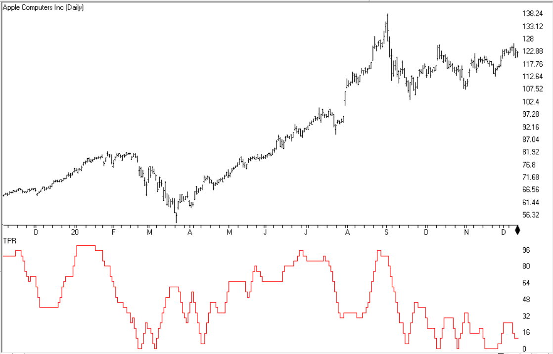
Code for the TPR indicator is set up in the AIQ code file for stocks with point value equal to 0.01. Figure 7 shows the indicator on a chart of Apple Inc. (AAPL).

Sample Chart
FIGURE 7: AIQ. The TPR indicator is shown on a chart of Apple Inc. (AAPL).

—Richard Denning
info@TradersEdgeSystems.com
for AIQ Systems

The RS4r: Tracking Relative Strength In Four Dimensions

Relative strength has more information embedded within it than meets the eye. Here is a way to identify and compress several dimensions of relative strength into one single scalable value, the RS4r, which allows you to compare and then rank securities for robustness across timeframes and shifting market conditions…

The importable AIQ EDS file based on James Garofallou’s article in
Stocks & Commodities magazine September 2020 issue, “The RS4r: Tracking Relative Strength In Four Dimensions,” can be obtained on request via email to info@TradersEdgeSystems.com. The code is also available here:

! The RS4r: Tracking Relative Strength in Four Dimensions
! Author: James Garofallou, PhD, TASC Sept 2020
! Coded by: Richard Denning, 7/18/2020

!INPUTS
C is [close].
len1 is 10.
len2 is 15.
NumIndx is 4.
BuyLvl is 80.

!FORMULAS
SPYc is TickerUDF("SPY",C).      !SP500
QQQc is TickerUDF("QQQ",C).     !NASDAQ100
MDYc is TickerUDF("MDY",C).     !SP400
IWMc is TickerUDF("IWM",C).      !Russel2000

RS1spy is C/SPYc.
RS1qqq is C/QQQc.
RS1mdy is C/MDYc.
RS1iwm is C/IWMc.

FastSPY is Expavg(RS1spy,len1).
MedSPY is Simpleavg(FastSPY,7).
SlowSPY is Simpleavg(FastSPY,15).
VSlowSPY is Simpleavg(SlowSPY,30).

FastQQQ is Expavg(RS1qqq,Len1).
MedQQQ is Simpleavg(FastQQQ,7).
SlowQQQ is Simpleavg(FastQQQ,15).
VSlowQQQ is Simpleavg(SlowQQQ,30).

FastMDY is Expavg(RS1mdy,Len1).
MedMDY is Simpleavg(FastMDY,7).
SlowMDY is Simpleavg(FastMDY,15).
VSlowMDY is Simpleavg(SlowMDY,30).

FastIWM is Expavg(RS1iwm,Len1).
MedIWM is Simpleavg(FastIWM,7).
SlowIWM is Simpleavg(FastIWM,15).
VSlowIWM is Simpleavg(SlowIWM,30).

Tier1spy is iff(FastSPY>=MedSPY and MedSPY>=SlowSPY and SlowSPY>=VslowSPY,10,0).
Tier1qqq is iff(FastQQQ>=MedQQQ and MedQQQ>=SlowQQQ and SlowQQQ>=VslowQQQ,10,0).
Tier1mdy is iff(FastMDY>=MedMDY and MedMDY>=SlowMDY and SlowMDY>=VslowMDY,10,0).
Tier1iwm is iff(FastIWM>=MedIWM and MedIWM>=SlowIWM and SlowIWM>=VslowIWM,10,0).

Tier2spy is iff(FastSPY>=MedSPY and MedSPY>=SlowSPY and SlowSPY<VslowSPY,9,0).
Tier2qqq is iff(FastQQQ>=MedQQQ and MedQQQ>=SlowQQQ and SlowQQQ<VslowQQQ,9,0).
Tier2mdy is iff(FastMDY>=MedMDY and MedMDY>=SlowMDY and SlowMDY<VslowMDY,9,0).
Tier2iwm is iff(FastIWM>=MedIWM and MedIWM>=SlowIWM and SlowIWM<VslowIWM,9,0).

Tier3spy is iff(FastSPY<MedSPY and MedSPY>=SlowSPY and SlowSPY>=VslowSPY,9,0).
Tier3qqq is iff(FastQQQ<MedQQQ and MedQQQ>=SlowQQQ and SlowQQQ>=VslowQQQ,9,0).
Tier3mdy is iff(FastMDY<MedMDY and MedMDY>=SlowMDY and SlowMDY>=VslowMDY,9,0).
Tier3iwm is iff(FastIWM<MedIWM and MedIWM>=SlowIWM and SlowIWM>=VslowIWM,9,0).

Tier4spy is iff(FastSPY<MedSPY and MedSPY>=SlowSPY and SlowSPY<VslowSPY,5,0).
Tier4qqq is iff(FastQQQ<MedQQQ and MedQQQ>=SlowQQQ and SlowQQQ<VslowQQQ,5,0).
Tier4mdy is iff(FastMDY<MedMDY and MedMDY>=SlowMDY and SlowMDY<VslowMDY,5,0).
Tier4iwm is iff(FastIWM<MedIWM and MedIWM>=SlowIWM and SlowIWM<VslowIWM,5,0).

RS2spy is Tier1spy + Tier2spy + Tier3spy + Tier4spy.
RS2qqq is Tier1qqq + Tier2qqq + Tier3qqq + Tier4qqq.
RS2mdy is Tier1mdy + Tier2mdy + Tier3mdy + Tier4mdy.
RS2iwm is Tier1iwm + Tier2iwm + Tier3iwm + Tier4iwm.


RS3x is  (RS2spy+RS2qqq+RS2mdy+RS2iwm).

RS4 is (RS3x/NumIndx)*10.
RS4osc is simpleavg(RS4,3).
mvSig is simpleavg(RS4osc,5).
RS4r is round(RS4).

mvRS4 is expavg(RS4r,4).
RS4up is iff(RS4r >= 80 or RS4r > mvRS4,1,0).

X is iff(RS4 >= 80,1,0).
R5 is iff(RS4up =1,round(simpleavg(X,len2)*100),0).

Buy if R5 >= BuyLvl.
ExitBuy if R5 < BuyLvl.

ShowValues if 1.

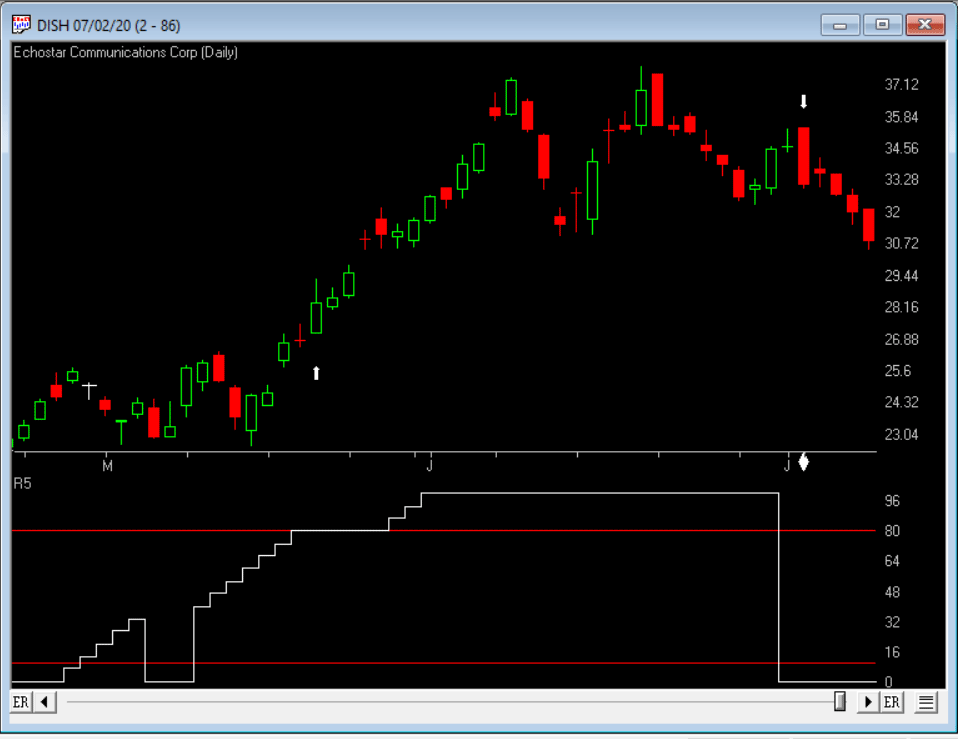
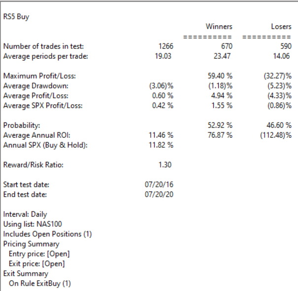
Code for the RS4r is included in the EDS file. I also coded a system that uses the RS4r (R5). I used four independent ETFs as indexes rather than the 11 mutual funds that the author used. I used SPY, QQQQ, MDY, and IWM. The trading system buys (long only) when the R5 >= 80 and exits the long position when RS4r < 80. The summary EDS backtest report for trading this system on the Nasdaq 100 stocks (commission & slippage not subtracted) is shown in Figure 13 and a sample trade on DISH with the R5 indicator is shown in Figure 12.

Sample Chart

FIGURE 12: AIQ. Chart of DISH with R5 indicator and sample trade using R5 indicator >= 80 to buy.

Sample Chart

FIGURE 13: AIQ. Summary EDS backtest report for the R5 system that trades the Nasdaq 100 stocks over the last 4 years.

—Richard Denning
info@TradersEdgeSystems.com
for AIQ Systems

Good Companies, Troubled Stocks and Potential Opportunity

Truth be told I am not much of a “stock picker”. Oh, I can pick ‘em alright just like anyone else.  They just to don’t go the right way as often as I’d like.  I also believe that the way to maximize profitability is to follow a momentum type approach that identifies stocks that are performing well and buying them when they breakout to the upside (ala O’Neil, Minervini, Zanger, etc.) and then riding them as long as they continue to perform.  Unfortunately, I’m just not very good at it. 

Back when I started out, there was such a thing as a “long-term investor.”  People would try to find good companies selling at a decent price and they would buy them and hold them for, well, the long-term.  Crazy talk, right? As I have already stated, I am not claiming that that is a better approach. I am just pointing out that it was “a thing.”

An Indicator

There is an indicator (I will call it VFAA, which is short for vixfixaverageave, which – lets face it – is a terrible name) that I follow that was developed as an extension of Larry William’s VixFix Indicator.  There is nothing magic about it.  Its purpose is to identify when price has reached an exceptionally oversold level and “may” be due to rally.  The code for this indicator appears later.

For the record, I DO NOT systematically use this indicator in the manner I am about to describe, nor am I recommending that you do.  Still, it seems to have some potential value, so what follows is merely an illustration for informational purposes only.

The Rules

*We will look at a monthly bar chart for a given stock

*A “buy signal” occurs when VFAA reaches or exceeds 80 and then turns down for one month

*A “sell (or exit) signal” occurs when VFAA subsequently rises by at least 0.25 from a monthly closing low

Seeing as how this is based solely on monthly closes it obviously this is not going to be a “precision market timing tool.”

Some “Good Companies” with “Troubled Stocks”

So now let’s apply this VFAA indicator to some actual stocks.  Again, I AM NOT recommending that anyone use this approach mechanically.  The real goal is merely to try to identify situations where a stock has been washed out, reversed and MAY be ready to run for a while.

Ticker BA

Figure 1 displays a monthly chart for Boeing (BA) with VFAA at the bottom.  The numbers on the chart represent the hypothetical + (-) % achieved by applying the rules above (although once again, to be clear I am not necessarily suggesting anyone use it exactly this way). 

Figure 1 – Ticker BA with VFAA (Courtesy AIQ TradingExpert)

From March 2019 into March 2020 BA declined -80%.  It has since bounced around and VFAA has soared to 110.88.  VFAA has yet to rollover on a month-end basis, so nothing to do here except exhibit – what’s that word again – oh right, “patience.”

Ticker GD

Figure 2 displays a monthly chart for General Dynamics (GD) with VFAA at the bottom. 

Figure 2 – Ticker GD with VFAA (Courtesy AIQ TradingExpert)

Are these “world-beating numbers”?  Not really.  But in terms of helping to identify potential opportunities, not so bad. VFAA gave a “buy signal” for GD at the end of July. So far, not so good as the stock is down about -6%.

Ticker WFC

Figure 3 displays a monthly chart for Wells Fargo (WFC) with VFAA at the bottom. 

Figure 3 – Ticker WFC with VFAA (Courtesy AIQ TradingExpert)

There are not many “signals” but the ones that occurred have been useful. Between 2018 and 2020 WFC declined -65%.  It has since bounced around and VFAA has soared to 102.44.  VFAA has yet to rollover on a month-end basis. But at some point it will, and a potential opportunity may arise.

VFAA Formula

Below is the code for VFAA

VixFix is an indicator developed many years ago by Larry Williams which essentially compares the latest low to the highest close in the latest 22 periods (then divides the difference by the highest close in the latest 22 periods).  I then multiply this result by 100 and add 50 to get VixFix.

*Next is a 3-period exponential average of VixFix

*Then VFAA is arrived at by calculating a 7-period exponential average of the previous result (essentially, we are “double-smoothing” VixFix)

Are we having fun yet?  See code below:

hivalclose is hival([close],22).

vixfix is (((hivalclose-[low])/hivalclose)*100)+50.

vixfixaverage is Expavg(vixfix,3).

vixfixaverageave is Expavg(vixfixaverage,7).

VFAA = vixfixaverageave

EDITORS NOTE: The AIQ Expert Design Studio code for the indicator is available to download from here. Save this file to your /wintes32/EDS Strategies folder https://aiqeducation.com/VFAA.EDS

Summary

One thing to note is that VFAA “signals” on a monthly chart don’t come around very often.  So, you can’t really sit around and wait for a signal to form on your “favorite company”.  You have to look for opportunity wherever it might exist.

One last time let me reiterate that I am not suggesting using VFAA as a standalone systematic approach to investing. But when a signal does occur – especially when applied to quality companies that have recently been “whacked”, it can help to identify a potential opportunity.

Jay Kaeppel

Disclaimer: The information, opinions and ideas expressed herein are for informational and educational purposes only and are based on research conducted and presented solely by the author.  The information presented represents the views of the author only and does not constitute a complete description of any investment service.  In addition, nothing presented herein should be construed as investment advice, as an advertisement or offering of investment advisory services, or as an offer to sell or a solicitation to buy any security.  The data presented herein were obtained from various third-party sources.  While the data is believed to be reliable, no representation is made as to, and no responsibility, warranty or liability is accepted for the accuracy or completeness of such information.  International investments are subject to additional risks such as currency fluctuations, political instability and the potential for illiquid markets.  Past performance is no guarantee of future results.  There is risk of loss in all trading.  Back tested performance does not represent actual performance and should not be interpreted as an indication of such performance.  Also, back tested performance results have certain inherent limitations and differs from actual performance because it is achieved with the benefit of hindsight.

Quick Market update video

The Expert System in TradingExpert Pro gave a 1 – 99 down signal on the Dow Jones on 8-27-20. The market internals based on the advancing vs declining issue in the New York market continue to diverge from the market price action.

The phase indicator used to confirm Expert Ratings turned down on 8-31-20. We usually look for a phase confirmation of an Expert Rating to occur within 3 days of the rating.

The changes made in the constituents of the Dow 30 effective 8-31-20

  • Salesforce.com replaced Exxon Mobil, Amgen replacedd Pfizer and Honeywell replaced Raytheon Technologies.
  • The changes were due to Apple’s 4-for-1 stock split, which significantly reduced the indexes exposure to the information technology sector.
  • The Dow 30 is a price weighted index.

Dow 30 MACD picture – Dotcom vs Covid

You may have seen some of the articles out there analyzing the skewed nature of the current market rally. As Joe Bartosiewicz in his August 8 Bartometer pointed out:

“The Top 15 Stocks in the S&P 500 account in Market Value 35% of the entire S&P 500 stock market. The Bottom 420 Stocks in the S&P 500 account in Market Value 33.8% of the entire S&P 500 stock market. This means that 15 stocks are controlling the entire S&P 500..”

The Dow Jones 30 index uses a price weighted criteria as part of it’s calculation, and also includes Apple; AAPL has more than doubled in price in under 5 months.

Given that there appears to be only a small basket of stocks leading this rally, we had a look back at the last time tech related stocks were driving the market higher; the dotcom bubble that ran through the 90s into the early 00s.

Monthly DJIA and MACD – left through 3/2002 – right through 10/2002

The first chart is a monthly of the Dow 30 with MACD indicator comparing the market 03/29//2002 as the dotcom bubble rolled over vs 7 months later. Students of divergence analysis, will tell you that MACD in late March 2002 clearly showed prices should be much lower still despite the @33 % rally from the September 2001 low. By late October 2002 the market had fallen again by @33%. At that time the market was close to @40% lower than the high at the start of 2000.


Monthly DJIA and MACD – left through 3/2002 – right through 8/2020

The second chart is a monthly of the Dow 30 on the right through 8/10/20 vs the rally peak of 03/29/2002. The current market has had a @50% rally from the low at the end of March 2020. The original correction was @37% from high to low, slightly bigger than the dotcom correction. The MACD, similar to 2002, is strongly diverging.

The decline in 2002, after the rally, took prices lower than the the prior bottom. If a similar pattern happens this time and the decline is @40% from the high of 29568, the Dow would at the 17700 level.

Vitali Apirine’s – The Compare Price Momentum Oscillator (CPMO)

The importable AIQ EDS file based on Vitali Apirine’s article in the August, 2020 issue of Stocks & Commodities magazine, “The Compare Price Momentum Oscillator (CPMO),” can be obtained on request via email to info@TradersEdgeSystems.com.

… Here is a way you can compare at a glance the momentum of two different market indexes or securities in the same chart. It could also be used to help generate trading signals. In this first part of a three-part series, we’ll look at comparing index momentums…

The code is also available here:

!Author: Vitali Aprine, TASC August 2020
!Coded by: Richard Denning, 6/20/20
!www.TradersEdgeSystems.com

!Custom smoothing multiplier: 2 / time period
!PMO line: 20-period custom EMA of (10 × 35-period
!custom EMA of ((Today’s price – Yesterday’s price) / !Yesterday’s price × 100))
!PMO signal line: 10-period EMA of the PMO line

Len1 is 20.
Len2 is 35.
Len3 is 10.
Ticker1 is “QQQ”.
Ticker2 is “SPY”.

C is [close].
C1 is valresult(C,1).
RC1 is (C/C1*100)-100.

custSmoLen1 is Len1 – 1.
custSmoLen2 is Len2 – 1.

CustEma is 10*expavg(RC1,custSmoLen2).
PMO is expavg(CustEma,custSmoLen1).
PMOsig is expavg(PMO,Len3).

Ticker1C is tickerUDF(Ticker1,C).
RC1ticker1 is (Ticker1C/valresult(Ticker1C,1)*100)-100.
CustEmaTicker1 is 10*expavg(RC1ticker1,custSmoLen2).
PMOticker1 is expavg(CustEmaTicker1,custSmoLen1).

Ticker2C is tickerUDF(Ticker2,C).
RC1ticker2 is (Ticker2C/valresult(Ticker2C,1)*100)-100.
CustEmaTicker2 is 10*expavg(RC1ticker2,custSmoLen2).
PMOticker2 is expavg(CustEmaTicker2,custSmoLen1).

CPMO is PMOTicker1 – PMOTicker2.
List if hasdatafor(1000) >= 900.

I coded the indicator described by the author. Figure 10 shows the indicator (QQQ,SPY,20,35) on chart of IWM. When the white line is above the red line on the CPMO indicator, this indicates that the QQQ is stronger than the SPY. Generally, it is considered bullish when the QQQ is leading in strength.

Sample Chart

FIGURE 10: AIQ. The CPMO indicator is shown on a chart of IWM with parameters (QQQ,SPY,20,35).

—Richard Denning
info@TradersEdgeSystems.com
for AIQ Systems

The Ultimate Ugly Contrarian Play

They always say you should buy when there is “blood in the street.”  They also say, “buy them when nobody wants them.”  So, let’s consider today what could be the most unloved, bombed out, everybody hates it “thing” in the world – coal.

Ugh, just the mention of the word coal elicits a recoiling response.  “Dirty energy!”  “Climate change inducing filth!” “Ban coal!”.  And so and so forth.  And maybe they have a point.  But “they” also say “facts are stubborn things” (OK, for the record, I think it’s a different “they” who says that but never mind about that right now).

So here is a stubborn fact: coal supplies about a quarter of the world’s primary energy and two-fifths of its electricity.  As I write, two of the fastest growing economies (at least they were as of a few months ago) – China and India – are not only heavily reliant upon coal for energy, but are still building more and more coal-fired plants.  Now I am making no comment on whether this is a good thing or a bad thing but the point is, it most definitely is a “thing.”

So however one feels about coal, the reality is that it is not going to go away anytime soon.  Does this mean it will “soar in value” anytime soon – or even ever for that matter?  Not necessarily.  But as an unloved commodity it’s sure is hard to beat coal.  And as “they” (they sure are a bunch of know it all’s they?) say, “opportunity is where you find it.” 

Ticker KOL is an ETF that invests in coal industry related companies.  And what a dog it has been.  Figure 1 displays a monthly chart of price action.  Since peaking in June 2008 at $60.80 a share, it now stands at a measly $6.29 a share, a cool -89.6% below its peak.  And like a lot of things it has been in a freefall of late.

Figure 1 – Ticker KOL Monthly chart (Courtesy AIQ TradingExpert)

So, is this a great time to buy KOL?  That’s not for me to say.  But for argument’s sake, Figure 2 displays a weekly chart of KOL with an indicator I call Vixfixaverageave (I know, I know), which is a version of an indicator developed a number of years ago by Larry Williams (Indicator code is at the end of the article).

Figure 2 – KOL weekly chart with Vixfixaverageave indicator (Courtesy AIQ TradingExpert)

Note that Vixfixaverageave is presently above 90 on the weekly chart.  This level has been reached twice before – once in 2008 and once in 2016.  Following these two previous instances, once the indicator actually peaked and ticked lower for one week, KOL enjoyed some pretty spectacular moves. 

To wit:

*Following the 12/19/08 Vixfixaverageave peak and reversal KOL advanced +252% over the next 27.5 months

*Following the 2/19/16 Vixfixaverageave peak and reversal KOL advanced +182% over the next 23.5 months

When will Vixfixaverageave peak and reverse on the weekly KOL chart?  There is no way to know.  One must just wait for it to happen.  And will it be time to buy KOL when this happens?  Again, that is not for me to say.  None of this is meant to imply that the bottom for KOL is an hand nor that a massive rally is imminent.

Still, if there is anything at all to contrarian investing, its hard to envision anything more contrarian that KOL.

Vixfixaverageave Calculations

hivalclose is hival([close],22).  <<<<<The high closing price in that last 22 periods

vixfix is (((hivalclose-[low])/hivalclose)*100)+50. <<<(highest closing price in last 22 periods minus current period low) divided by highest closing price in last 22 periods (then multiplied by 100 and 50 added to arrive at vixfix value)

vixfixaverage is Expavg(vixfix,3). <<< 3-period exponential average of vixfix

vixfixaverageave is Expavg(vixfixaverage,7). <<<7-period exponential average of vixfixaverage

Jay Kaeppel

Disclaimer: The information, opinions and ideas expressed herein are for informational and educational purposes only and are based on research conducted and presented solely by the author.  The information presented does not represent the views of the author only and does not constitute a complete description of any investment service.  In addition, nothing presented herein should be construed as investment advice, as an advertisement or offering of investment advisory services, or as an offer to sell or a solicitation to buy any security.  The data presented herein were obtained from various third-party sources.  While the data is believed to be reliable, no representation is made as to, and no responsibility, warranty or liability is accepted for the accuracy or completeness of such information.  International investments are subject to additional risks such as currency fluctuations, political instability and the potential for illiquid markets.  Past performance is no guarantee of future results.  There is risk of loss in all trading.  Back tested performance does not represent actual performance and should not be interpreted as an indication of such performance.  Also, back tested performance results have certain inherent limitations and differs from actual performance because it is achieved with the benefit of hindsight.

The Bartometer

January 14, 2020

Hello Everyone,

Market Recap:

Last year was an excellent year for the markets in general, with the markets appreciating 19-38%, depending on the indexes. One of the best sectors was the large growth sector with stocks like Apple Computer going up 88% and Microsoft up 56% over the last year. That is why the NASDAQ went up 38% This year; the market is doing the same thing with Apple +5%, Microsoft +3%, Alphabet +6%, Facebook +6%, and Amazon +3%.

When stocks are so large, and they go up a significant amount, they skew the market averages and make people think the markets are doing very well when in fact, the small and midcap stock indexes are down .5% -1.6%.

The participation of this current rally is VERY NARROW, meaning just a small number of large stocks are pushing this market higher and when the markets are climbing on only a few stocks then either the small and midcap stocks have to catch up or the large growth and technology stocks have to fade.

On my December Bartometer, I thought the market would rally towards the rest of the year and I thought the FIRST level of resistance would be 3280 on the S&P 500. Friday, the S&P 500 hit 3281 intraday high and closed at 3265. Even though I am still Bullish longer term, I think the markets require some healthy pullback… Going up without a correction is not suitable for the markets especially when people are now throwing money at the market. It’s called FOMO, or the Fear of Missing Out. This sort of panic to throw money at the index funds shows me that psychologically people think the markets will continue to rise. That scares me a little.

The rise might continue and I am still relatively bullish as I think the S&P could hit 3400 later in the year, but I am worried that one of the only sectors that are moving is the large-cap technology sector. At this point, if you are in or nearing retirement and have more than 65% of your money in equities, you may want to scale back your equity exposure to below that amount. Remember the old saying; you don’t make it until you take it.

An excerpt from Fundamental Economist Dr. Robert Genetski: from Classical Principles.com:


Another week of good news and another week of record-high prices for the major stock indexes. Technology remains the most robust sector with both the Nasdaq and Nasdaq 100 gaining more than a percent. The S&P500 and Dow were up ½%. Small caps continue to languish.

Trump’s strategy in dealing with Iran increases the odds of his reelection. Iran looks even less competent for failing to protect Soleimani, having more than 50 people trampled to death at his funeral, and then possibly shooting down their civilian airplane.

With central banks around the world, creating liquidity, any correction in the bull market should be limited. Stay bullish on stocks.

Some of the INDEXES of the markets both equities and interest rates are below.

The source is Morningstar.com up until January 10th, 2020.


Dow Jones +1.1%
S&P 500 +1.2%
NASDAQ Aggressive growth +2.7%
I Shares Russell 2000 ETF (IWM) Small cap – .47 of 1%
Midcap stock funds -.48 of 1%
International Index (MSCI – EAFE ex USA 1.0% Moderate Mutual Fund Investment Grade Bonds (AAA) Long duration +.56 of 1%
High Yield Merrill Lynch High Yield Index +.46 of 1%
Short Term Bond +.22 of 1%
Fixed Bond Yields (10 year) +1.8.% Yield
The average Moderate Fund is up .62 of 1% this year fully invested as a 65% in stocks and 35% in bonds and nothing in the money market.

Interest rates look stable going forward over the next 6 months

The Dow Jones Average is above. This index for the 5 largest stocks are Boeing, Apple, United healthcare, Goldman Sachs and Home Depot. They are the mix of American industry, but only contain 30 stocks. Even though the Dow is rising,

Look to the 3 graphs below the chart. You will see the horizontal blue line. When that is over 88 as it is, it shows that the market is OVERBOUGHT. Then when the green line falls below the green line you see the market selling off. It is there again, so be careful. The second graph shows Money flow/ Volume Accumulation. When this goes negative like it is below zero or the horizontal line, it shows that there is some distribution or selling pressure.

The last graph shows the Advance decline line. This is the number of stocks going up compared to the number of stocks going down on a running total. As you can see the Dow Jones is going up, but the Advance/decline is going DOWN. This means only a few stocks are going up. If this doesn’t change, the market could be ready for a little decline There is trend-line support at 28400 if it drops there. But unless the indicators change for the better, the market may fall and correct somewhat.

The NASDAQ is above. As you can see the NASDAQ is going up and is at the upper part of channel with-overbought and oversold indicators like the SK-SD stochastic indicators (the first graph) are very overbought. When the horizontal blue line is above 88 where the indicators are currently the market is overbought. Many times, when this indicator is above 88 you will see some sort of a correction or a give back.

See the last three times this indicator hit this level and crossed below it, the market fell. The NASDAQ can fall to the 8900 level where the bold trend line is above and still be bullish. It’s when we break that dark blue trend-line, then I will get very Cautious. Right now, the NASDAQ is overbought, and there are only a few stocks pushing this market higher. The third graph is the Advance decline Line. Notice, as the NASDAQ is going higher, it is going higher on a few stocks, that is why the Advance Decline Line is falling.

What is the Advance-Decline Line?

The advance/decline line (A/D) is a technical indicator that plots the difference between the number of advancing and declining stocks daily. The indicator is cumulative, with a positive number being added to the prior number, or if the number is negative, it is subtracted from the prior number.

The A/D line is used to show market sentiment, as it tells traders whether more stocks are rising or falling. It is used to confirm price trends in major indexes, and can also warn of reversals when divergence occurs.

The on-balance volume (OBV) is a technical analysis indicator intended to relate price and volume in the stock market. OBV is based on a cumulative total volume.[1] Money flow is calculated by averaging the high, low and closing prices, and multiplying by the daily volume. Comparing that result with the number for the previous day tells traders whether money flow was positive or negative for the current day. Positive money flow indicates that prices are likely to move higher, while negative money flow suggests prices are about to fall.

Source: Investopedia

A Support or support level is the level at which buyers tend to purchase or into a stock or index. It refers to the stock share price that a company or index should hold and start to rise. When the price of the stock falls towards its support level, the support level holds and is confirmed, or the stock continues to decline, and the support level must change.

  • Support levels on the S&P 500 area are 3248, 3217 area MAJOR Trend line support, 3182, 3119, and 3088. These might be BUY areas.
  • Support levels on the NASDAQ are 8900, 8655, and 8474.
  • On the Dow Jones support is at 28,420, 28245, 26093 (200-day moving average) and 27764
  • These may be safer areas to get into the equity markets on support levels slowly.
  • RESISTANCE LEVEL ON THE S&P 500 3280.

THE BOTTOM LINE:

The market is somewhat overbought and at FAIR VALUE. There are now some cracks in the dam showing as explained above, but my computer systems are still at a Hold for the market direction. I expected the S&P to hit 3280, it did last week and sold off very quickly to the 2165 area. The markets are rallying on large-cap growth and technology stocks and watching the other smaller to midcap companies decline. Either we start to see the small and midcap stocks begin to rally, or the market could begin to decline. The S&P could hit 3280 to 3400 later in the year. Earnings could potentially grow 6 to 7% or more this year and that is why there is the possibility that the S&P 500 could reach 3280 to 3400+ in 2020, a much smaller rise in the stock market than in 2019 but hopefully, a decent return, with obviously no guarantees expressed or implied.

Best to all of you,

Joe Bartosiewicz, CFP®
Investment Advisor Representative
5 Colby Way
Avon, CT 06001
860-940-7020 or 860-404-0408

SECURITIES AND ADVISORY SERVICES OFFERED THROUGH SAGE POINT FINANCIAL INC., MEMBER FINRA/SIPC, AND SEC-REGISTERED INVESTMENT ADVISOR.

Charts provided by AIQ Systems:

Technical Analysis is based on a study of historical price movements and past trend patterns. There is no assurance that these market changes or trends can or will be duplicated shortly. It logically follows that historical precedent does not guarantee future results. Conclusions expressed in the Technical Analysis section are personal opinions: and may not be construed as recommendations to buy or sell anything.

Disclaimer:

The views expressed are not necessarily the view of Sage Point Financial, Inc. and should not be interpreted directly or indirectly as an offer to buy or sell any securities mentioned herein. Securities and Advisory services offered through Sage Point Financial Inc., Member FINRA/SIPC, an SEC-registered investment advisor.

Past performance cannot guarantee future results. Investing involves risk, including the potential loss of principal. No investment strategy can guarantee a profit or protect against loss in periods of declining values. Please note that individual situations can vary. Therefore, the information presented in this letter should only be relied upon when coordinated with individual professional advice. *There is no guarantee that a diversified portfolio will outperform a non-diversified portfolio in any given market environment. No investment strategy, such as asset allocation, can guarantee a profit or protect against loss in periods of declining values. It is our goal to help investors by identifying changing market conditions. However, investors should be aware that no investment advisor can accurately predict all of the changes that may occur in the market. The price of commodities is subject to substantial price fluctuations of short periods and may be affected by unpredictable international monetary and political policies. The market for commodities is widely unregulated, and concentrated investing may lead to Sector investing may involve a greater degree of risk than investments with broader diversification. Indexes cannot be invested indirectly, are unmanaged, and do not incur management fees, costs, and expenses.

Dow Jones Industrial Average: A weighted price average of 30 significant stocks traded on the New York Stock Exchange and the NASDAQ.
S&P 500: The S&P 500 is an unmanaged indexed comprised of 500 widely held securities considered to be representative of the stock market in general.

NASDAQ: the NASDAQ Composite Index is an unmanaged, market-weighted index of all over the counter common stocks traded on the National Association of Securities Dealers Automated Quotation System
(IWM) I Shares Russell 2000 ETF: Which tracks the Russell 2000 index: which measures the performance of the small capitalization sector of the U.S. equity market.

A Moderate Mutual Fund risk mutual has approximately 50-70% of its portfolio in different equities, from growth, income stocks, international and emerging markets stocks to 30-50% of its portfolio in different categories of bonds and cash. It seeks capital appreciation with a low to moderate level of current income.

The Merrill Lynch High Yield Master Index: A broad-based measure of the performance of non-investment grade US Bonds MSCI EAFE: the MSCI EAFE Index (Morgan Stanley Capital International Europe, Australia, and Far East Index) is a widely recognized benchmark of non-US markets. It is an unmanaged index composed of a sample of companies’ representative of the market structure of 20 European and Pacific Basin countries and includes reinvestment of all dividends. Investment grade bond index: The S&P 500 Investment-grade corporate bond index, a sub-index of the S&P 500 Bond Index, seeks to measure the performance of the US corporate debt issued by constituents in the S&P 500 with an investment-grade rating. The S&P 500 Bond index is designed to be a corporate-bond counterpart to the S&P 500, which is widely regarded as the best single gauge of large-cap US equities.

Floating Rate Bond Index is a rule-based, market-value weighted index engineered to measure the performance and characteristics of floating-rate coupon U.S. Treasuries, which have a maturity greater than 12 months.
Money Flow; The Money Flow Index (MFI) is a momentum indicator that measures the flow of money into and out of a security over a specified period. It is related to the Relative Strength Index (RSI) but incorporates volume, whereas the RSI only considers SK-SD Stochastics. When an oversold stochastic moves up through its MA, a buy signal is produced. Furthermore, Lane recommends that the stochastic line be smoothed twice with three-period simple moving averages: SK is the three-period simple moving average of K, and SD is the three-period simple moving average of SK

Rising Wedge; A rising wedge is a technical indicator, suggesting a reversal pattern frequently seen in bear markets. This pattern shows up in charts when the price moves upward with pivot highs and lows converging toward a single point known as the apex

Exponential Deviation Bands

The importable AIQ EDS file based on Vitali Apirine’s article in July 2019 Stocks & Commodities issue, “Exponential Deviation Bands,”

and a recreated Excel spreadsheet similar to the one shown in the article can be obtained on request via email to info@TradersEdgeSystems.com. The code is also shown here:

Exponential deviation (ED) bands are plotted above and below a moving average (MA) from which the bands are calculated. An exponential deviation from the moving average is used to set the bands. ED bands can be used with either a simple moving average (SMA) or an exponential moving average (EMA). The moving average dictates direction, and the exponential deviation sets band width. Breakouts from the band and changes in the band’s direction can help identify price trends and price reversals. These bands can be used on a variety of securities with its standard settings.

!EXPONENTIAL DEVIATION BANDS
!Author: Vitali Apirine, TASC July 2019
!Coded by: Richard Denning, 5/15/2019
!www.TradersEdgeSystems.com

C is [close].
Periods is 20. 

MA20 is simpleavg(C,Periods).   !expavg(C,Periods).  !or simpleavg(C,Periods). 
MDev20 is (Abs(MA20-C)+Abs(MA20-valresult(C,1))+Abs(MA20-valresult(C,2))+Abs(MA20-valresult(C,3))
      +Abs(MA20-valresult(C,4))+Abs(MA20-valresult(C,5))+Abs(MA20-valresult(C,6))+Abs(MA20-valresult(C,7))
     +Abs(MA20-valresult(C,8))+Abs(MA20- valresult(C,9))+Abs(MA20- valresult(C,10))+Abs(MA20- valresult(C,11))
     +Abs(MA20- valresult(C,12))+Abs(MA20- valresult(C,13))+Abs(MA20- valresult(C,14))+Abs(MA20- valresult(C,15))
      +Abs(MA20- valresult(C,16)) +Abs(MA20- valresult(C,17))+Abs(MA20- valresult(C,18))+Abs(MA20- valresult(C,19)))/20.

Dev is Abs(MA20-C).  
Rate is 2/( Periods +1).  

DaysInto is ReportDate() - RuleDate().
Stop if DaysInto >= 200.
stopEXD is iff(Stop,Mdev20, EXD).
EXD is Dev*Rate + valresult(stopEXD,1)*(1-Rate).

UpperExp is MA20+2*EXD.  
MidExp is MA20.  
LowerExp is MA20-2*EXD. 

ShowValues if 1.

Figure 9 shows the exponential deviation bands centered on a 20-bar simple moving average on a chart of the New York Composite Index (NYA).

Sample Chart

FIGURE 9: AIQ. Here are exponential deviation bands centered on a 20-bar simple moving average on a chart of the New York Composite Index (NYA).

—Richard Denning
info@TradersEdgeSystems.com
for AIQ Systems

The Bartometer September, 2019

Hello Everyone,

Over the last month the S&P 500 has risen 3% and is about 2/3rds of 1% below its high it reached in July. Last month on the Bartometer I stated that my computer models were on a Short term Buy signal and the S&P needed to break out of 2944- 2954 for me to be more bullish. I also said that if the S&P stayed above 2954 for 2 days it should head back to the old high of 3025 or there about and it did. Now that the markets are near their old high, where do I think the markets will go? Well, the answer isn’t so easy to answer. Technically the markets are overbought again but two of the technical indicators that show continuation on are On Balance Volume and Money Flow. Both of these indicators are currently at a New High, when the markets are not. These indicators while not always indicative of further advancement are still positive for a continuation to the upside. See the charts below.

My fundamental economist Dr. Robert Genetski, from ClassicalPrinciples.com said last week’s move by the European Central Bank (ECB) to ease policy is good news for the period immediately ahead. The ECB cut its target interest rate and will indefinitely purchase $20 billion of securities each month beginning in November. The move pressures the Fed and other central banks to also ease policy. Negotiations with China also appear to be moving in a positive direction. China is suffering much more than the US from Trump’s tariffs. China is anxious to reach a deal to avoid further problems. On Wednesday the Fed will follow the ECB and the Bank of Japan (BOJ) by cutting interest rates. Unlike the ECB and BOJ, the Fed will not resume purchases of securities. Hence, the Fed will not be easing policy. However, the perception of a period of global easing is likely to provide a short-term tailwind for boosting stocks and interest rates. Over the past 2 weeks there has been a 30 basis point increase in the yield on 10-year T-Notes. This has narrowed the inversion with 3-month Treasury bills from 50 basis points to 20. The spike in rates means financial markets reflect the view that monetary policy is less restrictive. This view is reinforced by the actions of the EC.

On the Technical Side

My computer models went on a very short term BUY signal 5 weeks ago when the S&P was 2844 and has not gone to a Sell signal, but there needs to now be a push through the 3027 level on the S&P and stay there or there could be a sell off here. Two of my favorite indicators Money Flow and On Balance Volume are at a new high while the index is not. This is a positive indication for continuation on the upside. But remember, we still need to watch all of the information that is coming out of the mouth of all political figures and the global markets, but currently I am still moderately bullish. I never put my guard down. See chart below

Interest Outlook

I see the Federal Reserve reducing interest rates ¼% in December.

Some of the INDEXES of the markets both equities and interest rates are below. The source is Morningstar.com up until September 13th, 2019.

These are passive indexes.

*Dow Jones +18%

S&P 500 +21%

NASDAQ Aggressive growth +25%

I Shares Russell 2000 ETF (IWM) Small cap +18%

International Index (MSCI – EAFE ex USA) +13%

Moderate Mutual Fund +12%

Investment Grade Bonds (AAA) +11% +2.64%

High Yield Merrill Lynch High Yield Index +9% +4.26%

Floating Rate Bond Index +5% +2.60%

Short Term Bond +3%

Fixed Bond Yields (10 year) +1.82.% +2.63%

The average Moderate Fund is up 12% this year fully invested as a 60% in stocks and 40% in bonds. And nothing in the money market

*Explanation of each below

The Dow Jones Index is above. As it contains 30 of the largest industrial and American stocks. You will notice that the Dow above and to the right is approaching its old high achieved in July. It has rallied 5% since the Buy signal my computer models gave last month. But now it has to break out to new highs or it puts in a double top. There are 3 indicators above that are important. The first one is SK-SD Stochastics and it is back to the 88 level and that shows the market is overbought. The 2nd and third are Money Flow and On Balance Volume. Both of those indicators are very important for me to determine confirmation and continuation of the rally. Notice that both of them are at a new high while the Dow Jones is not. This is a positive divergence and hopefully the markets will continue its upward movement. I like the USA markets more than the International markets. The Dow Jones looks better than the S&P and the NASDAQ technically at this time. Remember, volatility will still be present so I would still be somewhat cautious.

Source: AIQ Systems on graphs

*On-balance volume (OBV) is a technical analysis indicator intended to relate price and volume in the stock market.
OBV is based on a cumulative total volume.[1]
*Money flow is calculated by averaging the high, low and closing prices, and multiplying by the daily volume. Comparing that result with the number for the previous day tells traders whether money flow was positive or negative for the current day. Positive money flow indicates that prices are likely to move higher, while negative money flow suggests prices are about to fall.

Source: Investopedia

*A Support or support level is the level at which buyers tend to purchase or into a stock or index. It refers to the stock share price that a company or index should hold and start to rise. When a price of the stock falls towards its support level, the support level holds and is confirmed, or the stock continues to decline, and the support level must change.

  • Support levels on the S&P 500 area are 2954.71, 2950, 2944, and 2931. These might be BUY areas.
  • Support levels on the NASDAQ are 8024, 7969, and 7777 (200 Day Moving Average.
  • On the Dow Jones support is at 26,766, 26,595, and 26,368
  • These may be safer areas to get into the equity markets on support levels slowly.
  • RESISTANCE LEVEL ON THE S&P 500 IS 3028. If there is a favorable tariff settlement, the market should rise short term.

THE BOTTOM LINE:

The Dow, the S&P 500 and the NASDAQ are all near new highs. 5 weeks ago on the Bartometer my computer models went to a Buy signal. Since then, the markets have rallied near their old highs. There are technical patterns that show the markets could breakout to new highs but IF THE MARKETS DON’T BREAKOUT OUT SOON, THE MARKETS COULD TOP OUT. I WILL CONTINUE TO ANALYZE THE TECHNICALs OF THE MARKET. There are seasonal patterns that are usually week. September and October ARE NOT SEASONALLY GOOD MONTHS. It looks like the market wants to goes up but with tweets coming out hourly, market timing will be more difficult. If things come in as Trump expects, watch for a solid rally possibly to the old highs. But there are headwinds currently short term.

Best to all of you,

Joe Bartosiewicz, CFP®
Investment Advisor Representative

5 Colby Way
Avon, CT 06001
860-940-7020 or 860-404-0408

SECURITIES AND ADVISORY SERVICES OFFERED THROUGH SAGE POINT FINANCIAL INC., MEMBER FINRA/SIPC, AND SEC-REGISTERED INVESTMENT ADVISOR.
Charts provided by AIQ Systems:
Technical Analysis is based on a study of historical price movements and past trend patterns. There is no assurance that these market changes or trends can or will be duplicated shortly. It logically follows that historical precedent does not guarantee future results. Conclusions expressed in the Technical Analysis section are personal opinions: and may not be construed as recommendations to buy or sell anything.

Disclaimer: The views expressed are not necessarily the view of Sage Point Financial, Inc. and should not be interpreted directly or indirectly as an offer to buy or sell any securities mentioned herein. Securities and Advisory services offered through Sage Point Financial Inc., Member FINRA/SIPC, and SEC-registered investment advisor.

Past performance cannot guarantee future results. Investing involves risk, including the potential loss of principal. No investment strategy can guarantee a profit or protect against loss in periods of declining values. Please note that individual situations can vary. Therefore, the information presented in this letter should only be relied upon when coordinated with individual professional advice. *There is no guarantee that a diversified portfolio will outperform a non-diversified portfolio in any given market environment. No investment strategy, such as asset allocation, can guarantee a profit or protect against loss in periods of declining values. It is our goal to help investors by identifying changing market conditions. However, investors should be aware that no investment advisor can accurately predict all of the changes that may occur in the market.
The price of commodities is subject to substantial price fluctuations of short periods and may be affected by unpredictable international monetary and political policies. The market for commodities is widely unregulated, and concentrated investing may lead to Sector investing may involve a greater degree of risk than investments with broader diversification.
Indexes cannot be invested indirectly, are unmanaged, and do not incur management fees, costs, and expenses.

Dow Jones Industrial Average: A weighted price average of 30 significant stocks traded on the New York Stock Exchange and the NASDAQ.

S&P 500: The S&P 500 is an unmanaged indexed comprised of 500 widely held securities considered to be representative of the stock market in general.

NASDAQ: the NASDAQ Composite Index is an unmanaged, market-weighted index of all over the counter common stocks traded on the National Association of Securities Dealers Automated Quotation System

(IWM) I Shares Russell 2000 ETF: Which tracks the Russell 2000 index: which measures the performance of the small capitalization sector of the U.S. equity market.

A Moderate Mutual Fund risk mutual has approximately 50-70% of its portfolio in different equities, from growth, income stocks, international and emerging markets stocks to 30- 50% of its portfolio indifferent categories of bonds and cash. It seeks capital appreciation with a low to moderate level of current income.

The Merrill Lynch High Yield Master Index: A broad-based measure of the performance of non-investment grade US Bonds

MSCI EAFE: the MSCI EAFE Index (Morgan Stanley Capital International Europe, Australia, and Far East Index) is a widely recognized benchmark of non-US markets. It is an unmanaged index composed of a sample of companies’ representative of the market structure of 20 European and Pacific Basin countries and includes reinvestment of all dividends.

Investment grade bond index: The S&P 500 Investment-grade corporate bond index, a sub-index of the S&P 500 Bond Index, seeks to measure the performance of the US corporate debt issued by constituents in the S&P 500 with an investment grade rating.

The S&P 500 Bond index is designed to be a corporate-bond counterpart to the S&P 500, which is widely regarded as the best single gauge of large cap US equities.

Floating Rate Bond Index is a rule-based, market-value weighted index engineered to measure the performance and characteristics of floating rate coupon U.S. Treasuries which have a maturity greater than 12 months.

The Agony and Ecstasy of Trend-Following

Let’s face it, many investors have a problem with riding a trend.  When things are going well they fret and worry about every blip in interest rates, housing starts, earnings estimates and the price of tea in China, which often keeps them from maximizing their profitability.  Alternatively, when things really do fall apart they suddenly become “long-term investors” (in this case “long-term” is defined roughly as the time between the current time and the time they “puke” their portfolio – just before the bottom).

Which reminds me to invoke:

Jay’s Trading Maxim #6: Human nature is a detriment to investment success and should be avoided as much as, well, humanly possible.

So, it can help to have a few “go to” indicators, to help one objectively tilt to the bullish or bearish side.  And we are NOT talking about “pinpoint precision timing” types of things here. Just simple, objective clues.  Like this one.

Monthly MACD

1

Figure 1 displays the S&P 500 index monthly chart with the monthly MACD Indicator at the bottom.Figure 1 – Monthly S&P 500 Index with MACD (Courtesy AIQ TradingExpert)

The “trading rules” we will use are pretty simple:

*If the Monthly MACD closes a month above 0, then hold the S&P 500 Index the next month

*If the Monthly MACD closes a month below 0, then hold the Barclays Treasury Intermediate Index the next month

*We start our test on 11/30/1970.

*For the record, data for the Barclays Treasury Intermediate Index begins in January 1973 so prior to that we simply used an annual interest rate of 1% as a proxy.

Figure 2 displays the equity curves for:

*The strategy just explained (blue line)

*Buying and holding the S&P 500 Index (orange) line

2

Figure 2 – Growth of $1,000 using MACD System versus Buy-and-Hold

Figure 3 displays some “Facts and Figure” regarding relative performance.

3

Figures 3 – Comparative Results

For the record:

*$1,000 invested using the “System” grew to $143,739 by 6/30/2019

*$1,000 invested using buy-and-hold grew to $102,569 by 6/30/2019

*The “System” experienced a maximum drawdown (month-end) of -23.3% and the Worst 5-year % return was +7.3% (versus a maximum drawdown of -50.9% and a Worst 5-year % return of -29.1% for Buy-and-Hold)

So, from the chart in Figure 2 and the data in Figure 3 it is “obvious” that using MACD to decide when to be in or out of the market is clearly “better” than buy-and-hold.  Right?  Here is where it “gets interesting” for a couple of reasons.

First off, the MACD Method outperforms in the long run by virtue of missing a large part of severe bear markets every now and then.  It also gets “whipsawed” more often than it “saves your sorry assets” during a big bear market.  So, in reality it requires ALOT of discipline (and self-awareness) to actually follow over time.

Consider this: if you were actually using just this one method to decide when to be in or out of the market (which is NOT what I am recommending by the way) you would have gotten out at the end of October 2018 with the S&P 500 Index at 2,711.74.  Now nine months later you would be sitting here with the S&P 500 Index flirting with 3,000 going “what the heck was I thinking about!?!?!?”  In other words, while you would have missed the December 2018 meltdown, you also would have been sitting in treasuries throughout the entire 2019 rally to date.

Like I said, human nature, it’s a pain.

To fully appreciate what makes this strategy “tick”, consider Figures 4 and 5. Figure 4 displays the growth of equity when MACD is > 0 (during these times the S&P 500 Index is held).

4

Figure 4 – Growth of $1,000 invested in S&P 500 Index when MACD > 0.

Sort of the “When things are swell, things are great” scenario.

Figure 5 displays the growth of $1,000 for both intermediate-term treasuries AND the S&P 500 Index during those times when MACD > 0.

5

Figure 5 – Growth of $1,000 invested in Intermediate-term treasuries (blue) and the S&P 500 (orange) when MACD < 0.

Essentially a “Tortoise and the Hare” type of scenario.

Summary

Simple trend-following methods – whether they involve moving average using price, trend lines drawn on charts or the MACD type of approach detailed herein – can be very useful over time.

*They can help an investor to reduce that “Is this the top?” angst and sort of force them to just go with the flowing while the flowing is good.

*They can also help an investor avoid riding a major bear market all the way to the bottom – which is a good thing both financially and emotionally.

But everything comes with a cost.  Trend-following methods will never get you in at the bottom nor out at the top, and you WILL experience whipsaws – i.e., times when you sell at one price and then are later forced to buy back at a higher price.

Consider it a “cost of doing business.”

Jay Kaeppel

Disclaimer:  The data presented herein were obtained from various third-party sources.  While I believe the data to be reliable, no representation is made as to, and no responsibility, warranty or liability is accepted for the accuracy or completeness of such information.  The information, opinions and ideas expressed herein are for informational and educational purposes only and do not constitute and should not be construed as investment advice, an advertisement or offering of investment advisory services, or an offer to sell or a solicitation to buy any security.

Weekly & Daily Stochastics

The AIQ code based on Vitali Apirine’s article in the September issue of Stocks and Commodities, “Weekly and Daily Stochastics, is provided below

Using Apirine’s weekly and daily stochastic indicators and a moving average to determine trend direction, I created an example system (long only) with the following rules:

Enter long next bar at open when all of the following are true:

  1. The 200-day simple average of the NDX is greater than the day before
  2. The 200-day simple average of the stock is greater than the day before
  3. Both the weekly and daily stochastic indicators have been below 20 in the last five days
  4. Both the weekly and daily stochastic indicators are greater than the day before.

I tested three exits. Figure 8 shows a 21-day hold then exit. Figure 9 shows a three-moving-average trend-following exit. Figure 10 shows an exit using only the weekly &amp; daily stochastic, once both are lower than the day before.

Sample Chart

FIGURE 8: AIQ, BUY and HOLD. Here is the sample equity curve (blue) compared to the NDX (red) for the test using a 21-day hold exit.

Sample Chart

FIGURE 9: AIQ, TREND-FOLLOWING EXIT. Here is the sample equity curve (blue) compared to the NDX index (red) for the test using a trend-following exit.

Sample Chart

FIGURE 10: AIQ, W and D STOCHASTIC EXIT. Here is the sample equity curve (blue) compared to the NDX index (red) for the test using the weekly and daily stochastic indicators.

The 21-day hold test showed a 11.2% return with a maximum drawdown of 29.3%. The trend-following exit test showed a 17.6% return with a maximum drawdown of 28.8%. The test using an exit based on only the weekly and daily stochastic indicators showed a return of 2.9% with a maximum drawdown of 32.5%. All the tests used the same entry rule and were run on an old 2016 list of the NASDAQ 100 stocks with the stocks that are no longer trading deleted.

!WEEKLY AND DAILY STOCHASTIC
!Author: Vitali Apirine, TASC Sept 2018
!Coded by: Richard Denning 7/7/2018
!www.TradersEdgeSystems.com

!INPUTS:
Periods is 14.
Periods1 is 3.
Pds is 70. 
Pds1 is 3.
smaLen1 is 70.
exitType is 1.

!ABBREVIATIONS:
C is [close].
H is [high].
L is [low].

!INDICATOR CODE:
STOCD is (C-LOWRESULT(L,Periods))/(HIGHRESULT(H,Periods)-LOWRESULT(L,Periods))*100. 
SD is Simpleavg(Stocd,Periods1).
StocW is (C-LOWRESULT(L,Pds))/(HIGHRESULT(H,Pds)-LOWRESULT(L,Pds))*100.
SW is Simpleavg(Stocw,Pds1).
HD if hasdatafor(1000) &gt;= 500.
SMA200 is simpleavg(C,200).
SMA200ndx is tickerUDF("NDX",SMA200).

!SYSTEM CODE:
Buy if SMA200ndx &gt; valresult(SMA200ndx,1)
          and SMA200 &gt; valresult(SMA200,1)
          and SW &gt; valresult(SW,1) 
          and SD &gt; valresult(SD,1) 
          and countof(SW &lt; 20,5)&gt;=1 
          and countof(SD &lt; 20,5)&gt;=1 
          and HD.
smaLen2 is smaLen1*2.
smaLen3 is smaLen1*4.
SMA1 is simpleavg(C,smaLen1).
SMA2 is simpleavg(C,smaLen2).
SMA3 is simpleavg(C,smaLen3).
PD is {position days}.

!EXIT TYPE 1 USES THE INDICATOR ONLY
!EXIT TYPE 2 IS TREND FOLLOWING
Sell if (SD &lt; valresult(SD,1) and SW &lt; valresult(SW,1) and exitType=1)
       or (exitType = 2 
           and ((Valresult(C,PD)valresult(SMA1,PD) And Cvalresult(SMA2,PD) And Cvalresult(SMA3,PD) And C 250)).

RSS is C/valresult(C,120).
RSL is C/valresult(C,240).

—Richard Denning

info@TradersEdgeSystems.com

for AIQ Systems

An Obscure but Potentially Useful Oversold Indicator

Trend-following is essentially a “tried and true’ approach to investing.  But overbought/oversold (i.e., attempting to buy low/sell high) – that’s where the “excitement” is.  Of course, when it comes to trading and investing, “excitement” can be highly overrated.  Nevertheless, in this piece I want to talk about a relatively obscure indicator that may be useful in identifying vastly oversold situations.

EDITORS NOTE: The AIQ EDS file for Jay Kaeppel’s indicator is available to download at

The VixRSI14 Indicator

Part of the reason this indicator is obscure is because I think I “invented” it – but only by mashing together an indicator from Larry Williams and an indicator from Welles Wilder.  The first part is the standard Welles Wilder 14-day Relative Strength Index, more commonly referred to as “RSI”.

The 2nd part of VixRSI14 is an indicator created by famed trader Larry Williams which he dubbed “VixFix”.  This indicator is an effort to create a “Vix Index-like” indicator for any security.

AIQ TradingExpert code for these indicators appears at the end of the article.

A Few Notes

*For the record, VixRSI14 is calculated by taking a 3-day exponential average of VixFix and dividing that by a 3-day exponential average of RSI14 (are we having fun yet?).  Please see code at the end of the article.

*I prefer to use VixRSI14 using weekly data rather than daily data

*(Unfortunately) There are no “magic numbers” that indicate that a completely risk-free, you can’t lose, just buy now and watch the money roll in” buying opportunity is at hand (Disclaimer: If there was, I would probably just keep it to myself and not bother writing the article – sorry, it’s just my nature).  That being said, a decent “rule of thumb” is to look for a reading above 3.5 followed by a downside reversal.

(Click any chart below to enlarge)

With those thoughts in mind, Figure 1 displays a weekly chart of Wynn Resorts (WYNN) with the two indicators plotted separately below the bar chart.1

Figure 1 – WYNN with William’s VixFix and Wilder’s RSI 14-day (Courtesy AIQ TradingExpert)

Note that as price declines, VixFix tends to rise and RSI14 tends to fall.  VIXRSI14 essentially identifies “extremes” in the difference between these two.  Figure 2 displays WYNN with VixRSI14 plotted below the bar chart.

2

Figure 2 – WYNN with VixRSI14 (Courtesy AIQ TradingExpert)

More “examples” appear in Figures 3 through 8 below.

3

Figure 3 – AMD (Courtesy AIQ TradingExpert)

4

Figure 4 – BAC (Courtesy AIQ TradingExpert)

5

Figure 5 – DISH (Courtesy AIQ TradingExpert)

6

Figure 6 – GRMN (Courtesy AIQ TradingExpert)

7

Figure 7 – NTAP (Courtesy AIQ TradingExpert)

8

Figure 8 – YHOO (Courtesy AIQ TradingExpert)

Summary

As always, I merely present “ideas” here at JOTM.  So, do not assume from the charts above that you have found the “keys to the kingdom”.  But if used in conjunction with other confirming indicators – and remembering to employ some sort of risk control for those instances when a stock price decline fails to arrest itself even after VixRSI4 peaks above 3.5 – VixRSI14 may hold some value.

Indicator Code

EDITORS NOTE: The AIQ EDS file for Jay Kaeppel’s indicator is available to download at

Below is the code for VixFix, RSI14 and VixRSI14 from AIQ Expert Design Studio.

!#######################################

!VixFix indicator code

hivalclose is hival([close],22).

vixfix is (((hivalclose-[low])/hivalclose)*100)+50.

!#######################################

!#######################################

!RSI14 code

Define days14 27.

U14 is [close]-val([close],1).

D14 is val([close],1)-[close].

AvgU14 is ExpAvg(iff(U14&gt;0,U14,0),days14).

AvgD14 is ExpAvg(iff(D14&gt;=0,D14,0),days14).

RSI14 is 100-(100/(1+(AvgU14/AvgD14))).

!#######################################

!#######################################

!VixRSI14 code

VixRSI14 is expavg(vixfix,3)/expavg(RSI14,3).

!#######################################

Jay Kaeppel

Disclaimer:  The data presented herein were obtained from various third-party sources.  While I believe the data to be reliable, no representation is made as to, and no responsibility, warranty or liability is accepted for the accuracy or completeness of such information.  The information, opinions and ideas expressed herein are for informational and educational purposes only and do not constitute and should not be construed as investment advice, an advertisement or offering of investment advisory services, or an offer to sell or a solicitation to buy any security.

An Obscure But Useful Trend-Following Tool

Everyone has heard about trend-following.  And most traders have at least a foggy grasp of the relative pros and cons associated with trend following.  And anyone who has ever employed any type of trend-following technique is aware that they are great when there is an actual trend, but that whipsaws are inevitable.

What I am about to show you will not change these facts.  But today’s piece is just a “quickie” to highlight an obscure way to use a common indicator as a “confirmation/ denial” check when assessing the trend of a given security.  For the record, I am making no claim that this indicator generates profitably “trading signals in and of itself.  Its one of those things that – and I hate this phrase as much as you do but – should be used in conjunction with other indicators to get a good sense of the current “state of the trend” for a given security.

Nothing more, nothing less.

MACD Stretched Long

Most traders are familiar with the MACD indicator.  Originally popularized by Gerald Appel, it uses a set of moving averages to attempt to assess the trend in price (and many traders also use it to try to identify overbought or oversold situations).  Standard parameters are 9,26 and 12.  The version I use is different in several ways:

*Whereas the standard MACD generates two lines and a histogram can be drawn of the difference between the two, this version just generates one line – we will call in the trend line (catchy, no?)

*We will use parameters of 40 and 105

*One other note is that (at least according to me) this indicator is best used with weekly data.

The MACD4010501

Here is the formula for AIQ TradingExpert Expert Design Studio:

Define ss3 40.

Define L3 105.

ShortMACDMA3 is expavg([Close],ss3)*100.

LongMACDMA3 is expavg([Close],L3)*100.

MACD4010501Value is ShortMACDMA3-LongMACDMA3.

As I said this should be used with “other” indicators.  For example, one might consider the current price versus a 40-week moving average.

Standard Interpretation:

*If price is above the 40-week moving average (or if whatever other trend-following indicator you are using is bullish), AND

*The MACD4010501 is trend higher THEN

ONLY play the long side of that security

Likewise:

*If price is below the 40-week moving average (or if whatever other trend-following indicator you are using is bearish), AND

*The MACD4010501 is trend lower THEN

ONLY play the short side of that security (or at least DO NOT play the long side)

Finally, DO NOT assume that every change of trend in MACD4010501 is some sort of buy or sell signal.  Consider it only as a filter for your trades.

Some random examples appear in Figures 1 through 4 (click to enlarge any chart)

1

Figure 1 – AMZN (Courtesy AIQ TradingExpert)

2

Figure 2 – IBM (Courtesy AIQ TradingExpert)

3

Figure 3 – WMT (Courtesy AIQ TradingExpert)

4

Figure 4 – TLT (Courtesy AIQ TradingExpert)

Summary

To repeat, the proper use of this obscure version of the popular MACD indicator is as follows:

*Consider the trend of MACD4010501

*Consider one or more other trend-following indicators

*If there is bullish agreement, then apply your own shorter-term entry and exit techniques to trade the long side.

*If there is bearish agreement, then apply your own shorter-term entry and exit techniques to trade the short side (or simply stand aside).

Trade on!

Jay Kaeppel

Disclaimer:  The data presented herein were obtained from various third-party sources.  While I believe the data to be reliable, no representation is made as to, and no responsibility, warranty or liability is accepted for the accuracy or completeness of such information.  The information, opinions and ideas expressed herein are for informational and educational purposes only and do not constitute and should not be construed as investment advice, an advertisement or offering of investment advisory services, or an offer to sell or a solicitation to buy any security.

A Look Ahead in Stocks, Bonds and Commodities

In the interest of full disclosure, the reality is that I am not great at “predicting” things.  Especially when it involves the future.  That being said, I am pretty good at:

*Identifying the trend “right now”

*Understanding that no trend lasts forever

*Being aware of when things are getting a bit “extended”

So, I am going to highlight a few “thoughts” regarding how one might best be served in the markets in the years ahead.

Where We Have Been

*After 17 years of sideways action (1965-1982) the stock market has overall been in a bullish trend since about 1982 – albeit with some major declines (1987, 2000-2002 and 2007-2009) when the market got significantly overvalued.

*Bond yields experienced a long-term decline starting in 1981 and bottomed out in recent years.

*Commodities have mostly been a “dog” for many years.

The way the majority of investors approach these goings on is to:

*Remain bullish on the stock market (“Because it just keeps going up”)

*Continue to hold bonds (“Because I have to earn a yield somewhere”)

*Avoid commodities (“Because they suck – and they’re scary”)

And as an avowed trend-follower I don’t necessarily disapprove.  But as a market observer I can’t help but think that things will be “different” in the not too distant future.

Considerations Going Forward

Stocks

Figure 1 displays the Shiller P/E ratio.  For the record, valuation measures are NOT good “timing” tools.  They don’t tell you “When” the market will top or bottom out.  But they do give a good indication of relative risk going forward (i.e., the higher the P/E the more the risk and vice versa).

Note:

*The magnitude of market declines following previous peaks in the P/E ratio

*That we are presently at (or near) the 2nd highest reading in history

(click on any chart below to enlarge it)

1

Figure 1 – Shiller P/E Ratio (and market action after previous overvalued peaks) (Courtesy: www.multpl.com/shiller-pe/)

The bottom line on stocks:  While the trend presently remains bullish, valuation levels remind us that the next bear market – whenever that may be – is quite likely to be “one of the painful kind”.

Bonds

Figure 2 displays the 60-year cycle in interest rates.2

Figure 2 – 60 -year cycle in interest rates (Courtesy: www.mcoscillator.com)

Given the historical nature of rates – and the Fed’s clear propensity for raising rates – it seems quite reasonable to expect higher interest rates in the years ahead.

Commodities

As you can see in Figure 3 – which compares the action of the Goldman Sachs Commodity Index to that of the S&amp;P 500 Index) – commodities are presently quite undervalued relative to stocks.  While there is no way to predict when this trend might change, the main point is that history strongly suggests that when it does change, commodities will vastly outperform stocks.3Figure 3 – Commodities extremely undervalued relative to stocks (Courtesy: Double Line Funds)

The Bottom Line – and How to Prepare for the Years Ahead

*No need to panic in stocks.  But keep an eye on the major averages.  If they start to drop below their 200-day averages and those moving average start to “roll over” (see example in Figure 4), it will absolutely, positively be time to “play defense.”

4

Figure 4 – Major stock average rolling over prior to 2008 collapse (Courtesy AIQ TradingExpert)

*Avoid long-term bonds.  If you hold a long-term bond with a duration of 15 years that tells you that if interest rates rise one full percentage point, then that bond will lose roughly 15% in value.  If it is paying say 3.5% in yield, there is basically no way to make up that loss (except to wait about 4 years and hope rates don’t rise any more in the interim – which doesn’t sound like a great investment strategy).

*Short-term to intermediate-term bonds allow you to reinvest more frequently at higher rates as rates rise. Historical returns have been low recently so many investors avoid these.  But remember, recent returns mean nothing going forward if rates rise in the years ahead.

*Consider floating rate bonds.  Figure 5 displays ticker OOSYX performance in recent years versus 10-year t-note yields. While I am not specifically “recommending” this fund, it illustrates how floating rate bonds may afford bond investors the opportunity to make money in bonds even as rates rise.5

Figure 5 – Ticker OOSYX (floating rate fund) versus 10-year treasury yields)

*Figure 6 display 4 ETFs that hold varying “baskets” of commodities (DBC, RJI, DJP and GSG clockwise from upper left).  When the trend in Figure 3 finally does reverse, these ETFs stand to perform exceptionally well.6

Figure 6 – Commodities performance relative to stock performance (GSCI versus SPX)

Finally, the truth is that I don’t know “when” any of this will play out.  But the bottom line is that I can’t help but think that the investment landscape is going to change dramatically in the years ahead.

So:

a) Pay attention, and

b) Be prepared to adapt

Jay Kaeppel

Disclaimer:  The data presented herein were obtained from various third-party sources.  While I believe the data to be reliable, no representation is made as to, and no responsibility, warranty or liability is accepted for the accuracy or completeness of such information.  The information, opinions and ideas expressed herein are for informational and educational purposes only and do not constitute and should not be construed as investment advice, an advertisement or offering of investment advisory services, or an offer to sell or a solicitation to buy any security.

Watch This Indicator

So, the big question on every investor’s mind is “What Comes Next?”  Since this is not an advisory service (and given the fact that I am not too good at predicting the future anyway) I have avoided commenting on “the state of the markets” lately.  That being said, I do have a few “thoughts”:

*The major averages (as of this exact moment) are still mostly above their longer-term moving averages (200-day, 10-month, 40-week, and so on and so forth).  So, on a trend-following basis the trend is still “up”.

0Figure 1 – The Major Index (Courtesy AIQ TradingExpert)

*We are in the most favorable 15 months of the 48-month election cycle (though off to a pretty awful start obviously) which beings Oct.1 of the mid-term year and ends Dec. 31st of the pre-election year.

*Investors should be prepared for some volatility as bottoms following sharp drops usually take at least a little while to form and typically are choppy affairs.  One day the market is up big and everyone breathes a sigh of relief and then the next day the market tanks.  And so on and so forth.

An Indicator to Watch

At the outset let me state that there are no “magical” indicators.  Still, there are some that typically are pretty useful.  One that I follow I refer to as Nasdaq HiLoMA.  It works as follows:

A = Nasdaq daily new highs

B = Nasdaq daily new lows

C = (A / (A+B)) * 100

D = 10-day moving average of C

C can range from 0% to 100%.  D is simply a 10-day average of C.

Nasdaq HiLoMA = D

Interpretation: When Nasdaq HiLoMA drops below 20 the market is “oversold”.

Note that the sentence above says “the market is oversold” and NOT “BUY NOW AGGRESSIVELY WITH EVERY PENNY YOU HAVE.”  This is an important distinction because – like most indicators – while this one may often give useful signals, it will occasionally give a completely false signal (i.e., the market will continue to decline significantly).

A couple of “finer points”:

*Look for the indicator to bottom out before considering it to be “bullish”.

*A rise back above 20 is often a sign that the decline is over (but, importantly, not always).  Sometimes there may be another retest of recent lows and sometimes a bear market just re-exerts itself)

*If the 200-day moving average for the Dow or S&amp;P 500 is currently trending lower be careful about using these signals.  Signals are typically more useful if the 200-day moving average for these indexes is rising or at least drifting sideways rather than clearly trending lower (ala 2008).

Figures 2 through 8 displays the S&amp;P 500 Index with the Nasdaq HiLoMA indicator.  Click to enlarge any chart.

1Figure 2 – SPX with Jay’s Nasdaq HiLoMA ending 2006 (Courtesy AIQ TradingExpert)

2Figure 3 – SPX with Jay’s Nasdaq HiLoMA ending 2008 (Courtesy AIQ TradingExpert)

3Figure 4 – SPX with Jay’s Nasdaq HiLoMA ending 2010 (Courtesy AIQ TradingExpert)

4Figure 5 – SPX with Jay’s Nasdaq HiLoMA ending 2012 (Courtesy AIQ TradingExpert)

5Figure 6 – SPX with Jay’s Nasdaq HiLoMA ending 2014 (Courtesy AIQ TradingExpert)

6Figure 7 – SPX with Jay’s Nasdaq HiLoMA ending 2016 (Courtesy AIQ TradingExpert)

7Figure 8 – SPX with Jay’s Nasdaq HiLoMA ending 2018 (Courtesy AIQ TradingExpert)

Summary

The stock market is in a favorable seasonal period and is oversold.  As long as the former remains true, react accordingly (with proper risk controls in place of course).

Jay Kaeppel

Disclaimer:  The data presented herein were obtained from various third-party sources.  While I believe the data to be reliable, no representation is made as to, and no responsibility, warranty or liability is accepted for the accuracy or completeness of such information.  The information, opinions and ideas expressed herein are for informational and educational purposes only and do not constitute and should not be construed as investment advice, an advertisement or offering of investment advisory services, or an offer to sell or a solicitation to buy any security.

Attention Wild-Eyed Speculators

Most people are familiar with ADHD, manic-depressive disorder, depression and schizophrenia.  But one common affliction within our trading community that gets almost no attention is WESS.  That stands for “Wild-Eyed Speculation Syndrome”.  And it’s more common than you think (“Hi, my name is Jay”).

The exact symptoms vary, but generally speaking they go something like this:

*A person gets up in the morning with a hankering to make a trade

*Said person then finds “some reason” to make some trade in something

*If the person happens to make money on that trade then the affliction is reinforced by virtue of IGTS (“I’ve Got the Touch Syndrome”, which is one of the occasional side effects of WESS)

*If the person loses money on the trade the side effects can vary but may include: angry outbursts, kicking oneself in the head (typically figuratively), vows to either stop the behavior or at least do it better, and so on.

*The most common side effect of WESS is a declining trading account balance (which not coincidentally is how this disorder is most commonly diagnosed).

For those suffering from WESS – with the caveat/disclosure that I am not a medical professional (although I have found that ibuprofen really clears up a lot of stuff, but I digress) – I am here to help.

If you find yourself suffering from Symptom #1 above:

The most effective step is to go back to bed until the urge passes.  If this doesn’t work or is not possible (for instance, if you have one of those pesky “jobs” – you know, that 8-hour a day activity that gets in the way of your trading), repeat these two mantras as many times as necessary:

Mantra 1: “I must employ some reasonably objective, repeatable criteria to find a trade with some actual potential”

Mantra 2: “I will risk no more than 2% of my trading capital” on any WESS induced trade (and just as importantly, you must fend off the voice on the other shoulder shouting “But this is the BIG ONE!!”)

Repeat these mantras as many times as necessary to avoid betting the ranch on some random idea that you “read about on the internet, so it must be true.”

Regarding Mantra 1

There are a million and one ways to find a trade.  There is no one best way.  But just to give you the idea I will mention one way and highlight a current setup. IMPORTANT: That being said, and as always, I DO NOT make recommendations on this blog.  The particular setup I will highlight may work out beautifully, or it may be a complete bust.  So DO NOT rush out and make a trade based on this just because you read it – you know – on the internet.

The Divergence

Lots of trades get made based on “divergence”.  In this case we are talking about the divergence between price and a given indicator – or even better, series of indicators.  There is nothing magic about divergence, and like a lot of things, sometimes it works and sometimes it doesn’t.  But the reason it is a viable consideration is that when an indicator flashes a bullish divergence versus price it alerts us to a potential – nothing more, nothing less – shift in momentum.

Let’s look at ticker GDX – an ETF that tracks an index of gold mining stocks.  In Figure1 1 through 4 below we see:

*GDX price making a lower low

*A given indicator NOT confirming that new low (i.e., a positive divergence)

1Figure 1 – GDX and MACD (Courtesy AIQ TradingExpert)

2Figure 2 – GDX and 3-day RSI (Courtesy AIQ TradingExpert)

3Figure 3 – GDX and TRIX (Courtesy AIQ TradingExpert)

4Figure 4 – GDX and William’s Ultimate Oscillator (Courtesy AIQ TradingExpert)

So, do the divergences that appear in Figures 1 through 4 justify a trade?  Well, here is where the aforementioned affliction comes into play.

Average Trader: “Maybe, maybe not.  In either case I am not entirely sure that trying to pick a bottom in gold stocks based solely on indicator divergences is a good idea”

WESS Sufferer: “Absofreakinglutely!!  Let’s do this!!”

You see the problem.

So, let’s assume that a WESS Sufferer likes what he or she sees in Figures 1 through 4.  The good news is that we have met the minimum criteria for Mantra #1 above – we have employed some reasonably objective, repeatable criteria (i.e., a bullish divergence between price and a number of variable indicators) to spot a potential opportunity.

Now we must follow Mantra #2 of risking no more than 2% of my trading capital.  Let’s assume our WESS Sufferer has a $25,000 trading account.  So he or she can risk a maximum of $500 ($25,000 x 2%).

In Figure 5 we see a potential support area for GDX at around $16.40 a share.

5Figure 5 – Ticker GDX with support at $16.40 (Courtesy AIQ TradingExpert)

So, one possibility would be to buy 300 shares of GDX at $17.84 and place a stop loss order below the “line in the sand” at say $16.34 a share.  So if the stop is hit, the trade would lose -$450, or -1.8% of our trading capital (17.84 – 16.34 = -1.50 x 300 shares = -$450).

Summary

Does any of the above fit in the category of “A Good Idea”.  That’s the thing about trading – and most things in life for that matter – it’s all in the eye of the beholder.  Remember, the above is NOT a “recommendation”, only an “example.”

The real key thing to note is that we went from being just a random WESS Sufferer to a WESS Sufferer with a Plan – one that has something other than just an “urge” to find a trade, AND (most importantly) a mechanism for limiting any damage that might be done if things don’t pan out.

And if that doesn’t work, well, there’s always ibuprofen.

Jay Kaeppel

Disclaimer:  The data presented herein were obtained from various third-party sources.  While I believe the data to be reliable, no representation is made as to, and no responsibility, warranty or liability is accepted for the accuracy or completeness of such information.  The information, opinions and ideas expressed herein are for informational and educational purposes only and do not constitute and should not be construed as investment advice, an advertisement or offering of investment advisory services, or an offer to sell or a solicitation to buy any security.


A Technical Method For Rating Stocks

The AIQ code based on Markos Katsanos’ article in this issue, “A Technical Method For Rating Stocks,” is shown below.
Synopsis from Stocks & Commodities June 2018
I’s it possible to create a stock rating system using multiple indicators or other technical criteria? If so, how does it compare with analyst ratings? Investors around the world move billions of dollars every day on advice from Wall Street research analysts. Most retail investors do not have the time or can’t be bothered to read the full stock report and rely solely on the bottom line: the stock rating. They believe these ratings are reliable and base their investment decisions at least partly on the analyst buy/sell rating. But how reliable are those buy/sell ratings? In this article I will present a technical stock rating system based on five technical criteria and indicators, backtest it, and compare its performance to analyst ratings.
!A TECHNICAL METHOD FOR RATING STOCKS
!Author: Markos Katsanos, TASC June 2018
!Coded by: Richard Denning, 4/18/18
!www.TradersEdgeSystems.com

!INPUTS:
  MAP is 63. 
  STIFFMAX is 7. 
  VFIPeriod is 130. 
  MASPY is 100. 
  MADL is 100.
  SCORECRIT is 5.
  W1 is 1.
  W2 is 1.
  W3 is 1.
  W4 is 1.
  W5 is 2.
 
!VFI FORMULA: 
  COEF is 0.2.
  VCOEF is 2.5.
  Avg is ([high]+[low]+[close])/3.
  inter is ln( Avg ) - ln( Valresult( Avg, 1 ) ). 
  vinter is sqrt(variance(inter, 30 )).
  cutoff is Coef * Vinter * [Close].
  vave is Valresult(simpleavg([volume], VFIPeriod ), 1 ).
  vmax is Vave * Vcoef.
  vc is Min( [volume], VMax ).
  mf is Avg - Valresult( Avg, 1 ).
  vcp is iff(MF > Cutoff,VC,iff(MF < -Cutoff,-VC,0)).
  vfitemp is Sum(VCP , VFIPeriod ) / Vave.
  vfi is expavg(VFItemp, 3 ).

!STIFFNESS 
  ma100 is Avg. 
  CLMA if [close] < MA100.
  STIFFNESS is countof(CLMA,MAP).

!CONDITIONS:
 ! MONEY FLOW:
   COND1 is iff(VFI>0,1,0). 
 !SIMPLEAVG:
    SMA is simpleavg([close],MADL).                              
    COND2 is iff([close]>SMA,1,0).  
 !SIMPLEAVG DIRECTION:                       
    COND3 is iff(SMA>valresult(SMA,4),1,0).  
!STIFFNESS:                          
    COND4 is iff(STIFFNESS<= STIFFMAX,1,0).  
!MARKET DIRECTION:
    SPY is TickerUDF("SPY",[close]).
    COND5 is iff(EXPAVG(SPY,MASPY)>= 
 valresult(EXPAVG(SPY,MASPY),2),1,0).            

SCORE is  W1*COND1+W2*COND2+W3*COND3+
   W4*COND4+W5*COND5.

 buy if Score>=SCORECRIT and hasdatafor(300)>=268. 
Figure 11 shows the summary results of a backtest using NASDAQ 100 stocks during a generally bullish period from April 2009 to April 2018. Figure 12 shows the backtest using the same list of NASDAQ 100 stocks during a period that had two bear markets (April 1999 to April 2009). The average results are similar except that there are fewer trades during the period that contained the two bear markets. Both backtests use a fixed 21-bar exit.
Sample Chart

FIGURE 11: AIQ, BULL MARKET. Here are the summary results of a backtest using NASDAQ 100 stocks during a generally bullish period from April 2009 to April 2018.
Sample Chart

FIGURE 12: AIQ, BEAR MARKET. Here are the summary results of a backtest using NASDAQ 100 stocks during a period from April 1999 to April 2009 that contained two bear markets.
—Richard Denning info@TradersEdgeSystems.com for AIQ Systems

World Met Resistance

In this article titled “World, Meet Resistance” – dated 12/21/2017 – I noted the fact that many single country ETFs and regional indexes were closing in on a serious level of potential resistance.  I also laid out three potential scenarios.  So what happened?  A fourth scenario not among the three I wrote about (Which really pisses me off.  But never mind about that right now).

As we will see in a moment what happened was:

*(Pretty much) Everything broke out above significant resistance

*Everything then reversed back below significant resistance.

World Markets in Motion

Figure 1 displays the index I follow which includes 33 single-country ETFs. As you can see, in January it broke out sharply above multi-year resistance. Just when it looked like the index was going to challenge the all-time high the markets reversed and then plunged back below the recently pierced resistance level.

(click to enlarge)1

Figure 1 – Jay’s World Index broke out in January, fell back  below resistance in February (Courtesy AIQ TradingExpert)

The same scenario holds true for the four regional indexes I follow – The Americas, Europe, Asia/Pacific and the Middle East – as seen in Figure 2.

(click to enlarge)2

Figure 2 – Jay’s Regional Index all broke above resistance, then failed (Courtesy  AIQ TradingExpert)

So where to from here?  Well I could lay out a list of potential scenarios. Of course if history is a guide what will follow will be a scenario I did not include (Which really pisses me off.  But never mind about that right now).

So I will simply make a subjective observation based on many years of observation.  The world markets may turn the tide again and propel themselves back to the upside.  But historically, when a stock, commodity or index tries to pierce a significant resistance level and then fails to follow through, it typically takes some time to rebuild a base before another retest of that resistance level unfolds.

Here’s hoping I’m wrong

Jay Kaeppel

Disclaimer:  The data presented herein were obtained from various third-party sources.  While I believe the data to be reliable, no representation is made as to, and no responsibility, warranty or liability is accepted for the accuracy or completeness of such information.  The information, opinions and ideas expressed herein are for informational and educational purposes only and do not constitute and should not be construed as investment advice, an advertisement or offering of investment advisory services, or an offer to sell or a solicitation to buy any security.