Category Archives: seasonal

Keeping a Wary Eye on the “Scary Stuff”

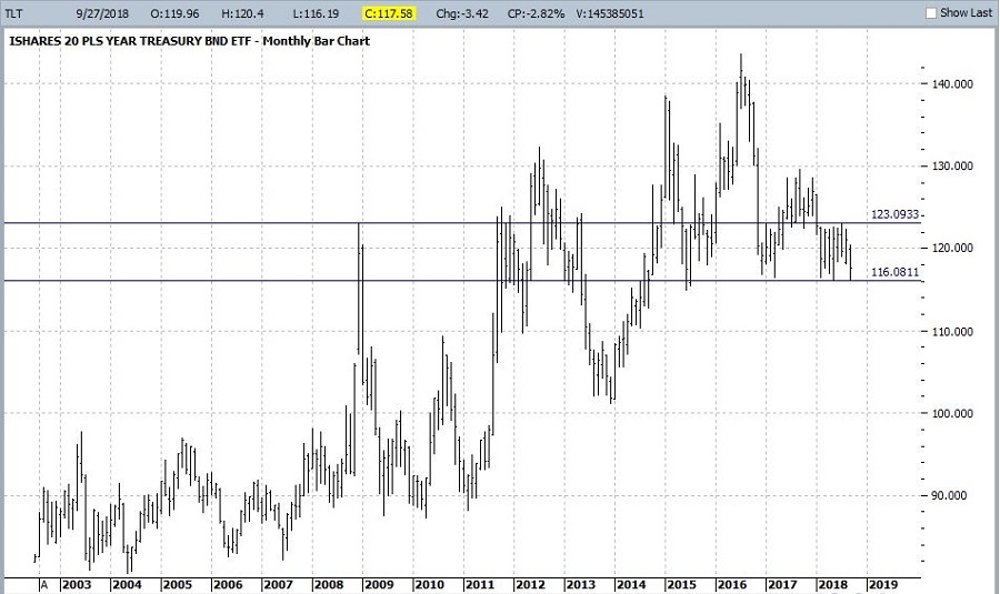
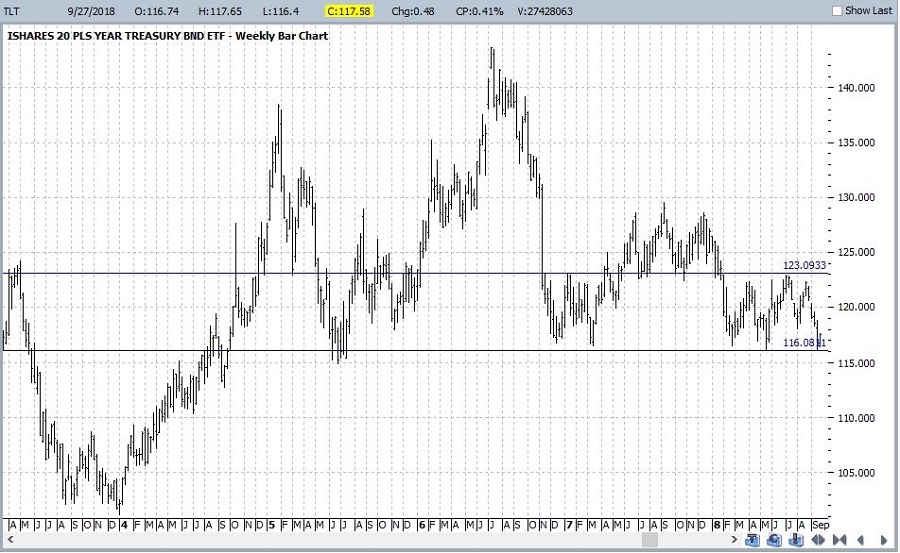
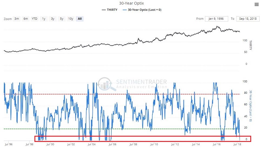
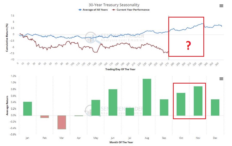
In many ways the markets imitate life.  For example, the trend is your friend.  You may enjoy your friendship with the trend for an indefinite length of time.  But the moment you ignore it – or just simply take it for granted that this friendship is permanent, with no additional effort required on your part – that’s when the trouble starts.

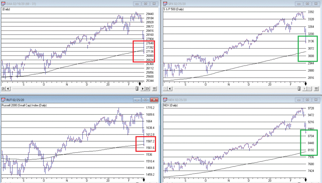
For the stock market right now, the bullish trend is our friend.  Figure 1 displays the 4 major indexes all above their respective – and rising – long-term moving averages.  This is essentially the definition of a “bull market.” 

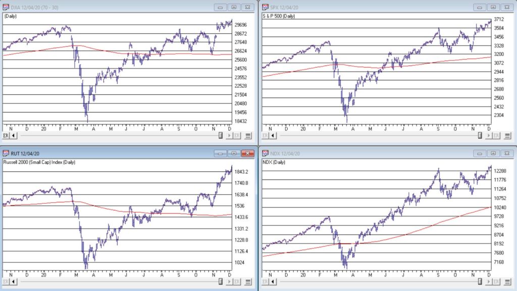
Figure 1 – 4 Major Indexes in Bullish Trends (Courtesy AIQ TradingExpert)

In addition, a number of indicators that I follow have given bullish signals in the last 1 to 8 months.  These often remain bullish for up to a year.  So, for the record, with my trusted trend-following, oversold/thrust and seasonal indicators mostly all bullish I really have no choice but to be in the bullish camp.

Not that I am complaining mind you.  But like everyone else, I try to keep my eyes open for potential signs of trouble.  And of course, there are always some.  One of the keys to long-term success in the stock market is determining when is the proper time to actually pay attention to the “scary stuff.”  Because scary stuff can be way early or in other cases can turn out to be not that scary at all when you look a little closer. 

So, let’s take a closer look at some of the scary stuff.

Valuations

Figure 2 displays an aggregate model of four separate measures of valuation.  The intent is to gain some perspective as to whether stocks are overvalued, undervalued or somewhere in between.

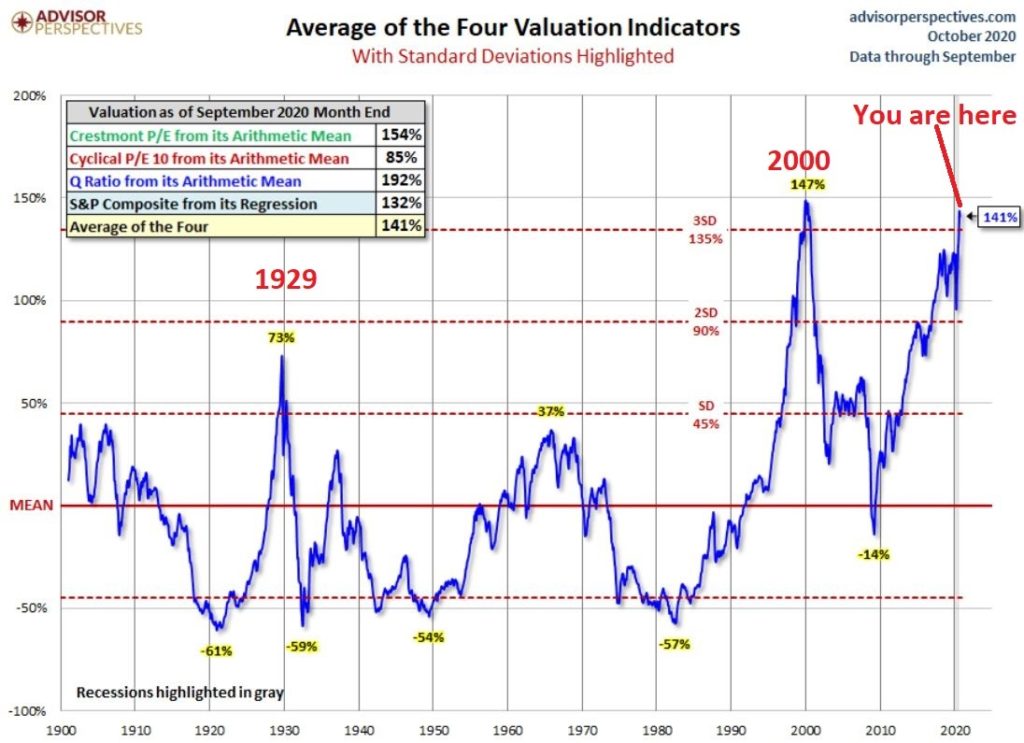
Figure 2 – Stock Market valuation at 2nd highest level ever (Courtesy: www.advisorperspectives.com)

Clearly the stock market is “overvalued” if looked at from a historical perspective.  The only two higher readings preceded the tops in 1929 (the Dow subsequently lost -89% of its value during the Great Depression) and 2000 (the Nasdaq 100 subsequently lost -83% of its value). 

Does this one matter?  Absolutely.  But here is what you need to know:

*Valuation IS NOT a timing indicator.  Since breaking out to a new high in 1995 the stock market has spent most of the past 25 years in “overvalued” territory.  During this time the Dow Industrials have increased 700%.  So, the proper response at the first sign of overvaluation should NOT be “SELL.”

*However, ultimately valuation DOES matter. 

Which leads directly to:

Jay’s Trading Maxim #44: If you are walking down the street and you trip and fall that’s one thing.  If you are climbing a mountain and you trip and fall that is something else.  And if you are gazing at the stars and don’t even realize that you are climbing a mountain and trip and fall – the only applicable phrase is “Look Out Below”.

So, the proper response is this: instead of walking along and staring at the stars, keep a close eye on the terrain directly in front of you.  And watch out for cliffs.

Top 5 companies as a % of S&P 500 Index

At times through history certain stocks or groups of stocks catch “lightning in a bottle.”  And when they do the advances are spectacular, enriching anyone who gets on board – unless they happen to get on board too late.  Figure 3 displays the percentage of the S&P 500 Index market capitalization made up by JUST the 5 largest cap companies in the index at any given point in time. 

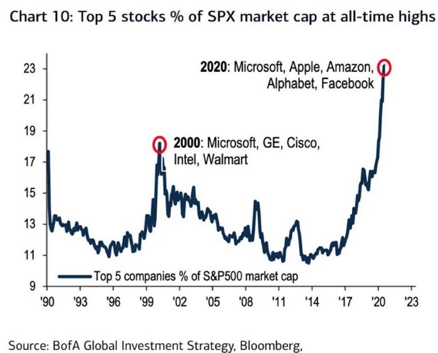
Figure 3 – Top 5 stocks as a % of S&P 500 Index market cap (Courtesy: www.Bloomberg.com)

The anecdotal suggestion is pretty obvious.  Following the market peak in 2000, the five stocks listed each took a pretty significant whack as shown in Figure 4.

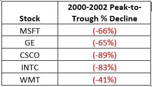
Figure 4 – Top Stocks after the 2000 Peak

Then when we look at how far the line in Figure 3 has soared in 2020 the obvious inference is that the 5 stocks listed for 2020 are due to take a similar hit.  And here is where it gets interesting.  Are MSFT, AAPL, AMZN, GOOGL and FB due to lose a significant portion of their value in the years directly ahead?

Two thoughts:

*There is no way to know for sure until it happens

*That being said, my own personal option is “yes, of course they are”

But here is where the rubber meets the road: Am I presently playing the bearish side of these stocks?  Nope.  The trend is still bullish.  Conversely, am I keeping a close eye and am I willing to play the bearish side of these stocks?  Yup.  But not until they – and the overall market – actually starts showing some actual cracks.

One Perspective on AAPL

Apple has been a dominant company for many years, since its inception really.  Will it continue to be?  I certainly would not bet against the ability of the company to innovate and grow its earnings and sales in the years ahead. Still timing – as they say – is everything.  For what it is worth, Figure 5 displays the price-to-book value ratio for AAPL since January 1990.

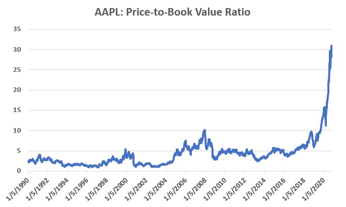
Figure 5 – AAPL price-to-book value ratio (Data courtesy of Sentimentrader.com)

Anything jump out at you?

Now one can argue pretty compellingly that price-to-book value is not the way to value a leading technology company.  And I probably agree – to a point.  But I can’t help but look at Figure 5 and wonder if that point has possibly been exceeded.

Summary

Nothing in this piece is meant to make you “bearish” or feel compelled to sell stocks.  For the record, I am still in the bullish camp.  But while this information DOES NOT constitute a “call to action”, IT DOES constitute a “call to pay close attention.” 

Bottom line: enjoy the bull market but DO NOT fall in love with it. 

Jay Kaeppel

Disclaimer: The information, opinions and ideas expressed herein are for informational and educational purposes only and are based on research conducted and presented solely by the author.  The information presented represents the views of the author only and does not constitute a complete description of any investment service.  In addition, nothing presented herein should be construed as investment advice, as an advertisement or offering of investment advisory services, or as an offer to sell or a solicitation to buy any security.  The data presented herein were obtained from various third-party sources.  While the data is believed to be reliable, no representation is made as to, and no responsibility, warranty or liability is accepted for the accuracy or completeness of such information.  International investments are subject to additional risks such as currency fluctuations, political instability and the potential for illiquid markets.  Past performance is no guarantee of future results.  There is risk of loss in all trading.  Back tested performance does not represent actual performance and should not be interpreted as an indication of such performance.  Also, back tested performance results have certain inherent limitations and differs from actual performance because it is achieved with the benefit of hindsight.

The Ridiculous Seasonality of AMD

Don’t you hate it when some analyst analyzes historical data and then purports to find some “order” in the historical chaos?  Hi, my name is Jay.  And…it’s just kind of what I do.  Sorry, it’s just my nature.  Take for instance the ridiculous case of AMD.

Advanced Micro Devices – Ticker AMD

According to “Adjusted Close” price data from www.finance.yahoo.com ticker AMD advanced from $3.15 a share in March of 1980 to $56.39 by May 20, 2020.  Given that the stock has risen +1,693% on a buy-and-hold basis, it is not exactly a revelation that – particularly with the huge benefit of perfect hindsight – there was some money to be made by holding the stock.

But that is only part of the story.  For as it turns out, AMD is one of the most consistently “cyclical” stocks you may ever find.  Figure 1 displays the average annual price trend for AMD from 3/17/1980 through 12/31/1999.  In other words, period 1 along the bottom of the chart is January Trading Day #1, and so on, through the last trading day of December.

Figure 1 – Annual Seasonal Price Trend for AMD (1980-1999)

As you can see, the stock tended to rally sharply through the end of May, from mid-July through about late August, and from late October through the end of the year (or more accurately, through the end of the next May).

Declines typically occurred between about June 1st and late July and again during September into late October.

Ah, sweet hindsight.

But what are the odds that any of this was meaningful after 1999?  I’m glad you asked.  Because that’s where the ridiculous part comes in. 

2000-2020

Figure 2 plots the same 1980-1999 annual seasonal price trend for AMD along with the annual seasonal trend for AMD from 2000-2019.  Notice any similarities? 

Figure 2 – Annual Seasonal Price Trend for AMD; 1980-1999 and 2000-2020

So, let’s make the ridiculous (there’s that word again) assumption that some (lucky) investor had started trading in and out of AMD on an annual basis the following seasonal calendar

Figure 3 – Annual Seasonal Bullish and Bearish Periods

Some how did the “walk forward” period of 2000 into late May-2020 compare to the “hindsight” period of 1980-1999?  Well there is good news and bad news.

The bad news is that results for each period was not quite as good during 2000-2020 as they were during 1980-1999.  The good news is that the 2000-2020 results were still pretty darn compelling.

Figure 4 – AMD performance during Bullish and Bearish Periods

The bottom line: The “bullish” periods have to continued to be quite bullish and the “bearish” periods continue to be quite bearish.

For the record, between March 1980 and May 2020:

*$1,000 in AMD on a buy-and-hold basis grew to $17,925

*$1,000 in AMD ONLY during the two “bullish” period discussed grew to $587,558,351

Let’s face it, these are – here I go again – ridiculous numbers.  And it should be pointed out that an investor holding AMD only during the “Bullish” periods would have suffered 4 separate drawdowns in excess of -50%, including a -79%(!) drawdown in 2008-2009.  See Figure 5.  So, don’t anybody get “stars in their eyes.”

Figure 5 – Drawdowns during Bullish Periods

At the same time, it is still better than the drawdown racked up during the “bearish” periods, which checks in at a cool -99.9867%.  See Figure 6.

Figure 6 – Drawdowns during Bearish Periods

Where We Are

AMD has been in a “bullish” period since the 19th trading day of October 2019, and this period will last until the close on 5/29/2020.  Through 5/20/2020 AMD is up +73% during the current bullish period (i.e., pandemic, schmandemic).  See Figure 7.

Figure 7 – AMD during recent “Bullish” period (Courtesy AIQ TradingExpert)

The next “bearish” period will last from the close on 5/29/2020 through the close on 7/23/2020.

Summary

So, in hindsight, the annual seasonal pattern for AMD tracked very closely with the annual seasonal pattern for the previous 20 years.  But what about the next 20 years?  Ah, there’s the rub. Despite the fact that the annual seasonal trend for the past 20 years very closely mirrored the annual seasonal trend for the prior 20 years, it is not possible to state with any certainty what the next 20 years hold. 

Still, if I decide to trade AMD I will probably consult my calendar first.

See also Jay’s “A Strategy You Probably Haven’t Considered” Video

Jay Kaeppel

Disclaimer: The information, opinions and ideas expressed herein are for informational and educational purposes only and are based on research conducted and presented solely by the author.  The information presented represents the views of the author only and does not constitute a complete description of any investment service.  In addition, nothing presented herein should be construed as investment advice, as an advertisement or offering of investment advisory services, or as an offer to sell or a solicitation to buy any security.  The data presented herein were obtained from various third-party sources.  While the data is believed to be reliable, no representation is made as to, and no responsibility, warranty or liability is accepted for the accuracy or completeness of such information.  International investments are subject to additional risks such as currency fluctuations, political instability and the potential for illiquid markets.  Past performance is no guarantee of future results.  There is risk of loss in all trading.  Back tested performance does not represent actual performance and should not be interpreted as an indication of such performance.  Also, back tested performance results have certain inherent limitations and differs from actual performance because it is achieved with the benefit of hindsight.

March and April to the Rescue?

Well that got ugly quick.  For the record, if you have been in the markets for any length of time you have seen this kind of action plenty of times.  An index, or stock, or commodity or whatever, trends and trends and trend steadily and relentlessly higher over a period of time.  And just when it seems like its going to last forever – BAM.  It gives back all or much of its recent rally gains very quickly.  Welcome to the exciting world of investing.

I make no claims of “calling the top” – because I never have actually (correctly) called one and I don’t expect that I ever will.  But having written Part I and Part II of articles titled “Please Take a Moment to Locate the Nearest Exit” in the last week, I was probably one of the least surprised people at what transpired in the stock market in the last few sessions. 

Of course the question on everyone’s lips – as always in this type of panic or near panic situation – is, “where to from here?”  And folks if I knew the answer, I swear I would tell you.  But like everyone else, I can only assess the situation, formulate a plan of action – or inaction, as the case may be – and act accordingly.  But some random thoughts:

*Long periods of relative calm followed by extreme drops are more often than not followed by periods of volatility.  So, look for a sharp rebound for at least a few days followed by another downdraft and so on and so forth, until either:

a) The market bottoms out and resumes an uptrend

b) The major indexes (think Dow, S&P 500, Nasdaq 100, Russell 2000) drop below their 200-day moving averages.  As of the close on 2/25 both the Dow and the Russell 2000 were below their 200-day moving average.  That would set up another a) or b) scenario.

If the major indexes break below their long-term moving averages it will either:

a) End up being a whipsaw – i.e., the market reverses quickly to the upside

b) Or will be a sign of more serious trouble

The main point is that you should be paying close attention in the days and weeks ahead to the indexes in Figure 1.

Figure 1 – Major indexes with 200-day moving averages (Courtesy AIQ TradingExpert)

One Possible Bullish Hope

One reason for potential optimism is that the two-month period of March and April has historically been one of the more favorable two-month periods on an annual basis.  Figure 2 displays the cumulative price gain achieved by the S&P 500 Index ONLY during March and April every year since 1945.  The long-term trend is unmistakable, but year-to-year results can of course, vary greatly.

Figure 2 – S&P 500 cumulative price gain March-April ONLY (1945-2019)

For the record:

S&P 500 March-AprilResult
Number of times UP55 (73%)
Number of times DOWN20 (27%)
Average UP%+5.0%
Average DOWN%(-3.4%)

Figure 3 – Facts and Figures

Will March and April bail us out?  Here’s hoping.

As an aside, this strategy is having a great week so far.

Jay Kaeppel

Disclaimer: The information, opinions and ideas expressed herein are for informational and educational purposes only and are based on research conducted and presented solely by the author.  The information presented does not represent the views of the author only and does not constitute a complete description of any investment service.  In addition, nothing presented herein should be construed as investment advice, as an advertisement or offering of investment advisory services, or as an offer to sell or a solicitation to buy any security.  The data presented herein were obtained from various third-party sources.  While the data is believed to be reliable, no representation is made as to, and no responsibility, warranty or liability is accepted for the accuracy or completeness of such information.  International investments are subject to additional risks such as currency fluctuations, political instability and the potential for illiquid markets.  Past performance is no guarantee of future results.  There is risk of loss in all trading.  Back tested performance does not represent actual performance and should not be interpreted as an indication of such performance.  Also, back tested performance results have certain inherent limitations and differs from actual performance because it is achieved with the benefit of hindsight.

A Simple Way To Trade Seasonality


In “A Simple Way To Trade Seasonality” in the September 2019 Stocks & Commodities, author Perry Kaufman describes methods he uses for measuring the seasonality in markets and approaches he uses for trading these patterns

Editors note: The full article can be obtained from Stocks & Commodities magazine at
http://technical.traders.com/sub/sublog2.asp#Sep the system rules are from the article and are based on these rules

1. Average the monthly frequency of the past 4 years.

2. Find the last occurrence of the highest frequency and the last occurrence of the lowest frequency using the average frequency in step 1. That is, if both March and April have a frequency of 70, we use April.

3. Only trade if the high frequency is 75% or greater and the low frequency is 25% or lower.

4. If the high frequency comes first, sell short at the end of the month with the high frequency. Cover the short at the end of the month with the low frequency.

5. If the low frequency comes first, buy at the end of the month with the low frequency. Sell to exit at the end of the month with the high frequency

The importable AIQ EDS file and Excel spreadsheet for Perry Kaufman’s article can be obtained on request via email to info@TradersEdgeSystems.com. The code is also shown below

!A Simple Way to Trade Seasonality
!Author: Perry Kaufman, TASC September 2019
!Coded by: Richard Denning, 07/21/2019
!www.TradersEdgeSystem.com

C is [close].
year is 2019.
len is 4000.
OSD is offsettodate(month(),day(),year()).
FirstDate is firstdatadate().

EOM1 if Month()=2 and valresult(month(),1)=1 and year()=year.
EOMos1 is scanany(EOM1,len) then OSD+1.
EOMc1 is valresult(C,^EOMos1).
EOM2 if Month()=3 and valresult(month(),1)=2 and year()=year.
EOMos2 is scanany(EOM2,len) then OSD+1.
EOMc2 is valresult(C,^EOMos2).
EOM3 if Month()=4 and valresult(month(),1)=3 and year()=year.
EOMos3 is scanany(EOM3,len) then OSD+1.
EOMc3 is valresult(C,^EOMos3).
EOM4 if Month()=5 and valresult(month(),1)=4 and year()=year.
EOMos4 is scanany(EOM4,len) then OSD+1.
EOMc4 is valresult(C,^EOMos4).
EOM5 if Month()=6 and valresult(month(),1)=5 and year()=year.
EOMos5 is scanany(EOM5,len) then OSD+1.
EOMc5 is valresult(C,^EOMos5).
EOM6 if Month()=7 and valresult(month(),1)=6 and year()=year.
EOMos6 is scanany(EOM6,len) then OSD+1.
EOMc6 is valresult(C,^EOMos6).
EOM7 if Month()=8 and valresult(month(),1)=7 and year()=year.
EOMos7 is scanany(EOM7,len) then OSD+1.
EOMc7 is valresult(C,^EOMos7).
EOM8 if Month()=9 and valresult(month(),1)=8 and year()=year.
EOMos8 is scanany(EOM8,len) then OSD+1.
EOMc8 is valresult(C,^EOMos8).
EOM9 if Month()=10 and valresult(month(),1)=9 and year()=year.
EOMos9 is scanany(EOM9,len) then OSD+1.
EOMc9 is valresult(C,^EOMos9).
EOM10 if Month()=11 and valresult(month(),1)=10 and year()=year.
EOMos10 is scanany(EOM10,len) then OSD+1.
EOMc10 is valresult(C,^EOMos10).
EOM11 if Month()=12 and valresult(month(),1)=11 and year()=year.
EOMos11 is scanany(EOM11,len) then OSD+1.
EOMc11 is valresult(C,^EOMos11).
EOM12 if Month()=1 and valresult(month(),1)=12 and valresult(year(),1)=year.
EOMos12 is scanany(EOM12,len) then OSD+1.
EOMc12 is valresult(C,^EOMos12).
YEARavg is (EOMc1+EOMc2+EOMc3+EOMc4+EOMc5+EOMc6+EOMc7+EOMc8+EOMc9+EOMc10+EOMc11+EOMc12)/12.

AR1 is (EOMc1 / YEARavg-1)*100.
AR2 is (EOMc2 / YEARavg-1)*100.
AR3 is (EOMc3 / YEARavg-1)*100.
AR4 is (EOMc4 / YEARavg-1)*100.
AR5 is (EOMc5 / YEARavg-1)*100.
AR6 is (EOMc6 / YEARavg-1)*100.
AR7 is (EOMc7 / YEARavg-1)*100.
AR8 is (EOMc8 / YEARavg-1)*100.
AR9 is (EOMc9 / YEARavg-1)*100.
AR10 is (EOMc10 / YEARavg-1)*100.
AR11 is (EOMc11 / YEARavg-1)*100.
AR12 is (EOMc12 / YEARavg-1)*100.

EOMc if firstdate < makedate(1,20,2019-20).
AR if EOMc.

The EDS code is not a trading system but a way to get the data needed into an Excel spreadsheet to enable you to make the seasonal calculations. The EDS file should be run on a date after the end of the year being calculated. Each year for which data is needed must be run separately by setting the “year” variable. Multiple symbols can be run at the same time by using a list of the desired symbols. Each time a year is run, the “AR” report must be saved as a “.csv” file. Once all the years needed have been run and saved to separate “.csv” files, they all should be cut and pasted to a single Excel sheet. They then can be sorted by symbol and each symbol can be copied and pasted to a tab for that symbol.

Figure 6 shows the rolling four-year frequency for the S&P 500 ETF (SPY) and Figure 7 shows the annual trades resulting from applying the seasonal rules to the frequency data.

Sample Chart

FIGURE 6: AIQ. Shown here is the rolling four-year frequency for the SPY.

Sample Chart

FIGURE 7: AIQ. Shown here are the annual trades resulting from applying the seasonal rules to the frequency data for SPY.

—Richard Denning
info@TradersEdgeSystems.com
for AIQ Systems

The (Potential) Bullish Case for Bonds

OK, first the bad news.  In terms of the long-term, we are probably in the midst of a rising interest rate environment.  Consider the information contained in Figure 1 from McClellan Financial Publications.

(click to enlarge)0a

Figure 1 – The 60-year cycle in interest rates (Courtesy: www.mscoscillator.com)

Though no cycle is ever perfect, it is only logical to look at Figure 1 and come away thinking that rates will rise in the years (and possibly decades) ahead.  And one should plan accordingly, i.e.:

*Eschew large holdings of long-term bonds. Remember that a bond with a “duration” -Google that term as it relates to bonds please – of 15 implies that if interest rates rise 1 full percentage point then that bond will lose roughly 15% of principal.  Ouch.

*Stick to short to intermediate term bonds (which will reinvest at higher rates more quickly than long-term bonds as rates rise) and possibly some exposure to floating rate bonds.

That is “The Big Picture”.

In the meantime, there is a potential bullish case to be for bonds in the shorter-term.  The “quick and dirty” guide to “where are bonds headed next” appears in the monthly and weekly charts of ticker TLT (iShares 20+ years treasury bond ETF).  Note the key support and resistance levels drawn on these charts.

(click to enlarge)1

Figure 2 – Monthly TLT with support and resistance (Courtesy ProfitSource by HUBB)

(click to enlarge)2

Figure 3 – Weekly TLT with support and resistance (Courtesy ProfitSource by HUBB)

There is nothing magic about these lines, but a break above resistance suggests a bull move, a break below support suggests a bear move, and anything in between suggests a trading range affair.

Now let’s look at some potentially positive influences.  Figure 4 displays a screen from the excellent site www.sentimentrader.com that shows that sentiment regarding the long treasury bond is rock bottom low.  As a contrarian sign this is typically considered to be bullish.

(click to enlarge)3

Figure 4 – 30-year treasury investor sentiment is extremely low (Courtesy Sentimentrader.com)

Figure 5 – also from www.sentimentrader.com – suggests that bonds may be entering a “bullish” seasonal period between now and at least late-November (and possibly as long as late January 2019).

(click to enlarge)4

Figure 5 – 30-year treasury seasonality (Courtesy Sentimentrader.com)

Figure 6 displays the 30-year treasury bond yield (multiplied by 10 for some reason).  While rates have risen 27% from the low (from 2.51% to 3.18%), they still remain below the long-term 120-month exponential moving average.

(click to enlarge)5

Figure 6 – Long-term treasury bond yields versus 120-month moving average (Courtesy AIQ TradingExpert)

Finally, two systems that I developed that deems the bond trend bullish or bearish based on the movements of 1) metals, and 2) Japanese stocks turned bullish recently.  The bond market has fallen since these bullish signal were flashed – possibly as a result of the anticipated rate hike from the Fed.  Now that that hike is out of the way we should keep a close eye on bonds for a potential advance in the months ahead.

(click to enlarge)6a

Figure 7 – Bonds tend to move inversely to Japanese stocks; Ticker EWJ 5-week average is below 30-week average, i.e., potentially bullish for bonds (Courtesy AIQ TradingExpert)

Summary

It’s a little confusing here.

a)  The “long-term” outlook for bonds is very “iffy”, so bond “investors” should continue to be cautious – as detailed above.

b) On the other hand, there appears to be a chance that bonds are setting up for a rally in the near-term.

c) But, in one final twist, remember that if TLT takes out its recent support level, all bullish bets are off.

Are we having fun yet?

Jay Kaeppel

Disclaimer:  The data presented herein were obtained from various third-party sources.  While I believe the data to be reliable, no representation is made as to, and no responsibility, warranty or liability is accepted for the accuracy or completeness of such information.  The information, opinions and ideas expressed herein are for informational and educational purposes only and do not constitute and should not be construed as investment advice, an advertisement or offering of investment advisory services, or an offer to sell or a solicitation to buy any security.

Summer Fun with Biotech and Real Estate

Studies suggest that buying an upside breakout can be a good strategy.  It sure can be scary though.  There is always that underlying fear of looking like “the last fool in” if the security in question experiences only a false breakout and then reverses back to the downside (and I hate it when that happens).  Still, for a stock to go from $50 to $100 it first has to go to $50.01, then $50.02, etc.
Buying into an impending breakout can be an even dicier proposition since this involves buying into what is essentially a “topping formation.”  I recently wrote about consolidation patterns in biotech and real estate.  These sectors appear to be getting closer to a resolution.  Consider tickers XBI (biotech ETF) and IYR (real estate ETF) as shown in Figure 1.
1Figure 1 – Biotech and Real Estate (Courtesy AIQ TradingExpert)
XBI appears to be breaking out to the upside – at least for now.  IYR is close to breaking out – however, one could look at it in an exactly opposite manner and claim that it is “running into resistance near the old highs and therefore may be forming a top.”
Ah, the eye of the beholder.
A Seasonal Play in Biotech and Real Estate
It is pretty widely known at this point that the summer months tend not to be very favorable for the stock market overall (although July of this year might be an exception to the rule).  But biotech and real estate often provide a summer trading opportunity.
The seasonally favorable period extends from:
*The close on June trading day #17 (6/23/2017 this year)
*Through the close on July trading day #21 (7/31/2017 this year)
Figure 2 displays the growth of $1,000 split evenly between ticker FBIOX (Fidelity Select Biotech) and ticker FRESX (Fidleity Select Real Estate) every since 1989 during this period.
2Figure 2 – Growth of $1,000 split between FBIOX and FRESX during seasonally favorable summer period (1989-2016)
Figure 3 displays a summary of the results since 1989.
Measure Result
# Years UP 22 (79%)
# Years DOWN 6 (21%)
Average All Years +3.3%
Average UP Year +5.0%
Average DOWN Year (-2.9%)
Best UP Year +14.9% (2009)
Worst DOWN Year (-4.3%) (2004)
Figure 3 – Summary Results
One thing to  note is the lack of downside volatility despite the fact that both biotech and real estate can be quite volatile (worst down period was -4.3% in 2004).
Year-by-Year Results Appear in Figure 4.  For comparisons sake the annual performance for the Dow Jones Industrials Average (DJIA) during the same period is included.
  Year        FBIOX/FRESX    DJIA    Diff
1989 4.8 5.1 (0.3)
1990 2.8 2.1 0.7
1991 5.8 3.6 2.2
1992 7.0 3.2 3.7
1993 0.8 2.1 (1.3)
1994 (0.6) 1.8 (2.4)
1995 3.5 2.7 0.8
1996 (4.1) (4.1) 0.1
1997 2.9 6.4 (3.5)
1998 1.8 2.2 (0.5)
1999 4.4 (0.1) 4.5
2000 0.3 1.1 (0.8)
2001 (3.6) 0.1 (3.8)
2002 (1.5) (4.9) 3.4
2003 8.0 1.0 7.0
2004 (4.3) (2.9) (1.4)
2005 9.6 2.1 7.5
2006 4.0 1.8 2.2
2007 (3.2) (1.0) (2.1)
2008 6.7 (1.9) 8.6
2009 14.9 10.0 4.9
2010 2.0 1.6 0.4
2011 3.0 0.8 2.2
2012 5.7 4.0 1.7
2013 12.6 5.2 7.5
2014 1.1 0.4 0.7
2015 0.6 (2.2) 2.8
2016 8.6 2.3 6.2
Figure 4 – Annual Results for FBBIOX/FRESX during seasonally favorable  summer period versus Dow Jones Industrials Average
For the record,during the seasonally favorable summer period:
*The FBIOX/FRESX combo has outperformed the Dow in 19 out of 28 years.
*$1,000 invested in FBIOX/FRESX grew to $2,440
*$1,000 invested in the Dow Industrials grew to $1,505
Summary
So is biotech and real estate the place to be in the month ahead?  Well, that’s “the thing” about seasonal trends – there’s no way to know for sure what it’s going to be “this time around.”
On a cautionary note, it should be pointed out that the FBIOX/FRESX combo has registered a gain during the seasonal summer period – and outperformed the Dow – in each of the last 9 nine years.
So is it “Away We Go” or this the year that “Murphy’s Law” exacts its revenge?  As always, time will tell.
Jay Kaeppel  Chief Market Analyst at JayOnTheMarkets.com and AIQ TradingExpert Pro (http://www.aiqeducation.com) client. 
Disclaimer:  The data presented herein were obtained from various third-party sources.  While I believe the data to be reliable, no representation is made as to, and no responsibility, warranty or liability is accepted for the accuracy or completeness of such information.  The information, opinions and ideas expressed herein are for informational and educational purposes only and do not constitute and should not be construed as investment advice, an advertisement or offering of investment advisory services, or an offer to sell or a solicitation to buy any security.

One Good Reason NOT to Pick a Bottom in DIS

A better title for this article might be “How to Avoid Losing 98% in Disney.”
The recent dip in the price of Disney stock may ultimately prove to be a buying opportunity.  But for reasons detailed below I am going to let this one pass.
If you have read my stuff in the past you know that I look a lot at seasonal trends.  This is especially true for sectors and commodities – which in some cases can be tied to recurring fundamental factors.  I have occasionally looked at individual stocks (here and here and here), but tend to think that an individual company’s fundamentals can change so drastically over time that a persistent seasonal trend is less likely.
It appears that there are exceptions to every rule.
In Figure 1 below we see that after a strong run up from its 2009 low, Disney finally topped out in August of 2015. Since that time it’s been a string of large moves up and down – with the latest being down. This might prompt one to consider the latest dip as a buying opportunity.  And in fact, maybe it is. But I won’t be making that play myself based simply on a seasonal trend in DIS stock that was highlighted by Brooke Thackray in his book Thackray’s 2017 Investor’s Guide.
0Figure 1 – Is latest dip in DIS a buying opportunity?  Maybe, but history suggests we look elsewhere….(Courtesy AIQ TradingExpert)
When NOT to Own Disney Stock
In his book, Thackray highlights the period from June 5th through the end of September as an “unfavorable” period for DIS stock.  He also listed a specific “favorable” period that I’ll not mention here.  For purposes of this article I made the following changes:
*The “unfavorable” period begins at the close on the 5th trading day of June and ends at the close on the last trading day of September.
*The rest of the year – i.e., end of September until the close on the 5th trading day of June – is considered the “favorable” period.
Also, the test uses price data only.  No dividends are included nor is any interest assumed to be earned while out of DIS stock.
The results are fairly striking.  From the end of 1971 through the end of 2016:
*$1,000 invested in DIS on a buy-and-hold basis grew +8,042% to $81,422 (average annual +/- = +15.8%)
*$1,000 invested in DIS only during the “favorable” period grew +430,874% to $4,309,735 (average annual +/- = +25.0%)
*$1,000 invested in DIS only during the “unfavorable” period declined -98% to $18.89 (average annual +/- = (-6.9%))
It’s sort of hard to ignore the difference between +430,784% and -98%.
Figure 1 displays the cumulative performance during the unfavorable period from 1971 through 2016.
1
Figure 1 – Growth of $1,000 invested in DIS only from close of June Trading Day #5 through the end of September (1971-2016)
Figure 2 displays the growth of $1,000 during the favorable period (blue line) versus a buy-and-hold approach (red line).
2
Figure 2 – Growth of $1,000 invested in DIS only from the end of September through June Trading Day #5 (blue) versus Buy-and-Hold (red); 1971-2016
*The favorable period showed a net gain in 39 out of 45 years (87%)
*The unfavorable period showed a net gain in only 13 out of 45 years (29%)
*Buy-and-hold showed a net gain in 28 out of 45 years (62%)
Figure 3 displays year-by-year results.
Year Favorable Unfavorable Buy/Hold
1972 78.1 (3.5) 71.9
1973 (53.5) (12.0) (59.1)
1974 4.4 (56.4) (54.4)
1975 175.6 (12.4) 141.5
1976 5.2 (6.9) (2.0)
1977 (28.2) 19.1 (14.4)
1978 4.6 (3.3) 1.2
1979 1.2 10.5 11.9
1980 20.8 (5.8) 13.8
1981 42.8 (28.7) 1.9
1982 16.0 4.4 21.1
1983 (5.7) (11.6) (16.7)
1984 25.6 (9.6) 13.6
1985 94.4 (3.3) 88.0
1986 98.3 (23.0) 52.8
1987 14.6 20.1 37.6
1988 4.2 6.5 10.9
1989 32.7 28.3 70.3
1990 28.4 (29.4) (9.3)
1991 14.4 (1.5) 12.8
1992 51.3 (0.7) 50.2
1993 16.0 (14.5) (0.8)
1994 23.2 (12.4) 7.9
1995 27.7 0.3 28.0
1996 18.4 0.0 18.4
1997 43.3 (0.9) 41.9
1998 36.9 (33.6) (9.1)
1999 15.8 (15.8) (2.5)
2000 4.0 (4.8) (1.1)
2001 23.6 (42.1) (28.4)
2002 12.6 (30.1) (21.3)
2003 50.9 (5.2) 43.0
2004 28.9 (7.6) 19.2
2005 (2.5) (11.6) (13.8)
2006 41.8 0.8 43.0
2007 (6.2) 0.4 (5.8)
2008 (24.4) (7.0) (29.7)
2009 29.1 10.1 42.1
2010 16.1 0.2 16.3
2011 30.4 (23.4) (0.0)
2012 15.9 14.6 32.8
2013 54.3 (0.6) 53.4
2014 17.2 5.2 23.3
2015 20.4 (7.3) 11.6
2016 5.0 (5.6) (0.8)
2017 ? ? ?
# Years UP 39 13 28
# Years DOWN 6 32 17
Average % +/- 25.0 (6.9) 15.8
Figure 3 – Year-by-Year Results
Summary
Brooke Thackray found an extremely interesting and robust “unfavorable” seasonal trend in DIS stock.  Of course none of the data above guarantees that DIS stock is doomed to languish and/or decline in the months ahead.  But I for one do not intend to “buck the odds” and play the long side of DIS for a while.
Jay Kaeppel  Chief Market Analyst at JayOnTheMarkets.com and AIQ TradingExpert Pro http://www.aiqsystems.com) client. 
Disclaimer:  The data presented herein were obtained from various third-party sources.  While I believe the data to be reliable, no representation is made as to, and no responsibility, warranty or liability is accepted for the accuracy or completeness of such information.  The information, opinions and ideas expressed herein are for informational and educational purposes only and do not constitute and should not be construed as investment advice, an advertisement or offering of investment advisory services, or an offer to sell or a solicitation to buy any security.

With Retailers, it’s ‘When’ Not ‘What’

I’ve been seeing a number of panicked missives lately regarding the retailing sector.  They typically go something like this:
“Despite new highs for most of the major market indexes, the retailing sector has been struggling – and in some cases hit hard – therefore it is clearly (paraphrasing here) THE END OF THE WORLD AS WE KNOW IT, AHHHHHHHHHHHHH……………………..”
Or something along those lines.  And the truth is that they may be right.  But as it turns out, with the retailing sector it is typically more a question of “when” and not “what” (or even WTF
Recent Results
The concerns alluded to above are understandable given recent results in certain segments of the retailing sector. Figure 1 displays the stock price action for four major retailers.  It isn’t pretty.
(click to enlarge)
1
Figure 1 – Major retailers taking a hit (Chart courtesy AIQ TradingExpert)
So if major retailers are performing poorly one can certainly see why someone might extrapolate this to conclude that the economy is not firing on all cylinders and that the recent rally to new highs by the major averages is just a mirage.  And again, that opinion may ultimately prove to be correct this time around.
But before swearing off of retailing stocks, consider the following.
Retailers – When not What
For our test we will use monthly total return data for the Fidelity Select Retailing sector fund (ticker FSRPX).  Figure 2 displays the growth of $1,000 invested in FSRPX only during the months of:
*February, March, April, May, November, December
2
Figure 2 – Growth of $1,000 invested in ticker FSRPX only during the “favorable” months since 1986
For the record:
*An initial $1,000 grew to $50,274, or +4,927% (this test does not include any interest earned during the months out of FSRPX).
*# of years showing a net gain = 27
*# of years showing a net loss = 4
*Average UP year = +17.0%
*Average DOWN year = (-3.4%)
*Maximum UP Year = +50.0% (1990)
*Maximum DOWN Year = (-5.9%) (1994)
The Year-by-Year Results appear in Figure 3
Year % +(-)
1986 26.2
1987 15.8
1988 12.2
1989 16.9
1990 50.0
1991 45.5
1992 8.0
1993 4.6
1994 (5.9)
1995 3.0
1996 26.1
1997 18.1
1998 45.7
1999 4.0
2000 1.8
2001 12.5
2002 (0.1)
2003 18.5
2004 11.3
2005 10.3
2006 0.1
2007 (2.8)
2008 (4.7)
2009 44.9
2010 24.5
2011 4.6
2012 10.8
2013 16.6
2014 11.5
2015 6.1
2016 9.2
Figure 3 – Year-by-Year Results for  “Favorable” Months since 1986
The Rest of the Year
If for some reason you had decided to skip the months above and hold FSRPX only during all of the other months of the year, your results appear in Figure 4.4
Figure 4 – Growth of $1,000 invested in ticker FSRPX only during the “unfavorable” months since 1986
For the record:
*An initial $1,000 grew to $1,037, or +3.7% (this test does not include any interest earned during the months out of FSRPX).
Summary
Is the retailing sector guaranteed to generate a gain during our “favorable” months in 2017?  Not at all.  Still, given that retailing is presently beaten down a bit and the fact that the worst full year loss during the favorable months was -5.9%, it may be time to think about taking a look (although – as always, and for the record – I am not “recommending” retailing stocks, only pointing out the historical trends).
Still, as the old saying goes, the results below are what we “quantitative types” refer to as “statistically significant”.
*Favorable months since 1986 = +4,927%
*Unfavorable months since 1986 = +3.7%
 Jay Kaeppel

Chief Market Analyst at JayOnTheMarkets.com and AIQ TradingExpert Pro (http://www.aiqsystems.com) client. http://jayonthemarkets.com/
 

MatchMaking a seasonal Energy play

If you follow jay Kaeppel’s posts in this blog, you’ll know that he’s the master of research on all things seasonal. This past week he posted a seasonal article on energy using FSESX – Fidelity Select Energy Services. Previously he had noted the bullish tendency for ticker FSESX during the months of February, March and April.  In his follow up piece, he added one more “favorable” month and then also looked at a 6-month “unfavorable” period. The article is included at the end of this post so you can see the results.

As Mutual funds are not for everyone, we went in search of alternative tickers that could closely match FSESX in performance characteristics. Using AIQ Matchmaker we compared the price action of FSESX against our universe of stocks and ETFs looking for a match.

Matchmaker uses Spearman Rank Correlation analysis to identify a close match to FSESX. The closer the result to 1000, the higher the correlation. Anything over 950 is a very close match. Here’s the results.
Figure 1. MatchMaker correlation for last 4 years – FSESX vs stocks and ETFs
The ETF IEZ – iShares Oil and Equipment & Services showed a very high correlation over the 4 years we tested. OIH – Oil Service Holders, another ETF, also showed high correlation.
Here’s an AIQ overlay chart of recent daily price action comparing FSESX vs IEZ.
 
Figure 2. Recent daily price action comparing FSESX vs IEZ.
IEZ appears to be a good surrogate for FSESX at least over the last 4 years.
We also wanted a visual of the seasonal pattern in action. Fortunately we have a tool still in development at AIQ that’s just right for this. Basically it provides a price comparison of ‘x’ numbers of years of the same ticker overlaid on each other.
Here’s 3 of the last 4 years on IEZ, the average of the years displayed is in black. We highlighted the Feb, Mar, Apr and Dec in yellow. We could have included more years but for illustration purposes it was easier to show the 3 years (the chart gets busy with too many lines on it!)
 
Figure 3 – IEZ seasonal chart (beta) for 3 years with average.
The Feb, Mar, Apr period has a definite bullish tendency, the Dec period does Ok too. You’ll notice the tendency for IEZ to fall sharply in January. Conclusion? IEZ is a reasonable surrogate for FSESX if you’re contemplating this seasonal move.
_________________________________________________________
The article this follow up is based upon is by Jay Kaeppel and is included below. Jay is Chief Market Analyst at JayOnTheMarkets.com and AIQ TradingExpert Pro client. http://jayonthemarkets.com/

When to Feel ‘Energetic’ (or NOT)

If you are looking for a market sector with some serious seasonal trends, look no further than the energy sector. Previously I had noted the bullish tendency for ticker FSESX during the months of February, March and April.  In this piece, we will add one more “favorable” month and then also look at a 6-month “unfavorable” period.
For the record, the information that follows is not being recommended as a standalone strategy.  It is presented simply to make you aware of certain long-term trends that have been very persistently bullish (or bearish as the case may be) in the energy sector.
4 Favorable Months
*The four “favorable” months for our test are February, March, April and December
Figure 1 displays the growth of $1,000 invested in ticker FSESX only during these four months every year since 1986 versus simply buying-and-holding ticker FSESX.
1
Figure 1 – Growth of $1,000 invested in FSESX only during Feb, Mar, Apr, Dec every year since 1986
Starting in 1986, an initial $1,000 investment grew to $76,019 (or +7,500%) versus $10,237 (or 923%) using a buy-and-hold strategy.
6 Unfavorable Months
The six “Unfavorable” months are June, July, August, September, October and November.
First the “positive” news:
*This 6-month period has managed to show a gain 14 times in 31 years – so by no means should you consider this period a “sure thing” loser
*During 4 separate years – 1997, 2003, 2004 and 2010 – the “unfavorable” months registered a cumulative gain in excess of +30%.
Doesn’t sound all that “unfavorable” so far does it?  But here’s the catch: Despite the occasional 30%or more gain, it is fair to refer to this 6-month period as “unfavorable” as the cumulative long-term results of buying and holding FSESX during these months has been nothing short of devastating.
Figure 2 displays the growth of $1,000 invested in ticker FSESX only between the end of May and the end of November every year starting in 1986.
3
Figure 2 – Growth of $1,000 invested in FSESX only during June through November every year since 1986
Starting in 1986, an initial $1,000 investment declined to just $82, or a cumulative loss of -91.8%
Figure 3 displays some comparative data between favorable and unfavorable periods as well as using a Buy-and-Hold strategy.
Measure Buy-and-Hold 4 Favorable Months 6 Unfavorable Months
Average Annual % +(-) 12.8 16.5 (-4.2)
Median Annual % +(-) 8.7 15.5 (-1.8)
Standard Deviation 33.4 20.1 24.6
# Years UP 18 26 14
# Years DOWN 13 5 17
Worst Year (-55.4) 2008 (-7.6) 1994 (-62.8) 2008
$1,000 becomes $10,237 $76,019 $82
Cumulative % +(-) +923% +7,500% (-92%)
Figure 3 – Comparative Results
Figure 4 displays the year-to-year results for a Buy-and-Hold approach versus holding only during the 4 “favorable” months or the “Unfavorable” 6 months.
Year All 12 months % +(-) 4 Favorable % +(-) 6 Unfavorable % +(-)
1986 (8.9) (5.2) (9.2)
1987 (20.7) 22.9 (40.1)
1988 (4.2) 22.8 (16.3)
1989 50.3 27.1 16.2
1990 8.7 4.9 (11.2)
1991 (19.9) 4.1 (25.0)
1992 4.9 (1.6) (1.3)
1993 16.4 24.5 (10.7)
1994 (0.5) (7.6) 3.1
1995 40.0 33.7 2.0
1996 45.9 22.5 20.8
1997 43.9 (4.9) 32.9
1998 (41.4) 26.5 (50.5)
1999 80.9 74.1 7.5
2000 51.7 77.6 (21.1)
2001 (22.4) 20.8 (32.4)
2002 2.2 26.2 (18.0)
2003 13.1 15.5 (16.0)
2004 26.2 1.2 30.2
2005 47.4 4.8 34.0
2006 (9.1) (4.1) (1.8)
2007 58.3 25.6 16.7
2008 (55.4) 10.5 (62.8)
2009 60.4 24.5 9.6
2010 31.7 21.6 33.7
2011 (18.5) 3.1 (16.8)
2012 (3.9) 0.7 9.6
2013 14.1 0.3 11.5
2014 (19.5) 7.2 (26.7)
2015 (19.7) 2.9 (17.9)
2016 44.2 28.4 20.1
Figure 4 – Yearly % +(-) for Buy-and-Hold versus 4 Favorable Months versus 6 Unfavorable Months
Summary
There is no guarantee from year-to-year results of buying and holding ticker FSESX during the “Favorable 4” months will show a gain and/or outperform the “Unfavorable 6” months. And there is by no means any guarantee that the “Unfavorable 6” will show a loss during any given year (note that 2016 saw the Unfavorable 6 generate a cumulative gain of +20.1%!).  So just remember that we are talking about some very long-term  trends here.
Still, most investors can discern the difference between:
*Favorable 4 months gain = +7,500%
*Unfavorable 6 months loss = (-92%)
This type of difference is what we “quantitative types” refer to as “statistically significant.”

Seasonal Bonds Strategy using TMF

Recently Jay Kaeppel of Jay On The Markets posted an update on the Seasonal Bonds Strategy using TMF. The gist of the strategy is straightforward,  “Long TMF on the last 5 day of each month” 

I’ve posted the article below. 

Here’s a seasonal chart of the last 3 years with the average of the 3 years (black line). I colored the last 5 trading days of the average line in yellow to see what Jay was referring to. 8 of the 12 months were positive, 2 flat and 2 negative. Looks pretty good. At the bottom of the page you can see the returns this strategy yields.

BTW this Chart type, known as a seasonality chart will be included in the next AIQ TradingExpert Pro release this fall (OK marketing bit over) 


On 3/15/15 I wrote about an even more aggressive strategy using triple-leveraged ticker TMF that tracks long-term t-bonds using leverage of 3-to-1.
So of course the bond market rewarded my “brilliance” with a swift kick in the you know where in the months of March and April 2015 and especially in August 2015.
This would typically be enough to cause many people to go, “Well that guy’s and idiot” and to move on.  But fortunately in this case, the market is a marathon and not a sprint.
Update
Figure 1 displays the results generated by:
*Holding long 1 t-bond futures contract ONLY for the last 5 days of each month since 12/30/1983
*Holding long 1 t-bond futures contract during all other days since 12/30/19831
Figure 1 – Long 1 t-bond futures contract ONLY during last 5 trading days of month (blue) versus long 1 t-bond futures contract on all other days  (red); 12/31/1983-8/12/2016
The results sort of speak for themselves.
After I wrote about my aggressive TMF strategy, TMF (of course) got hit very hard (as triple leveraged ETFs will do from time to time, hence the use of the words “aggressive” and “risky”), in March 2015 (-4.5%), April 2015 (-5.3%) and especially in August 2015 (-11.5%).
Still, as you can see in Figure 2, things have rebounded nicely since (hmmm, maybe I should be worried).2
Figure 2– Growth of $1,000 Long ETF ticker TMF ONLY during last 5 trading days of month (blue) versus long TMF all other days; (red); 12/9/2009-8/12/2016
So far the “Long TMF on the last 5 day of each month” strategy is up +31.8% for the year in 2016.
Year Last 5 TDM Long TMF
2009* +12.9%
2010 +33.4%
2011 +15.2%
2012 +35.7%
2013 +6.7%
2014 +45.7%
2015 +6.8%
2016** +31.8%
*-Starting 4/16/2009 when TMF started trading
**-Through 8/12/2016
Summary
So did this odd little strategy “weather the storm” and “take the market’s best shot” in 2015 and now it is “smooth sailing”?  Probably not.  Make no mistake – this is a strategy that entails a great deal of risk.  Still, for aggressive traders looking for an “edge”, it might be worth a closer look.
Jay Kaeppel

The 3 Days of the Month to Avoid

Some days are just better than others – am I right or am I right?  As a corollary, some days are worse than others.  Wouldn’t it be nice to know in advance which days were going to be which?

Well, when it comes to the stock market, maybe you can.

The 3 Days to Miss

For our purposes we will refer to the very last trading day of the month as TDM -1.  The day before that will be TDM -2, the one before that TDM -3, etc.  Now let’s focus specifically on TDMs -7, -6 and -5.

Let’s now assume that we will buy and hold the Dow Jones Industrials Average every day of every month EXCEPT for those three days – i.e., we will sell at the close of TDM -8 every single month and buy back in 3 days later.  We will refer to this as Jay’s -765 Method.  Granted some may not be comfortable trading this often, but before dismissing the idea please consider the results.

Figure 1 displays the growth of $1,000 invested in the Dow as described above versus the growth of $1,000 from buying and holding the Dow.

*The starting date for this test is 12/1/1933.
*For this test no interest is assumed on the 3 days a month spent out of the market.
1

Figure 1 – Growth of $1,000 invested in Dow Industrials during all days EXCEPT TDM -7,TDM -6 and TDM -5 (blue line) versus $1,000 invested in Dow Industrials using buy-and-hold (red line); 12/1/1933-8/15/2016

For the record:
*Jay’s -765 Method gained +94,190%
*The Dow buy-and-hold gained +18,745%

While these results are compelling, the real “Wow” comes from looking at would have happened if you had been long the Dow ONLY on TDMs -7,-6 and -5 every month since 1933.  These results appear in Figure 2 (but you’d better brace yourself before taking a glance).
2

Figure 2 – Growth of $1,000 invested in the Dow ONLY on the 7th to last, 6th to last and 5th to last trading days of every month since 12/1/1933

The net result is an almost unrelenting 83 year decline of -80%.

Summary

I would guess that some readers would like me to offer a detailed and logical reason as to why this works.  Unfortunately, I will have to go with my stock answer of “It beats me.”  Of course, as a proud graduate of “The School of Whatever Works” (Team Cheer: “Whatever!”) I am not as interested in the “Why” of things as I am the “How Much.”

Sorry, it’s just my nature.

Jay Kaeppel
Chief Market Analyst at JayOnTheMarkets.com and AIQ TradingExpert Pro (http://www.aiqsystems.com) client

August/September – Play it Safe or Swing for the Fences?

We are entering an “interesting” time of year for investors (Unfortunately, that’s “Interesting” as in the ancient Chinese curse stating “May you live in interesting times”).
Now I personally I have no idea if the stock market is going to break out to the upside and rally to further new highs or if this latest lull will be followed by a painful reversal of fortune.  I am willing to play the long side as long as things are holding up/moving in the right direction.  But investors should be aware that the August/September timeframe is the “Danger Zone” for the stock market historically.
August/September Historically
Figure 1 speaks for itself.  The chart displays the growth of $1000 invested in the Dow Jones Industrials Average only during the months of August and September every year starting in1934.
1
Figure 1 – Growth of $1,000 invested in Dow Jones Industrials Average (using price data only) ONLY during August and September; 12/31/1933-present
Two key takeaways:
*The net result has been a loss of -53% or the past 82 year.  Not exactly the kind of returns most of us are looking for.
HOWEVER
*Despite the negative net results, the fact is that the Aug/Sep period has showed a gain more often (45 times) than not (37 times).
So while caution appears to be in order, no one should assume that the next two months are doomed to show a loss.
Stocks versus Bonds
Figure 2 compares the performance of:
Ticker VFINX – Vanguard S&P 500 Index fund
*Ticker VFIIX – Vanguard Mortgage Bond Fund
(*VFIIX is used as a proxy for intermediate-term treasuries as it has a high correlation to IT treasuries and a longer data history.  Any short-to-intermediate term treasury fund or ETF would likely produce similar results)
The test starts in 1980 (when VFIIX started trading) and shows the total return for buying and holding each fund ONLY during the months of August and September each year since.
2
Figure 2 – Growth of $1,000 invested in VFINX (stocks; blue line) versus VFIIX (bonds; red line); August 1980 to present
Summary
So what will it be this year?  A breakout to new highs?  Or something much worse?  I wish I could tell you the answer.  But at least now you have some information to help guide your “speculative” versus “conservative” instincts in the months ahead.
Jay Kaeppel
Chief Market Analyst at JayOnTheMarkets.com and AIQ TradingExpert Pro (http://www.aiqsystems.com) client

The World is Your Oyster – 4 Days a Month

Some things are just plain hard to explain.  I did the following test using all 17 of the iShares single country funds that started trading 1996:
I tested the performance of each single country ETF on each specific trading day of the month (i.e., the 1st trading day of any month is TDM 1, the next day is TDM 2, etc.)
I also examined the last 7 trading days of the month counting backwards (i.e., the last trading day of the month is TDM -1, the day before that is TDM -2, etc.)
The basic idea was to see if there were any consistently favorable or unfavorable days of the month.  I wasn’t necessarily expecting much given that the stock markets of each of 17 different countries could  rightly be expected to “walk to the beat of their own drum”, given that the fundamentals underlying the stock market in any given country may be unique from that of other countries.
Or maybe not so much.
For what it is worth, the results from 3/25/1996 through 6/20/2016 appear in Figure 1.
(click to enlarge)
1
Figure 1 – Trading Day of Month Results for 17 iShares single country ETFs; 3/25/96 through 6/20/16
Each column displays the cumulative % return for each individual single country ETF if we held a long position in that ETF on only that particular trading day of the month.
As you can see – and what are the odds of this, I am not even sure how to calculate that – there are 4 days (highlighted in green in Figure 1) that were uniformly “favorable”, i.e., all 17 ETFs showed a net gain on that particular trading day of the month (for the record, there are three trading days – TDM #7 and TDMs -7 and -6 – during which all  17 ETFs showed a net loss (highlighted in yellow in Figure 1.  Go figure).
Using as a Strategy
I am not recommended the following strategy, but wanted to test it out for arguments sake.  Figure 2 displays the results of the following test:
*Buy and hold an equally weighted position in all 17 single country ETFs only on TDM 1, 9, 13 and -4 (i.e., if Friday is the last trading day of the month then – barring a holiday – TDM -4 would be the Tuesday of that week), earn annualized interest of 1% per month while out of ETFs.
*Versus simply buying and holding all 17 single country ETFs from 3/25/1996 through 6/20/2016.
2
Figure 2 – Cumulative % return for holding all 17 single country ETF only 4 days a month (blue) versus buying and holding (red); 3/25/96 through 6/20/16
Summary
Yes, this model can probably be accused of being “curve fit”.  Also, does anybody really want to trade in and out of 17 single country ETFs 4 times a month?  I don’t know.  But the bigger points are:
*Why would all 17 single country ETFs all be up (or down) on a particular day of the month over a 20 year period?
*If I were considering buying and holding a cross section of individual country ETF’s, um, well, I can’t help but think that I would be haunted by the thought that there might be a better way.
Jay Kaeppel
Chief Market Analyst at JayOnTheMarkets.com and AIQ TradingExpert Pro (http://www.aiqsystems.com) client

Beware the Middle of May

The beginning of the month of May and the end of the month of May into early June have overall been a decent time to be in the stock market.  The middle of May, typically not so much.
For our purposes we will split May (into June) into three segments:
*Segment 1: The first 3 trading days of May (Bullish)
*Segment 2: May trading days #4 through #16 (Bearish)
*Segment 3: May trading day #17 through the 5th trading day of June
Figure 1 displays the growth of $1,000 invested in the Dow Jones Industrials Average only during the first three trading days of May since 1934.
1
Figure 1 – Growth of $1,000 invested in Dow Industrials during 1st three trading days of May (1934-present)
Figure 2 displays the growth of $1,000 invested in the Dow Jones Industrials Average only during trading days 4 through 16 of May since 1934.
2
Figure 2 – Growth of $1,000 invested in Dow Industrials during trading days 4 through 16 of May (1934-present)
Figure 3 displays the growth of $1,000 invested in the Dow Jones Industrials Average only from the close of May trading day #16 and the close of the 5th trading day of June.
3
Figure 3 – Growth of $1,000 invested in Dow Industrials during trading days #17 and higher during May and the 1st five trading days of June  (1934-present)
Combining and Comparing
In Figure 4 the blue line displays the growth of $1,000 invested in the Dow only during Segment #1 and Segment #3.  The red line displays the growth of $1,000 invested in the Dow only during Segment #2.
4
Figure 4 – Growth of $1,000 during Segments 1 and 3 (blue) versus Segment 2 (red)
*During Segments #1 and #3 the Dow gained +157.5%
*During Segment #2 the Dow lost -51.1%
During 2016:
*Segment #1 extends from the close on 4/29/16 through the close on 5/4/16
*Segment #2 extends from the close on 5/4/16 through the close on 5/23/16
*Segment #3 extends from the close on 5/23/16 through the close on 6/7/16
Summary
So is the Dow sure to gain ground during Segments #1 and 3 and to lose ground during Segment #2?  Not at all.  For the record:
*Segments 1 and 3 combined have gained an average of +1.2% with 65% of years showing a gain and 35% showing a loss
*Segments 2 has lost an average of (-0.8%) with 49% of years showing a gain and 51% showing a loss
So clearly there are no “sure things” being unveiled here.  Still, if the early days of May see the stock market register a meaningful gain it might make sense to avoid jumping on to the band wagon.
At least for another 13 trading days.….
Jay Kaeppel
Chief Market Analyst at JayOnTheMarkets.com and AIQ TradingExpert Pro (http://www.aiq.com) client

For Every Season, a Sector Fund Portfolio

In this article dated 1/28/16 I wrote about a simple two-fund portfolio that had somehow managed to make money from the end of January to the end of April, 27 years in a row.  OK, make that 28 years in a row.
The portfolio was 50% invested in retail stocks (via ticker FSRPX) and energy services stocks (via ticker FSESX).  As you can see in Table 1 below, FSRPX underperformed most of the major averages but FSESX far outperformed.  As a result, the 50/50 FSRPX/FSESX portfolio gained +12.8% from the end of January to the end of April.
1a
Figure 1 – Jay’s 2-Fund Portfolio versus Major Market Indexes
1
Figure 2 – Tickers FSESX and FSRPX; end of January through April (Courtesy AIQ TradingExpert)
This year’s gain (+12.8%) exceeded the historical average (+10.3%) and historical median (+10.1%).  So chalk one up for the good guys.
Moving on to May
In case you missed it, I also wrote recently about a “May portfolio” here. This portfolio is a bit more defensive in nature and consists of 25% in each of the four funds listed below:
FDFAX – Fidelity Select Consumer Staples
FSHCX – Fidelity Select Health Care Services
FSPHX – Fidelity Select Health Care
FGOVX – Fidelity Government Income Fund
This portfolio has showed a gain during the month of May in 22 of the past 27 years (or 81% of the time).
Jay Kaeppel
Chief Market Analyst at JayOnTheMarkets.com and AIQ TradingExpert Pro (http://www.aiq.com) client