Category Archives: commodities

The Rally in “Stuff” Rolls On

In this article, dated 7/10/2020, I noted that my “Stuff” Index was coming on strong and that its performance may be a “shot across the bow” that some changes may be coming to the financial markets.  Since then, the trend has accelerated.

STUFF vs. FANG vs. QQQ

Figure 1 displays the performance of STUFF components since 7/10

Figure 2 displays the performance of FANG components since 7/10

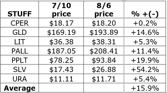
Figure 1 – Price performance of Jay’s STUFF Index components since 7/10

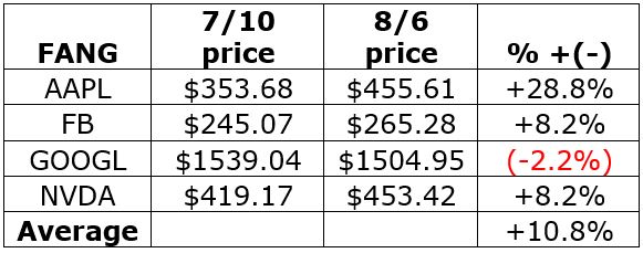
Figure 2 – Price performance of FANG stocks since 7/10

For the record, the “high-flying” Nasdaq 100 Index (using ticker QQQ as a proxy investment) is up +4.0% during the same time.

Is this a trend – or a blip?  Unfortunately, I can’t answer that question. But it certainly appears that there is something afoot in “Stuff”, particularly the metals.  Figure 3 displays the weekly charts for ETFs tracking Silver, Gold, Palladium and Platinum (clockwise from upper left). 

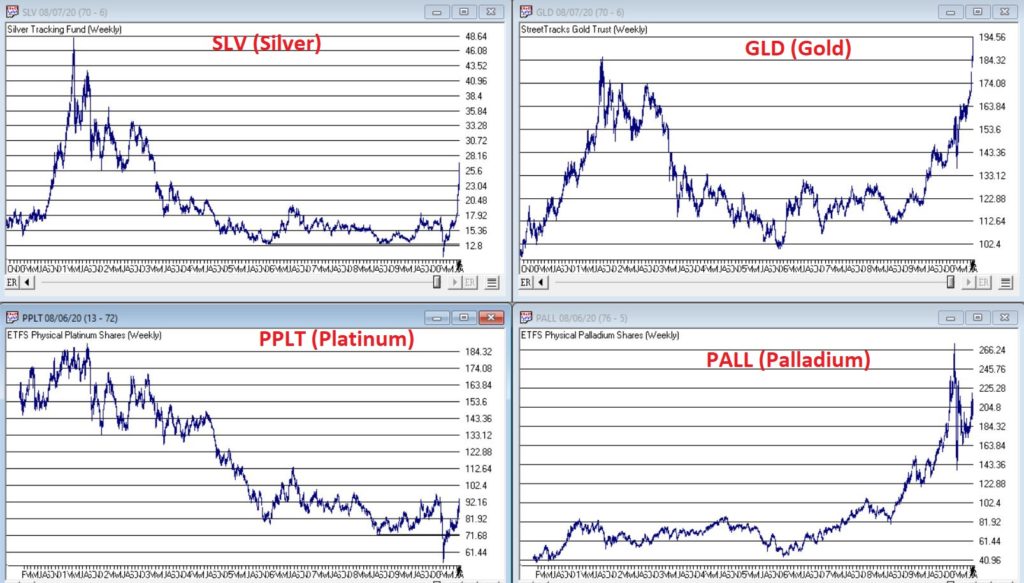
Figure 3 – The metals components of the Stuff Index (Courtesy AIQ TradingExpert)

When it comes bull markets in metals, the typical pattern historically goes something like this:

*Gold leads the way (check)

*Eventually silver comes on strong and often ends up outperforming gold (check)

*The other metals rise significantly “under the radar” as everyone focus on – literally in this case, ironically – the “shiny objects” (gold and silver)

Again, while I had inklings that a bull market in metals was forming (and have held positions in them for several years, and still hold them), I certainly did not “predict” the recent explosion in gold and silver prices. 

Two things to note:

*Gold and silver are obviously very “overbought”, so buying a large position here entails significant risk

*Still it should be noted that both SLV and PPLT would have to double in price from their current levels just to get back to their previous all-time highs of 2011

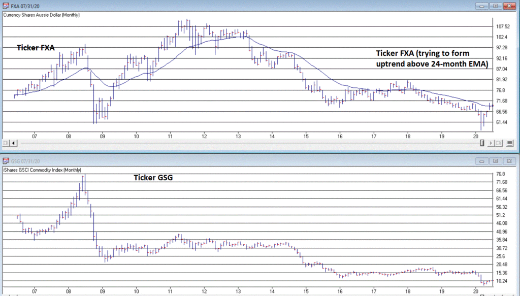
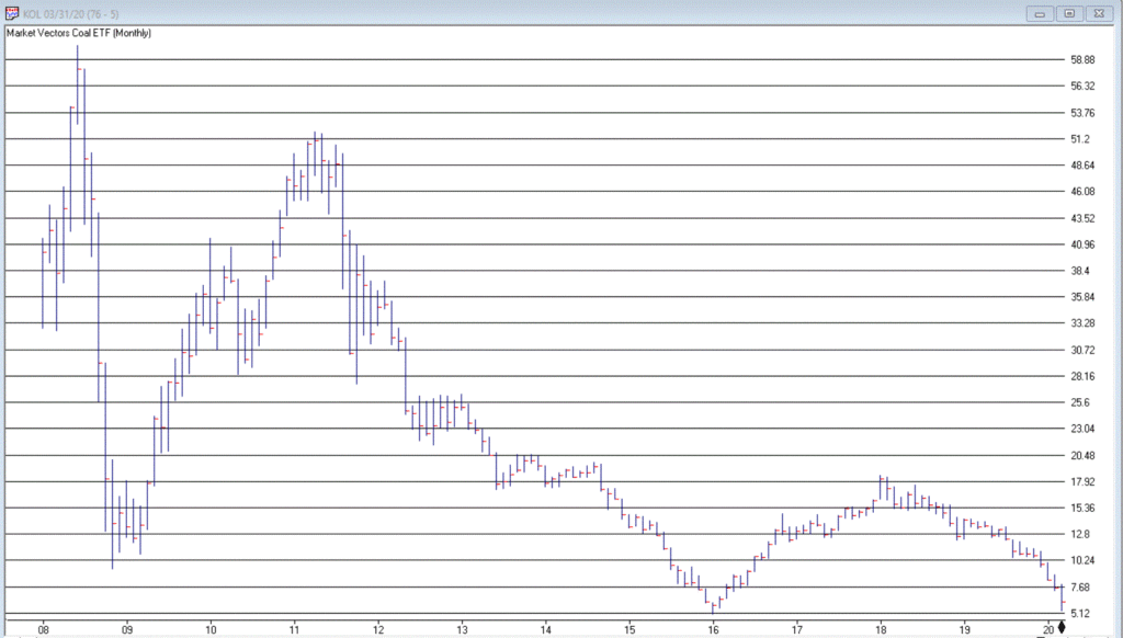
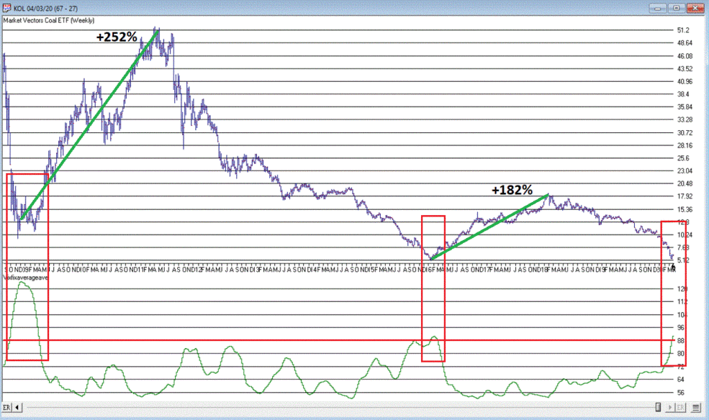
So, don’t be surprised if “Stuff” enjoys a continued resurgence.  Note in Figure 4 that a number of commodity related ETFs are way, way beaten down and could have a lot of upside potential if a resurgence actually does unfold.

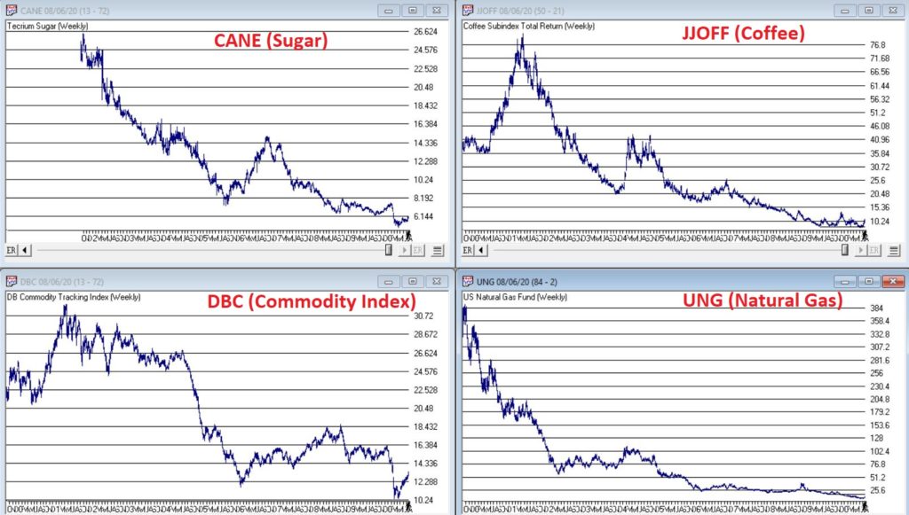
Figure 4 – Four commodity ETFs weekly (Courtesy AIQ TradingExpert)

What is interesting – and almost not visible to the naked eye – is the action in the lower right hand corner of these four charts. To highlight what is “hiding in plain sight”, Figure 5 “zooms in” on the recent action of same four tickers as Figure 4, but in a daily price format rather than a monthly price format.

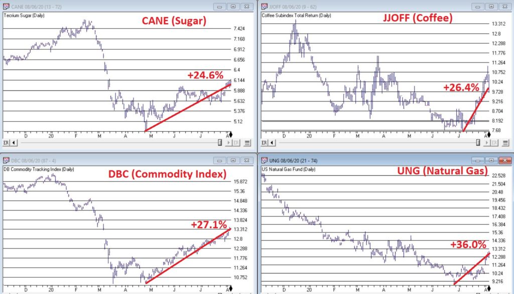
Figure 5 – Four commodity ETFs daily (Courtesy AIQ TradingExpert)

Despite the ugly pictures painted in Figure 4, it is interesting to note in Figure 5 that all four of these commodity related ETFs have rallied sharply of late.  There is of course, no guarantee this will continue.  But if the rally in “Stuff” – currently led by metals – spreads to the commodity sector as a whole, another glance in Figures 3 and 4 reveals a lot of potential upside opportunity.

Time will tell.  In the meantime, keep an eye on the “shiny objects” (gold and silver) for clues as to whether or not the rally in “Stuff” has staying power.

See also Jay Kaeppel Interviewin July 2020 issue of Technical Analysis of Stocks and Commodities magazine

See also Jay’s “A Strategy You Probably Haven’t Considered” Video

See also Video – The Long-Term…Now More Important Than Ever

Jay Kaeppel

Disclaimer: The information, opinions and ideas expressed herein are for informational and educational purposes only and are based on research conducted and presented solely by the author.  The information presented represents the views of the author only and does not constitute a complete description of any investment service.  In addition, nothing presented herein should be construed as investment advice, as an advertisement or offering of investment advisory services, or as an offer to sell or a solicitation to buy any security.  The data presented herein were obtained from various third-party sources.  While the data is believed to be reliable, no representation is made as to, and no responsibility, warranty or liability is accepted for the accuracy or completeness of such information.  International investments are subject to additional risks such as currency fluctuations, political instability and the potential for illiquid markets.  Past performance is no guarantee of future results.  There is risk of loss in all trading.  Back tested performance does not represent actual performance and should not be interpreted as an indication of such performance.  Also, back tested performance results have certain inherent limitations and differs from actual performance because it is achieved with the benefit of hindsight.

How to Know When to Worry About Inflation

Inflation was a big deal – back in the late 70’s and early 80’s.  Since then it has been the subject of a whole lot of “the boy crying wolf” scenarios.  Take a look at Figure 1.  The red line displays the 12-month rate-of-change in the Consumer Price Index (i.e., the annual rate of inflation) since 1913.

Figure 1 – The Consumer Price Index (1913-2020)

Things to note, focusing on 1930 forward to the present:

*In the 1930’s we had deflation (actually much worse than inflation as the economy essentially spirals lower and slower) with the CPI reaching almost -10%

*There were peaks in the 15% range in the late 1940’s and late 70’s/early 80’s

*As you can see in the black box to the right hand side, inflation has been less than 5% annually for most of the last 35 years

As a result, most investors have been conditioned to not fret too much about inflation.  And any time spent actually worrying about inflation in the past several decades has been a waste of good anxiety.

But nothing lasts forever.  Especially in the financial markets, where things tend to move in a cyclical nature over long periods of time.  To illustrate this point with a random, yet related example, consider Figure 2 which displays the yield on 30-year treasury bonds since 1942.

Figure 2 – 30-year treasury bond yield (1942-2020) (Courtesy: www.StockCharts.com)

Since the early 1980’s, investors have been nicely rewarded for holding bonds – especially long-term bonds.  But from the mid 1950’s into 1980 the experience was much different (rising yields equate to lower bond prices).  Presumably someday rates will rise again and an entire generation of bond investors will have no idea what is happening to their investments (see hereherehere and here).  But for now, we are focusing on inflation.

How to Know When to Worry About Inflation

I’ll give you three things to follow. 

#1. Gold

In a recent paper co-authored by legendary trader Paul Tudor Jones (see here) the authors laid out the case for higher inflation in the years ahead and suggested gold bullion could reach $2,400 an ounce.  Is this a possibility?  Absolutely. 

Figure 3 displays from 2005 through 2012:

*ticker GLD (an ETF that tracks the price of gold bullion)

*my own index called ANTIGLD3 (components highlighted on right) with a Front Weighted Moving Average and a 55-week exponential moving average)

The ANTIGLD3 Index is a contrarian trend-following tool, i.e., when this index is in a downtrend it is bullish for gold and vice versa.

Figure 3 – Ticker GLD versus Jay’s ANTIGLD3 Index (2005-2012) (Courtesy AIQ TradingExpert)

Figure 4 displays the same tickers from 2012 into 2020

Figure 4 – Ticker GLD versus Jay’s ANTIGLD3 Index (2012-2020) (Courtesy AIQ TradingExpert)

The key thing to note in Figure 4 is that after several years of whipsaws the two trend-following indicators applied to ANTIGLD3 are in a clear downtrend (since this is a contrarian index that means it is purportedly bullish for gold). 

So, is it off to the races for gold?  I can’t say for sure. But it appears to be trying. Also note that gold can rally significantly in price for reasons other than inflation (see 2005-2011 rally)

I have positions in gold and gold stocks but not huge ones.  For whatever reason, so far, I am “not feeling it.”  As you will see in a moment, some inflation trend-following “things” that I watch have yet to confirm that inflation is an imminent threat at this exact moment.

But I am holding my positions just in case gold itself is the actual “leading indicator” in this story.

#2. The Aussie Dollar versus its 24-month moving average

I covered this in detail here so will not get too in-depth here.  But you can get the gist of it pretty simply from Figure 5. The top chart is ticker FXA with a 24-month exponential moving average and the bottom chart is ticker GSG which tracks the Goldman Sachs Commodity Index.

Figure 5 – Ticker FXA (top) and ticker GSG (bottom) (Courtesy AIQ TradingExpert)

Long story short, commodities – or “hard assets”, are typically a good place to be during a period of sharply rising and/or high inflation – perform better when FXA is in an uptrend (i.e., above the 24-month EMA) than when below.  As of early July FXA has just moved above its 24-month EMA.  For the record, I usually only consider this at month-end.  So, check back after 7/31. 

If FXA establishes an uptrend, the likelihood of higher prices for commodities – including gold – rises. Thus, an uptrend for FXA would be another potential warning sign of impending inflation.

#3. TIPs versus Long-Term Treasuries

TIPs bonds are Treasury Inflation Protected securities, i.e., the principal can rise as inflation (based on the Consumer Price Index) rises (see here).  In other words, a TIP bond can gain value as inflation rises. Long-term treasuries on the other hand are the securities most likely to get hurt by a rise in inflation (as the rate of return is fixed once you buy the bond and a rise in inflation can reduce the future value and/or purchasing power of that fixed return). 

So, in a low inflationary period we typically see TIPs fall relative to long-term treasuries and during rising inflation we would expect to see TIPS rise relative to long-term bonds. 

Figure 6 displays the chart of ticker TIP relative to ticker TLT on a weekly basis (with a 200-wekk moving average) from www.StockCharts.com.

Figure 6 – Ticker TIP relative to ticker TLT (weekly) still trending lower (Courtesy: www.StockCharts.com)

The bottom line: While gold itself is attempting to breakout to the upside and the Aussie Dollar is trying to establish an uptrend, the TIP:TLT relationship is not presently indicating any meaningful inflationary concerns. 

Summary

Inflation has been low for about 35 years.  But as they say, “don’t go to sleep on it.” 

If you want to be objectively prepared, keep an eye on:

*Gold bullion (in an uptrend, confirmed by a downtrend in my “anti-gold index”)

*The Aussie Dollar (No trend at the moment, but trying to establish an uptrend)

*Ticker TIP versus ticker TLT (Nowhere close to an uptrend right now)

So one up, one down and one sideways.  But pay close attention going forward.

If and when all three establish uptrends, the game we’ve all been playing for several decades will likely change dramatically.

See also Jay Kaeppel Interview in July 2020 issue of Technical Analysis of Stocks and Commodities magazine

See also Jay’s “A Strategy You Probably Haven’t Considered” Video

See also Video – The Long-Term…Now More Important Than Ever

Jay Kaeppel

Disclaimer: The information, opinions and ideas expressed herein are for informational and educational purposes only and are based on research conducted and presented solely by the author.  The information presented represents the views of the author only and does not constitute a complete description of any investment service.  In addition, nothing presented herein should be construed as investment advice, as an advertisement or offering of investment advisory services, or as an offer to sell or a solicitation to buy any security.  The data presented herein were obtained from various third-party sources.  While the data is believed to be reliable, no representation is made as to, and no responsibility, warranty or liability is accepted for the accuracy or completeness of such information.  International investments are subject to additional risks such as currency fluctuations, political instability and the potential for illiquid markets.  Past performance is no guarantee of future results.  There is risk of loss in all trading.  Back tested performance does not represent actual performance and should not be interpreted as an indication of such performance.  Also, back tested performance results have certain inherent limitations and differs from actual performance because it is achieved with the benefit of hindsight.

The Ultimate Ugly Contrarian Play

They always say you should buy when there is “blood in the street.”  They also say, “buy them when nobody wants them.”  So, let’s consider today what could be the most unloved, bombed out, everybody hates it “thing” in the world – coal.

Ugh, just the mention of the word coal elicits a recoiling response.  “Dirty energy!”  “Climate change inducing filth!” “Ban coal!”.  And so and so forth.  And maybe they have a point.  But “they” also say “facts are stubborn things” (OK, for the record, I think it’s a different “they” who says that but never mind about that right now).

So here is a stubborn fact: coal supplies about a quarter of the world’s primary energy and two-fifths of its electricity.  As I write, two of the fastest growing economies (at least they were as of a few months ago) – China and India – are not only heavily reliant upon coal for energy, but are still building more and more coal-fired plants.  Now I am making no comment on whether this is a good thing or a bad thing but the point is, it most definitely is a “thing.”

So however one feels about coal, the reality is that it is not going to go away anytime soon.  Does this mean it will “soar in value” anytime soon – or even ever for that matter?  Not necessarily.  But as an unloved commodity it’s sure is hard to beat coal.  And as “they” (they sure are a bunch of know it all’s they?) say, “opportunity is where you find it.” 

Ticker KOL is an ETF that invests in coal industry related companies.  And what a dog it has been.  Figure 1 displays a monthly chart of price action.  Since peaking in June 2008 at $60.80 a share, it now stands at a measly $6.29 a share, a cool -89.6% below its peak.  And like a lot of things it has been in a freefall of late.

Figure 1 – Ticker KOL Monthly chart (Courtesy AIQ TradingExpert)

So, is this a great time to buy KOL?  That’s not for me to say.  But for argument’s sake, Figure 2 displays a weekly chart of KOL with an indicator I call Vixfixaverageave (I know, I know), which is a version of an indicator developed a number of years ago by Larry Williams (Indicator code is at the end of the article).

Figure 2 – KOL weekly chart with Vixfixaverageave indicator (Courtesy AIQ TradingExpert)

Note that Vixfixaverageave is presently above 90 on the weekly chart.  This level has been reached twice before – once in 2008 and once in 2016.  Following these two previous instances, once the indicator actually peaked and ticked lower for one week, KOL enjoyed some pretty spectacular moves. 

To wit:

*Following the 12/19/08 Vixfixaverageave peak and reversal KOL advanced +252% over the next 27.5 months

*Following the 2/19/16 Vixfixaverageave peak and reversal KOL advanced +182% over the next 23.5 months

When will Vixfixaverageave peak and reverse on the weekly KOL chart?  There is no way to know.  One must just wait for it to happen.  And will it be time to buy KOL when this happens?  Again, that is not for me to say.  None of this is meant to imply that the bottom for KOL is an hand nor that a massive rally is imminent.

Still, if there is anything at all to contrarian investing, its hard to envision anything more contrarian that KOL.

Vixfixaverageave Calculations

hivalclose is hival([close],22).  <<<<<The high closing price in that last 22 periods

vixfix is (((hivalclose-[low])/hivalclose)*100)+50. <<<(highest closing price in last 22 periods minus current period low) divided by highest closing price in last 22 periods (then multiplied by 100 and 50 added to arrive at vixfix value)

vixfixaverage is Expavg(vixfix,3). <<< 3-period exponential average of vixfix

vixfixaverageave is Expavg(vixfixaverage,7). <<<7-period exponential average of vixfixaverage

Jay Kaeppel

Disclaimer: The information, opinions and ideas expressed herein are for informational and educational purposes only and are based on research conducted and presented solely by the author.  The information presented does not represent the views of the author only and does not constitute a complete description of any investment service.  In addition, nothing presented herein should be construed as investment advice, as an advertisement or offering of investment advisory services, or as an offer to sell or a solicitation to buy any security.  The data presented herein were obtained from various third-party sources.  While the data is believed to be reliable, no representation is made as to, and no responsibility, warranty or liability is accepted for the accuracy or completeness of such information.  International investments are subject to additional risks such as currency fluctuations, political instability and the potential for illiquid markets.  Past performance is no guarantee of future results.  There is risk of loss in all trading.  Back tested performance does not represent actual performance and should not be interpreted as an indication of such performance.  Also, back tested performance results have certain inherent limitations and differs from actual performance because it is achieved with the benefit of hindsight.

Where We Are (and One Thing to Watch For)

I haven’t written a lot lately.  Mostly I guess because there doesn’t seem to be a lot new to say.  As you can see in Figure 1, the major market indexes are in an uptrend.  All 4 (Dow, S&P 500, Russell 2000 and Nasdaq 100) are above their respective 200-day MA’s and all but Russell 2000 have made new all-time highs.

Figure 1 – 4 Major Market Indexes (Courtesy AIQ TradingExpert)

As you can see in Figure 2, my market “bellwethers” are still slightly mixed.  Semiconductors are above their 200-day MA and have broken out to a new high, Transports and the Value Line Index (a broad measure of the stock market) are holding above their 200-day MA’s but are well off all-time highs, and the inverse VIX ETF ticker ZIV is in a downtrend (ideally it should trend higher with the overall stock market).

Figure 2 – Jay’s 4 Market “Bellwethers” (Courtesy AIQ TradingExpert)

As you can see in Figure 3, Gold, Bonds and the U.S. Dollar are still holding in uptrends above their respective 200-day MA’s (although all have backed off of recent highs) and crude oil is sort of “nowhere”.

Figure 3 – Gold, Bonds, U.S. Dollar and Crude Oil (Courtesy AIQ TradingExpert)

Like I said, nothing has really changed.  So, at this point the real battle is that age-old conundrum of “Patience versus Complacency”.  When the overall trend is clearly “Up” typically the best thing to do is essentially “nothing” (assuming you are already invested in the market).  At the same time, the danger of extrapolating the current “good times” ad infinitum into the future always lurks nearby. 

What we don’t want to see is:

*The major market averages breaking back down below their 200-day MA’s.

What we would like to see is:

*The Transports and the Value Line Index break out to new highs (this would be bullish confirmation rather the current potentially bearish divergence)

The Importance of New Highs in the Value Line Index

One development that would provide bullish confirmation for the stock market would be if the Value Line Geometric Index were to rally to a new 12-month high.  It tends to be a bullish sign when this index reaches a new 12-month high after not having done so for at least 12-months.

Figure 4 displays the cumulative growth for the index for all trading days within 18 months of the first 12-month new high after at least 12-months without one.

Figure 4 – Cumulative growth for Value Line Geometric Index within 18-months of a new 12-month high

Figure 5 displays the cumulative growth for the index for all other trading days.

Figure 5 – Cumulative growth for Value Line Geometric Index during all other trading days

In Figure 4 we see that a bullish development (the first 12-month new high in at least 12 months) is typically followed by more bullish developments. In Figure 5 we see that all other trading days essentially amount to nothing.

Figure 6 displays the Value Line Geometric Index with the relevant new highs highlighted.

Figure 6 – Value Line Geometric Index (Courtesy AIQ TradingExpert)

Summary

The trend at this very moment is “Up.”  So sit back, relax and enjoy the ride.  Just don’t ever forget that the ride WILL NOT last forever.  If the Value Line Geometric Index (and also the Russell 2000 and the Dow Transports) joins the party then history suggests the party will be extended.  If they don’t, the party may end sooner than expected.

So pay attention.

Jay Kaeppel

Disclaimer: The information, opinions and ideas expressed herein are for informational and educational purposes only and are based on research conducted and presented solely by the author.  The information presented does not represent the views of the author only and does not constitute a complete description of any investment service.  In addition, nothing presented herein should be construed as investment advice, as an advertisement or offering of investment advisory services, or as an offer to sell or a solicitation to buy any security.  The data presented herein were obtained from various third-party sources.  While the data is believed to be reliable, no representation is made as to, and no responsibility, warranty or liability is accepted for the accuracy or completeness of such information.  International investments are subject to additional risks such as currency fluctuations, political instability and the potential for illiquid markets.  Past performance is no guarantee of future results.  There is risk of loss in all trading.  Back tested performance does not represent actual performance and should not be interpreted as an indication of such performance.  Also, back tested performance results have certain inherent limitations and differs from actual performance because it is achieved with the benefit of hindsight.

A Simple Way To Trade Seasonality


In “A Simple Way To Trade Seasonality” in the September 2019 Stocks & Commodities, author Perry Kaufman describes methods he uses for measuring the seasonality in markets and approaches he uses for trading these patterns

Editors note: The full article can be obtained from Stocks & Commodities magazine at
http://technical.traders.com/sub/sublog2.asp#Sep the system rules are from the article and are based on these rules

1. Average the monthly frequency of the past 4 years.

2. Find the last occurrence of the highest frequency and the last occurrence of the lowest frequency using the average frequency in step 1. That is, if both March and April have a frequency of 70, we use April.

3. Only trade if the high frequency is 75% or greater and the low frequency is 25% or lower.

4. If the high frequency comes first, sell short at the end of the month with the high frequency. Cover the short at the end of the month with the low frequency.

5. If the low frequency comes first, buy at the end of the month with the low frequency. Sell to exit at the end of the month with the high frequency

The importable AIQ EDS file and Excel spreadsheet for Perry Kaufman’s article can be obtained on request via email to info@TradersEdgeSystems.com. The code is also shown below

!A Simple Way to Trade Seasonality
!Author: Perry Kaufman, TASC September 2019
!Coded by: Richard Denning, 07/21/2019
!www.TradersEdgeSystem.com

C is [close].
year is 2019.
len is 4000.
OSD is offsettodate(month(),day(),year()).
FirstDate is firstdatadate().

EOM1 if Month()=2 and valresult(month(),1)=1 and year()=year.
EOMos1 is scanany(EOM1,len) then OSD+1.
EOMc1 is valresult(C,^EOMos1).
EOM2 if Month()=3 and valresult(month(),1)=2 and year()=year.
EOMos2 is scanany(EOM2,len) then OSD+1.
EOMc2 is valresult(C,^EOMos2).
EOM3 if Month()=4 and valresult(month(),1)=3 and year()=year.
EOMos3 is scanany(EOM3,len) then OSD+1.
EOMc3 is valresult(C,^EOMos3).
EOM4 if Month()=5 and valresult(month(),1)=4 and year()=year.
EOMos4 is scanany(EOM4,len) then OSD+1.
EOMc4 is valresult(C,^EOMos4).
EOM5 if Month()=6 and valresult(month(),1)=5 and year()=year.
EOMos5 is scanany(EOM5,len) then OSD+1.
EOMc5 is valresult(C,^EOMos5).
EOM6 if Month()=7 and valresult(month(),1)=6 and year()=year.
EOMos6 is scanany(EOM6,len) then OSD+1.
EOMc6 is valresult(C,^EOMos6).
EOM7 if Month()=8 and valresult(month(),1)=7 and year()=year.
EOMos7 is scanany(EOM7,len) then OSD+1.
EOMc7 is valresult(C,^EOMos7).
EOM8 if Month()=9 and valresult(month(),1)=8 and year()=year.
EOMos8 is scanany(EOM8,len) then OSD+1.
EOMc8 is valresult(C,^EOMos8).
EOM9 if Month()=10 and valresult(month(),1)=9 and year()=year.
EOMos9 is scanany(EOM9,len) then OSD+1.
EOMc9 is valresult(C,^EOMos9).
EOM10 if Month()=11 and valresult(month(),1)=10 and year()=year.
EOMos10 is scanany(EOM10,len) then OSD+1.
EOMc10 is valresult(C,^EOMos10).
EOM11 if Month()=12 and valresult(month(),1)=11 and year()=year.
EOMos11 is scanany(EOM11,len) then OSD+1.
EOMc11 is valresult(C,^EOMos11).
EOM12 if Month()=1 and valresult(month(),1)=12 and valresult(year(),1)=year.
EOMos12 is scanany(EOM12,len) then OSD+1.
EOMc12 is valresult(C,^EOMos12).
YEARavg is (EOMc1+EOMc2+EOMc3+EOMc4+EOMc5+EOMc6+EOMc7+EOMc8+EOMc9+EOMc10+EOMc11+EOMc12)/12.

AR1 is (EOMc1 / YEARavg-1)*100.
AR2 is (EOMc2 / YEARavg-1)*100.
AR3 is (EOMc3 / YEARavg-1)*100.
AR4 is (EOMc4 / YEARavg-1)*100.
AR5 is (EOMc5 / YEARavg-1)*100.
AR6 is (EOMc6 / YEARavg-1)*100.
AR7 is (EOMc7 / YEARavg-1)*100.
AR8 is (EOMc8 / YEARavg-1)*100.
AR9 is (EOMc9 / YEARavg-1)*100.
AR10 is (EOMc10 / YEARavg-1)*100.
AR11 is (EOMc11 / YEARavg-1)*100.
AR12 is (EOMc12 / YEARavg-1)*100.

EOMc if firstdate < makedate(1,20,2019-20).
AR if EOMc.

The EDS code is not a trading system but a way to get the data needed into an Excel spreadsheet to enable you to make the seasonal calculations. The EDS file should be run on a date after the end of the year being calculated. Each year for which data is needed must be run separately by setting the “year” variable. Multiple symbols can be run at the same time by using a list of the desired symbols. Each time a year is run, the “AR” report must be saved as a “.csv” file. Once all the years needed have been run and saved to separate “.csv” files, they all should be cut and pasted to a single Excel sheet. They then can be sorted by symbol and each symbol can be copied and pasted to a tab for that symbol.

Figure 6 shows the rolling four-year frequency for the S&P 500 ETF (SPY) and Figure 7 shows the annual trades resulting from applying the seasonal rules to the frequency data.

Sample Chart

FIGURE 6: AIQ. Shown here is the rolling four-year frequency for the SPY.

Sample Chart

FIGURE 7: AIQ. Shown here are the annual trades resulting from applying the seasonal rules to the frequency data for SPY.

—Richard Denning
info@TradersEdgeSystems.com
for AIQ Systems

What it Will Take to Get Commodities Moving

I keep seeing headlines about the “imminent” re-emergence of commodities as a viable investment as an asset class.  And as I wrote about here, I mostly agree wholeheartedly that “the worn will turn” at some point in the years ahead, as commodities are historically far undervalued relative to stocks.

The timing of all of this is another story.  Fortunately, it is a fairly short and simple story.  In a nutshell, it goes like this:

*As long as the U.S. Dollar remains strong, don’t bet heavy on commodities.

The End

Well not exactly. 

The 2019 Anomaly

The Year 2019 was something of an anomaly as both the U.S. Dollar and precious metals such as gold and silver rallied.  This type of action is most unusual.  Historically gold and silver have had a highly inverse correlation to the dollar.  So, the idea that both the U.S. Dollar AND commodities (including those beyond just precious metals) will continue to rise is not likely correct.

Commodities as an Asset Class

When we are talking “commodities as an asset class” we are talking about more than just metals.  We are also talking about more than just energy products. 

The most popular commodity ETFs are DBC and GSG as they are more heavily traded than most others.  And they are fine trading vehicles.  One thing to note is that both (and most other “me too” commodity ETFs) have a heavy concentration in energies.  This is not inappropriate given the reality that most of the industrialized world (despite all the talk of climate change) still runs on traditional fossil fuel-based energy.

But to get a broader picture of “commodities as an asset class” I focus on ticker RJI (ELEMENTS Linked to the Rogers International Commodity Index – Total Return) which diversifies roughly as follows:

Agriculture          40.90%

Energy               24.36%

Industrial Metals 16.67%

Precious Metals    14.23%

Livestock               3.85%

Note that these allocations can change over time, but the point is that RJI has much more exposure beyond the energy class of assets than alot of other commodity ETFs.

RJI vs. the Dollar

As a proxy for the U.S. Dollar we will use ticker UUP (Invesco DB US Dollar Index Bullish Fund).  Figure 1 displays the % gain/loss for UUP (blue line) versus RJI (orange line) since mid-2008.

Figure 1 – UUP versus RJI; Cumulative Return using weekly closing prices; May-2008-Sep-2019

*Since May of 2008 UUP has gained +17.2%

*Since May of 2008 RJI has lost -60%

The correlation in price action between these two ETFs since 2008 is -0.76 (a correlation of -1.00 means they are perfectly inverse), so clearly there is (typically) a high degree of inverse correlation between the U.S. dollar and “commodities”.

Next, we will apply an indicator that I have dubbed “MACD4010501” (Note to myself: come up with a better name).  The calculations for this indicator will appear at the end of the article (but it is basically a 40-period exponential average minus a 105-period exponential average).  In Figure 2 we see a weekly chart of ticker UUP with this MACD indicator in the top clip and a weekly chart of ticker RJI in the bottom clip.

Figure 2 – UUP with Jay’s MACD Indicator versus ticker RJI (courtesy AIQ TradingExpert )

Interpretation is simple:

*when the MACD indicator applied to UUP is declining, this is bullish for RJI

*when the MACD indicator applied to UUP is rising, this is bearish for RJI.

Figure 3 displays the growth of equity achieved by holding RJI (using weekly closing price data) when the UUP MACD Indicator is declining (i.e., RJI is bullish blue line in Figure 3) versus when the UUP MACD Indicator is rising (i.e., RJI is bearish orange line in Figure 3).

Figure 3 – RJI cumulative performance based on whether MACD indicator for ticker UUP is falling (bullish for RJI) of rising (bearish for RJI)

In sum:

*RJI gained +45.8% when the UUP MACD indicator was falling

*RJI lost -72.3% when the UUP MACD indicator was rising

The bottom line is that RJI rarely makes much upside headway when the UUP MACD Indicator is rising (i.e., is bearish for RJI).

Summary

Commodities as an asset class are extremely undervalued on a historical basis compared to stocks.  However, the important thing to remember is that “the worm is unlikely to turn” as long as the U.S. Dollar remains strong.

So, keep an eye on the U.S. Dollar for signs of weakness.  That will be your sign that the time may be coming for commodities.

FYI: Code for Jay’s MACD4010501 Indicator (AIQ TradingExpert EDS)

The indicator is essentially a 40-period exponential average minus a 105-period exponential average as shown below:

Define ss3 40.

Define L3 105.

ShortMACDMA3 is expavg([Close],ss3)*100.

LongMACDMA3 is expavg([Close],L3)*100.

MACD4010501 is ShortMACDMA3-LongMACDMA3.

Jay Kaeppel

Disclaimer: The information, opinions and ideas expressed herein are for informational and educational purposes only and are based on research conducted and presented solely by the author.  The information presented does not represent the views of the author only and does not constitute a complete description of any investment service.  In addition, nothing presented herein should be construed as investment advice, as an advertisement or offering of investment advisory services, or as an offer to sell or a solicitation to buy any security.  The data presented herein were obtained from various third-party sources.  While the data is believed to be reliable, no representation is made as to, and no responsibility, warranty or liability is accepted for the accuracy or completeness of such information.  International investments are subject to additional risks such as currency fluctuations, political instability and the potential for illiquid markets.  Past performance is no guarantee of future results.  There is risk of loss in all trading.  Back tested performance does not represent actual performance and should not be interpreted as an indication of such performance.  Also, back tested performance results have certain inherent limitations and differs from actual performance because it is achieved with the benefit of hindsight.

Too Soon to Get Sweet on Sugar

One of my (admittedly, potentially foolish) beliefs is that commodities will outperform stocks again someday.  Possibly someday starting soon (roughly defined as anywhere from today to a year from today) and that the shift will be dramatic and last for a period of 3 to 8 years.

And no, I don’t think I could be any more vague.  But I haven’t really “taken the plunge” (i.e., shifted money from the stock market into commodities in any meaningful way) yet.  But I am keeping a close eye on things.  Rather than rattled off another 1,000 words to explain, I will simply refer you to Figure 1 that tracks the ratio of the S&P Commodity Index to the S&P 500 Index.

1

Figure 1 – Commodities versus Stocks (Source: www.DailyReckoning.com)

History suggests that “the worm will (eventually) turn.”

Sugar

2

Let’s focus on one commodity for now.  Sadly, it’s one of my favorites (ranks right up there with coffee).  Sugar.  As you can see in Figures 2 and 3, sugar has a history of contracting in price over a period of time and then alternately – and please excuse my use of the following overly technical terms – “swooping” or “soaring”.Figure 2 – Sugar 1970-1998 (Courtesy ProfitSource by HUBB)

3

Figure 3 – Sugar 1998-2019 (Courtesy ProfitSource by HUBB)

4

Sugar can be traded either in the futures market (each full one-point movement in price equates to $1,120 in contract value).  An alternative for “normal people” is ticker CANE which is the Teucrium Sugar ETF which trades like shares of stock.  See Figure 4.Figure 4 – ETF Ticker CANE (Courtesy AIQ TradingExpert)

As you can see, sugar has been “contracting” in price of late.  Does this mean it is reading to “swoop” or “soar”?  Possibly.  But for those who want to play the bullish side, it is probably a bit too soon to dive in.

Seasonality in Sugar

5

Figure 5 displays the annual seasonal trend in sugar.  It should be noted that you should NOT expect every year to follow this trend.  It is a display of previous historical tendencies and NOT a roadmap.Figure 5 – Sugar Annual Seasonal Trend (Courtesy Sentimentrader.com)

Still, the primary point is captured nicely in:

Jay’s Trading Maxim #92: One of the keys to long term success is committing capital where the probabilities are (or a least appear to be) in your favor.

February through April is NOT that time for anyone looking to play the long side of sugar.

Figure 6 displays the cumulative results achieved by holding long one sugar futures contract ONLY during the months of February through April every year starting in 1970.

6

Figure 6 – Cumulative $+(-) holding long sugar futures Feb, Mar, Apr every year since 1970

Some things to note regarding sugar Feb through Apr:

*UP 18 times

*DOWN 31 times

*Average gain = +$2,201

*Average loss = (-$3,377)

*Largest gain = +$6,630 (1974)

*Largest loss = (-$18,424) (1975)

Summary

The point IS NOT to argue that sugar is doomed to plunge between now and the end of April, nor even to argue that it cannot rally strongly between now and then – because it can.

The point IS to merely point out that the odds do not presently favor the bulls, which means – well, see Trading Maxim #92 above.

Jay Kaeppel

Disclaimer:  The data presented herein were obtained from various third-party sources.  While I believe the data to be reliable, no representation is made as to, and no responsibility, warranty or liability is accepted for the accuracy or completeness of such information.  The information, opinions and ideas expressed herein are for informational and educational purposes only and do not constitute and should not be construed as investment advice, an advertisement or offering of investment advisory services, or an offer to sell or a solicitation to buy any security.

Utilities at the Crossroads

A lot of eyes are firmly fixed on Utilities at the moment.  And for good reason.  As you can see in Figure 1, the Dow Jones Utilities Average is presently facing a key resistance level.  If it breaks out above the likelihood of a good seasonal rally (more in a moment) increases significantly.

1

Figure 1 – Utilities and resistance (Courtesy AIQ TradingExpert)

One concern may be the fact that a 5-wave Elliott Wave advance appears to possibly have about run its course (according to the algorithmically drawn wave count from ProfitSource by HUBB which I use).  See Figure 2.

2

Figure 2 – Utilities and Elliott Wave (Courtesy ProfitSource by HUBB)

For what it is worth, the March through July timeframe is “typically” favorable for utilities.  Figure 3 displays the growth of $1,000 invested in the Fidelity Select Sector Utilities fund (ticker FSUTX) ONLY during the months of March through July each year starting in 1982.

3

Figure 3 – Growth of $1,000 invested in ticker FSUTX Mar-Jul every year (1982-2018)

For the record:

*# times UP = 29 (78%)

*# times DOWN = 8 (22%)

*Average UP = +9.3%

*Average DOWN = (-5.8%)

*Largest UP = +21.1% (1989)

*Largest DOWN = (-25.8%) (2002)

*Solid performance but obviously by no means nowhere close to “a sure thing”.

*It should be noted that several of the “Down” years occurred when the S&amp;P 500 was already in a pretty clearly established downtrend (2001, 2002 and 2008), i.e., below its 10-month moving average.  See Figure 4.

4

Figure 4 – S&amp;P Index w/10-month moving average (Courtesy AIQ TradingExpert)

Summary

Utilities are flirting with new all-time highs and March through July is a “seasonally bullish” period for utilities.  Does that mean “happy days are here again, and we should all be piling into utilities?  Yeah, isn’t that always the thing about the markets?  There is rarely a 100% clear indication for anything.

As always, my “prediction” about what will happen next in utilities is irrelevant and I am NOT pounding the table urging you to pile in.  But I can tell you what I am watching closely at the moment:

*The S&amp;P 500 Index is flirting right around its 10-month moving average (roughly 2,752 on the S&amp;P 500 Index).  If it starts to break down from there then perhaps 2019 may not pan out so well for utilities.

*The Dow Jones Utility Average is facing a serious test of resistance and may run out of steam (according to Elliott Wave).

*But a breakout to the upside could well clear the decks for utilities to be a market leader for the next several months

Focus people, focus.

Jay Kaeppel

Disclaimer:  The data presented herein were obtained from various third-party sources.  While I believe the data to be reliable, no representation is made as to, and no responsibility, warranty or liability is accepted for the accuracy or completeness of such information.  The information, opinions and ideas expressed herein are for informational and educational purposes only and do not constitute and should not be construed as investment advice, an advertisement or offering of investment advisory services, or an offer to sell or a solicitation to buy any security.

Bean There, Done That

In this piece I wrote about a strong seasonal tendency in corn based on the planting cycle.  Turns out soybeans are in the same boat.  This can be a good thing for traders who are, a) willing to speculate, b) not dumb enough to the bet the ranch.

The Trend

Figure 1 displays the annual seasonal trend for soybeans (from www.sentimentrader.com).  Just as with corn, the months of February through April tend to see positive results.  Please note the use of the word “tend” and the lack of the words “sure” or “thing”.

bean seasonality

Figure 1- Soybean Annual Seasonal Trend (Courtesy Sentimentrader.com)

The History

Figure 2 displays a monthly chart for soybeans going back 4 decades.

2

Figure 2 – Monthly chart for Soybeans (Courtesy ProfitSource by HUBB)

Here are the two things to note (using some pretty technical terms):

*Soybeans (like most commodities)  spend a lot of time “churning”, “grinding”, “consolidating” and generally going “nowhere”

*HOWEVER, “when beans go they really go!” (hopefully that wasn’t “too technical”)

*The primary thing to remember is that when soybeans get going to the upside, typically the best thing to do is to banish the word from “overbought” from your trading lexicon.  See Figure 3.3

Figure 3 – Big moves in Beans (Courtesy ProfitSource by HUBB)

Now let’s focus on the months of February, March and April.  Figure 4 displays the hypothetical $ growth (no slippage or commissions) from holding long a 1-lot of soybean futures during February, March and April every year starting in 1976.

4

Figure 4 – Long 1 soybean futures contract during Feb-Mar-Apr every year since 1976

The Results

Some things to note regarding Feb-Apr in soybeans:

*# of times UP = 33

*# of times DOWN = 10

*Average $ gain = +$3,808

*Average $ loss = (-$1,788)

*Largest gain = +$15,025

*Largest loss = (-$3,775)

In sum, a winners to losers ratio of 3.3 (or 76% winners), an average win to average loss ratio of 2.13-to-1

Bottom line: these are great numbers for traders BUT they entail the assumption of significant risk (2017 saw a loss of over -$3,400)

An Alternative Way to Play

Ticker SOYB is the Teucrium ETF designed to track the price of soybeans.  SOYB allows traders to buy soybeans just as they would buy shares of stock.  Just remember that you don’t get the same leverage buying SOYB as you would buying a futures contract.

Figure 5 displays a monthly chart for SOYB and Figure 6 displays a daily chart.  Note the significant resistance level at around $16.96 a share.  If SOYB takes out that level sooner than later it might be a bullish sign.

5

Figure 5 – SOYB Monthly (Courtesy AIQ TradingExpert)

6

Figure 6 – SOYB Daily (Courtesy AIQ TradingExpert)

Summary

Soybeans have been beaten down a bit over the last several years.  If (and “yes”, that is a big “If”) beans are going to make a move higher, history suggests that the Feb through April period is a likely time for that to happen.

Am I “recommending” or even “merely suggesting” that you should buy soybean futures or ticker SOYB?  Not at all.  I adhere to that old media adage of “We (I) report, you decide.”

Which is better I think than the current motto of major media which appears to be “We decide, then we report our decision.”

Jay Kaeppel

Disclaimer:  The data presented herein were obtained from various third-party sources.  While I believe the data to be reliable, no representation is made as to, and no responsibility, warranty or liability is accepted for the accuracy or completeness of such information.  The information, opinions and ideas expressed herein are for informational and educational purposes only and do not constitute and should not be construed as investment advice, an advertisement or offering of investment advisory services, or an offer to sell or a solicitation to buy any security.

Can Corn?

It’s January.  It’s cold.  And the ground in the Midwest is frozen (and getting more frozen by the moment I might #$%^ add).  So of course, it is time to thinking about planting corn!

Wait, what!?

Well, yes as it turns out just about everyone involved in the agricultural industry has questions (doubts?) about corn planting in the spring and the eventual crop harvested in fall.  And the big questions are, “How will planting go?” and “how much corn will be produced?”  As it relates to corm the whole supply/demand thing you learned about way back when hinges on the ultimate answers to those two questions.

In a nutshell, there is “doubt.”  No surprise really as there is absolutely not a single corn seed planted anywhere in the Midwest at this moment.  So, who knows for sure?

One thing we do know for sure is that a lot of people are aware of this phenomenon in corn and feel compelled to “hedge their bets”, typically on an annual basis.  Figure 1 displays an annual seasonal chart for corn futures from www.sentimentrader.com.1Figure 1 – Annual Seasonal trend for Corn (Courtesy Sentimentrader.com)

As you can see, price strength is typical in the first 4 to 5 months of the year.  This should not be surprising because – as I described above – doubt about supply causes buying pressure (typically).

So for traders the real question is “should I be buying corn in anticipation of buying pressure?”  The answer is “definitely, maybe!”  Let’s take a closer look.

Figure 2 displays spot corn prices since 2001.

2

Figure 2 – Spot Corn prices (Courtesy ProfitSource by HUBB)

We can notice two things:

*Corn is presently in a fairly prolonged consolidation/compression range

*Previous consolidation/compression ranges have been followed by some significant advances

Despite this, one should not necessarily assume that corn is about to burst higher in price.  So let’s look at things from a more technical/tactical trading point of view.

How to Play Corn

*The “purest’ play is corn futures.  However, corn futures are not for most people.  In Figure 2, corn is trading at “350”, which equates to $3.50 a bushel in corn futures parlance.  Here is what you need to know:

If one were to buy a corn futures contract at $3.50 a bushel, a move to $4.50 a bushel would generate a gain of +$5,000 and a move to $2.50 a bushel would generate a loss of -$5,000.

In sum, a great way to make a lot of money if you are right and a great way to lose a lot of money if you are wrong.  There is an alternative for the “average” investor.

*Ticker CORN is the Teucrium Corn ETF which allows investors to trade corn like they would trade shares of stock.  Figure 3 displays a daily chart for ticker CORN.

3

Figure 3 – Ticker CORN with a significant resistance level around $16.53 (Courtesy AIQ TradingExpert)

Note that I have drawn a horizontal line $16.53, which connect the January 2018 low and the December 2018 high.  As with any line that one might arbitrarily draw on a bar chart, there is nothing “magic” about this price level.  But it does represent a potential line in the sand that be utilized in the following “highly complex” manner:

*CORN above $16.53 = (Possibly) Good

*CORN below $16.53 = Bad

The Choices

So what’s an investor to do?  As always, there are choices.

Choice #1 is flush this idea and forget all about corn.

Choice #2 is to buy now in hopes of an upside breakout, possibly with a stop-loss under the September 2018 low of $15.39.

Choice #3 is to wait for an upside breakout above $16.53 as confirmation that an actual bullish trend is forming.

Summary

I don’t make “recommendations” here at JOTM, so whether you prefer #1, #2 or #3 above is entirely up to you.  The key points though are:

It appears that there may be an opportunity forming (higher seasonal corn prices based on perceptions of problematic weather for planting and a long consolidation/compression in price).

A trader considering this idea needs to make decisions regarding what to trade (futures or CORN ETF), when to actually get in (before the breakout or after) and where to place a stop-loss.

Jay Kaeppel

Disclaimer:  The data presented herein were obtained from various third-party sources.  While I believe the data to be reliable, no representation is made as to, and no responsibility, warranty or liability is accepted for the accuracy or completeness of such information.  The information, opinions and ideas expressed herein are for informational and educational purposes only and do not constitute and should not be construed as investment advice, an advertisement or offering of investment advisory services, or an offer to sell or a solicitation to buy any security.

A Long and Short-Term Bond Market Perspective, Part I

Meanwhile, back in the bond market.  Yes, the stock market has been the place for “action” recently.  First a massive decline in short order followed immediately by a stunning advance.  But many investors also look to the bond market in order to achieve their long-term goals.  So, let’s try to put things in perspective a bit.

The Main Points

*Point ARates will likely work their way higher over time

There has historically been a roughly 60-year cycle in interest rates (See Figure 1).  If this holds to form, odds are the next 30 years will not look anything like the last 30 years in the bond market, i.e., rates will likely work their way higher over time.

1

Figure 1 – 60-year cycle in rates suggest higher yields in years ahead (Source: mcoscillator.com)

*Point BInvestors should be wary of buying and holding long-term bonds

Figure 1 does not mean that rates will rise in a straight-line advance.  But again, odds are that rates will rise over time, so as a result, investors should be wary of buying and holding long-term bonds (as they stand to get hurt the most if rates rise).  That being said, in the short-term anything can happen, and long-term bonds may still be useful to shorter-term traders, BUT…

…Short to intermediate term bond funds are better now for investors than long-term bonds (if rates rise over time investors in short/intermediate term bonds can reinvest more quickly at higher rates, while long-term bond holders just lose principal).

4

Figure 2 – Affect of rising rates on bonds of various maturities (Source: AAII.com)

*Point CIt appears to be too soon to declare a confirmed “Bond Bear Market!!!”

Bond yields looked in 2018 like they were staging a major upside breakout – and then reversed back to the downside.  So – Point A above not withstanding – it appears to be too soon to declare confirmed “Bond Bear Market!!!”

2

Figure 3 – 10-year treasury yield “breakout fake out” (Source: AIQ TradingExpert)

3

Figure 4 – 30-year treasury yield tested 120-month moving average, then failed  (Source: AIQ TradingExpert)

*Point DCorporate bonds as a whole carry more risk than in years past

The risk associated with corporate bonds as an asset class are higher than in the past due to A) a higher rate of debt, and B) a large segment of the corporate bond market is now in the BBB or BBB- rating category.  If they drop one grade they are no longer considered “investment grade” and many institutional holders will have no choice but to sell those bonds en masse.  Which raises the age-old question, “too whom?”

For more on this topic see herehere and here.5Figure 5 – Rising corporate debt (Source: Real Investment Advice)

*Point E:

On the brighter side, two bond market models that I follow are presently bullish.  More about these in Part II.

Jay Kaeppel

Disclaimer:  The data presented herein were obtained from various third-party sources.  While I believe the data to be reliable, no representation is made as to, and no responsibility, warranty or liability is accepted for the accuracy or completeness of such information.  The information, opinions and ideas expressed herein are for informational and educational purposes only and do not constitute and should not be construed as investment advice, an advertisement or offering of investment advisory services, or an offer to sell or a solicitation to buy any security.

A Long and Short-Term Bond Market Perspective, Part II

In Part I here I laid out my main thoughts regarding the bond market.  The final point mentioned that two trading models for bonds that I follow are presently bullish.  So in Part II let’s bring those up-to-date.

#1. Japanese Stocks (EWJ) vs. Long-Term Treasuries (TLT)

I have written about this model on several occasions in the past (herehere and here).  But in a nutshell:

*The Japanese stock market (using ETF ticker EWJ as a proxy) and long-term U.S. treasury bonds (using ETF ticker TLT as a proxy) tend to have an inverse relationship over time.

Therefore:

*A bearish trend for EWJ (5-week moving average below 30-week moving average) tends to be bullish for bonds.

*A bullish trend for EWJ (5-week moving average above 30-week moving average) tends to be bearish for bonds.

Figure 1 displays the EWJ on top with TLT on the bottom.  Note the general inverse correlation in price movement.

1

Figure 1 – T-Bonds (ticker TLT in bottom clip) tend to move inversely to Japanese stocks (ticker EWJ with 5-weel and 30-week moving averages in top clip) (Courtesy AIQ TradingExpert)

#2. Gold/Copper Ratio versus Bonds

I have written about this before here.  In a nutshell:

*The gold/copper ratio has a relatively high correlation to the price of t-bonds (current correlation coefficient = 0.73; a reading of 1.00 means they mirror each other, a reading of -1 means there are trade exactly inversely).

Figure 2 displays treasury bond futures prices (blue) versus the Gold/Copper Ratio (x10) since 2001.  The correlation is fairly obvious to the naked eye.

2

Figure 2 – T-bond futures price (blue) versus Gold/Copper ratio (x10); 12/31/01-1/11/2019

*When the gold/copper ratio is in an uptrend (see here for how that designation is made) this indicator is considered bullish for bonds

*When the gold/copper ratio is in a downtrend this indicator is considered bearish for bonds

Putting the Two Together

*If either of the models is bullish that is considered bullish for bonds

*If both models are bearish that is considered very bearish for bonds

Figure 3 displays the gain or loss from holding a long position in a treasury bond futures contract depending on whether, a) neither model is bullish (red), or, b) one or more of the models is bullish (blue)

3

Figure 3 – Cumulative $ gain (loss) from holding long t-bond futures if 1 or more model is bullish (blue) versus if neither model is bullish (red); 7/22/96-1/11/19

As you can see, a bullish reading in no way guarantees higher bond price and a bearish reading in no way guarantees lower bond price.  Still, given the stark differences between the performance of the blue line and the red line, that would seem to be the way to bet.

For what it is worth, both models detailed above are bullish at the moment.

Summary

*In Part I, I basically inferred a preference for short to intermediate term bonds for people who buy and hold bonds (or bond funds) as part of a longer-term investment strategy (if rates rise 1 percentage point, a 30-year bond paying 4% a year, will lose -15% in principal – too much risk from my perspective).

*At the same time, as highlighted here in Part II, long-term bonds can still offer outstanding trading opportunities both on the long side and the short side – for those inclined to play.

Jay Kaeppel

Disclaimer:  The data presented herein were obtained from various third-party sources.  While I believe the data to be reliable, no representation is made as to, and no responsibility, warranty or liability is accepted for the accuracy or completeness of such information.  The information, opinions and ideas expressed herein are for informational and educational purposes only and do not constitute and should not be construed as investment advice, an advertisement or offering of investment advisory services, or an offer to sell or a solicitation to buy any security.

‘Dogs’ ‘Due’ for ‘Days’

While I am by and large an avowed “trend-follower” I also recognize that sometimes things get beaten down so much that they ultimately offer great potential long-term value.  Or, as they say, “every dog has it’s day.”  So, let’s consider some “dogs”.

For the record, and as always, I am not “recommending” these assets – I am simply highlighting what look like potential opportunities.

Dog #1: Soybeans (ticker SOYB)

As I wrote about in this article, soybeans are very cyclical in nature.  According to that article there are two “bullish seasonal periods” for beans and one “bearish”:

*Long beans from close on the last trading day of January through the close on 2nd trading day of May

*Short beans from the close on 14th trading day of June through the close on 2nd trading day of October

*Long beans from the close on 2nd trading day of October through the close on 5th trading day of November

In Figure 1 (ticker SOYB – an ETF that tracks the price of soybean futures) has been beaten down quite a bit.  This doesn’t mean price can’t go lower.  However, given the cyclical nature of bean prices they probably won’t go down forever.

1

Figure 1 – Weekly SOYB; prices beaten down (Courtesy AIQ TradingExpert)

Figure 2 is a daily chart of SOYB and displays the recent “bearish” seasonal period and the latest “bullish” period so far.

2

Figure 2 – Daily SOYB (Courtesy AIQ TradingExpert)

Dog #2: Uranium (ticker URA)

In this article and this article, I wrote about the prospects for uranium and ticker URA – an ETF that tracks the price of uranium.  Since that time URA has basically continued to go nowhere.  As you can see in Figure 3, it has been doing just that for some time.  While there is no guarantee that the breakout out of the range indicated in Figure 2 will be to the upside, historically, elongated bases such as this often lead to just that.  A trader can buy it at current levels and put a stop loss somewhere below the low for the base and take a reasonable amount of risk if they are willing to bet on an eventual upside breakout.

3

Figure 3 – Ticker URA with a long (really long) base (Courtesy AIQ TradingExpert)

Dog #3: Base Metals (Ticker DBB)

Under the category of – I called this one way, way too soon – in this article I wrote about the potential for ticker DBB to be an outperformer in the years ahead.  As you can see in Figure 4, so far, not so good.

4

Figure 4 – Base Metals via ticker DBB (Courtesy AIQ TradingExpert)

Still, the argument for base metals is this:

*In Figure 3 is this article you can see that commodities as an asset class are due for a good move relative to stocks in the years ahead.

*In addition, the Fed is raising interest rates.

As discussed historically base metals have been the best performing commodity sector when interest rates are rising.  Ticker DBB offers investors a play on a basket of base metals.

Summary

Will any of these “dog” ideas pan out?  As always, only time will tell.  But given the cyclical nature of commodities and the price and fundamental factors that may impact these going forward, they might at least be worth a look.

In the meantime, “Woof” (which – as far as I can tell – means “Have a nice day”).

Jay Kaeppel

Disclaimer:  The data presented herein were obtained from various third-party sources.  While I believe the data to be reliable, no representation is made as to, and no responsibility, warranty or liability is accepted for the accuracy or completeness of such information.  The information, opinions and ideas expressed herein are for informational and educational purposes only and do not constitute and should not be construed as investment advice, an advertisement or offering of investment advisory services, or an offer to sell or a solicitation to buy any security.

A Look Ahead in Stocks, Bonds and Commodities

In the interest of full disclosure, the reality is that I am not great at “predicting” things.  Especially when it involves the future.  That being said, I am pretty good at:

*Identifying the trend “right now”

*Understanding that no trend lasts forever

*Being aware of when things are getting a bit “extended”

So, I am going to highlight a few “thoughts” regarding how one might best be served in the markets in the years ahead.

Where We Have Been

*After 17 years of sideways action (1965-1982) the stock market has overall been in a bullish trend since about 1982 – albeit with some major declines (1987, 2000-2002 and 2007-2009) when the market got significantly overvalued.

*Bond yields experienced a long-term decline starting in 1981 and bottomed out in recent years.

*Commodities have mostly been a “dog” for many years.

The way the majority of investors approach these goings on is to:

*Remain bullish on the stock market (“Because it just keeps going up”)

*Continue to hold bonds (“Because I have to earn a yield somewhere”)

*Avoid commodities (“Because they suck – and they’re scary”)

And as an avowed trend-follower I don’t necessarily disapprove.  But as a market observer I can’t help but think that things will be “different” in the not too distant future.

Considerations Going Forward

Stocks

Figure 1 displays the Shiller P/E ratio.  For the record, valuation measures are NOT good “timing” tools.  They don’t tell you “When” the market will top or bottom out.  But they do give a good indication of relative risk going forward (i.e., the higher the P/E the more the risk and vice versa).

Note:

*The magnitude of market declines following previous peaks in the P/E ratio

*That we are presently at (or near) the 2nd highest reading in history

(click on any chart below to enlarge it)

1

Figure 1 – Shiller P/E Ratio (and market action after previous overvalued peaks) (Courtesy: www.multpl.com/shiller-pe/)

The bottom line on stocks:  While the trend presently remains bullish, valuation levels remind us that the next bear market – whenever that may be – is quite likely to be “one of the painful kind”.

Bonds

Figure 2 displays the 60-year cycle in interest rates.2

Figure 2 – 60 -year cycle in interest rates (Courtesy: www.mcoscillator.com)

Given the historical nature of rates – and the Fed’s clear propensity for raising rates – it seems quite reasonable to expect higher interest rates in the years ahead.

Commodities

As you can see in Figure 3 – which compares the action of the Goldman Sachs Commodity Index to that of the S&amp;P 500 Index) – commodities are presently quite undervalued relative to stocks.  While there is no way to predict when this trend might change, the main point is that history strongly suggests that when it does change, commodities will vastly outperform stocks.3Figure 3 – Commodities extremely undervalued relative to stocks (Courtesy: Double Line Funds)

The Bottom Line – and How to Prepare for the Years Ahead

*No need to panic in stocks.  But keep an eye on the major averages.  If they start to drop below their 200-day averages and those moving average start to “roll over” (see example in Figure 4), it will absolutely, positively be time to “play defense.”

4

Figure 4 – Major stock average rolling over prior to 2008 collapse (Courtesy AIQ TradingExpert)

*Avoid long-term bonds.  If you hold a long-term bond with a duration of 15 years that tells you that if interest rates rise one full percentage point, then that bond will lose roughly 15% in value.  If it is paying say 3.5% in yield, there is basically no way to make up that loss (except to wait about 4 years and hope rates don’t rise any more in the interim – which doesn’t sound like a great investment strategy).

*Short-term to intermediate-term bonds allow you to reinvest more frequently at higher rates as rates rise. Historical returns have been low recently so many investors avoid these.  But remember, recent returns mean nothing going forward if rates rise in the years ahead.

*Consider floating rate bonds.  Figure 5 displays ticker OOSYX performance in recent years versus 10-year t-note yields. While I am not specifically “recommending” this fund, it illustrates how floating rate bonds may afford bond investors the opportunity to make money in bonds even as rates rise.5

Figure 5 – Ticker OOSYX (floating rate fund) versus 10-year treasury yields)

*Figure 6 display 4 ETFs that hold varying “baskets” of commodities (DBC, RJI, DJP and GSG clockwise from upper left).  When the trend in Figure 3 finally does reverse, these ETFs stand to perform exceptionally well.6

Figure 6 – Commodities performance relative to stock performance (GSCI versus SPX)

Finally, the truth is that I don’t know “when” any of this will play out.  But the bottom line is that I can’t help but think that the investment landscape is going to change dramatically in the years ahead.

So:

a) Pay attention, and

b) Be prepared to adapt

Jay Kaeppel

Disclaimer:  The data presented herein were obtained from various third-party sources.  While I believe the data to be reliable, no representation is made as to, and no responsibility, warranty or liability is accepted for the accuracy or completeness of such information.  The information, opinions and ideas expressed herein are for informational and educational purposes only and do not constitute and should not be construed as investment advice, an advertisement or offering of investment advisory services, or an offer to sell or a solicitation to buy any security.

Dollar or Miners? It’s One or the Other

Gold, gold stocks and commodities in general are starting to get a lot of notice lately.  And not without good reason.  Consider the bullish implications for all things precious metal in the articles below – one from Tom McClellan of the McClellan Report and one from the Felder Report.
*Gold/Silver Ratio Tom McClellan
I have also previously touched on these themes time or two (or four) of late.
Where We Are Now
So on the one hand, it can be argued that gold, mining stocks and commodities in general are poised for a significant move to the upside.
Consider the “coiling” action displayed in Figure 1, which is a monthly chart for a mining index that I track that I’ve labeled GLDSLVJK.
1a
Figure 1 – Jay’s Gold Stock (GLDSLV) Index (Courtesy AIQ TradingExpert)
I look at the coiling action displayed in Figure 1 – in conjunction with the information contained in the articles linked above – and I can’t help but to think that a big upside breakout in gold stocks is imminent.
The “Fly in the Ointment”
When it comes to all of this metals/miners/commodities bullishness there’s just one “fly in the ointment” – the U.S. Dollar. Let’s be succinct here and invoke:
Jay’s Trading Maxim #102: Whichever way the dollar goes, a lot of things go the other way.
To wit, see Figure 2, which highlights the inverse nature of, well, a lot of things to the U.S. Dollar (a value of 1000 means 100% correlation and a value of -1000 means a 100% inverse correlation.
1
Figure 2 – Things that trade inversely to the U.S. Dollar (Courtesy AIQ TradingExpert)
In other words, when the U.S. dollar goes up, the things listed on the right hand side of Figure 2
Now consider Figure 3 – which appears to be showing a potential upside breakout for the U.S. dollar.
3
Figure 3 – U.S. Dollar; breaking out to the upside? (Courtesy ProfitSource by HUBB)
Which brings us back to the title – Dollar or Miners, it’s One or the Other.
If the U.S. Dollar is truly staging an upside breakout, chances are gold miners will not.
Stay tuned….and keep a close on the buck.
Jay Kaeppel
Disclaimer:  The data presented herein were obtained from various third-party sources.  While I believe the data to be reliable, no representation is made as to, and no responsibility, warranty or liability is accepted for the accuracy or completeness of such information.  The information, opinions and ideas expressed herein are for informational and educational purposes only and do not constitute and should not be construed as investment advice, an advertisement or offering of investment advisory services, or an offer to sell or a solicitation to buy any security.

What to Watch in Energies

With crude oil hitting its highest level since November of 2014, the energy sector is suddenly drawing a lot of interest.  But there are few caveats that investors might want to keep in mind before getting too far ahead of themselves.

(BTW: If you enjoy reading JayOnTheMarkets.com – heck, even if you hate reading JayOnTheMarkets.com – please tell others and encourage them to stop by, “Like” an article, link an article, etc..  Thanks, The Management)

Energy Seasonality

Figure 1 (from www.Sentimentrader.com, which is quickly becoming one of my favorite sites) displays the annual seasonal calendar for ticker XLE – the SPDR Energy ETF. While it should be pointed out that it certainly is not like every year plays out like this chart, the primary point is that the “meat” part of year of from the end of January through the end of April is nearing the end of the line.0Figure 1 – XLE Seasonality (Courtesy: www.Sentimentrader.com)

XLE Overhead Resistance

XLE has had a terrific month of April, rallying over 14% since the low on 4/2.  And while it has been an impressive show of momentum, a look at the “bigger picture” points to some key levels of potential resistance just ahead.

Figure 2 is a monthly bar chart of XLE with two significant resistance levels drawn (at roughly $78.25 and $80.50). XLE has failed twice previously at roughly $78.40 – in December 2016 and again in January of 2018.1Figure 2 – XLE Monthly with overhead resistance (Courtesy ProfitSource by HUBB)

On the plus side, XLE is clearly trending higher at the moment and there is still another 6.4% and 9.4% of upside potential between the current price and the resistance levels drawn in Figure 2.  So short-term upside potential remains.

The only real “warning” I am raising is to pay attention to “what happens (if and) when we get there” (“there” being the $78.25-$80.50 range).

Jay’s Energy ETF Index

I created and follow an index of all manner of energy related ETFs (it combines traditional fossil fuel related ETFs with alternative energy source ETFs). A monthly chart with a significant resistance level drawn appears in Figure 3.2Figure 3 – Jay’s Energy ETF Index (Courtesy AIQ TradingExpert)

Figure 4 “zooms in” on Figure 3 using a daily bar chart of my Energy ETF Index.  As you can see, as nice as the latest rally has been, there is a “day of reckoning” looming out there somewhere if the energy sectors keeps going and retests this significant level.

2aFigure 4 – Jay’s Energy ETF Index; Daily (Courtesy AIQ TradingExpert)

For the record this index is comprised of:

GEX – Alternative Energy

KOL – Coal

LIT – Lithium

NLR – Nuclear

OIH – Oil Service

TAN – Solar

UGA – Gasoline

UHN – Heating Oil

UNG – Natural Gas

URA – Uranium

USO – Crude Oil

XLE – Energy Sector

Summary

Some might interpret this piece as a bearish to neutral word of warning related to the energy sector.  In reality I am pretty agnostic when it comes to energy and (sadly) can’t offer you a “prediction” that would do you any good.

But I will be watching closely to see what happens to XLE and my own index if and when the key resistance levels are tested – especially if that test occurs after the end of the most favorable February through April period.

Commodity related assets – such as energy, especially fossil fuels – appear “due” for a favorable move relative to stocks.  If and when these key resistance levels are pierced we could see an “off to the races” situation unfold.

Until then, be careful about  “bumping your head.”

Jay Kaeppel

Disclaimer:  The data presented herein were obtained from various third-party sources.  While I believe the data to be reliable, no representation is made as to, and no responsibility, warranty or liability is accepted for the accuracy or completeness of such information.  The information, opinions and ideas expressed herein are for informational and educational purposes only and do not constitute and should not be construed as investment advice, an advertisement or offering of investment advisory services, or an offer to sell or a solicitation to buy any security.

Yes, the U.S. Dollar is at a Critical Juncture

If you have read any of my pieces lately you are already aware that as it relates to the financial markets a lot of things are presently at a critical juncture (including my sanity, but I digress).  Today let’s add the U.S. Dollar to that seemingly ever longer list of financial areas that appear to be at a crossroads.  And this one has some large implications simply because a lot of other markets are affected at least to some extent by what happens in the dollar.

Figure 1 displays the Spot U.S. Dollar on a monthly basis.

1

Figure 1 – U.S. Dollar Monthly (Courtesy ProfitSource by HUBB)

The reality is that there is no one definitive price at which to draw a “definitive” line in the sand.  So I arbitrarily picked two.  There is nothing “magical” about these two lines and a move above or below either does not technically “prove” anything.  Still, as far as this range goes, a lot of previous price moves have “gone here to die” so to speak.

Now this is the point in the article where a skilled analyst would explain in painstaking detail why the dollar is absolutely, positively destined to move higher (or lower) from here.  Sorry, folks I honestly don’t know. But there are two things I do know which might still prove useful:

1) For every prognosticator out there pounding the table that the dollar is sure to move higher there is another (equally slightly crazed) prognosticator averring that the dollar is destined to decline.  And the key thing to note is that they both can make a pretty compelling case.

2) A lot rides on which way the dollar goes from here, because there is no shortage of markets that react – at least in part – to the movements of the U.S. dollar.  This means that alot of trading opportunities will be affected/created by the next big move from the dollar.

A few examples appear in Figure 2 below which displays the inverse nature of the correlation between the U.S. Dollar (using ticker UUP as a proxy) and the market in question (for the record, a figure of 1000 means the market moves exactly like the dollar and a figure of -1000 means the market moves exactly inversely to the dollar).

2

Figure 2 – Correlations to U.S. Dollar (Courtesy AIQ TradingExpert)

Now the fact that foreign currencies (ticker FXE – which tracks the Euro) move inversely to the U.S. Dollar is fairly obvious.  But note that on this list are:

*Foreign Bonds and U.S. Bonds (BWX and TLT)

*Precious Metals (GLD and SLV)

*Commodities (like coffee, soybeans and crude oil)

*Broad Commodity Indexes (DBC and GSG)

This encompasses a pretty darn wide swath of the trading world.  And every single one of them will be influenced to some extent by which way the dollar goes from here.

As you can see in Figures 3 through 6 (click to enlarge any of the charts), what happens to the U.S. Dollar can matter a lot to what happens in these markets.

3

Figure 3 – Dollar vs. Euro (Courtesy AIQ TradingExpert)

4

Figure 4 – Dollar vs. Bonds (Courtesy AIQ TradingExpert)

5

Figure 5 – Dollar vs. Metals (Courtesy AIQ TradingExpert)

6

Figure 6 – Dollar vs. Commodity Indexes (Courtesy AIQ TradingExpert)

Summary

So the bottom line is that I do not know which way the dollar goes from here.  But I do know that whichever way it goes a lot of “things” will likely go “the other way.”  And everything listed in Figure 2 represents a lot of trading opportunities.

This represents a good time to invoke:

Jay’s Trading Maxim #17: (with credit given to George and Tom at Optionetics back in the day): Investing success involves two “simple” steps. #1) Spot opportunity.  #2) Exploit opportunity.  Everything you do as a trader or investor falls into one of these two categories.

A bunch of opportunities may soon be spotted (assuming the dollar actually ever does get around to deciding which way it wants to go…).

So focus here, people, focus…

Jay Kaeppel

Disclaimer:  The data presented herein were obtained from various third-party sources.  While I believe the data to be reliable, no representation is made as to, and no responsibility, warranty or liability is accepted for the accuracy or completeness of such information.  The information, opinions and ideas expressed herein are for informational and educational purposes only and do not constitute and should not be construed as investment advice, an advertisement or offering of investment advisory services, or an offer to sell or a solicitation to buy any security.

A ‘Simple Hedge’ as Market ‘Bumps it’s Head’

The S&P 500 has “bumped its head” in a clear resistance level.  The VIX Index has dropped into a familiar support level.  Is the party over?  I hope not.  I would love to see the stock market keep heading higher.  But hey, warning signs are warning signs right?
So should we all panic?  Not necessarily.  Still – and fortunately – there is a difference between “being panicked” and “being prepared”.  So let’s talk about a simple hedge “just in case” the stock market decides to sell off in the not too distant future.
Figure 1 displays ticker SPY with a fairly obvious resistance range highlighted. As the verbiage on the chart asks, “will you be surprised if the market pauses or worse here?”1
Figure 1 – Ticker SPY at in resistance zone (Courtesy AIQ TradingExpert)
Figure 2 displays ticker VXX (the ETF that ostensibly tracks the VIX Index).  From a completely and entirely subjective point of view it can be argued that the VIX is in “the calm before the storm” mode.2
Figure 2 – Ticker VXX at support zone (Courtesy AIQ TradingExpert)
Figure 3 displays that the implied volatility for options on ticker VXX has fallen significantly and that VXX options are relatively cheap.3Figure 3 – VXX option implied volatility has fallen hard (Courtesy www.OptionsAnalysis.com)
So what about buying the June VXX 16 call for $200 as a hedge against the stock market suffering a hit between now and June option expiration?
Figure 4 displays the particulars and Figure 5 displays the risk curves.4Figure 4 – VXX June 16 call (Courtesy www.OptionsAnalysis.com)5Figure 5 – Risk curves for VXX June 16 call (Courtesy www.OptionsAnalysis.com)
Summary
As always I am not “recommending” this trade I am simply pointing out that several factors (S&P at resistance, VIX at support, option premiums relatively low, and don’t forget “Sell in May” which is just around the corner) may be coming together to make considering a hedge a reasonable idea.
The questions to ask yourself are:
*Do I think there is a chance/likelihood that the S&P will suffer a selloff in the next 7 weeks or so?
*Am I willing to risk $200 if it doesn’t?
Jay Kaeppel
Chief Market Analyst at JayOnTheMarkets.com and TradingExpert Pro client

Soybeans, Crude Oil and Gold, Oh My

Well I have not been writing a lot lately.  The truth is I am a little “out of sync” with the markets these days.  And I prefer to write when I feel like I have at least some idea of what the heck is going on.  Which is a good thing I think.
So for today let’s just review and update some relevant things that I have written about in the past.
Soybeans
In this article I suggested a bullish position in May soybean futures.  Under the category of “One for the Good Guys”, beans have rallied nicely as shown in Figure 1.  
1
Figure 1 – May Soybeans (Courtesy: www.Barchart.com)
At this point a trailing stop – or selling half into strength and using a trailing stop on the remaining position – sounds like a good idea to me.  It should also be noted that “First Notice Day” for May soybeans is 4/29.  Bottom line, unless you want someone to dump 5,000 bushels of soybeans in your front yard (OK, it doesn’t really work like that but it is fun envision that it does), then you need to exit any and all long positions in May beans before that date.  This can involve taking profits, rolling into July or both.
Crude Oil (ETF ticker USO)
In this article I wrote about entering a somewhat bullish position using put options on ticker USO.  As you can see in Figure 2, it is “so far so good”.  At this point the trade has captured $588 of the initial $689 credit.
2
Figure 2 – USO put position (Courtesy www.OptionsAnalysis.com)
One position management note: USO is at a key price level as you can also see in Figure 2.  If USO fails to break through to the upside I would consider taking some (or even all) profits and moving on to the next trade, rather than waiting another 3 months in hopes of capturing the remaining profit potential.
Gold
In this article I wrote about a relatively crude moving average method I use to help identify the trend of gold.  As you can see in Figure 3, my “Anti-Gold” index recently flipped back to being “bullish” for gold (by virtue of the fact that the “anti-gold” index flipped to being bearish).3
Figure 3 – Ticker GLD vs. Jay’s “Anti-Gold” Index (Courtesy AIQ TradingExpert)
So does this mean it is “clear sailing” for all things gold related?  Not at all.  All moving average systems are susceptible to whipsaws.  This one is no exception.  In the short-term gold and gold stocks appear to be overbought.  Still, as you can see in Figure 4, the Elliott Wave count for ticker GLD is suggesting the possibility for higher prices in the not too distant future.
4
Figure 4 – Bullish Elliott Wave count for GLD (Courtesy ProfitSource by HUBB)
Jay Kaeppel
Chief Market Analyst at JayOnTheMarkets.com and TradingExpert Pro client