Category Archives: stock market

The Bartometer

January 14, 2020

Hello Everyone,

Market Recap:

Last year was an excellent year for the markets in general, with the markets appreciating 19-38%, depending on the indexes. One of the best sectors was the large growth sector with stocks like Apple Computer going up 88% and Microsoft up 56% over the last year. That is why the NASDAQ went up 38% This year; the market is doing the same thing with Apple +5%, Microsoft +3%, Alphabet +6%, Facebook +6%, and Amazon +3%.

When stocks are so large, and they go up a significant amount, they skew the market averages and make people think the markets are doing very well when in fact, the small and midcap stock indexes are down .5% -1.6%.

The participation of this current rally is VERY NARROW, meaning just a small number of large stocks are pushing this market higher and when the markets are climbing on only a few stocks then either the small and midcap stocks have to catch up or the large growth and technology stocks have to fade.

On my December Bartometer, I thought the market would rally towards the rest of the year and I thought the FIRST level of resistance would be 3280 on the S&P 500. Friday, the S&P 500 hit 3281 intraday high and closed at 3265. Even though I am still Bullish longer term, I think the markets require some healthy pullback… Going up without a correction is not suitable for the markets especially when people are now throwing money at the market. It’s called FOMO, or the Fear of Missing Out. This sort of panic to throw money at the index funds shows me that psychologically people think the markets will continue to rise. That scares me a little.

The rise might continue and I am still relatively bullish as I think the S&P could hit 3400 later in the year, but I am worried that one of the only sectors that are moving is the large-cap technology sector. At this point, if you are in or nearing retirement and have more than 65% of your money in equities, you may want to scale back your equity exposure to below that amount. Remember the old saying; you don’t make it until you take it.

An excerpt from Fundamental Economist Dr. Robert Genetski: from Classical Principles.com:


Another week of good news and another week of record-high prices for the major stock indexes. Technology remains the most robust sector with both the Nasdaq and Nasdaq 100 gaining more than a percent. The S&P500 and Dow were up ½%. Small caps continue to languish.

Trump’s strategy in dealing with Iran increases the odds of his reelection. Iran looks even less competent for failing to protect Soleimani, having more than 50 people trampled to death at his funeral, and then possibly shooting down their civilian airplane.

With central banks around the world, creating liquidity, any correction in the bull market should be limited. Stay bullish on stocks.

Some of the INDEXES of the markets both equities and interest rates are below.

The source is Morningstar.com up until January 10th, 2020.


Dow Jones +1.1%
S&P 500 +1.2%
NASDAQ Aggressive growth +2.7%
I Shares Russell 2000 ETF (IWM) Small cap – .47 of 1%
Midcap stock funds -.48 of 1%
International Index (MSCI – EAFE ex USA 1.0% Moderate Mutual Fund Investment Grade Bonds (AAA) Long duration +.56 of 1%
High Yield Merrill Lynch High Yield Index +.46 of 1%
Short Term Bond +.22 of 1%
Fixed Bond Yields (10 year) +1.8.% Yield
The average Moderate Fund is up .62 of 1% this year fully invested as a 65% in stocks and 35% in bonds and nothing in the money market.

Interest rates look stable going forward over the next 6 months

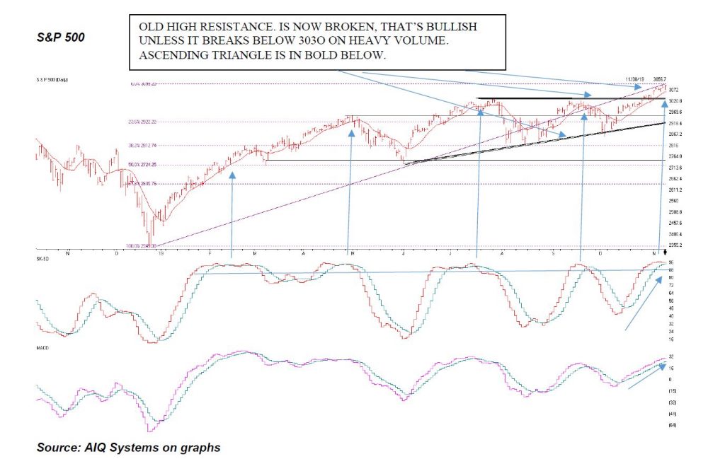
The Dow Jones Average is above. This index for the 5 largest stocks are Boeing, Apple, United healthcare, Goldman Sachs and Home Depot. They are the mix of American industry, but only contain 30 stocks. Even though the Dow is rising,

Look to the 3 graphs below the chart. You will see the horizontal blue line. When that is over 88 as it is, it shows that the market is OVERBOUGHT. Then when the green line falls below the green line you see the market selling off. It is there again, so be careful. The second graph shows Money flow/ Volume Accumulation. When this goes negative like it is below zero or the horizontal line, it shows that there is some distribution or selling pressure.

The last graph shows the Advance decline line. This is the number of stocks going up compared to the number of stocks going down on a running total. As you can see the Dow Jones is going up, but the Advance/decline is going DOWN. This means only a few stocks are going up. If this doesn’t change, the market could be ready for a little decline There is trend-line support at 28400 if it drops there. But unless the indicators change for the better, the market may fall and correct somewhat.

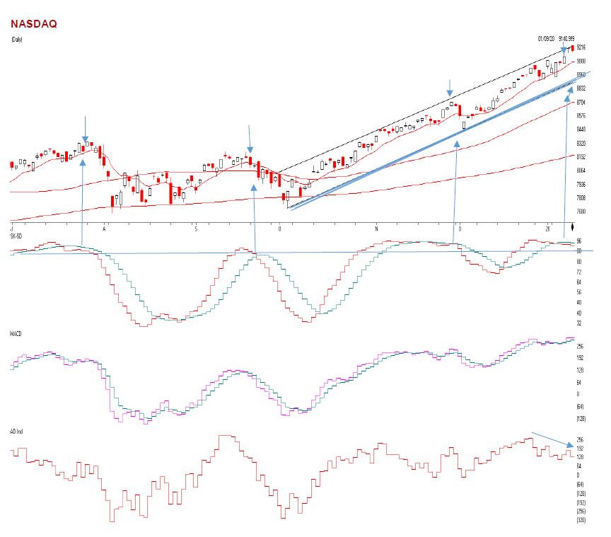
The NASDAQ is above. As you can see the NASDAQ is going up and is at the upper part of channel with-overbought and oversold indicators like the SK-SD stochastic indicators (the first graph) are very overbought. When the horizontal blue line is above 88 where the indicators are currently the market is overbought. Many times, when this indicator is above 88 you will see some sort of a correction or a give back.

See the last three times this indicator hit this level and crossed below it, the market fell. The NASDAQ can fall to the 8900 level where the bold trend line is above and still be bullish. It’s when we break that dark blue trend-line, then I will get very Cautious. Right now, the NASDAQ is overbought, and there are only a few stocks pushing this market higher. The third graph is the Advance decline Line. Notice, as the NASDAQ is going higher, it is going higher on a few stocks, that is why the Advance Decline Line is falling.

What is the Advance-Decline Line?

The advance/decline line (A/D) is a technical indicator that plots the difference between the number of advancing and declining stocks daily. The indicator is cumulative, with a positive number being added to the prior number, or if the number is negative, it is subtracted from the prior number.

The A/D line is used to show market sentiment, as it tells traders whether more stocks are rising or falling. It is used to confirm price trends in major indexes, and can also warn of reversals when divergence occurs.

The on-balance volume (OBV) is a technical analysis indicator intended to relate price and volume in the stock market. OBV is based on a cumulative total volume.[1] Money flow is calculated by averaging the high, low and closing prices, and multiplying by the daily volume. Comparing that result with the number for the previous day tells traders whether money flow was positive or negative for the current day. Positive money flow indicates that prices are likely to move higher, while negative money flow suggests prices are about to fall.

Source: Investopedia

A Support or support level is the level at which buyers tend to purchase or into a stock or index. It refers to the stock share price that a company or index should hold and start to rise. When the price of the stock falls towards its support level, the support level holds and is confirmed, or the stock continues to decline, and the support level must change.

  • Support levels on the S&P 500 area are 3248, 3217 area MAJOR Trend line support, 3182, 3119, and 3088. These might be BUY areas.
  • Support levels on the NASDAQ are 8900, 8655, and 8474.
  • On the Dow Jones support is at 28,420, 28245, 26093 (200-day moving average) and 27764
  • These may be safer areas to get into the equity markets on support levels slowly.
  • RESISTANCE LEVEL ON THE S&P 500 3280.

THE BOTTOM LINE:

The market is somewhat overbought and at FAIR VALUE. There are now some cracks in the dam showing as explained above, but my computer systems are still at a Hold for the market direction. I expected the S&P to hit 3280, it did last week and sold off very quickly to the 2165 area. The markets are rallying on large-cap growth and technology stocks and watching the other smaller to midcap companies decline. Either we start to see the small and midcap stocks begin to rally, or the market could begin to decline. The S&P could hit 3280 to 3400 later in the year. Earnings could potentially grow 6 to 7% or more this year and that is why there is the possibility that the S&P 500 could reach 3280 to 3400+ in 2020, a much smaller rise in the stock market than in 2019 but hopefully, a decent return, with obviously no guarantees expressed or implied.

Best to all of you,

Joe Bartosiewicz, CFP®
Investment Advisor Representative
5 Colby Way
Avon, CT 06001
860-940-7020 or 860-404-0408

SECURITIES AND ADVISORY SERVICES OFFERED THROUGH SAGE POINT FINANCIAL INC., MEMBER FINRA/SIPC, AND SEC-REGISTERED INVESTMENT ADVISOR.

Charts provided by AIQ Systems:

Technical Analysis is based on a study of historical price movements and past trend patterns. There is no assurance that these market changes or trends can or will be duplicated shortly. It logically follows that historical precedent does not guarantee future results. Conclusions expressed in the Technical Analysis section are personal opinions: and may not be construed as recommendations to buy or sell anything.

Disclaimer:

The views expressed are not necessarily the view of Sage Point Financial, Inc. and should not be interpreted directly or indirectly as an offer to buy or sell any securities mentioned herein. Securities and Advisory services offered through Sage Point Financial Inc., Member FINRA/SIPC, an SEC-registered investment advisor.

Past performance cannot guarantee future results. Investing involves risk, including the potential loss of principal. No investment strategy can guarantee a profit or protect against loss in periods of declining values. Please note that individual situations can vary. Therefore, the information presented in this letter should only be relied upon when coordinated with individual professional advice. *There is no guarantee that a diversified portfolio will outperform a non-diversified portfolio in any given market environment. No investment strategy, such as asset allocation, can guarantee a profit or protect against loss in periods of declining values. It is our goal to help investors by identifying changing market conditions. However, investors should be aware that no investment advisor can accurately predict all of the changes that may occur in the market. The price of commodities is subject to substantial price fluctuations of short periods and may be affected by unpredictable international monetary and political policies. The market for commodities is widely unregulated, and concentrated investing may lead to Sector investing may involve a greater degree of risk than investments with broader diversification. Indexes cannot be invested indirectly, are unmanaged, and do not incur management fees, costs, and expenses.

Dow Jones Industrial Average: A weighted price average of 30 significant stocks traded on the New York Stock Exchange and the NASDAQ.
S&P 500: The S&P 500 is an unmanaged indexed comprised of 500 widely held securities considered to be representative of the stock market in general.

NASDAQ: the NASDAQ Composite Index is an unmanaged, market-weighted index of all over the counter common stocks traded on the National Association of Securities Dealers Automated Quotation System
(IWM) I Shares Russell 2000 ETF: Which tracks the Russell 2000 index: which measures the performance of the small capitalization sector of the U.S. equity market.

A Moderate Mutual Fund risk mutual has approximately 50-70% of its portfolio in different equities, from growth, income stocks, international and emerging markets stocks to 30-50% of its portfolio in different categories of bonds and cash. It seeks capital appreciation with a low to moderate level of current income.

The Merrill Lynch High Yield Master Index: A broad-based measure of the performance of non-investment grade US Bonds MSCI EAFE: the MSCI EAFE Index (Morgan Stanley Capital International Europe, Australia, and Far East Index) is a widely recognized benchmark of non-US markets. It is an unmanaged index composed of a sample of companies’ representative of the market structure of 20 European and Pacific Basin countries and includes reinvestment of all dividends. Investment grade bond index: The S&P 500 Investment-grade corporate bond index, a sub-index of the S&P 500 Bond Index, seeks to measure the performance of the US corporate debt issued by constituents in the S&P 500 with an investment-grade rating. The S&P 500 Bond index is designed to be a corporate-bond counterpart to the S&P 500, which is widely regarded as the best single gauge of large-cap US equities.

Floating Rate Bond Index is a rule-based, market-value weighted index engineered to measure the performance and characteristics of floating-rate coupon U.S. Treasuries, which have a maturity greater than 12 months.
Money Flow; The Money Flow Index (MFI) is a momentum indicator that measures the flow of money into and out of a security over a specified period. It is related to the Relative Strength Index (RSI) but incorporates volume, whereas the RSI only considers SK-SD Stochastics. When an oversold stochastic moves up through its MA, a buy signal is produced. Furthermore, Lane recommends that the stochastic line be smoothed twice with three-period simple moving averages: SK is the three-period simple moving average of K, and SD is the three-period simple moving average of SK

Rising Wedge; A rising wedge is a technical indicator, suggesting a reversal pattern frequently seen in bear markets. This pattern shows up in charts when the price moves upward with pivot highs and lows converging toward a single point known as the apex

Bartometer November 11, 2019

Hello Everyone,

Market Recap:

On my last Bartometer I stated that we were #1 On Buy signal, #2 the Dow Jones and the stock market had Bullish Ascending triangles patterns, #3. Money flow and On Balance Volume were breaking out to NEW HIGHS when the stock market wasn’t. This shows demand for stocks over and above the price. These 3 indicators were telling me and I was telling you that I thought the market would breakout to new highs, AND IT DID. The stock market broke out of the bullish ascending triangle, (see index on the next page about ascending triangles)*. On the S&P I said that it had to breakout of 3030 and it did. It is now 3093. I said the Dow Jones had to breakout of the 27400, and it did. It is now 27681.

Where does is go from here and could we get a little pull back?

See chart below for an explanation.

An excerpt from Fundamental Economist Dr. Robert Genetski: from Classical Principles.com:

Stocks benefited from encouraging news of a potential trade agreement between the US and China as well as some good news on the economy. Markets seldom move in only one direction. The S&P500 is now within 3% of its fundamental value. A pause or even a slight correction is overdue, particularly if there is any negative news. Even so, with stronger fundamentals and the Fed purchasing securities, any correction should be fairly mild. Stay bullish on stocks.

Adding to Bob’s his Comment:

Signs of strength in the economy combined with gains in stock prices led to a sharp jump in intermediate and longer-term interest rates. This week the interest rate on 10-year T-Notes moved 25 basis points higher. The latest moves turned the yield curve to a more normal shape. As with stocks, interest rates have spiked higher and are overdue for some correction. However, after more than a decade of interest rates declining and being well below their fundamental levels, rates remain 200 basis points below fundamental levels. While the Fed’s low target places a limit on how high interest rates will go, there is still a lot of upward potential for longer-term rates. Fixed-income portfolios should remain defensive.

On the Technical Side:

Over the last almost 22 months, the Dow Jones FINALLY broke out to new highs from the old highs set on Jan 31, 2018 at 26,714. That is a POSITIVE. Money Flow and On Balance Volume are still at a new high, but the markets are again becoming overbought. So, could the market comes down a little now? YES, the markets are now overbought and there could easily be a slight decline to 27191 to 27298, a decline of around 2%, and the S&P to decline to 3029 area, a decline of 2% or so, BUT no more than that, because if the markets GO BACK BELOW THE BREAKOUT it can cause traders to start selling in mass. So look for a possible test of the breakout, but IF the markets close below the breakout of 27300 to 27384 on the Dow Jones or 3030 on the S&P convincingly, then I will be getting Very Cautious. If that doesn’t happen then I am still moderately bullish. But I realize the market are now OVERBOUGHT and in my opinion, it is not a time to go out and invest a lot of money in the markets. Dollar cost averaging is fine. I stated in my January Bartometer that I thought the S&P could reach 3130 to 3180+ this year. At 3093 currently, that is about 1-3% from here.

Some of the INDEXES of the markets both equities and interest rates are below. The source is Morningstar.com up until November 9th, 2019. These are passive indexes.
*Dow Jones +20%
S&P 500 +24%
NASDAQ Aggressive growth +31%
I Shares Russell 2000 ETF (IWM) Small cap +19%
International Index (MSCI – EAFE ex USA) +16%
Moderate Mutual Fund +14%
Investment Grade Bonds (AAA) +13%
High Yield Merrill Lynch High Yield Index +11%
Floating Rate Bond Index +4.0%
Short Term Bond +4.0%
Fixed Bond Yields (10 year) +1.75.% Yield


The average Moderate Fund is up 14% this year fully invested as a 60% in stocks and 40% in bonds and nothing in the money market.

S&P 500

Ascending Triangle is above, and is Bullish as long as it stays above the breakout of 3027-3030

The S&P 500 is above. The S&P 500 contains 500 of the largest companies in the US. The 2 top companies by market value are Microsoft and Apple. But there are 498 other stocks in it. If you can see above the ASCENDING TRIANGLE that is BOLDED. Notice the clear breakout to new highs. This is clearly BULLISH like I thought would happen last month. And it did. Now that it has risen 2% ABOVE the breakout, a BREAKDOWN below the 3030 convincingly would get me VERY Cautious. It is normal to come back down to test the breakout, but not to break down below it. So if you see the S&P close below 3030 convincingly on heavy volume, I will be getting Cautious to Very Cautious depending on the reason. But the market is now at fair value to me and there may be another 1-4% more for the year in my opinion, but not much more unless there is incredible news from the Political or Tariff front. It is not a great time to go out and buy a lot in the stock market in my opinion as well.

The Middle graph is called the SK-SD Stochastics model. It shows the markets as being overbought when the indicator is above 88 where it is above the 88 horizontal line. Notice every time the indicator was above 88 it seemed to peak out and sell off. This is not guaranteed but it is good indicator.

The 3rd indicator is MACD or Momentum this indicator is still bullish until the pink line breaks down below the blue line. As of right now, momentum is still higher, but the markets are over bought, so be careful.

An ascending triangle is a chart pattern used in technical analysis. It is created by price moves that allow for a horizontal line to be drawn along the swing highs, and a rising trend line to be drawn along the swing lows. The two lines form a triangle. Traders often watch for breakouts from triangle patterns.

See the pattern above? It’s an Ascending triangle. Ascending triangles are BULLISH as long as they don’t go back below the breakout. If this is a successful Ascending triangle the S&P can rise to 3130-3180 first and possibly higher IF the breakout isn’t broken convincingly on the downside or breaking and closing below 3030.

On-balance volume (OBV) is a technical analysis indicator intended to relate price and volume in the stock market. OBV is based on a cumulative total volume.

Money flow is calculated by averaging the high, low and closing prices, and multiplying by the daily volume. Comparing that result with the number for the previous day tells traders whether money flow was positive or negative for the current day. Positive money flow indicates that prices are likely to move higher, while negative money flow suggests prices are about to fall.

A Support or support level is the level at which buyers tend to purchase or into a stock or index. It refers to the stock share price that a company or index should hold and start to rise. When the price of the stock falls towards its support level, the support level holds and is confirmed, or the stock continues to decline, and the support level must change.

  • Support levels on the S&P 500 area are 3027-3030, 3017, 2952, 2922, and 2812. These might be BUY areas.
  • Support levels on the NASDAQ are 8251, 8144, 8080 and 7771.
  • On the Dow Jones support is at 26,285, 25,763, and 25,458
  • These may be safer areas to get into the equity markets on support levels slowly.
  • RESISTANCE LEVEL ON THE S&P 500 IS 3130 and the Dow Jones breakout is 27,400. If there is a favorable tariff settlement, the market should rise short term.

THE BOTTOM LINE:

The Dow, the S&P 500 and the NASDAQ are at new highs after rallying over the last 3 weeks. Normally the markets after reaching new highs become overbought and may come back down towards the breakout areas to see if the breakouts area holds. lf breakout of 3030 are holds then the markets tend to drift back towards the old high to see if it can break out again. If it does then 3130 to 3180 could be the next target. If 3030 doesn’t hold on the S&P and starts to break down below 3030 then I will be getting cautious or very cautious.. I WILL CONTINUE TO ANALYZE THE TECHNICALS OF THE MARKET. The seasonal patterns of the markets are bullish towards the end of the year. Last year the markets fell in December. It looks like the market still wants to go up, but with tweets coming out hourly, market timing will be more difficult.

Best to all of you,

Joe Bartosiewicz, CFP®

Investment Advisor Representative
5 Colby Way
Avon, CT 06001
860-940-7020 or 860-404-0408

SECURITIES AND ADVISORY SERVICES OFFERED THROUGH SAGE POINT FINANCIAL INC., MEMBER FINRA/SIPC, AND SEC-REGISTERED INVESTMENT ADVISOR.

Charts provided by AIQ Systems:

Technical Analysis is based on a study of historical price movements and past trend patterns. There is no assurance that these market changes or trends can or will be duplicated shortly. It logically follows that historical precedent does not guarantee future results. Conclusions expressed in the Technical Analysis section are personal opinions: and may not be construed as recommendations to buy or sell anything.

Disclaimer: The views expressed are not necessarily the view of Sage Point Financial, Inc. and should not be interpreted directly or indirectly as an offer to buy or sell any securities mentioned herein. Securities and Advisory services offered through Sage Point Financial Inc., Member FINRA/SIPC, an SEC-registered investment advisor.

Past performance cannot guarantee future results. Investing involves risk, including the potential loss of principal. No investment strategy can guarantee a profit or protect against loss in periods of declining values. Please note that individual situations can vary. Therefore, the information presented in this letter should only be relied upon when coordinated with individual professional advice. *There is no guarantee that a diversified portfolio will outperform a non-diversified portfolio in any given market environment. No investment strategy, such as asset allocation, can guarantee a profit or protect against loss in periods of declining values.

It is our goal to help investors by identifying changing market conditions. However, investors should be aware that no investment advisor can accurately predict all of the changes that may occur in the market.

The price of commodities is subject to substantial price fluctuations of short periods and may be affected by unpredictable international monetary and political policies. The market for commodities is widely unregulated, and concentrated investing may lead to Sector investing may involve a greater degree of risk than investments with broader diversification.

Indexes cannot be invested indirectly, are unmanaged, and do not incur management fees, costs, and expenses.

Dow Jones Industrial Average: A weighted price average of 30 significant stocks traded on the New York Stock Exchange and the NASDAQ.

S&P 500: The S&P 500 is an unmanaged indexed comprised of 500 widely held securities considered to be representative of the stock market in general.

NASDAQ: the NASDAQ Composite Index is an unmanaged, market-weighted index of all over the counter common stocks traded on the National Association of Securities Dealers Automated Quotation System

(IWM) I Shares Russell 2000 ETF: Which tracks the Russell 2000 index: which measures the performance of the small capitalization sector of the U.S. equity market.

A Moderate Mutual Fund risk mutual has approximately 50-70% of its portfolio in different equities, from growth, income stocks, international and emerging markets stocks to 30-50% of its portfolio in different categories of bonds and cash. It seeks capital appreciation with a low to moderate level of current income.

The Merrill Lynch High Yield Master Index: A broad-based measure of the performance of non-investment grade US Bonds

MSCI EAFE: the MSCI EAFE Index (Morgan Stanley Capital International Europe, Australia, and Far East Index) is a widely recognized benchmark of non-US markets. It is an unmanaged index composed of a sample of companies’ representative of the market structure of 20 European and Pacific Basin countries and includes reinvestment of all dividends.

Investment grade bond index: The S&P 500 Investment-grade corporate bond index, a sub-index of the S&P 500 Bond Index, seeks to measure the performance of the US corporate debt issued by constituents in the S&P 500 with an investment-grade rating. The S&P 500 Bond index is designed to be a corporate-bond counterpart to the S&P 500, which is widely regarded as the best single gauge of large-cap US equities.

Floating Rate Bond Index is a rule-based, market-value weighted index engineered to measure the performance and characteristics of floating-rate coupon U.S. Treasuries, which have a maturity greater than 12 months.

The Big Canary in the Coal Mine…

Technology is what it’s all about these days.  Technology (primarily) runs on semiconductors.  If the semiconductor business is good, business is good.  OK, that’s about as large a degree of oversimplification as I can manage.  But while it may be overstated, there is definitely a certain amount of truth to it.

So, it can pay to keep an eye on the semiconductor sector.  The simplest way to do that is to follow ticker SMH.  Keeping with the mode of oversimplifying things, in a nutshell, if SMH is not acting terribly that’s typically a good thing.  So where do all things SMH stand now?  Let’s take a look.

Ticker SMH

As with all things market-related (among other things), beauty is in the eye of the beholder.  A quick glance at Figure 1 argues that SMH is inarguably in a strong uptrend, well above its 200-day moving average

Figure 1 – SMH in an uptrend (Courtesy AIQ TradingExpert)

A glance at Figure 2 suggests that SMH has just completed 5 waves up and may be due for a decline.

Figure 2 – SMH with potentially bearish Elliott Wave count (Courtesy ProfitSource by HUBB)

And Figure 3 highlights a very obvious bearish divergence between SMH weekly price action and the 3-period RSI indicator – i.e., SMH keeps moving incrementally higher while RSI3 reaches slightly lower highs each time.  Speaking anecdotally, this setup seems to presage at least a short-term decline maybe 70% of the time.  Of course, the degree of decline varies also.

Figure 3 – SMH with 3-period RSI bearish divergence (Courtesy AIQ TradingExpert)

So, what does it all mean?  First off, I am not going to make any predictions (if you knew my record on “predictions” you would thing that that is a good thing).  I am simply going to point out that one way or the other SMH may be about to give us some important information.

Scenario 1 – SMH breaks out to the upside and stays there: If SMH breaks through the upside and runs, the odds are very high that the overall stock market will run with it.

Course of action: Play for a bullish run by the overall market into the end of the year.

Scenario 2 -SMH breaks out briefly to the upside but then falls back below the recent highs: This would be at least a short-term bearish sign.  Failed breakouts are typically a bad sign and the security in question often behaves badly after disappointing bullish investors.  In this case, if it happens to SMH it could follow through to the overall market.

Course of action: If this happens, you might consider “playing some defense” (hedging, raising some cash, etc.) . Failed breakouts often make the market a little “cranky” (and cranky is one of my fields of expertise).

Scenario 3: SMH fails to breakout and suffers an intermediate-term decline.  If I were to fixate only on the bearish RSI3 divergence I showed earlier in Figure 3, this would seem like the most likely result. 

Course of action: If SMH sells off without breaking above recent resistance, keep an eye on SMH price via its 200-day moving average.  Simple interpretation goes like this: If SMH sells off but holds or regains it’s 200-day moving average then the bullish case can quickly be re-established; If SMH sells off and holds below its 200-day moving average, that should be considered a bearish sign for the overall market.

Jay Kaeppel

Disclaimer:  The data presented herein were obtained from various third-party sources.  While I believe the data to be reliable, no representation is made as to, and no responsibility, warranty or liability is accepted for the accuracy or completeness of such information.  The information, opinions and ideas expressed herein are for informational and educational purposes only and do not constitute and should not be construed as investment advice, an advertisement or offering of investment advisory services, or an offer to sell or a solicitation to buy any security.

Chart Patterns: Flag and Pennants

By Steve Hill

President, AIQ Systems

Stephen Hill is President of AIQ Systems. For the past 15 years he has been involved in all aspects of AIQ Systems, from support and sales to programming and education. Steve is a frequent speaker at events in the U.S. and Europe, talking on subjects as diverse as Portfolio Simulation TechniquesAdvanced Chart Pattern Analysis and Trading System Design.

Chart pattern analysis, often thought of as part science part art is a key element in many traders decision process. Common patterns like double tops and bottoms are somewhat self-fulfilling, given that most of us can see these patterns occurring. Measures of what consititues a double top or bottom in good analytical terms we’ll save for another article. In this this article we are focussing on two of my favorite chart patterns; Flags and Pennants

Flags and Pennants are Consolidation or Continuation Patterns

These patterns break out in the direction of the previous trend, confirming the existing trend, suggesting that investors are considering whether the market is overbought or oversold but ultimately deciding to confirm the existing trend. Flags and pennants are of two types, bullish or bearish

Flags and pennants are generally considered continuation patterns as they breakout in the prevailing trend direction. They represent a brief pause especially after a steep run up in an active ticker. They are a fairly common and useful for short term trading.

Bullish Flags – formation

Lower tops and lower bottoms bounded by two parallel trendlines with pattern slanting against the prevailing trend are considered bull flags (figure 1).


Figure 1Bullish flag pattern

Bearish Flags – formation

Higher tops and higher bottoms bounded by two parallel trendlines with pattern slanting against the prevailing trend are considered bear flags. (figure 2).


Figure 2Bearish flag pattern

Elements of bullish flags

  • A rapid and steep price rise of around 20% from bottom of the pole to top.
  • Decreasing volume during the formation of the flag.
  • Breakout occurs to the upside with resumption of increase volume levels
  • Flags length excluding the pole classic should be around 10 days, can be less but not more than 20 days.
Figure 3. Whole Foods Market, Inc (WFMI) bullish flag


Bulkowski noted that the high and tight flag performed best. (source Encyclodpedia of Chart Patterns by Thomas Bulkowski).
2Some 25% of the patterns are horizontal notes Markos Katsanos. (source Measuring Flags & Pennants: Technical Analysis of Stocks and Commodities vol 23 no 4)bullish flag breakout on increased volume note the pole length is 20% + of the price action and the diminishing volume on the flag.


Elements of bearish flags

  • A rapid and steep price decline of around 20% from top of the pole to bottom.
  • Decreasing volume during the formation of the flag.
  • Breakout occurs to the downside with resumption of increase volume levels.
  • Flag length excluding the pole should be around 10 days, can be less but not more than 20 days.

Figure 4 shows MNST classic bearish flag breakout on increased volume note the pole length is 20% + of the price action and the diminishing volume on the flag.

Bullish Pennants – formation

Pennants look very much like symmetrical triangles, on the end of a pole, typically they are smaller in size and duration (figure 5).

Bearish Pennants – formation

An upside down bullish pennant, the triangle is at the bottom of the pole. (figure 6).

Elements of bullish pennants

  • A rapid and steep price rise of around 20% from bottom of the pole to top.
  • Decreasing volume during the formation of the pennant.
  • Pennants look like symmetrical triangles on a pole, price action is converging.
  • Diminishing volume as pennant forms.
  • Breakout to the upside with re- sumption of volume levels.
  • Pennant length excluding the pole should be around 10 days, can be less but not more than 20 days.Figure 7 shows CDW classic bullish pennant breakout on increased volume

Figure 7CDW Computer Centers (CDW) bullish pennant

Elements of bearish pennants

  • A rapid and steep price drop of around 20% from top of the pole to bottom.
  • Decreasing volume during the formation of the pennant.
  • Pennants look like symmetrical triangles on a pole, price action is converging.
  • Diminishing volume as pennant forms.
  • Breakout to the downside with resumption of volume levels.
  • Pennant length excluding the pole should be around 10 days, can be less but not more than 20 days.

How do you trade flags and pennants?

Katsanos study of Flags and pennants revealed that the average breakout was 45% over an average period of 11 days. Bulkowski noted a 63% average gain. to trade these breakouts, set tight stops at low of day before breakout and use trailing stops once breakout occurs.

Target prices are more difficult to predict as these are continuation patterns, but after 11 days you are beyond the average move in days.

AIQ tip

Once a breakout occurs, use AIQ space on right of the chart (rtalerts only) and advance 11 days into the future. Draw a trendline parallel to the pole trend from the breakout point.

A Useful Interest Rate Indicator

2018 witnessed something of a “fake out” in the bond market.  After bottoming out in mid-2016 interest rates finally started to “breakout” to new multi-year highs in mid to late 2018. Then just as suddenly, rates dropped back down.

1

Figure 1 displays the tendency of interest rates to move in 60-year waves – 30 years up, 30 years down.  The history in this chart suggests that the next major move in interest rates should be higher.Figure 1 – 60-year wave in interest rates (Courtesy: www.mcoscillator.com)

A Way to Track the Long-Term Trend in Rates

Ticker TNX is an index that tracks the yield on 10-year treasury notes (x10).  Figure 2 displays this index with a 120-month exponential moving average overlaid.  Think of it essentially as a smoothed 10-year average.

2

Figure 2 – Ticker TNX with 120-month EMA (Courtesy AIQ TradingExpert)

Interpretation is pretty darn simple.  If the month-end value for TNX is:

*Above the 120mo EMA then the trend in rates is UP (i.e., bearish for bonds)

*Below the 120mo EMA then the trend in rates is DOWN (i.e., bullish for bonds)

3

Figure 3 displays 10-year yields since 1900 with the 120mo EMA overlaid.  As you can see, rates tend to move in long-term waves.

Figure 3 – 10-year yield since 1900 with 120-month exponential moving average

Two key things to note:

*This simple measure does a good job of identifying the major trend in interest rates

*It will NEVER pick the top or bottom in rates AND it WILL get whipsawed from time to time (ala 2018).

*Rates were in a continuous uptrend from 1950 to mid-1985 and were in a downtrend form 1985 until the 2018 whipsaw.

*As you can see in Figure 2, it would not take much of a rise in rates to flip the indicator back to an “uptrend”.

With those thoughts in mind, Figure 4 displays the cumulative up or down movement in 10-year yields when, a) rates are in an uptrend (blue) versus when rates are in a downtrend (orange).

4

Figure 4 – Cumulative move in 10-year yields if interest rate trend is UP (blue) or DOWN (orange)

You can see the large rise in rates from the 1950’s into the 1980’s in the blue line as well as the long-term decline in rates since that time in the orange line.  You can also see the recent whipsaw at the far right of the blue line.

Summary

Where do rates go from here?  It beats me.  As long as the 10-year yield holds below its long-term average I for one will give the bond bull the benefit of the doubt.  But when the day comes that 10-year yields move decisively above their long-term average it will be essential for bond investors to alter their thinking from the mindset of the past 30+ years, as in that environment, long-term bonds will be a difficult place to be.

And that won’t be easy, as old habits die hard.

5

Figure 5 is from this article from BetterBuyandHold.com and displays the project returns for short, intermediate and long term bonds if rates were to reverse the decline in rates since 1982.Figure 5 – Projected total return for short, intermediate and long-term treasuries if rates reverse decline in rate of past 30+ years (Courtesy: BetterBuyandHold.com)

When rates finally do establish a new rising trend, short-tern and intermediate term bonds will be the place to be.  When that day will come is anyone’s guess.  But the 10-year yield/120mo EMA method at least we have an objective way to identify the trend shortly after the fact.

Jay Kaeppel

Disclaimer:  The data presented herein were obtained from various third-party sources.  While I believe the data to be reliable, no representation is made as to, and no responsibility, warranty or liability is accepted for the accuracy or completeness of such information.  The information, opinions and ideas expressed herein are for informational and educational purposes only and do not constitute and should not be construed as investment advice, an advertisement or offering of investment advisory services, or an offer to sell or a solicitation to buy any security.