Recording of FREE 90-minute AIQ Zoom meet on September 7, 2023.
In this 90-minute session, Steve Hill, CEO of AIQ Systems looked at Market Timing based on Sector Rotation + David Wozniak of TFR will cover a Mid-Year Market Forecast
Please note due to recording issues the first 5 minutes of the session has some external noise.
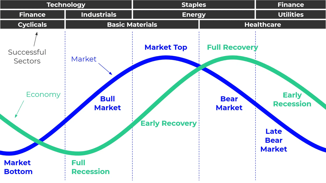
In many ways the markets imitate life. For example, the trend is your friend. You may enjoy your friendship with the trend for an indefinite length of time. But the moment you ignore it – or just simply take it for granted that this friendship is permanent, with no additional effort required on your part – that’s when the trouble starts.
For the stock market right now, the bullish trend is our friend. Figure 1 displays the 4 major indexes all above their respective – and rising – long-term moving averages. This is essentially the definition of a “bull market.”
In addition, a number of indicators that I follow have given bullish signals in the last 1 to 8 months. These often remain bullish for up to a year. So, for the record, with my trusted trend-following, oversold/thrust and seasonal indicators mostly all bullish I really have no choice but to be in the bullish camp.
Not that I am complaining mind you. But like everyone else, I try to keep my eyes open for potential signs of trouble. And of course, there are always some. One of the keys to long-term success in the stock market is determining when is the proper time to actually pay attention to the “scary stuff.” Because scary stuff can be way early or in other cases can turn out to be not that scary at all when you look a little closer.
So, let’s take a closer look at some of the scary stuff.
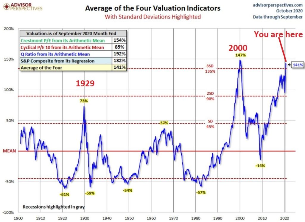
Valuations
Figure 2 displays an aggregate model of four separate measures of valuation. The intent is to gain some perspective as to whether stocks are overvalued, undervalued or somewhere in between.
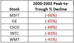
Clearly the stock market is “overvalued” if looked at from a historical perspective. The only two higher readings preceded the tops in 1929 (the Dow subsequently lost -89% of its value during the Great Depression) and 2000 (the Nasdaq 100 subsequently lost -83% of its value).
Does this one matter? Absolutely. But here is what you need to know:
*Valuation IS NOT a timing indicator. Since breaking out to a new high in 1995 the stock market has spent most of the past 25 years in “overvalued” territory. During this time the Dow Industrials have increased 700%. So, the proper response at the first sign of overvaluation should NOT be “SELL.”
*However, ultimately valuation DOES matter.
Which leads directly to:
Jay’s Trading Maxim #44: If you are walking down the street and you trip and fall that’s one thing. If you are climbing a mountain and you trip and fall that is something else. And if you are gazing at the stars and don’t even realize that you are climbing a mountain and trip and fall – the only applicable phrase is “Look Out Below”.
So, the proper response is this: instead of walking along and staring at the stars, keep a close eye on the terrain directly in front of you. And watch out for cliffs.
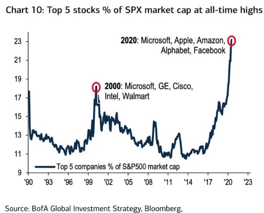
Top 5 companies as a % of S&P 500 Index
At times through history certain stocks or groups of stocks catch “lightning in a bottle.” And when they do the advances are spectacular, enriching anyone who gets on board – unless they happen to get on board too late. Figure 3 displays the percentage of the S&P 500 Index market capitalization made up by JUST the 5 largest cap companies in the index at any given point in time.
Figure 3 – Top 5 stocks as a % of S&P 500 Index market cap (Courtesy: www.Bloomberg.com)
The anecdotal suggestion is pretty obvious. Following the market peak in 2000, the five stocks listed each took a pretty significant whack as shown in Figure 4.
Figure 4 – Top Stocks after the 2000 Peak
Then when we look at how far the line in Figure 3 has soared in 2020 the obvious inference is that the 5 stocks listed for 2020 are due to take a similar hit. And here is where it gets interesting. Are MSFT, AAPL, AMZN, GOOGL and FB due to lose a significant portion of their value in the years directly ahead?
Two thoughts:
*There is no way to know for sure until it happens
*That being said, my own personal option is “yes, of course they are”
But here is where the rubber meets the road: Am I presently playing the bearish side of these stocks? Nope. The trend is still bullish. Conversely, am I keeping a close eye and am I willing to play the bearish side of these stocks? Yup. But not until they – and the overall market – actually starts showing some actual cracks.
One Perspective on AAPL
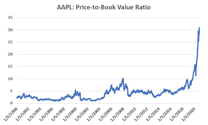
Apple has been a dominant company for many years, since its inception really. Will it continue to be? I certainly would not bet against the ability of the company to innovate and grow its earnings and sales in the years ahead. Still timing – as they say – is everything. For what it is worth, Figure 5 displays the price-to-book value ratio for AAPL since January 1990.
Figure 5 – AAPL price-to-book value ratio (Data courtesy of Sentimentrader.com)
Anything jump out at you?
Now one can argue pretty compellingly that price-to-book value is not the way to value a leading technology company. And I probably agree – to a point. But I can’t help but look at Figure 5 and wonder if that point has possibly been exceeded.
Summary
Nothing in this piece is meant to make you “bearish” or feel compelled to sell stocks. For the record, I am still in the bullish camp. But while this information DOES NOT constitute a “call to action”, IT DOES constitute a “call to pay close attention.”
Bottom line: enjoy the bull market but DO NOT fall in love with it.
Jay Kaeppel
Disclaimer: The information, opinions and ideas expressed herein are for informational and educational purposes only and are based on research conducted and presented solely by the author. The information presented represents the views of the author only and does not constitute a complete description of any investment service. In addition, nothing presented herein should be construed as investment advice, as an advertisement or offering of investment advisory services, or as an offer to sell or a solicitation to buy any security. The data presented herein were obtained from various third-party sources. While the data is believed to be reliable, no representation is made as to, and no responsibility, warranty or liability is accepted for the accuracy or completeness of such information. International investments are subject to additional risks such as currency fluctuations, political instability and the potential for illiquid markets. Past performance is no guarantee of future results. There is risk of loss in all trading. Back tested performance does not represent actual performance and should not be interpreted as an indication of such performance. Also, back tested performance results have certain inherent limitations and differs from actual performance because it is achieved with the benefit of hindsight.
Well, the election is over and and if Trump doesn’t win the contested vote then Biden is President. My biggest concern going forward is the race in Georgia that could switch the control of the senate to the Democrats enabling them unchecked control in the government. If this happens, and Democrats get rid of the filibuster rule there could be volatily in the stock and bond markets because: It could increase taxes on corporations, raise capital gains taxes and estate taxes by reducing the couple estate tax exclusion from $11 million to $3.5 milllion.
If the Democrats don’t win then there will be gridlock, and gridlock meaning that many of the tax increases may not pass. We will see what happens on January 5th 2021. Currently my Technical Analysis computer is still on a Buy-Hold as of about a week to 2 weeks ago, but it changes daily.
The increases in the Covid 19 virus is again causing Governors in many states to restrict access to non-essential business. This will reduce earnings of many corporations but increase the earnings of technology companies that are benefitting by people using their goods and services from home. Once a safe and effective vaccine is created by either Pfizer or Moderna, and when people feel safe to travel/use the goods and services of non essential companies will they prevail. then the Value stocks, eg., the cruise lines, airlines, resorts, restaurants, retail, manufacturing, telecommunications and more should rise. Until that time, the market will be volatile.
We are now in a seasonally strong time for the stock markets, but with the overhang of the senate election in Georgia, and the increase in Covid 19 coupled with the upcoming Flu season, caution is still somewhat appropriate. For people who are more Cautious in general, but over the next 1-2 years I still think the market could go higher even though the market is about 6% overvalued mostly because of the technology stocks. When the pandemic is even close to nearing its conclusion, the Value sector should continue its rise. So, small, mid and large value stocks could be the bigger winner, and if we get a selloff because of Covid 19, I will be buying those sectors.
Some of the INDEXES of the markets both equities and interest rates are below. The source is Morningstar.com up until Novemeber 14, 2020. These are passive indexes.
Dow Jones +5.1% S&P 500 +12.2% EQUAL WEIGHTED S&P 500 +3.1% NASDAQ Aggressive growth +29% Large Cap Value -3.0% I Shares Russell 2000 ETF (IWM) Small cap +5.2% Midcap stock funds -4.66 International Index (MSCI – EAFE ex USA +2% Financial stocks -10% Energy stocks -36% Healthcare Stocks +11%
Moderate Mutual Fund Investment Grade Bonds (AAA) Long duration +6.5% igh Yield Merrill Lynch High Yield Index +1.9%
Floating Rate Bond Funds -.60% Short Term Bond +1.6% Mutli sector bond funds +2.3%
I do expect potential major volatility over the next few months if the Republicans lose the Senate.
Classicalprinicples.com and Robert Genetskis Excerpts
Market Outlook
Stocks were mixed this past week. The previously out-of-favor small caps rose 3%-4%, when the Nasdaq and QQQs fell 2%-3%. The Dow and S&P500 gained 1%-2%. I expect stocks to continue to consolidate within the range of the past five months. Biden’s choice of advisors is interesting. His Chief of Staff was the one in charge of fighting Ebola. He admitted they had made every mistake imaginable in that fight. Another medical advisor says the country should lock down for 4-6 weeks and can simply pay workers and businesses for lost income. Just what Biden needs… another advisor with no concept of economics feeding him mush. It’s important to pay attention to Biden’s advisors. Their ideas can provide a clue to just how crazy things can get. Hopefully, cooler heads will prevent the chaos that would result from such complete nonsense.
A Look Back
The latest weekly data show the labor market continues to improve in spite of Covid. Initial unemployment claims fell to 709,000 in the first week of this month. This is down about 140,000 from the previous month. For the final week in October, the insured unemployment rate fell to 4.6%, down from 7.5% from the previous month. The number of people receiving insured unemployment payments fell to 6.8 million. There were close to 11 million a month ago.
What to expect this coming week
Look for the economic numbers to continue to show the economy performing well. Tuesday’s report for manufacturing in October should be a strong one. Business surveys show manufacturing production increasing dramatically in October. Hence, the Fed’s manufacturing number should be up substantially.
Source: Classical Principles.com
S&P 500 Chart Source: AIQsystems.com
The S&P 500 is above. As you can see my computer models gave a BUY signal on 10/30/20 and another one a couple days later. Another Bullish sign is when it broke above the middle of the W pattern. This is BULLISH unless it breaks down below that breakout. Now it has to breakout from the old high of 3648. If it does with conviction volume watch the 3750 area for some resistance. But it has to breakout from 3648 with a lot of volume first.
We are now in a bullish seasonal pattern for the market. One year from now I think the economy will do much better than it is now and the markets should be higher as well.
MACD or Momentum is still Bullish as the pink line has broken out of the blue line showing positive momentum.
Support levels on the S&P 500 area are 3546, 3392-3405, 3306 and 3244. 3143 is 200 Day Moving average NASDAQ Support, 11621, 11300-11360, 11062. Resistance is 12075 These may be safer areas to get into the equity markets on support levels slowly on the accumulation areas.
THE BOTTOM LINE:
The market has rebounded nicely over the last month mainly because of earnings of companies beating expectations. The NASDAQ has done the best this year and should continue to do well IF the market continues higher. Now that the vaccine is a reality the value stocks should start to rise. You may want to call me to review everything including your 401(k) to determine the best allocation going forward. I like the USA market better than the international market.
Best to all of you,
Joe Bartosiewicz, CFP® Investment Advisor Representative
92 High Street
Thomaston, CT 06787
860-940-7020
Securities and advisory services offered through SagePoint Financial, Inc. (SPF), member FINRA/SIPC. SPF is separately owned and other entities and/or marketing names, products or services referenced here are independent of SPF. 800-552-3319 20 East Thomas Road Ste 2000 Phoenix AZ 85012
Charts provided by AIQ Systems:
Technical Analysis is based on a study of historical price movements and past trend patterns. There is no assurance that these market changes or trends can or will be duplicated shortly. It logically follows that historical precedent does not guarantee future results. Conclusions expressed in the Technical Analysis section are personal opinions: and may not be construed as recommendations to buy or sell anything.
Disclaimer: The views expressed are not necessarily the view of Sage Point Financial, Inc. and should not be interpreted directly or indirectly as an offer to buy or sell any securities mentioned herein. Securities and Advisory services offered through Sage Point Financial Inc., Member FINRA/SIPC, an SEC-registered investment advisor.
Past performance cannot guarantee future results. Investing involves risk, including the potential loss of principal. No investment strategy can guarantee a profit or protect against loss in periods of declining values. Please note that individual situations can vary. Therefore, the information presented in this letter should only be relied upon when coordinated with individual professional advice. *There is no guarantee that a diversified portfolio will outperform a non-diversified portfolio in any given market environment. No investment strategy, such as asset allocation, can guarantee a profit or protect against loss in periods of declining values. It is our goal to help investors by identifying changing market conditions. However, investors should be aware that no investment advisor can accurately predict all of the changes that may occur in the market.
The price of commodities is subject to substantial price fluctuations of short periods and may be affected by unpredictable international monetary and political policies. The market for commodities is widely unregulated, and concentrated investing may lead to Sector investing may involve a greater degree of risk than investments with broader diversification.
Indexes cannot be invested indirectly, are unmanaged, and do not incur management fees, costs, and expenses.
Dow Jones Industrial Average: A weighted price average of 30 significant stocks traded on the New York Stock Exchange and the NASDAQ.
S&P 500: The S&P 500 is an unmanaged indexed comprised of 500 widely held securities considered to be representative of the stock market in general.
NASDAQ: the NASDAQ Composite Index is an unmanaged, market-weighted index of all over the counter common stocks traded on the National Association of Securities Dealers Automated Quotation System
(IWM) I Shares Russell 2000 ETF: Which tracks the Russell 2000 index: which measures the performance of the small capitalization sector of the U.S. equity market.
A Moderate Mutual Fund risk mutual has approximately 50-70% of its portfolio in different equities, from growth, income stocks, international and emerging markets stocks to 30-50% of its portfolio in different categories of bonds and cash. It seeks capital appreciation with a low to moderate level of current income.
The Merrill Lynch High Yield Master Index: A broad-based measure of the performance of non-investment grade US Bonds
MSCI EAFE: the MSCI EAFE Index (Morgan Stanley Capital International Europe, Australia, and Far East Index) is a widely recognized benchmark of non-US markets. It is an unmanaged index composed of a sample of companies’ representative of the market structure of 20 European and Pacific Basin countries and includes reinvestment of all dividends.
Investment grade bond index: The S&P 500 Investment-grade corporate bond index, a sub-index of the S&P 500 Bond Index, seeks to measure the performance of the US corporate debt issued by constituents in the S&P 500 with an investment-grade rating. The S&P 500 Bond index is designed to be a corporate-bond counterpart to the S&P 500, which is widely regarded as the best single gauge of large-cap US equities.
Floating Rate Bond Index is a rule-based, market-value weighted index engineered to measure the performance and characteristics of floating-rate coupon U.S. Treasuries, which have a maturity greater than 12 months.
For the record, I am an avowed “trend-follower.” But I also know that no trend lasts forever. So, while I have gotten pretty good at “riding along”, I do – like most people – like to “look ahead” since I do know that the landscape will forever be changing.
So, with the caveat that none of what follows should be considered a “call to action”, only as a “call to pay attention”, let’s venture out “into the weeds.”
AIROIL
Here is an ugly pairing – airline stocks and traditional energy stocks – yikes! In Figure 1 you see an index that I created and followed call AIROIL comprised of three airline stocks and five “Big Oil” stocks. During the pandemic meltdown this index fell to a level not seen since 2007 before “bouncing”.
Editors Note:
Jay's AIROIL Index is built using the AIQ Data Manager by creating a list andcreating a group ticker (in this case AIROIL). Stocks are inserted under the ticker and the index is then computed using Compute Group/Sector indices.
In the bottom clip you see an indicator I call VFAA. Note that when VFAA tops out and rolls over, meaningful advances in the index tend to follow. In addition, VFAA is at a high level seen only once before in 2009. Following that reversal, the index rose almost 500% over the next 9 years.
So, is now a great time to pile into airlines and big oil? One would have to be a pretty hard-core contrarian to pound the table on this one. The airlines are in terrible shape due to the pandemic and vast uncertainty remains regarding when things might improve. And “Big Oil” is about as unloved as any sector has ever been.
So, am I suggesting anyone “load up” on airlines and oil? Nope. What I am saying is that I am watching this closely and that if and when VFAA “rolls over” I may look to commit some money to these sectors on a longer-term contrarian basis.
International/Commodities/Value
Also known of late as “the barking dogs”. If you have had money committed to any or all of these asset classes in recent years you are shaking your head right about now. These areas have VASTLY underperformed a simple “buy-and-hold the S&P 500 Index” approach for a number of years.
Is this state of affairs going to change anytime soon? Regarding “anytime soon” – it beats me. However, I am on the record as arguing that at some point this WILL change. History makes one thing very clear – no asset class has a permanent edge. So, given that the S&P 500 Index has beaten these above mentioned by such a wide margin for such a long time (roughly a decade or more) I am confident that one day in the next x years, the “worm will turn.”
Figure 2 displays an index that I created and follow that tracks an international ETF, a commodity ETF and a value ETF. The VFAA indicator appears in the bottom clip.
Now if history is a guide, then the recent “rollover” by VFAA suggests that this particular grouping of asset classes should perform well in the coming years. Two things to note:
1. There is no guarantee
2. There is absolutely no sign yet that “the turn” – relative to the S&P 500 – is occurring
Figure 3, 4 and 5 are “relative strength” charts from www.StockCharts.com. They DO NOT display the price of any security; they display the performance of the first ETF list compared to the second ETF listed. So, Figure 3 displays the performance of ticker EFA (iShares MSCI EAFE ETF which tracks a broad index of stocks from around the globe, excluding the U.S.) relative to the S&P 500 Index.
When the bars are trending lower it means EFA is underperforming SPY and vice versa. The trend in Figure 3 is fairly obvious – international stocks continue to lose ground to U.S. large-cap stocks.
If your goal is to pick a bottom, have at it. As for me, I am waiting for some “signs of life” in international stocks relative to U.S. stocks before doing anything.
Figure 4 displays ticker DBC (a commodity-based ETF) versus SPY and Figure 5 displays ticker VTV (Vanguard Value ETF) versus ticker VUG (Vanguard Growth ETF). Both tell the same tale as Figure 3 – unless you are an avowed bottom-picker there is no actionable intelligence. Still, both these trends are now extremely overdone, so a significant opportunity may be forming.
*Nothing is happening at the moment with everything displayed above…
*…But something will (at least in my market-addled opinion) – so pay close attention.
Jay Kaeppel
Disclaimer: The information, opinions and ideas expressed herein are for informational and educational purposes only and are based on research conducted and presented solely by the author. The information presented represents the views of the author only and does not constitute a complete description of any investment service. In addition, nothing presented herein should be construed as investment advice, as an advertisement or offering of investment advisory services, or as an offer to sell or a solicitation to buy any security. The data presented herein were obtained from various third-party sources. While the data is believed to be reliable, no representation is made as to, and no responsibility, warranty or liability is accepted for the accuracy or completeness of such information. International investments are subject to additional risks such as currency fluctuations, political instability and the potential for illiquid markets. Past performance is no guarantee of future results. There is risk of loss in all trading. Back tested performance does not represent actual performance and should not be interpreted as an indication of such performance. Also, back tested performance results have certain inherent limitations and differs from actual performance because it is achieved with the benefit of hindsight.
You may have seen some of the articles out there analyzing the skewed nature of the current market rally. As Joe Bartosiewicz in his August 8 Bartometer pointed out:
“The Top 15 Stocks in the S&P 500 account in Market Value 35% of the entire S&P 500 stock market. The Bottom 420 Stocks in the S&P 500 account in Market Value 33.8% of the entire S&P 500 stock market. This means that 15 stocks are controlling the entire S&P 500..”
The Dow Jones 30 index uses a price weighted criteria as part of it’s calculation, and also includes Apple; AAPL has more than doubled in price in under 5 months.
Given that there appears to be only a small basket of stocks leading this rally, we had a look back at the last time tech related stocks were driving the market higher; the dotcom bubble that ran through the 90s into the early 00s.
Monthly DJIA and MACD – left through 3/2002 – right through 10/2002
The first chart is a monthly of the Dow 30 with MACD indicator comparing the market 03/29//2002 as the dotcom bubble rolled over vs 7 months later. Students of divergence analysis, will tell you that MACD in late March 2002 clearly showed prices should be much lower still despite the @33 % rally from the September 2001 low. By late October 2002 the market had fallen again by @33%. At that time the market was close to @40% lower than the high at the start of 2000.
Monthly DJIA and MACD – left through 3/2002 – right through 8/2020
The second chart is a monthly of the Dow 30 on the right through 8/10/20 vs the rally peak of 03/29/2002. The current market has had a @50% rally from the low at the end of March 2020. The original correction was @37% from high to low, slightly bigger than the dotcom correction. The MACD, similar to 2002, is strongly diverging.
The decline in 2002, after the rally, took prices lower than the the prior bottom. If a similar pattern happens this time and the decline is @40% from the high of 29568, the Dow would at the 17700 level.
Market volatility has stabilized some. In this update we’ll take a look at the current AI signals on the Dow Jones. For folks less familiar with our AI engine here’s a recap of what we do.
TradingExpert Pro uses two AI knowledge bases, one specifically designed to issue market timing signals and the other designed to issue stock timing signals.
Each contains approximately 400 rules, but only a few “fire” on any given day. In the language of expert systems, those rules that are found to be valid on a particular day are described as having “fired”.
Rules can fire in opposite directions. When this happens, the bullish and bearish rules fight it out. It’s only when bullish rules dominate that the Expert Rating signal is bullish, or when bearish rules dominate that the Expert Rating signal is bearish.
The Expert Rating consists of two values.
The upside rating is the value on the left and the downside rating is on the right. Expert Ratings are based on a scale of 0 to 100. An Expert Rating of 95 to 100 is considered a strong signal that the Stock or market may change direction.
An Expert Rating below 90 is considered meaningless. A low rating means that there is not enough consistency in the rules that fired to translate to a signal. The expert system has not found enough evidence to warrant a change from the last strong signal.
In this article I wrote about a signal called “Bull Market Thrust”. The upshot is that since 1991 it has identified 8 “bullish periods”. The start and end dates of those periods – and the price performance of several indexes during each period – appear in Figure 1.
Figure 1 – “Bull Market Thrust” bullish periods
One key thing to note is that – focusing solely on the Nasdaq 100 Index – 100% of the “bullish periods” witnessed a gain, i.e., “perfection.” The average gain was +40%.
So that looks pretty good and pretty darned encouraging going forward since there was a new buy signal on June 8th of this year. And indeed, if history is a guide the outlook for the Nasdaq (and the stock market as a whole) is favorable in the next year. But there is one thing to keep in mind….
Jay’s Trading Maxim #33: When you have actual money on the line, the chasm between theory and reality can be a mile wide.
The bottom line is that even during “bullish periods” the market fluctuates. And if one is focused on “news” there is plenty of opportunity to feel angst no matter how strong the market “should be.” So, in an effort to “mange expectations”, the charts below display the price action of the Nasdaq 100 during each “bullish period” displayed in Figure 1.
Nasdaq 100 during “Bullish Periods” based on Bull Market Thrust signals
*Each chart displays one of the “Bullish Periods” from Figure 1.
*Each chart contains one or more red boxes highlighting a period of “market trouble”
THE POINT: the key thing to ponder is how easily it would be to allow yourself to get “shaken out” if you were focused on what the “news of the day” is telling you, rather than what the market itself is telling you.
Figure 2 – NDX: 1/29/91 – 2/28/93
Figure 3 – NDX: 6/5/2003-6/4/2004
Figure 4 – NDX: 3/23/2009-3/1/2011
Figure 5 – NDX: 7/7/2011-7/6/2012
Figure 6 – NDX: 7/9/13-7/15/2014
Figure 7 – NDX: 2/26/2016-11/17/2017
Figure 8 – NDX: 1/8/2019-1/17/2020
Figure 9 – 6/8/2020-?
The bottom line is that:
*Sometimes the market “took off” after the signal
*Sometime the market sold off shortly after the signal (see 2011 signal)
*In every case there was a drawdown of some significant somewhere along the way
The purpose of paying attention to things like “Bull Market Thrust” buy signals is not to “pick bottoms with uncanny accuracy.”
In the real word, the purpose is to help strengthen our resolve in riding the exceptional opportunities.
See also Jay Kaeppel Interview in July 2020 issue of Technical Analysis of Stocks and Commodities magazine
Disclaimer: The information, opinions and ideas expressed herein are for informational and educational purposes only and are based on research conducted and presented solely by the author. The information presented represents the views of the author only and does not constitute a complete description of any investment service. In addition, nothing presented herein should be construed as investment advice, as an advertisement or offering of investment advisory services, or as an offer to sell or a solicitation to buy any security. The data presented herein were obtained from various third-party sources. While the data is believed to be reliable, no representation is made as to, and no responsibility, warranty or liability is accepted for the accuracy or completeness of such information. International investments are subject to additional risks such as currency fluctuations, political instability and the potential for illiquid markets. Past performance is no guarantee of future results. There is risk of loss in all trading. Back tested performance does not represent actual performance and should not be interpreted as an indication of such performance. Also, back tested performance results have certain inherent limitations and differs from actual performance because it is achieved with the benefit of hindsight.
I hope all of you are keeping healthy in this pandemic. Some of you may have had the COVID-19 virus or have a family member who may have contracted it, but for the most part as a whole, we are working together to get through this and doing okay.
RECAP:
Last month I illustrated the previous time we have a virus that was similar to the Coronavirus, and that was the Spanish Flu back in 1918. It was a horrible time where more than 51 million and some estimates are up to 100 million people died. More than 675,000 people died from the Spanish flu in the U.S. It infected more than 50 million people worldwide and was a disaster. There was very little anyone could do during that time, and there was little medicinal relief. The Spanish Flu is called the most significant medical holocaust in history. And yet the stock markets in this country fell 34% from the beginning of the flu to the lowest part in the stock market. A year later, it went up 80% approximately from its low to its high. Am I saying this will happen again? No, I’m not planning on it, but if the world recovered from a 50 million person loss and a massive pandemic it had when the world population was much smaller, then we should recover and move beyond this as well.
Over the last month, the stock and bond markets, especially the NASDAQ, have soared with the NASDAQ now up 1.66% for the year. The reason is that with most people confined to their homes, stocks like Amazon, Google, Netflix, Facebook, Microsoft, Zoom, DocuSign, and more are being used, contributing to their earnings and revenues dramatically. Stocks like Airlines, cruise ships, restaurants, manufacturing, and many more are not doing well. That is why you will see below that the sectors in terms of which areas are declining and which are growing are very different.
CURRENT TRENDS:
The growth sector has done relatively well, but only a few large companies have contributed. These few large companies are why the Equal Weighted S&P 500 is -16.2% but the regular S&P is down 9%. I continue to like the large tech and health care companies, the NASDAQ is nearing the end of its game, and it is not much below its high it hit in February. The Midcaps are down 18-23% this year, and particular issues have more of a potential move upward, in my opinion. A year or two out from this point, I think this sector and the markets should be nicely higher. Can it go down from here into the fall and winter if we have a second wave down? Absolutely, but it is an excellent time to add money to your equity side in a diversified portfolio over the next 6 months. Many people are doubling up their contributions on a monthly basis. If you are more than five years before retirement, you may want to think about doing something similar. If stocks are cheap then isn’t it smart to buy when they are reasonably priced if over the long term the market should be higher?
Have we gone down this much over the last 50 years? Yes, many times. Has it recovered each time? Yes. Because capitalism works and good companies over the long term make money, we are all in this together.
Some of the INDEXES of the markets both equities and interest rates are below. The source is Morningstar.com up until May 8, 2020. These are passive indexes. Dow Jones -14.0% S&P 500 -9.0% EQUAL WEIGHTED S&P 500 -16.1% NASDAQ Aggressive growth +1.66% I Shares Russell 2000 ETF (IWM) Small cap -20% Midcap stock funds -18-23% International Index (MSCI – EAFE ex USA -19.0% Financial stocks -27% Energy stocks -34% Healthcare Stocks -.50%
Moderate Mutual Fund Investment Grade Bonds (AAA) Long duration -8.5% High Yield Merrill Lynch High Yield Index -9.4% Floating Rate Bond Funds -7.3% Short Term Bond -3.52% Fixed Bond Yields (10 year) .68% Yield As you see above, the only index doing well is Large tech. You should have this sector, but most everything else is starting to recover.
Classicalprinicples.com and Robert Genetskis Excerpts:
After soaring a week ago, stock prices turned mixed. The Nasdaq and Nasdaq 100 were up 1% and 4%, while the S&P 500 and Dow fell 1%, and small caps were down 2% to 4%.
The economic collapse in April has led forecasters to revise downward estimates of the decline in output, employment, and profits. Last week I expected the economy would begin to recover in May. It will. Unfortunately, ongoing restrictions from Governors and the stimulus bill will limit the initial stage of the recovery. Due to these current restrictions, means the economy will not show signs of a meaningful recovery until June at the earliest.
As a result, the financial damage to the economy in terms of lost output, jobs, wages and salaries, profits and debt will continue for another month
While several technology companies are holding up well, non-tech companies are suffering. And few companies are willing to guide earnings.
The 800-pound gorilla continues to be the outlook for the virus. Containing the spread of the virus remains a crucial problem.
Some countries and states succeed without a lockdown, while others are less successful. Due to the differing results, it raises the near-term uncertainties over how quickly the economy can recover. If setbacks occur, stocks will be vulnerable.
Despite a 15%+ unemployment rate in April and probably higher in May, the stock prices continue to anticipate better times and a recovery in the markets. I am optimistic longer term for the stock markets, although the short term could be more volatile.
Dr. Genetski’s opinion is that every person and circumstance is different. There are no guarantees expressed or implied in any part of this correspondence. Source: Classical Principles.com
DOW JONES
As you can see the Dow went down to the 18,300 level and has risen to the 50% Fibonacci Level at 23,901. In other words when markets decline, they tend to retrace much of the decline at the 23.8%, the 50% the 61.8% and the 78.6% level and stall and reverse. Notice at the 23901 level the Dow tended to hang around there for a couple of weeks and tried to go up to the next level at the 25236 level. This is the next level where the Dow Jones could stall if it keeps rising. The Dow Jones is made up of a lot of large industrial, and value stocks that have really not participating in the rally as much as the NASDAQ tech stocks seen on the next page. Watch for a trend line break of 23901 to confirm another down leg to the 22565 if it is on big volume. This is short term. Long term I am still positive over the next 2 years or so, when we get a vaccine and a treatment, and more herd immunity.
The SK-SD stochastics model. If it is above the 88 level like it is now the market is a little over bought and this means don’t buy now short term. Volume over the last month or so the market has been rising on low volume. This means people are afraid to commit and there may not be a lot of conviction on the rally.
NASDAQ QQQ
The true Champ this year again has been the NASDAQ. These stocks include, Facebook, Amazon, Docusign, Paypal, Mcrosoft, Netflix, etc. All of the stocks that benefit by you and your businesses being home. This QQQ are the top 100 NASDAQ stocks and is now up 3% plus for the year while everything else in the normal world is down 16-38%. The QQQ is now getting a little OVERBOUGHT so I would not go out and buy a bunch of tech stocks here. In fact, the QQQ is approaching a pretty substantial resistance level. The first is a gap fill and could bring the QQQ to 230.55 and reverse or it could reach its old high of 237 and reverse. Longer term I think it will break through the old high, but we are now getting to a point I think the QQQ has gone up as far as it should. So watch the 230.55 to fill the gap and reverses or the old high of 237 area.
The SK-SD Stochastics is overbought just like it was in the Dow Jones. The Momentum indicator gave a Buy signal at the blue arrow as it as the pink crossed the blue line, if it crosses the blue lien going down it is a SELL. This large tech area is still long term bullish, but short term I would take a few chips off the table as an index. The midcap, small cap and large cap value sector has a lot more to recover.
If the QQQ falls or closes below 216.8 or breaks the trend line I am getting Cautious to very Cautious.
SUPPORT LEVELS:
Support levels on the S&P 500 area are 2882, 2796, 2649, and 2500. These might be accumulation levels, especially 2649, or 2500. 2936 and 3015 is resistance. Support levels on the NASDAQ are 9036, 8612, and 7856 Topping areas 9323 to 9573. On the Dow Jones support is at 23,901, 22,569, and 20912. Topping areas 25,236 and 27,077. These may be safer areas to get into the equity markets on support levels slowly on the accumulation areas.
THE BOTTOM LINE:
The market has rebounded nicely over the last month mainly on the NASDAQ tech stocks that benefit from people staying at home and using all of the tech companies to their benefits. This stay “at home” policy has increased demand for technology, and why the internet stocks have done so well. The other part of the markets from the financial to energy and other value stocks are still down from 18-33%. It is all about the growth sector that is benefiting the most. Over the long term, I am very bullish on the market, but over a short time, I can see a topping or sideways to down on the large growth companies as they are now reasonably priced. If the market continues to do well, I would expect the Midcaps to start to outperform. But there is a caveat. There are trend-line right below the markets, and if they are broken and close below those areas, then the markets could start a correction again. Trend-lines are essential to hold. If they don’t hold, then there could be a setback to support the levels stated above. I still like the USA market better than the international one.
Best to all of you,
Joe Bartosiewicz, CFP® Investment Advisor Representative 5 Colby Way Avon, CT 06001 860-940-7020 or 860-404-0408
SECURITIES AND ADVISORY SERVICES OFFERED THROUGH SAGE POINT FINANCIAL INC., MEMBER FINRA/SIPC, AND SEC-REGISTERED INVESTMENT ADVISOR.
Charts provided by AIQ Systems:
Technical Analysis is based on a study of historical price movements and past trend patterns. There is no assurance that these market changes or trends can or will be duplicated shortly. It logically follows that historical precedent does not guarantee future results. Conclusions expressed in the Technical Analysis section are personal opinions: and may not be construed as recommendations to buy or sell anything.
Disclaimer: The views expressed are not necessarily the view of Sage Point Financial, Inc. and should not be interpreted directly or indirectly as an offer to buy or sell any securities mentioned herein. Securities and Advisory services offered through Sage Point Financial Inc., Member FINRA/SIPC, and an SEC-registered investment advisor.
Past performance cannot guarantee future results. Investing involves risk, including the potential loss of principal. No investment strategy can guarantee a profit or protect against loss in periods of declining values. Please note that individual situations can vary. Therefore, the information presented in this letter should only be relied upon when coordinated with individual professional advice. *There is no guarantee that a diversified portfolio will outperform a non-diversified portfolio in any given market environment. No investment strategy, such as asset allocation, can guarantee a profit or protect against loss in periods of declining values. It is our goal to help investors by identifying changing market conditions. However, investors should be aware that no investment advisor can accurately predict all of the changes that may occur in the market. The price of commodities is subject to substantial price fluctuations of short periods and may be affected by unpredictable international monetary and political policies. The market for commodities is widely unregulated, and concentrated investing may lead to Sector investing may involve a greater degree of risk than investments with broader diversification. Indexes cannot be invested indirectly, are unmanaged, and do not incur management fees, costs, and expenses.
Dow Jones Industrial Average: A weighted price average of 30 significant stocks traded on the New York Stock Exchange and the NASDAQ. S&P 500: The S&P 500 is an unmanaged indexed comprised of 500 widely held securities considered to be representative of the stock market in general.
NASDAQ: the NASDAQ Composite Index is an unmanaged, market-weighted index of all over the counter common stocks traded on the National Association of Securities Dealers Automated Quotation System (IWM) I Shares Russell 2000 ETF: Which tracks the Russell 2000 index: which measures the performance of the small capitalization sector of the U.S. equity market.
A Moderate Mutual Fund risk mutual has approximately 50-70% of its portfolio in different equities, from growth, income stocks, international and emerging markets stocks to 30-50% of its portfolio in different categories of bonds and cash. It seeks capital appreciation with a low to moderate level of current income.
The Merrill Lynch High Yield Master Index: A broad-based measure of the performance of non-investment grade US Bonds
MSCI EAFE: the MSCI EAFE Index (Morgan Stanley Capital International Europe, Australia, and Far East Index) is a widely recognized benchmark of non-US markets. It is an unmanaged index composed of a sample of companies’ representative of the market structure of 20 European and Pacific Basin countries and includes reinvestment of all dividends. Investment grade bond index: The S&P 500 Investment-grade corporate bond index, a sub-index of the S&P 500 Bond Index, seeks to measure the performance of the US corporate debt issued by constituents in the S&P 500 with an investment-grade rating. The S&P 500 Bond index is designed to be a corporate-bond counterpart to the S&P 500, which is widely regarded as the best single gauge of large-cap US equities.
Floating Rate Bond Index is a rule-based, market-value weighted index engineered to measure the performance and characteristics of floating-rate coupon U.S. Treasuries, which have a maturity greater than 12 months.
Money Flow; The Money Flow Index (MFI) is a momentum indicator that measures the flow of money into and out of a security over a specified period. It is related to the Relative Strength Index (RSI) but incorporates volume, whereas the RSI only considers SK-SD Stochastics. When an oversold stochastic moves up through its MA, a buy signal is produced. Furthermore, Lane recommends that the stochastic line be smoothed twice with three-period simple moving averages: SK is the three-period simple moving average of K, and SD is the three-period simple moving average of SK
Rising Wedge; A rising wedge is a technical indicator, suggesting a reversal pattern frequently seen in bear markets. This pattern shows up in charts when the price moves upward with pivot highs and lows converging toward a single point known as the apex
The 2020 COVID-19 Virus has adversely affected the entire world, and this will go down as one of the most volatile years in the stock and bond market in generations and even more volatile than the 2008 Bear Market.
CURRENT MARKET CONDITIONS:
This reason is that the declines came over eight days and not like the 2007-2009 decline which took a year and one half. The great recession of 2008 was a humanmade financial problem and this is a virus where very few are working. In the Recession of 2008, people were at least going to work and going out and spending money to support the economy. Now we are all destined to stay in the house unless we have an essential business. But the U.S. Government is doing everything it can to give grants and forgivable loans so that the economy doesn’t totally crash. That is better than in 2008. It is still serial to be confined to your house or go for a walk.
When we get our statement of our investments from our 401(k) s or from these accounts, you will see pretty large drops in values in the investment account and you will wonder if this is all worth it to stay in it or are we all destined just to make 1-3% in a savings account or a 3% fixed annuity with me. Right now getting 3% with no fees looks pretty good.
If you believe that good stocks and funds from successful growing businesses do well over the long term and this sell-off in the markets are BUYING opportunities over the next few months you may want to dollar cost average into the markets. If you believe that this COVID-19 virus will soon be over within months and that 1 to 3 years from now the markets will be higher than they are now is it worth holding on OR Buying more when markets are lower? The question is if you are buying or investing for the next 1-20 years. Do you like suitable stock and bond investments that are cheap now or more expensive? If your answer is yes, than you may want to average into the markets over the next few months as it is down during this pandemic.
MARKET RECAP:
On my last 3 Bartometers I was getting and got Very Cautious about the stock and bond markets, but did I expect this? Not really. I said if the NASDAQ broke 9200, I will get very Cautious but a 25 to 35% decline I did not expect. The markets had rallied 20%+ from the low hit a couple of weeks ago but still, the markets are down 17-20% into 2020. Are we in a recession now? I’d say yes, but it is forced because of COVID-19, but it will be one just because of the number of people laid off.
In the following pages are discussions of the long term of the markets, what do in a Bear market and my technicals of the markets going forward. But above I would like to say that even though American Capitalism is under fire, and also though the market got hurt as well as our portfolios, we will rise to the COVID-19 challenge like any other war or attack on the United States of America going back to the Revolutionary War to WW1, WW2, and all the other wars we had in our history. This country and its citizens will find a vaccine to this virus and I believe in my heart that 1 to 2 years from now this market should be nicely higher. Dollar-cost averaging currently buying a lower priced shares of good companies should, with no guarantees expressed or implied, be a good deal higher over the next few years. What do you think? Have we gone down this much over the last 50 years? Yes, many times. Has it recovered each time? Yes. Because capitalism works and good companies over the long term make money.
Some of the INDEXES of the markets both equities and interest rates are below. The source is Morningstar.com up until April 7, 2020. These are passive indexes. *Dow Jones -20% S&P 500 -17% NASDAQ Aggressive growth -9% I Shares Russell 2000 ETF (IWM) Small cap -31% Midcap stock funds -29% International Index (MSCI – EAFE ex USA -22% Investment Grade Bond -4% High Yield Bond -13% Government bond +4% The average Moderate Fund is down -16% this year fully invested as a 65% in stocks and 35% in bonds and nothing in the money market.
WANT TO SHOW YOU THE YEAR BY YEAR RETURNS OF THE S&P 500 TOTAL RETURNS BY YEAR
WHAT HAPPENED TO THE MARKETS DURING THE PANDEMIC AND SPANISH FLU IN 1917-1918:
The stock market today is looking a lot like it did a century ago, and if Great Hill Capital’s Thomas Hayes’s interpretation of the trendlines is on point, the bottom could be approaching.
“Just as the market started discounting the worst-case scenario in 1917,” he wrote, “it was already discounting a recovery months before the worst-case scenario occurred in 1918.”
What was going on in 1917? The Spanish Flu was just starting to bubble up, with the deadliest month of the whole pandemic not hitting until October 1918 — by then, as you can see from this chart, the Dow Jones Industrial Average DJIA, -1.68% had already begun to heal.
Hayes then posted this chart of the modern-day market plunge, noting that the nasty drawdowns amid the early stages of both pandemics were virtually the same.
More than 51 million people died globally in the Spanish Flu Pandemic, and the market rebounded more than 80% in the following two years from its bottom to top. This is no guarantee the market will rally that much or at all, but the USA is now better equipped to handle a massive Pandemic then in 1918 to 1919. Also, many companies are internet companies that could do well as people shop and do business over the internet; in addition, it is much more diversified and global than it was in 1918. For these reasons and more, I believe that the long term is more promising now for a recovery over the next 1 to 2 years.
There is one caveat; the Commodity index is right near its low of 2009, where it found it at a 29-year support level. If that breaks through that level, then we can go into a deeper recession for a more extended period. The market rebound depends on how quickly the government fixes this problem and people go back to work. I am optimistic over the next two years; but understand a recession should happen at least for a few quarters. I think the Recession should be relatively short term.
Since this graph was made a week ago, look at the next page and it is up to date. COMPARE the next graph to the Pandemic of 1918 and it is starting to look more like it. There is no guarantee expressed or implied, but look at the Pandemic and then the updated Dow on the next page.
The Dow Jones is above. This is the Daily Chart. As you can see, the decline of the Dow Jones Average was relatively very quick. Current is sitting at 22653 right BELOW THE 50% Fibonacci retracement level. A normal BEAR market usually tops on a countertrend rally right at a 50% or 61.8% Fibonacci level and declines or puts in a short top. So if this is true in this case there could be resistance at 23,901 or 25,236 area. There is also some resistance at the 200 day moving average at 26,660 and sloping downward. My AIQ models gave a BUY on 3/24/2020, but only a short term Buy not a longer term Weekly Buy. So even though the market is somewhat short term Bullish, there could be a short term top at 23,901, 25,236 or the 26,660 areas.
Momentum is good but can change quickly on the downside after earnings come out that will be bad. A buy signal is giving when the lavender line crosses blue line and Sell signal when it does it on the downside
One thing I don’t like is the On Balance Volume Line. Notice as the market is going up it is going up on low relative volume. This is somewhat negative. Over all I think the market should be higher when this is all done and when there is a vaccine and people go on living their normal lives it should be better. This market will be volatile. The market may continue on the upside but over the short term I think the rally is limited to the levels I said above on the Fibonacci levels and the 200 day moving average. In addition, the market may not like the earnings numbers over the next couple of weeks and the market could drop again towards 20000 or below again.
Key investor Points to remember in a Bear Market:
Stay calm and keep a long-term perspective.
Maintain a balanced and broadly diversified portfolio.
Balance equity portfolios with a mix of dividend-paying companies and growth stocks.
Choose funds with a strong history of weathering market declines.
Use high-quality bonds to help offset equity volatility.
Advisors can help investors navigate periods of market volatility
THE BOTTOM LINE:
The market has had its worst decline in 10 years. It has recovered about 35% of the loss over the last week. It is not a time to sell during this decline in my opinion but for some of you it would a great time to start to nibble in your mutual funds on setbacks because the COV19 virus should be controlled over the next year and if you look at all of the virus pandemics we have had, it has been a good time to Buy if your goals are longer term. It is not a time to throw caution to the wind but call me to make selective dollar-cost average buys. In addition, when EARNINGS come out in the next 2 weeks the stock market could go back down again. Remember you buy when there is blood in the streets. Bonds should be more in the investment-grade or short- term investment grade side. If you are a long-term investor and have 20 years+ towards retirement use sell-offs to add through dollar-cost averaging. Diversification is essential but portfolios should be somewhat safer.
Best to all of you,
Joe Bartosiewicz, CFP® Investment Advisor Representative 5 Colby Way Avon, CT 06001 860-940-7020 or 860-404-0408
SECURITIES AND ADVISORY SERVICES OFFERED THROUGH SAGE POINT FINANCIAL INC., MEMBER FINRA/SIPC, AND SEC-REGISTERED INVESTMENT ADVISOR.
Charts provided by AIQ Systems:
Technical Analysis is based on a study of historical price movements and past trend patterns. There is no assurance that these market changes or trends can or will be duplicated shortly. It logically follows that historical precedent does not guarantee future results. Conclusions expressed in the Technical Analysis section are personal opinions: and may not be construed as recommendations to buy or sell anything.
Disclaimer: The views expressed are not necessarily the view of Sage Point Financial, Inc. and should not be interpreted directly or indirectly as an offer to buy or sell any securities mentioned herein. Securities and Advisory services offered through Sage Point Financial Inc., Member FINRA/SIPC, and an SEC-registered investment advisor.
Past performance cannot guarantee future results. Investing involves risk, including the potential loss of principal. No investment strategy can guarantee a profit or protect against loss in periods of declining values. Please note that individual situations can vary. Therefore, the information presented in this letter should only be relied upon when coordinated with individual professional advice. *There is no guarantee that a diversified portfolio will outperform a non-diversified portfolio in any given market environment. No investment strategy, such as asset allocation, can guarantee a profit or protect against loss in periods of declining values. It is our goal to help investors by identifying changing market conditions. However, investors should be aware that no investment advisor can accurately predict all of the changes that may occur in the market. The price of commodities is subject to substantial price fluctuations of short periods and may be affected by unpredictable international monetary and political policies. The market for commodities is widely unregulated, and concentrated investing may lead to Sector investing may involve a greater degree of risk than investments with broader diversification. Indexes cannot be invested indirectly, are unmanaged, and do not incur management fees, costs, and expenses.
Dow Jones Industrial Average: A weighted price average of 30 significant stocks traded on the New York Stock Exchange and the NASDAQ. S&P 500: The S&P 500 is an unmanaged indexed comprised of 500 widely held securities considered to be representative of the stock market in general.
NASDAQ: the NASDAQ Composite Index is an unmanaged, market-weighted index of all over the counter common stocks traded on the National Association of Securities Dealers Automated Quotation System (IWM) I Shares Russell 2000 ETF: Which tracks the Russell 2000 index: which measures the performance of the small capitalization sector of the U.S. equity market.
A Moderate Mutual Fund risk mutual has approximately 50-70% of its portfolio in different equities, from growth, income stocks, international and emerging markets stocks to 30-50% of its portfolio in different categories of bonds and cash. It seeks capital appreciation with a low to moderate level of current income.
The Merrill Lynch High Yield Master Index: A broad-based measure of the performance of non-investment grade US Bonds
MSCI EAFE: the MSCI EAFE Index (Morgan Stanley Capital International Europe, Australia, and Far East Index) is a widely recognized benchmark of non-US markets. It is an unmanaged index composed of a sample of companies’ representative of the market structure of 20 European and Pacific Basin countries and includes reinvestment of all dividends. Investment grade bond index: The S&P 500 Investment-grade corporate bond index, a sub-index of the S&P 500 Bond Index, seeks to measure the performance of the US corporate debt issued by constituents in the S&P 500 with an investment-grade rating. The S&P 500 Bond index is designed to be a corporate-bond counterpart to the S&P 500, which is widely regarded as the best single gauge of large-cap US equities.
Floating Rate Bond Index is a rule-based, market-value weighted index engineered to measure the performance and characteristics of floating-rate coupon U.S. Treasuries, which have a maturity greater than 12 months.
Money Flow; The Money Flow Index (MFI) is a momentum indicator that measures the flow of money into and out of a security over a specified period. It is related to the Relative Strength Index (RSI) but incorporates volume, whereas the RSI only considers SK-SD Stochastics. When an oversold stochastic moves up through its MA, a buy signal is produced. Furthermore, Lane recommends that the stochastic line be smoothed twice with three-period simple moving averages: SK is the three-period simple moving average of K, and SD is the three-period simple moving average of SK
Rising Wedge; A rising wedge is a technical indicator, suggesting a reversal pattern frequently seen in bear markets. This pattern shows up in charts when the price moves upward with pivot highs and lows converging toward a single point known as the apex
Everybody likes it when an asset that they hold goes up in price. In fact, the more the better. But only to a point as it turns out. When price gets carried away to the upside – we trader types typically refer to it as a “going parabolic”, i.e., a situation when prices are essentially rising straight up – it almost invariably ends very badly. We have seen a couple of examples recently.
Palladium
Palladium is a metal that according to Bloomberg’s “About 85% of palladium ends up in the exhaust systems in cars, where it helps turn toxic pollutants into less-harmful carbon dioxide and water vapor. It is also used in electronics, dentistry, medicine, hydrogen purification, chemical applications, groundwater treatment, and jewelry. Palladium is a key component of fuel cells, which react hydrogen with oxygen to produce electricity, heat, and water.”
And it was pretty hot stuff for some time. At least until it wasn’t. As a proxy we will look at the ETF ticker symbol PALL, which attempts to track the price of palladium.
*From January 2016 into January 2018, PALL rose +139%
*In the next 7 months it declined by -26%
*And then the fun really began – Between August 2018 and February 2020 PALL rose +245%, with a +110% gain occurring in the final 5+ months of the advance
What a time it was. Until it wasn’t anymore.
Since peaking at $273.16 a share on 2/27/2020, PALL plunged -50% in just 12 trading days. To put it another way, it gave back an entire year’s worth of gains in just 12 trading days.
Was there any way to see this coming? Maybe. In Figure 1 we see a monthly chart with an indicator called “RSI32” in the bottom clip. This indicator is derived by taking the 2-month average of the standard 3-month Relative Strength Index (RSI).
Notice that historically when the RSI32 indicator gets above 96, trouble tends to follow pretty quickly. See Figure 2
Figure 2 – PALL: Peaks in RSI32 and the subsequent maximum drawdown (Courtesy AIQ TradingExpert)
T-Bonds
During the panic sell-off in the stock market in recent weeks, treasury bonds became very popular as a “safe haven” as investors piled out of stocks and into the “safety” of U.S. Treasuries. What too many investors appeared to forget in their haste was that long-term treasury can be extremely volatile (for the record, short and intermediate term treasuries are much less volatile than long-term bonds and are much better suited to act as a safe haven). Likewise – just an opinion – buying a 30-year bond paying 1% per year is not entirely unlike buying a stock index fund when the market P/E Ratio is over 30 – there just isn’t a lot of underlying value there. So you are essentially betting on a continuation of the current trend and NOT on the ultimate realization of the underlying value – because there really isn’t any.
Anyway, Figure 3 displays a monthly chart of ticker TLT – an ETF that tracks the long-term treasury – with the RSI32 indicator in the bottom clip.
Bond price movement is typically not as extreme and volatile as Palladium, so for bonds a RSI32 reading above 80 typically indicates that potential trouble may lie ahead.
As of the close of 3/17/20, TLT was almost -15% off of its high in just 6 trading days. We’ll see where it goes from here.
Tesla (Ticker TSLA)
Anytime you see what is essentially a manufacturing company – no matter how “hot”, “hip”, or “cool” the product they build – go up 200% in 2 months’ time, the proper response is NOT giddy delight. The proper response is:
*If you DO own the stock, either set a trailing stop or take some profits immediately and set a trailing stop for the rest
*If you DO NOT own the stock, DO NOT allow yourself to get sucked in
Take TSLA in Figure 4 for instance. By February 2020 TSLA was up almost 200% in 2 months and almost 450% in 8 months. The RSI32 indicator was above 96 – a stark warning sign.
19 trading days after making its closing high, TSLA is down -59%.
Typically, the security in question gives back months – or in some case, years – worth of gains in a shockingly short period of time.
Beware the parabola.
Jay Kaeppel
Disclaimer: The information, opinions and ideas expressed herein are for informational and educational purposes only and are based on research conducted and presented solely by the author. The information presented does not represent the views of the author only and does not constitute a complete description of any investment service. In addition, nothing presented herein should be construed as investment advice, as an advertisement or offering of investment advisory services, or as an offer to sell or a solicitation to buy any security. The data presented herein were obtained from various third-party sources. While the data is believed to be reliable, no representation is made as to, and no responsibility, warranty or liability is accepted for the accuracy or completeness of such information. International investments are subject to additional risks such as currency fluctuations, political instability and the potential for illiquid markets. Past performance is no guarantee of future results. There is risk of loss in all trading. Back tested performance does not represent actual performance and should not be interpreted as an indication of such performance. Also, back tested performance results have certain inherent limitations and differs from actual performance because it is achieved with the benefit of hindsight.
Over the last month the stock market has had one of its worst declines over the shortest periods of time in history. Not even did the 2008 declines beat the velocity of the declines we saw over the last month. In 2 days the NASDAQ fell over almost 11% because of the rightfully so, Corona Virus and its potential to not only kill people but mainly do disrupt the business process of selling and the supply lines to get product. Two things I do want to say is
1. You don’t base your long term financial goals based on a short term flu. 5 years from now this will be just another flu we had. People will have forgotten about it.
2. Over the last two months I have be saying to take profits as we were overvalued, I was getting Cautious with the Rising Wedge pattern and thought the S&P 500 would go to the 3280-3380 and top out. The S&P 500 topped at 3386 and fell through the trend lines to the 2900 area, down 13% from the 3380 level. As of this point I am still very Cautious, but looking for a bottom soon over the next 2 months.
This is why I do technical analysis. People can say that the Corona Virus did it, and it did contribute, but the market was positioning itself for a fall. I think the market will continue to be volatile and potentially fall more. With the outbreak just beginning the USA, the S&P should test the 2855 level it hit a week ago and either bounce from there but I feel it will probably break down below that and hit the 2600 to the 2750 level. There have only been less than 500 people who have gotten the tests. Once the US government opens the tests up to many more people there should be many many more people who have the virus. This will scare people to stop going out at restaurants, coffee shops, theatres, cruise ships, travel and more. It will take out a percentage out of the Gross Domestic Product, (GDP). It will probably cause the markets to fall another 5 to 10%+, but it will not kill Capitalism. It should only be a short term. Remember, if this is a flu where less than 1% of the people who contract it dies, then who are dying? The elderly and the sick who have immune problems. So protect yourself. Get the N95 masks on Amazon, get myricetin as a supplement people are recommending to build up your immune system. Talk to your doctor first. Call me to rearrange your portfolios with me and your 401(k). Remember too, this will pass, but I think we have more on the downside.
This is what’s happened over the last 20 years:
2000 Y2k is going to kill us all.
2001 Anthrax is going to kill us all.
2002 West Nile Virus is going to kill us all.
2003 SARS is going to kill us all.
2005 The Bird Flu is going to kill us all. 2008 The Great Recession is going to kill us all.
2010 BP Oil is going to kill us all.
2012 The Mayan Calendar is going to kill us all.
2013 North Korea is going to kill us all.
2014 Ebola is going to kill us all.
2015 Disney Measles and ISIS is going to kill us all.
2016 Zika virus is going to kill us all.
2020 Corona Virus is going to kill us all.
Now granted this is worse because it is a pandemic and it is worse than most of the others, not in life as we lose 30-60 thousand every year to the regular flu, but there is no vaccine yet, and it is creating FEAR. But mostly the FEAR is stopping people from spending money, this will cause the markets to fall. So FEAR is killing you. Protect yourself. Be smart. Use FEAR in the markets as an advantage. Over the last few months, go to the old Bartometers, I have been saying to take profits, the markets are too overbought, that we had a Rising Wedge formation that is a reversal pattern and I thought we could go down. Well now that that has happened, is the market a BUY yet? No, because I feel it will go down more, but it may bottom over the next month or two.
There may be buying opportunities that only come once every 10 years or so. With no guarantees, if the market goes below the 2855 level down to the 2600 level to the 2750 level you may want to call me for potential buying opportunities. Remember what Warren Buffet says, “ Buy when there is BLOOD in the STREETS” That’s when most make money over the long term, When Florida houses were plummeting in the 2008 recession, were there great BUYS? In the great recession, did stocks go so low that if you bought in early 2009 did you get unbelievable deals on stocks and funds? Yes… You make money in the bull markets by buying in the BEAR MARKETS. I am not saying to buy now but get your GREED hats on. You all need to contact me to discuss strategy now. Remember, can we go down more? YES and probably will. Can we go into a Recession because of this situation? Maybe and most likely, economists are giving it a 50-50% chance. Should you reduce equities more, possibly depending on your situation and how close you are to retirement? Last month I said to take money off the table because the markets were too high. Now it’s more of a shift between funds and change some of the bonds as if Oil keeps falling, you don’t want to have much in the High Yield Bond sector or Floating rate bond area. I am concerned, however, about the corporations continue to buy back their own shares while they are issuing debt to do it. This buying back of stock is building the asset bubble. This is one concern I have in addition Corona Virus.
An excerpt from Fundamental Economist Dr. Robert Genetski: from Classical Principles.com: Stock Market Volatile as the Virus Gains
Investors switched from euphoria to fear and back several times this past week. When the dust settled, the Nasdaq, Nasdaq 100 and S&P 500 rose 1%-3% while small cap stocks fell 1%-2%.
The reason I recommend caution is related to the expectation of a sharp increase in the virus in the US. The US conducted only 473 tests through March 1. The number of tests will increase dramatically in the period ahead. More testing means more confirmed cases. The latest figures for the US show 226 cases.
Outside the US infections are growing at a rate of 20% a day. The rate of increase has slowed in Korea, but has increased dramatically in Italy and throughout Europe.
There is some good news. The daily rate of increase in China has slowed to less than 0.2% for the four days ending March 5th. Flexport, a global freight logistics company, reports that 60% of China’s manufacturing capacity is now back on line. Since US companies depend on China for critical supplies and medicines, the threat of shortages should soon be less pressing. There was more good news this past week as surveys of business activity show the US economy remained remarkably strong in February. While various international companies are suffering greatly, recent indications show the US is weathering the storm well, at least through February. Amid the uncertainty over the spread of the virus in the US, it continues to make sense to be cautious about owning stocks.
Returns in 2020 Some of the INDEXES of the markets both equities and interest rates are below. The source is Morningstar.com up until March 7, 2020. These are passive indexes.
*Dow Jones -8.9% S&P 500 -8.2% NASDAQ Aggressive growth -4.4% I Shares Russell 2000 ETF (IWM) Small cap -12.84% Midcap stock funds -12.54% International Index (MSCI – EAFE ex USA -10.4% Moderate Mutual Fund Investment Grade Bonds (AAA) Long duration -4.70% High Yield Merrill Lynch High Yield Index -3.7%
Floating Rate Bond Funds -2.4% Short Term Bond +1.3% Fixed Bond Yields (10 year) .76% Yield
The average Moderate Fund is down -4.70% this year fully invested as a 65% in stocks and 35% in bonds and nothing in the money market.
Interest rates look stable going forward over the next 6 months
The S&P 500 is above. I used a weekly chart as I think the S&P will fall below 2855 and possibly hit the following support levels for support. 2822, 2721-2747, 2600-2630, and 2340.
These are points that investors are looking at as a support levels. I think we have more to go on the downside. The Blue arrows are areas that listed to the left I think the S&P can go too.
The middle graph is the SK-SD stochastics. This shows a breakdown, Last month I said anything over the 88 level is overbought. It’s 21 to 48 on the Daily, now it’s getting OVERSOLD but can go down more.
The third graph is the Stochastics chart. Anything below 20 is showing the market is very oversold. But can still trend lower.
The Dow Jones is above. I drew the last three years and notice the that the 23576 is support right at the red line , but I believe the low will breakdown as it could test and breakdown and test its 200 week moving average at 23,587. If that doesn’t hold then the old lows of 21,734 are next.
This could be the capitulation investors are looking at to starting getting back into the markets. If this happens then there is a much greater chance that a Recession will occur. Please call me to Strategize your portfolio at 860-940-7020.
Support levels on the S&P 500 area are 2822, 2721-2747, 2600-2630 and 2340. These might be accumulation areas if you are a Long term investor. Support levels on the NASDAQ are 7658 to 7715, 7303, and 6861. On the Dow Jones support is at 23,587 (200 week moving average), 21,734, 19,794 and 17,863 These may be safer areas to get into the equity markets on support levels slowly.
THE BOTTOM LINE: Now that the markets have broken down the trend line I explained last month. I am more Cautious on the markets. The Corona Flu will scare people and they will pull in their horns towards traveling, going out and this act alone can cause a Recession. The market is starting to become somewhat oversold but I still would no Buy here, but wait until the Corona Virus Fear is nearing the worst it could get. That could be over the next 2 months or so. I think the S&P 500 and the markets could continue to fall as energy is also going down.
Best to all of you,
Joe Bartosiewicz, CFP® Investment Advisor Representative Contact information:
5 Colby Way Avon, CT 06001 860-940-7020 or 860-404-0408
SECURITIES AND ADVISORY SERVICES OFFERED THROUGH SAGE POINT FINANCIAL INC., MEMBER FINRA/SIPC, AND SEC-REGISTERED INVESTMENT ADVISOR.
Charts provided by AIQ Systems: Technical Analysis is based on a study of historical price movements and past trend patterns. There is no assurance that these market changes or trends can or will be duplicated shortly. It logically follows that historical precedent does not guarantee future results. Conclusions expressed in the Technical Analysis section are personal opinions: and may not be construed as recommendations to buy or sell anything.
Disclaimer: The views expressed are not necessarily the view of Sage Point Financial, Inc. and should not be interpreted directly or indirectly as an offer to buy or sell any securities mentioned herein. Securities and Advisory services offered through Sage Point Financial Inc., Member FINRA/SIPC, an SEC-registered investment advisor.
Past performance cannot guarantee future results. Investing involves risk, including the potential loss of principal. No investment strategy can guarantee a profit or protect against loss in periods of declining values. Please note that individual situations can vary. Therefore, the information presented in this letter should only be relied upon when coordinated with individual professional advice. *There is no guarantee that a diversified portfolio will outperform a non-diversified portfolio in any given market environment. No investment strategy, such as asset allocation, can guarantee a profit or protect against loss in periods of declining values.
It is our goal to help investors by identifying changing market conditions. However, investors should be aware that no investment advisor can accurately predict all of the changes that may occur in the market.
The price of commodities is subject to substantial price fluctuations of short periods and may be affected by unpredictable international monetary and political policies. The market for commodities is widely unregulated, and concentrated investing may lead to Sector investing may involve a greater degree of risk than investments with broader diversification.
Indexes cannot be invested indirectly, are unmanaged, and do not incur management fees, costs, and expenses.
Dow Jones Industrial Average: A weighted price average of 30 significant stocks traded on the New York Stock Exchange and the NASDAQ.
S&P 500: The S&P 500 is an unmanaged indexed comprised of 500 widely held securities considered to be representative of the stock market in general.
NASDAQ: the NASDAQ Composite Index is an unmanaged, market-weighted index of all over the counter common stocks traded on the National Association of Securities Dealers Automated Quotation System
(IWM) I Shares Russell 2000 ETF: Which tracks the Russell 2000 index: which measures the performance of the small capitalization sector of the U.S. equity market.
A Moderate Mutual Fund risk mutual has approximately 50-70% of its portfolio in different equities, from growth, income stocks, international and emerging markets stocks to 30-50% of its portfolio in different categories of bonds and cash. It seeks capital appreciation with a low to moderate level of current income.
The Merrill Lynch High Yield Master Index: A broad-based measure of the performance of non-investment grade US Bonds
MSCI EAFE: the MSCI EAFE Index (Morgan Stanley Capital International Europe, Australia, and Far East Index) is a widely recognized benchmark of non-US markets. It is an unmanaged index composed of a sample of companies’ representative of the market structure of 20 European and Pacific Basin countries and includes reinvestment of all dividends.
Investment grade bond index: The S&P 500 Investment-grade corporate bond index, a sub-index of the S&P 500 Bond Index, seeks to measure the performance of the US corporate debt issued by constituents in the S&P 500 with an investment-grade rating. The S&P 500 Bond index is designed to be a corporate-bond counterpart to the S&P 500, which is widely regarded as the best single gauge of large-cap US equities.
Floating Rate Bond Index is a rule-based, market-value weighted index engineered to measure the performance and characteristics of floating-rate coupon U.S. Treasuries, which have a maturity greater than 12 months.
Money Flow; The Money Flow Index (MFI) is a momentum indicator that measures the flow of money into and out of a security over a specified period. It is related to the Relative Strength Index (RSI) but incorporates volume, whereas the RSI only considers
SK-SD Stochastics. When an oversold stochastic moves up through its MA, a buy signal is produced. Furthermore, Lane recommends that the stochastic line be smoothed twice with three-period simple moving averages: SK is the three-period simple moving average of K, and SD is the three-period simple moving average of SK
Rising Wedge; A rising wedge is a technical indicator, suggesting a reversal pattern frequently seen in bear markets. This pattern shows up in charts when the price moves upward with pivot highs and lows converging toward a single point known as the apex
To put this piece in context please refer to Part I here.
Part I detailed the Good News (the stock market is still very much in a bullish trend and may very well continue to be for some time) and touched on one piece of Bad News (the market is overvalued on a long-term valuation basis).
The Next Piece of Bad News: The “Early Lull”
In my book, Seasonal Stock Market Trends, I wrote about something called the Decennial Pattern, that highlights the action of the stock market in a “typical” decade.
The Four Parts of the “Typical Decade” are:
The Early Lull: Market often struggles in first 2.5 years of a decade
The Mid-Decade Rally: Market typically rallies in the middle of a decade – particularly between Oct 1 Year “4” and Mar 31 Year “6”
The 7-8 Decline: Market often experiences a sharp decline somewhere in the Year “7” to Year “8” period
The Late Rally: Market often rallies strongly into the end of the decade.
We are now in the “Early Lull” period. This in no way “guarantees” trouble in the stock market in the next two years. But it does offer a strong “suggestion”, particularly when we focus only on decades since 1900 that started with an Election Year (which is where we are now) – 1900, 1920, 1940, 1960, 1980, 2000.
As you can see in Figures 5 and 6, each of these 6 2.5-year decade opening periods witnessed a market decline – -14% on average and -63% cumulative. Once again, no guarantee that 2020 into mid 2022 will show weakness, but….. the warning sign is there
Figure 5 – Dow price performance first 2.5 years of decades that open with a Presidential Election Year (1900-present)
Figure 6 – Cumulative Dow price performance first 2.5 years of decades that open with a Presidential Election Year (1900-present)
Summary
Repeating now: the trend of the stock market is presently “Up”.
Therefore:
*The most prudent thing to do today is to avoid all of the “news generated” worry and angst and enjoy the trend.
*The second most prudent thing to do is to acknowledge that this up trend will NOT last forever, and to prepare – at least mentally – for what you will do when that eventuality transpires, i.e., take a moment to locate the nearest exit.
Stay tuned for Part III
Jay Kaeppel
Disclaimer: The information, opinions and ideas expressed herein are for informational and educational purposes only and are based on research conducted and presented solely by the author. The information presented does not represent the views of the author only and does not constitute a complete description of any investment service. In addition, nothing presented herein should be construed as investment advice, as an advertisement or offering of investment advisory services, or as an offer to sell or a solicitation to buy any security. The data presented herein were obtained from various third-party sources. While the data is believed to be reliable, no representation is made as to, and no responsibility, warranty or liability is accepted for the accuracy or completeness of such information. International investments are subject to additional risks such as currency fluctuations, political instability and the potential for illiquid markets. Past performance is no guarantee of future results. There is risk of loss in all trading. Back tested performance does not represent actual performance and should not be interpreted as an indication of such performance. Also, back tested performance results have certain inherent limitations and differs from actual performance because it is achieved with the benefit of hindsight.
Well that sounds like a pretty alarming headline, doesn’t it? But before you actually take a moment to locate the nearest exit please note the important difference between the words “Please locate the nearest exit” and “Oh My God, it’s the top, sell everything!!!”
You see the difference, right? Good. Let’s continue. First, a true confession – I am not all that great at “market timing”, i.e., consistently buying at the bottom and/or selling at the top (I console myself with the knowledge that neither is anyone else). On the other hand, I am reasonably good at identifying trends and at recognizing risk. Fortunately, as it turns out, this can be a pretty useful skill.
So, while I may not be good at market timing, I can still make certain reasonable predictions. Like for example, “at some point this bull market will run out of steam and now is as good a time as any to start making plans about how one will deal with this inevitable eventuality – whenever it may come”. (Again, please notice the crucial difference between that sentence and “Oh My God, it’s the top, sell everything!!”)
First the Good News
The trend in the stock market is bullish. Duh. Is anyone surprised by that statement? Again, we are talking subtleties here. We are not talking about predictions, forecasts, projected scenarios, implications of current action for the future, etc. We are just talking about pure trend-following and looking at the market as it is today. Figure 1 displays the S&P 500 Index monthly since 1971 and Figure 2 displays four major indexes (Dow, S&P 500, Nasdaq 100, Russell 2000) versus their respective 200-day moving averages.
Figure 2 – Dow, S&P 500, Nasdaq 100, Russell 2000 w respective 200-day moving average (Courtesy AIQ TradingExpert)
It is impossible to look at the current status of “things” displayed in Figures 1 and 2 and state “we are in a bear market”. The trend – at the moment – is “Up”. The truth is that in the long run many investors would benefit from ignoring all of the day to day “predictions, forecasts, projected scenarios, implications of current action for the future, etc.” that emanates from financial news and just sticking to the rudimentary analysis just applied to Figures 1 and 2.
In short, stop worrying and learn to love the trend. Still, no trend lasts forever, which is kind of the point of this article.
So now let’s talk about the “Bad News”. But before we do, I want to point out the following: the time to actually worry and/or do something regarding the Bad News will be when the price action in Figure 2 changes for the worse. Let me spell it out as clearly and as realistically as possible.
If (or should I say when?) the major U.S. stock indexes break below their respective 200-day moving averages (and especially if those moving average start to roll over and trend down):
*It could be a whipsaw that will be followed by another rally (sorry folks, but for the record I did mention that I am not that good at market timing and that I was going to speak as realistically as possible – and a whipsaw is always a realistic possibility when it comes to trend-following)
*It could be the beginning of a significant decline in the stock market (think -30% or possibly even much more)
So, the proper response to reading the impending discussion of the Bad News is not “I should do something”. The proper response is “I need to resolve myself to doing something when the time comes that something truly needs to be done.”
You see the difference, right? Good. Let’s continue.
The Bad News
The first piece of Bad News is that stocks are overvalued. Now that fact hardly scares anybody anymore – which actually is understandable since the stock market has technically been overvalued for some time now AND has not been officially “undervalued” since the early 1980’s. Also, valuation is NOT a timing tool, only a perspective tool. So high valuation levels a re pretty easy to ignore at this point.
Still, here is some “perspective” to consider:
*Recession => Economic equivalent of jumping out the window
*P/E Ratio => What floor you are on at the time you jump
Therefore:
*A high P/E ratio DOES NOT tell you WHEN a bear market will occur
*A high P/E ratio DOES WARN you that when the next bear market does occur it will be one of the painful kind (i.e., don’t say you were not warned)
Figure 3 displays the Shiller P/E Ratio plus (in red numbers) the magnitude of the bear market that followed important peaks in the Shiller P/E Ratio.
Repeating now: Figure 3 does not tell us that a bear market is imminent. It does however, strongly suggest that whenever the next bear market does unfold, it will be, ahem, significant in nature. To drive this point home, a brief history:
1929: P/E peak followed by -89% Dow decline in 3 years
1937: P/E peak followed by -49% Dow decline in 7 months(!?)
1965: P/E peak followed by 17 years of sideways price action with a -40% Dow decline along the way
2000: P/E peak followed by -83% Nasdaq 100 decline in 2 years
2007: P/E peak followed by -54% Dow decline in 17 months
Following next peak: ??
As you can see, history suggests that the next bear market – whenever it may come – will quite likely be severe. There is actually another associated problem to consider. Drawdowns are one thing – some investors are resolved to never try to time anything and are thus resigned to the fact that they will have to “ride ‘em out” once in awhile. OK fine – strap yourself in and, um, enjoy the ride. But another problem associated with high valuation levels is the potential (likelihood?) for going an exceedingly long period of time without making any money at all. Most investors have pretty much forgotten – or have never experienced – what this is like.
Figure 4 displays three such historical periods – the first associated with the 1929 peak, the second with the 1965 peak and the third with the 2000 peak.
Figure 4 – Long sideways periods often follow high P/E ratios
*From 1927 to 1949: the stock market went sideways for 22 years. Some random guy in 1947 – “Hey Honey, remember that money we put to work in the stock market back in 1927? Great News! We’re back to breakeven! (I can’t speak for anyone else, but personally I would prefer to avoid having THAT conversation.)
*From 1965 to 1982: the stock market went sideways. While this is technically a 0% return over 17 years (with drawdows of -20%, -30% and -40% interspersed along the way – just to make it less boring), it was actually worse than that. Because of high inflation during this period, purchasing power declined a fairly shocking -75%. So that money you “put to work” in that S&P 500 Index fund in 1965, 17 years later had only 25% as much purchasing power (but hey, this couldn’t possibly happen again, right!?).
*From 2000 to 2012: the stock market went sideways. With the market presently at much higher all-time highs most investors have forgotten all about this. Still, it is interesting to note that from 8/31/2000 through 1/31/2020 (19 years and 5 months), the average annual compounded total return for the Vanguard S&P 500 Index fund (ticker VFINX) was just +5.75%. Not exactly a stellar rate of return for almost 20 years of a “ride ’em out” in an S&P 500 Index fund approach).
The Point: When valuations are high, future long-term returns tend to be subpar – and YES, valuations are currently high.
You have been warned.
Stay tuned for Part II…
Jay Kaeppel
Disclaimer: The information, opinions and ideas expressed herein are for informational and educational purposes only and are based on research conducted and presented solely by the author. The information presented does not represent the views of the author only and does not constitute a complete description of any investment service. In addition, nothing presented herein should be construed as investment advice, as an advertisement or offering of investment advisory services, or as an offer to sell or a solicitation to buy any security. The data presented herein were obtained from various third-party sources. While the data is believed to be reliable, no representation is made as to, and no responsibility, warranty or liability is accepted for the accuracy or completeness of such information. International investments are subject to additional risks such as currency fluctuations, political instability and the potential for illiquid markets. Past performance is no guarantee of future results. There is risk of loss in all trading. Back tested performance does not represent actual performance and should not be interpreted as an indication of such performance. Also, back tested performance results have certain inherent limitations and differs from actual performance because it is achieved with the benefit of hindsight.
Last year was an excellent year for the markets in general, with the markets appreciating 19-38%, depending on the indexes. One of the best sectors was the large growth sector with stocks like Apple Computer going up 88% and Microsoft up 56% over the last year. That is why the NASDAQ went up 38% This year; the market is doing the same thing with Apple +5%, Microsoft +3%, Alphabet +6%, Facebook +6%, and Amazon +3%.
When stocks are so large, and they go up a significant amount, they skew the market averages and make people think the markets are doing very well when in fact, the small and midcap stock indexes are down .5% -1.6%.
The participation of this current rally is VERY NARROW, meaning just a small number of large stocks are pushing this market higher and when the markets are climbing on only a few stocks then either the small and midcap stocks have to catch up or the large growth and technology stocks have to fade.
On my December Bartometer, I thought the market would rally towards the rest of the year and I thought the FIRST level of resistance would be 3280 on the S&P 500. Friday, the S&P 500 hit 3281 intraday high and closed at 3265. Even though I am still Bullish longer term, I think the markets require some healthy pullback… Going up without a correction is not suitable for the markets especially when people are now throwing money at the market. It’s called FOMO, or the Fear of Missing Out. This sort of panic to throw money at the index funds shows me that psychologically people think the markets will continue to rise. That scares me a little.
The rise might continue and I am still relatively bullish as I think the S&P could hit 3400 later in the year, but I am worried that one of the only sectors that are moving is the large-cap technology sector. At this point, if you are in or nearing retirement and have more than 65% of your money in equities, you may want to scale back your equity exposure to below that amount. Remember the old saying; you don’t make it until you take it.
An excerpt from Fundamental Economist Dr. Robert Genetski: from Classical Principles.com:
Another week of good news and another week of record-high prices for the major stock indexes. Technology remains the most robust sector with both the Nasdaq and Nasdaq 100 gaining more than a percent. The S&P500 and Dow were up ½%. Small caps continue to languish.
Trump’s strategy in dealing with Iran increases the odds of his reelection. Iran looks even less competent for failing to protect Soleimani, having more than 50 people trampled to death at his funeral, and then possibly shooting down their civilian airplane.
With central banks around the world, creating liquidity, any correction in the bull market should be limited. Stay bullish on stocks.
Some of the INDEXES of the markets both equities and interest rates are below.
The source is Morningstar.com up until January 10th, 2020.
Dow Jones +1.1% S&P 500 +1.2% NASDAQ Aggressive growth +2.7% I Shares Russell 2000 ETF (IWM) Small cap – .47 of 1% Midcap stock funds -.48 of 1% International Index (MSCI – EAFE ex USA 1.0% Moderate Mutual Fund Investment Grade Bonds (AAA) Long duration +.56 of 1% High Yield Merrill Lynch High Yield Index +.46 of 1% Short Term Bond +.22 of 1% Fixed Bond Yields (10 year) +1.8.% Yield The average Moderate Fund is up .62 of 1% this year fully invested as a 65% in stocks and 35% in bonds and nothing in the money market.
Interest rates look stable going forward over the next 6 months
The Dow Jones Average is above. This index for the 5 largest stocks are Boeing, Apple, United healthcare, Goldman Sachs and Home Depot. They are the mix of American industry, but only contain 30 stocks. Even though the Dow is rising,
Look to the 3 graphs below the chart. You will see the horizontal blue line. When that is over 88 as it is, it shows that the market is OVERBOUGHT. Then when the green line falls below the green line you see the market selling off. It is there again, so be careful. The second graph shows Money flow/ Volume Accumulation. When this goes negative like it is below zero or the horizontal line, it shows that there is some distribution or selling pressure.
The last graph shows the Advance decline line. This is the number of stocks going up compared to the number of stocks going down on a running total. As you can see the Dow Jones is going up, but the Advance/decline is going DOWN. This means only a few stocks are going up. If this doesn’t change, the market could be ready for a little decline There is trend-line support at 28400 if it drops there. But unless the indicators change for the better, the market may fall and correct somewhat.
The NASDAQ is above. As you can see the NASDAQ is going up and is at the upper part of channel with-overbought and oversold indicators like the SK-SD stochastic indicators (the first graph) are very overbought. When the horizontal blue line is above 88 where the indicators are currently the market is overbought. Many times, when this indicator is above 88 you will see some sort of a correction or a give back.
See the last three times this indicator hit this level and crossed below it, the market fell. The NASDAQ can fall to the 8900 level where the bold trend line is above and still be bullish. It’s when we break that dark blue trend-line, then I will get very Cautious. Right now, the NASDAQ is overbought, and there are only a few stocks pushing this market higher. The third graph is the Advance decline Line. Notice, as the NASDAQ is going higher, it is going higher on a few stocks, that is why the Advance Decline Line is falling.
What is the Advance-Decline Line?
The advance/decline line (A/D) is a technical indicator that plots the difference between the number of advancing and declining stocks daily. The indicator is cumulative, with a positive number being added to the prior number, or if the number is negative, it is subtracted from the prior number.
The A/D line is used to show market sentiment, as it tells traders whether more stocks are rising or falling. It is used to confirm price trends in major indexes, and can also warn of reversals when divergence occurs.
The on-balance volume (OBV) is a technical analysis indicator intended to relate price and volume in the stock market. OBV is based on a cumulative total volume.[1] Money flow is calculated by averaging the high, low and closing prices, and multiplying by the daily volume. Comparing that result with the number for the previous day tells traders whether money flow was positive or negative for the current day. Positive money flow indicates that prices are likely to move higher, while negative money flow suggests prices are about to fall.
Source: Investopedia
A Support or support level is the level at which buyers tend to purchase or into a stock or index. It refers to the stock share price that a company or index should hold and start to rise. When the price of the stock falls towards its support level, the support level holds and is confirmed, or the stock continues to decline, and the support level must change.
Support levels on the S&P 500 area are 3248, 3217 area MAJOR Trend line support, 3182, 3119, and 3088. These might be BUY areas.
Support levels on the NASDAQ are 8900, 8655, and 8474.
On the Dow Jones support is at 28,420, 28245, 26093 (200-day moving average) and 27764
These may be safer areas to get into the equity markets on support levels slowly.
RESISTANCE LEVEL ON THE S&P 500 3280.
THE BOTTOM LINE:
The market is somewhat overbought and at FAIR VALUE. There are now some cracks in the dam showing as explained above, but my computer systems are still at a Hold for the market direction. I expected the S&P to hit 3280, it did last week and sold off very quickly to the 2165 area. The markets are rallying on large-cap growth and technology stocks and watching the other smaller to midcap companies decline. Either we start to see the small and midcap stocks begin to rally, or the market could begin to decline. The S&P could hit 3280 to 3400 later in the year. Earnings could potentially grow 6 to 7% or more this year and that is why there is the possibility that the S&P 500 could reach 3280 to 3400+ in 2020, a much smaller rise in the stock market than in 2019 but hopefully, a decent return, with obviously no guarantees expressed or implied.
Best to all of you,
Joe Bartosiewicz, CFP® Investment Advisor Representative 5 Colby Way Avon, CT 06001 860-940-7020 or 860-404-0408
SECURITIES AND ADVISORY SERVICES OFFERED THROUGH SAGE POINT FINANCIAL INC., MEMBER FINRA/SIPC, AND SEC-REGISTERED INVESTMENT ADVISOR.
Charts provided by AIQ Systems:
Technical Analysis is based on a study of historical price movements and past trend patterns. There is no assurance that these market changes or trends can or will be duplicated shortly. It logically follows that historical precedent does not guarantee future results. Conclusions expressed in the Technical Analysis section are personal opinions: and may not be construed as recommendations to buy or sell anything.
Disclaimer:
The views expressed are not necessarily the view of Sage Point Financial, Inc. and should not be interpreted directly or indirectly as an offer to buy or sell any securities mentioned herein. Securities and Advisory services offered through Sage Point Financial Inc., Member FINRA/SIPC, an SEC-registered investment advisor.
Past performance cannot guarantee future results. Investing involves risk, including the potential loss of principal. No investment strategy can guarantee a profit or protect against loss in periods of declining values. Please note that individual situations can vary. Therefore, the information presented in this letter should only be relied upon when coordinated with individual professional advice. *There is no guarantee that a diversified portfolio will outperform a non-diversified portfolio in any given market environment. No investment strategy, such as asset allocation, can guarantee a profit or protect against loss in periods of declining values. It is our goal to help investors by identifying changing market conditions. However, investors should be aware that no investment advisor can accurately predict all of the changes that may occur in the market. The price of commodities is subject to substantial price fluctuations of short periods and may be affected by unpredictable international monetary and political policies. The market for commodities is widely unregulated, and concentrated investing may lead to Sector investing may involve a greater degree of risk than investments with broader diversification. Indexes cannot be invested indirectly, are unmanaged, and do not incur management fees, costs, and expenses.
Dow Jones Industrial Average: A weighted price average of 30 significant stocks traded on the New York Stock Exchange and the NASDAQ. S&P 500: The S&P 500 is an unmanaged indexed comprised of 500 widely held securities considered to be representative of the stock market in general.
NASDAQ: the NASDAQ Composite Index is an unmanaged, market-weighted index of all over the counter common stocks traded on the National Association of Securities Dealers Automated Quotation System (IWM) I Shares Russell 2000 ETF: Which tracks the Russell 2000 index: which measures the performance of the small capitalization sector of the U.S. equity market.
A Moderate Mutual Fund risk mutual has approximately 50-70% of its portfolio in different equities, from growth, income stocks, international and emerging markets stocks to 30-50% of its portfolio in different categories of bonds and cash. It seeks capital appreciation with a low to moderate level of current income.
The Merrill Lynch High Yield Master Index: A broad-based measure of the performance of non-investment grade US Bonds MSCI EAFE: the MSCI EAFE Index (Morgan Stanley Capital International Europe, Australia, and Far East Index) is a widely recognized benchmark of non-US markets. It is an unmanaged index composed of a sample of companies’ representative of the market structure of 20 European and Pacific Basin countries and includes reinvestment of all dividends. Investment grade bond index: The S&P 500 Investment-grade corporate bond index, a sub-index of the S&P 500 Bond Index, seeks to measure the performance of the US corporate debt issued by constituents in the S&P 500 with an investment-grade rating. The S&P 500 Bond index is designed to be a corporate-bond counterpart to the S&P 500, which is widely regarded as the best single gauge of large-cap US equities.
Floating Rate Bond Index is a rule-based, market-value weighted index engineered to measure the performance and characteristics of floating-rate coupon U.S. Treasuries, which have a maturity greater than 12 months. Money Flow; The Money Flow Index (MFI) is a momentum indicator that measures the flow of money into and out of a security over a specified period. It is related to the Relative Strength Index (RSI) but incorporates volume, whereas the RSI only considers SK-SD Stochastics. When an oversold stochastic moves up through its MA, a buy signal is produced. Furthermore, Lane recommends that the stochastic line be smoothed twice with three-period simple moving averages: SK is the three-period simple moving average of K, and SD is the three-period simple moving average of SK
Rising Wedge; A rising wedge is a technical indicator, suggesting a reversal pattern frequently seen in bear markets. This pattern shows up in charts when the price moves upward with pivot highs and lows converging toward a single point known as the apex
I haven’t written a lot lately. Mostly I guess because there doesn’t seem to be a lot new to say. As you can see in Figure 1, the major market indexes are in an uptrend. All 4 (Dow, S&P 500, Russell 2000 and Nasdaq 100) are above their respective 200-day MA’s and all but Russell 2000 have made new all-time highs.
As you can see in Figure 2, my market “bellwethers” are still slightly mixed. Semiconductors are above their 200-day MA and have broken out to a new high, Transports and the Value Line Index (a broad measure of the stock market) are holding above their 200-day MA’s but are well off all-time highs, and the inverse VIX ETF ticker ZIV is in a downtrend (ideally it should trend higher with the overall stock market).
As you can see in Figure 3, Gold, Bonds and the U.S. Dollar are still holding in uptrends above their respective 200-day MA’s (although all have backed off of recent highs) and crude oil is sort of “nowhere”.
Figure 3 – Gold, Bonds, U.S. Dollar and Crude Oil (Courtesy AIQ TradingExpert)
Like I said, nothing has really changed. So, at this point the real battle is that age-old conundrum of “Patience versus Complacency”. When the overall trend is clearly “Up” typically the best thing to do is essentially “nothing” (assuming you are already invested in the market). At the same time, the danger of extrapolating the current “good times” ad infinitum into the future always lurks nearby.
What we don’t want to see is:
*The major market averages breaking back down below their 200-day MA’s.
What we would like to see is:
*The Transports and the Value Line Index break out to new highs (this would be bullish confirmation rather the current potentially bearish divergence)
The Importance of New Highs in the Value Line Index
One development that would provide bullish confirmation for the stock market would be if the Value Line Geometric Index were to rally to a new 12-month high. It tends to be a bullish sign when this index reaches a new 12-month high after not having done so for at least 12-months.
Figure 4 displays the cumulative growth for the index for all trading days within 18 months of the first 12-month new high after at least 12-months without one.
Figure 4 – Cumulative growth for Value Line Geometric Index within 18-months of a new 12-month high
Figure 5 displays the cumulative growth for the index for all other trading days.
Figure 5 – Cumulative growth for Value Line Geometric Index during all other trading days
In Figure 4 we see that a bullish development (the first 12-month new high in at least 12 months) is typically followed by more bullish developments. In Figure 5 we see that all other trading days essentially amount to nothing.
Figure 6 displays the Value Line Geometric Index with the relevant new highs highlighted.
The trend at this very moment is “Up.” So sit back, relax and enjoy the ride. Just don’t ever forget that the ride WILL NOT last forever. If the Value Line Geometric Index (and also the Russell 2000 and the Dow Transports) joins the party then history suggests the party will be extended. If they don’t, the party may end sooner than expected.
So pay attention.
Jay Kaeppel
Disclaimer: The information, opinions and ideas expressed herein are for informational and educational purposes only and are based on research conducted and presented solely by the author. The information presented does not represent the views of the author only and does not constitute a complete description of any investment service. In addition, nothing presented herein should be construed as investment advice, as an advertisement or offering of investment advisory services, or as an offer to sell or a solicitation to buy any security. The data presented herein were obtained from various third-party sources. While the data is believed to be reliable, no representation is made as to, and no responsibility, warranty or liability is accepted for the accuracy or completeness of such information. International investments are subject to additional risks such as currency fluctuations, political instability and the potential for illiquid markets. Past performance is no guarantee of future results. There is risk of loss in all trading. Back tested performance does not represent actual performance and should not be interpreted as an indication of such performance. Also, back tested performance results have certain inherent limitations and differs from actual performance because it is achieved with the benefit of hindsight.
As the primary currency recognized around the globe, the U.S. Dollar is pretty important. And the trend of the dollar is pretty important also. While a strong dollar is good in terms of attracting capital to U.S. shores, it makes it more difficult for U.S. firms that export goods. One might argue that a “steady” dollar is generally preferable to a very strong or very weak dollar.
Speaking of the trend of the dollar, a lot of things move inversely to the dollar. In fact, one can typically argue that as long as the dollar is strong, certain “assets” will struggle to make major advances. These include – commodities in general, metals specifically, foreign currencies (obviously) and international bonds (strongly).
Let’s first take a look at the state of the dollar.
Ticker UUP
For our purposes we will use the ETF ticker UUP ( Invesco DB US Dollar Index Bullish Fund) to track the U.S. Dollar. Figure 1 displays a monthly chart and suggests that UUP just ran into – and reversed at least for now – in a significant zone of resistance.
Which way will things go? It beats me. But I for one will be keeping a close eye on UUP versus the resistance levels highlighted in Figures 1 and 2. So will traders of numerous other securities.
Inverse to the Buck
Figure 4 displays the 4-year weekly correlation for 5 ETFs to ticker UUP (a correlation of 1000 means they trade exactly the same a UUP and a correlation of -1000 means they trade exactly inversely to UUP).
In the following charts, note the inverse relationship between the dollar (UUP on the bottom) and the security in the top chart. When the dollar goes way down they tend to go way up – and vice versa.
Note also that in the last year several of these securities went up at the same time the dollar did. This is a historical anomaly and should not be expected to continue indefinitely.
Figure 8 – Ticker BWX (SPDR Bloomberg Barclays International Treasury Bond) vs. UUP (Courtesy AIQ TradingExpert )
Figure 9 – Ticker IBND (SPDR Bloomberg Barclays International Corporate Bond) vs. UUP (Courtesy AIQ TradingExpert )
Figure 10 – Ticker FXE (Invesco CurrencyShares Euro Currency Trust) vs UUP (Courtesy AIQ TradingExpert )
Summary
If the dollar fails to break out of it’s recent resistance area and actually begins to decline then commodities, currencies, metals and international stocks and bonds will gain a favorable headwind. How it all actually plays out, however, remains to be seen.
So keep an eye on the buck. Alot is riding on it – whichever way it goes.
Jay Kaeppel
Disclaimer: The data presented herein were obtained from various third-party sources. While I believe the data to be reliable, no representation is made as to, and no responsibility, warranty or liability is accepted for the accuracy or completeness of such information. The information, opinions and ideas expressed herein are for informational and educational purposes only and do not constitute and should not be construed as investment advice, an advertisement or offering of investment advisory services, or an offer to sell or a solicitation to buy any security.
Technology is what it’s all about these days. Technology (primarily) runs on semiconductors. If the semiconductor business is good, business is good. OK, that’s about as large a degree of oversimplification as I can manage. But while it may be overstated, there is definitely a certain amount of truth to it.
So, it can pay to keep an eye on the semiconductor sector. The simplest way to do that is to follow ticker SMH. Keeping with the mode of oversimplifying things, in a nutshell, if SMH is not acting terribly that’s typically a good thing. So where do all things SMH stand now? Let’s take a look.
Ticker SMH
As with all things market-related (among other things), beauty is in the eye of the beholder. A quick glance at Figure 1 argues that SMH is inarguably in a strong uptrend, well above its 200-day moving average
A glance at Figure 2 suggests that SMH has just completed 5 waves up and may be due for a decline.
Figure 2 – SMH with potentially bearish Elliott Wave count (Courtesy ProfitSource by HUBB)
And Figure 3 highlights a very obvious bearish divergence between SMH weekly price action and the 3-period RSI indicator – i.e., SMH keeps moving incrementally higher while RSI3 reaches slightly lower highs each time. Speaking anecdotally, this setup seems to presage at least a short-term decline maybe 70% of the time. Of course, the degree of decline varies also.
So, what does it all mean? First off, I am not going to make any predictions (if you knew my record on “predictions” you would thing that that is a good thing). I am simply going to point out that one way or the other SMH may be about to give us some important information.
Scenario 1 – SMH breaks out to the upside and stays there: If SMH breaks through the upside and runs, the odds are very high that the overall stock market will run with it.
Course of action: Play for a bullish run by the overall market into the end of the year.
Scenario 2 -SMH breaks out briefly to the upside but then falls back below the recent highs: This would be at least a short-term bearish sign. Failed breakouts are typically a bad sign and the security in question often behaves badly after disappointing bullish investors. In this case, if it happens to SMH it could follow through to the overall market.
Course of action: If this happens, you might consider “playing some defense” (hedging, raising some cash, etc.) . Failed breakouts often make the market a little “cranky” (and cranky is one of my fields of expertise).
Scenario 3: SMH fails to breakout and suffers an intermediate-term decline. If I were to fixate only on the bearish RSI3 divergence I showed earlier in Figure 3, this would seem like the most likely result.
Course of action: If SMH sells off without breaking above recent resistance, keep an eye on SMH price via its 200-day moving average. Simple interpretation goes like this: If SMH sells off but holds or regains it’s 200-day moving average then the bullish case can quickly be re-established; If SMH sells off and holds below its 200-day moving average, that should be considered a bearish sign for the overall market.
Jay Kaeppel
Disclaimer: The data presented herein were obtained from various third-party sources. While I believe the data to be reliable, no representation is made as to, and no responsibility, warranty or liability is accepted for the accuracy or completeness of such information. The information, opinions and ideas expressed herein are for informational and educational purposes only and do not constitute and should not be construed as investment advice, an advertisement or offering of investment advisory services, or an offer to sell or a solicitation to buy any security.
When AIQ released StockExpert in 1987, the Expert Ratings were the foundation of the system. This release represented the first software product developed for personal computers that used Artificial Intelligence to signal equity movement. AIQ’s founder and knowledge engineer, Dr. J.D. Smith, chose to use expert system technology that was developed at Stanford University in the late 60’s. An expert system uses a knowledge based rule driven structure.
Dr. Smith tested hundreds of technical rules that had been published by respected analysts.Those rules that tested well were placed into a knowledge base of rules. Rules were weighted based on their effectiveness. When a series of bullish rules was triggered, an Expert Rating buy signal was generated. A series of bearish rules generated an Expert Rating sell signal.
In this video Steve Hill explains the internal rules of the Expert System that generated the signal
The sell signal that the AI system issued on April 18, 2019 presaged a 2000 point move down. Things have now changed. On June 4, 2019 the AI system issued a buy signal.
The major stock indexes fell about 5% in May and rebounded most of the loss in June so far in one week. Source: CNBC.com
CURRENT EVENTS INFLUENCING MARKET MOVEMENT:
Stocks fell because of the Chinese and the 5% Mexican tariff announcement. There will probably be a positive announcement on the Mexican tariff front as tariffs will hurt our economy and the auto industry. In a positive development, Fed officials said they would be open to reducing interest rates if the tariffs weaken the economy. The current interest rate on the ten-year bond has dropped from 3.2% on the ten-year bond to about 2.10% now just in roughly six months. The affordability of buying a new house has gotten much better.
Trump will do what he can to shore up the economy, and if the markets fall, he is keenly aware of stemming any significant decline in the stock market as he wants to be reelected. The jobs report was a little weaker than was expected; that is why the Fed may reduce interest rates to keep the economy on an upward trajectory consistent with a 2-3% per year growth in the GDP. Overall, I am still positive on the economy unless full tariffs are enacted on the Mexican and the Chinese economies.
If they are expanded to the 25% fully enacted, I will be getting more cautious on the economy and the stock markets.
INTEREST RATE SCENARIO
The Federal funds rate is about 50 basis points or half of 1% higher than the two and five year Treasury Notes and has historically indicated that a recession is looming. The next few months will indicate whether the economy will soften. At this point, I don’t think it will decline as much as to go into recession, but there are still risks. Trump will determine what will happen to the economy. If the tariff situation is resolved, then I think the economy will still be in a growth phase, but if the tariffs are not resolved and get worse, the risks of a recession will increase dramatically.
MARKET RECAP:
Last month on my May 5th Bartometer I said that if the S&P 500 closes below 2,886 I will get VERY CAUTIOUS and It did. After that, it proceeded to 2,740 a drop OF 5%, AND my computer models gave a BUY signal ON 6/5/19, the big up day at 2,800, and it rallied to an intraday high of 2,885.85 and closed at 2875. Even though we are on the BUY-HOLD signal, I would like the S&P 500 to break out of 2886, preferably the 2,893 level and stay there for 2 to 3 days for me to believe the rally can approach the old highs of 2,954. See the charts for an explanation.
Index Averages
Some of the INDEXES of the markets both equities and interest rates are below. The source is Morningstar.com up until June 7, 2019.
*Dow Jones +12.50% S&P 500 +15.60% NASDAQ Aggressive growth +17.50% I Shares Russell 2000 ETF (IWM) Small cap +12.97% International Index (MSCI – EAFE ex USA) +9.97% Moderate Mutual Fund +8.20% Investment Grade Bonds (AAA) +7.03% +2.64% High Yield Merrill Lynch High Yield Index +7.39% +4.26% Floating Rate Bond Index +4.90% +2.60% Fixed Bond Yields (10 year) +2.10% Yield 2.63%
The average Moderate Fund is up 8.2% this year fully invested as a 60% in stocks and 40% in bonds.
If interest rates are peaking and look to be flattening or declining over the next year then investment grade or multisector bonds technically might be better than floating rate bonds. But diversification is important.
The S&P 500
Source: AIQ Systems
The S&P is above. Last month AIQ gave a SELL signal on April 18th but I went to a VERY CAUTIOUS the close below 2,886. The S&P dropped 5% after it closed below 2,886.
My models went to a BUY signal at 2,800 on 6/05/2019 the S&P now we are right back up to 2,875. Where do we go from here? If the 2,893 level can be broken on the Upside which I think it can and stay there for 2-3 days , then the S&P should approach its old high of 2,954 it hit on May 1, 2019. Notice the graph below the S&P. This chart is the SK-SD stochastics, it is breaking out on the upside and it shows the market is oversold and could continue to rally.
Source: Investopedia
*A Support or support level is the level at which buyers tend to purchase or into a stock or index. It refers to the stock share price that a company or index should hold and start to rise. When a price of the stock falls towards its support level, the support level holds and is confirmed, or the stock continues to decline, and the support level must change.
Support levels on the S&P 500 area are 2865, 2811, 2740, and 2683 areas. These might be BUY areas.
Support levels on the NASDAQ are 7704, 7414, 7291, and 7171.
On the Dow Jones support is at 25,943, 25739, 25,538 and 25,376. These may be safer areas to get into the equity markets on support levels slowly.
RESISTANCE LEVEL ON THE S&P 500 IS 2885. If there is a favorable tariff settlement, the market should rise short term.
THE BOTTOM LINE:
The S&P 500 is right at the point where it needs to break out of 2,893. I am still Moderately Bullish on the market and think it will break out. My computer technical models are on a short term buy signal, so do I think the S&P will breakout above 2,954, the old high it hit on May 1, 2019? We will see, but if it approaches that level, it will be imperative to watch the 2,954 level to see if it turns down. I will be watching that level to see if it is a breakout. If it cannot, then I would become Cautious again.
Best to all of you,
Joe Bartosiewicz, CFP® Investment Advisor Representative
5 Colby Way Avon, CT 06001 860-940-7020 or 860-404-0408
Contact information: SECURITIES AND ADVISORY SERVICES OFFERED THROUGH SAGE POINT FINANCIAL INC., MEMBER FINRA/SIPC, AND SEC-REGISTERED INVESTMENT ADVISOR.
Charts provided by AIQ Systems:
Technical Analysis is based on a study of historical price movements and past trend patterns. There is no assurance that these market changes or trends can or will be duplicated shortly. It logically follows that historical precedent does not guarantee future results. Conclusions expressed in the Technical Analysis section are personal opinions: and may not be construed as recommendations to buy or sell anything.
Disclaimer: The views expressed are not necessarily the view of Sage Point Financial, Inc. and should not be interpreted directly or indirectly as an offer to buy or sell any securities mentioned herein. Securities and Advisory services offered through Sage Point Financial Inc., Member FINRA/SIPC, and SEC-registered investment advisor. Past performance cannot guarantee future results. Investing involves risk, including the potential loss of principal. No investment strategy can guarantee a profit or protect against loss in periods of declining values. Please note that individual situations can vary. Therefore, the information presented in this letter should only be relied upon when coordinated with individual professional advice. *There is no guarantee that a diversified portfolio will outperform a non-diversified portfolio in any given market environment. No investment strategy, such as asset allocation, can guarantee a profit or protect against loss in periods of declining values. It is our goal to help investors by identifying changing market conditions. However, investors should be aware that no investment advisor can accurately predict all of the changes that may occur in the market. The price of commodities is subject to substantial price fluctuations of short periods and may be affected by unpredictable international monetary and political policies. The market for commodities is widely unregulated, and concentrated investing may lead to Sector investing may involve a greater degree of risk than investments with broader diversification. Indexes cannot be invested indirectly, are unmanaged, and do not incur management fees, costs, and expenses. Dow Jones Industrial Average: A weighted price average of 30 significant stocks traded on the New York Stock Exchange and the NASDAQ. S&P 500: The S&P 500 is an unmanaged indexed comprised of 500 widely held securities considered to be representative of the stock market in general. NASDAQ: the NASDAQ Composite Index is an unmanaged, market-weighted index of all over the counter common stocks traded on the National Association of Securities Dealers Automated Quotation System (IWM) I Shares Russell 2000 ETF: Which tracks the Russell 2000 index: which measures the performance of the small capitalization sector of the U.S. equity market. A Moderate Mutual Fund risk mutual has approximately 50-70% of its portfolio in different equities, from growth, income stocks, international and emerging markets stocks to 30-50% of its portfolio indifferent categories of bonds and cash. It seeks capital appreciation with a low to moderate level of current income. The Merrill Lynch High Yield Master Index: A broad-based measure of the performance of non-investment grade US Bonds MSCI EAFE: the MSCI EAFE Index (Morgan Stanley Capital International Europe, Australia, and Far East Index) is a widely recognized benchmark of non-US markets. It is an unmanaged index composed of a sample of companies’ representative of the market structure of 20 European and Pacific Basin countries and includes reinvestment of all dividends. Investment grade bond index: The S&P 500 Investment-grade corporate bond index, a sub-index of the S&P 500 Bond Index, seeks to measure the performance of the US corporate debt issued by constituents in the S&P 500 with an investment grade rating. The S&P 500 Bond index is designed to be a corporate-bond counterpart to the S&P 500, which is widely regarded as the best single gauge of large cap US equities. Floating Rate Bond Index is a rule-based, market-value weighted index engineered to measure the performance and characteristics of floating rate coupon U.S. Treasuries which have a maturity greater than 12 months.
Everyone has heard about trend-following. And most traders have at least a foggy grasp of the relative pros and cons associated with trend following. And anyone who has ever employed any type of trend-following technique is aware that they are great when there is an actual trend, but that whipsaws are inevitable.
What I am about to show you will not change these facts. But today’s piece is just a “quickie” to highlight an obscure way to use a common indicator as a “confirmation/ denial” check when assessing the trend of a given security. For the record, I am making no claim that this indicator generates profitably “trading signals in and of itself. Its one of those things that – and I hate this phrase as much as you do but – should be used in conjunction with other indicators to get a good sense of the current “state of the trend” for a given security.
Nothing more, nothing less.
MACD Stretched Long
Most traders are familiar with the MACD indicator. Originally popularized by Gerald Appel, it uses a set of moving averages to attempt to assess the trend in price (and many traders also use it to try to identify overbought or oversold situations). Standard parameters are 9,26 and 12. The version I use is different in several ways:
*Whereas the standard MACD generates two lines and a histogram can be drawn of the difference between the two, this version just generates one line – we will call in the trend line (catchy, no?)
*We will use parameters of 40 and 105
*One other note is that (at least according to me) this indicator is best used with weekly data.
The MACD4010501
Here is the formula for AIQ TradingExpert Expert Design Studio:
Define ss3 40.
Define L3 105.
ShortMACDMA3 is expavg([Close],ss3)*100.
LongMACDMA3 is expavg([Close],L3)*100.
MACD4010501Value is ShortMACDMA3-LongMACDMA3.
As I said this should be used with “other” indicators. For example, one might consider the current price versus a 40-week moving average.
Standard Interpretation:
*If price is above the 40-week moving average (or if whatever other trend-following indicator you are using is bullish), AND
*The MACD4010501 is trend higher THEN
ONLY play the long side of that security
Likewise:
*If price is below the 40-week moving average (or if whatever other trend-following indicator you are using is bearish), AND
*The MACD4010501 is trend lower THEN
ONLY play the short side of that security (or at least DO NOT play the long side)
Finally, DO NOT assume that every change of trend in MACD4010501 is some sort of buy or sell signal. Consider it only as a filter for your trades.
Some random examples appear in Figures 1 through 4 (click to enlarge any chart)
To repeat, the proper use of this obscure version of the popular MACD indicator is as follows:
*Consider the trend of MACD4010501
*Consider one or more other trend-following indicators
*If there is bullish agreement, then apply your own shorter-term entry and exit techniques to trade the long side.
*If there is bearish agreement, then apply your own shorter-term entry and exit techniques to trade the short side (or simply stand aside).
Trade on!
Jay Kaeppel
Disclaimer: The data presented herein were obtained from various third-party sources. While I believe the data to be reliable, no representation is made as to, and no responsibility, warranty or liability is accepted for the accuracy or completeness of such information. The information, opinions and ideas expressed herein are for informational and educational purposes only and do not constitute and should not be construed as investment advice, an advertisement or offering of investment advisory services, or an offer to sell or a solicitation to buy any security.