2018 witnessed something of a “fake out” in the bond market. After bottoming out in mid-2016 interest rates finally started to “breakout” to new multi-year highs in mid to late 2018. Then just as suddenly, rates dropped back down.
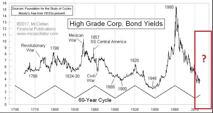
Figure 1 displays the tendency of interest rates to move in 60-year waves – 30 years up, 30 years down. The history in this chart suggests that the next major move in interest rates should be higher.Figure 1 – 60-year wave in interest rates (Courtesy: www.mcoscillator.com)
A Way to Track the Long-Term Trend in Rates
Ticker TNX is an index that tracks the yield on 10-year treasury notes (x10). Figure 2 displays this index with a 120-month exponential moving average overlaid. Think of it essentially as a smoothed 10-year average.
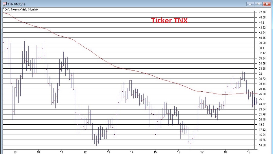
Figure 2 – Ticker TNX with 120-month EMA (Courtesy AIQ TradingExpert)
Interpretation is pretty darn simple. If the month-end value for TNX is:
*Above the 120mo EMA then the trend in rates is UP (i.e., bearish for bonds)
*Below the 120mo EMA then the trend in rates is DOWN (i.e., bullish for bonds)
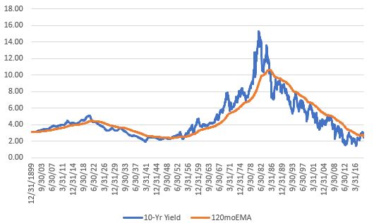
Figure 3 displays 10-year yields since 1900 with the 120mo EMA overlaid. As you can see, rates tend to move in long-term waves.
Figure 3 – 10-year yield since 1900 with 120-month exponential moving average
Two key things to note:
*This simple measure does a good job of identifying the major trend in interest rates
*It will NEVER pick the top or bottom in rates AND it WILL get whipsawed from time to time (ala 2018).
*Rates were in a continuous uptrend from 1950 to mid-1985 and were in a downtrend form 1985 until the 2018 whipsaw.
*As you can see in Figure 2, it would not take much of a rise in rates to flip the indicator back to an “uptrend”.
With those thoughts in mind, Figure 4 displays the cumulative up or down movement in 10-year yields when, a) rates are in an uptrend (blue) versus when rates are in a downtrend (orange).
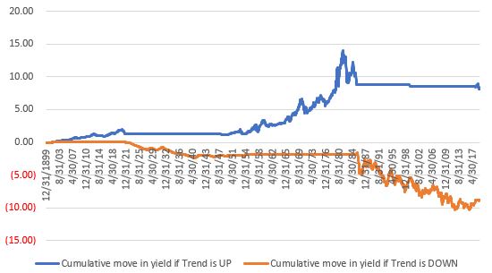
Figure 4 – Cumulative move in 10-year yields if interest rate trend is UP (blue) or DOWN (orange)
You can see the large rise in rates from the 1950’s into the 1980’s in the blue line as well as the long-term decline in rates since that time in the orange line. You can also see the recent whipsaw at the far right of the blue line.
Summary
Where do rates go from here? It beats me. As long as the 10-year yield holds below its long-term average I for one will give the bond bull the benefit of the doubt. But when the day comes that 10-year yields move decisively above their long-term average it will be essential for bond investors to alter their thinking from the mindset of the past 30+ years, as in that environment, long-term bonds will be a difficult place to be.
And that won’t be easy, as old habits die hard.
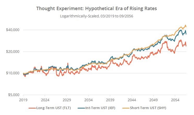
Figure 5 is from this article from BetterBuyandHold.com and displays the project returns for short, intermediate and long term bonds if rates were to reverse the decline in rates since 1982.Figure 5 – Projected total return for short, intermediate and long-term treasuries if rates reverse decline in rate of past 30+ years (Courtesy: BetterBuyandHold.com)
When rates finally do establish a new rising trend, short-tern and intermediate term bonds will be the place to be. When that day will come is anyone’s guess. But the 10-year yield/120mo EMA method at least we have an objective way to identify the trend shortly after the fact.
Jay Kaeppel
Disclaimer: The data presented herein were obtained from various third-party sources. While I believe the data to be reliable, no representation is made as to, and no responsibility, warranty or liability is accepted for the accuracy or completeness of such information. The information, opinions and ideas expressed herein are for informational and educational purposes only and do not constitute and should not be construed as investment advice, an advertisement or offering of investment advisory services, or an offer to sell or a solicitation to buy any security.