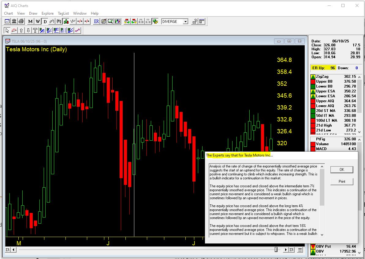
Category Archives: Stock trading

Bartometer

April 10, 2021

Hello Everyone,

The stock markets continue to rise over the last month with the Value sector leading the way. The energy, financial, airlines, cruise ship sector and more have followed right along the last few months as well. Over the short term the Value sector still looks good going forward with the recovery of the economy and the realization that the Covid 19 virus will soon subside. I still like the growth sector involving technology over the longer term, but the sector that should outperform shorter term as the economy is recovering is the value sector. On the Bartometer at the end of last year I thought the S&P 500 would hit 4200-4400. As of Friday the S&P was 4094. My AIQ Trading Expert and my other technical computer algorithms are still at a BUY-HOLD signal. Remember that this market is very overvalued and is selling at 24 times earnings, and is currently 21% overvalued based on earnings and interest rates.. Earnings growth has to be great for this market to continue higher.

Interest rates have climbed to the 1.7% level on the 10-year government bond. Bonds, in general, have fallen this year from 0-to 13%, with Floating rate bonds actually rising 2% in 2021. Floating rate bonds and variable interest rate bonds both pay a higher rate as interest rates rise. The interest rate rise over the short term should be more subdued based on Federal Chairman Reserve Powell’s testimony that he is dovish on interest rate rises. I believe over the longer term with the deficit continuing to rise that the market will push interest rates higher. I also believe that inflationary pressures will also push the need for interest rates to rise over the next year or two. Allocations for bonds in your portfolio should be more concentrated in shorter duration, and in the floating rate bond sector/ Treasury inflation-protected Strips or TIPS. Please call me to strategize your portfolio holistically.

Some of the INDEXES of the markets both equities and interest rates are below. The source is Morningstar.com up until April 09, 2021.

Dow Jones +10.97%
S&P 500 +10.0%
EQUAL WEIGHTED S&P 500 +14%
NASDAQ Aggressive growth +7.58%
Large Cap Value +9.68%
I Shares Russell 2000 ETF (IWM) Small cap +13.34%
Midcap stock funds +14.0%
International Index (MSCI – EAFE ex USA +9%
International Emerging Markets +3.6%
Financial stocks +13%
Energy stocks +28%
Healthcare Stocks +.9% Moderate Mutual Fund Investment Grade Bonds (AAA) Long duration +5.1%
High Yield Merrill Lynch High Yield Index +1.4% Floating Rate Bond Funds +1.7%
Short Term Bond +.0%
Multi sector bond funds +.3% Gold -8.43% Long Term 20 year Bond fund -12% 10 year Bond Yield 1.62%

Classicalprinciples.com and Robert Genetskis Excerpts

Market Outlook

Stocks turned in a mixed performance this past week. The Nasdaq and QQQs had the biggest gains while the S&P500 and Dow rose to new all-time highs. In contrast, small-cap stocks fell ½%. Weekly moves show stocks rotating into and out of different areas, while the overall market trend continues to be positive.

The main force behind the upward move is a highly expansive Fed policy. Monetary stimulus creates a surplus of liquidity for stocks and ignited gains in business activity. This week’s sharp reversal in longer-term interest rates provided another spark for sending prices higher

The Biden Administration tried to discourage investors by proposing more destructive policies. Investors were not discouraged. Cautious statements by some Democrats are viewed as a possible barrier to the more these destructive policy proposals. The Fed continues to add kindling to the inflationary fire and promises it will continue to do so. Although longer-term interest rates moved lower this past week, implied inflation expectations remain high. The implied inflation expectation is currently 2.3%. It is measured by subtracting the inflation-adjusted 10-year T-bond yield from the actual 10-year T-bond yield.

Although core inflation rates remain very low, the bond market expects higher inflation. The market is more reliable. As for stocks, the gains in the S&P500 move the index to 21% above fundamental value.

Stocks are overextended and the risks of a reversal, or at least a leveling off, are rising. In spite of the heightened risks and the likelihood for some temporary setback, ongoing monetary stimulus has the potential to continue to drive stock prices higher.

Stock Valuation: S&P 500 21% Overvalued
Economic Fundamentals: Positive
Monetary Policy; Highly Expansive
.
Source: Classical Principles.com

S & P 500

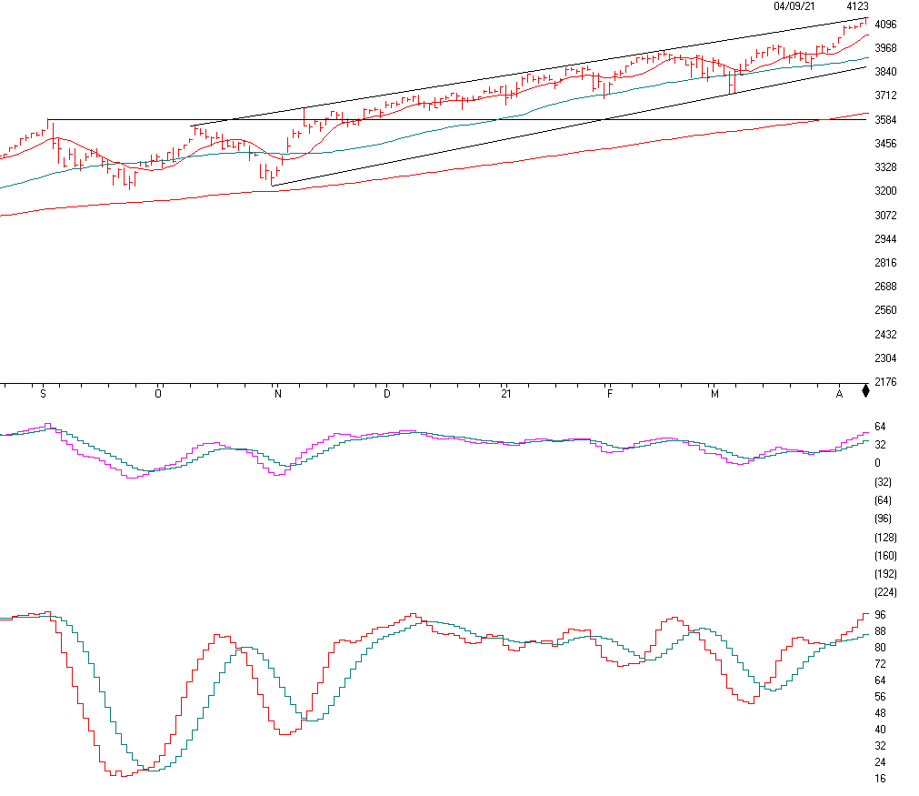
The market weighted S&P 500 which weights the largest companies like Apple, Microsoft, Google and more. This index is up 10% in 2021. 500 of the largest stocks in the USA are in this index. If you look to thchart above you will see an ASCENDING CHANNEL. An ascending channel is Bullish and if it breaks out above the top of the channel it can signal a Continuation of the move higher. Many times the market will top out at the top of the channel, right where it is now. If it breaks down below the channel then it can signal a possible trend change. There is a definite channel trend here HIGHER. But could have a short term setback here.

The indicator below the price chart is the MACD, or momentum indicator has turned to the upside, See the pink line breaking out of the blue line, another Bullish signal

The bottom indicator is SD-SK Stochastics is now above the 88 line and clearing shows an overbought situation in the stock market. Even though the market indicators are BULLISH, and 21% overvalued, we have to be wondering when all of this upside will stop. I thought 4200 to 4400 on the S&P 500. That is a 2-7% move from here. It can go higher than that, we will see. Earnings are coming out and if they show a clear cut blowout in earnings then the market should continue higher, but we have to keep aware of the overvalued nature of the market.

Chart Source: AIQsystems.com

Support levels

S&P 500 4040, 3919, 3870, 3655.
NASDAQ 13,611, 13,472, 13012.
Dow Jones 33280, 29280
These may be safer areas to get into the equity markets on support levels slowly on the accumulation areas.

THE BOTTOM LINE:

The market continues to look ok albeit very overvalued based on earnings and interest rates. I still think the market could reach my 4200-4400 or higher before the end of the year or higher and the economy should be higher than where we are today. I am worried that interest rates over the next year or so will be higher than 2% on the ten-year bond. Markets usually have a more serious correction if the 10-year bond goes above 2.75% to 3%. We are far from that point. I still like Value stocks for the short term and growth for the mid to long term as growth stocks is where the real growth in the economy should be. The NASDAQ stocks have underperformed for the year but, if you are longer-term investors then have a mix of growth and Value stocks or funds. I have been suggesting a higher percentage of small and midcap value and growth funds over the last 5 months and now the smaller stocks are overvalued and a reduction of smaller stocks may be in order. In addition, the Price to Earnings in the market is over 24 times earnings, this indicates a much-overvalued market. If you are within a year of retirement you may want to take some profits if you made money and wait for a better entry. It all depends on your goals and risk tolerance.

Best to all of you,

Joe Bartosiewicz, CFP®
Investment Advisor Representative

Securities and advisory services offered through SagePoint Financial, Inc. (SPF), member FINRA/SIPC. SPF is separately owned and other entities and/or marketing names, products or services referenced here are independent of SPF. 800-552-3319 20 East Thomas Road Ste 2000 Phoenix AZ 85012

If you have any questions, please call me at 860-940-7020.
Joe Bartosiewicz, CFP®
92 High Street
Thomaston, CT 06787 and
7501 East MCDowell RD #2172 Scottsdale, AZ 85257

Disclaimer: The views expressed are not necessarily the view of Sage Point Financial, Inc. and should not be interpreted directly or indirectly as an offer to buy or sell any securities mentioned herein. Securities and Advisory services offered through Sage Point Financial Inc., Member FINRA/SIPC, an SEC-registered investment advisor.
Past performance cannot guarantee future results. Investing involves risk, including the potential loss of principal. No investment strategy can guarantee a profit or protect against loss in periods of declining values. Please note that individual situations can vary. Therefore, the information presented in this letter should only be relied upon when coordinated with individual professional advice. *There is no guarantee that a diversified portfolio will outperform a non-diversified portfolio in any given market environment. No investment strategy, such as asset allocation, can guarantee a profit or protect against loss in periods of declining values.
It is our goal to help investors by identifying changing market conditions. However, investors should be aware that no investment advisor can accurately predict all of the changes that may occur in the market.

The price of commodities is subject to substantial price fluctuations of short periods and may be affected by unpredictable international monetary and political policies. The market for commodities is widely unregulated, and concentrated investing may lead to Sector investing may involve a greater degree of risk than investments with broader diversification.
Indexes cannot be invested indirectly, are unmanaged, and do not incur management fees, costs, and expenses.
Dow Jones Industrial Average: A weighted price average of 30 significant stocks traded on the New York Stock Exchange and the NASDAQ.
S&P 500: The S&P 500 is an unmanaged indexed comprised of 500 widely held securities considered to be representative of the stock market in general.
NASDAQ: the NASDAQ Composite Index is an unmanaged, market-weighted index of all over the counter common stocks traded on the National Association of Securities Dealers Automated Quotation System
(IWM) I Shares Russell 2000 ETF: Which tracks the Russell 2000 index: which measures the performance of the small capitalization sector of the U.S. equity market.
A Moderate Mutual Fund risk mutual has approximately 50-70% of its portfolio in different equities, from growth, income stocks, international and emerging markets stocks to 30-50% of its portfolio in different categories of bonds and cash. It seeks capital appreciation with a low to moderate level of current income.
The Merrill Lynch High Yield Master Index: A broad-based measure of the performance of non-investment grade US Bonds
MSCI EAFE: the MSCI EAFE Index (Morgan Stanley Capital International Europe, Australia, and Far East Index) is a widely recognized benchmark of non-US markets. It is an unmanaged index composed of a sample of companies’ representative of the market structure of 20 European and Pacific Basin countries and includes reinvestment of all dividends.
Investment grade bond index: The S&P 500 Investment-grade corporate bond index, a sub-index of the S&P 500 Bond Index, seeks to measure the performance of the US corporate debt issued by constituents in the S&P 500 with an investment-grade rating. The S&P 500 Bond index is designed to be a corporate-bond counterpart to the S&P 500, which is widely regarded as the best single gauge of large-cap US equities.
Floating Rate Bond Index is a rule-based, market-value weighted index engineered to measure the performance and characteristics of floating-rate coupon U.S. Treasuries, which have a maturity greater than 12 months.

Good Companies, Troubled Stocks and Potential Opportunity

Truth be told I am not much of a “stock picker”. Oh, I can pick ‘em alright just like anyone else.  They just to don’t go the right way as often as I’d like.  I also believe that the way to maximize profitability is to follow a momentum type approach that identifies stocks that are performing well and buying them when they breakout to the upside (ala O’Neil, Minervini, Zanger, etc.) and then riding them as long as they continue to perform.  Unfortunately, I’m just not very good at it. 

Back when I started out, there was such a thing as a “long-term investor.”  People would try to find good companies selling at a decent price and they would buy them and hold them for, well, the long-term.  Crazy talk, right? As I have already stated, I am not claiming that that is a better approach. I am just pointing out that it was “a thing.”

An Indicator

There is an indicator (I will call it VFAA, which is short for vixfixaverageave, which – lets face it – is a terrible name) that I follow that was developed as an extension of Larry William’s VixFix Indicator.  There is nothing magic about it.  Its purpose is to identify when price has reached an exceptionally oversold level and “may” be due to rally.  The code for this indicator appears later.

For the record, I DO NOT systematically use this indicator in the manner I am about to describe, nor am I recommending that you do.  Still, it seems to have some potential value, so what follows is merely an illustration for informational purposes only.

The Rules

*We will look at a monthly bar chart for a given stock

*A “buy signal” occurs when VFAA reaches or exceeds 80 and then turns down for one month

*A “sell (or exit) signal” occurs when VFAA subsequently rises by at least 0.25 from a monthly closing low

Seeing as how this is based solely on monthly closes it obviously this is not going to be a “precision market timing tool.”

Some “Good Companies” with “Troubled Stocks”

So now let’s apply this VFAA indicator to some actual stocks.  Again, I AM NOT recommending that anyone use this approach mechanically.  The real goal is merely to try to identify situations where a stock has been washed out, reversed and MAY be ready to run for a while.
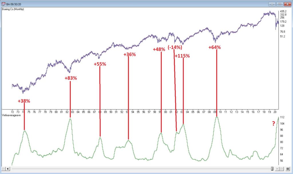
Ticker BA

Figure 1 displays a monthly chart for Boeing (BA) with VFAA at the bottom.  The numbers on the chart represent the hypothetical + (-) % achieved by applying the rules above (although once again, to be clear I am not necessarily suggesting anyone use it exactly this way). 

Figure 1 – Ticker BA with VFAA (Courtesy AIQ TradingExpert)

From March 2019 into March 2020 BA declined -80%.  It has since bounced around and VFAA has soared to 110.88.  VFAA has yet to rollover on a month-end basis, so nothing to do here except exhibit – what’s that word again – oh right, “patience.”
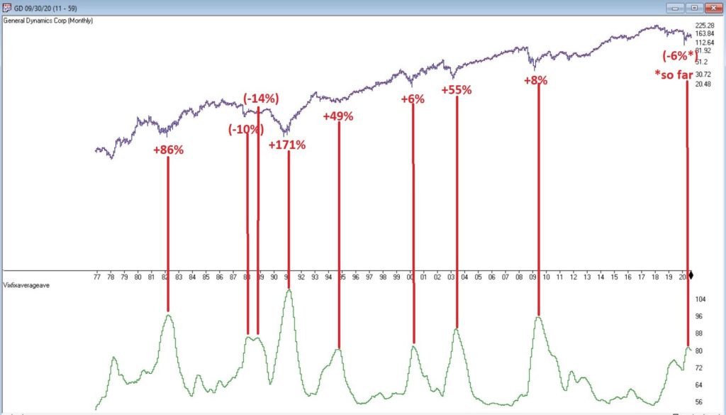
Ticker GD

Figure 2 displays a monthly chart for General Dynamics (GD) with VFAA at the bottom. 

Figure 2 – Ticker GD with VFAA (Courtesy AIQ TradingExpert)

Are these “world-beating numbers”?  Not really.  But in terms of helping to identify potential opportunities, not so bad. VFAA gave a “buy signal” for GD at the end of July. So far, not so good as the stock is down about -6%.
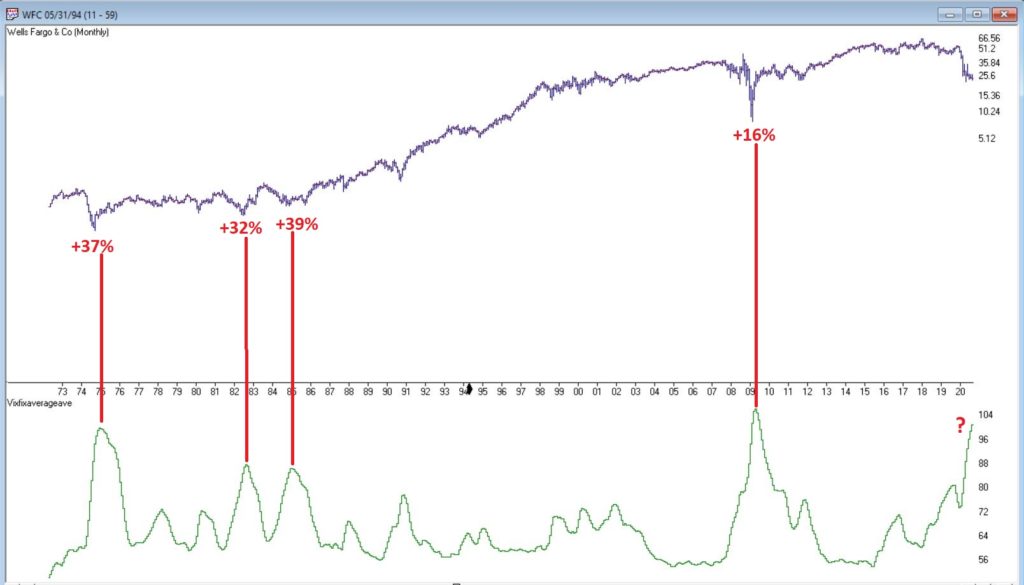
Ticker WFC

Figure 3 displays a monthly chart for Wells Fargo (WFC) with VFAA at the bottom. 

Figure 3 – Ticker WFC with VFAA (Courtesy AIQ TradingExpert)

There are not many “signals” but the ones that occurred have been useful. Between 2018 and 2020 WFC declined -65%.  It has since bounced around and VFAA has soared to 102.44.  VFAA has yet to rollover on a month-end basis. But at some point it will, and a potential opportunity may arise.

VFAA Formula

Below is the code for VFAA

VixFix is an indicator developed many years ago by Larry Williams which essentially compares the latest low to the highest close in the latest 22 periods (then divides the difference by the highest close in the latest 22 periods).  I then multiply this result by 100 and add 50 to get VixFix.

*Next is a 3-period exponential average of VixFix

*Then VFAA is arrived at by calculating a 7-period exponential average of the previous result (essentially, we are “double-smoothing” VixFix)

Are we having fun yet?  See code below:

hivalclose is hival([close],22).

vixfix is (((hivalclose-[low])/hivalclose)*100)+50.

vixfixaverage is Expavg(vixfix,3).

vixfixaverageave is Expavg(vixfixaverage,7).

VFAA = vixfixaverageave

EDITORS NOTE: The AIQ Expert Design Studio code for the indicator is available to download from here. Save this file to your /wintes32/EDS Strategies folder https://aiqeducation.com/VFAA.EDS

Summary

One thing to note is that VFAA “signals” on a monthly chart don’t come around very often.  So, you can’t really sit around and wait for a signal to form on your “favorite company”.  You have to look for opportunity wherever it might exist.

One last time let me reiterate that I am not suggesting using VFAA as a standalone systematic approach to investing. But when a signal does occur – especially when applied to quality companies that have recently been “whacked”, it can help to identify a potential opportunity.

Jay Kaeppel

Disclaimer: The information, opinions and ideas expressed herein are for informational and educational purposes only and are based on research conducted and presented solely by the author.  The information presented represents the views of the author only and does not constitute a complete description of any investment service.  In addition, nothing presented herein should be construed as investment advice, as an advertisement or offering of investment advisory services, or as an offer to sell or a solicitation to buy any security.  The data presented herein were obtained from various third-party sources.  While the data is believed to be reliable, no representation is made as to, and no responsibility, warranty or liability is accepted for the accuracy or completeness of such information.  International investments are subject to additional risks such as currency fluctuations, political instability and the potential for illiquid markets.  Past performance is no guarantee of future results.  There is risk of loss in all trading.  Back tested performance does not represent actual performance and should not be interpreted as an indication of such performance.  Also, back tested performance results have certain inherent limitations and differs from actual performance because it is achieved with the benefit of hindsight.

Please Take a Moment to Locate the Nearest Exit (Part I)

Well that sounds like a pretty alarming headline, doesn’t it?  But before you actually take a moment to locate the nearest exit please note the important difference between the words “Please locate the nearest exit” and “Oh My God, it’s the top, sell everything!!!”

You see the difference, right?  Good.  Let’s continue.  First, a true confession – I am not all that great at “market timing”, i.e., consistently buying at the bottom and/or selling at the top (I console myself with the knowledge that neither is anyone else).  On the other hand, I am reasonably good at identifying trends and at recognizing risk.  Fortunately, as it turns out, this can be a pretty useful skill.

So, while I may not be good at market timing, I can still make certain reasonable predictions.  Like for example, “at some point this bull market will run out of steam and now is as good a time as any to start making plans about how one will deal with this inevitable eventuality – whenever it may come”.  (Again, please notice the crucial difference between that sentence and “Oh My God, it’s the top, sell everything!!”)

First the Good News

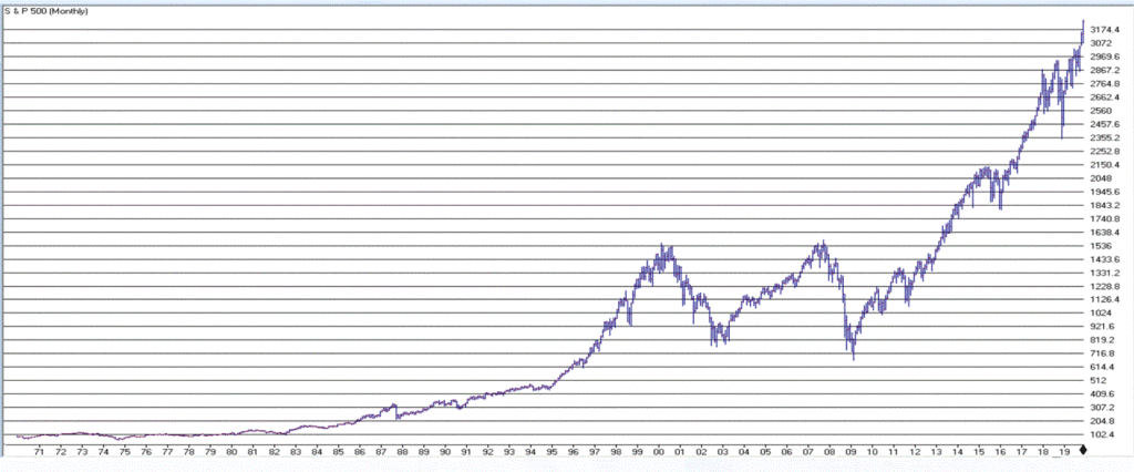
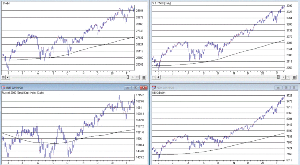
The trend in the stock market is bullish.  Duh.  Is anyone surprised by that statement?  Again, we are talking subtleties here.  We are not talking about predictions, forecasts, projected scenarios, implications of current action for the future, etc.  We are just talking about pure trend-following and looking at the market as it is today.  Figure 1 displays the S&P 500 Index monthly since 1971 and Figure 2 displays four major indexes (Dow, S&P 500, Nasdaq 100, Russell 2000) versus their respective 200-day moving averages.

Figure 1 – S&P 500 Monthly  (Courtesy AIQ TradingExpert)

Figure 2 – Dow, S&P 500, Nasdaq 100, Russell 2000 w respective 200-day moving average (Courtesy AIQ TradingExpert)

It is impossible to look at the current status of “things” displayed in Figures 1 and 2 and state “we are in a bear market”.  The trend – at the moment – is “Up”.  The truth is that in the long run many investors would benefit from ignoring all of the day to day “predictions, forecasts, projected scenarios, implications of current action for the future, etc.” that emanates from financial news and just sticking to the rudimentary analysis just applied to Figures 1 and 2. 

In short, stop worrying and learn to love the trend. Still, no trend lasts forever, which is kind of the point of this article.

So now let’s talk about the “Bad News”.  But before we do, I want to point out the following:  the time to actually worry and/or do something regarding the Bad News will be when the price action in Figure 2 changes for the worse.  Let me spell it out as clearly and as realistically as possible. 

If (or should I say when?) the major U.S. stock indexes break below their respective 200-day moving averages (and especially if those moving average start to roll over and trend down):

*It could be a whipsaw that will be followed by another rally (sorry folks, but for the record I did mention that I am not that good at market timing and that I was going to speak as realistically as possible – and a whipsaw is always a realistic possibility when it comes to trend-following)

*It could be the beginning of a significant decline in the stock market (think -30% or possibly even much more)

So, the proper response to reading the impending discussion of the Bad News is not “I should do something”.  The proper response is “I need to resolve myself to doing something when the time comes that something truly needs to be done.”

You see the difference, right?  Good.  Let’s continue.

The Bad News

The first piece of Bad News is that stocks are overvalued.  Now that fact hardly scares anybody anymore – which actually is understandable since the stock market has technically been overvalued for some time now AND has not been officially “undervalued” since the early 1980’s.  Also, valuation is NOT a timing tool, only a perspective tool.  So high valuation levels a re pretty easy to ignore at this point.

Still, here is some “perspective” to consider:

*Recession => Economic equivalent of jumping out the window

*P/E Ratio => What floor you are on at the time you jump

Therefore:

*A high P/E ratio DOES NOT tell you WHEN a bear market will occur

*A high P/E ratio DOES WARN you that when the next bear market does occur it will be one of the painful kind (i.e., don’t say you were not warned)

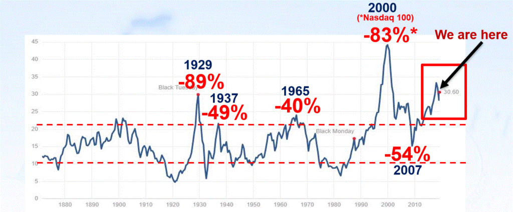
Figure 3 displays the Shiller P/E Ratio plus (in red numbers) the magnitude of the bear market that followed important peaks in the Shiller P/E Ratio. 

Figure 3 – Shiller P/E Ratio Peaks (with subsequent bear market declines in red); (Courtesy: https://www.multpl.com/shiller-pe)

Repeating now: Figure 3 does not tell us that a bear market is imminent.  It does however, strongly suggest that whenever the next bear market does unfold, it will be, ahem, significant in nature.  To drive this point home, a brief history:

1929: P/E peak followed by -89% Dow decline in 3 years

1937: P/E peak followed by -49% Dow decline in 7 months(!?)

1965: P/E peak followed by 17 years of sideways price action with a -40% Dow decline along the way

2000: P/E peak followed by -83% Nasdaq 100 decline in 2 years

2007: P/E peak followed by -54% Dow decline in 17 months

Following next peak: ??

As you can see, history suggests that the next bear market – whenever it may come – will quite likely be severe.  There is actually another associated problem to consider.  Drawdowns are one thing – some investors are resolved to never try to time anything and are thus resigned to the fact that they will have to “ride ‘em out” once in awhile.  OK fine – strap yourself in and, um, enjoy the ride. But another problem associated with high valuation levels is the potential (likelihood?) for going an exceedingly long period of time without making any money at all.  Most investors have pretty much forgotten – or have never experienced – what this is like.

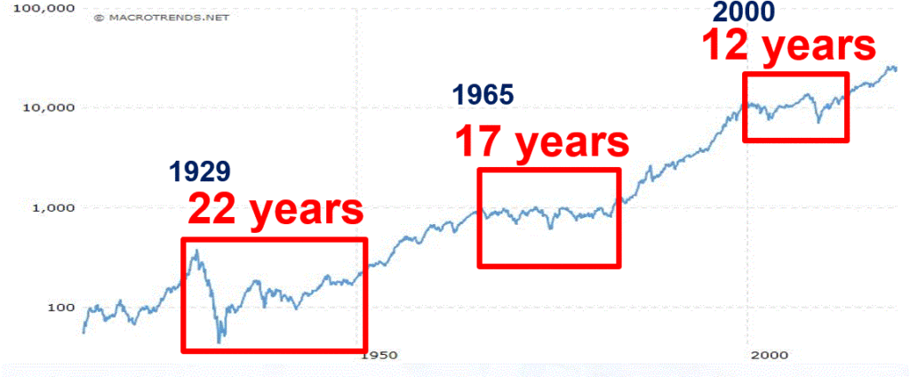
Figure 4 displays three such historical periods – the first associated with the 1929 peak, the second with the 1965 peak and the third with the 2000 peak. 

Figure 4 – Long sideways periods often follow high P/E ratios

*From 1927 to 1949: the stock market went sideways for 22 years.  Some random guy in 1947 – “Hey Honey, remember that money we put to work in the stock market back in 1927? Great News! We’re back to breakeven! (I can’t speak for anyone else, but personally I would prefer to avoid having THAT conversation.)

*From 1965 to 1982: the stock market went sideways.  While this is technically a 0% return over 17 years (with drawdows of -20%, -30% and -40% interspersed along the way – just to make it less boring), it was actually worse than that. Because of high inflation during this period, purchasing power declined a fairly shocking -75%. So that money you “put to work” in that S&P 500 Index fund in 1965, 17 years later had only 25% as much purchasing power (but hey, this couldn’t possibly happen again, right!?).

*From 2000 to 2012: the stock market went sideways.  With the market presently at much higher all-time highs most investors have forgotten all about this.  Still, it is interesting to note that from 8/31/2000 through 1/31/2020 (19 years and 5 months), the average annual compounded total return for the Vanguard S&P 500 Index fund (ticker VFINX) was just +5.75%.  Not exactly a stellar rate of return for almost 20 years of a “ride ’em out” in an S&P 500 Index fund approach).

The Point: When valuations are high, future long-term returns tend to be subpar – and YES, valuations are currently high.

You have been warned.

Stay tuned for Part II…

Jay Kaeppel

Disclaimer: The information, opinions and ideas expressed herein are for informational and educational purposes only and are based on research conducted and presented solely by the author.  The information presented does not represent the views of the author only and does not constitute a complete description of any investment service.  In addition, nothing presented herein should be construed as investment advice, as an advertisement or offering of investment advisory services, or as an offer to sell or a solicitation to buy any security.  The data presented herein were obtained from various third-party sources.  While the data is believed to be reliable, no representation is made as to, and no responsibility, warranty or liability is accepted for the accuracy or completeness of such information.  International investments are subject to additional risks such as currency fluctuations, political instability and the potential for illiquid markets.  Past performance is no guarantee of future results.  There is risk of loss in all trading.  Back tested performance does not represent actual performance and should not be interpreted as an indication of such performance.  Also, back tested performance results have certain inherent limitations and differs from actual performance because it is achieved with the benefit of hindsight.

What it Will Take to Get Commodities Moving

I keep seeing headlines about the “imminent” re-emergence of commodities as a viable investment as an asset class.  And as I wrote about here, I mostly agree wholeheartedly that “the worn will turn” at some point in the years ahead, as commodities are historically far undervalued relative to stocks.

The timing of all of this is another story.  Fortunately, it is a fairly short and simple story.  In a nutshell, it goes like this:

*As long as the U.S. Dollar remains strong, don’t bet heavy on commodities.

The End

Well not exactly. 

The 2019 Anomaly

The Year 2019 was something of an anomaly as both the U.S. Dollar and precious metals such as gold and silver rallied.  This type of action is most unusual.  Historically gold and silver have had a highly inverse correlation to the dollar.  So, the idea that both the U.S. Dollar AND commodities (including those beyond just precious metals) will continue to rise is not likely correct.

Commodities as an Asset Class

When we are talking “commodities as an asset class” we are talking about more than just metals.  We are also talking about more than just energy products. 

The most popular commodity ETFs are DBC and GSG as they are more heavily traded than most others.  And they are fine trading vehicles.  One thing to note is that both (and most other “me too” commodity ETFs) have a heavy concentration in energies.  This is not inappropriate given the reality that most of the industrialized world (despite all the talk of climate change) still runs on traditional fossil fuel-based energy.

But to get a broader picture of “commodities as an asset class” I focus on ticker RJI (ELEMENTS Linked to the Rogers International Commodity Index – Total Return) which diversifies roughly as follows:

Agriculture          40.90%

Energy               24.36%

Industrial Metals 16.67%

Precious Metals    14.23%

Livestock               3.85%

Note that these allocations can change over time, but the point is that RJI has much more exposure beyond the energy class of assets than alot of other commodity ETFs.

RJI vs. the Dollar

As a proxy for the U.S. Dollar we will use ticker UUP (Invesco DB US Dollar Index Bullish Fund).  Figure 1 displays the % gain/loss for UUP (blue line) versus RJI (orange line) since mid-2008.

Figure 1 – UUP versus RJI; Cumulative Return using weekly closing prices; May-2008-Sep-2019

*Since May of 2008 UUP has gained +17.2%

*Since May of 2008 RJI has lost -60%

The correlation in price action between these two ETFs since 2008 is -0.76 (a correlation of -1.00 means they are perfectly inverse), so clearly there is (typically) a high degree of inverse correlation between the U.S. dollar and “commodities”.

Next, we will apply an indicator that I have dubbed “MACD4010501” (Note to myself: come up with a better name).  The calculations for this indicator will appear at the end of the article (but it is basically a 40-period exponential average minus a 105-period exponential average).  In Figure 2 we see a weekly chart of ticker UUP with this MACD indicator in the top clip and a weekly chart of ticker RJI in the bottom clip.

Figure 2 – UUP with Jay’s MACD Indicator versus ticker RJI (courtesy AIQ TradingExpert )

Interpretation is simple:

*when the MACD indicator applied to UUP is declining, this is bullish for RJI

*when the MACD indicator applied to UUP is rising, this is bearish for RJI.

Figure 3 displays the growth of equity achieved by holding RJI (using weekly closing price data) when the UUP MACD Indicator is declining (i.e., RJI is bullish blue line in Figure 3) versus when the UUP MACD Indicator is rising (i.e., RJI is bearish orange line in Figure 3).

Figure 3 – RJI cumulative performance based on whether MACD indicator for ticker UUP is falling (bullish for RJI) of rising (bearish for RJI)

In sum:

*RJI gained +45.8% when the UUP MACD indicator was falling

*RJI lost -72.3% when the UUP MACD indicator was rising

The bottom line is that RJI rarely makes much upside headway when the UUP MACD Indicator is rising (i.e., is bearish for RJI).

Summary

Commodities as an asset class are extremely undervalued on a historical basis compared to stocks.  However, the important thing to remember is that “the worm is unlikely to turn” as long as the U.S. Dollar remains strong.

So, keep an eye on the U.S. Dollar for signs of weakness.  That will be your sign that the time may be coming for commodities.

FYI: Code for Jay’s MACD4010501 Indicator (AIQ TradingExpert EDS)

The indicator is essentially a 40-period exponential average minus a 105-period exponential average as shown below:

Define ss3 40.

Define L3 105.

ShortMACDMA3 is expavg([Close],ss3)*100.

LongMACDMA3 is expavg([Close],L3)*100.

MACD4010501 is ShortMACDMA3-LongMACDMA3.

Jay Kaeppel

Disclaimer: The information, opinions and ideas expressed herein are for informational and educational purposes only and are based on research conducted and presented solely by the author.  The information presented does not represent the views of the author only and does not constitute a complete description of any investment service.  In addition, nothing presented herein should be construed as investment advice, as an advertisement or offering of investment advisory services, or as an offer to sell or a solicitation to buy any security.  The data presented herein were obtained from various third-party sources.  While the data is believed to be reliable, no representation is made as to, and no responsibility, warranty or liability is accepted for the accuracy or completeness of such information.  International investments are subject to additional risks such as currency fluctuations, political instability and the potential for illiquid markets.  Past performance is no guarantee of future results.  There is risk of loss in all trading.  Back tested performance does not represent actual performance and should not be interpreted as an indication of such performance.  Also, back tested performance results have certain inherent limitations and differs from actual performance because it is achieved with the benefit of hindsight.

What the Hal?

Some industries are cyclical in nature.  And there is not a darned thing you – or they – can do about it.  Within those industries there are individual companies that are “leaders”, i.e., well run companies that tend to out earn other companies in that given industry and whose stock tends to outperform other companies in that industry.

Unfortunately for them, even they cannot avoid the cyclical nature of the business they are in.  Take Halliburton (ticker HAL) for example.  Halliburton is one of the world’s largest providers of products and services to the energy industry.  And they do a good job of it. Which is nice.  It does not however, release them from the binds of being a leader in a cyclical industry.

A Turning Point at Hand?

1

A quick glance at Figure 1 clearly illustrates the boom/bust nature of the performance of HAL stock.Figure 1 – Halliburton (HAL) (Courtesy AIQ TradingExpert)

Which raises an interesting question: is there a way to time any of these massive swings?  Well here is where things get a little murky.  If you are talking about “picking timing tops and bottoms with uncanny accuracy”, well, while there are plenty of ads out there claiming to be able to do just that, in reality that is not really “a thing”.  Still, there may be a way to highlight a point in time where:

*Things are really over done to the downside, and

*For a person who is not going to get crazy and “bet the ranch”, and who understands how a stop-loss order works and is willing to use one…

..there is at least one interesting possibility.

It’s involves a little-known indicator that is based on a more well-known another indicator that was developed by legendary trader Larry Williams roughly 15 or more years ago.  William’s indicator is referred to as “VixFix” and attempts to replicate a VIX-like indicator for any market.  The formula is pretty simple, as follows  (the code is from AIQ Expert Design Studio):

*hivalclose is hival([close],22).

*vixfix is (((hivalclose-[low])/hivalclose)*100)+50.

In English, it is the highest close in the last 22-periods minus the current period low, which is then divided by the highest close in the last 22-periods. The result then gets multiplied by 100 and 50 is added.

Figure 2 displays a monthly chart of HAL with William’s VixFix in the lower clip.  In a nutshell, when price declines VixFix rises and vice versa.

2

Figure 2 – HAL Monthly with William’s VixFix (Courtesy AIQ TradingExpert)

Now let’s go one more step as follows by creating an exponentially smoothed version as follows (the code is from AIQ Expert Design Studio):

*hivalclose is hival([close],22).

*vixfix is (((hivalclose-[low])/hivalclose)*100)+50. <<<Vixfix from above

*vixfixaverage is Expavg(vixfix,3).  <<<3-period exponential MA of Vixfix

*Vixfixaverageave is Expavg(vixfixaverage,7). <<<7-period exp. MA

I refer to this as Vixfixaverageave (Note to myself: get a better name) because it essentially takes an average of an average.  In English (OK, sort of), first Vixfix is calculated, then a 3-period exponential average of Vixfix is calculated (vixfixaverage) and then a 7-period exponential average of vixfixaverage is calculated to arrive at Vixfixaverageave (got that?)

3

Anyway, this indicator appears on the monthly chart for HAL that appears in Figure 3.Figure 3 – HAL with Vixaverageave (Courtesy AIQ TradingExpert)

So here is the idea:

*When Vixfixaverageave for HAL exceeds 96 it is time to start looking for a buying opportunity.

OK, that last sentence is not nearly as satisfying as one that reads “the instant the indicator reaches 96 it is an automatic buy signal and you can’t lose”.  But it is more accurate.  Previous instances of a 96+ reading for Vixfixaverageave for HAL appear in Figure 4.

4

Figure 4 – HAL with previous “buy zone” readings from Vixfixaverageave (Courtesy  AIQ TradingExpert)

Note that in previous instances, the actual bottom in price action occurred somewhere between the time the indicator first broke above 96 and the time the indicator topped out.  So, to reiterate, Vixfixaverageave is NOT a “precision timing tool”, per se.  But it may be useful in highlighting extremes.

This is potentially relevant because with one week left in May, the monthly Vixfixaverageave value is presently above 96.  This is NOT a “call to action”.  If price rallies in the next week Vixfixaverageave may still drop back below 96 by month-end.  Likewise, even if it is above 96 at the end of May – as discussed above and as highlighted in Figure 4, when the actual bottom might occur is impossible to know.

5

Let me be clear: this article is NOT purporting to say that now is the time to buy HAL.  Figure 5 displays the largest gain, the largest drawdown and the 12-month gain or loss following months when Vixfixaverageave for HAL first topped 96.  As you can see there is alot of variation and volatility.  

Figure 5 – Previous 1st reading above 96 for HAL Vixfixaverageave

So HAL may be months and/or many % points away from an actual bottom.  But the main point is that the current action of Vixfixaverageave suggests that now is the time to start paying attention.

Jay Kaeppel

Disclaimer:  The data presented herein were obtained from various third-party sources.  While I believe the data to be reliable, no representation is made as to, and no responsibility, warranty or liability is accepted for the accuracy or completeness of such information.  The information, opinions and ideas expressed herein are for informational and educational purposes only and do not constitute and should not be construed as investment advice, an advertisement or offering of investment advisory services, or an offer to sell or a solicitation to buy any security.

All Eyes on Key Bellwether Support Levels

First the reality.  Nobody knows what the market is going to do.  Yes, I am aware that there are roughly a bazillion people out there “prognosticating” (myself included) about the stock market.  And yes, if one makes enough “predictions”, the law of averages dictates that one will be correct a certain percentage of the time.

Still, the market does offer clues.  Sometimes those clues turn out to be false leads.  But sometimes they do offer important information.  For example, Figure 1 displays four major market indexes.  As you can see, in the Aug-Sep-Oct time frame all four of these averages “broke out” to new all-time highs (i.e., The Good News) and then broke back down below the previous resistance line drawn on each chart (i.e., The Bad News).

1

Figure 1 – Four major indexes breakout then fail (Courtesy AIQ TradingExpert)

False breakouts happen all the time.  And the reality here is that sometimes they mean something and sometimes they don’t.  But when all four major average do the same thing, a warning sign has been issued to those who are interested in seeing it.  That’s why it can be useful to seek “confirmation”.  For my purposes I look to what I refer to as my 4 “bellwethers”, which are:

SMH – Semiconductors

TRAN – Dow Transportation Average

ZIV – Velocity Shares Inverse VIX Index

BID – Sotheby Holdings

These tickers appear in Figure 2 (click to enlarge).

2

Figure 2 – Jay’s Market Bellwethers (Courtesy AIQ TradingExpert)

While the major indexes were testing new highs in Aug/Sep and then breaking down in October:

SMH – Never really came close to breaking out above its March high

TRAN – Followed the major indexes by hitting new highs in Aug/SP and then breaking down in October

ZIV – Never came anywhere close to its Jan-2018 high

BID – Broke to a new high in Jun/Jul, then failed badly.

In a nutshell, the failed major index breakouts were accompanied by absolutely no positive signs from the 4 bellwethers. So, the warning signs were there if one wished to see them.

So where are the bellwethers now?  Another close look at Figure 2 reveals that:

SMH – the key support level at 80.92

TRAN – the key level for the Dow Transports is 8744.36

ZIV – the key support level is 60.60

BID – a potential support level is 32.95 (the Apr 2013 low)

Summary

*Given the washed-out/oversold level that many indicators and sentiment surveys have reached…

*…Combined with the fact that we are in the seasonally favorable pre-election year (no down pre-election years since the 1930’s)

*There is a chance that 2019 could be surprisingly bullish, and shell-shocked investors should not stick their heads in the sand to the possibility.

At the same time:

*Based solely on trend-following indicators ALL of the major market indexes are technically in confirmed bear markets.  As a result, there is absolutely nothing wrong with having some portion of one’s capital in defensive positions at the moment (30% cash or short-term bonds?).

*Keep a close eye on January performance.  A bullish January would be a positive sign just as a negative January could – in this case – signal a continued market decline.

*Keep a close eye on the 4 Bellwethers relative to their respective support levels.

In a nutshell:

*Up January + Bellwethers holding above support = GOOD

*Down January + Bellwether breaking down below support = BAD

Those are all the “clues” I can offer at the moment.

Jay Kaeppel

Disclaimer:  The data presented herein were obtained from various third-party sources.  While I believe the data to be reliable, no representation is made as to, and no responsibility, warranty or liability is accepted for the accuracy or completeness of such information.  The information, opinions and ideas expressed herein are for informational and educational purposes only and do not constitute and should not be construed as investment advice, an advertisement or offering of investment advisory services, or an offer to sell or a solicitation to buy any security.

NASDAQ dive

Working on some slides for a seminar last week, it was apparent that breadth indicators on the NASDAQ signaled a divergence from the price action of the market.
Looking specifically at AD Ind and HI/LO, although other breadth measures told the same tale.

The AD indicator explained

The Advance/Decline Indicator is an exponentially weighted average of the net advancing versus declining issues. With this indicator, the direction of the trend is of importance and not the actual value of the indicator. When the indicator is increasing, advances are outweighing declines, and when it is decreasing, there are more declining is­sues than advancing.
The  Advance/Decline Indicator is a breadth indicator very similar to the Advance/Decline Line.  However, this indicator tends to be more sensitive and at times will signal a move earlier than the Advance/Decline Line.
The breadth was telling us something was amiss from last week. Take a look at this chart of the NASDAQ clearly a divergence was in place before the downturn.
Today’s (10-10-18) 316 point drop in the NASDAQ a 4% drop and nearly 9% drop from the high is close to the 10% corrective point and some buyers may come in over the next few days and keep the decline in check or not.
The markets are down between 6 and 10% in 5 days. Keeping good stops is a must in your portfolio to protect you from the worst of this. Using trailing stops between 7 and 10 % on stocks that are moving and protective stops 5 to 7 % below initial investment for example can easily reduce your losses in these volatile markets.

New Highs, Check…Now What?

Let’s open with Jay’s Trading Maxim #7.

Jay’s Trading Maxim #7: Being able to identify the trend today is worth more than 1,000 predictions of what the trend will be in the future.

Yes trend-following is boring.  And no, trend-following never does get you in near the bottom nor out at the top.  But the reality is that if you remain long when the trend appears to be up (for our purposes here let’s define this roughly as the majority of major market averages holding above their long-term moving averages) and play defense (i.e., raise cash, hedge, etc.) when the trend appears to be down (i.e., the majority of major market averages are below their long-term moving averages), chances are you will do pretty well for yourself.  And you may find yourself sleeping pretty well at night as well along the way.

To put it more succinctly:

*THE FOREST = Long-term trend

*THE TREES = All the crap that everyone tells you “may” affect the long-term trend at some point in the future

Human nature is a tricky thing.  While we should clearly be focused on THE FOREST the reality is that most investors focus that majority of their attention on all those pesky trees.  Part of the reason for this is that some trees can offer clues.  It’s a question of identifying a few “key trees” and then ignoring the rest of the noise.

A New High

With the Dow Industrials rallying to a new high virtually all the major averages have now reached a new high at least within the last month.  And as you can see in Figure 1 all are well above their respective 200-day moving average.  Long story short the trend is “UP”.

(click to enlarge)1Figure 1 – U.S. Major Market Indexes in Uptrends (Courtesy AIQ TradingExpert)

Now What? The Good News

As strong as the market has been of late it should be noted that we are about to enter the most favorable seasonal portion of the 48-month election cycle.  This period begins at the close of September 2018 and extends through the end of December 2019.

Figure 2 displays the growth of $1,000 invested in the Dow Industrials only during this 15-month period every 4 years.  Figure 3 displays the actual % +(-) for each of these periods.  Note that since 1934-35, the Dow has showed a gain 20 out of 21 times during this period.

2a

Figure 2 – Growth of $1,000 invested in Dow Industrials ONLY during 15 bullish months (mid-term through pre-election year) within 48-month election cycle.

Start Date End Date Dow % +(-)
9/30/1934 12/31/1935 +55.6%
9/30/1938 12/31/1939 +6.2%
9/30/1942 12/31/1943 +24.5%
9/30/1946 12/31/1947 +5.1%
9/30/1950 12/31/1951 +18.9%
9/30/1954 12/31/1955 +35.5%
9/30/1958 12/31/1959 +27.7%
9/30/1962 12/31/1963 +31.8%
9/30/1966 12/31/1967 +16.9%
9/30/1970 12/31/1971 +17.0%
9/30/1974 12/31/1975 +40.2%
9/30/1978 12/31/1979 (-3.1%)
9/30/1982 12/31/1983 +40.4%
9/30/1986 12/31/1987 +9.7%
9/30/1990 12/31/1991 +29.2%
9/30/1994 12/31/1995 +33.1%
9/30/1998 12/31/1999 +46.6%
9/30/2002 12/31/2003 +37.7%
9/30/2006 12/31/2007 +13.6%
9/30/2010 12/31/2011 +13.0%
9/30/2014 12/31/2015 +2.2%

Figure 3 – 15 bullish months (mid-term through pre-election year) within 48-month election cycle

Now What? The Worrisome Trees

While the major averages are setting records a lot of other “things” are not.  My own cluster of “market bellwethers” appear in Figure 4.  Among them the Dow Transportation Index is the only one remotely close to a new high, having broken out to the upside last week.  In the meantime, the semiconductors (ticker SMH), the inverse VIX index ETF (ticker ZIV) and Sotheby’s (ticker BID) continue to meander/flounder. This is by no means a “run for the hills” signal.  But the point is that at some point I would like to see some confirmation from these tickers that often (though obviously not always) presage trouble in the stock market when they fail to confirm bullish action in the major averages.

(click to enlarge)4Figure 4 – Jay’s 4 Bellwethers (SMH/TRAN/ZIV/BID) (Courtesy AIQ TradingExpert)

Another source of potential concern is the action of, well, the rest of the darn World.  Figure 5 displays my own regional indexes – Americas, Europe, Asia/Pacific and Middle East.  They all look awful.

(click to enlarge)3Figure 5 – 4 World Regional Indexes (Courtesy AIQ TradingExpert)

Now the big question is “will the rest of the world’s stock markets start acting better, or will the U.S. market start acting worse?”  Sadly, I can’t answer that question.  The key point I do want to make though is that this dichotomy of performance – i.e., U.S market soaring, rest of the world sinking – is unlikely to be sustainable for very long.

Summary

It is hard to envision the market relentlessly higher with no serious corrections over the next 15 months.  And “yes”, those bellwether and world region indexes trees are “troublesome”.

Still the trend at the moment is inarguably “Up” and we about to enter one of the most seasonally favorable periods for the stock market.

So, my advice is simple:

1) Decide now what defensive actions you will take if the market does start to breakdown

2) Resolve to actually take those actions if the need arises

3) Enjoy the ride as long as it lasts.

Jay Kaeppel

Disclaimer:  The data presented herein were obtained from various third-party sources.  While I believe the data to be reliable, no representation is made as to, and no responsibility, warranty or liability is accepted for the accuracy or completeness of such information.  The information, opinions and ideas expressed herein are for informational and educational purposes only and do not constitute and should not be construed as investment advice, an advertisement or offering of investment advisory services, or an offer to sell or a solicitation to buy any security.

Four Things to Watch for Warning Signs

First things first: I am primarily a trend-follower (this is based on, a) the relative long-term benefits of following trends and b) my lack of ability to actually “predict” anything – but I digress).
As a trend-follower I love the fact that the stock market has been trending higher and the fact that there is so much “angst” regarding the “inevitable top.”  Still, like a lot of investors I try to spot “early warning signs” whenever possible.  Here are the four “things” I am following now for signs of trouble.
Fidelity Select Electronics
In Figure 1 you see, a) the blow-off top of 1999-2000 and b) today.  Are the two the same?  I guess only time will tell.  But the point is, I can’t help but think that if and when the bloom comes off of the electronics boom, overall trouble will follow.  Here is hoping that I am not as correct here as I was here.
1
Figure 1 – Ticker FSELX (Courtesy AIQ TradingExpert)
Just asking.
Transportation Index
As you can see in Figure 2, the Dow Transports has a history of making double tops which is followed by trouble in the broader market.  Are we in the process of building another double top?  And will trouble follow if we are?  Dunno, hence the reason it is on my “Watch List” rather than on my “OH MY GOD SELL EVERYTHING NOW!!!!! List”.
2
Figure 2 – Dow Transportation Index (Courtesy AIQ TradingExpert)
I guess we’ll just have to wait and see.
Ticker XIV
Ticker XIV is an ETF that is designed to track inverse the VIX Index. As a refresher, the VIX Index tends to “spike” higher when stocks fall sharply and to decline when stocks are rising and/or relatively quiet.  To put it in simpler terms, in a bull market ticker XIV will rise.  As you can see in Figure 3 one might argue that XIV has gone “parabolic”.  This is a potential warning sign (assuming you agree that the move is parabolic) as a parabolic price move for just about anything is almost invariably followed by, well, let’s just say, “not so pretty”.
3
Figure 3 – Ticker XIV (Courtesy AIQ TradingExpert)
Let’s hope not.  Because if it does qualify as  parabolic that’s a very bad sign.
Ticker BID
This one may or may not be relevant but for what it is worth, Sotheby’s (ticker BID) has on several occasions served as something of a “leading indicator” at stock market tops (for the record it has also given some false signals, so this one is more for perspective purposes rather than actual trading purposes). Still, if this one tops out in conjunction with any or all of the above, it would likely serve as a useful warning sign.
4
Figure 4 – Ticker BID (Courtesy AIQ TradingExpert)
Summary
There is no “urgent action” to be taken based on any of this.  Bottom line: Nothing in this article should trigger you to run for the exits.
Still, it might be wise to at least take a look around and “locate the exit nearest you.”
You know, just in case.
Chief Market Analyst at JayOnTheMarkets.com and AIQ TradingExpert Pro (Courtesy AIQ TradingExpert) client. http://jayonthemarkets.com/
Disclaimer:  The data presented herein were obtained from various third-party sources.  While I believe the data to be reliable, no representation is made as to, and no responsibility, warranty or liability is accepted for the accuracy or completeness of such information.  The information, opinions and ideas expressed herein are for informational and educational purposes only and do not constitute and should not be construed as investment advice, an advertisement or offering of investment advisory services, or an offer to sell or a solicitation to buy any security.

Volume-Weighted Moving Average Breakouts

The AIQ code based on Ken Calhoun’s article in the February 2017 issue of Technical Analysis ofSTOCKS & COMMODITIES, “Volume-Weighted Moving Average Breakouts,” can be found at http://aiqsystems.com/Volume-Weighted-Moving-Average-Breakouts.EDS 
 
Please note that I tested the author’s system using the NASDAQ 100 list of stocks on daily bars rather than intraday bars from 12/31/2008 thru 2/10/2017. Figure 7 shows the resulting equity curve trading the author’s system with the cross-down exit. Figure 8 shows the ASA report for this test. The annualized return showed about a 17% return with a maximum drawdown of 19%.
Sample Chart

FIGURE 7: AIQ. Here are sample test results from the AIQ Portfolio Manager taking three signals per day and 10 concurrent positions maximum run on NASDAQ 100 stocks (daily bar data) over the period 12/31/08 to 2/10/07.
Sample Chart

FIGURE 8: AIQ. This shows the ASA report for the system, which shows the test metrics and settings.
The code and EDS file can be downloaded from http://aiqsystems.com/Volume-Weighted-Moving-Average-Breakouts.EDS , and is also shown below.
!Volume-Weighted Moving Average Breakouts
!Author: Ken Calhoun, TASC Apr 2017
!Coded by: Richard Denning 2/11/17
!www.TradersEdgeSystems.com

!INPUTS:
smaLen is 70.
vwmaLen is 50.

SMA is simpleavg([close],smaLen).
VWMA is sum([close]*[volume],vwmaLen)/sum([volume],vwmaLen).
HasData if hasdatafor(max(smaLen,vwmaLen)+10)>max(smaLen,vwmaLen).
Buy if SMA < VWMA and valrule(SMA > VWMA,1) and HasData.
Sell if SMA > VWMA.

rsVWMA is VWMA / valresult(VWMA,vwmaLen)-1.
rsSMA is SMA / valresult(SMA,smaLen)-1.
—Richard Denning
info@TradersEdgeSystems.com
for AIQ Systems

It’s all relative you see

The markets have been shall we say been less than inspiring recently. Brexit came and went with a brief hiccup in the action and only in the last week or so has the volatility picked up. The Dow as you can see in this weekly chart is back the same level as December 2014


The VXX shows clearly the decline in volatility since the high back in 2011


The summer doldrums may be over, but during periods when the market is range bound, segments within the market are often performing very well or very poorly. One AIQ Report that can show the strength within segments is the Relative Strength Strong – Short Term. This report shows stocks in 3 month trend up and is a great report for those who trade with ‘the trend is your friend’. Here is Friday 9-16-2016 report. The report is ranked by the stocks with the best trend.


I highlighted 6 stocks in the top of this report. All have good trends in place, and all in the Oil and Exploration S&P 500 group. The group has performed quite well recently. The top 2 OILEXPO stocks CHK and DVN have both had a small pullback to their uptrend line. We’ll see how they do this week.


The World is Your Oyster – 4 Days a Month

Some things are just plain hard to explain.  I did the following test using all 17 of the iShares single country funds that started trading 1996:
I tested the performance of each single country ETF on each specific trading day of the month (i.e., the 1st trading day of any month is TDM 1, the next day is TDM 2, etc.)
I also examined the last 7 trading days of the month counting backwards (i.e., the last trading day of the month is TDM -1, the day before that is TDM -2, etc.)
The basic idea was to see if there were any consistently favorable or unfavorable days of the month.  I wasn’t necessarily expecting much given that the stock markets of each of 17 different countries could  rightly be expected to “walk to the beat of their own drum”, given that the fundamentals underlying the stock market in any given country may be unique from that of other countries.
Or maybe not so much.
For what it is worth, the results from 3/25/1996 through 6/20/2016 appear in Figure 1.
(click to enlarge)
1
Figure 1 – Trading Day of Month Results for 17 iShares single country ETFs; 3/25/96 through 6/20/16
Each column displays the cumulative % return for each individual single country ETF if we held a long position in that ETF on only that particular trading day of the month.
As you can see – and what are the odds of this, I am not even sure how to calculate that – there are 4 days (highlighted in green in Figure 1) that were uniformly “favorable”, i.e., all 17 ETFs showed a net gain on that particular trading day of the month (for the record, there are three trading days – TDM #7 and TDMs -7 and -6 – during which all  17 ETFs showed a net loss (highlighted in yellow in Figure 1.  Go figure).
Using as a Strategy
I am not recommended the following strategy, but wanted to test it out for arguments sake.  Figure 2 displays the results of the following test:
*Buy and hold an equally weighted position in all 17 single country ETFs only on TDM 1, 9, 13 and -4 (i.e., if Friday is the last trading day of the month then – barring a holiday – TDM -4 would be the Tuesday of that week), earn annualized interest of 1% per month while out of ETFs.
*Versus simply buying and holding all 17 single country ETFs from 3/25/1996 through 6/20/2016.
2
Figure 2 – Cumulative % return for holding all 17 single country ETF only 4 days a month (blue) versus buying and holding (red); 3/25/96 through 6/20/16
Summary
Yes, this model can probably be accused of being “curve fit”.  Also, does anybody really want to trade in and out of 17 single country ETFs 4 times a month?  I don’t know.  But the bigger points are:
*Why would all 17 single country ETFs all be up (or down) on a particular day of the month over a 20 year period?
*If I were considering buying and holding a cross section of individual country ETF’s, um, well, I can’t help but think that I would be haunted by the thought that there might be a better way.
Jay Kaeppel
Chief Market Analyst at JayOnTheMarkets.com and AIQ TradingExpert Pro (http://www.aiqsystems.com) client

Classic Flag Breakouts on CVX, NFG, TOT

Our Chart pattern Recognition tool had a wealth of gasoline related stocks have breakouts yesterday. The classic flag breakout on good volume could be seen on CVX, NFG and TOT.

Quick reminder on what a flag pattern is.

The flag pattern is considered a continuation pattern after a consolidation period. The flag is a rectangular shape, similar to  the pennant, but the pennant looks more like a triangle.

Usually there’s a strong price movement followed by sideways price movement which is the flag. The pattern is complete when prices breakout in the same direction as the initial price movement. The following move will be in the same direction as the prior sharp move. The move prior to the flag is called the pole.

The flag pattern forms a rectangle with two parallel trendlines that act as support and resistance for the price until the price breaks out. Usually the flag will slope in the opposite direction to the trend.

The buy or sell signal occurs when the price breaks through the support or resistance level, with the trend continuing in the same direction as the pole. The breakthrough should occur on heavier volume.

I’ve put all three charts together and you can clearly see the pole, flag and breakout. As noted above the volume on the breakout on TOT was reasonable. The Quality of the pattern was also considered high.

Incidentally the volume on NFG and CVX was not as significant.

The entire list of stocks that generated completed flags in our nightly report on 5/25/16 is below.

and check out this new video that shows how we automate this reporting every night using the Chart Pattern recognition plug-in for TradingExpert.

Tired of staring at charts time and time again? We have an app for that

Tired of staring at charts time and time again, not certain what is setting up?
Check out this chart of FITB, Fifth Third Bancorp, How would you have traded this over the last 6 months?
Image
What if you had a tool that shows you the exact pattern that’s setup AND includes the direction the breakout is likely to be? A tool that generates a report every night of chart patterns that have completed and are breaking out. 
​​​​​​​
 Wouldn’t that simplify your trading?
Check out this completed falling wedge pattern from 02/12/16. You would have been alerted to this breakout on 2/12/16, the direction indicator suggested that prices will rise and they did.
 
Image
Or this inverse head and shoulders on 3/1/16, the direction indicator suggested prices would rise and they did.
Image
and check out this new video that shows the most recent price pattern we were alerted to on FITB on 5/13/16 AND how we automate this reporting every night.

Trading Gap Reversals

The AIQ code based on Ken Calhoun’s article in April 2016 issue of Stock & Commodities Trading Gap Reversals”, is provided below. 
AIQ has also posted the EDS file at “ is provided for downloading at 
Save this file to your/wintes32/EDS Strategies folder.
Since I mainly work with daily bar strategies, I wanted to test the gap-down concept on a daily bar trading system rather than on one-minute bars. I set up a system that buys after a stock has gapped down at least 10% in the last two days and then trades above the high of the gap-down bar. The entry is then at the close of that bar. For exits, I used the built-in exit, the profit-protect exit set at 80% once profit reaches 3% or more combined with a stop-loss using the low of the gap-down bar and also a time exit set to five bars. 
I then ran this system on the NASDAQ 100 list of stocks in the EDS backtester over the period 12/31/1999 to 1/11/2016 (Figure 7). The system generated 303 trades with an average profit of 1.09% per trade with a reward-to-risk ratio of 1.35. Slippage and commissions have not been deducted from these results.
Sample Chart
FIGURE 7: AIQ. This shows the EDS test results for the example system.
Again, the code and EDS file can be downloaded from www.TradersEdgeSystems.com/traderstips.htm, and is also shown below.
!TRADING GAP REVERSALS
!Author: Ken Calhoun, TASC April 2016
!Coded by: Richard Denning 2/1/2016
!www.TradersEdgeSystems.com

!INPUTS:
GapSize is 10.
GapLookBack is 5.
MaxBars is 5.

!CODING ABBREVIATIONS:
H is [high].
C is [close].
C1 is val([close],1).
L is [low].
O is [open].

GapD is (O / C1 - 1) * 100.
GapOS is scanany(GapD < -GapSize,GapLookBack) <> nodate()
  then offsettodate(month(),day(),year()).
Hgap  is valresult(H,^GapOS).
Lgap  is valresult(L,^GapOS).
SU if  scanany(GapD < -GapSize,GapLookBack).
SU1 if  scanany(GapD < -GapSize,GapLookBack,1).
SU2 if  scanany(GapD < -GapSize,GapLookBack,2).
LE if ((SU1 then resetdate()) or (SU2 then resetdate())) 
 and H > Hgap.
ExitLong if {position days} > maxBars
 or C < Lgap.
EntryPr is max(O,Hgap).
List  if C > 0.
—Richard Denning

We’ve been watching MIDZ – Direxion Daily Mid Cap bear 3X

We’ve been watching MIDZ – Direxion Daily Mid Cap bear 3X in our barometer the last few trading days. This 3 x bearish ticker has been in a long down trend, but recently Moneyflow has begun to show signs of accumulation and the MACD diverged up when the price was still heading down.
The 5 day barometer readings on Moneyflow and MACD in our Quotes montage are showing some bullish signs either all green or green arrow up. Maybe times are a changing.
How do we do what we do? TRY US http://aiqeducation.com/

Why a fine-tuned Group/Sector structure is essential for identifying good trading opportunities

Index Methodology Overview

This paper was prepared to assist subscribers/investors with an understanding of the investment concepts behind the construction and use of the FATI® Sector/Group Index.


Key Concepts


Data Dependence

The investment world is more data dependent today than ever before. This applies to both technical or fundamental data. The individual stock universe is comprised of approximately 16,000 stocks, of which 8,000 have quasi-reliable technical and fundamental data available. Even a universe of 8,000 stocks is extremely large and very hard for any investor to manage.

One of the risks with large amounts of data, of any type, is its quality. If we use low quality data, it could create incorrect outputs used in your investment decision process. There is an old adage that applies here and most have heard it before: Garbage In – Garbage Out. The quality of data and the ability to manage this data is paramount in the investment management process.

Sector/Group Structure

Many of the available Sector/Group Indices have, what is called, ‘limited participation’. Some of the industries groups contain only one or two stocks. The FATI® Sector/ Group Index is designed to maximize the number of issues in each industry group. For example, a major index provider has an index with 60 industries and an average of 8.3 stocks per industry. If you look closely you will find over 10% of the industries are comprised of only one or two stocks. Hardly a representative sample. The FATI® Sector/Group Index averages over 44 stocks per industry and no less than 6-7 stocks on average in an industry group. This gives investors a more accurate representation of each industry. The index also broadens the number of sectors from the industry average of 10 to 17 sectors. This was done to improve the granularity of the index and make it easy to identify investment opportunities.

Influential Factors on the Markets

It is a well-known fact approximately 90% of the volume in the equity markets come from institutional investors. These investors include mutual funds, pension plans, insurance companies and hedge funds Due to the large size of the portfolios they manage, it may take weeks, if not months; for them to build a position in a stock. Remember, these investors try to buy or sell in a stealth manner to avoid tipping their actions and having the price pushed up or down before they have finished acquiring or disposing a position.

Since institutional investors have such a significant influence on the market, it only makes sense to focus on the stocks they watch and trade. We conducted a poll to determine if there were a common, and simple, set of criterion which could be used to narrow a list of over 8,000 stocks. At the same time, try to determine what the average investment manager’s universe of stocks is comprised of. Institutional analyst’s standards are high when it comes data requirements. If those standards are missing from the data of a company, they won’t consider the company for investment potential. Remember Data Dependence from above. ‘Garbage In – Garbage Out’.

The Search


The Poll and Results

The poll was conducted from a random list of investment managers. Armed with the data collected from the investment managers a plethora of test screenings were performed. Each screening was reviewed to determine the data available, data completeness and data quality, both fundamental and technical. After exhaustive testing, a final list of criterion was selected. The final screening using the selected criterion was performed and compared to several investment manager’s universe of stocks. The results showed, on average, the final screen captured 86% of their universe of stocks. Some higher some lower.

Below is the final criterion used in the construction of the FATI® Sector/Group Index.

  • Average Daily Trading Volume >= 100,000 shares
  • Current Price >= $5.00
  • Number of Analysts in Average Broker Rating >= 2
  • Market Cap Valuation >= $100 million

The index is updated once a month using the criterion listed above. In any given month as many as 20-300 stocks may be added and/or deleted from the index. The number of issues in the index has ranged between 2,500-3,000 stocks. By narrowing the number of stocks in this manner, the fundamental and technical data was more plentiful, more accurate and more complete.

Putting it All Together

Knowing the key concepts and the criterion used in the construction of the FATI® Sector/Group Index, let’s put it all together and answer the question.

Why Use the FATI® Sector/Group Index?”

The index provides investors with:

1. a list of stocks institutional investors watch and trade.
2. a higher quality Sector/Group structure for better investment decisions.
3. market capitalizations ranging from Mega Caps to Nano Caps.
4. the elimination of low priced / low quality stocks with poor quality data.
5. simple maintenance of the index and fundamental data. Download and Use.


One Last Thought

There are two generally accepted approaches to investing. Fundamental and Technical. Which is better is not up for debate here, but instead consider the following;

Fact, the majority of institutional investors purchase companies based upon strong fundamentals and earnings.

Professional Traders focus on technical indicators, patterns and news events to determine when to buy or sell a stock.


Why choose between two methodologies?

Don’t, use both.

First, use the FATI® Sector/Group Index to focus on the stocks institutional investors are watching and trading. Next, screen for companies in the Index with strong fundamentals and earnings. Lastly, use technical analysis to determine when to buy or sell the fundamentally screened stocks.


FATI® Sector/Group Index
+
Fundamental Data
+
Technical Analysis
=
MORE PROFITS


Find out how you can add FATI® Sector/Group Index + Fundamentals  to your trading arsenal

or call sales at  1-800-332-2999