Category Archives: chart patterns

World Met Resistance

In this article titled “World, Meet Resistance” – dated 12/21/2017 – I noted the fact that many single country ETFs and regional indexes were closing in on a serious level of potential resistance.  I also laid out three potential scenarios.  So what happened?  A fourth scenario not among the three I wrote about (Which really pisses me off.  But never mind about that right now).

As we will see in a moment what happened was:

*(Pretty much) Everything broke out above significant resistance

*Everything then reversed back below significant resistance.

World Markets in Motion

Figure 1 displays the index I follow which includes 33 single-country ETFs. As you can see, in January it broke out sharply above multi-year resistance. Just when it looked like the index was going to challenge the all-time high the markets reversed and then plunged back below the recently pierced resistance level.

(click to enlarge)1

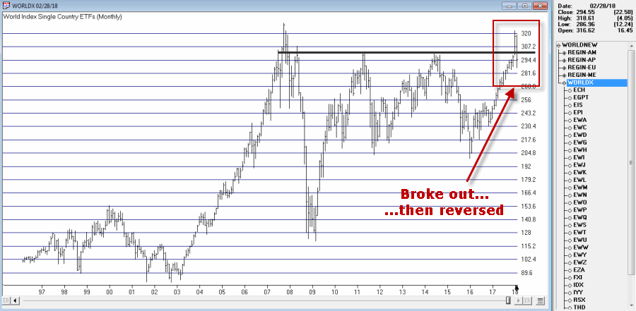
Figure 1 – Jay’s World Index broke out in January, fell back  below resistance in February (Courtesy AIQ TradingExpert)

The same scenario holds true for the four regional indexes I follow – The Americas, Europe, Asia/Pacific and the Middle East – as seen in Figure 2.

(click to enlarge)2

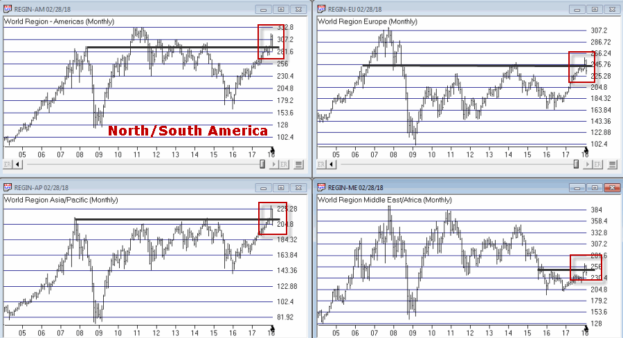
Figure 2 – Jay’s Regional Index all broke above resistance, then failed (Courtesy  AIQ TradingExpert)

So where to from here?  Well I could lay out a list of potential scenarios. Of course if history is a guide what will follow will be a scenario I did not include (Which really pisses me off.  But never mind about that right now).

So I will simply make a subjective observation based on many years of observation.  The world markets may turn the tide again and propel themselves back to the upside.  But historically, when a stock, commodity or index tries to pierce a significant resistance level and then fails to follow through, it typically takes some time to rebuild a base before another retest of that resistance level unfolds.

Here’s hoping I’m wrong

Jay Kaeppel

Disclaimer:  The data presented herein were obtained from various third-party sources.  While I believe the data to be reliable, no representation is made as to, and no responsibility, warranty or liability is accepted for the accuracy or completeness of such information.  The information, opinions and ideas expressed herein are for informational and educational purposes only and do not constitute and should not be construed as investment advice, an advertisement or offering of investment advisory services, or an offer to sell or a solicitation to buy any security.

One More Cry of ‘Wolf’

If I were the type to make bold proclamations I would probably consider “taking my shot” right here and shout “This is the Top” and/or “The Market May Crash.”  Unfortunately, on those occasions (well) in the past when I would make bold public predictions of what was about to happen in the financial markets I would almost invariably end up looking pretty stupid. So even if I did make a “bold proclamation” it wouldn’t necessarily mean that anyone should pay any attention.
Besides all that the last thing I want is for “the party to end”.  Even if you do think the market is about to tank it’s a pretty crummy thing to have to root for.  Even if you did manage to “call the top”, the ripple effect of the ramifications associated with a serious stock market decline can have pretty negative effect on just about everyone’s life.
So let’s put it this way: I am concerned – and prepared to act defensively if necessary – but still have money in the market and am still hoping for the best.
Reasons for Caution (Indexes)
Figure 1 displays four major indexes. The Dow keeps hitting new highs day after day while the others – at the moment – are failing to confirm.  That doesn’t mean that they won’t in the days ahead.  But the longer this trend persists the more negative the potential implications.
1
Figure 1 – Dow at new highs, small-caps, Nasdaq and S&P 500 not quite (Courtesy AIQ TradingExpert)
Reasons for Caution (Bellwethers)
Figure 2 displays 4 “bellwethers” that I follow which may give some early warning signs.
2
Figure 2 – Market Bellwethers possibly flashing some warning signs (Courtesy AIQ TradingExpert)
*SMH soared to a high in early June and has been floundering a bit since.
*Dow Transports tried to break out to the upside in July but failed miserably.
*XIV is comfortably in new high territory.
*BID tried to break out in July and then collapsed.  It is presently about 12% off of its high.
In a nutshell – 3 of the 4 are presently flashing warning signs.
Reasons for Caution (Market Churn)
In this article I wrote about an indicator that I follow that can be useful in identify market “churn” – which can often be a precursor to market declines.  Spikes above 100 by the blue line often signify impending market trouble
It should be noted that the indicators signals are often early and occasionally flat out wrong.  Still, a churning market with the Dow making new highs has often served as a “classic” warning sign.
3
Figure 3 – JK HiLo Index (blue) versus Nasdaq Compsite / 20 (red); 12/31/2006-present
Summary
Again, and for the record, I do not possess the ability to “predict” the markets.  But I have seen a few “warning signs” flash bright red at times in the past.  As a general rule, it is best to at least pay attention – and maybe make a few “contingency plans” – you know,  just in case.
Here’s hoping my gut is wrong – again.
Jay Kaeppel Chief Market Analyst at JayOnTheMarkets.com and AIQ TradingExpert Pro (http://www.aiqsystems.com) client. 
Disclaimer:  The data presented herein were obtained from various third-party sources.  While I believe the data to be reliable, no representation is made as to, and no responsibility, warranty or liability is accepted for the accuracy or completeness of such information.  The information, opinions and ideas expressed herein are for informational and educational purposes only and do not constitute and should not be construed as investment advice, an advertisement or offering of investment advisory services, or an offer to sell or a solicitation to buy any security.

Chart Pattern Recognition – Lock in 2008 pricing 5 days remaining!

Why add Chart Pattern to your TradingExpert Pro? 

 
  • Over 3000 stocks tracked
  • 16 different patterns tracked
  • 6 gauges of each pattern's quality
  • Automatically generate report every night
  • Built in EDS file so you can backtest and add to your own strategy
  • Completed and emerging patterns
​​​​​​​
OR CALL AIQ SALES on 1-800-332-2999 or 775-832-2798
 
 LOCK in 2008 pricing
 

hfwacp7-13-16

 
If you order before July 31, 2016
you'll get the 2008 pricing!
 
 
OR CALL AIQ SALES on 1-800-332-2999 or 775-832-2798

Inverse Head and Shoulders on the market?

There was an interesting Inverse Head and Shoulders pattern completed last night on SPY. As SPY is the proxy ETF for the S&P500 index, it caught my attention. A closer look at the Chart attached shows this pattern usually breaks out to the upside.
Analysis of the supplementary information clearly shows that the uniformity of this inverse head and shoulders is good, however the overall quality of the pattern is only average. The biggest issue is the lack of volume and lack of power of the breakout. The volume is particularly low. More volume is needed before this pattern is confirmed, particularly on a strong up day.

Learn more about Chart Pattern Recognition for TradingExpert Pro  http://aiqsystems.com/chartpatterns.htm

Classic Flag Breakouts on CVX, NFG, TOT

Our Chart pattern Recognition tool had a wealth of gasoline related stocks have breakouts yesterday. The classic flag breakout on good volume could be seen on CVX, NFG and TOT.

Quick reminder on what a flag pattern is.

The flag pattern is considered a continuation pattern after a consolidation period. The flag is a rectangular shape, similar to  the pennant, but the pennant looks more like a triangle.

Usually there’s a strong price movement followed by sideways price movement which is the flag. The pattern is complete when prices breakout in the same direction as the initial price movement. The following move will be in the same direction as the prior sharp move. The move prior to the flag is called the pole.

The flag pattern forms a rectangle with two parallel trendlines that act as support and resistance for the price until the price breaks out. Usually the flag will slope in the opposite direction to the trend.

The buy or sell signal occurs when the price breaks through the support or resistance level, with the trend continuing in the same direction as the pole. The breakthrough should occur on heavier volume.

I’ve put all three charts together and you can clearly see the pole, flag and breakout. As noted above the volume on the breakout on TOT was reasonable. The Quality of the pattern was also considered high.

Incidentally the volume on NFG and CVX was not as significant.

The entire list of stocks that generated completed flags in our nightly report on 5/25/16 is below.

and check out this new video that shows how we automate this reporting every night using the Chart Pattern recognition plug-in for TradingExpert.