Category Archives: chart patterns

Just how much influence a President has on the stock market

I often wondered just how much influence a President has on the stock market and found this interesting chart from Macrotrends. 

In the first 21 months from their inauguration you can see the top 10 performing Presidents. Who would have thought Gerald Ford would be so far up the list. Of course geopolitical events and prior President and Congress actions also take time to percolate into the market. 

Obama came into office soon after the 2008 financial crisis unemployment near 9% in 2009 and Ford after the oil crisis and Nixon. There are of course many other influencing factors, but a good rule of thumb In economic terms, the first year or so of any administration is just a carryover from the previous administration.

Probably the most significant contributor for the last decade has been the Federal Reserve chairs who have kept short-term rates low, while driving longer-term rates down by buying up $4.5 trillion of US government bonds and mortgage-backed securities. Lower returns has driven many investors into riskier assets like Stocks and this has helped fuel the stock market run that began in March 2009 and continues today. 

Economics aside, the current correction, and yes we are still in corrective territory can be seen in this SPX monthly chart. The Fibonacci retracement drawn from the low of the February 2018 correction to the recent high shows we’re at or past the 38.2% level. The next significant level is at 50% level of around 2729.

Dollar and Gold ‘To the Barricades’

This week it is the U.S. dollar and Gold taking their turns testing critical inflection points.

U.S. Dollar

As you can see in Figure 1, on a seasonal basis the dollar is moving into a traditionally weaker time of year.1Figure 1 – U.S. Dollar seasonality (Courtesy Sentimentrader.com)

In Figure 2 you can see that traders have been and remain pretty optimistic.  This is traditionally a bearish contrarian sign.2Figure 2 – U.S. Dollar trade sentiment (Courtesy Sentimentrader.com)

In Figure 3 we see the “line in the sand” for ticker UUP – an ETF that tracks the U.S. Dollar.  Unless and until UUP punches through to the upside there is significant potential downside risk.3Figure 3 – U.S. Dollar w/resistance (Courtesy AIQ TradingExpert)

Gold

As you can see in Figure 4, on a seasonal basis the dollar is moving into a traditionally stronger time of year.4Figure 4 – Gold seasonality (Courtesy Sentimentrader.com)

In Figure 5 you can see that traders have been and remain pretty pessimistic.  This is traditionally a bullish contrarian sign.5Figure 5 – Gold trader sentiment (Courtesy Sentimentrader.com)

In Figure 6 we see the “line(s) in the sand” for ticker GLD – an ETF that tracks gold bullion.

6Figure 6 – Gold w/support (Courtesy  AIQ TradingExpert)

I would be hesitant about trying to “pick a bottom” as gold still looks pretty week.  But if:

a) GLD does hold above the support area in Figure 6 and begins to perk up,

AND

b) Ticker UUP fails to break out to the upside

Things could look a lot better for gold very quickly.

Summary

As usual I am not actually making any “predictions” here or calling for any particular action.  I mainly just want to encourage gold and/or dollar traders to be paying close attention in the days and weeks ahead, as the potential for a major reversal in both markets appears possible.

Likewise, if no reversal does take place – and if the dollar breaks out to the upside and gold breaks down, both markets may be “off to the races.”

So dollar and gold traders – take a deep breath; focus your attention; and prepare for action…one way or the other.

Jay Kaeppel

Disclaimer:  The data presented herein were obtained from various third-party sources.  While I believe the data to be reliable, no representation is made as to, and no responsibility, warranty or liability is accepted for the accuracy or completeness of such information.  The information, opinions and ideas expressed herein are for informational and educational purposes only and do not constitute and should not be construed as investment advice, an advertisement or offering of investment advisory services, or an offer to sell or a solicitation to buy any security.

Here Are The Warning Signs to Watch For

Here’s a number for you – 88%.  Since 1948, over any 10-year period the Dow has showed a gain 88% of the time.  That’s a pretty good number.  It also explains why we should give bull markets the benefit of the doubt (for the record, if you only hold the Dow between the end of October and the end of May every year you would have a showed a 10-year gain 98% of the time!  But this article is not about seasonality per se, so that’s a topic for another day).
Of course, there is a lot of variability along the way, and if you Google “current signs of a bear market” you come up with 4,280,000 articles to peruse.  So, few investors ever feel “contented”.  We’re always waiting for the “other shoe to drop.”
Some Warning Signs to Look For
#1. Major Indexes
Figure 1 displays the four major average – Dow, S&P 500, Nasdaq 100 and Russell 2000 with their respective 200-day moving averages.  In the last few days the Dow slipped a little below its 200-day average, the other three remain above.

(click to enlarge)1a
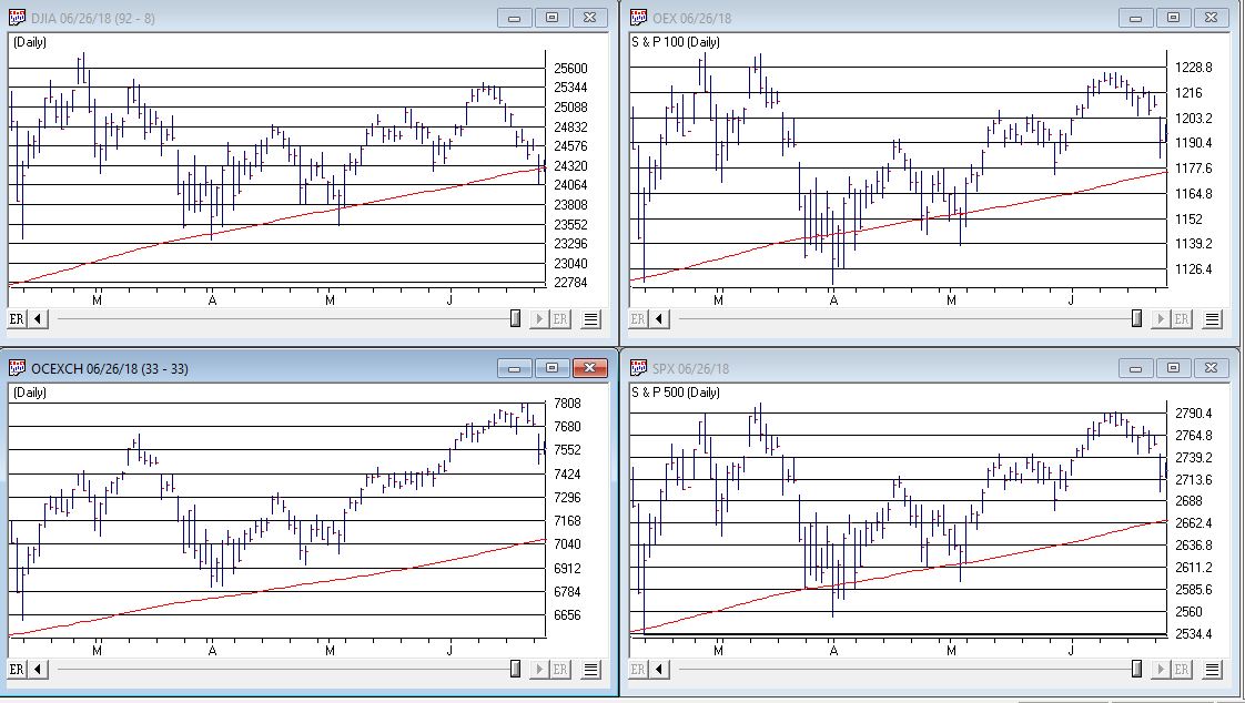
Figure 1 – Four major market averages with 200-day moving averages (Courtesy AIQ TradingExpert)

Warning Sign to Watch For: If 3 or more of these averages drop below their 200-day moving average.
#2. Market Bellwethers
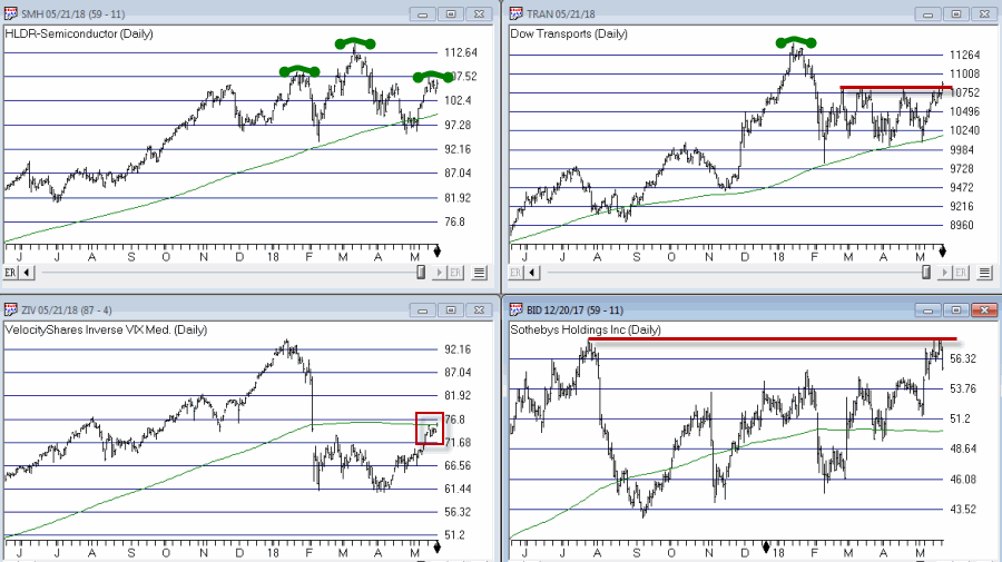
Figure 2 displays my four market “bellwhethers” – tickers SMH (semiconductors), TRAN (Dow Transports), ZIV (inverse VIX) and BID (Sotheby’s Holdings) with their respective 200-day moving averages.  At the moment only ZIV is below it’s 200-day moving average but some of the others are close

(click to enlarge)2
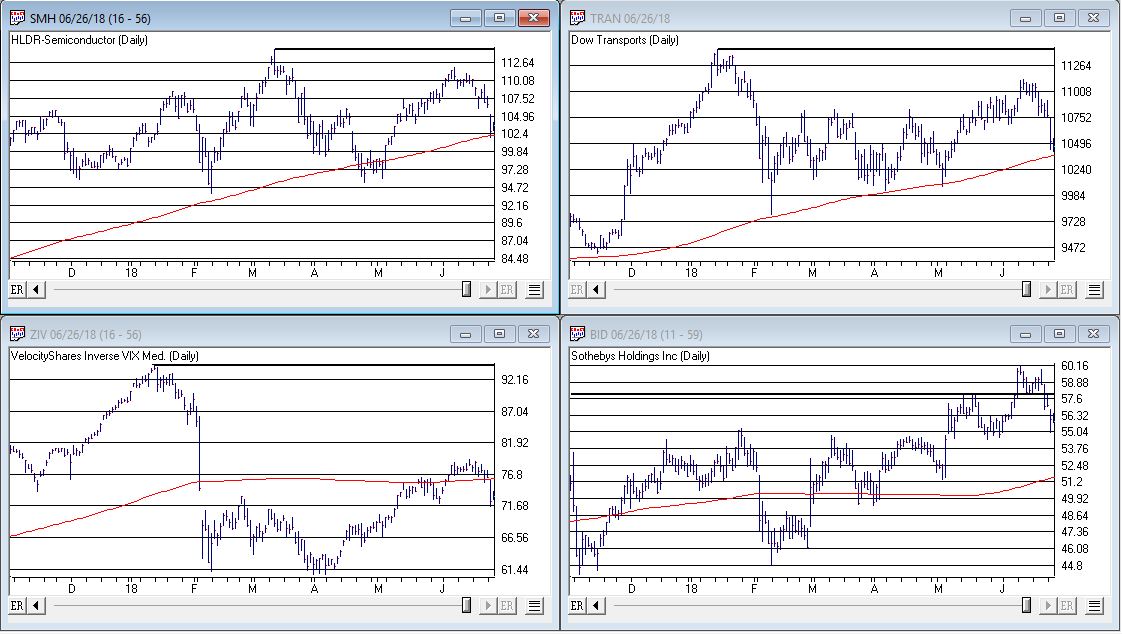
Figure 2 – Four market bellwethers with 200-dqy moving averages (Courtesy AIQ TradingExpert)

Warning Sign to Watch For: If 3 or more of these averages drop below their 200-day moving average.
#3. S&P 500 Monthly Method
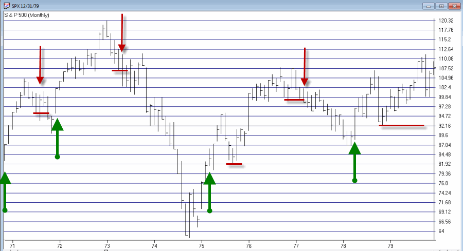
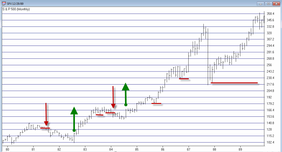
In this article I detailed a simple timing method using S&P 500 Index monthly closing prices.  Figure 3 show the S&P 500 Index with it’s “trigger warning” price of 2,532.69 highlighted.

(click to enlarge)3
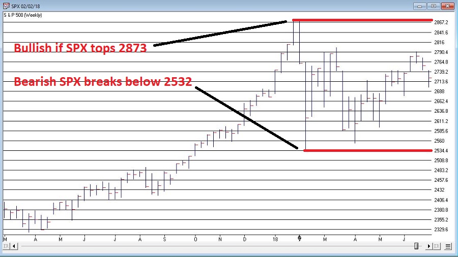
Figure 3 – S&P 500 Index Monthly Method Trigger Points (Courtesy AIQ TradingExpert)

Warning Sign to Watch For: If SPX closes below 2532.69 without first taking out the January high of 2872.87
#4. International Growth Stocks
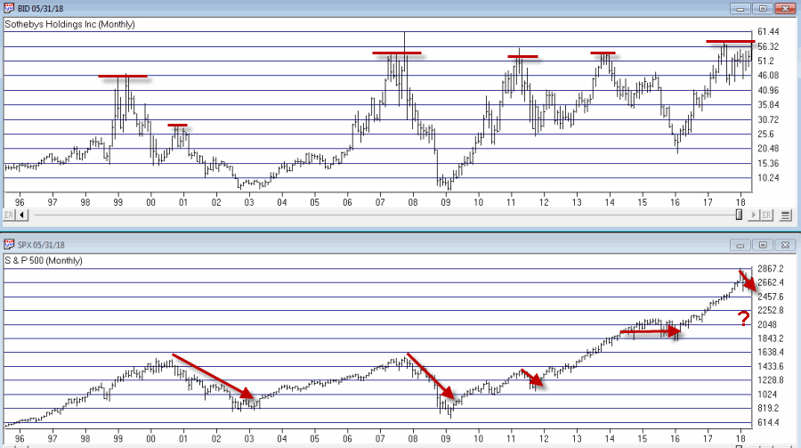
When growth stocks around the world are performing well, things are good.  When they top out, try to rebound and then fail, things are (typically) not so good.  The last two major U.S. bear markets were presaged by a break in ticker VWIGX (Vanguard International Growth) as seen in Figure 4.

(click to enlarge)4
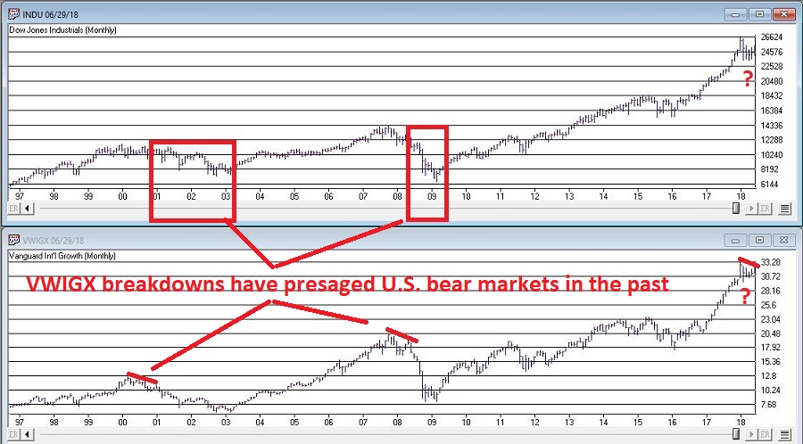
Figure 4 – Dow Jones Industrials Average (top) and previous warnings from ticker VWIGX (bottom)(Courtesy AIQ TradingExpert)

Warning Sign to Watch For: Technically this one is currently flashing a warning sign.  That warning will remain active unless and until VWIGX takes out the January high of 33.19.
#5. The 10-Year minus 2-Year Yield Spread
This is one of the most misrepresented indicators, so I will state it as plainly as possible:
*A narrowing yield curve IS NOT a bearish sign for the stock market
*An actual inverted yield curve IS a bearish sign for the stock market
Figure 5 displays the latest 10-year minus 2-year spread.  Yes, it has narrowed quite a bit.  This has launched a bazillion and one erroneously frightening articles.  But remember the rules above.

(click to enlarge)5
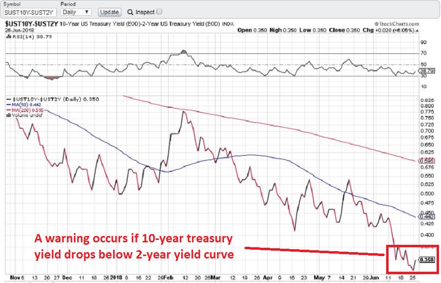
Figure 5 – 10-year treasury yield minus 2-year treasury yield (Courtesy: www.StockCharts.com)

Warning Sign to Watch For: If the 10-year yield minus the 2-year yield falls into negative territory it will flash a powerful warning sign for the stock market and the overall economy.  Until then ignore all the hand-wringing about a “flattening” yield curve.
Summary
We are in a seasonally unfavorable period for the stock market and – as always – we are bombarded daily with a thousand and one reasons why the next bear market is imminent.
So my advice is to do the following:
1. Ignore it all and keep track of the items listed above
2. The more warning signs that appear – if any – the more defensive you should become
In the meantime, try to go ahead and enjoy your summer.
Jay Kaeppel
Disclaimer:  The data presented herein were obtained from various third-party sources.  While I believe the data to be reliable, no representation is made as to, and no responsibility, warranty or liability is accepted for the accuracy or completeness of such information.  The information, opinions and ideas expressed herein are for informational and educational purposes only and do not constitute and should not be construed as investment advice, an advertisement or offering of investment advisory services, or an offer to sell or a solicitation to buy any security.

Does it all Hinge on BID?

The question posed in the title is essentially, “does the fate of the stock market hinge on the action of Sotheby’s Holdings” (ticker BID)?  Sotheby’s is the oldest stock on the NYSE and is the only publicly traded investment opportunity in the art market.  As the art market is highly sensitive to the overall economy it has been argued that BID is a potential stock market “bellwether”.
Still, the most obvious answer to the question posed above is of course “No.”  Of course the performance of the whole stock market does not come down to the performance of one stock.  That’s the obvious answer.
The more curious answer is arrived at by first looking at Figure 1.  Figure 1 displays a monthly bar chart for BID in the top clip and the S&P 500 Index in the bottom clip.  What is interesting is that historically when BID tops out, bad things tend to follow for the broader stock market.1
Figure 1 – BID tops often foreshadow SPX weakness (Courtesy AIQ TradingExpert)
Consider:
*The bear market of 2000-2002 was presaged by a dramatic top for BID in 1999, and confirmed again in late 2000.
*The great bear market of 2008 was also preceded by a top and breakdown in BID.
*The 2011 top in BID was followed by a quick but sharp -21% SPX decline.
*The 2013-2014 BID top was followed by roughly 2 years of sideways SPX price action.
*More recently the top in 2017-2018 top has been accompanied by much volatility and consternation in the broader market.
Figure 2 “zooms in” to recent years using weekly data.
2
Figure 2 – BID Weekly chart (Courtesy AIQ TradingExpert)
In Figure 2 we can see how poor performance for BID presaged an extended period of sideways trading for the SPX.  At the far right we can also see that BID is at something of a critical juncture.  If it punches through to the upside and moves higher it could be something of an “All Clear” sign for the market.  On the other hand, if BID fails here and forms a clear multiple top, well, history suggests that that might be an ominous sign for the broader market.
Other Bellwethers
BID is one of four market “bellwethers” that I like to monitor.  The other 3 are SMH (semiconductor index), TRAN (Dow Transports) and ZIV (inverse VIX).  You can see the status of each in Figure 3.
3
Figure 3 – Four stock market “Bellwethers” (Courtesy AIQ TradingExpert)
To sum up the current status of these bellwethers:
*All 4 (including ZIV as of the latest close) are above their respective 200-day moving average.  So technically, they are all in “up trends.”
*All 4 are also threatening to create some sort of topping formation.
In sum, as long as all four of these bellwethers continue to trend higher, “Life is Good” in the stock market.  At the same time, if some or all of these fail to break through and begin to top out, the broader market may experience more trouble.
Bottom line: Now is a good time to pay close attention to the stock market for “tells”.
Jay Kaeppel
Disclaimer:  The data presented herein were obtained from various third-party sources.  While I believe the data to be reliable, no representation is made as to, and no responsibility, warranty or liability is accepted for the accuracy or completeness of such information.  The information, opinions and ideas expressed herein are for informational and educational purposes only and do not constitute and should not be construed as investment advice, an advertisement or offering of investment advisory services, or an offer to sell or a solicitation to buy any security.

Trend Following in One Minute a Month

In the article linked below, investor and Forbes columnist Kenneth Fisher writes about what to look for at a market top (How to Tell a Bull Market from a Bear Market Blip). One piece of advice that I have heard him offer before is to wait at least 3 months after a top in price to worry about whether or not we are in a bear market.  That is good advice and provided the impetus for a simple trend-following model I follow based on that “wait 3 months” idea.

First, a few key points:

*Trend-following is NOT about picking tops and bottoms or timing the market with “uncanny accuracy”.  So don’t expect any trend-following system to do so.

*The primary edge in any trend-following method is simply missing as much of the major soul – and capital – crushing bear markets as possible, with the understanding that you will miss some of the upside during bull markets.

The Good News:

*Starting in November 1970 this system has beaten a buy and hold strategy

*This system requires no math. There are no moving averages, etc.  Anyone can look at a monthly S&P 500 bar chart and generate the signals.  And it literally takes less than 1 minute per month to update.

The Bad News:

*Every trend-following method known to man experiences whipsaws, i.e., a sell signal followed by a buy signal at a higher price.  This system is no exception.

*Due to said whipsaws this system has significantly underperformed the S&P 500 buy-and-hold since the low in early 2009.

For what it’s worth, my educated guess is that following the next prolonged bear market, that will change.  But there are no guarantees.

OK, all the caveats in place, here goes.

Jay’s Monthly SPX Bar Chart Trend-Following System

*This system uses a monthly price bar chart for the S&P 500 (SPX) to generate trading signals.

*For the purposes of this method, no action is taken until the end of the month, even if a trend change is signaled earlier in the month.

*A buy signal occurs when during the current month, SPX exceeds its highest price for the previous 6 calendar months.

A sell signal occurs as follows:

a) SPX registers a month where the high for the month if above the high of the previous month. We will call this the “swing high”.

b) SPX then goes 3 consecutive monthly bars without exceeding the “swing high.” When this happens, note the lowest low price registered during those 3 months. We will call this price the “sell trigger price.”

c) An actual sell trigger occurs at the end of a month when SPX register a low that is below the “sell trigger price”, HOWEVER,

d) If SPX makes a new monthly high above the previous “swing high” BEFORE it registers a low below the “sell trigger price” the sell signal alert is aborted

Sounds complicated right?  It’s not.  Let’s illustrate on some charts.

In the charts that follow:

*An Up green arrow marks a buy signal

*A Down red arrow marks a sell signal

*A horizontal red line marks a “sell trigger price”.

Sometimes a sell trigger price is hit and is marked by a down red arrow as a sell signal.  Other times a sell trigger price is aborted by SPX making a new high and negating the potential sell signal.

spx trendf 1

Figure 1 – SPX signals 1970-1979 (Courtesy AIQ TradingExpert)

SPX trendf 2

Figure 2 – SPX signals 1980-1989 (Courtesy AIQ TradingExpert)

SPX trendf 3

Figure 3 – SPX signals 1990-1999 (Courtesy AIQ TradingExpert)

SPX trendf 4

Figure 4 – SPX signals 2000-2009 (Courtesy AIQ TradingExpert)

SPX trendf 5

Figure 5 – SPX signals 2010-present (Courtesy AIQ TradingExpert)

To demonstrate results we will use monthly close price data for SPX.  If the system is bullish then the system will hold SPX for that month.  If the system is bearish we will assume interest is earned at an annual rate of 1% per year.

Figure 6 displays the results of the System versus Buy and Hold starting with $1,000 starting November 1970 through 1994 (roughly 24 years).

6

Figure 6 – Growth of $1,000 invested using System versus Buy-and-Hold; Nov-1970 through Dec-1994

Figure 7 displays the results of the System versus Buy and Hold starting with $1,000 starting at the end of 1994 through the most recent close.

7

Figure 7 – Growth of $1,000 invested using System versus Buy-and-Hold; Dec-1994 through Feb-2018

Figure 8 displays the growth of $1,000 generated by holding the S&P 500 Index ONLY when the trend-following system is bearish.  In Figure 8 you will see exactly what I mentioned at the outset – that the key is simply to miss some of the more severe effects of bear markets along the way.

8

Figure 8 – Growth of $1,000 invested ONLY when trend-following model is Bearish; 1970-2018

Finally, Figure 9 displays trade-by-trade results (using month-end price data).

9

Figure 9 – Trade-by-trade results; Month end price data

Summary

So is this “The World Beater, Best Thing Since Sliced Bread” system?  Not at all.  If you had started using this system in real time in March of 2009 chances are by now you would have abandoned it and moved on to something else, as the whip saw signals in 2011-2012 and 2016 has the System performing worse than buy and hold over a 9 year period.

But here is the thing to remember.  Chances are prolonged bear markets have not been eradicated, never to occur again.  100+ years of market history demonstrates that bear markets of 12 to 36 months in duration are simply “part of the game”.  And it is riding these bear markets to the depths that try investors souls – and wipe out a lot of their net worth in the process.

Chances are when the next 12 to 36 month bear market rolls around – and it will – a trend-following method similar to the one detailed here may help you to “save your sorry assets” (so to speak).

Jay Kaeppel

Disclaimer:  The data presented herein were obtained from various third-party sources.  While I believe the data to be reliable, no representation is made as to, and no responsibility, warranty or liability is accepted for the accuracy or completeness of such information.  The information, opinions and ideas expressed herein are for informational and educational purposes only and do not constitute and should not be construed as investment advice, an advertisement or offering of investment advisory services, or an offer to sell or a solicitation to buy any security.