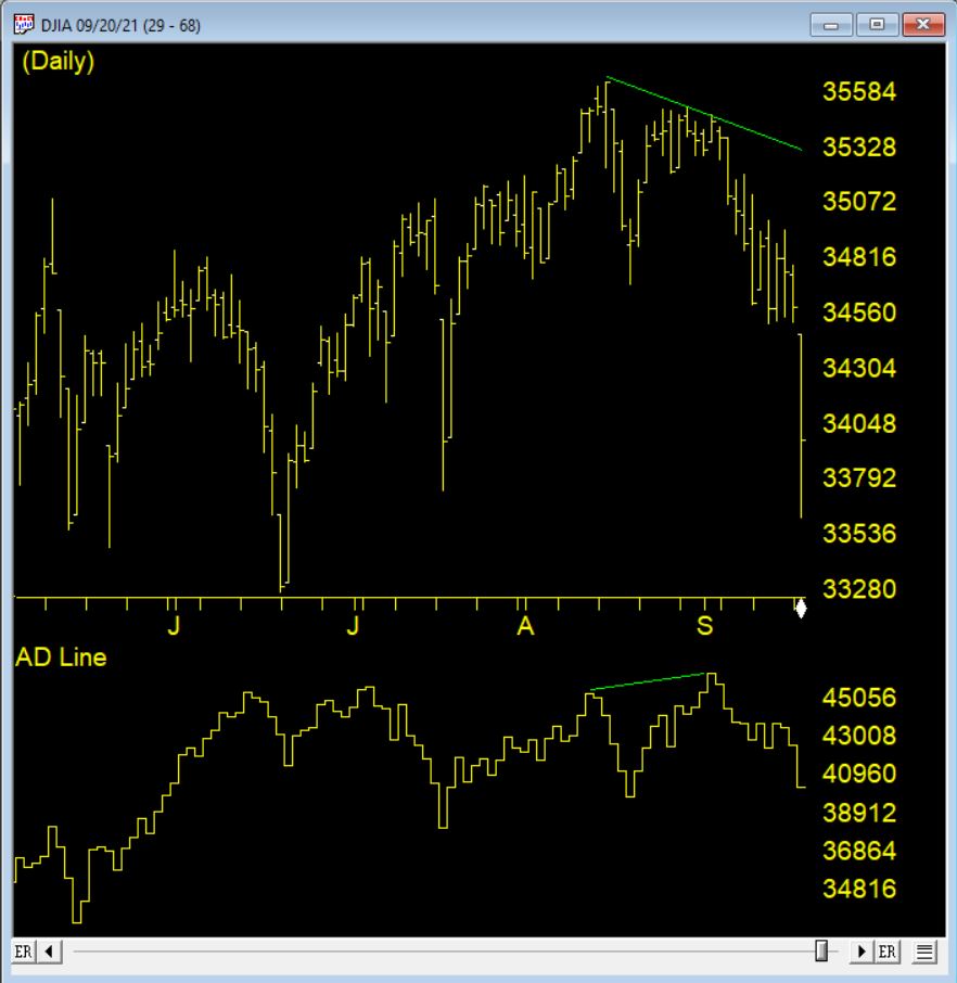
Advance-Decline data is calculated from daily issues reported on the New York Stock exchange. The Basic formula for calculating the Advance-Decline is the difference between the number of Advancing Issues and the number of Declining Issues per day, and adding it to or subtracting it from the previous day’s total.
In simple terms, the AdvanceDecline Line shows the direction in which the majority of stocks are headed. In a more important sense, it can show whether buying enthusiasm during a rally is spread across a broad number of stocks (a positive indication), or whether buying is narrowly focused on just a few industry groups or sectors (a generally negative sign).
An Advance-Decline Line is a contract/expanding/short-term market indicator. It is also referred to as an “order of magnitude” indicator because it provides a quick estimate of the market’s internal strength by showing how the overall market (or a specific sector) is trading in relation to a moving average.
One of the most popular ways of judging the market strength of the overall market is by using the advancedecline line (ADVs), also known as the “AD Line.” This metric is calculated by subtracting the number of decliners from the number of advancers in a market index. During a strong bull market (when a bull market begins), an AD line that is rising indicates growing market breadth (better market breadth) and indicates that money is continuing to move into the market. Conversely, falling AD lines indicate shrinking market breadth (worse market breadth) and indicate that money is leaving the broader market.
Because of its elegant simplicity, and the valuable insights it has provided at market turning points, the AD Line has become a highly prized indicator by both fundamentalists and technicians throughout the decades. But, in recent years, something seems to have gone astray.
The AD Line against the DJIA 9/1/2021 clearly shows the indicator making a new high, however the market drops precipitously shortly after
How could the time-tested Advance-Decline Line give off such obviously false signals? The answer is simple, but not easily seen. The change has occurred, not in the indicator, but in the data it measures. Over the past 3 decades, the New York Stock Exchange has allowed trading in a growing number of issues that are not, or do not trade like, domestic common stocks.
The truth is that most of the issues currently listed on the NYSE are not really stocks, at least not what investors generally define as stocks. Their inclusion has created turbulence in the sea of securities that has been amplified by the Advance-Decline Line. These stock-like issues include closed end funds (CEFs), American Depository Receipts (ADRs), and exchange-traded funds (ETFs).
In other words, the common stock components of the Advance-Decline Line offset one another, while the bond-related components were rising strongly, giving the Advance-Decline Line a positive bias. In other words, during those periods, the Advance-Decline Line was, in essence, measuring the strength of the bond market, not the stock market. It’s no wonder that the signals were misleading!
In an upcoming free zoom meeting we will be discussing making an AD line indicator that more closely measures the stocks on the NYSE and may improve the signals on the market.
Creating An Advance-Decline Line ‘Without the Flaws’ – FREE webinar
Hour-long session with Steve Hill, CEO of AIQ Systems. Many of the issues currently listed on the New York Stock Exchange are not really stocks but closed end funds, bond funds, ADRs. This has been the principal cause of the false signals given off by the Advance-Decline indicator. Using AIQ’s Breadth Builder Steve will show you how we have a fix for that.
On my last Bartometer the S&P 500 was around 4580 and I stated the market was again overbought and to Sell some equities and bonds. I stated I saw the S&P retreating to the 4200 level and if that broke then the 3800-3850 level would be the next support. Last Thursday the S&P declined to the 3840 level and bounced to the 4000 area in one day. Even though the markets are now VERY OVERSOLD and can rally a bit more, there is no major upside driver to now start a new Bull Market. Even though the market retreated so much this year, with the NASDAQ down 30% off its highs, the markets are now very oversold, but I only see minor rallies from here and more volatility until inflation and interest rates peak.
We still have the same concerns:
High Inflation.
Potentially Higher interest rates over the next few months.
Potential recession in 2023.
Potentially Slowing earnings growth.
Putins war in the Ukraine and more.
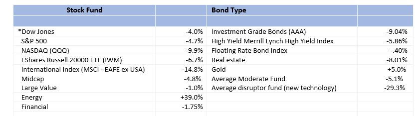
In my opinion, any rally into the 4200 to 4400 area is still a place to consider reducing exposure to equities and bonds depending on your individual circumstances. This however is one of the worst 4.5 months we have had in a long time. As reported by Morningstar, the stock markets down anywhere from 11-50% and bonds down from 5 to 22%. Most investors are seeing their investments go down.
The only major sector that has done well recently is energy sector. Other than that, everything else is falling. Does that mean to stop investing? No, as a matter of fact, I believe the opportunities in the stock and bond markets are going to give many of you opportunities that you have not seen in a while. Dollar cost averaging can be a beneficial way to enter the markets. Consider increasing purchases over the next 1 year as the markets are lower. Warren Buffets frequently states “buy when there is blood in the streets.” There is blood in the streets now for many stocks and its possible it may get worse. Nothing is guaranteed, but if you believe in capitalism and that great companies and markets do well over time this may become a buying opportunity. When markets are down like this you may want to take advantage of these drops. Look on page 4 to see the last 52 year of the S&P 500.
Some of the INDEXES of the markets both equities and interest rates are below. The source is Morningstar.com up until May 14, 2022 These are passive indexes.
Excerpts from Dr. Robert Genetski
Market Outlook . A Look Back
The bloodbath on Wall Street has taken the Nasdaq and other indexes down almost 30% from their highs.
Among the better relative performers, the S&P500 is down 18% and the Dow 14%.
Economic news is mixed. April business surveys show a sharp decline in output in China and Russia. Much of the rest of the world, including the US, continues to grow at a moderate pace amid rapid inflation.
The stock market’s technical signals remain very negative. My technical guru, Joe Bartosiewicz, CFP, wrote about major support for the S&P 500 at about 3800-3850. The index fell to a low of 3840 yesterday before rebounding to 3930. While this could be the bottom, no one can say for certain if it is.
On a positive note, the IBD ratio of bulls to bears is just about where it was in late March, 2020, during the worst fears of the Covid outbreak. Amid such extreme pessimism markets often change direction. Stocks often reflect the collective wisdom of all investors. If so, they are pointing to a much weaker economy than our forecast suggests. The key unknown is how badly shortages of food, diesel fuel and other raw materials will slow both the economy and spending. If the economy stalls or dips into a downturn, there will be some relief from inflation, but at a serious cost in jobs.
With China, Russia and Ukraine creating SupplySide problems, our forecast is for the economy to weaken this summer without going into a downturn. By the end of the summer, the economy will either be soft with continued high inflation or will be flat to down with some relief on prices. Neither scenario is very attractive. Amid all the uncertainty, my stock portfolio remains 50% in stocks and 50% in cash.
A Look Back This week’s April inflation reports showed no relief from soaring inflation. April’s total cpi index slowed to a 4% annual rate while the monthly cpi ex-food and energy increased a 7% annual rate.
Economic Fundamentals Weakening
Stock Valuation Over-Valued 19%
Monetary Policy: Expansive
Recommended Stock Exposure: 50% This is a reduction of his stock allocation.
Dr Robert Genetski, American Strategic Advisors and LPL Financial are not affiliated. The opinions expressed in this material do necessarily reflect the views of LPL Financial.
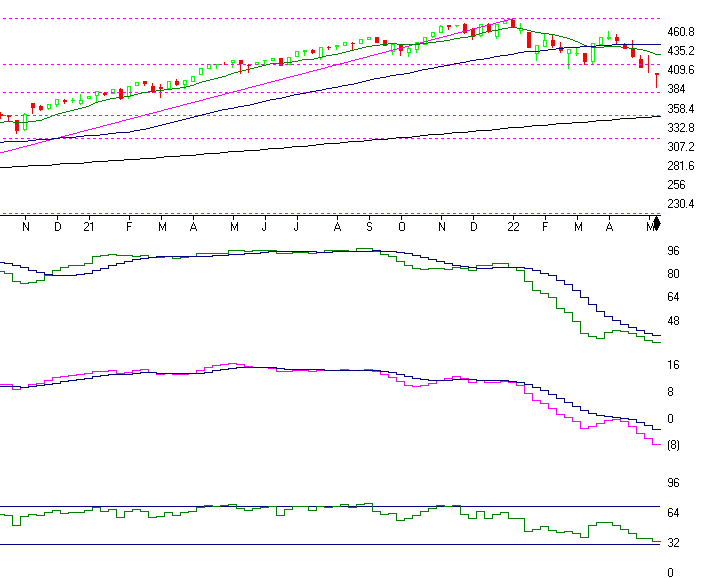
S & P 500
Charts Source: AIQSystems.com
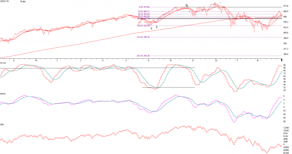
Above is the WEEKLY Chart of the S&P 500. This chart goes over the last 1.5 years in the S&P. As you can see the S&P is down about 20% off its high and down 15.2% in 2022. As you can see, I said that the 4200 level was support and if it broke that support then The 3580 to 3850 should find some buying support. That did happen bottoming at 3840 on Thursday and closed up 2.29% on Friday, Closing at 4023.89. It has substantial Selling resistance from here to the 4200 first then 4400 area next where it can top out again. I am not thinking the S&P can start a new Bull market anytime soon. I do believe the stock market should bottom over the next year so that is why we can consider buying more equities through dollar cost averaging monthly over the next year.
SK-SD stochastics is next. This indicator was the reason I got negative last month right near the top. This today is the weekly chart, last month was the daily chart. But last week the SK-SD Stochastics was showing an 82 reading meaning it was over bought again. Now, however it is at 16 on the Daily graph and below 32 on the weekly graph. Meaning? The markets are very OVERSOLD and can potentially have a Rally at anytime.
Next is the MACD or Momentum graph. This shows that the momentum is engrained in a strong down trend for a while. A trend change to the upside would happen if the pink line crosses over the purple line. But as of this moment, I see volatility and a rally or two.
The last indicator is the RSI Wilder index. This is very interesting as if it breaks below the 32 line like it ALMOST IS, then the market is getting extremely oversold and we could have a major rally. It’s almost there now.
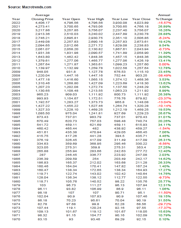
52 YEARS OF PERFORMANCE OF THE S&P 500:
The Stock Market and INFLATION
As you can above, the S&P 500 has performed well over the long term. It has averaged an INFLATION ADJUSTED RETURN OF 6.49% according to Officialdata.org for the last 52 years. It averaged 10.66% before inflation and 6.49% after inflation. So as you can see the stock market has been one of the best ways to offset inflation over the long term. Yes, the market goes down, but over the long term it’s still one of the best places to make money.
SUPPORT AND RESISTANCE LEVELS ON THE S&P 500
SUPPORT 3800 to 3850, then 3719, 3478, and 3380. These are areas not exact numbers RESISTANCE 4071, 4210, 4322, and 4434
Bottom Line
The market has had one of the worst 4.5 months n a few years dropping 11-50% The cause?? Overvaluation, Higher Interest rates, INFLATION, Covid and the Russian War.. If interest rates are rising and could rise 3 to 5 times like the Federal Reserve says that is why we should consider reducing regular bonds for at least another few months. At that time if interest rates peak because inflation is peaking then regular bonds may be a good investment but the only bonds I might consider are FLOATING RATE BONDS now. In addition, if interest rates rise financials potentially tend to perform better than most. In addition, stocks with pricing power and with good consistent earnings can do better than aggressive companies that have potential but no earnings. Commodities tend to do well in an inflationary environment. Look for companies with revenue growth that has the potential of beating inflation. I am still long term bullish on equities, but the short term could get very volatile where we could go a little higher on the markets but maybe back to 4500, but the downside could be the 3650 level and if we go into a soft recession then the 3300 3500 level is possible and lower if the recession is steeper. This is predicated on the actions of the Federal Reserve. I will continue to do my analysis and inform you when a bottom looks imminent.
The Best to all of you,
Joe Bartosiewicz, CFP® Investment Advisor Representative Contact information:
Disclaimer: The views expressed are not necessarily the view of LPL Financial or American Strategic Advisors, Inc. and should not be interpreted directly or indirectly as an offer to buy or sell any securities mentioned herein. Past performance cannot guarantee future results. Investing involves risk including the potential loss of principal. No investment strategy can guarantee a profit or protect against loss in periods of declining values. Please note that individual situations can vary. Therefore, the information presented in this letter should only be relied upon when coordinated with individual professional advice. *There is no guarantee that a diversified portfolio will outperform a non-diversified portfolio in any given market environment. No investment strategy, such as asset allocation, can guarantee a profit or protect against loss in periods of declining values.
It is our goal to help investors by identifying changing market conditions. However, investors should be aware that no investment advisor can accurately predict all of the changes that may occur in the market.
The price of commodities is subject to substantial price fluctuations of short periods of time and may be affected by unpredictable international monetary and political policies. The market for commodities is widely unregulated and concentrated investing may lead to Sector investing may involve a greater degree of risk than investments with broader diversification.
Indexes cannot be invested in directly, are unmanaged and do not incur management fees, costs, and expenses.
Dow Jones Industrial Average: A price weighted average of 30 significant stocks traded on the New York Stock Exchange and the NASDAQ. S&P 500: The S&P 500 is an unmanaged indexed comprised of 500 widely held securities considered to be representative of the stock market in general.
NASDAQ: the NASDAQ Composite Index is an unmanaged, market weighted index of all over the counter common stocks traded on the National Association of Securities Dealers Automated Quotation System
(IWM) I Shares Russell 2000 ETF: Which tracks the Russell 2000 index: which measures the performance of the small capitalization sector of the U.S. equity market.
The Merrill Lynch High Yield Master Index: A broad based measure of the performance of non-investment grade US Bonds
MSCI EAFE: the MSCI EAFE Index (Morgan Stanley Capital International Europe, Australia and Far East Index) is a widely recognized benchmark of non US markets. It is an unmanaged index composed of a sample of companies’ representative of the market structure of 20 European and Pacific Basin countries and includes reinvestment of all dividends.
Investment grade bond index: The S&P 500 Investment grade corporate bond index, a sub-index of the S&P 500 Bond Index, seeks to measure the performance of the US corporate debt issued by constituents in the S&P 500 with an investment grade rating. The S&P 500 Bond index is designed to be a corporate-bond counterpart to the S&P 500, which is widely regarded as the best single gauge of large cap US equities.
Floating Rate Bond Index is a rules based, market-value weighted index engineered to measure the performance and characteristics of floating rate coupon U.S. Treasuries which have a maturity greater than 12 months.
The opinions voiced in this material are for general information only and are not intended to provide specific advice or recommendations for any individual. All performance referenced is historical and there is no guarantee of future results. All indices are unmananaged an may not be invested into directly. Stock investments include risks, including fluctuations in market price and loss of principal. No strategy assures success or protects against loss. Because of their narrow focus, sector investing includes risk subject to greater volatility than investing more broadly across multiple sectors
Rarely do we come across a newsletter and alerting service that offers the kind of insight and alerts that Trading Floor Research is offering. TFR was founded by David Wozniak, a high net worth portfolio manager for over 32 years.
The system David employs in his newsletter and alert service has a high probability trading model that was developed, backtested, and used to successfully manage portfolios by selling losses quickly and letting profits run.
The TFR service uses a combination of Group/Sector rotation (based on David’s own custom groups), Donchian’s four-week rule, volume, trend analysis of averages and Fibonacci expansions for entry and exit targets.
High Probability Trading Setups
A newsletter is e-mailed to you twice a week. It provides new industry group, individual stock, and ETF buy signals. The research reports will highlight valid entry points, high probability sell targets, and stop-loss numbers.
High Probability Trading Setups
Never miss a buy or sell opportunity. A text alert lets you know when a newsletter buy candidate becomes a confirmed buy. A text is also sent when the stock hits its sell target.
Take the Emotion Out of Your Trading Process
Increase your probability of success with less stress. Let Trading Floor Research help you find new stock ideas and provide a proper capital allocation of your trades. TFR will guide you through the process from start to finish.
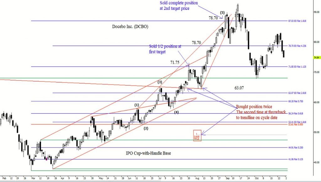
Example Chart – DCBO Docebo Inc.
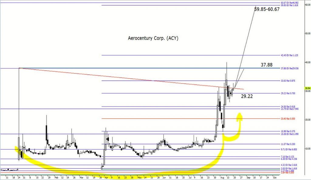
Example Chart – ACY Aerocentury Corp.
Innovative Investing
Trading Floor Research is about giving you high probability trading ideas with high probability sell targets. You get an entry price, a target price, and a stop price with every trade. We know selling can be more difficult than buying.
That’s why you’ll know your sell target before you enter the trade.
The system has a high probability trading model that was developed, backtested, and used to manage high net worth portfolios for over 32 years. Successfully managing portfolios has taught me that the secret to success includes selling losses quickly and letting profits run.
TFR informs you through a text alert of your next trading opportunity, and when a sell target is achieved. This allows you to react as quickly as possible to new trading ideas and maximize your ability to make greater trading profits.
Trading Floor Research provides commentary on individual stocks, their industry group, and the market. This gives you greater insight into every trade. Trade setups will come with a possible 1 to 5-star rating based on an individual stock’s probability of success. Make better risk management decisions by knowing what to allocate to every trade.
Trading Floor Research takes you down to the trading floor by monitoring and reporting institutional money flow. You get a better feel for stock accumulation and distribution.
I am now a Partner at American Strategic Advisors in Stamford Connecticut.
Now
to the the important news that will continue to affect all of us.
1. Putin and the Russians continue to penetrate
and choke off the cities of Ukraine although there are talks of a cease fire..
This will most likely continue until the Ukranians give up, Putin gives up or
there is an escalations that can be a disaster.
2. As reported on CNBC, Inflationary pressures
are 6-7% plus should continue to weigh heavily on the economy and overall costs
in the USA.
3. Interest rates
will continue to rise at least 3 to 5 more time unless the data changes
4. Earnings
will slow if the war continues and inflation does not subside. This could cause
a Global Recession
5. Overall the
citizens of the USA want to travel and to spend money but they are being suppressed
by the uncertainty of war, higher interest rates, higher inflation and spiking energy
costs.
Earnings are expected to continue to grow this year about 3 to 7%, but after the bounce in the stock market over the last 2 weeks the market is getting overbought again somewhat and getting near resistance. The market can continue to rally from here, BUT now I would consider reducing equity positions as there are too many head winds in the market that could become a problem in the next few weeks and months. The stocks that tend to do well in an inflationary environment are stocks that have pricing power. These companies can raise prices somewhat and people will continue to use their products. As prices go higher people tend to buy other substitute products. If you are nearing or in retirement, I would consider reducing equities by 5 to 10% to fixed accounts if you are over allocated to equities. I still like energy, and dividend stocks and over the longer term higher quality technology stocks.
Some of the INDEXES of the markets both equities and interest rates are below. The source is Morningstar.com up until April 1, 2022 These are passive indexes.
Excerpts from Dr. Robert Genetski
Market
Outlook
Nervous
investors continue to produce highly erratic moves in stock prices. This week started
with substantial gains, then ended by giving back the gains. By yesterday, most stocks ended the week unchanged.
Daily moves in stock prices are usually in response to major news events. The gains earlier in the week appear consistent with a promise that peace talks could end the war. The declines later in the week were consistent with a lack of progress in the talks and with Russian troops being exposed to radiation
at Chernobyl.
Most technical stock market indicators remain negative. The S&P500 is in the best shape since it is the only major index above its 200-day average. All others have failed to move above key resistance
levels.
Economic indicators for March point to moderate growth of 2% to 3%. Rapid inflation continues to eat away at increases in spending and incomes. After a sharp increase, longer-term interest rates have leveled off. The spread between the 2-year Treasury and the 10-year Treasury is currently a mere 0.01 percentage point. The narrowing of this spread suggests the Fed will be able quickly to contain
inflation by rapidly raising short-term rates. This is highly unlikely.
Although the flood of money entering the economy slowed a bit in March. It will take much more than slowing to offset the surge this past year. With little change the S&P500, the index remains 29% above its underlying value. Investors should remain cautious in a highly erratic news driven market.
A Look Back
Today’s March employment report shows a strong rise of 426,000 private payroll jobs, a 4% annualized increase. Average weekly earnings increased at a 5% annual rate and the unemployment rate declined to 3.6%. As expected,
the economy continues to perform well.
Forces Impacting the near term outlook for stock prices
Economic Fundamentals Mixed
Stock Valuation Over-Valued 29%
Monetary Policy: Highly Expansive
Recommended Stock Exposure: 60%
This is
a reduction of his stock allocation.
Dr Robert Genetski, American Strategic Advisors and LPL Financial are not affiliated. The opionions expressed in this material do necessarily reflect the views of LPL Financial.
S&P 500 Charts Source: AIQSystems.com
The S&P 500 is above. As you can see it has rebounded over the last month where the AIQ Systems gave BUY signals on March 10th but it is again flashing topping action again. The S&P is masking what is happening to the very aggressive stocks that have fast revenue growth but no real earnings as of yet and have dropped 30% or more. Over the longer term I am still Bullish, but over the next few months I do not see any new highs in the S&P 500. I see the S&P not going above the old high and actually trying to test the 4200 level again on the S&P 500. So, any rally in the markets may be to REDUCE equities. In addition, we will probably not have a recession this year, but in 2023 the chances go up for a recession. Stick with companies with solid earnings.
The SK-SD Stochastics chart is
again getting very overbought as the fast line is now over 88 and getting
overbought. MEANING?, the market is getting short term overbought again. See
the ABOVE pointing Arrows? Everytime the SK-SD Stochatisc was above the 88 line
the market topped out short term! Meaning I’m CAUTIOUS here, consider selling a
little above the 88 line, where it is now.
MACD or Momentum line. Momentum
is still going higher. The BUY signal was when the pink line crossed the Aqua
line in early March, but now it has gone up a good deal. My AIQ models are NOT
confirming Sell signals, I am saying they are flashing topping action.
The last chart is On Balance Volume. This chart shows as markets go up all volume is added and when markets fall then all volume is subtracted. Notice volume is not that great when markets are rising. It should at least follow the market above and it is not.
Bottom Line
The
market has had one of the worst quarters in a few years. The cause? Overvaluation,
Higher Interest rates, INFLATION, Covid and the Russian situation. If interest
rates rise 5 to 7 times like the Federal
reserve says then regular bonds may be a SELL, and the only bonds I might
consider FLOATING RATE BONDS. In addition if interest rates rise then financials
tend to perform better then most. In addition, stocks with pricing power and
with good consistent earnings do better than aggressive companies that have
potential but no earnings. Commodities tend
to do well in an inflationary environment. Look for companies with revenue growth
that has the potential of beating inflation. I am still long term bullish but the short
term could get very volatile where we could go a little higher on the markets
but there is a good potential of testing the 4200 level on the S&P 500
again later in the year.. I am Cautious on the market over the next few months.
If the market sells off and interest rates have gone up substantially then at
the peak of pessimism begets bottoms in the market. I will continue to do my
analysis and inform you when a bottom
looks iminant.
P
Support
levels on the S&P 500 area are 4250, 4200, and 3800- 3850 areas and 3500. These
might be BUY areas.
Please call me for a Review if
you have not seen me in 6 months, it is important.
The Best to all of
you,
Joe
Joe Bartosiewicz, CFP® Investment Advisor Representative
SECURITIES AND ADVISORY SERVICES
OFFERED THROUGH LPL Financial, a registered investment advisor, MEMBER
FINRA/SIPC.
Charts provided by AIQ
Systems:
Technical Analysis is based
on a study of historical price movements and past trend patterns. There is no
assurance that these market changes or trends can or will be duplicated
shortly. It logically follows that historical precedent does not guarantee future
results. Conclusions expressed in the Technical Analysis section are personal
opinions: and may not be construed as recommendations to buy or sell anything.
The economic forecasts set forth in this material may not develop as predicted
and there can be no guarantee that strategies promoted will be successful. Each
clients investment experience is unique to their circumstance and must be
carefully planned with their advisor.
Disclaimer: The views
expressed are not necessarily the view of LPL Financial or American Strategic
Advisors, Inc. and should not be interpreted directly or indirectly as an offer
to buy or sell any securities mentioned herein.Past performance cannot
guarantee future results. Investing involves risk including the potential loss
of principal. No investment strategy can guarantee a profit or protect against
loss in periods of declining values. Please note that individual situations can
vary. Therefore, the information presented in this letter should only be relied
upon when coordinated with individual professional advice. *There is no
guarantee that a diversified portfolio will outperform a non-diversified
portfolio in any given market environment. No investment strategy, such as
asset allocation, can guarantee a profit or protect against loss in periods of
declining values.
It is our goal to help
investors by identifying changing market conditions. However, investors should
be aware that no investment advisor can accurately predict all of the changes
that may occur in the market.
The price of commodities is
subject to substantial price fluctuations of short periods of time and may be
affected by unpredictable international monetary and political policies. The
market for commodities is widely unregulated and concentrated investing may lead
to Sector investing may involve a greater degree of risk than investments with
broader diversification.
Indexes cannot be invested
in directly, are unmanaged and do not incur management fees, costs, and
expenses.
Dow Jones Industrial
Average: A price weighted average of 30 significant stocks traded on the New
York Stock Exchange and the NASDAQ.
S&P 500: The S&P
500 is an unmanaged indexed comprised of 500 widely held securities considered
to be representative of the stock market in general.
NASDAQ: the NASDAQ
Composite Index is an unmanaged, market weighted index of all over the counter
common stocks traded on the National Association of Securities Dealers
Automated Quotation System
(IWM) I Shares Russell 2000
ETF: Which tracks the Russell 2000
index: which measures the performance of the small capitalization sector of the
U.S. equity market.
The Merrill Lynch High
Yield Master Index: A broad based measure of the performance of non-investment
grade US Bonds
MSCI EAFE: the MSCI EAFE
Index (Morgan Stanley Capital International Europe, Australia and Far East
Index) is a widely recognized benchmark of non US markets. It is an unmanaged
index composed of a sample of companies’ representative of the market structure
of 20 European and Pacific Basin countries and includes reinvestment of all
dividends.
Investment grade bond
index: The S&P 500 Investment grade corporate bond index, a sub-index of
the S&P 500 Bond Index, seeks to measure the performance of the US
corporate debt issued by constituents in the S&P 500 with an investment
grade rating. The S&P 500 Bond index is designed to be a corporate-bond
counterpart to the S&P 500, which is widely regarded as the best single
gauge of large cap US equities.
Floating Rate Bond Index is
a rules based, market-value weighted index engineered to measure the
performance and characteristics of floating rate coupon U.S. Treasuries which
have a maturity greater than 12 months.
The opinions voiced in this
material are for general information only and are not intended to provide specific
advice or recommendations for any individual. All performance referenced is
historical and there is no guarantee of future results. All indices are
unmananaged an may not be invested into directly. Stock investments include
risks, including fluctuations in market price and loss of principal. No
strategy assures success or protects against loss. Because of their narrow
focus, secot investing includes risk subject to greater volatility than
investing more broadly across multiple sectors.
The four EDS files and accompanying backtest files, download these to your /wintes32/EDS Strategies folder. If your browser opens the file in a new tab, right click on the link instead and use save link as.