Category Archives: technical indicator

Good Companies, Troubled Stocks and Potential Opportunity

Truth be told I am not much of a “stock picker”. Oh, I can pick ‘em alright just like anyone else.  They just to don’t go the right way as often as I’d like.  I also believe that the way to maximize profitability is to follow a momentum type approach that identifies stocks that are performing well and buying them when they breakout to the upside (ala O’Neil, Minervini, Zanger, etc.) and then riding them as long as they continue to perform.  Unfortunately, I’m just not very good at it. 

Back when I started out, there was such a thing as a “long-term investor.”  People would try to find good companies selling at a decent price and they would buy them and hold them for, well, the long-term.  Crazy talk, right? As I have already stated, I am not claiming that that is a better approach. I am just pointing out that it was “a thing.”

An Indicator

There is an indicator (I will call it VFAA, which is short for vixfixaverageave, which – lets face it – is a terrible name) that I follow that was developed as an extension of Larry William’s VixFix Indicator.  There is nothing magic about it.  Its purpose is to identify when price has reached an exceptionally oversold level and “may” be due to rally.  The code for this indicator appears later.

For the record, I DO NOT systematically use this indicator in the manner I am about to describe, nor am I recommending that you do.  Still, it seems to have some potential value, so what follows is merely an illustration for informational purposes only.

The Rules

*We will look at a monthly bar chart for a given stock

*A “buy signal” occurs when VFAA reaches or exceeds 80 and then turns down for one month

*A “sell (or exit) signal” occurs when VFAA subsequently rises by at least 0.25 from a monthly closing low

Seeing as how this is based solely on monthly closes it obviously this is not going to be a “precision market timing tool.”

Some “Good Companies” with “Troubled Stocks”

So now let’s apply this VFAA indicator to some actual stocks.  Again, I AM NOT recommending that anyone use this approach mechanically.  The real goal is merely to try to identify situations where a stock has been washed out, reversed and MAY be ready to run for a while.

Ticker BA

Figure 1 displays a monthly chart for Boeing (BA) with VFAA at the bottom.  The numbers on the chart represent the hypothetical + (-) % achieved by applying the rules above (although once again, to be clear I am not necessarily suggesting anyone use it exactly this way). 

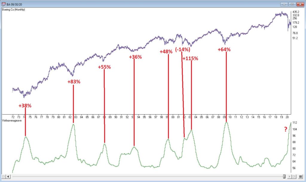
Figure 1 – Ticker BA with VFAA (Courtesy AIQ TradingExpert)

From March 2019 into March 2020 BA declined -80%.  It has since bounced around and VFAA has soared to 110.88.  VFAA has yet to rollover on a month-end basis, so nothing to do here except exhibit – what’s that word again – oh right, “patience.”

Ticker GD

Figure 2 displays a monthly chart for General Dynamics (GD) with VFAA at the bottom. 

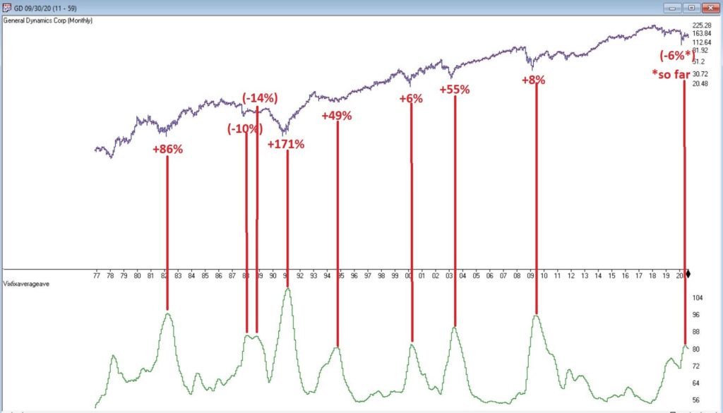
Figure 2 – Ticker GD with VFAA (Courtesy AIQ TradingExpert)

Are these “world-beating numbers”?  Not really.  But in terms of helping to identify potential opportunities, not so bad. VFAA gave a “buy signal” for GD at the end of July. So far, not so good as the stock is down about -6%.

Ticker WFC

Figure 3 displays a monthly chart for Wells Fargo (WFC) with VFAA at the bottom. 

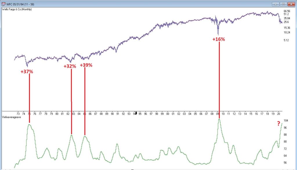
Figure 3 – Ticker WFC with VFAA (Courtesy AIQ TradingExpert)

There are not many “signals” but the ones that occurred have been useful. Between 2018 and 2020 WFC declined -65%.  It has since bounced around and VFAA has soared to 102.44.  VFAA has yet to rollover on a month-end basis. But at some point it will, and a potential opportunity may arise.

VFAA Formula

Below is the code for VFAA

VixFix is an indicator developed many years ago by Larry Williams which essentially compares the latest low to the highest close in the latest 22 periods (then divides the difference by the highest close in the latest 22 periods).  I then multiply this result by 100 and add 50 to get VixFix.

*Next is a 3-period exponential average of VixFix

*Then VFAA is arrived at by calculating a 7-period exponential average of the previous result (essentially, we are “double-smoothing” VixFix)

Are we having fun yet?  See code below:

hivalclose is hival([close],22).

vixfix is (((hivalclose-[low])/hivalclose)*100)+50.

vixfixaverage is Expavg(vixfix,3).

vixfixaverageave is Expavg(vixfixaverage,7).

VFAA = vixfixaverageave

EDITORS NOTE: The AIQ Expert Design Studio code for the indicator is available to download from here. Save this file to your /wintes32/EDS Strategies folder https://aiqeducation.com/VFAA.EDS

Summary

One thing to note is that VFAA “signals” on a monthly chart don’t come around very often.  So, you can’t really sit around and wait for a signal to form on your “favorite company”.  You have to look for opportunity wherever it might exist.

One last time let me reiterate that I am not suggesting using VFAA as a standalone systematic approach to investing. But when a signal does occur – especially when applied to quality companies that have recently been “whacked”, it can help to identify a potential opportunity.

Jay Kaeppel

Disclaimer: The information, opinions and ideas expressed herein are for informational and educational purposes only and are based on research conducted and presented solely by the author.  The information presented represents the views of the author only and does not constitute a complete description of any investment service.  In addition, nothing presented herein should be construed as investment advice, as an advertisement or offering of investment advisory services, or as an offer to sell or a solicitation to buy any security.  The data presented herein were obtained from various third-party sources.  While the data is believed to be reliable, no representation is made as to, and no responsibility, warranty or liability is accepted for the accuracy or completeness of such information.  International investments are subject to additional risks such as currency fluctuations, political instability and the potential for illiquid markets.  Past performance is no guarantee of future results.  There is risk of loss in all trading.  Back tested performance does not represent actual performance and should not be interpreted as an indication of such performance.  Also, back tested performance results have certain inherent limitations and differs from actual performance because it is achieved with the benefit of hindsight.

Quick Market update video

The Expert System in TradingExpert Pro gave a 1 – 99 down signal on the Dow Jones on 8-27-20. The market internals based on the advancing vs declining issue in the New York market continue to diverge from the market price action.

The phase indicator used to confirm Expert Ratings turned down on 8-31-20. We usually look for a phase confirmation of an Expert Rating to occur within 3 days of the rating.

The changes made in the constituents of the Dow 30 effective 8-31-20

  • Salesforce.com replaced Exxon Mobil, Amgen replacedd Pfizer and Honeywell replaced Raytheon Technologies.
  • The changes were due to Apple’s 4-for-1 stock split, which significantly reduced the indexes exposure to the information technology sector.
  • The Dow 30 is a price weighted index.

Dow 30 MACD picture – Dotcom vs Covid

You may have seen some of the articles out there analyzing the skewed nature of the current market rally. As Joe Bartosiewicz in his August 8 Bartometer pointed out:

“The Top 15 Stocks in the S&P 500 account in Market Value 35% of the entire S&P 500 stock market. The Bottom 420 Stocks in the S&P 500 account in Market Value 33.8% of the entire S&P 500 stock market. This means that 15 stocks are controlling the entire S&P 500..”

The Dow Jones 30 index uses a price weighted criteria as part of it’s calculation, and also includes Apple; AAPL has more than doubled in price in under 5 months.

Given that there appears to be only a small basket of stocks leading this rally, we had a look back at the last time tech related stocks were driving the market higher; the dotcom bubble that ran through the 90s into the early 00s.

Monthly DJIA and MACD – left through 3/2002 – right through 10/2002

The first chart is a monthly of the Dow 30 with MACD indicator comparing the market 03/29//2002 as the dotcom bubble rolled over vs 7 months later. Students of divergence analysis, will tell you that MACD in late March 2002 clearly showed prices should be much lower still despite the @33 % rally from the September 2001 low. By late October 2002 the market had fallen again by @33%. At that time the market was close to @40% lower than the high at the start of 2000.


Monthly DJIA and MACD – left through 3/2002 – right through 8/2020

The second chart is a monthly of the Dow 30 on the right through 8/10/20 vs the rally peak of 03/29/2002. The current market has had a @50% rally from the low at the end of March 2020. The original correction was @37% from high to low, slightly bigger than the dotcom correction. The MACD, similar to 2002, is strongly diverging.

The decline in 2002, after the rally, took prices lower than the the prior bottom. If a similar pattern happens this time and the decline is @40% from the high of 29568, the Dow would at the 17700 level.

Vitali Apirine’s – The Compare Price Momentum Oscillator (CPMO)

The importable AIQ EDS file based on Vitali Apirine’s article in the August, 2020 issue of Stocks & Commodities magazine, “The Compare Price Momentum Oscillator (CPMO),” can be obtained on request via email to info@TradersEdgeSystems.com.

… Here is a way you can compare at a glance the momentum of two different market indexes or securities in the same chart. It could also be used to help generate trading signals. In this first part of a three-part series, we’ll look at comparing index momentums…

The code is also available here:

!Author: Vitali Aprine, TASC August 2020
!Coded by: Richard Denning, 6/20/20
!www.TradersEdgeSystems.com

!Custom smoothing multiplier: 2 / time period
!PMO line: 20-period custom EMA of (10 × 35-period
!custom EMA of ((Today’s price – Yesterday’s price) / !Yesterday’s price × 100))
!PMO signal line: 10-period EMA of the PMO line

Len1 is 20.
Len2 is 35.
Len3 is 10.
Ticker1 is “QQQ”.
Ticker2 is “SPY”.

C is [close].
C1 is valresult(C,1).
RC1 is (C/C1*100)-100.

custSmoLen1 is Len1 – 1.
custSmoLen2 is Len2 – 1.

CustEma is 10*expavg(RC1,custSmoLen2).
PMO is expavg(CustEma,custSmoLen1).
PMOsig is expavg(PMO,Len3).

Ticker1C is tickerUDF(Ticker1,C).
RC1ticker1 is (Ticker1C/valresult(Ticker1C,1)*100)-100.
CustEmaTicker1 is 10*expavg(RC1ticker1,custSmoLen2).
PMOticker1 is expavg(CustEmaTicker1,custSmoLen1).

Ticker2C is tickerUDF(Ticker2,C).
RC1ticker2 is (Ticker2C/valresult(Ticker2C,1)*100)-100.
CustEmaTicker2 is 10*expavg(RC1ticker2,custSmoLen2).
PMOticker2 is expavg(CustEmaTicker2,custSmoLen1).

CPMO is PMOTicker1 – PMOTicker2.
List if hasdatafor(1000) >= 900.

I coded the indicator described by the author. Figure 10 shows the indicator (QQQ,SPY,20,35) on chart of IWM. When the white line is above the red line on the CPMO indicator, this indicates that the QQQ is stronger than the SPY. Generally, it is considered bullish when the QQQ is leading in strength.

Sample Chart

FIGURE 10: AIQ. The CPMO indicator is shown on a chart of IWM with parameters (QQQ,SPY,20,35).

—Richard Denning
info@TradersEdgeSystems.com
for AIQ Systems

The Ultimate Ugly Contrarian Play

They always say you should buy when there is “blood in the street.”  They also say, “buy them when nobody wants them.”  So, let’s consider today what could be the most unloved, bombed out, everybody hates it “thing” in the world – coal.

Ugh, just the mention of the word coal elicits a recoiling response.  “Dirty energy!”  “Climate change inducing filth!” “Ban coal!”.  And so and so forth.  And maybe they have a point.  But “they” also say “facts are stubborn things” (OK, for the record, I think it’s a different “they” who says that but never mind about that right now).

So here is a stubborn fact: coal supplies about a quarter of the world’s primary energy and two-fifths of its electricity.  As I write, two of the fastest growing economies (at least they were as of a few months ago) – China and India – are not only heavily reliant upon coal for energy, but are still building more and more coal-fired plants.  Now I am making no comment on whether this is a good thing or a bad thing but the point is, it most definitely is a “thing.”

So however one feels about coal, the reality is that it is not going to go away anytime soon.  Does this mean it will “soar in value” anytime soon – or even ever for that matter?  Not necessarily.  But as an unloved commodity it’s sure is hard to beat coal.  And as “they” (they sure are a bunch of know it all’s they?) say, “opportunity is where you find it.” 

Ticker KOL is an ETF that invests in coal industry related companies.  And what a dog it has been.  Figure 1 displays a monthly chart of price action.  Since peaking in June 2008 at $60.80 a share, it now stands at a measly $6.29 a share, a cool -89.6% below its peak.  And like a lot of things it has been in a freefall of late.

Figure 1 – Ticker KOL Monthly chart (Courtesy AIQ TradingExpert)

So, is this a great time to buy KOL?  That’s not for me to say.  But for argument’s sake, Figure 2 displays a weekly chart of KOL with an indicator I call Vixfixaverageave (I know, I know), which is a version of an indicator developed a number of years ago by Larry Williams (Indicator code is at the end of the article).

Figure 2 – KOL weekly chart with Vixfixaverageave indicator (Courtesy AIQ TradingExpert)

Note that Vixfixaverageave is presently above 90 on the weekly chart.  This level has been reached twice before – once in 2008 and once in 2016.  Following these two previous instances, once the indicator actually peaked and ticked lower for one week, KOL enjoyed some pretty spectacular moves. 

To wit:

*Following the 12/19/08 Vixfixaverageave peak and reversal KOL advanced +252% over the next 27.5 months

*Following the 2/19/16 Vixfixaverageave peak and reversal KOL advanced +182% over the next 23.5 months

When will Vixfixaverageave peak and reverse on the weekly KOL chart?  There is no way to know.  One must just wait for it to happen.  And will it be time to buy KOL when this happens?  Again, that is not for me to say.  None of this is meant to imply that the bottom for KOL is an hand nor that a massive rally is imminent.

Still, if there is anything at all to contrarian investing, its hard to envision anything more contrarian that KOL.

Vixfixaverageave Calculations

hivalclose is hival([close],22).  <<<<<The high closing price in that last 22 periods

vixfix is (((hivalclose-[low])/hivalclose)*100)+50. <<<(highest closing price in last 22 periods minus current period low) divided by highest closing price in last 22 periods (then multiplied by 100 and 50 added to arrive at vixfix value)

vixfixaverage is Expavg(vixfix,3). <<< 3-period exponential average of vixfix

vixfixaverageave is Expavg(vixfixaverage,7). <<<7-period exponential average of vixfixaverage

Jay Kaeppel

Disclaimer: The information, opinions and ideas expressed herein are for informational and educational purposes only and are based on research conducted and presented solely by the author.  The information presented does not represent the views of the author only and does not constitute a complete description of any investment service.  In addition, nothing presented herein should be construed as investment advice, as an advertisement or offering of investment advisory services, or as an offer to sell or a solicitation to buy any security.  The data presented herein were obtained from various third-party sources.  While the data is believed to be reliable, no representation is made as to, and no responsibility, warranty or liability is accepted for the accuracy or completeness of such information.  International investments are subject to additional risks such as currency fluctuations, political instability and the potential for illiquid markets.  Past performance is no guarantee of future results.  There is risk of loss in all trading.  Back tested performance does not represent actual performance and should not be interpreted as an indication of such performance.  Also, back tested performance results have certain inherent limitations and differs from actual performance because it is achieved with the benefit of hindsight.