Category Archives: jay kaeppel

‘Dogs’ ‘Due’ for ‘Days’

While I am by and large an avowed “trend-follower” I also recognize that sometimes things get beaten down so much that they ultimately offer great potential long-term value.  Or, as they say, “every dog has it’s day.”  So, let’s consider some “dogs”.

For the record, and as always, I am not “recommending” these assets – I am simply highlighting what look like potential opportunities.

Dog #1: Soybeans (ticker SOYB)

As I wrote about in this article, soybeans are very cyclical in nature.  According to that article there are two “bullish seasonal periods” for beans and one “bearish”:

*Long beans from close on the last trading day of January through the close on 2nd trading day of May

*Short beans from the close on 14th trading day of June through the close on 2nd trading day of October

*Long beans from the close on 2nd trading day of October through the close on 5th trading day of November

In Figure 1 (ticker SOYB – an ETF that tracks the price of soybean futures) has been beaten down quite a bit.  This doesn’t mean price can’t go lower.  However, given the cyclical nature of bean prices they probably won’t go down forever.

1

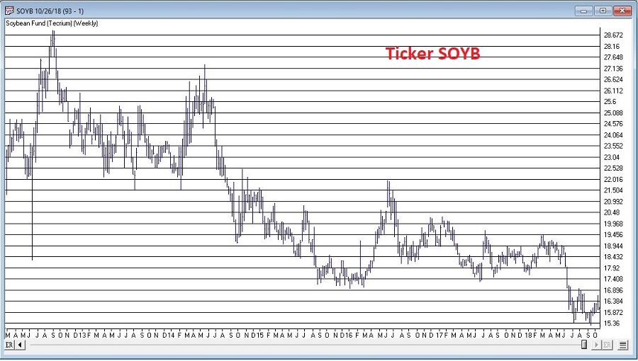
Figure 1 – Weekly SOYB; prices beaten down (Courtesy AIQ TradingExpert)

Figure 2 is a daily chart of SOYB and displays the recent “bearish” seasonal period and the latest “bullish” period so far.

2

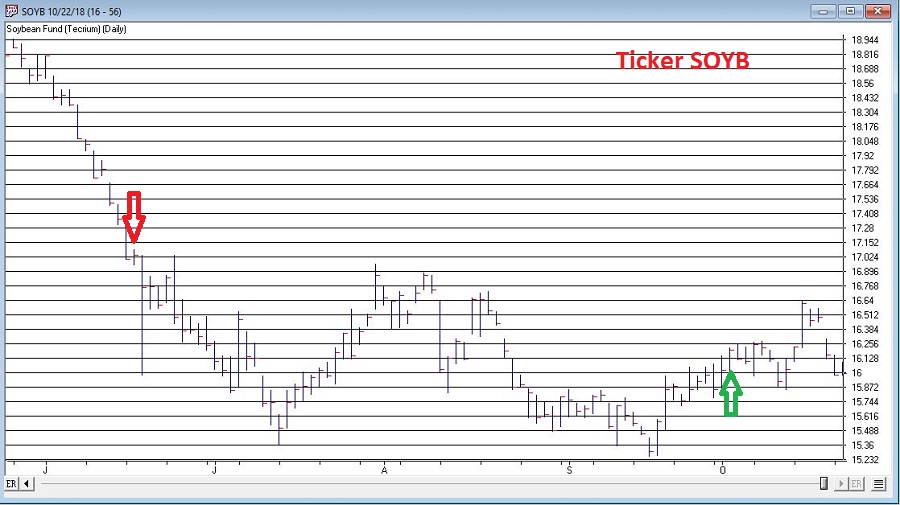
Figure 2 – Daily SOYB (Courtesy AIQ TradingExpert)

Dog #2: Uranium (ticker URA)

In this article and this article, I wrote about the prospects for uranium and ticker URA – an ETF that tracks the price of uranium.  Since that time URA has basically continued to go nowhere.  As you can see in Figure 3, it has been doing just that for some time.  While there is no guarantee that the breakout out of the range indicated in Figure 2 will be to the upside, historically, elongated bases such as this often lead to just that.  A trader can buy it at current levels and put a stop loss somewhere below the low for the base and take a reasonable amount of risk if they are willing to bet on an eventual upside breakout.

3

Figure 3 – Ticker URA with a long (really long) base (Courtesy AIQ TradingExpert)

Dog #3: Base Metals (Ticker DBB)

Under the category of – I called this one way, way too soon – in this article I wrote about the potential for ticker DBB to be an outperformer in the years ahead.  As you can see in Figure 4, so far, not so good.

4

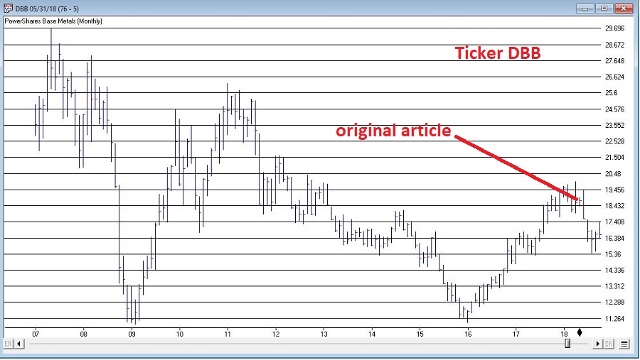
Figure 4 – Base Metals via ticker DBB (Courtesy AIQ TradingExpert)

Still, the argument for base metals is this:

*In Figure 3 is this article you can see that commodities as an asset class are due for a good move relative to stocks in the years ahead.

*In addition, the Fed is raising interest rates.

As discussed historically base metals have been the best performing commodity sector when interest rates are rising.  Ticker DBB offers investors a play on a basket of base metals.

Summary

Will any of these “dog” ideas pan out?  As always, only time will tell.  But given the cyclical nature of commodities and the price and fundamental factors that may impact these going forward, they might at least be worth a look.

In the meantime, “Woof” (which – as far as I can tell – means “Have a nice day”).

Jay Kaeppel

Disclaimer:  The data presented herein were obtained from various third-party sources.  While I believe the data to be reliable, no representation is made as to, and no responsibility, warranty or liability is accepted for the accuracy or completeness of such information.  The information, opinions and ideas expressed herein are for informational and educational purposes only and do not constitute and should not be construed as investment advice, an advertisement or offering of investment advisory services, or an offer to sell or a solicitation to buy any security.

A Look Ahead in Stocks, Bonds and Commodities

In the interest of full disclosure, the reality is that I am not great at “predicting” things.  Especially when it involves the future.  That being said, I am pretty good at:

*Identifying the trend “right now”

*Understanding that no trend lasts forever

*Being aware of when things are getting a bit “extended”

So, I am going to highlight a few “thoughts” regarding how one might best be served in the markets in the years ahead.

Where We Have Been

*After 17 years of sideways action (1965-1982) the stock market has overall been in a bullish trend since about 1982 – albeit with some major declines (1987, 2000-2002 and 2007-2009) when the market got significantly overvalued.

*Bond yields experienced a long-term decline starting in 1981 and bottomed out in recent years.

*Commodities have mostly been a “dog” for many years.

The way the majority of investors approach these goings on is to:

*Remain bullish on the stock market (“Because it just keeps going up”)

*Continue to hold bonds (“Because I have to earn a yield somewhere”)

*Avoid commodities (“Because they suck – and they’re scary”)

And as an avowed trend-follower I don’t necessarily disapprove.  But as a market observer I can’t help but think that things will be “different” in the not too distant future.

Considerations Going Forward

Stocks

Figure 1 displays the Shiller P/E ratio.  For the record, valuation measures are NOT good “timing” tools.  They don’t tell you “When” the market will top or bottom out.  But they do give a good indication of relative risk going forward (i.e., the higher the P/E the more the risk and vice versa).

Note:

*The magnitude of market declines following previous peaks in the P/E ratio

*That we are presently at (or near) the 2nd highest reading in history

(click on any chart below to enlarge it)

1

Figure 1 – Shiller P/E Ratio (and market action after previous overvalued peaks) (Courtesy: www.multpl.com/shiller-pe/)

The bottom line on stocks:  While the trend presently remains bullish, valuation levels remind us that the next bear market – whenever that may be – is quite likely to be “one of the painful kind”.

Bonds

Figure 2 displays the 60-year cycle in interest rates.2

Figure 2 – 60 -year cycle in interest rates (Courtesy: www.mcoscillator.com)

Given the historical nature of rates – and the Fed’s clear propensity for raising rates – it seems quite reasonable to expect higher interest rates in the years ahead.

Commodities

As you can see in Figure 3 – which compares the action of the Goldman Sachs Commodity Index to that of the S&P 500 Index) – commodities are presently quite undervalued relative to stocks.  While there is no way to predict when this trend might change, the main point is that history strongly suggests that when it does change, commodities will vastly outperform stocks.3Figure 3 – Commodities extremely undervalued relative to stocks (Courtesy: Double Line Funds)

The Bottom Line – and How to Prepare for the Years Ahead

*No need to panic in stocks.  But keep an eye on the major averages.  If they start to drop below their 200-day averages and those moving average start to “roll over” (see example in Figure 4), it will absolutely, positively be time to “play defense.”

4

Figure 4 – Major stock average rolling over prior to 2008 collapse (Courtesy AIQ TradingExpert)

*Avoid long-term bonds.  If you hold a long-term bond with a duration of 15 years that tells you that if interest rates rise one full percentage point, then that bond will lose roughly 15% in value.  If it is paying say 3.5% in yield, there is basically no way to make up that loss (except to wait about 4 years and hope rates don’t rise any more in the interim – which doesn’t sound like a great investment strategy).

*Short-term to intermediate-term bonds allow you to reinvest more frequently at higher rates as rates rise. Historical returns have been low recently so many investors avoid these.  But remember, recent returns mean nothing going forward if rates rise in the years ahead.

*Consider floating rate bonds.  Figure 5 displays ticker OOSYX performance in recent years versus 10-year t-note yields. While I am not specifically “recommending” this fund, it illustrates how floating rate bonds may afford bond investors the opportunity to make money in bonds even as rates rise.5

Figure 5 – Ticker OOSYX (floating rate fund) versus 10-year treasury yields)

*Figure 6 display 4 ETFs that hold varying “baskets” of commodities (DBC, RJI, DJP and GSG clockwise from upper left).  When the trend in Figure 3 finally does reverse, these ETFs stand to perform exceptionally well.6

Figure 6 – Commodities performance relative to stock performance (GSCI versus SPX)

Finally, the truth is that I don’t know “when” any of this will play out.  But the bottom line is that I can’t help but think that the investment landscape is going to change dramatically in the years ahead.

So:

a) Pay attention, and

b) Be prepared to adapt

Jay Kaeppel

Disclaimer:  The data presented herein were obtained from various third-party sources.  While I believe the data to be reliable, no representation is made as to, and no responsibility, warranty or liability is accepted for the accuracy or completeness of such information.  The information, opinions and ideas expressed herein are for informational and educational purposes only and do not constitute and should not be construed as investment advice, an advertisement or offering of investment advisory services, or an offer to sell or a solicitation to buy any security.

Watch This Indicator

So, the big question on every investor’s mind is “What Comes Next?”  Since this is not an advisory service (and given the fact that I am not too good at predicting the future anyway) I have avoided commenting on “the state of the markets” lately.  That being said, I do have a few “thoughts”:

*The major averages (as of this exact moment) are still mostly above their longer-term moving averages (200-day, 10-month, 40-week, and so on and so forth).  So, on a trend-following basis the trend is still “up”.

0Figure 1 – The Major Index (Courtesy AIQ TradingExpert)

*We are in the most favorable 15 months of the 48-month election cycle (though off to a pretty awful start obviously) which beings Oct.1 of the mid-term year and ends Dec. 31st of the pre-election year.

*Investors should be prepared for some volatility as bottoms following sharp drops usually take at least a little while to form and typically are choppy affairs.  One day the market is up big and everyone breathes a sigh of relief and then the next day the market tanks.  And so on and so forth.

An Indicator to Watch

At the outset let me state that there are no “magical” indicators.  Still, there are some that typically are pretty useful.  One that I follow I refer to as Nasdaq HiLoMA.  It works as follows:

A = Nasdaq daily new highs

B = Nasdaq daily new lows

C = (A / (A+B)) * 100

D = 10-day moving average of C

C can range from 0% to 100%.  D is simply a 10-day average of C.

Nasdaq HiLoMA = D

Interpretation: When Nasdaq HiLoMA drops below 20 the market is “oversold”.

Note that the sentence above says “the market is oversold” and NOT “BUY NOW AGGRESSIVELY WITH EVERY PENNY YOU HAVE.”  This is an important distinction because – like most indicators – while this one may often give useful signals, it will occasionally give a completely false signal (i.e., the market will continue to decline significantly).

A couple of “finer points”:

*Look for the indicator to bottom out before considering it to be “bullish”.

*A rise back above 20 is often a sign that the decline is over (but, importantly, not always).  Sometimes there may be another retest of recent lows and sometimes a bear market just re-exerts itself)

*If the 200-day moving average for the Dow or S&P 500 is currently trending lower be careful about using these signals.  Signals are typically more useful if the 200-day moving average for these indexes is rising or at least drifting sideways rather than clearly trending lower (ala 2008).

Figures 2 through 8 displays the S&P 500 Index with the Nasdaq HiLoMA indicator.  Click to enlarge any chart.

1Figure 2 – SPX with Jay’s Nasdaq HiLoMA ending 2006 (Courtesy AIQ TradingExpert)

2Figure 3 – SPX with Jay’s Nasdaq HiLoMA ending 2008 (Courtesy AIQ TradingExpert)

3Figure 4 – SPX with Jay’s Nasdaq HiLoMA ending 2010 (Courtesy AIQ TradingExpert)

4Figure 5 – SPX with Jay’s Nasdaq HiLoMA ending 2012 (Courtesy AIQ TradingExpert)

5Figure 6 – SPX with Jay’s Nasdaq HiLoMA ending 2014 (Courtesy AIQ TradingExpert)

6Figure 7 – SPX with Jay’s Nasdaq HiLoMA ending 2016 (Courtesy AIQ TradingExpert)

7Figure 8 – SPX with Jay’s Nasdaq HiLoMA ending 2018 (Courtesy AIQ TradingExpert)

Summary

The stock market is in a favorable seasonal period and is oversold.  As long as the former remains true, react accordingly (with proper risk controls in place of course).

Jay Kaeppel

Disclaimer:  The data presented herein were obtained from various third-party sources.  While I believe the data to be reliable, no representation is made as to, and no responsibility, warranty or liability is accepted for the accuracy or completeness of such information.  The information, opinions and ideas expressed herein are for informational and educational purposes only and do not constitute and should not be construed as investment advice, an advertisement or offering of investment advisory services, or an offer to sell or a solicitation to buy any security.

The (Potential) Bullish Case for Bonds

OK, first the bad news.  In terms of the long-term, we are probably in the midst of a rising interest rate environment.  Consider the information contained in Figure 1 from McClellan Financial Publications.

(click to enlarge)0a

Figure 1 – The 60-year cycle in interest rates (Courtesy: www.mscoscillator.com)

Though no cycle is ever perfect, it is only logical to look at Figure 1 and come away thinking that rates will rise in the years (and possibly decades) ahead.  And one should plan accordingly, i.e.:

*Eschew large holdings of long-term bonds. Remember that a bond with a “duration” -Google that term as it relates to bonds please – of 15 implies that if interest rates rise 1 full percentage point then that bond will lose roughly 15% of principal.  Ouch.

*Stick to short to intermediate term bonds (which will reinvest at higher rates more quickly than long-term bonds as rates rise) and possibly some exposure to floating rate bonds.

That is “The Big Picture”.

In the meantime, there is a potential bullish case to be for bonds in the shorter-term.  The “quick and dirty” guide to “where are bonds headed next” appears in the monthly and weekly charts of ticker TLT (iShares 20+ years treasury bond ETF).  Note the key support and resistance levels drawn on these charts.

(click to enlarge)1

Figure 2 – Monthly TLT with support and resistance (Courtesy ProfitSource by HUBB)

(click to enlarge)2

Figure 3 – Weekly TLT with support and resistance (Courtesy ProfitSource by HUBB)

There is nothing magic about these lines, but a break above resistance suggests a bull move, a break below support suggests a bear move, and anything in between suggests a trading range affair.

Now let’s look at some potentially positive influences.  Figure 4 displays a screen from the excellent site www.sentimentrader.com that shows that sentiment regarding the long treasury bond is rock bottom low.  As a contrarian sign this is typically considered to be bullish.

(click to enlarge)3

Figure 4 – 30-year treasury investor sentiment is extremely low (Courtesy Sentimentrader.com)

Figure 5 – also from www.sentimentrader.com – suggests that bonds may be entering a “bullish” seasonal period between now and at least late-November (and possibly as long as late January 2019).

(click to enlarge)4

Figure 5 – 30-year treasury seasonality (Courtesy Sentimentrader.com)

Figure 6 displays the 30-year treasury bond yield (multiplied by 10 for some reason).  While rates have risen 27% from the low (from 2.51% to 3.18%), they still remain below the long-term 120-month exponential moving average.

(click to enlarge)5

Figure 6 – Long-term treasury bond yields versus 120-month moving average (Courtesy AIQ TradingExpert)

Finally, two systems that I developed that deems the bond trend bullish or bearish based on the movements of 1) metals, and 2) Japanese stocks turned bullish recently.  The bond market has fallen since these bullish signal were flashed – possibly as a result of the anticipated rate hike from the Fed.  Now that that hike is out of the way we should keep a close eye on bonds for a potential advance in the months ahead.

(click to enlarge)6a

Figure 7 – Bonds tend to move inversely to Japanese stocks; Ticker EWJ 5-week average is below 30-week average, i.e., potentially bullish for bonds (Courtesy AIQ TradingExpert)

Summary

It’s a little confusing here.

a)  The “long-term” outlook for bonds is very “iffy”, so bond “investors” should continue to be cautious – as detailed above.

b) On the other hand, there appears to be a chance that bonds are setting up for a rally in the near-term.

c) But, in one final twist, remember that if TLT takes out its recent support level, all bullish bets are off.

Are we having fun yet?

Jay Kaeppel

Disclaimer:  The data presented herein were obtained from various third-party sources.  While I believe the data to be reliable, no representation is made as to, and no responsibility, warranty or liability is accepted for the accuracy or completeness of such information.  The information, opinions and ideas expressed herein are for informational and educational purposes only and do not constitute and should not be construed as investment advice, an advertisement or offering of investment advisory services, or an offer to sell or a solicitation to buy any security.

New Highs, Check…Now What?

Let’s open with Jay’s Trading Maxim #7.

Jay’s Trading Maxim #7: Being able to identify the trend today is worth more than 1,000 predictions of what the trend will be in the future.

Yes trend-following is boring.  And no, trend-following never does get you in near the bottom nor out at the top.  But the reality is that if you remain long when the trend appears to be up (for our purposes here let’s define this roughly as the majority of major market averages holding above their long-term moving averages) and play defense (i.e., raise cash, hedge, etc.) when the trend appears to be down (i.e., the majority of major market averages are below their long-term moving averages), chances are you will do pretty well for yourself.  And you may find yourself sleeping pretty well at night as well along the way.

To put it more succinctly:

*THE FOREST = Long-term trend

*THE TREES = All the crap that everyone tells you “may” affect the long-term trend at some point in the future

Human nature is a tricky thing.  While we should clearly be focused on THE FOREST the reality is that most investors focus that majority of their attention on all those pesky trees.  Part of the reason for this is that some trees can offer clues.  It’s a question of identifying a few “key trees” and then ignoring the rest of the noise.

A New High

With the Dow Industrials rallying to a new high virtually all the major averages have now reached a new high at least within the last month.  And as you can see in Figure 1 all are well above their respective 200-day moving average.  Long story short the trend is “UP”.

(click to enlarge)1Figure 1 – U.S. Major Market Indexes in Uptrends (Courtesy AIQ TradingExpert)

Now What? The Good News

As strong as the market has been of late it should be noted that we are about to enter the most favorable seasonal portion of the 48-month election cycle.  This period begins at the close of September 2018 and extends through the end of December 2019.

Figure 2 displays the growth of $1,000 invested in the Dow Industrials only during this 15-month period every 4 years.  Figure 3 displays the actual % +(-) for each of these periods.  Note that since 1934-35, the Dow has showed a gain 20 out of 21 times during this period.

2a

Figure 2 – Growth of $1,000 invested in Dow Industrials ONLY during 15 bullish months (mid-term through pre-election year) within 48-month election cycle.

Start Date End Date Dow % +(-)
9/30/1934 12/31/1935 +55.6%
9/30/1938 12/31/1939 +6.2%
9/30/1942 12/31/1943 +24.5%
9/30/1946 12/31/1947 +5.1%
9/30/1950 12/31/1951 +18.9%
9/30/1954 12/31/1955 +35.5%
9/30/1958 12/31/1959 +27.7%
9/30/1962 12/31/1963 +31.8%
9/30/1966 12/31/1967 +16.9%
9/30/1970 12/31/1971 +17.0%
9/30/1974 12/31/1975 +40.2%
9/30/1978 12/31/1979 (-3.1%)
9/30/1982 12/31/1983 +40.4%
9/30/1986 12/31/1987 +9.7%
9/30/1990 12/31/1991 +29.2%
9/30/1994 12/31/1995 +33.1%
9/30/1998 12/31/1999 +46.6%
9/30/2002 12/31/2003 +37.7%
9/30/2006 12/31/2007 +13.6%
9/30/2010 12/31/2011 +13.0%
9/30/2014 12/31/2015 +2.2%

Figure 3 – 15 bullish months (mid-term through pre-election year) within 48-month election cycle

Now What? The Worrisome Trees

While the major averages are setting records a lot of other “things” are not.  My own cluster of “market bellwethers” appear in Figure 4.  Among them the Dow Transportation Index is the only one remotely close to a new high, having broken out to the upside last week.  In the meantime, the semiconductors (ticker SMH), the inverse VIX index ETF (ticker ZIV) and Sotheby’s (ticker BID) continue to meander/flounder. This is by no means a “run for the hills” signal.  But the point is that at some point I would like to see some confirmation from these tickers that often (though obviously not always) presage trouble in the stock market when they fail to confirm bullish action in the major averages.

(click to enlarge)4Figure 4 – Jay’s 4 Bellwethers (SMH/TRAN/ZIV/BID) (Courtesy AIQ TradingExpert)

Another source of potential concern is the action of, well, the rest of the darn World.  Figure 5 displays my own regional indexes – Americas, Europe, Asia/Pacific and Middle East.  They all look awful.

(click to enlarge)3Figure 5 – 4 World Regional Indexes (Courtesy AIQ TradingExpert)

Now the big question is “will the rest of the world’s stock markets start acting better, or will the U.S. market start acting worse?”  Sadly, I can’t answer that question.  The key point I do want to make though is that this dichotomy of performance – i.e., U.S market soaring, rest of the world sinking – is unlikely to be sustainable for very long.

Summary

It is hard to envision the market relentlessly higher with no serious corrections over the next 15 months.  And “yes”, those bellwether and world region indexes trees are “troublesome”.

Still the trend at the moment is inarguably “Up” and we about to enter one of the most seasonally favorable periods for the stock market.

So, my advice is simple:

1) Decide now what defensive actions you will take if the market does start to breakdown

2) Resolve to actually take those actions if the need arises

3) Enjoy the ride as long as it lasts.

Jay Kaeppel

Disclaimer:  The data presented herein were obtained from various third-party sources.  While I believe the data to be reliable, no representation is made as to, and no responsibility, warranty or liability is accepted for the accuracy or completeness of such information.  The information, opinions and ideas expressed herein are for informational and educational purposes only and do not constitute and should not be construed as investment advice, an advertisement or offering of investment advisory services, or an offer to sell or a solicitation to buy any security.