The “barbell” approach to bond investing typically involves buying a long-term bond fund or ETF and a short-term bond fund or ETF. The idea is that the long-term component provides the upside potential while the short-term component dampens overall volatility and “smooths” the equity curve. This article is not intended to examine the relative pros and cons of this approach. The purpose is to consider an alternative for the years ahead.
The Current Situation
Interest rates bottomed out several years ago and rose significantly from mid-2016 into late 2018. Just when everyone (OK, roughly defined as “at least myself”) assumed that “rates were about to establish an uptrend” – rates topped in late 2018 and have fallen off since. Figure 1 displays ticker TYX (the 30-year treasury yield x 10) so you can see for yourself.
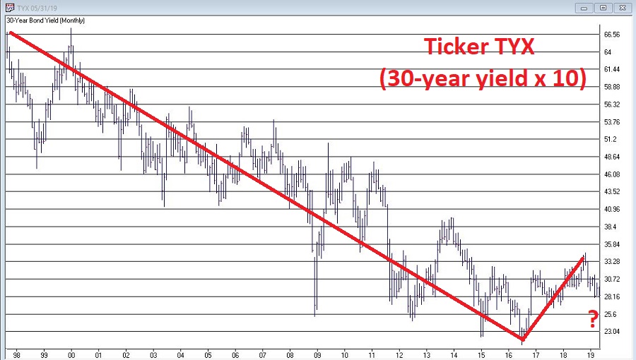
Figure 1 – 30-year treasury yields (TNX) (Courtesy AIQ TradingExpert)
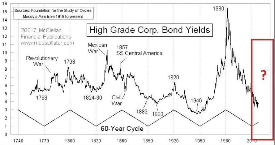
In terms of the bigger picture, rates have showed a historical tendency to move in 30-year waves. If that tendency persists then rates should begin to rise off the lows in recent years in a more meaningful way. See Figure 2.Figure 2 – 60-year wave in interest rates (Courtesy: www.mcoscillator.com)
Will this happen? No one can say for sure. Here is what we do know: If rates decline, long-term treasuries will perform well (as long-term bonds react inversely to the trend in yields) and if rates rise then long-term bond holders stand to get hurt.
So here is an alternative idea for consideration – a bond “barbell” that includes:
*Long-term treasuries (example: ticker VUSTX)
*Floating rate bonds (example: ticker FFRAX)
Just as treasuries rise when rates fall and vice versa, floating rate bonds tend to rise when rates rise and to fall when rates fall, i.e., (and please excuse the use of the following technical terms) when one “zigs” the other “zags”. For the record, VUSTX and FFRAX have a monthly correlation of -0.29, meaning they have an inverse correlation.
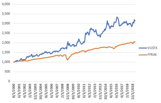
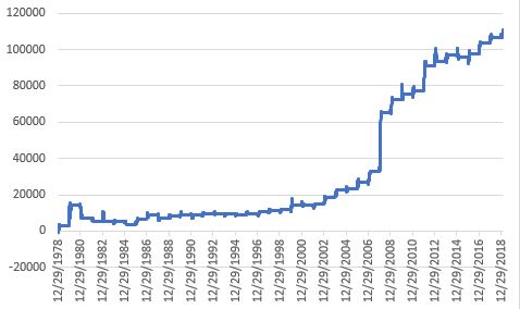
Figure 3 displays the growth of $1,000 invested separately in VUSTX and FFRAX since FFRAX started trading in 2000. As you can see the two funds have “unique” equity curves.
Figure 3 – Growth of $1,00 invested in VUSTX and FFRAX separately
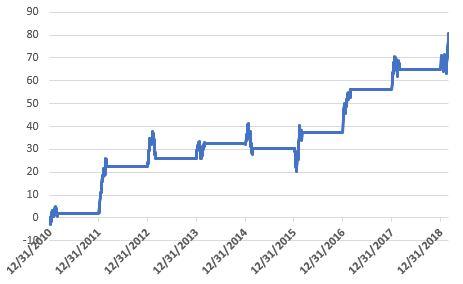
Now let’s assume that every year on December 31st we split the money 50/50 between long-term treasuries and floating rate bonds. This combined equity curve appears in Figure 4.
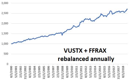
Figure 4 – Growth of $1,000 50/50 VUSTX/FFRAX; rebalanced annually
Since 2000, long-treasuries have made the most money. This is because interest rates declined significantly for most of that period. If interest rise in the future, long-term treasuries will be expected to perform much more poorly. However, floating rate bonds should prosper in such an environment.
Figure 5 displays some relevant facts and figures.
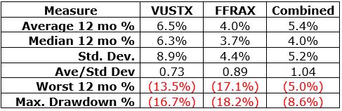
Figure 5 – Relevant performance Figures
The key things to note in Figure 5 are:
*The worst 12-month period for VUSTX was -13.5% and the worst 12-month period for FFRAX was -17.1%. However, when the two funds are traded together the worst 12-month period was just -5.0%.
*The maximum drawdown for VUSTX was -16.7% and the maximum drawdown for FFRAX was -18.2%. However, when the two funds are traded together the worst 12-month period was just -8.6%.
Summary
The “portfolio” discussed herein is NOT a recommendation, it is merely “food for thought”. If nothing else, combining two sectors of the “bond world” that are very different (one reacts well to falling rates and the other reacts well to rising rates) certainly appears to reduce the overall volatility.
My opinion is that interest rates will rise in the years ahead and that long-term bonds are a dangerous place to be. While my default belief is that investors should avoid long-term bonds during a rising rate environment, the test conducted here suggests that there might be ways for holders of long-term bonds to mitigate some of their interest rate risk without selling their long-term bonds.
Like I said, food for thought.
Jay Kaeppel
Disclaimer: The data presented herein were obtained from various third-party sources. While I believe the data to be reliable, no representation is made as to, and no responsibility, warranty or liability is accepted for the accuracy or completeness of such information. The information, opinions and ideas expressed herein are for informational and educational purposes only and do not constitute and should not be construed as investment advice, an advertisement or offering of investment advisory services, or an offer to sell or a solicitation to buy any security.