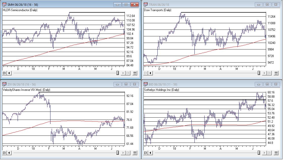
There are many ETF families in the market today, and of course, the oldest and most popular ETF, SPY has been around since 1993. Ultra ProShares Exchange Traded Funds (ETFs) developed by Profunds and traded on the AMEX. are one of the most actively traded areas of the markets. With $billions pouring into the UltraShort QQQ ETF, QID, it’s evident that it’s become one of the most actively traded ETFs globally.
Whether you’re a trader or investor, these Ultra ETFs serve as valuable tools capable of enhancing returns while mitigating risks.
Ultra bullish and UltraShort ETFs on broad market indices expanded some years ago to include leveraged bullish and bearish Sector and International ETFs. These additions enable investors to hedge or amplify sector exposure effortlessly. Moreover, these Ultra and UltraShort ETFs are compatible with IRAs or retirement accounts, where shorting or margin trading is typically restricted.
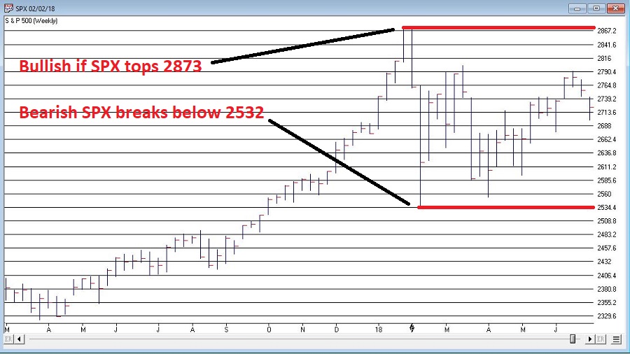
From a trader’s perspective, the liquidity and leverage of Ultra Bullish and UltraShort ETFs, which move two times the underlying index or inversely track it, offer a simpler and less risky alternative to options, futures, or shorting stocks.
For day traders, the highly liquid QQQ ETFs, QLD and QID, along with S&P500 ETFs, SDS and SSO, have become favored vehicles. The volatility of these ETFs presents opportunities for swift gains.
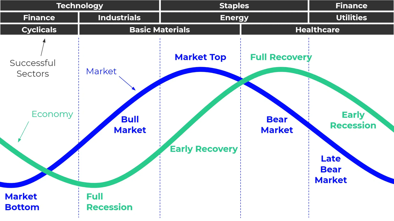
For investors and portfolio managers, ProShares ETFs offer a plethora of risk management tactics and asset allocation strategies. They provide flexibility to hedge against market risk or capitalize on market fluctuations. Furthermore, leveraging Ultra ETFs in asset allocation frees up capital for further diversification, allowing for strategic positioning across various sectors and markets. Sectors, in particular, have gained importance in recent times, with ProShares Sector ETFs offering exposure to Dow Jones Sectors.
For further leveraging the leverage, listed options on Ultra ETFs bring new possibilities for creative strategies. Covered call writes on bearish ETFs or options on Ultra ETFs provide avenues for managing risk and capitalizing on market movements with added leverage.
Given these ‘options on steroids’ move so quickly, only spend as much as you can afford to lose keeping in mind the thought “Have a hunch – buy a bunch. Hunch is wrong – bunch is gone”. While using Puts or Calls on Ultra Short and Ultra ETF’s requires some upside down and out-of-the-box thinking they add are few arrows to the trader’s quiver.
In conclusion, the Ultra ProShares ETFs have revolutionized trading and investing, offering opportunities previously inaccessible to individual investors.
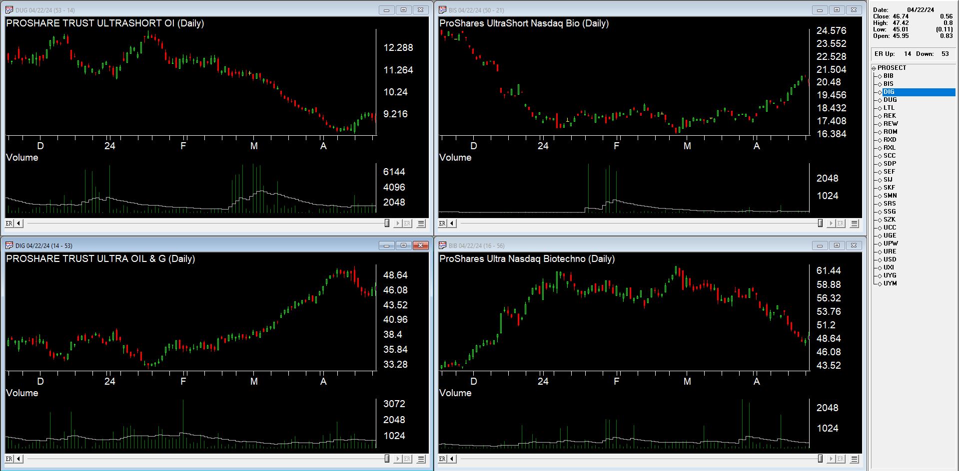
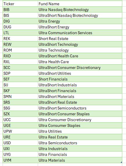
There’s an AIQ list of the Proshares Sector ETFs available for download at https://aiqeducation.com/PROSECT.lis
This list file needs to be in your /wintes32 folder