Category Archives: chart patterns

Chart Patterns: Flag and Pennants

By Steve Hill

President, AIQ Systems

Stephen Hill is President of AIQ Systems. For the past 15 years he has been involved in all aspects of AIQ Systems, from support and sales to programming and education. Steve is a frequent speaker at events in the U.S. and Europe, talking on subjects as diverse as Portfolio Simulation TechniquesAdvanced Chart Pattern Analysis and Trading System Design.

Chart pattern analysis, often thought of as part science part art is a key element in many traders decision process. Common patterns like double tops and bottoms are somewhat self-fulfilling, given that most of us can see these patterns occurring. Measures of what consititues a double top or bottom in good analytical terms we’ll save for another article. In this this article we are focussing on two of my favorite chart patterns; Flags and Pennants

Flags and Pennants are Consolidation or Continuation Patterns

These patterns break out in the direction of the previous trend, confirming the existing trend, suggesting that investors are considering whether the market is overbought or oversold but ultimately deciding to confirm the existing trend. Flags and pennants are of two types, bullish or bearish

Flags and pennants are generally considered continuation patterns as they breakout in the prevailing trend direction. They represent a brief pause especially after a steep run up in an active ticker. They are a fairly common and useful for short term trading.

Bullish Flags – formation

Lower tops and lower bottoms bounded by two parallel trendlines with pattern slanting against the prevailing trend are considered bull flags (figure 1).


Figure 1Bullish flag pattern

Bearish Flags – formation

Higher tops and higher bottoms bounded by two parallel trendlines with pattern slanting against the prevailing trend are considered bear flags. (figure 2).


Figure 2Bearish flag pattern

Elements of bullish flags

  • A rapid and steep price rise of around 20% from bottom of the pole to top.
  • Decreasing volume during the formation of the flag.
  • Breakout occurs to the upside with resumption of increase volume levels
  • Flags length excluding the pole classic should be around 10 days, can be less but not more than 20 days.
Figure 3. Whole Foods Market, Inc (WFMI) bullish flag


Bulkowski noted that the high and tight flag performed best. (source Encyclodpedia of Chart Patterns by Thomas Bulkowski).
2Some 25% of the patterns are horizontal notes Markos Katsanos. (source Measuring Flags & Pennants: Technical Analysis of Stocks and Commodities vol 23 no 4)bullish flag breakout on increased volume note the pole length is 20% + of the price action and the diminishing volume on the flag.


Elements of bearish flags

  • A rapid and steep price decline of around 20% from top of the pole to bottom.
  • Decreasing volume during the formation of the flag.
  • Breakout occurs to the downside with resumption of increase volume levels.
  • Flag length excluding the pole should be around 10 days, can be less but not more than 20 days.

Figure 4 shows MNST classic bearish flag breakout on increased volume note the pole length is 20% + of the price action and the diminishing volume on the flag.

Bullish Pennants – formation

Pennants look very much like symmetrical triangles, on the end of a pole, typically they are smaller in size and duration (figure 5).

Bearish Pennants – formation

An upside down bullish pennant, the triangle is at the bottom of the pole. (figure 6).

Elements of bullish pennants

  • A rapid and steep price rise of around 20% from bottom of the pole to top.
  • Decreasing volume during the formation of the pennant.
  • Pennants look like symmetrical triangles on a pole, price action is converging.
  • Diminishing volume as pennant forms.
  • Breakout to the upside with re- sumption of volume levels.
  • Pennant length excluding the pole should be around 10 days, can be less but not more than 20 days.Figure 7 shows CDW classic bullish pennant breakout on increased volume

Figure 7CDW Computer Centers (CDW) bullish pennant

Elements of bearish pennants

  • A rapid and steep price drop of around 20% from top of the pole to bottom.
  • Decreasing volume during the formation of the pennant.
  • Pennants look like symmetrical triangles on a pole, price action is converging.
  • Diminishing volume as pennant forms.
  • Breakout to the downside with resumption of volume levels.
  • Pennant length excluding the pole should be around 10 days, can be less but not more than 20 days.

How do you trade flags and pennants?

Katsanos study of Flags and pennants revealed that the average breakout was 45% over an average period of 11 days. Bulkowski noted a 63% average gain. to trade these breakouts, set tight stops at low of day before breakout and use trailing stops once breakout occurs.

Target prices are more difficult to predict as these are continuation patterns, but after 11 days you are beyond the average move in days.

AIQ tip

Once a breakout occurs, use AIQ space on right of the chart (rtalerts only) and advance 11 days into the future. Draw a trendline parallel to the pole trend from the breakout point.

Too Soon to Get Sweet on Sugar

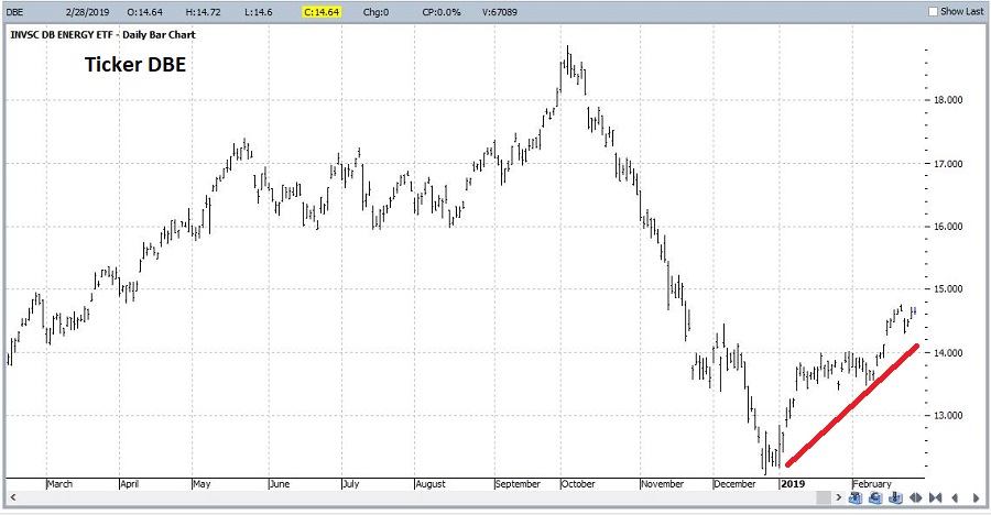
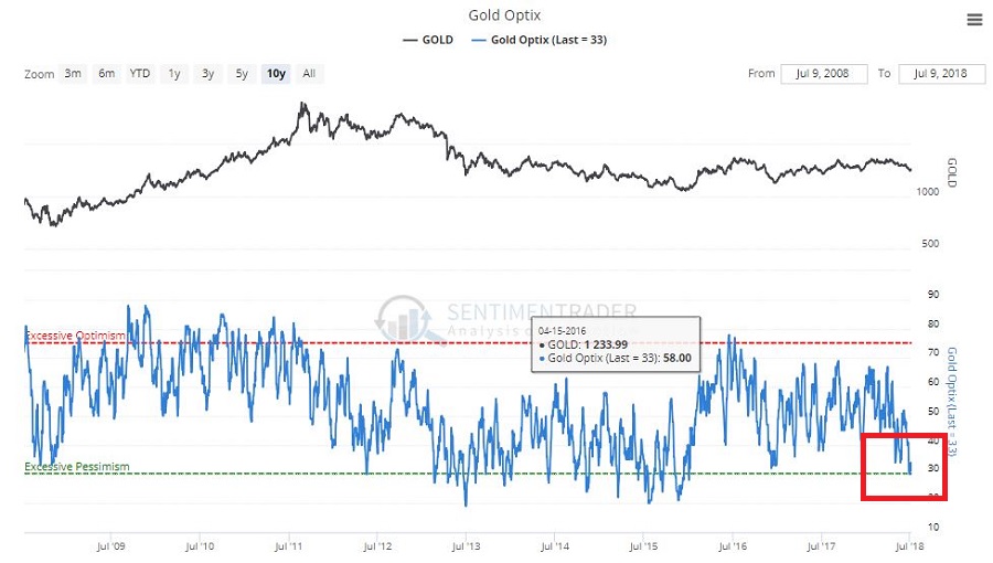
One of my (admittedly, potentially foolish) beliefs is that commodities will outperform stocks again someday.  Possibly someday starting soon (roughly defined as anywhere from today to a year from today) and that the shift will be dramatic and last for a period of 3 to 8 years.

And no, I don’t think I could be any more vague.  But I haven’t really “taken the plunge” (i.e., shifted money from the stock market into commodities in any meaningful way) yet.  But I am keeping a close eye on things.  Rather than rattled off another 1,000 words to explain, I will simply refer you to Figure 1 that tracks the ratio of the S&P Commodity Index to the S&P 500 Index.

1

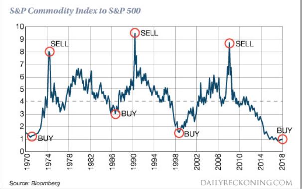
Figure 1 – Commodities versus Stocks (Source: www.DailyReckoning.com)

History suggests that “the worm will (eventually) turn.”

Sugar

2

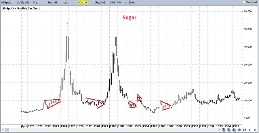
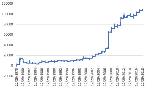
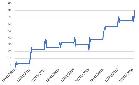
Let’s focus on one commodity for now.  Sadly, it’s one of my favorites (ranks right up there with coffee).  Sugar.  As you can see in Figures 2 and 3, sugar has a history of contracting in price over a period of time and then alternately – and please excuse my use of the following overly technical terms – “swooping” or “soaring”.Figure 2 – Sugar 1970-1998 (Courtesy ProfitSource by HUBB)

3

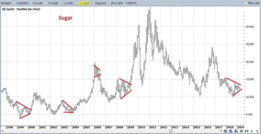
Figure 3 – Sugar 1998-2019 (Courtesy ProfitSource by HUBB)

4

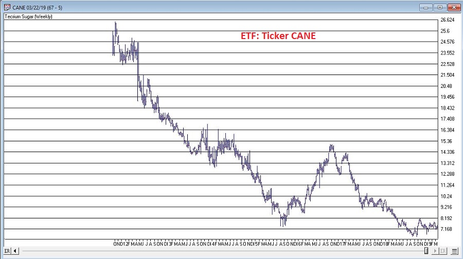
Sugar can be traded either in the futures market (each full one-point movement in price equates to $1,120 in contract value).  An alternative for “normal people” is ticker CANE which is the Teucrium Sugar ETF which trades like shares of stock.  See Figure 4.Figure 4 – ETF Ticker CANE (Courtesy AIQ TradingExpert)

As you can see, sugar has been “contracting” in price of late.  Does this mean it is reading to “swoop” or “soar”?  Possibly.  But for those who want to play the bullish side, it is probably a bit too soon to dive in.

Seasonality in Sugar

5

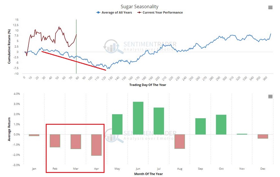
Figure 5 displays the annual seasonal trend in sugar.  It should be noted that you should NOT expect every year to follow this trend.  It is a display of previous historical tendencies and NOT a roadmap.Figure 5 – Sugar Annual Seasonal Trend (Courtesy Sentimentrader.com)

Still, the primary point is captured nicely in:

Jay’s Trading Maxim #92: One of the keys to long term success is committing capital where the probabilities are (or a least appear to be) in your favor.

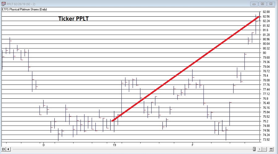
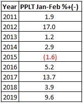
February through April is NOT that time for anyone looking to play the long side of sugar.

Figure 6 displays the cumulative results achieved by holding long one sugar futures contract ONLY during the months of February through April every year starting in 1970.

6

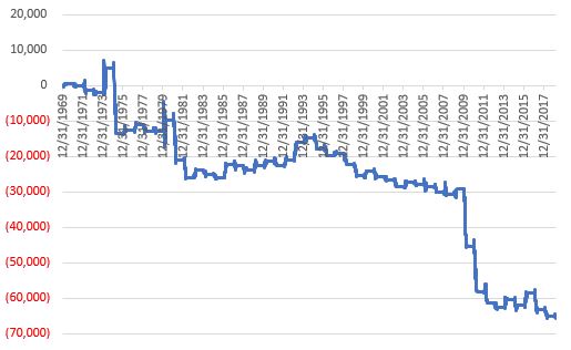
Figure 6 – Cumulative $+(-) holding long sugar futures Feb, Mar, Apr every year since 1970

Some things to note regarding sugar Feb through Apr:

*UP 18 times

*DOWN 31 times

*Average gain = +$2,201

*Average loss = (-$3,377)

*Largest gain = +$6,630 (1974)

*Largest loss = (-$18,424) (1975)

Summary

The point IS NOT to argue that sugar is doomed to plunge between now and the end of April, nor even to argue that it cannot rally strongly between now and then – because it can.

The point IS to merely point out that the odds do not presently favor the bulls, which means – well, see Trading Maxim #92 above.

Jay Kaeppel

Disclaimer:  The data presented herein were obtained from various third-party sources.  While I believe the data to be reliable, no representation is made as to, and no responsibility, warranty or liability is accepted for the accuracy or completeness of such information.  The information, opinions and ideas expressed herein are for informational and educational purposes only and do not constitute and should not be construed as investment advice, an advertisement or offering of investment advisory services, or an offer to sell or a solicitation to buy any security.

It Really Was the Most Platinum Time of the Year; What Time is it Now?

In this article I highlighted the fact that platinum tends to be a consistent performer during the months of January and February combined.  2019 held serve as platinum futures registered their 23rd Jan-Feb gain in the last 24 years.  The Platinum ETF (ticker PPLT) registered a two month gain of +9.6%.  See Figure 1.

1

Figure 1 – Ticker PPLT (Courtesy AIQ TradingExpert)

Figure 2 displays the updated hypothetical growth of equity achieved by holding long 1 platinum futures contract during January and February every year starting in 1979.

2

Figure 2 – Platinum futures $ +(-) during Jan-Feb; 1979-2019

Since most investors will never trade platinum futures, Figure 3 displays the growth of $1,000 invested in ticker PPLT only during Jan and Feb since 2011.

3

Figure 3 – Cumulative % growth of $1,000 invested in ticker PPLT ONLY during Jan. and Feb.; 2011-2019

4

Figure 4 – Yearly % +(-) for PPLT during Jan-Feb

Going Forward

So platinum was great, but what have you done for me lately?  For what it is worth, historically two sectors that “should” be doing well in the March-April period are energies and grains (please remember that seasonal trends DO NOT always work every year).   As you can see in Figure 5, energies have been rallying since late December (though lots of consternation regarding crude oil remains a constant).

5

Figure 5 – Ticker DBE (Energies) – so far so good; (Courtesy ProfitSource by HUBB)

Grains have been a bust so far (their “favorable seasonal period” typically begins in late January-early February – no dice this time around).  Where too from here?  One of two scenarios: either this is just going to be an off year for grains, or right now will be looked back upon as a buying opportunity.  Only time will tell.

6

Figure 6 – Ticker DBA (Agricultural) – so far NOT so good; (Courtesy ProfitSource by HUBB)

And of course, don’t forget that the stock market tends to do pretty well March through May….

Jay Kaeppel

Disclaimer:  The data presented herein were obtained from various third-party sources.  While I believe the data to be reliable, no representation is made as to, and no responsibility, warranty or liability is accepted for the accuracy or completeness of such information.  The information, opinions and ideas expressed herein are for informational and educational purposes only and do not constitute and should not be construed as investment advice, an advertisement or offering of investment advisory services, or an offer to sell or a solicitation to buy any security.

All Eyes on Key Bellwether Support Levels

First the reality.  Nobody knows what the market is going to do.  Yes, I am aware that there are roughly a bazillion people out there “prognosticating” (myself included) about the stock market.  And yes, if one makes enough “predictions”, the law of averages dictates that one will be correct a certain percentage of the time.

Still, the market does offer clues.  Sometimes those clues turn out to be false leads.  But sometimes they do offer important information.  For example, Figure 1 displays four major market indexes.  As you can see, in the Aug-Sep-Oct time frame all four of these averages “broke out” to new all-time highs (i.e., The Good News) and then broke back down below the previous resistance line drawn on each chart (i.e., The Bad News).

1

Figure 1 – Four major indexes breakout then fail (Courtesy AIQ TradingExpert)

False breakouts happen all the time.  And the reality here is that sometimes they mean something and sometimes they don’t.  But when all four major average do the same thing, a warning sign has been issued to those who are interested in seeing it.  That’s why it can be useful to seek “confirmation”.  For my purposes I look to what I refer to as my 4 “bellwethers”, which are:

SMH – Semiconductors

TRAN – Dow Transportation Average

ZIV – Velocity Shares Inverse VIX Index

BID – Sotheby Holdings

These tickers appear in Figure 2 (click to enlarge).

2

Figure 2 – Jay’s Market Bellwethers (Courtesy AIQ TradingExpert)

While the major indexes were testing new highs in Aug/Sep and then breaking down in October:

SMH – Never really came close to breaking out above its March high

TRAN – Followed the major indexes by hitting new highs in Aug/SP and then breaking down in October

ZIV – Never came anywhere close to its Jan-2018 high

BID – Broke to a new high in Jun/Jul, then failed badly.

In a nutshell, the failed major index breakouts were accompanied by absolutely no positive signs from the 4 bellwethers. So, the warning signs were there if one wished to see them.

So where are the bellwethers now?  Another close look at Figure 2 reveals that:

SMH – the key support level at 80.92

TRAN – the key level for the Dow Transports is 8744.36

ZIV – the key support level is 60.60

BID – a potential support level is 32.95 (the Apr 2013 low)

Summary

*Given the washed-out/oversold level that many indicators and sentiment surveys have reached…

*…Combined with the fact that we are in the seasonally favorable pre-election year (no down pre-election years since the 1930’s)

*There is a chance that 2019 could be surprisingly bullish, and shell-shocked investors should not stick their heads in the sand to the possibility.

At the same time:

*Based solely on trend-following indicators ALL of the major market indexes are technically in confirmed bear markets.  As a result, there is absolutely nothing wrong with having some portion of one’s capital in defensive positions at the moment (30% cash or short-term bonds?).

*Keep a close eye on January performance.  A bullish January would be a positive sign just as a negative January could – in this case – signal a continued market decline.

*Keep a close eye on the 4 Bellwethers relative to their respective support levels.

In a nutshell:

*Up January + Bellwethers holding above support = GOOD

*Down January + Bellwether breaking down below support = BAD

Those are all the “clues” I can offer at the moment.

Jay Kaeppel

Disclaimer:  The data presented herein were obtained from various third-party sources.  While I believe the data to be reliable, no representation is made as to, and no responsibility, warranty or liability is accepted for the accuracy or completeness of such information.  The information, opinions and ideas expressed herein are for informational and educational purposes only and do not constitute and should not be construed as investment advice, an advertisement or offering of investment advisory services, or an offer to sell or a solicitation to buy any security.

Just how much influence a President has on the stock market

I often wondered just how much influence a President has on the stock market and found this interesting chart from Macrotrends. 

In the first 21 months from their inauguration you can see the top 10 performing Presidents. Who would have thought Gerald Ford would be so far up the list. Of course geopolitical events and prior President and Congress actions also take time to percolate into the market. 

Obama came into office soon after the 2008 financial crisis unemployment near 9% in 2009 and Ford after the oil crisis and Nixon. There are of course many other influencing factors, but a good rule of thumb In economic terms, the first year or so of any administration is just a carryover from the previous administration.

Probably the most significant contributor for the last decade has been the Federal Reserve chairs who have kept short-term rates low, while driving longer-term rates down by buying up $4.5 trillion of US government bonds and mortgage-backed securities. Lower returns has driven many investors into riskier assets like Stocks and this has helped fuel the stock market run that began in March 2009 and continues today. 

Economics aside, the current correction, and yes we are still in corrective territory can be seen in this SPX monthly chart. The Fibonacci retracement drawn from the low of the February 2018 correction to the recent high shows we’re at or past the 38.2% level. The next significant level is at 50% level of around 2729.