Category Archives: indexes

Portfolio Strategy Based On Accumulation/Distribution

The AIQ code based on Domenico D’Errico’s article in the August issue of Stocks & Commodities magazine, “Portfolio Strategy Based On Accumulation/Distribution,” is shown below.

“Whether you are an individual trader or an asset manager, your main goal in reading a chart is to detect the intentions of major institutions, large operators, well-informed insiders, bankers and so on, so you can follow them. Here, we’ll build an automated stock portfolio strategy based on a cornerstone price analysis theory.”

!Portfolio Strategy Based on Accumulation/Distribution
!Author: Domenic D'Errico, TASC Aug 2018
!Coded by: Richard Denning 6/10/18
!www.TradersEdgeSystem.com
!Portfolio Strategy Based on Accumulation/Distribution
!Author: Domenic D'Errico, TASC Aug 2018
!Coded by: Richard Denning 6/10/18
!www.TradersEdgeSystem.com

!SET TO WEEKLY MODE IN PROPERTIES
!ALSO VIEW CHARTS IN WEEKLY MODE

!INPUTS:
rLen is 4.
consolFac is 75. ! in percent
adxTrigger is 30.
volRatio is 1.
volAvgLen is 4.
volDelay is 4.

!CODING ABREVIATIONS:
H is [high].
L is [low].
C is [close].
C1 is valresult(C,1).
H1 is valresult(H,1).
L1 is valresult(L,1).

!RANGE ACCUMULATION/DISTRIBUTION:
theRange is hival([high],rLen) - loval([low],rLen).
Consol if theRange < consolFac/100 * valresult(theRange,rLen).
rRatio is theRange/valresult(theRange,4)*100.

!AVERAGE TRUE RANGE ACCUMULATION/DISTRIBUTION:
avgLen is rLen * 2 - 1.	
TR  is Max(H-L,max(abs(C1-L),abs(C1-H))).
ATR  is expAvg(TR,avgLen).

ConsolATR if ATR < consolFac/100 * valresult(ATR,rLen). atrRatio is ATR / valresult(ATR,4)*100. !ADX ACCUMULATION/DISTRIBUTION: !ADX INDICATOR as defined by Wells Wilder rhigh is (H-H1). rlow is (L1-L). DMplus is iff(rhigh > 0 and rhigh > rlow, rhigh, 0).
DMminus is iff(rlow > 0 and rlow >= rhigh, rlow, 0).
AvgPlusDM is expAvg(DMplus,avgLen).
AvgMinusDM is expavg(DMminus,avgLen).           	
PlusDMI is (AvgPlusDM/ATR)*100.	
MinusDMI is AvgMinusDM/ATR*100.	
DIdiff is PlusDMI-MinusDMI. 		
Zero if PlusDMI = 0 and MinusDMI =0.
DIsum is PlusDMI+MinusDMI.
DX is iff(ZERO,100,abs(DIdiff)/DIsum*100).
ADX is ExpAvg(DX,avgLen).

ConsolADX if ADX < adxTrigger. !CODE FOR ACCUMULATIOIN/DISTRIBUTION RANGE BREAKOUT: consolOS is scanany(Consol,250) then offsettodate(month(),day(),year()). Top is highresult([high],rLen,^consolOS). Top0 is valresult(Top,^consolOS) then resetdate(). Bot is loval([low],rLen,^consolOS). AvgVol is simpleavg([volume],volAvgLen). Bot12 is valresult(Bot,12). BuyRngBO if [close] > Top
and ^consolOS <= 5 and ^consolOS >= 1
and Bot > Bot12
and valresult(AvgVol,volDelay)>volRatio*valresult(AvgVol,volAvgLen+volDelay).
EntryPrice is [close].

Sell if [close] < loval([low],rLen,1).
ExitPrice is [close].

Figure 9 shows the summary backtest results of the range accumulation breakout system using NASDAQ 100 stocks from December 2006 to June 2018. The exits differ from the author’s as follows: I used two of the built-in exits — a 20% stop-loss and a profit-protect of 40% of profits once profit reaches 10%.

Sample Chart

FIGURE 9: AIQ. Here are the summary results of a backtest using NASDAQ 100 stocks.

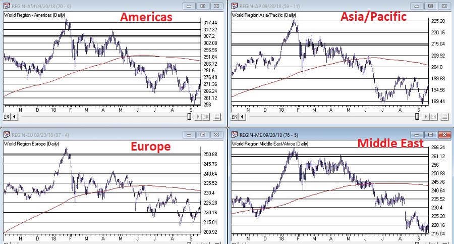
Figure 10 shows a color study on REGN. The yellow bars show where the range accumulation/distribution shows a consolidation.

Sample Chart

FIGURE 10: AIQ. This color study shows range consolidation (yellow bars).

—Richard Denning

info@TradersEdgeSystems.com

for AIQ Systems

The SPX ‘Magic Number’

According to one simple technique the “Magic Number” for the S&amp;P 500 Index is 2872.87.  According to this simple technique if the S&P 550 Index closes above this number the stock market “should” continue to be bullish for at least another year.

Sounds optimistic? Well, there certainly are no “sure things” in the financial markets.  Still, let’s take a closer look.

The Simple Technique

The technique I mentioned works like this:

When the S&P 500 Index:

*Closes at its highest price in the past 252 trading days

*For the 1st time in the most recent 126 trading days

*It generates a bullish signal for the next 252 trading days

In essence, we are talking about buying when the index makes a 1-year high for the 1st time in 6 months and holding for 1 year.

Figure 1 displays the most recent previous buy signal that occurred on 7/11/16.  The sell date was 252 trading days later on 7/11/17.

1

Figure 1 – 2016 Signal (Courtesy AIQ TradingExpert)

Figure 2 displays the signal before that which occurred on 2/27/12.  The sell date was 252 trading days later on 2/26/13.

2

Figure 2 – 2012 Signal (Courtesy AIQ TradingExpert)

Figure 3 displays all the signals since 1933.

Buy Date Sell Date Buy Price Sell Price %+(-)
5/27/33 4/6/34 9.64 10.95 +13.6
5/18/35 3/20/36 9.87 15.04 +52.4
10/6/38 8/9/39 12.82 11.78 (8.1)
10/7/42 8/10/43 9.17 11.71 +27.7
6/1/44 4/7/45 12.31 13.84 +12.4
5/15/48 4/8/49 16.55 14.97 (9.5)
10/5/49 8/23/50 15.78 18.82 +19.3
3/5/54 3/4/55 26.52 37.52 +41.5
8/4/58 8/4/59 47.94 60.61 +26.4
1/10/61 11/2/62 58.97 57.75 (2.1)
4/15/63 4/15/64 69.09 80.09 +15.9
4/24/67 4/25/68 92.62 96.62 +4.3
4/30/68 6/9/69 97.46 101.2 +3.8
1/8/71 1/6/72 92.19 103.51 +12.3
2/7/72 2/8/73 104.54 113.16 +8.2
6/24/75 6/22/76 94.19 103.47 +9.9
8/1/78 7/31/79 100.66 103.81 +3.1
8/14/79 8/12/80 107.52 123.79 +15.1
10/8/82 10/6/83 131.05 170.28 +29.9
11/7/84 11/7/85 169.17 192.62 +13.9
10/19/88 10/18/89 276.97 341.76 +23.4
5/30/90 2/13/92 360.86 413.69 +14.6
7/30/92 7/29/93 423.92 450.24 +6.2
2/6/95 2/5/96 481.14 641.43 +33.3
9/3/03 9/2/04 1026.27 1118.31 +9.0
11/5/04 11/4/05 1166.17 1220.14 +4.6
10/13/09 10/13/10 1073.19 1178.1 +9.8
11/5/10 11/4/11 1225.85 1253.23 +2.2
2/27/12 2/26/13 1367.59 1496.94 +9.5
7/11/16 7/11/17 2137.16 2425.53 +13.5

Figure 3 – Previous Signals

Things to note:

*27 of the 30 signals (i.e., 90%) have witnessed a 12-month gain

*3 of 30 signals (i.e., 10%) have witnessed a loss

*The last “losing trade” occurred in 1961-1962

*The last 20 signals have been followed by a 12-month gain for the S&amp;P 500

*The average of all 30 signals is +13.9%

*The average for all 27 winning trades is +16.1%

*The average of all 3 losing trades is -6.6%

*The worst losing trade was -9.5%

Two Technical Notes

Believe it or not, into the early 1950’s the stock market used to be open on Saturday.  So those days counted toward the 126 and 252 trading days counts.  This explains why the buy and sell dates prior to 1954 were less than one calendar year apart.

It is possible to get a new signal before an existing signal reaches it’s Sell Date.  In those rare cases we simply extend the holding period an additional 252 trading days.  This occurred in 1961-1962, 1968-1969, 1990-1992.

Figure 4 shows that SPX is very close to generating a new signal.  The most recent high close was in January at 2872.87 which was more than 126 trading days ago.  A new signal will occur if SPX closes above that level.

4

Figure 4 – Potential new signal forming (Courtesy AIQ TradingExpert)

Summary

The Good News is that this technique has a 90% accuracy rate and that one good day in the market could generated a new buy signal.  The Bad News is that – as I mentioned earlier – there are no “sure things” in the market.  Given that this particular method is on a 20-trade winning streak, it is understandable to think that maybe the law of averages is against it this time.

We’ll just have to wait and see what happens.

Jay Kaeppel

Disclaimer:  The data presented herein were obtained from various third-party sources.  While I believe the data to be reliable, no representation is made as to, and no responsibility, warranty or liability is accepted for the accuracy or completeness of such information.  The information, opinions and ideas expressed herein are for informational and educational purposes only and do not constitute and should not be construed as investment advice, an advertisement or offering of investment advisory services, or an offer to sell or a solicitation to buy any security.

When It All Becomes Too Obvious

Investors who pay close attention to the financial markets by and large spend a fair amount of time being “perplexed.”  If you take all the “news” related to the markets and combine that with all the day-to-day and week-to-week gyrations of the markets, there often seems to be no rhyme or reason for what goes on (hence the reason I generally advocate a slightly less hyper, more trend-driven approach).

But sometimes it all seems to come crystal clear.  In the most recent fortnight most of the major market averages (with the Dow and S&P 500 being the primary exceptions) have touched or at least teased new highs.  Facebook got crushed and the market didn’t tank.  Tesla struggled mightily before bursting back into the bright sunlight – and the market didn’t tank.  In fact, all kinds of things have happened and still the major U.S. averages march relentlessly higher backed by a strong economy, reasonably moderate inflation and higher, yet by no means high interest rates.

At this point, it appears “obvious” that there is no end in sight to the Great Bull Market.  A number of momentum studies I have read lately seem to all confirm that the U.S. market will continue to march higher to significantly higher new highs.

And the fact that it is so “obvious” scares the $%^&amp; out of me.  Don’t misunderstand.  This is not about to devolve into a hysterical “Sell Everything!” screed.  The trend is bullish therefore so am I.  But the “what could possibly go wrong” antennae still pop up from time to time.  So here are some random views regarding all things stock market.

The Major Averages

Figure 1 displays 4 major U.S. market averages.  All are in uptrends above their respective 200-day moving averages and all are close to all-time highs.  The big question is “what happens when they get there?”  Do they all break through effortlessly?  Or do we get a “struggle?”

(click to enlarge)

1

Figure 1 – The Major U.S. Averages; clearly in up trends, but… (Courtesy AIQ TradingExpert)

Figure 2 displays my own 4 market “bellwethers”, including the semiconductors (SMH), Dow Transports (TRAN), Inverse VIX ETF (ZIV) and Sotheby’s Holdings (BID).  At the moment, none of these are actively “confirming” new highs and they each have a clear “line in the sand” resistance level overhead.  So, for the moment they presently pose something of a minor warning sign.

(click to enlarge)

2Figure 2 – Jay’s Market “Bellwethers”; stuck in “nowhere” (Courtesy AIQ TradingExpert)

While the U.S. economy and stock market appear to be hitting on all cylinders, the rest of the world is sort of “chugging along.”  Figure 3 displays 4 “Geographic Groups” that I follow – The Americas, Asia/Pacific, Europe and Middle East.  The good news is that each group is presently holding above it’s respective 21-month moving average.  So technically, the trend is “Up.”  But the bad news is that each group has some significant overhead resistance, so the current uptrend is by no means of the “rip roaring” variety.

(click to enlarge)

3

Figure 3 – Major Geographic Groups; Hanging onto uptrends but serious overhead resistance (Courtesy AIQ TradingExpert)

The VIX Index

Traders have been pretty much conditioned in recent years to assume that the VIX Index – which measures volatility and by extension, “fear” – is and will remain low as the market chugs higher.  And that may prove to be true.  But when everything gets to “obvious” (i.e., the U.S. market is “clearly” heading higher) and things get too quiet (VIX dropped below 11% for the 1st time in 3 months) it can pay to “expect the unexpected.”

Figure 4 is from www.sentimentrader.com and displays those instances in the past when the VIX Index fell below 11% for the first time in 3 months.  Historically, VIX makes some kind of an up move in the 2 to 3 months following such occurrences.

(click to enlarge)

4

Figure 4 – VIX Index performance after VIX Index drops below 11% for 1st time in 3 months (Courtesy Sentimentrader.com)

Things may or may not play out “like usual” this time around, however, given that…

*The U.S. averages are “obviously” heading higher

*The market bellwethers are so far not confirming

*The rest of the worlds stock markets are nowhere near as strong

*VIX has a history of “spiking”, especially during the seasonally unfavorable months of August and September

…It might make sense to consider a long volatility play (NOTE: Long volatility plays using ticker VXX have a long history of not panning out as ticker VXX is essentially built to go to zero – for more information on VXX and the effects of “contango” please see www.Google.com.  Long VXX trades are best considered).

One example appears in Figures 5 and 6.  This trade involves:

*Buying 5 Oct VXX 31 calls @ $2.74

*Selling 4 Oct VXX 36 calls @ $1.82

(click to enlarge)

5Figure 5 – VXX example trade particulars (Courtesy www.OptionsAnalysis.com)

(click to enlarge)

6

Figure 6 – VXX example trade risk curves (Courtesy www.OptionsAnalysis.com)

The maximum risk is $642 if VXX fails to get above the breakeven price of $32.28 by October 19th.  On the other hand, if something completely not “obvious” happens and volatility does in fact spike, the trade has significant upside potential.

(NOTE: As always, please remember that this is an “example” of a speculative contrarian trade, and NOT a “recommendation.”  If the stock market rallies – as it “obviously” seems to want to do, this trade will likely lose money.)

Jay Kaeppel

Disclaimer:  The data presented herein were obtained from various third-party sources.  While I believe the data to be reliable, no representation is made as to, and no responsibility, warranty or liability is accepted for the accuracy or completeness of such information.  The information, opinions and ideas expressed herein are for informational and educational purposes only and do not constitute and should not be construed as investment advice, an advertisement or offering of investment advisory services, or an offer to sell or a solicitation to buy any security.

Here Are The Warning Signs to Watch For

Here’s a number for you – 88%.  Since 1948, over any 10-year period the Dow has showed a gain 88% of the time.  That’s a pretty good number.  It also explains why we should give bull markets the benefit of the doubt (for the record, if you only hold the Dow between the end of October and the end of May every year you would have a showed a 10-year gain 98% of the time!  But this article is not about seasonality per se, so that’s a topic for another day).
Of course, there is a lot of variability along the way, and if you Google “current signs of a bear market” you come up with 4,280,000 articles to peruse.  So, few investors ever feel “contented”.  We’re always waiting for the “other shoe to drop.”
Some Warning Signs to Look For
#1. Major Indexes
Figure 1 displays the four major average – Dow, S&P 500, Nasdaq 100 and Russell 2000 with their respective 200-day moving averages.  In the last few days the Dow slipped a little below its 200-day average, the other three remain above.

(click to enlarge)1aFigure 1 – Four major market averages with 200-day moving averages (Courtesy AIQ TradingExpert)

Warning Sign to Watch For: If 3 or more of these averages drop below their 200-day moving average.
#2. Market Bellwethers
Figure 2 displays my four market “bellwhethers” – tickers SMH (semiconductors), TRAN (Dow Transports), ZIV (inverse VIX) and BID (Sotheby’s Holdings) with their respective 200-day moving averages.  At the moment only ZIV is below it’s 200-day moving average but some of the others are close

(click to enlarge)2Figure 2 – Four market bellwethers with 200-dqy moving averages (Courtesy AIQ TradingExpert)

Warning Sign to Watch For: If 3 or more of these averages drop below their 200-day moving average.
#3. S&P 500 Monthly Method
In this article I detailed a simple timing method using S&P 500 Index monthly closing prices.  Figure 3 show the S&P 500 Index with it’s “trigger warning” price of 2,532.69 highlighted.

(click to enlarge)3Figure 3 – S&P 500 Index Monthly Method Trigger Points (Courtesy AIQ TradingExpert)

Warning Sign to Watch For: If SPX closes below 2532.69 without first taking out the January high of 2872.87
#4. International Growth Stocks
When growth stocks around the world are performing well, things are good.  When they top out, try to rebound and then fail, things are (typically) not so good.  The last two major U.S. bear markets were presaged by a break in ticker VWIGX (Vanguard International Growth) as seen in Figure 4.

(click to enlarge)4Figure 4 – Dow Jones Industrials Average (top) and previous warnings from ticker VWIGX (bottom)(Courtesy AIQ TradingExpert)

Warning Sign to Watch For: Technically this one is currently flashing a warning sign.  That warning will remain active unless and until VWIGX takes out the January high of 33.19.
#5. The 10-Year minus 2-Year Yield Spread
This is one of the most misrepresented indicators, so I will state it as plainly as possible:
*A narrowing yield curve IS NOT a bearish sign for the stock market
*An actual inverted yield curve IS a bearish sign for the stock market
Figure 5 displays the latest 10-year minus 2-year spread.  Yes, it has narrowed quite a bit.  This has launched a bazillion and one erroneously frightening articles.  But remember the rules above.

(click to enlarge)5Figure 5 – 10-year treasury yield minus 2-year treasury yield (Courtesy: www.StockCharts.com)

Warning Sign to Watch For: If the 10-year yield minus the 2-year yield falls into negative territory it will flash a powerful warning sign for the stock market and the overall economy.  Until then ignore all the hand-wringing about a “flattening” yield curve.
Summary
We are in a seasonally unfavorable period for the stock market and – as always – we are bombarded daily with a thousand and one reasons why the next bear market is imminent.
So my advice is to do the following:
1. Ignore it all and keep track of the items listed above
2. The more warning signs that appear – if any – the more defensive you should become
In the meantime, try to go ahead and enjoy your summer.
Jay Kaeppel
Disclaimer:  The data presented herein were obtained from various third-party sources.  While I believe the data to be reliable, no representation is made as to, and no responsibility, warranty or liability is accepted for the accuracy or completeness of such information.  The information, opinions and ideas expressed herein are for informational and educational purposes only and do not constitute and should not be construed as investment advice, an advertisement or offering of investment advisory services, or an offer to sell or a solicitation to buy any security.

What in the World to Watch

If an investor were to sit down and peruse the Web looking for guidance regarding the stock market, there is a good chance they would come away bewildered and confused.

So, let’s try to simplify things a bit.

The Current Trend

Here I will defer to:

Jay’s Trading Maxim #14: When in doubt, usually the best question to ask is “What is the trend right now?”

There are always a million and one reasons why an investor may feel doubt.  But answering that simple question can often lead to a much greater deal of clarity.  Like now for instance.

In Figure 1 we see the Dow, Nasdaq 100, Russell 200 small-cap index and the S&amp;P 500.  The key thing to note is that all 4 of them are above their respective 200-day moving average, i.e., “right now” the trend is up.

Which leads to:

Jay’s Trading Maxim #14a: If the trend right now is “Up”, act accordingly.  At least until the answer changes.

1

Figure 1 – Major U.S. Indexes in Up Trends (Courtesy AIQ TradingExpert)

SPX Monthly Trend-Following

I wrote here and here about a simple monthly trend-following method using the S&amp;P 500 Index.

This method gave an “alert” when the S&amp;P 500 went 3 calendar months (Feb, March and April) without making a new high.

The “line in the sand” is the low during this period of 2532,69.  As long as price holds above this level, this method deems the trend as still “Up”.

It will take a move above the January high 2872.87 to eliminate this line in the sand.  Between here and there there is resistance at 2801.90.

4

Figure 2 – S&P 500 Index key support and resistance (Courtesy AIQ TradingExpert)

The (Problematic) World

I am not speaking in any geopolitical sense here.  And I don’t want to sound like the Ugly American.  But while the U.S. stock market is “taking care of business” and moving higher, the stock markets of much of the rest of the world are not.  And I am not sure if I should worry about this or not.

But for what it is worth, all 4 regional single country ETF indexes that I created (Americas, Asia/Pacific, Europe and Middle East) and follow are not looking terribly inspiring at the moment.

(click to enlarge)

3

Figure 3 – The Rest of the World Lags (Courtesy AIQ TradingExpert)

Summary

The trend “right now” is “Up”.  So enjoy.

But maybe check back again soon.  Just in case.

Jay Kaeppel

Disclaimer:  The data presented herein were obtained from various third-party sources.  While I believe the data to be reliable, no representation is made as to, and no responsibility, warranty or liability is accepted for the accuracy or completeness of such information.  The information, opinions and ideas expressed herein are for informational and educational purposes only and do not constitute and should not be construed as investment advice, an advertisement or offering of investment advisory services, or an offer to sell or a solicitation to buy any security.