Everyone has heard about trend-following. And most traders have at least a foggy grasp of the relative pros and cons associated with trend following. And anyone who has ever employed any type of trend-following technique is aware that they are great when there is an actual trend, but that whipsaws are inevitable.
What I am about to show you will not change these facts. But today’s piece is just a “quickie” to highlight an obscure way to use a common indicator as a “confirmation/ denial” check when assessing the trend of a given security. For the record, I am making no claim that this indicator generates profitably “trading signals in and of itself. Its one of those things that – and I hate this phrase as much as you do but – should be used in conjunction with other indicators to get a good sense of the current “state of the trend” for a given security.
Nothing more, nothing less.
MACD Stretched Long
Most traders are familiar with the MACD indicator. Originally popularized by Gerald Appel, it uses a set of moving averages to attempt to assess the trend in price (and many traders also use it to try to identify overbought or oversold situations). Standard parameters are 9,26 and 12. The version I use is different in several ways:
*Whereas the standard MACD generates two lines and a histogram can be drawn of the difference between the two, this version just generates one line – we will call in the trend line (catchy, no?)
*We will use parameters of 40 and 105
*One other note is that (at least according to me) this indicator is best used with weekly data.
The MACD4010501
Here is the formula for AIQ TradingExpert Expert Design Studio:
Define ss3 40.
Define L3 105.
ShortMACDMA3 is expavg([Close],ss3)*100.
LongMACDMA3 is expavg([Close],L3)*100.
MACD4010501Value is ShortMACDMA3-LongMACDMA3.
As I said this should be used with “other” indicators. For example, one might consider the current price versus a 40-week moving average.
Standard Interpretation:
*If price is above the 40-week moving average (or if whatever other trend-following indicator you are using is bullish), AND
*The MACD4010501 is trend higher THEN
ONLY play the long side of that security
Likewise:
*If price is below the 40-week moving average (or if whatever other trend-following indicator you are using is bearish), AND
*The MACD4010501 is trend lower THEN
ONLY play the short side of that security (or at least DO NOT play the long side)
Finally, DO NOT assume that every change of trend in MACD4010501 is some sort of buy or sell signal. Consider it only as a filter for your trades.
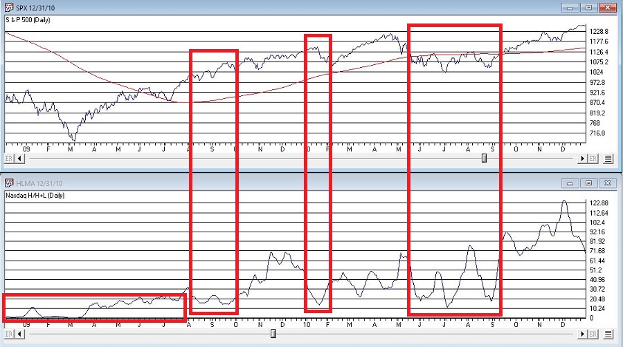
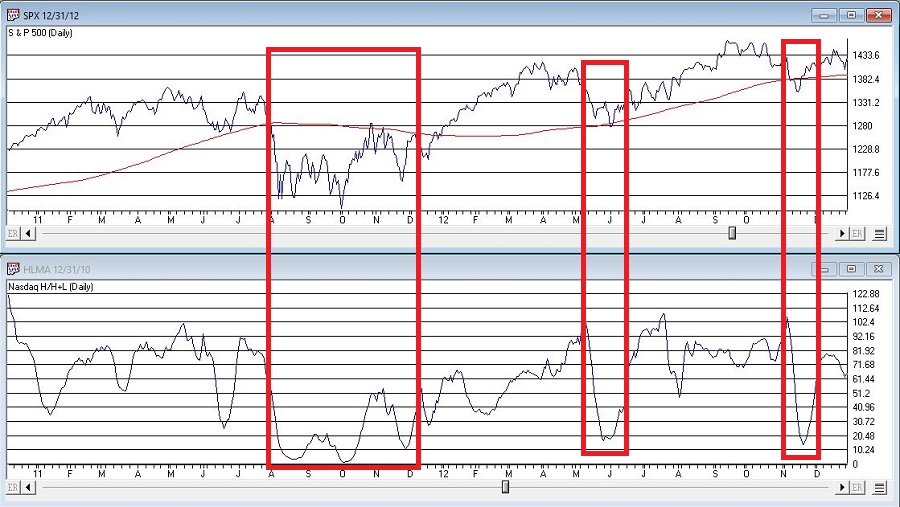
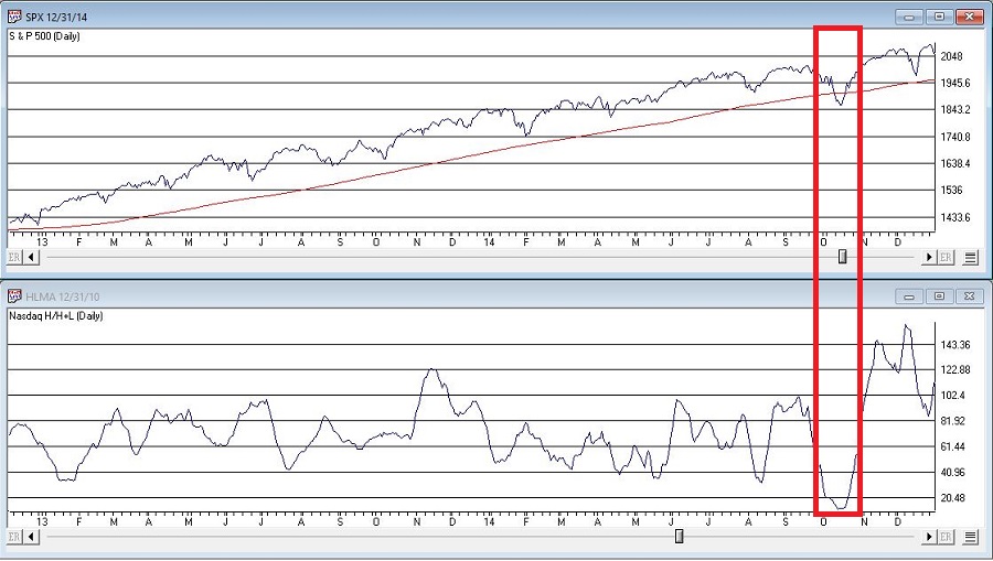
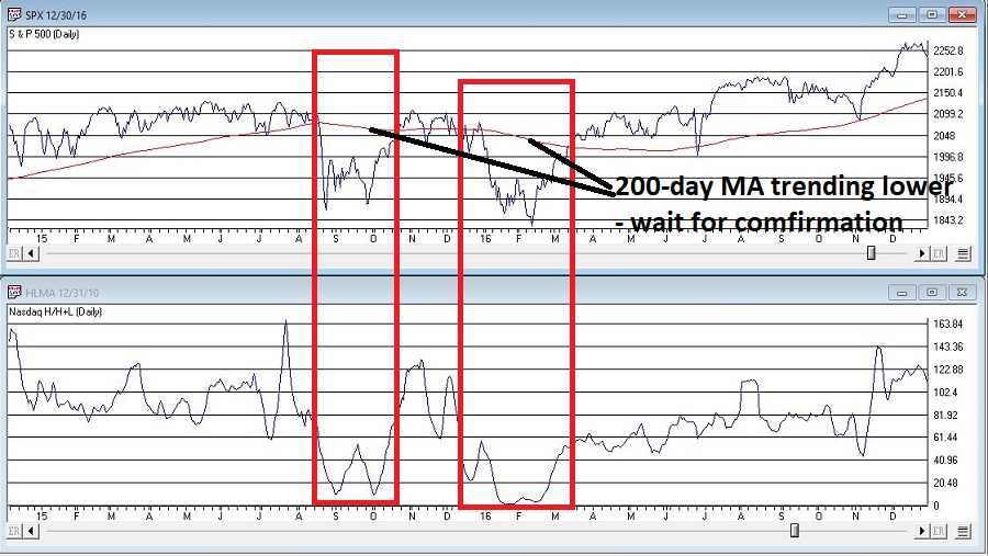
Some random examples appear in Figures 1 through 4 (click to enlarge any chart)

Figure 1 – AMZN (Courtesy AIQ TradingExpert)
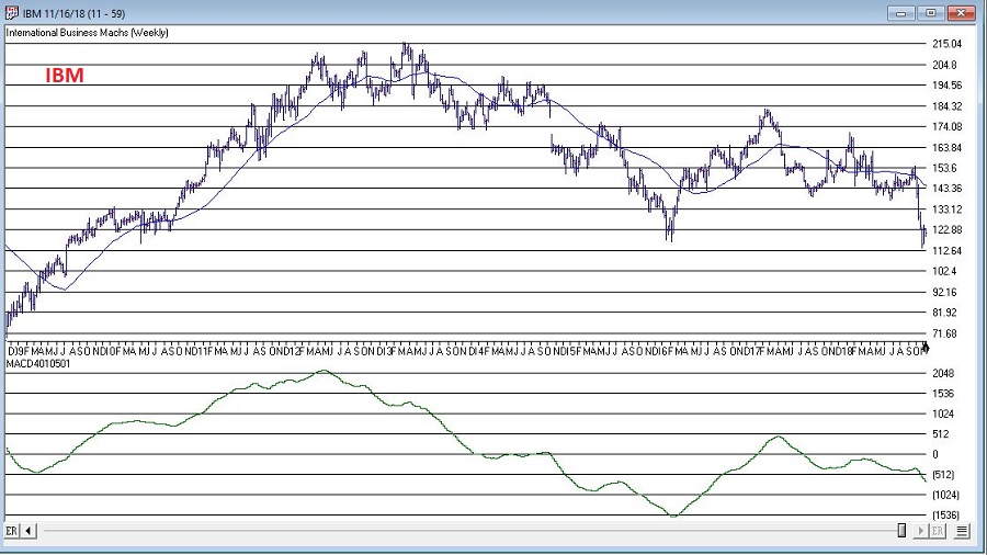
Figure 2 – IBM (Courtesy AIQ TradingExpert)
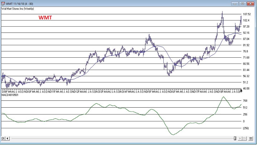
Figure 3 – WMT (Courtesy AIQ TradingExpert)
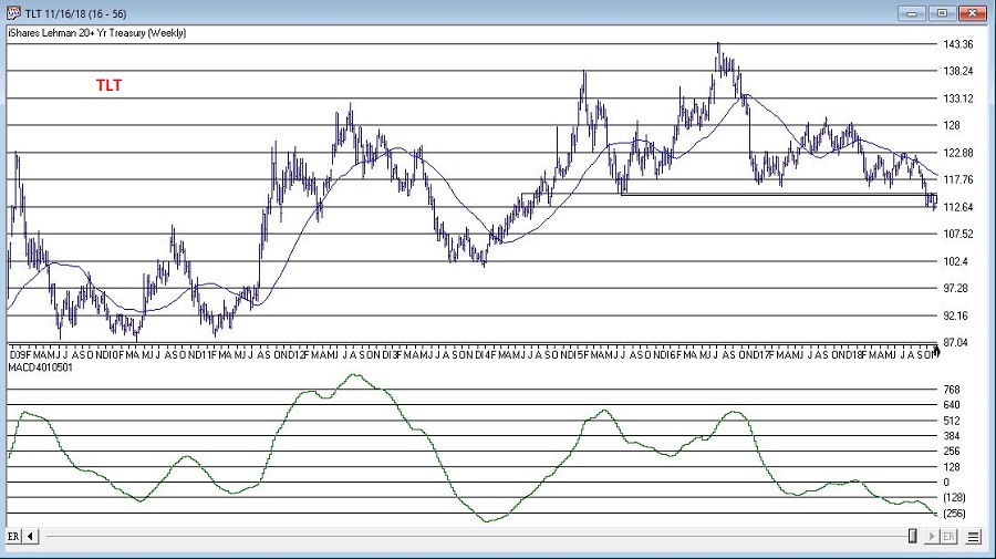
Figure 4 – TLT (Courtesy AIQ TradingExpert)
Summary
To repeat, the proper use of this obscure version of the popular MACD indicator is as follows:
*Consider the trend of MACD4010501
*Consider one or more other trend-following indicators
*If there is bullish agreement, then apply your own shorter-term entry and exit techniques to trade the long side.
*If there is bearish agreement, then apply your own shorter-term entry and exit techniques to trade the short side (or simply stand aside).
Trade on!
Jay Kaeppel
Disclaimer: The data presented herein were obtained from various third-party sources. While I believe the data to be reliable, no representation is made as to, and no responsibility, warranty or liability is accepted for the accuracy or completeness of such information. The information, opinions and ideas expressed herein are for informational and educational purposes only and do not constitute and should not be construed as investment advice, an advertisement or offering of investment advisory services, or an offer to sell or a solicitation to buy any security.