Category Archives: commodities

A Simple Way To Trade Seasonality


In “A Simple Way To Trade Seasonality” in the September 2019 Stocks & Commodities, author Perry Kaufman describes methods he uses for measuring the seasonality in markets and approaches he uses for trading these patterns

Editors note: The full article can be obtained from Stocks & Commodities magazine at
http://technical.traders.com/sub/sublog2.asp#Sep the system rules are from the article and are based on these rules

1. Average the monthly frequency of the past 4 years.

2. Find the last occurrence of the highest frequency and the last occurrence of the lowest frequency using the average frequency in step 1. That is, if both March and April have a frequency of 70, we use April.

3. Only trade if the high frequency is 75% or greater and the low frequency is 25% or lower.

4. If the high frequency comes first, sell short at the end of the month with the high frequency. Cover the short at the end of the month with the low frequency.

5. If the low frequency comes first, buy at the end of the month with the low frequency. Sell to exit at the end of the month with the high frequency

The importable AIQ EDS file and Excel spreadsheet for Perry Kaufman’s article can be obtained on request via email to info@TradersEdgeSystems.com. The code is also shown below

!A Simple Way to Trade Seasonality
!Author: Perry Kaufman, TASC September 2019
!Coded by: Richard Denning, 07/21/2019
!www.TradersEdgeSystem.com

C is [close].
year is 2019.
len is 4000.
OSD is offsettodate(month(),day(),year()).
FirstDate is firstdatadate().

EOM1 if Month()=2 and valresult(month(),1)=1 and year()=year.
EOMos1 is scanany(EOM1,len) then OSD+1.
EOMc1 is valresult(C,^EOMos1).
EOM2 if Month()=3 and valresult(month(),1)=2 and year()=year.
EOMos2 is scanany(EOM2,len) then OSD+1.
EOMc2 is valresult(C,^EOMos2).
EOM3 if Month()=4 and valresult(month(),1)=3 and year()=year.
EOMos3 is scanany(EOM3,len) then OSD+1.
EOMc3 is valresult(C,^EOMos3).
EOM4 if Month()=5 and valresult(month(),1)=4 and year()=year.
EOMos4 is scanany(EOM4,len) then OSD+1.
EOMc4 is valresult(C,^EOMos4).
EOM5 if Month()=6 and valresult(month(),1)=5 and year()=year.
EOMos5 is scanany(EOM5,len) then OSD+1.
EOMc5 is valresult(C,^EOMos5).
EOM6 if Month()=7 and valresult(month(),1)=6 and year()=year.
EOMos6 is scanany(EOM6,len) then OSD+1.
EOMc6 is valresult(C,^EOMos6).
EOM7 if Month()=8 and valresult(month(),1)=7 and year()=year.
EOMos7 is scanany(EOM7,len) then OSD+1.
EOMc7 is valresult(C,^EOMos7).
EOM8 if Month()=9 and valresult(month(),1)=8 and year()=year.
EOMos8 is scanany(EOM8,len) then OSD+1.
EOMc8 is valresult(C,^EOMos8).
EOM9 if Month()=10 and valresult(month(),1)=9 and year()=year.
EOMos9 is scanany(EOM9,len) then OSD+1.
EOMc9 is valresult(C,^EOMos9).
EOM10 if Month()=11 and valresult(month(),1)=10 and year()=year.
EOMos10 is scanany(EOM10,len) then OSD+1.
EOMc10 is valresult(C,^EOMos10).
EOM11 if Month()=12 and valresult(month(),1)=11 and year()=year.
EOMos11 is scanany(EOM11,len) then OSD+1.
EOMc11 is valresult(C,^EOMos11).
EOM12 if Month()=1 and valresult(month(),1)=12 and valresult(year(),1)=year.
EOMos12 is scanany(EOM12,len) then OSD+1.
EOMc12 is valresult(C,^EOMos12).
YEARavg is (EOMc1+EOMc2+EOMc3+EOMc4+EOMc5+EOMc6+EOMc7+EOMc8+EOMc9+EOMc10+EOMc11+EOMc12)/12.

AR1 is (EOMc1 / YEARavg-1)*100.
AR2 is (EOMc2 / YEARavg-1)*100.
AR3 is (EOMc3 / YEARavg-1)*100.
AR4 is (EOMc4 / YEARavg-1)*100.
AR5 is (EOMc5 / YEARavg-1)*100.
AR6 is (EOMc6 / YEARavg-1)*100.
AR7 is (EOMc7 / YEARavg-1)*100.
AR8 is (EOMc8 / YEARavg-1)*100.
AR9 is (EOMc9 / YEARavg-1)*100.
AR10 is (EOMc10 / YEARavg-1)*100.
AR11 is (EOMc11 / YEARavg-1)*100.
AR12 is (EOMc12 / YEARavg-1)*100.

EOMc if firstdate < makedate(1,20,2019-20).
AR if EOMc.

The EDS code is not a trading system but a way to get the data needed into an Excel spreadsheet to enable you to make the seasonal calculations. The EDS file should be run on a date after the end of the year being calculated. Each year for which data is needed must be run separately by setting the “year” variable. Multiple symbols can be run at the same time by using a list of the desired symbols. Each time a year is run, the “AR” report must be saved as a “.csv” file. Once all the years needed have been run and saved to separate “.csv” files, they all should be cut and pasted to a single Excel sheet. They then can be sorted by symbol and each symbol can be copied and pasted to a tab for that symbol.

Figure 6 shows the rolling four-year frequency for the S&P 500 ETF (SPY) and Figure 7 shows the annual trades resulting from applying the seasonal rules to the frequency data.

Sample Chart

FIGURE 6: AIQ. Shown here is the rolling four-year frequency for the SPY.

Sample Chart

FIGURE 7: AIQ. Shown here are the annual trades resulting from applying the seasonal rules to the frequency data for SPY.

—Richard Denning
info@TradersEdgeSystems.com
for AIQ Systems

What it Will Take to Get Commodities Moving

I keep seeing headlines about the “imminent” re-emergence of commodities as a viable investment as an asset class.  And as I wrote about here, I mostly agree wholeheartedly that “the worn will turn” at some point in the years ahead, as commodities are historically far undervalued relative to stocks.

The timing of all of this is another story.  Fortunately, it is a fairly short and simple story.  In a nutshell, it goes like this:

*As long as the U.S. Dollar remains strong, don’t bet heavy on commodities.

The End

Well not exactly. 

The 2019 Anomaly

The Year 2019 was something of an anomaly as both the U.S. Dollar and precious metals such as gold and silver rallied.  This type of action is most unusual.  Historically gold and silver have had a highly inverse correlation to the dollar.  So, the idea that both the U.S. Dollar AND commodities (including those beyond just precious metals) will continue to rise is not likely correct.

Commodities as an Asset Class

When we are talking “commodities as an asset class” we are talking about more than just metals.  We are also talking about more than just energy products. 

The most popular commodity ETFs are DBC and GSG as they are more heavily traded than most others.  And they are fine trading vehicles.  One thing to note is that both (and most other “me too” commodity ETFs) have a heavy concentration in energies.  This is not inappropriate given the reality that most of the industrialized world (despite all the talk of climate change) still runs on traditional fossil fuel-based energy.

But to get a broader picture of “commodities as an asset class” I focus on ticker RJI (ELEMENTS Linked to the Rogers International Commodity Index – Total Return) which diversifies roughly as follows:

Agriculture          40.90%

Energy               24.36%

Industrial Metals 16.67%

Precious Metals    14.23%

Livestock               3.85%

Note that these allocations can change over time, but the point is that RJI has much more exposure beyond the energy class of assets than alot of other commodity ETFs.

RJI vs. the Dollar

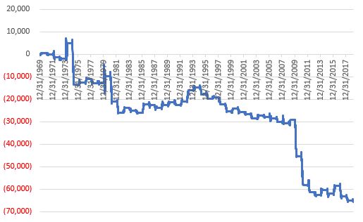
As a proxy for the U.S. Dollar we will use ticker UUP (Invesco DB US Dollar Index Bullish Fund).  Figure 1 displays the % gain/loss for UUP (blue line) versus RJI (orange line) since mid-2008.

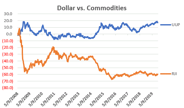
Figure 1 – UUP versus RJI; Cumulative Return using weekly closing prices; May-2008-Sep-2019

*Since May of 2008 UUP has gained +17.2%

*Since May of 2008 RJI has lost -60%

The correlation in price action between these two ETFs since 2008 is -0.76 (a correlation of -1.00 means they are perfectly inverse), so clearly there is (typically) a high degree of inverse correlation between the U.S. dollar and “commodities”.

Next, we will apply an indicator that I have dubbed “MACD4010501” (Note to myself: come up with a better name).  The calculations for this indicator will appear at the end of the article (but it is basically a 40-period exponential average minus a 105-period exponential average).  In Figure 2 we see a weekly chart of ticker UUP with this MACD indicator in the top clip and a weekly chart of ticker RJI in the bottom clip.

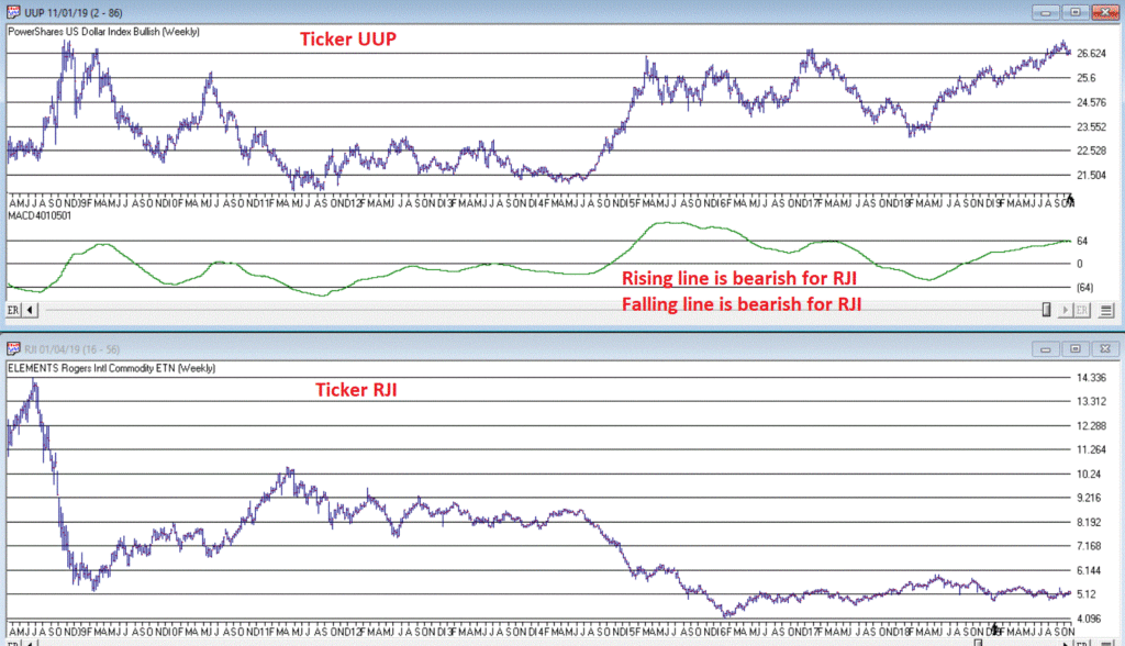
Figure 2 – UUP with Jay’s MACD Indicator versus ticker RJI (courtesy AIQ TradingExpert )

Interpretation is simple:

*when the MACD indicator applied to UUP is declining, this is bullish for RJI

*when the MACD indicator applied to UUP is rising, this is bearish for RJI.

Figure 3 displays the growth of equity achieved by holding RJI (using weekly closing price data) when the UUP MACD Indicator is declining (i.e., RJI is bullish blue line in Figure 3) versus when the UUP MACD Indicator is rising (i.e., RJI is bearish orange line in Figure 3).

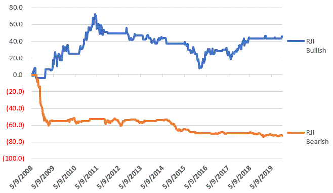
Figure 3 – RJI cumulative performance based on whether MACD indicator for ticker UUP is falling (bullish for RJI) of rising (bearish for RJI)

In sum:

*RJI gained +45.8% when the UUP MACD indicator was falling

*RJI lost -72.3% when the UUP MACD indicator was rising

The bottom line is that RJI rarely makes much upside headway when the UUP MACD Indicator is rising (i.e., is bearish for RJI).

Summary

Commodities as an asset class are extremely undervalued on a historical basis compared to stocks.  However, the important thing to remember is that “the worm is unlikely to turn” as long as the U.S. Dollar remains strong.

So, keep an eye on the U.S. Dollar for signs of weakness.  That will be your sign that the time may be coming for commodities.

FYI: Code for Jay’s MACD4010501 Indicator (AIQ TradingExpert EDS)

The indicator is essentially a 40-period exponential average minus a 105-period exponential average as shown below:

Define ss3 40.

Define L3 105.

ShortMACDMA3 is expavg([Close],ss3)*100.

LongMACDMA3 is expavg([Close],L3)*100.

MACD4010501 is ShortMACDMA3-LongMACDMA3.

Jay Kaeppel

Disclaimer: The information, opinions and ideas expressed herein are for informational and educational purposes only and are based on research conducted and presented solely by the author.  The information presented does not represent the views of the author only and does not constitute a complete description of any investment service.  In addition, nothing presented herein should be construed as investment advice, as an advertisement or offering of investment advisory services, or as an offer to sell or a solicitation to buy any security.  The data presented herein were obtained from various third-party sources.  While the data is believed to be reliable, no representation is made as to, and no responsibility, warranty or liability is accepted for the accuracy or completeness of such information.  International investments are subject to additional risks such as currency fluctuations, political instability and the potential for illiquid markets.  Past performance is no guarantee of future results.  There is risk of loss in all trading.  Back tested performance does not represent actual performance and should not be interpreted as an indication of such performance.  Also, back tested performance results have certain inherent limitations and differs from actual performance because it is achieved with the benefit of hindsight.

Too Soon to Get Sweet on Sugar

One of my (admittedly, potentially foolish) beliefs is that commodities will outperform stocks again someday.  Possibly someday starting soon (roughly defined as anywhere from today to a year from today) and that the shift will be dramatic and last for a period of 3 to 8 years.

And no, I don’t think I could be any more vague.  But I haven’t really “taken the plunge” (i.e., shifted money from the stock market into commodities in any meaningful way) yet.  But I am keeping a close eye on things.  Rather than rattled off another 1,000 words to explain, I will simply refer you to Figure 1 that tracks the ratio of the S&P Commodity Index to the S&P 500 Index.

1

Figure 1 – Commodities versus Stocks (Source: www.DailyReckoning.com)

History suggests that “the worm will (eventually) turn.”

Sugar

2

Let’s focus on one commodity for now.  Sadly, it’s one of my favorites (ranks right up there with coffee).  Sugar.  As you can see in Figures 2 and 3, sugar has a history of contracting in price over a period of time and then alternately – and please excuse my use of the following overly technical terms – “swooping” or “soaring”.Figure 2 – Sugar 1970-1998 (Courtesy ProfitSource by HUBB)

3

Figure 3 – Sugar 1998-2019 (Courtesy ProfitSource by HUBB)

4

Sugar can be traded either in the futures market (each full one-point movement in price equates to $1,120 in contract value).  An alternative for “normal people” is ticker CANE which is the Teucrium Sugar ETF which trades like shares of stock.  See Figure 4.Figure 4 – ETF Ticker CANE (Courtesy AIQ TradingExpert)

As you can see, sugar has been “contracting” in price of late.  Does this mean it is reading to “swoop” or “soar”?  Possibly.  But for those who want to play the bullish side, it is probably a bit too soon to dive in.

Seasonality in Sugar

5

Figure 5 displays the annual seasonal trend in sugar.  It should be noted that you should NOT expect every year to follow this trend.  It is a display of previous historical tendencies and NOT a roadmap.Figure 5 – Sugar Annual Seasonal Trend (Courtesy Sentimentrader.com)

Still, the primary point is captured nicely in:

Jay’s Trading Maxim #92: One of the keys to long term success is committing capital where the probabilities are (or a least appear to be) in your favor.

February through April is NOT that time for anyone looking to play the long side of sugar.

Figure 6 displays the cumulative results achieved by holding long one sugar futures contract ONLY during the months of February through April every year starting in 1970.

6

Figure 6 – Cumulative $+(-) holding long sugar futures Feb, Mar, Apr every year since 1970

Some things to note regarding sugar Feb through Apr:

*UP 18 times

*DOWN 31 times

*Average gain = +$2,201

*Average loss = (-$3,377)

*Largest gain = +$6,630 (1974)

*Largest loss = (-$18,424) (1975)

Summary

The point IS NOT to argue that sugar is doomed to plunge between now and the end of April, nor even to argue that it cannot rally strongly between now and then – because it can.

The point IS to merely point out that the odds do not presently favor the bulls, which means – well, see Trading Maxim #92 above.

Jay Kaeppel

Disclaimer:  The data presented herein were obtained from various third-party sources.  While I believe the data to be reliable, no representation is made as to, and no responsibility, warranty or liability is accepted for the accuracy or completeness of such information.  The information, opinions and ideas expressed herein are for informational and educational purposes only and do not constitute and should not be construed as investment advice, an advertisement or offering of investment advisory services, or an offer to sell or a solicitation to buy any security.

Utilities at the Crossroads

A lot of eyes are firmly fixed on Utilities at the moment.  And for good reason.  As you can see in Figure 1, the Dow Jones Utilities Average is presently facing a key resistance level.  If it breaks out above the likelihood of a good seasonal rally (more in a moment) increases significantly.

1

Figure 1 – Utilities and resistance (Courtesy AIQ TradingExpert)

One concern may be the fact that a 5-wave Elliott Wave advance appears to possibly have about run its course (according to the algorithmically drawn wave count from ProfitSource by HUBB which I use).  See Figure 2.

2

Figure 2 – Utilities and Elliott Wave (Courtesy ProfitSource by HUBB)

For what it is worth, the March through July timeframe is “typically” favorable for utilities.  Figure 3 displays the growth of $1,000 invested in the Fidelity Select Sector Utilities fund (ticker FSUTX) ONLY during the months of March through July each year starting in 1982.

3

Figure 3 – Growth of $1,000 invested in ticker FSUTX Mar-Jul every year (1982-2018)

For the record:

*# times UP = 29 (78%)

*# times DOWN = 8 (22%)

*Average UP = +9.3%

*Average DOWN = (-5.8%)

*Largest UP = +21.1% (1989)

*Largest DOWN = (-25.8%) (2002)

*Solid performance but obviously by no means nowhere close to “a sure thing”.

*It should be noted that several of the “Down” years occurred when the S&amp;P 500 was already in a pretty clearly established downtrend (2001, 2002 and 2008), i.e., below its 10-month moving average.  See Figure 4.

4

Figure 4 – S&amp;P Index w/10-month moving average (Courtesy AIQ TradingExpert)

Summary

Utilities are flirting with new all-time highs and March through July is a “seasonally bullish” period for utilities.  Does that mean “happy days are here again, and we should all be piling into utilities?  Yeah, isn’t that always the thing about the markets?  There is rarely a 100% clear indication for anything.

As always, my “prediction” about what will happen next in utilities is irrelevant and I am NOT pounding the table urging you to pile in.  But I can tell you what I am watching closely at the moment:

*The S&amp;P 500 Index is flirting right around its 10-month moving average (roughly 2,752 on the S&amp;P 500 Index).  If it starts to break down from there then perhaps 2019 may not pan out so well for utilities.

*The Dow Jones Utility Average is facing a serious test of resistance and may run out of steam (according to Elliott Wave).

*But a breakout to the upside could well clear the decks for utilities to be a market leader for the next several months

Focus people, focus.

Jay Kaeppel

Disclaimer:  The data presented herein were obtained from various third-party sources.  While I believe the data to be reliable, no representation is made as to, and no responsibility, warranty or liability is accepted for the accuracy or completeness of such information.  The information, opinions and ideas expressed herein are for informational and educational purposes only and do not constitute and should not be construed as investment advice, an advertisement or offering of investment advisory services, or an offer to sell or a solicitation to buy any security.

Bean There, Done That

In this piece I wrote about a strong seasonal tendency in corn based on the planting cycle.  Turns out soybeans are in the same boat.  This can be a good thing for traders who are, a) willing to speculate, b) not dumb enough to the bet the ranch.

The Trend

Figure 1 displays the annual seasonal trend for soybeans (from www.sentimentrader.com).  Just as with corn, the months of February through April tend to see positive results.  Please note the use of the word “tend” and the lack of the words “sure” or “thing”.

bean seasonality

Figure 1- Soybean Annual Seasonal Trend (Courtesy Sentimentrader.com)

The History

Figure 2 displays a monthly chart for soybeans going back 4 decades.

2

Figure 2 – Monthly chart for Soybeans (Courtesy ProfitSource by HUBB)

Here are the two things to note (using some pretty technical terms):

*Soybeans (like most commodities)  spend a lot of time “churning”, “grinding”, “consolidating” and generally going “nowhere”

*HOWEVER, “when beans go they really go!” (hopefully that wasn’t “too technical”)

*The primary thing to remember is that when soybeans get going to the upside, typically the best thing to do is to banish the word from “overbought” from your trading lexicon.  See Figure 3.3

Figure 3 – Big moves in Beans (Courtesy ProfitSource by HUBB)

Now let’s focus on the months of February, March and April.  Figure 4 displays the hypothetical $ growth (no slippage or commissions) from holding long a 1-lot of soybean futures during February, March and April every year starting in 1976.

4

Figure 4 – Long 1 soybean futures contract during Feb-Mar-Apr every year since 1976

The Results

Some things to note regarding Feb-Apr in soybeans:

*# of times UP = 33

*# of times DOWN = 10

*Average $ gain = +$3,808

*Average $ loss = (-$1,788)

*Largest gain = +$15,025

*Largest loss = (-$3,775)

In sum, a winners to losers ratio of 3.3 (or 76% winners), an average win to average loss ratio of 2.13-to-1

Bottom line: these are great numbers for traders BUT they entail the assumption of significant risk (2017 saw a loss of over -$3,400)

An Alternative Way to Play

Ticker SOYB is the Teucrium ETF designed to track the price of soybeans.  SOYB allows traders to buy soybeans just as they would buy shares of stock.  Just remember that you don’t get the same leverage buying SOYB as you would buying a futures contract.

Figure 5 displays a monthly chart for SOYB and Figure 6 displays a daily chart.  Note the significant resistance level at around $16.96 a share.  If SOYB takes out that level sooner than later it might be a bullish sign.

5

Figure 5 – SOYB Monthly (Courtesy AIQ TradingExpert)

6

Figure 6 – SOYB Daily (Courtesy AIQ TradingExpert)

Summary

Soybeans have been beaten down a bit over the last several years.  If (and “yes”, that is a big “If”) beans are going to make a move higher, history suggests that the Feb through April period is a likely time for that to happen.

Am I “recommending” or even “merely suggesting” that you should buy soybean futures or ticker SOYB?  Not at all.  I adhere to that old media adage of “We (I) report, you decide.”

Which is better I think than the current motto of major media which appears to be “We decide, then we report our decision.”

Jay Kaeppel

Disclaimer:  The data presented herein were obtained from various third-party sources.  While I believe the data to be reliable, no representation is made as to, and no responsibility, warranty or liability is accepted for the accuracy or completeness of such information.  The information, opinions and ideas expressed herein are for informational and educational purposes only and do not constitute and should not be construed as investment advice, an advertisement or offering of investment advisory services, or an offer to sell or a solicitation to buy any security.