Category Archives: back testing

Where We Are

One of the best pieces of advice I ever got was this: “Don’t tell the market what it’s supposed to do, let the market tell you what you’re supposed to do.”

That is profound.  And it really makes me wish I could remember the name of the guy who said it.  Sorry dude.  Anyway, whoever and wherever you are, thank you Sir.

Think about it for a moment.  Consider all the “forecasts”, “predictions” and “guides” to “what is next for the stock market” that you have heard during the time that you’ve followed the financial markets.  Now consider how many of those actually turned out to be correct.  Chances are the percentage is fairly low.

So how do you “let the market tell you what to do?”  Well, like everything else, there are lots of different ways to do it.  Let’s consider a small sampling.

Basic Trend-Following

Figure 1 displays the Dow Industrials, the Nasdaq 100, the S&P 500 and the Russell 2000 clockwise form the upper left.  Each displays a 200-day moving average and an overhead resistance point.

1

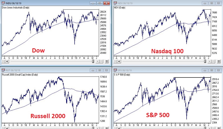
Figure 1 – Dow/NDX/SPX/RUT (Courtesy AIQ TradingExpert)

The goal is to move back above the resistance points and extend the bull market.  But the real key is for them to remain in an “uptrend”, i.e.,:

*Price above 200-day MA = GOOD

*Price below 200-day MA = BAD

Here is the tricky part.  As you can see, a simple cross of the 200-day moving average for any index may or may not be a harbinger of trouble.  That is, there is nothing “magic” about any moving average.  In a perfect world we would state that: “A warning sign occurs when the majority of indexes drop below their respective 200-day moving average.”

Yet in both October 2018 and May 2019 all four indexes dropped below their MA’s and still the world did not fall apart, and we did not plunge into a major bear market.  And as we sit, all four indexes are now back above their MA’s.  So, what’s the moral of the story?  Simple – two things:

  1. The fact remains that major bear markets (i.e., the 1 to 3 year -30% or more variety) unfold with all the major averages below their 200-day moving averages.  So, it is important to continue to pay attention.
  2. Whipsaws are a fact of life when it comes to moving averages.

The problem then is that #2 causes a lot of investors to forget or simply dismiss #1.

Here is my advice: Don’t be one of those people.  While a drop below a specific moving average by most or all the indexes may not mean “SELL EVERYTHING” now, it will ultimately mean “SEEK SHELTER” eventually as the next major bear market unfolds.  That is not a “prediction”, that is simply math.

The Bellwethers

I have written in the past about several tickers that I like to track for “clues” about the overall market.  Once again, nothing “magic” about these tickers, but they do have a history of topping out before the major averages prior to bear markets.  So, what are they saying?  See Figure 2.

2

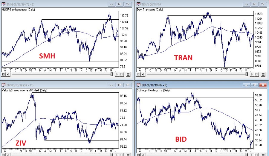
Figure 2 – SMH/Dow Transports/ZIV/BID (Courtesy AIQ TradingExpert)

The bellwethers don’t look great overall.

SMH (semiconductor ETF): Experienced a false breakout to new highs in April, then plunged.  Typically, not a good sign, but it has stabilized for now and is now back above its 200-day MA.

Dow Transports: On a “classic” technical analysis basis, this is an “ugly chart.” Major overhead resistance, not even an attempt to test that resistance since the top last September and price currently below the 200-day MA.

ZIV (inverse VIX ETF): Well below it’s all-time high (albeit well above its key support level), slightly above it’s 200-day MA and sort of seems to be trapped in a range.  Doesn’t necessarily scream “SELL”, but the point is it is not suggesting bullish things for the market at the moment.

BID (Sotheby’s – which holds high-end auctions): Just ugly until a buyout offer just appeared.  Looks like this bellwether will be going away.

No one should take any action based solely on the action of these bellwethers.  But the main thing to note is that these “key” (at least in my market-addled mind) things is that they are intended to be a “look behind the curtain”:

*If the bellwethers are exuding strength overall = GOOD

*If the bellwethers are not exuding strength overall = BAD (or at least not “GOOD”)

A Longer-Term Trend-Following Method

In this article I detailed a longer-term trend-following method that was inspired by an article written by famed investor and Forbes columnist Ken Fisher.  The gist is that a top is not formed until the S&P 500 Index goes three calendar months without making a new high.  It made a new high in May, so the earliest this method could trigger an “alert” would be the end of August (assuming the S&P 500 Index does NOT trade above it’s May high in the interim.

Jay Kaeppel

Disclaimer:  The data presented herein were obtained from various third-party sources.  While I believe the data to be reliable, no representation is made as to, and no responsibility, warranty or liability is accepted for the accuracy or completeness of such information.  The information, opinions and ideas expressed herein are for informational and educational purposes only and do not constitute and should not be construed as investment advice, an advertisement or offering of investment advisory services, or an offer to sell or a solicitation to buy any security.

What the Hal?

Some industries are cyclical in nature.  And there is not a darned thing you – or they – can do about it.  Within those industries there are individual companies that are “leaders”, i.e., well run companies that tend to out earn other companies in that given industry and whose stock tends to outperform other companies in that industry.

Unfortunately for them, even they cannot avoid the cyclical nature of the business they are in.  Take Halliburton (ticker HAL) for example.  Halliburton is one of the world’s largest providers of products and services to the energy industry.  And they do a good job of it. Which is nice.  It does not however, release them from the binds of being a leader in a cyclical industry.

A Turning Point at Hand?

1

A quick glance at Figure 1 clearly illustrates the boom/bust nature of the performance of HAL stock.Figure 1 – Halliburton (HAL) (Courtesy AIQ TradingExpert)

Which raises an interesting question: is there a way to time any of these massive swings?  Well here is where things get a little murky.  If you are talking about “picking timing tops and bottoms with uncanny accuracy”, well, while there are plenty of ads out there claiming to be able to do just that, in reality that is not really “a thing”.  Still, there may be a way to highlight a point in time where:

*Things are really over done to the downside, and

*For a person who is not going to get crazy and “bet the ranch”, and who understands how a stop-loss order works and is willing to use one…

..there is at least one interesting possibility.

It’s involves a little-known indicator that is based on a more well-known another indicator that was developed by legendary trader Larry Williams roughly 15 or more years ago.  William’s indicator is referred to as “VixFix” and attempts to replicate a VIX-like indicator for any market.  The formula is pretty simple, as follows  (the code is from AIQ Expert Design Studio):

*hivalclose is hival([close],22).

*vixfix is (((hivalclose-[low])/hivalclose)*100)+50.

In English, it is the highest close in the last 22-periods minus the current period low, which is then divided by the highest close in the last 22-periods. The result then gets multiplied by 100 and 50 is added.

Figure 2 displays a monthly chart of HAL with William’s VixFix in the lower clip.  In a nutshell, when price declines VixFix rises and vice versa.

2

Figure 2 – HAL Monthly with William’s VixFix (Courtesy AIQ TradingExpert)

Now let’s go one more step as follows by creating an exponentially smoothed version as follows (the code is from AIQ Expert Design Studio):

*hivalclose is hival([close],22).

*vixfix is (((hivalclose-[low])/hivalclose)*100)+50. <<<Vixfix from above

*vixfixaverage is Expavg(vixfix,3).  <<<3-period exponential MA of Vixfix

*Vixfixaverageave is Expavg(vixfixaverage,7). <<<7-period exp. MA

I refer to this as Vixfixaverageave (Note to myself: get a better name) because it essentially takes an average of an average.  In English (OK, sort of), first Vixfix is calculated, then a 3-period exponential average of Vixfix is calculated (vixfixaverage) and then a 7-period exponential average of vixfixaverage is calculated to arrive at Vixfixaverageave (got that?)

3

Anyway, this indicator appears on the monthly chart for HAL that appears in Figure 3.Figure 3 – HAL with Vixaverageave (Courtesy AIQ TradingExpert)

So here is the idea:

*When Vixfixaverageave for HAL exceeds 96 it is time to start looking for a buying opportunity.

OK, that last sentence is not nearly as satisfying as one that reads “the instant the indicator reaches 96 it is an automatic buy signal and you can’t lose”.  But it is more accurate.  Previous instances of a 96+ reading for Vixfixaverageave for HAL appear in Figure 4.

4

Figure 4 – HAL with previous “buy zone” readings from Vixfixaverageave (Courtesy  AIQ TradingExpert)

Note that in previous instances, the actual bottom in price action occurred somewhere between the time the indicator first broke above 96 and the time the indicator topped out.  So, to reiterate, Vixfixaverageave is NOT a “precision timing tool”, per se.  But it may be useful in highlighting extremes.

This is potentially relevant because with one week left in May, the monthly Vixfixaverageave value is presently above 96.  This is NOT a “call to action”.  If price rallies in the next week Vixfixaverageave may still drop back below 96 by month-end.  Likewise, even if it is above 96 at the end of May – as discussed above and as highlighted in Figure 4, when the actual bottom might occur is impossible to know.

5

Let me be clear: this article is NOT purporting to say that now is the time to buy HAL.  Figure 5 displays the largest gain, the largest drawdown and the 12-month gain or loss following months when Vixfixaverageave for HAL first topped 96.  As you can see there is alot of variation and volatility.  

Figure 5 – Previous 1st reading above 96 for HAL Vixfixaverageave

So HAL may be months and/or many % points away from an actual bottom.  But the main point is that the current action of Vixfixaverageave suggests that now is the time to start paying attention.

Jay Kaeppel

Disclaimer:  The data presented herein were obtained from various third-party sources.  While I believe the data to be reliable, no representation is made as to, and no responsibility, warranty or liability is accepted for the accuracy or completeness of such information.  The information, opinions and ideas expressed herein are for informational and educational purposes only and do not constitute and should not be construed as investment advice, an advertisement or offering of investment advisory services, or an offer to sell or a solicitation to buy any security.

A Different Kind of Bond Barbell

The “barbell” approach to bond investing typically involves buying a long-term bond fund or ETF and a short-term bond fund or ETF.  The idea is that the long-term component provides the upside potential while the short-term component dampens overall volatility and “smooths” the equity curve.  This article is not intended to examine the relative pros and cons of this approach.  The purpose is to consider an alternative for the years ahead.

The Current Situation

Interest rates bottomed out several years ago and rose significantly from mid-2016 into late 2018.  Just when everyone (OK, roughly defined as “at least myself”) assumed that “rates were about to establish an uptrend” – rates topped in late 2018 and have fallen off since.  Figure 1 displays ticker TYX (the 30-year treasury yield x 10) so you can see for yourself.

1

Figure 1 – 30-year treasury yields (TNX) (Courtesy AIQ TradingExpert)

2

In terms of the bigger picture, rates have showed a historical tendency to move in 30-year waves.  If that tendency persists then rates should begin to rise off the lows in recent years in a more meaningful way.  See Figure 2.Figure 2 – 60-year wave in interest rates (Courtesy: www.mcoscillator.com)

Will this happen?  No one can say for sure.  Here is what we do know:  If rates decline, long-term treasuries will perform well (as long-term bonds react inversely to the trend in yields) and if rates rise then long-term bond holders stand to get hurt.

So here is an alternative idea for consideration – a bond “barbell” that includes:

*Long-term treasuries (example: ticker VUSTX)

*Floating rate bonds (example: ticker FFRAX)

Just as treasuries rise when rates fall and vice versa, floating rate bonds tend to rise when rates rise and to fall when rates fall, i.e., (and please excuse the use of the following technical terms) when one “zigs” the other “zags”.  For the record, VUSTX and FFRAX have a monthly correlation of -0.29, meaning they have an inverse correlation.

3

Figure 3 displays the growth of $1,000 invested separately in VUSTX and FFRAX since FFRAX started trading in 2000.  As you can see the two funds have “unique” equity curves.

Figure 3 – Growth of $1,00 invested in VUSTX and FFRAX separately

Now let’s assume that every year on December 31st we split the money 50/50 between long-term treasuries and floating rate bonds.  This combined equity curve appears in Figure 4.

4

Figure 4 – Growth of $1,000 50/50 VUSTX/FFRAX; rebalanced annually

Since 2000, long-treasuries have made the most money.  This is because interest rates declined significantly for most of that period.  If interest rise in the future, long-term treasuries will be expected to perform much more poorly.  However, floating rate bonds should prosper in such an environment.

Figure 5 displays some relevant facts and figures.

5

Figure 5 – Relevant performance Figures

The key things to note in Figure 5 are:

*The worst 12-month period for VUSTX was -13.5% and the worst 12-month period for FFRAX was -17.1%.  However, when the two funds are traded together the worst 12-month period was just -5.0%.

*The maximum drawdown for VUSTX was -16.7% and the maximum drawdown for FFRAX was -18.2%.  However, when the two funds are traded together the worst 12-month period was just -8.6%.

Summary

The “portfolio” discussed herein is NOT a recommendation, it is merely “food for thought”.  If nothing else, combining two sectors of the “bond world” that are very different (one reacts well to falling rates and the other reacts well to rising rates) certainly appears to reduce the overall volatility.

My opinion is that interest rates will rise in the years ahead and that long-term bonds are a dangerous place to be.  While my default belief is that investors should avoid long-term bonds during a rising rate environment, the test conducted here suggests that there might be ways for holders of long-term bonds to mitigate some of their interest rate risk without selling their long-term bonds.

Like I said, food for thought.

Jay Kaeppel

Disclaimer:  The data presented herein were obtained from various third-party sources.  While I believe the data to be reliable, no representation is made as to, and no responsibility, warranty or liability is accepted for the accuracy or completeness of such information.  The information, opinions and ideas expressed herein are for informational and educational purposes only and do not constitute and should not be construed as investment advice, an advertisement or offering of investment advisory services, or an offer to sell or a solicitation to buy any security.

Weekly & Daily Stochastics

The AIQ code based on Vitali Apirine’s article in the September issue of Stocks and Commodities, “Weekly and Daily Stochastics, is provided below

Using Apirine’s weekly and daily stochastic indicators and a moving average to determine trend direction, I created an example system (long only) with the following rules:

Enter long next bar at open when all of the following are true:

  1. The 200-day simple average of the NDX is greater than the day before
  2. The 200-day simple average of the stock is greater than the day before
  3. Both the weekly and daily stochastic indicators have been below 20 in the last five days
  4. Both the weekly and daily stochastic indicators are greater than the day before.

I tested three exits. Figure 8 shows a 21-day hold then exit. Figure 9 shows a three-moving-average trend-following exit. Figure 10 shows an exit using only the weekly &amp; daily stochastic, once both are lower than the day before.

Sample Chart

FIGURE 8: AIQ, BUY and HOLD. Here is the sample equity curve (blue) compared to the NDX (red) for the test using a 21-day hold exit.

Sample Chart

FIGURE 9: AIQ, TREND-FOLLOWING EXIT. Here is the sample equity curve (blue) compared to the NDX index (red) for the test using a trend-following exit.

Sample Chart

FIGURE 10: AIQ, W and D STOCHASTIC EXIT. Here is the sample equity curve (blue) compared to the NDX index (red) for the test using the weekly and daily stochastic indicators.

The 21-day hold test showed a 11.2% return with a maximum drawdown of 29.3%. The trend-following exit test showed a 17.6% return with a maximum drawdown of 28.8%. The test using an exit based on only the weekly and daily stochastic indicators showed a return of 2.9% with a maximum drawdown of 32.5%. All the tests used the same entry rule and were run on an old 2016 list of the NASDAQ 100 stocks with the stocks that are no longer trading deleted.

!WEEKLY AND DAILY STOCHASTIC
!Author: Vitali Apirine, TASC Sept 2018
!Coded by: Richard Denning 7/7/2018
!www.TradersEdgeSystems.com

!INPUTS:
Periods is 14.
Periods1 is 3.
Pds is 70. 
Pds1 is 3.
smaLen1 is 70.
exitType is 1.

!ABBREVIATIONS:
C is [close].
H is [high].
L is [low].

!INDICATOR CODE:
STOCD is (C-LOWRESULT(L,Periods))/(HIGHRESULT(H,Periods)-LOWRESULT(L,Periods))*100. 
SD is Simpleavg(Stocd,Periods1).
StocW is (C-LOWRESULT(L,Pds))/(HIGHRESULT(H,Pds)-LOWRESULT(L,Pds))*100.
SW is Simpleavg(Stocw,Pds1).
HD if hasdatafor(1000) &gt;= 500.
SMA200 is simpleavg(C,200).
SMA200ndx is tickerUDF("NDX",SMA200).

!SYSTEM CODE:
Buy if SMA200ndx &gt; valresult(SMA200ndx,1)
          and SMA200 &gt; valresult(SMA200,1)
          and SW &gt; valresult(SW,1) 
          and SD &gt; valresult(SD,1) 
          and countof(SW &lt; 20,5)&gt;=1 
          and countof(SD &lt; 20,5)&gt;=1 
          and HD.
smaLen2 is smaLen1*2.
smaLen3 is smaLen1*4.
SMA1 is simpleavg(C,smaLen1).
SMA2 is simpleavg(C,smaLen2).
SMA3 is simpleavg(C,smaLen3).
PD is {position days}.

!EXIT TYPE 1 USES THE INDICATOR ONLY
!EXIT TYPE 2 IS TREND FOLLOWING
Sell if (SD &lt; valresult(SD,1) and SW &lt; valresult(SW,1) and exitType=1)
       or (exitType = 2 
           and ((Valresult(C,PD)valresult(SMA1,PD) And Cvalresult(SMA2,PD) And Cvalresult(SMA3,PD) And C 250)).

RSS is C/valresult(C,120).
RSL is C/valresult(C,240).

—Richard Denning

info@TradersEdgeSystems.com

for AIQ Systems

When to Buy Energy Stocks

Crude oil and pretty much the entire energy sector has been crushed in recent months. This type of action sometimes causes investors to wonder if a buying opportunity may be forming.

The answer may well be, “Yes, but not just yet.”

Seasonality and Energy

Historically the energy sector shows strength during the February into May period.  This is especially true if the November through January period is negative.  Let’s take a closer look.

The Test

If Fidelity Select Energy (ticker FSENX) shows a loss during November through January then we will buy and hold FSENX from the end of January through the end of May.  The cumulative growth of $1,000 appears in Figure 1 and the yearly results in Figure 2.

1

Figure 1 – Growth of $1,000 invested in FSENX ONLY during Feb-May ONLY IF Nov-Jan shows a loss

2

Figure 2 – % + (-) from holding FSENX during Feb-May ONLY IF Nov-Jan shows a loss

Figure 3 displays ticker XLE (an energy ETF that tracks loosely with FSENX).  As you can see, at the moment the Nov-Jan return is down roughly -15%.

3

Figure 3 – Ticker XLE (Courtesy AIQ TradingExpert)

All of this suggests remaining patient and not trying to pick a bottom in the fickle energy sector. If, however, the energy sector shows a 3-month loss at the end of January, history suggests a buying opportunity may then be at end.

Summary

Paraphrasing here – “Patience, ah, people, patience”.

Jay Kaeppel

Disclaimer:  The data presented herein were obtained from various third-party sources.  While I believe the data to be reliable, no representation is made as to, and no responsibility, warranty or liability is accepted for the accuracy or completeness of such information.  The information, opinions and ideas expressed herein are for informational and educational purposes only and do not constitute and should not be construed as investment advice, an advertisement or offering of investment advisory services, or an offer to sell or a solicitation to buy any security.