December 14, 2019
Hello Everyone,
Market Recap:
The last month has been very good for the stock market. With the stock indexes rallying 25% or more this year, the market is now at fair value. This means that even though I feel the market could rise next year to my potential forecast of 3280 to 3380, the market based on this year’s earnings is currently where it should be. Barring any Trump slump in the impeachments or Chinese tariffs blow ups, the markets could sell off in the first part of 2020 but if earnings grow 6-7% and interest rates stay low then any market sell off should be just a correction and nothing more than a 4-7% selloff possibly. But because some hedge fund managers are underperforming the S&P 500 this year, any sell off over the next week or so maybe shallow as they want to show their investors at the end of the year that they were fully invested. Beware of a possible sell off after January 2, 2020.
An excerpt from Fundamental Economist Dr. Robert Genetski: from Classical Principles.com:
Stocks rebounded this past week with gains in the vicinity of 2%. The S&P500, Nasdaq and Nasdaq 100 hit new all-time record highs. Christmas came early for investors as trade agreements with China and with Democrats over the USMCA appear wrapped up. The USMCA trade agreement is not a major move in the direction of free trade. It involves only minor adjustments to trade affecting relatively few industries. The main benefit of the agreement is it reduces the uncertainty businesses face over the potential for a major disruption in trade. While details of the agreement with China are not yet available, the main benefit of an agreement will be to reduce uncertainty. This makes it easier for businesses to plan for the future. The resolution of key trade issues and the Fed’s purchases of securities mean the immediate outlook for both the economy and stocks remains positive. Stay bullish.
Longer-term interest rates should remain in the present vicinity for the immediate future.
On the Technical Side:
In November the S&P 500 broke out of the Ascending Triangle that was very Bullish. Now that the S&P 500 is at 3169 and at Fair value it would be normal to see a little correction that I don’t see until the first quarter of next year possibly.
Interest Outlook:
I see the Federal Reserve remaining stable with interest rates.
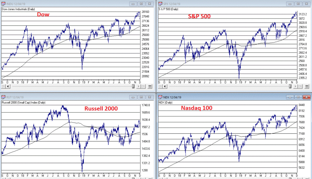
Some of the INDEXES of the markets both equities and interest rates are below. The source is Morningstar.com up until December 13th, 2019. These are passive indexes.
Dow Jones +23%
S&P 500 +27%
NASDAQ Aggressive growth +34%
I Shares Russell 2000 ETF (IWM) Small cap +23%
International Index (MSCI – EAFE ex USA) +19%
Moderate Mutual Fund +16%
Investment Grade Bonds (AAA) Long duration +13%
High Yield Merrill Lynch High Yield Index +12%
Floating Rate Bond Index +3-5%
Short Term Bond +3%
Fixed Bond Yields (10 year) +1.80.% Yield
The average Moderate Fund is up 16% this year fully invested as a 65% in stocks and 35% in bonds and nothing in the money market.
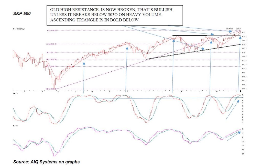
S&P 500
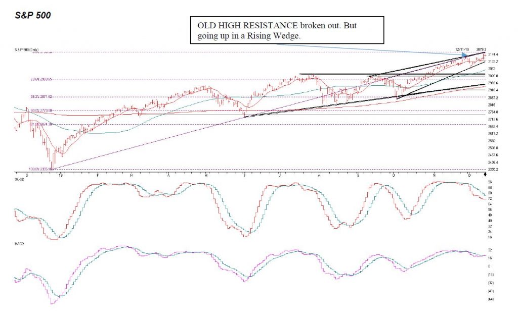
Source: AIQ Systems on graphs
The S&P 500 is above. I thought it would break out in October and it did and continued in November and December, but now it needs to Breakout ABOVE and close above 3190 to 3195 or it tops out here. There is a Rising Wedge that I am pointing to above. These tend to be topping and reversal patterns. So watch for a continuation of the breakout above 3190-3195 or it can stall here. If the S&P 500 closes below 3120 I will be getting Cautious. The 50 Day moving average at 3063 should find some Buying support. But the 3030 level is Key Support. If it is closes below 3120 I get Cautious, this means reduce exposure in equities a little if it closes below there. If it closes below the 50 Day Moving average of 3063 I may want to reduce a little more. And a Close below 3030 gets me Very Cautious.
I like the Midcap and some of the smaller stocks and the international and emerging markets going into next year and a reduction of the ULTRA large companies as they are fairly valued.
The first indicator above is the SK-SD Stochastic indicator. This shows the market is a little overbought on a weekly basis but not tremendously overbought.
The second Indicator is the MACD or Moving Average Convergence Divergence Indicator. This is breaking out on the upside showing that the market is gaining its upward momentum again.
Also On-Balance on a monthly total is at new highs in the Dow Jones. This is also Bullish.
OLD HIGH RESISTANCE broken out. But going up in a Rising Wedge.
- Support levels on the S&P 500 area are 3154, 3124, 3030, 3017 and 2966. These might be BUY areas.
- Support levels on the NASDAQ are 8588, 8348, 8253, 8136 and 8019.
- On the Dow Jones support is at 27,667, 27,389, and 27,269 and 26,726
- These may be safer areas to get into the equity markets on support levels slowly.
- RESISTANCE LEVEL ON THE S&P 500 3190-3195. We need a break of 3195 to void the Rising Wedge.
THE BOTTOM LINE:
The market has rallied a great deal this year after a moderately down 2018. We have made a nice gain this year depending on how aggressive you were in your portfolio. The 3130-3180 I called earlier in the year to reach hit its target at 3169 as of Friday, but it should be reasonably ok and going into the end of December, but I expect a little correction earlier in the first part of 2020 but if everything goes well in our favor with the Chinese Tariffs then earnings could potentially grow 6 to 7% or more and there is possibility that the S&P 500 could reach 3280 to 3380 in 2020, a much smaller rise in the stock market than in 2019 but hopefully a decent return, with obvious no guarantees expressed or implied.
Best to all of you,
Joe
Joe Bartosiewicz, CFP®
Investment Advisor Representative
5 Colby Way
Avon, CT 06001
860-940-7020 or 860-404-0408
SECURITIES AND ADVISORY SERVICES OFFERED THROUGH SAGE POINT FINANCIAL INC., MEMBER FINRA/SIPC, AND SEC-REGISTERED
INVESTMENT ADVISOR.
Charts provided by AIQ Systems:
Technical Analysis is based on a study of historical price movements and past trend patterns. There is no assurance that these market changes or trends can or will be duplicated shortly. It logically follows that historical precedent does not guarantee future results. Conclusions expressed in the Technical Analysis section are personal opinions: and may not be construed as recommendations to buy or sell anything.
Disclaimer: The views expressed are not necessarily the view of Sage Point Financial, Inc. and should not be interpreted directly or indirectly as an offer to buy or sell any securities mentioned herein. Securities and Advisory services offered through Sage Point Financial Inc., Member FINRA/SIPC, an SEC-registered investment advisor.
Past performance cannot guarantee future results. Investing involves risk, including the potential loss of principal. No investment strategy can guarantee a profit or protect against loss in periods of declining values. Please note that individual situations can vary. Therefore, the information presented in this letter should only be relied upon when coordinated with individual professional advice. *There is no guarantee that a diversified portfolio will outperform a non-diversified portfolio in any given market environment. No investment strategy, such as asset allocation, can guarantee a profit or protect against loss in periods of declining values.
It is our goal to help investors by identifying changing market conditions. However, investors should be aware that no investment advisor can accurately predict all of the changes that may occur in the market.
The price of commodities is subject to substantial price fluctuations of short periods and may be affected by unpredictable international monetary and political policies. The market for commodities is widely unregulated, and concentrated investing may lead to Sector investing may involve a greater degree of risk than investments with broader diversification.
Indexes cannot be invested indirectly, are unmanaged, and do not incur management fees, costs, and expenses.
Dow Jones Industrial Average: A weighted price average of 30 significant stocks traded on the New York Stock Exchange and the NASDAQ.
S&P 500: The S&P 500 is an unmanaged indexed comprised of 500 widely held securities considered to be representative of the stock market in general.
NASDAQ: the NASDAQ Composite Index is an unmanaged, market-weighted index of all over the counter common stocks traded on the National Association of Securities Dealers Automated Quotation System (IWM) I Shares Russell 2000 ETF: Which tracks the Russell 2000 index: which measures the performance of the small capitalization sector of the U.S. equity market.
A Moderate Mutual Fund risk mutual has approximately 50-70% of its portfolio in different equities, from growth, income stocks, international and emerging markets stocks to 30-
50% of its portfolio in different categories of bonds and cash. It seeks capital appreciation with a low to moderate level of current income.
The Merrill Lynch High Yield Master Index: A broad-based measure of the performance of non-investment grade US Bonds
MSCI EAFE: the MSCI EAFE Index (Morgan Stanley Capital International Europe, Australia, and Far East Index) is a widely recognized benchmark of non-US markets. It is an unmanaged index composed of a sample of companies’ representative of the market structure of 20 European and Pacific Basin countries and includes reinvestment of all dividends.
Investment grade bond index: The S&P 500 Investment-grade corporate bond index, a sub-index of the S&P 500 Bond Index, seeks to measure the performance of the US corporate debt issued by constituents in the S&P 500 with an investment-grade rating. The S&P 500 Bond index is designed to be a corporate-bond counterpart to the S&P 500, which is widely regarded as the best single gauge of large-cap US equities.
Floating Rate Bond Index is a rule-based, market-value weighted index engineered to measure the performance and characteristics of floating-rate coupon U.S. Treasuries, which have a maturity greater than 12 months.