The importable AIQ EDS file based on Vitali Apirine’s article in the April Stocks & Commodities issue, “On-Balance Volume Modified,” can be obtained on request via email to info@TradersEdgeSystems.com. The code is also available below.
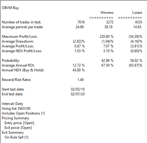
I coded the indicator described by the author and also coded a simple buy-sell on crossovers of the indicator. I tested the long side in the AIQ EDS module. Figure 5 shows the backtest results over the last 10 years using the Nasdaq 100 list of stocks.
FIGURE 5: AIQ. Sample backtest results are shown for the last 10 years using the Nasdaq 100 list of stocks.
!ON-BALANCE VOUUME MODIFIED (OBVM)
!Author: Vitali Apirine, TASC Apr 2020 !Coded by: Richard Denning 2/9/20 !www.TradersEdgeSystems.com
!ON BALANCE VOLUME:
C is [close].
C1 is val([close],1).

!OBV THAT HAS SAME SHAPE AS BUILT-IN OBV INDICATOR
DaySum is hasdatafor(2000).
F  is iff(C > C1,1,iff(C < C1,-1,0)).
VolSum1  is Sum([volume] / 1000 * F, DaySum).
VolSum2  is 1000 + VolSum1.
OBVv1  is iff(FirstDataDate() >= Reportdate(),1000,VolSum2).

!ON BALANCE VOLUME MODIFIED:
!Hard coded version:
len1 is 7. len2 is 10.
VVV is expavg(OBVv1,len1).
SigVVV is expavg(VVV,len2).

!ON BALANCE VOULUME MODIFIED (***preferred version***):
!Using built-in OBV indicator (runs much faster)
pd1 is 7.
pd2 is 10.
OBVM is expavg([OBV],pd1).
sigOBVM is expavg(OBVM,pd2).
Don’t you hate it when some analyst analyzes historical data and then purports to find some “order” in the historical chaos? Hi, my name is Jay. And…it’s just kind of what I do. Sorry, it’s just my nature. Take for instance the ridiculous case of AMD.
Advanced Micro Devices – Ticker AMD
According to “Adjusted Close” price data from www.finance.yahoo.com ticker AMD advanced from $3.15 a share in March of 1980 to $56.39 by May 20, 2020. Given that the stock has risen +1,693% on a buy-and-hold basis, it is not exactly a revelation that – particularly with the huge benefit of perfect hindsight – there was some money to be made by holding the stock.
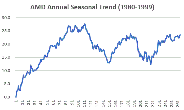
But that is only part of the story. For as it turns out, AMD is one of the most consistently “cyclical” stocks you may ever find. Figure 1 displays the average annual price trend for AMD from 3/17/1980 through 12/31/1999. In other words, period 1 along the bottom of the chart is January Trading Day #1, and so on, through the last trading day of December.
Figure 1 – Annual Seasonal Price Trend for AMD (1980-1999)
As you can see, the stock tended to rally sharply through the end of May, from mid-July through about late August, and from late October through the end of the year (or more accurately, through the end of the next May).
Declines typically occurred between about June 1st and late July and again during September into late October.
Ah, sweet hindsight.
But what are the odds that any of this was meaningful after 1999? I’m glad you asked. Because that’s where the ridiculous part comes in.
2000-2020
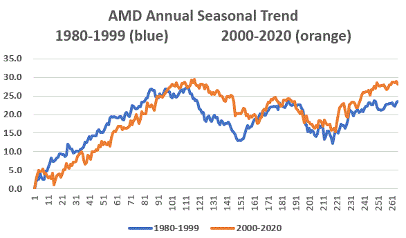
Figure 2 plots the same 1980-1999 annual seasonal price trend for AMD along with the annual seasonal trend for AMD from 2000-2019. Notice any similarities?
Figure 2 – Annual Seasonal Price Trend for AMD; 1980-1999 and 2000-2020
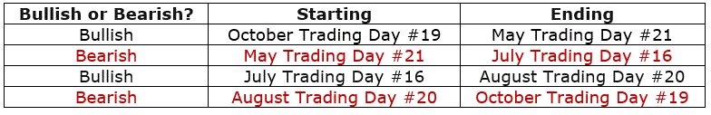
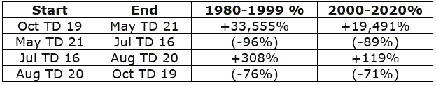
So, let’s make the ridiculous (there’s that word again) assumption that some (lucky) investor had started trading in and out of AMD on an annual basis the following seasonal calendar
Figure 3 – Annual Seasonal Bullish and Bearish Periods
Some how did the “walk forward” period of 2000 into late May-2020 compare to the “hindsight” period of 1980-1999? Well there is good news and bad news.
The bad news is that results for each period was not quite as good during 2000-2020 as they were during 1980-1999. The good news is that the 2000-2020 results were still pretty darn compelling.
Figure 4 – AMD performance during Bullish and Bearish Periods
The bottom line: The “bullish” periods have to continued to be quite bullish and the “bearish” periods continue to be quite bearish.
For the record, between March 1980 and May 2020:
*$1,000 in AMD on a buy-and-hold basis grew to $17,925
*$1,000 in AMD ONLY during the two “bullish” period discussed grew to $587,558,351
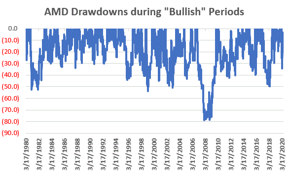
Let’s face it, these are – here I go again – ridiculous numbers. And it should be pointed out that an investor holding AMD only during the “Bullish” periods would have suffered 4 separate drawdowns in excess of -50%, including a -79%(!) drawdown in 2008-2009. See Figure 5. So, don’t anybody get “stars in their eyes.”
Figure 5 – Drawdowns during Bullish Periods
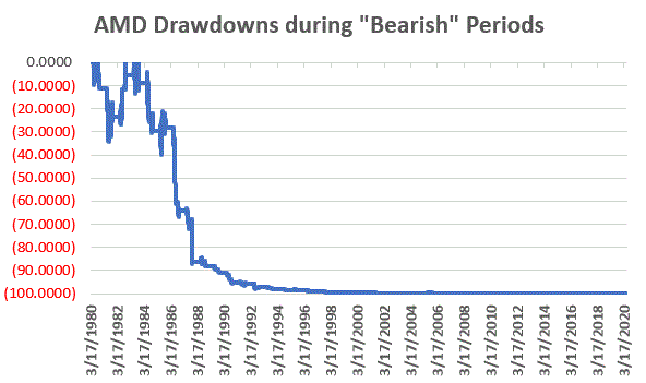
At the same time, it is still better than the drawdown racked up during the “bearish” periods, which checks in at a cool -99.9867%. See Figure 6.
Figure 6 – Drawdowns during Bearish Periods
Where We Are
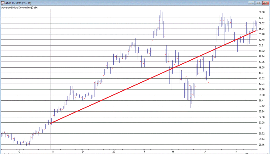
AMD has been in a “bullish” period since the 19th trading day of October 2019, and this period will last until the close on 5/29/2020. Through 5/20/2020 AMD is up +73% during the current bullish period (i.e., pandemic, schmandemic). See Figure 7.
The next “bearish” period will last from the close on 5/29/2020 through the close on 7/23/2020.
Summary
So, in hindsight, the annual seasonal pattern for AMD tracked very closely with the annual seasonal pattern for the previous 20 years. But what about the next 20 years? Ah, there’s the rub. Despite the fact that the annual seasonal trend for the past 20 years very closely mirrored the annual seasonal trend for the prior 20 years, it is not possible to state with any certainty what the next 20 years hold.
Still, if I decide to trade AMD I will probably consult my calendar first.
Disclaimer: The information, opinions and ideas expressed herein are for informational and educational purposes only and are based on research conducted and presented solely by the author. The information presented represents the views of the author only and does not constitute a complete description of any investment service. In addition, nothing presented herein should be construed as investment advice, as an advertisement or offering of investment advisory services, or as an offer to sell or a solicitation to buy any security. The data presented herein were obtained from various third-party sources. While the data is believed to be reliable, no representation is made as to, and no responsibility, warranty or liability is accepted for the accuracy or completeness of such information. International investments are subject to additional risks such as currency fluctuations, political instability and the potential for illiquid markets. Past performance is no guarantee of future results. There is risk of loss in all trading. Back tested performance does not represent actual performance and should not be interpreted as an indication of such performance. Also, back tested performance results have certain inherent limitations and differs from actual performance because it is achieved with the benefit of hindsight.
The old saying that “It Doesn’t Have to be Rocket Science” when it comes to the markets got to be an old saying by being true for all these years. Despite all of the increases in technology and computer speed, in the end it mostly comes down to “Is price rising or falling?” Let’s consider one the simpler approaches.
The Trend
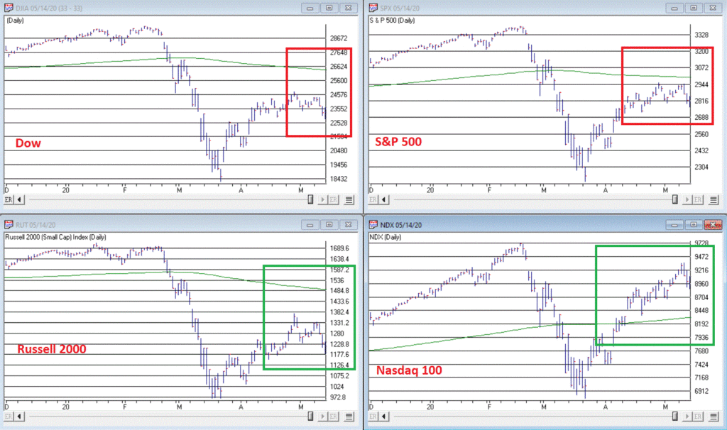
Figure 1 displays four major indexes – The Dow, the S&P 500, the Nasdaq 100 and the Russell 2000.
There is a great deal of useful information contained in these four charts. To wit:
*3 of the 4 are presently below their respective 200-day moving averages, i.e., in “downtrends”
*The 200-day moving average for all but the Nasdaq has now “rolled over” and is declining
Interpretation can be fairly simple:
*If these trends do not change, more trouble lies ahead
That wasn’t so difficult, was it?
Of course, for most people that’s “not good enough.” We want to know in advance IF these trends will or will not persist. My candid reply is “Good luck with that.”
My other response is “be patient, and keep a close eye on these indexes and these moving averages”:
*If the indexes fail to get back above these moving average, more pain is likely to unfold (see here and here)
*If the Nasdaq fails to hold above its moving average and joins the others, chances are serious defensive action (i.e., raise cash, hedge, etc.) is in order
*If the 3 down trending indexes follow the Nasdaq higher (and also this) then the worst is likely over and a much more aggressive investment stance would be warranted.
In the immortal words of Tom Petty: “The waiting is the hardest part.”
Disclaimer: The information, opinions and ideas expressed herein are for informational and educational purposes only and are based on research conducted and presented solely by the author. The information presented represents the views of the author only and does not constitute a complete description of any investment service. In addition, nothing presented herein should be construed as investment advice, as an advertisement or offering of investment advisory services, or as an offer to sell or a solicitation to buy any security. The data presented herein were obtained from various third-party sources. While the data is believed to be reliable, no representation is made as to, and no responsibility, warranty or liability is accepted for the accuracy or completeness of such information. International investments are subject to additional risks such as currency fluctuations, political instability and the potential for illiquid markets. Past performance is no guarantee of future results. There is risk of loss in all trading. Back tested performance does not represent actual performance and should not be interpreted as an indication of such performance. Also, back tested performance results have certain inherent limitations and differs from actual performance because it is achieved with the benefit of hindsight.
I hope all of you are keeping healthy in this pandemic. Some of you may have had the COVID-19 virus or have a family member who may have contracted it, but for the most part as a whole, we are working together to get through this and doing okay.
RECAP:
Last month I illustrated the previous time we have a virus that was similar to the Coronavirus, and that was the Spanish Flu back in 1918. It was a horrible time where more than 51 million and some estimates are up to 100 million people died. More than 675,000 people died from the Spanish flu in the U.S. It infected more than 50 million people worldwide and was a disaster. There was very little anyone could do during that time, and there was little medicinal relief. The Spanish Flu is called the most significant medical holocaust in history. And yet the stock markets in this country fell 34% from the beginning of the flu to the lowest part in the stock market. A year later, it went up 80% approximately from its low to its high. Am I saying this will happen again? No, I’m not planning on it, but if the world recovered from a 50 million person loss and a massive pandemic it had when the world population was much smaller, then we should recover and move beyond this as well.
Over the last month, the stock and bond markets, especially the NASDAQ, have soared with the NASDAQ now up 1.66% for the year. The reason is that with most people confined to their homes, stocks like Amazon, Google, Netflix, Facebook, Microsoft, Zoom, DocuSign, and more are being used, contributing to their earnings and revenues dramatically. Stocks like Airlines, cruise ships, restaurants, manufacturing, and many more are not doing well. That is why you will see below that the sectors in terms of which areas are declining and which are growing are very different.
CURRENT TRENDS:
The growth sector has done relatively well, but only a few large companies have contributed. These few large companies are why the Equal Weighted S&P 500 is -16.2% but the regular S&P is down 9%. I continue to like the large tech and health care companies, the NASDAQ is nearing the end of its game, and it is not much below its high it hit in February. The Midcaps are down 18-23% this year, and particular issues have more of a potential move upward, in my opinion. A year or two out from this point, I think this sector and the markets should be nicely higher. Can it go down from here into the fall and winter if we have a second wave down? Absolutely, but it is an excellent time to add money to your equity side in a diversified portfolio over the next 6 months. Many people are doubling up their contributions on a monthly basis. If you are more than five years before retirement, you may want to think about doing something similar. If stocks are cheap then isn’t it smart to buy when they are reasonably priced if over the long term the market should be higher?
Have we gone down this much over the last 50 years? Yes, many times. Has it recovered each time? Yes. Because capitalism works and good companies over the long term make money, we are all in this together.
Some of the INDEXES of the markets both equities and interest rates are below. The source is Morningstar.com up until May 8, 2020. These are passive indexes. Dow Jones -14.0% S&P 500 -9.0% EQUAL WEIGHTED S&P 500 -16.1% NASDAQ Aggressive growth +1.66% I Shares Russell 2000 ETF (IWM) Small cap -20% Midcap stock funds -18-23% International Index (MSCI – EAFE ex USA -19.0% Financial stocks -27% Energy stocks -34% Healthcare Stocks -.50%
Moderate Mutual Fund Investment Grade Bonds (AAA) Long duration -8.5% High Yield Merrill Lynch High Yield Index -9.4% Floating Rate Bond Funds -7.3% Short Term Bond -3.52% Fixed Bond Yields (10 year) .68% Yield As you see above, the only index doing well is Large tech. You should have this sector, but most everything else is starting to recover.
Classicalprinicples.com and Robert Genetskis Excerpts:
After soaring a week ago, stock prices turned mixed. The Nasdaq and Nasdaq 100 were up 1% and 4%, while the S&P 500 and Dow fell 1%, and small caps were down 2% to 4%.
The economic collapse in April has led forecasters to revise downward estimates of the decline in output, employment, and profits. Last week I expected the economy would begin to recover in May. It will. Unfortunately, ongoing restrictions from Governors and the stimulus bill will limit the initial stage of the recovery. Due to these current restrictions, means the economy will not show signs of a meaningful recovery until June at the earliest.
As a result, the financial damage to the economy in terms of lost output, jobs, wages and salaries, profits and debt will continue for another month
While several technology companies are holding up well, non-tech companies are suffering. And few companies are willing to guide earnings.
The 800-pound gorilla continues to be the outlook for the virus. Containing the spread of the virus remains a crucial problem.
Some countries and states succeed without a lockdown, while others are less successful. Due to the differing results, it raises the near-term uncertainties over how quickly the economy can recover. If setbacks occur, stocks will be vulnerable.
Despite a 15%+ unemployment rate in April and probably higher in May, the stock prices continue to anticipate better times and a recovery in the markets. I am optimistic longer term for the stock markets, although the short term could be more volatile.
Dr. Genetski’s opinion is that every person and circumstance is different. There are no guarantees expressed or implied in any part of this correspondence. Source: Classical Principles.com
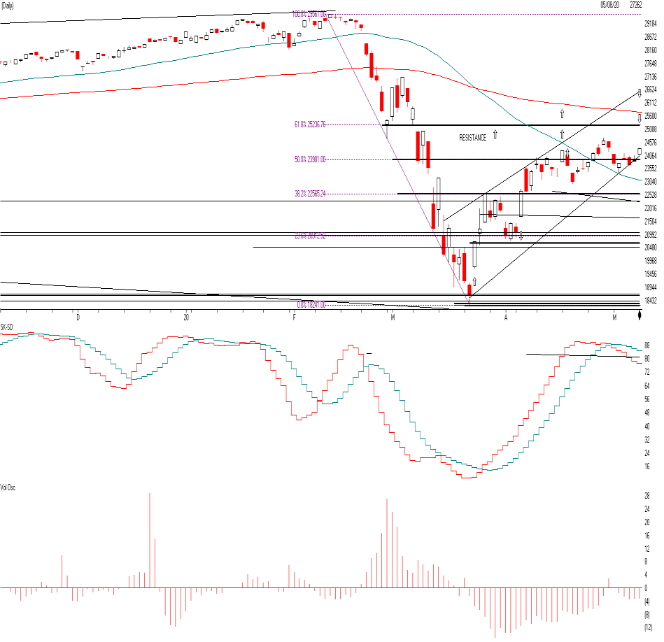
DOW JONES
As you can see the Dow went down to the 18,300 level and has risen to the 50% Fibonacci Level at 23,901. In other words when markets decline, they tend to retrace much of the decline at the 23.8%, the 50% the 61.8% and the 78.6% level and stall and reverse. Notice at the 23901 level the Dow tended to hang around there for a couple of weeks and tried to go up to the next level at the 25236 level. This is the next level where the Dow Jones could stall if it keeps rising. The Dow Jones is made up of a lot of large industrial, and value stocks that have really not participating in the rally as much as the NASDAQ tech stocks seen on the next page. Watch for a trend line break of 23901 to confirm another down leg to the 22565 if it is on big volume. This is short term. Long term I am still positive over the next 2 years or so, when we get a vaccine and a treatment, and more herd immunity.
The SK-SD stochastics model. If it is above the 88 level like it is now the market is a little over bought and this means don’t buy now short term. Volume over the last month or so the market has been rising on low volume. This means people are afraid to commit and there may not be a lot of conviction on the rally.
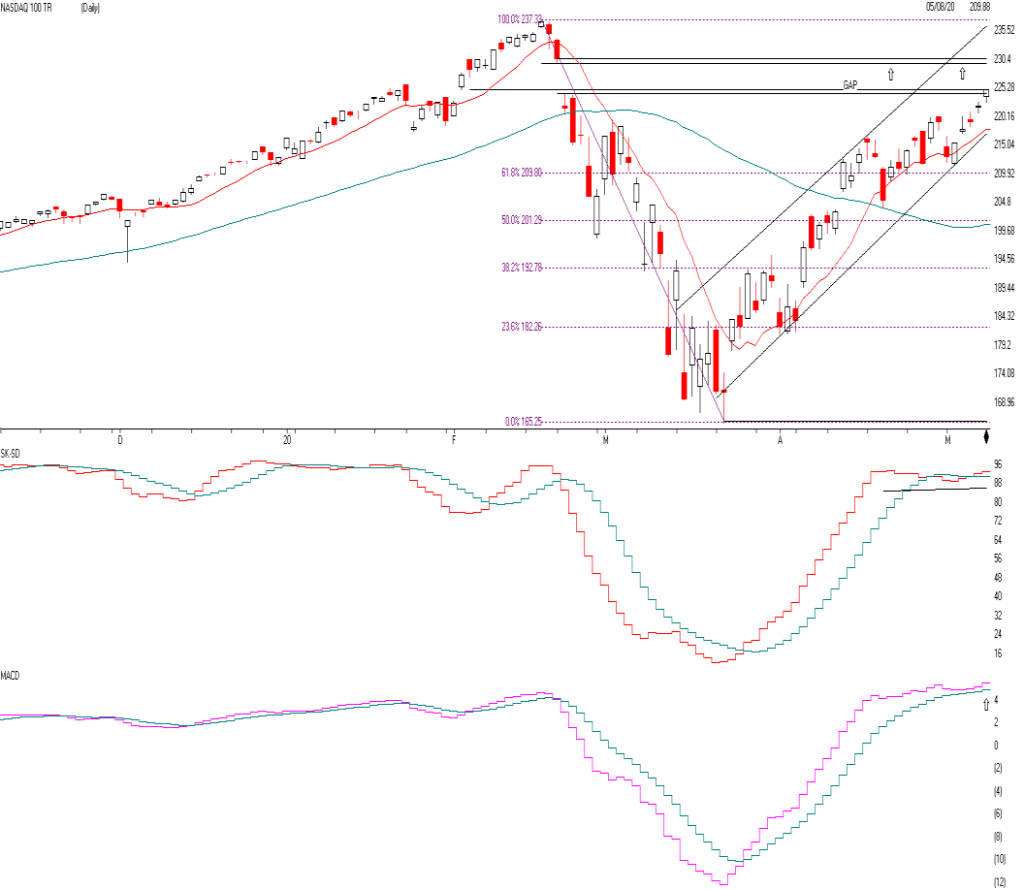
NASDAQ QQQ
The true Champ this year again has been the NASDAQ. These stocks include, Facebook, Amazon, Docusign, Paypal, Mcrosoft, Netflix, etc. All of the stocks that benefit by you and your businesses being home. This QQQ are the top 100 NASDAQ stocks and is now up 3% plus for the year while everything else in the normal world is down 16-38%. The QQQ is now getting a little OVERBOUGHT so I would not go out and buy a bunch of tech stocks here. In fact, the QQQ is approaching a pretty substantial resistance level. The first is a gap fill and could bring the QQQ to 230.55 and reverse or it could reach its old high of 237 and reverse. Longer term I think it will break through the old high, but we are now getting to a point I think the QQQ has gone up as far as it should. So watch the 230.55 to fill the gap and reverses or the old high of 237 area.
The SK-SD Stochastics is overbought just like it was in the Dow Jones. The Momentum indicator gave a Buy signal at the blue arrow as it as the pink crossed the blue line, if it crosses the blue lien going down it is a SELL. This large tech area is still long term bullish, but short term I would take a few chips off the table as an index. The midcap, small cap and large cap value sector has a lot more to recover.
If the QQQ falls or closes below 216.8 or breaks the trend line I am getting Cautious to very Cautious.
SUPPORT LEVELS:
Support levels on the S&P 500 area are 2882, 2796, 2649, and 2500. These might be accumulation levels, especially 2649, or 2500. 2936 and 3015 is resistance. Support levels on the NASDAQ are 9036, 8612, and 7856 Topping areas 9323 to 9573. On the Dow Jones support is at 23,901, 22,569, and 20912. Topping areas 25,236 and 27,077. These may be safer areas to get into the equity markets on support levels slowly on the accumulation areas.
THE BOTTOM LINE:
The market has rebounded nicely over the last month mainly on the NASDAQ tech stocks that benefit from people staying at home and using all of the tech companies to their benefits. This stay “at home” policy has increased demand for technology, and why the internet stocks have done so well. The other part of the markets from the financial to energy and other value stocks are still down from 18-33%. It is all about the growth sector that is benefiting the most. Over the long term, I am very bullish on the market, but over a short time, I can see a topping or sideways to down on the large growth companies as they are now reasonably priced. If the market continues to do well, I would expect the Midcaps to start to outperform. But there is a caveat. There are trend-line right below the markets, and if they are broken and close below those areas, then the markets could start a correction again. Trend-lines are essential to hold. If they don’t hold, then there could be a setback to support the levels stated above. I still like the USA market better than the international one.
Best to all of you,
Joe Bartosiewicz, CFP® Investment Advisor Representative 5 Colby Way Avon, CT 06001 860-940-7020 or 860-404-0408
SECURITIES AND ADVISORY SERVICES OFFERED THROUGH SAGE POINT FINANCIAL INC., MEMBER FINRA/SIPC, AND SEC-REGISTERED INVESTMENT ADVISOR.
Charts provided by AIQ Systems:
Technical Analysis is based on a study of historical price movements and past trend patterns. There is no assurance that these market changes or trends can or will be duplicated shortly. It logically follows that historical precedent does not guarantee future results. Conclusions expressed in the Technical Analysis section are personal opinions: and may not be construed as recommendations to buy or sell anything.
Disclaimer: The views expressed are not necessarily the view of Sage Point Financial, Inc. and should not be interpreted directly or indirectly as an offer to buy or sell any securities mentioned herein. Securities and Advisory services offered through Sage Point Financial Inc., Member FINRA/SIPC, and an SEC-registered investment advisor.
Past performance cannot guarantee future results. Investing involves risk, including the potential loss of principal. No investment strategy can guarantee a profit or protect against loss in periods of declining values. Please note that individual situations can vary. Therefore, the information presented in this letter should only be relied upon when coordinated with individual professional advice. *There is no guarantee that a diversified portfolio will outperform a non-diversified portfolio in any given market environment. No investment strategy, such as asset allocation, can guarantee a profit or protect against loss in periods of declining values. It is our goal to help investors by identifying changing market conditions. However, investors should be aware that no investment advisor can accurately predict all of the changes that may occur in the market. The price of commodities is subject to substantial price fluctuations of short periods and may be affected by unpredictable international monetary and political policies. The market for commodities is widely unregulated, and concentrated investing may lead to Sector investing may involve a greater degree of risk than investments with broader diversification. Indexes cannot be invested indirectly, are unmanaged, and do not incur management fees, costs, and expenses.
Dow Jones Industrial Average: A weighted price average of 30 significant stocks traded on the New York Stock Exchange and the NASDAQ. S&P 500: The S&P 500 is an unmanaged indexed comprised of 500 widely held securities considered to be representative of the stock market in general.
NASDAQ: the NASDAQ Composite Index is an unmanaged, market-weighted index of all over the counter common stocks traded on the National Association of Securities Dealers Automated Quotation System (IWM) I Shares Russell 2000 ETF: Which tracks the Russell 2000 index: which measures the performance of the small capitalization sector of the U.S. equity market.
A Moderate Mutual Fund risk mutual has approximately 50-70% of its portfolio in different equities, from growth, income stocks, international and emerging markets stocks to 30-50% of its portfolio in different categories of bonds and cash. It seeks capital appreciation with a low to moderate level of current income.
The Merrill Lynch High Yield Master Index: A broad-based measure of the performance of non-investment grade US Bonds
MSCI EAFE: the MSCI EAFE Index (Morgan Stanley Capital International Europe, Australia, and Far East Index) is a widely recognized benchmark of non-US markets. It is an unmanaged index composed of a sample of companies’ representative of the market structure of 20 European and Pacific Basin countries and includes reinvestment of all dividends. Investment grade bond index: The S&P 500 Investment-grade corporate bond index, a sub-index of the S&P 500 Bond Index, seeks to measure the performance of the US corporate debt issued by constituents in the S&P 500 with an investment-grade rating. The S&P 500 Bond index is designed to be a corporate-bond counterpart to the S&P 500, which is widely regarded as the best single gauge of large-cap US equities.
Floating Rate Bond Index is a rule-based, market-value weighted index engineered to measure the performance and characteristics of floating-rate coupon U.S. Treasuries, which have a maturity greater than 12 months.
Money Flow; The Money Flow Index (MFI) is a momentum indicator that measures the flow of money into and out of a security over a specified period. It is related to the Relative Strength Index (RSI) but incorporates volume, whereas the RSI only considers SK-SD Stochastics. When an oversold stochastic moves up through its MA, a buy signal is produced. Furthermore, Lane recommends that the stochastic line be smoothed twice with three-period simple moving averages: SK is the three-period simple moving average of K, and SD is the three-period simple moving average of SK
Rising Wedge; A rising wedge is a technical indicator, suggesting a reversal pattern frequently seen in bear markets. This pattern shows up in charts when the price moves upward with pivot highs and lows converging toward a single point known as the apex
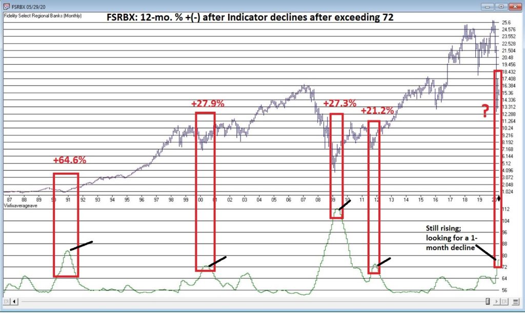
To say that there is has been and remains a great deal of angst in the financial markets is a bit of an understatement. This is especially true when it comes to the financial sector. The financial sector has a fairly high correlation to treasury yields (ticker FSRBX – Fidelity Select Banking Portfolio has a 0.52 correlation to ticker TNX – which tracks 10-year treasury yields). As yields have plummeted so has the financial sector. During the recent decline, FSRBX plunged -51% from its December 2019 peak. With little expectation of higher rates anytime soon a lot of investors are understandably wary of diving into this sector.
But much like with the energy sector, the old adage that the time to buy is when there is “blood in the streets”, should give one pause before they turn their back completely on the financial sector. For the time being I am keeping my eye on a little-known indicator called “Vixfixaverageave” (yes, I agree it is a really bad name). The calculations for this indicator appear at the end of this article. The reason I am watching it right now is that it recently reached a very oversold level that has helped to highlight some useful buying opportunities for financials in the past.
Ticker FSRBX
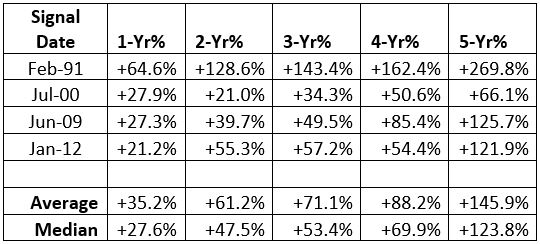
Figure 1 displays a monthly chart for FSRBX in the top clip and the Vixfixaverageave indicator in the bottom clip. Note that the indicator rose above 72 at the end of April 2020. As you can see there have been four previous occasions when this indicator, a) exceeded 72 and then b) reversed lower for one month. For arguments sake we will call that a buy signal.
Figure 2 displays the 1 to 5 year % + (-) for FSRBX following the four previous signals. As you can see, they all proved to be exceptional buying opportunities.
Figure 2 – FSRBX returns 1 to 5 years after signal
Now for the disappointing news: if you are thinking that all we have to do is wait for this indicator to finally top out and that big profits are “guaranteed” to roll in, you are making a mistake. As they say, “past performance is no guarantee of future results.” (Sorry, I don’t make the rules). So, when the Vixfixaverageave monthly reading for FSRBX does finally roll over, the proper course of action would be to:
*Decide if you really want to act based on the signal
*Decide how much capital you are willing to commit
*Decide how much of that capital you are actually willing to risk – i.e. will you stop out if a loss exceeds x%, or do you plan to simply hold it for 1 to 5 years regardless?
Summary
There are a million and one ways to trigger an entry signal. The one discussed herein is just one more. What really separates the winners from the losers is the answers to the three questions just posed.
Vixfixaverageave Calculations
EDITTORS NOTE: The code sections can be copied and pasted into AIQ EDS or you can download the indicator code in an EDS file from here and save it to your /wintes32/EDS Strategies folder.
This indicator is based on another indicator called VixFix which was developed many years ago by Larry Williams.
hivalclose is hival([close],22). <<<<<The high closing price in that last 22 periods
vixfix is (((hivalclose-[low])/hivalclose)*100)+50. <<<(highest closing price in last 22 periods minus current period low) divided by highest closing price in last 22 periods (then multiplied by 100 and 50 added to arrive at vixfix value)
vixfixaverage is Expavg(vixfix,3). <<< 3-period exponential average of vixfix
vixfixaverageave is Expavg(vixfixaverage,7). <<<7-period exponential average of vixfixaverage
Jay Kaeppel
Disclaimer: The information, opinions and ideas expressed herein are for informational and educational purposes only and are based on research conducted and presented solely by the author. The information presented represents the views of the author only and does not constitute a complete description of any investment service. In addition, nothing presented herein should be construed as investment advice, as an advertisement or offering of investment advisory services, or as an offer to sell or a solicitation to buy any security. The data presented herein were obtained from various third-party sources. While the data is believed to be reliable, no representation is made as to, and no responsibility, warranty or liability is accepted for the accuracy or completeness of such information. International investments are subject to additional risks such as currency fluctuations, political instability and the potential for illiquid markets. Past performance is no guarantee of future results. There is risk of loss in all trading. Back tested performance does not represent actual performance and should not be interpreted as an indication of such performance. Also, back tested performance results have certain inherent limitations and differs from actual performance because it is achieved with the benefit of hindsight.