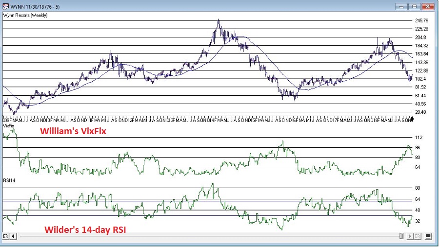
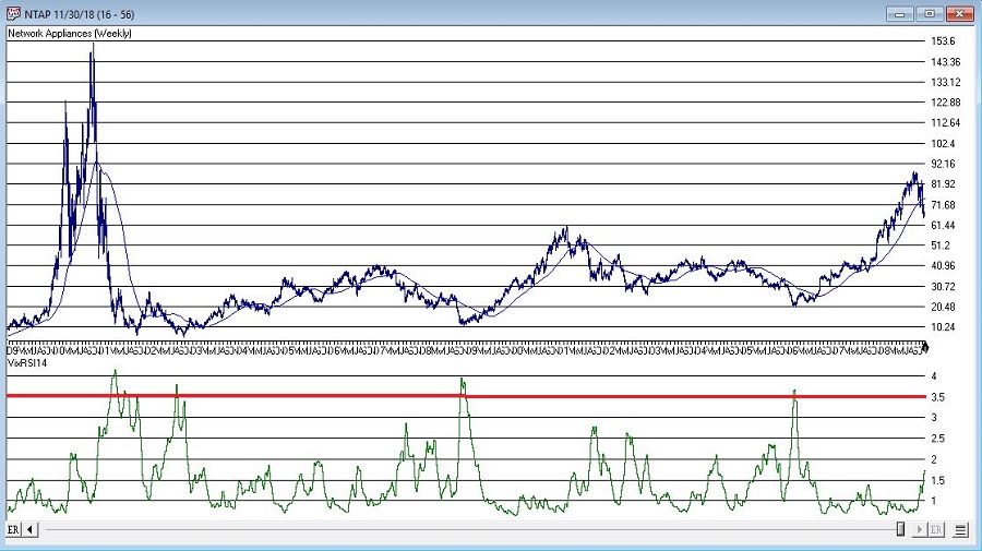
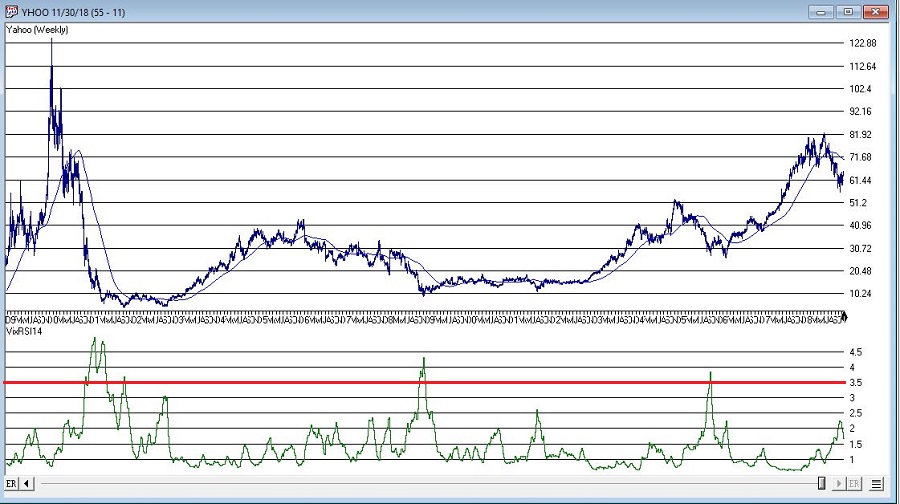
Category Archives: technical indicator

A Look Ahead in Stocks, Bonds and Commodities

In the interest of full disclosure, the reality is that I am not great at “predicting” things.  Especially when it involves the future.  That being said, I am pretty good at:

*Identifying the trend “right now”

*Understanding that no trend lasts forever

*Being aware of when things are getting a bit “extended”

So, I am going to highlight a few “thoughts” regarding how one might best be served in the markets in the years ahead.

Where We Have Been

*After 17 years of sideways action (1965-1982) the stock market has overall been in a bullish trend since about 1982 – albeit with some major declines (1987, 2000-2002 and 2007-2009) when the market got significantly overvalued.

*Bond yields experienced a long-term decline starting in 1981 and bottomed out in recent years.

*Commodities have mostly been a “dog” for many years.

The way the majority of investors approach these goings on is to:

*Remain bullish on the stock market (“Because it just keeps going up”)

*Continue to hold bonds (“Because I have to earn a yield somewhere”)

*Avoid commodities (“Because they suck – and they’re scary”)

And as an avowed trend-follower I don’t necessarily disapprove.  But as a market observer I can’t help but think that things will be “different” in the not too distant future.

Considerations Going Forward

Stocks

Figure 1 displays the Shiller P/E ratio.  For the record, valuation measures are NOT good “timing” tools.  They don’t tell you “When” the market will top or bottom out.  But they do give a good indication of relative risk going forward (i.e., the higher the P/E the more the risk and vice versa).

Note:

*The magnitude of market declines following previous peaks in the P/E ratio

*That we are presently at (or near) the 2nd highest reading in history

(click on any chart below to enlarge it)

1

Figure 1 – Shiller P/E Ratio (and market action after previous overvalued peaks) (Courtesy: www.multpl.com/shiller-pe/)

The bottom line on stocks:  While the trend presently remains bullish, valuation levels remind us that the next bear market – whenever that may be – is quite likely to be “one of the painful kind”.

Bonds

Figure 2 displays the 60-year cycle in interest rates.2

Figure 2 – 60 -year cycle in interest rates (Courtesy: www.mcoscillator.com)

Given the historical nature of rates – and the Fed’s clear propensity for raising rates – it seems quite reasonable to expect higher interest rates in the years ahead.

Commodities

As you can see in Figure 3 – which compares the action of the Goldman Sachs Commodity Index to that of the S&P 500 Index) – commodities are presently quite undervalued relative to stocks.  While there is no way to predict when this trend might change, the main point is that history strongly suggests that when it does change, commodities will vastly outperform stocks.3Figure 3 – Commodities extremely undervalued relative to stocks (Courtesy: Double Line Funds)

The Bottom Line – and How to Prepare for the Years Ahead

*No need to panic in stocks.  But keep an eye on the major averages.  If they start to drop below their 200-day averages and those moving average start to “roll over” (see example in Figure 4), it will absolutely, positively be time to “play defense.”

4

Figure 4 – Major stock average rolling over prior to 2008 collapse (Courtesy AIQ TradingExpert)

*Avoid long-term bonds.  If you hold a long-term bond with a duration of 15 years that tells you that if interest rates rise one full percentage point, then that bond will lose roughly 15% in value.  If it is paying say 3.5% in yield, there is basically no way to make up that loss (except to wait about 4 years and hope rates don’t rise any more in the interim – which doesn’t sound like a great investment strategy).

*Short-term to intermediate-term bonds allow you to reinvest more frequently at higher rates as rates rise. Historical returns have been low recently so many investors avoid these.  But remember, recent returns mean nothing going forward if rates rise in the years ahead.

*Consider floating rate bonds.  Figure 5 displays ticker OOSYX performance in recent years versus 10-year t-note yields. While I am not specifically “recommending” this fund, it illustrates how floating rate bonds may afford bond investors the opportunity to make money in bonds even as rates rise.5

Figure 5 – Ticker OOSYX (floating rate fund) versus 10-year treasury yields)

*Figure 6 display 4 ETFs that hold varying “baskets” of commodities (DBC, RJI, DJP and GSG clockwise from upper left).  When the trend in Figure 3 finally does reverse, these ETFs stand to perform exceptionally well.6

Figure 6 – Commodities performance relative to stock performance (GSCI versus SPX)

Finally, the truth is that I don’t know “when” any of this will play out.  But the bottom line is that I can’t help but think that the investment landscape is going to change dramatically in the years ahead.

So:

a) Pay attention, and

b) Be prepared to adapt

Jay Kaeppel

Disclaimer:  The data presented herein were obtained from various third-party sources.  While I believe the data to be reliable, no representation is made as to, and no responsibility, warranty or liability is accepted for the accuracy or completeness of such information.  The information, opinions and ideas expressed herein are for informational and educational purposes only and do not constitute and should not be construed as investment advice, an advertisement or offering of investment advisory services, or an offer to sell or a solicitation to buy any security.

Watch This Indicator

So, the big question on every investor’s mind is “What Comes Next?”  Since this is not an advisory service (and given the fact that I am not too good at predicting the future anyway) I have avoided commenting on “the state of the markets” lately.  That being said, I do have a few “thoughts”:

*The major averages (as of this exact moment) are still mostly above their longer-term moving averages (200-day, 10-month, 40-week, and so on and so forth).  So, on a trend-following basis the trend is still “up”.

0Figure 1 – The Major Index (Courtesy AIQ TradingExpert)

*We are in the most favorable 15 months of the 48-month election cycle (though off to a pretty awful start obviously) which beings Oct.1 of the mid-term year and ends Dec. 31st of the pre-election year.

*Investors should be prepared for some volatility as bottoms following sharp drops usually take at least a little while to form and typically are choppy affairs.  One day the market is up big and everyone breathes a sigh of relief and then the next day the market tanks.  And so on and so forth.

An Indicator to Watch

At the outset let me state that there are no “magical” indicators.  Still, there are some that typically are pretty useful.  One that I follow I refer to as Nasdaq HiLoMA.  It works as follows:

A = Nasdaq daily new highs

B = Nasdaq daily new lows

C = (A / (A+B)) * 100

D = 10-day moving average of C

C can range from 0% to 100%.  D is simply a 10-day average of C.

Nasdaq HiLoMA = D

Interpretation: When Nasdaq HiLoMA drops below 20 the market is “oversold”.

Note that the sentence above says “the market is oversold” and NOT “BUY NOW AGGRESSIVELY WITH EVERY PENNY YOU HAVE.”  This is an important distinction because – like most indicators – while this one may often give useful signals, it will occasionally give a completely false signal (i.e., the market will continue to decline significantly).

A couple of “finer points”:

*Look for the indicator to bottom out before considering it to be “bullish”.

*A rise back above 20 is often a sign that the decline is over (but, importantly, not always).  Sometimes there may be another retest of recent lows and sometimes a bear market just re-exerts itself)

*If the 200-day moving average for the Dow or S&P 500 is currently trending lower be careful about using these signals.  Signals are typically more useful if the 200-day moving average for these indexes is rising or at least drifting sideways rather than clearly trending lower (ala 2008).

Figures 2 through 8 displays the S&P 500 Index with the Nasdaq HiLoMA indicator.  Click to enlarge any chart.

1Figure 2 – SPX with Jay’s Nasdaq HiLoMA ending 2006 (Courtesy AIQ TradingExpert)

2Figure 3 – SPX with Jay’s Nasdaq HiLoMA ending 2008 (Courtesy AIQ TradingExpert)

3Figure 4 – SPX with Jay’s Nasdaq HiLoMA ending 2010 (Courtesy AIQ TradingExpert)

4Figure 5 – SPX with Jay’s Nasdaq HiLoMA ending 2012 (Courtesy AIQ TradingExpert)

5Figure 6 – SPX with Jay’s Nasdaq HiLoMA ending 2014 (Courtesy AIQ TradingExpert)

6Figure 7 – SPX with Jay’s Nasdaq HiLoMA ending 2016 (Courtesy AIQ TradingExpert)

7Figure 8 – SPX with Jay’s Nasdaq HiLoMA ending 2018 (Courtesy AIQ TradingExpert)

Summary

The stock market is in a favorable seasonal period and is oversold.  As long as the former remains true, react accordingly (with proper risk controls in place of course).

Jay Kaeppel

Disclaimer:  The data presented herein were obtained from various third-party sources.  While I believe the data to be reliable, no representation is made as to, and no responsibility, warranty or liability is accepted for the accuracy or completeness of such information.  The information, opinions and ideas expressed herein are for informational and educational purposes only and do not constitute and should not be construed as investment advice, an advertisement or offering of investment advisory services, or an offer to sell or a solicitation to buy any security.

Attention Wild-Eyed Speculators

Most people are familiar with ADHD, manic-depressive disorder, depression and schizophrenia.  But one common affliction within our trading community that gets almost no attention is WESS.  That stands for “Wild-Eyed Speculation Syndrome”.  And it’s more common than you think (“Hi, my name is Jay”).

The exact symptoms vary, but generally speaking they go something like this:

*A person gets up in the morning with a hankering to make a trade

*Said person then finds “some reason” to make some trade in something

*If the person happens to make money on that trade then the affliction is reinforced by virtue of IGTS (“I’ve Got the Touch Syndrome”, which is one of the occasional side effects of WESS)

*If the person loses money on the trade the side effects can vary but may include: angry outbursts, kicking oneself in the head (typically figuratively), vows to either stop the behavior or at least do it better, and so on.

*The most common side effect of WESS is a declining trading account balance (which not coincidentally is how this disorder is most commonly diagnosed).

For those suffering from WESS – with the caveat/disclosure that I am not a medical professional (although I have found that ibuprofen really clears up a lot of stuff, but I digress) – I am here to help.

If you find yourself suffering from Symptom #1 above:

The most effective step is to go back to bed until the urge passes.  If this doesn’t work or is not possible (for instance, if you have one of those pesky “jobs” – you know, that 8-hour a day activity that gets in the way of your trading), repeat these two mantras as many times as necessary:

Mantra 1: “I must employ some reasonably objective, repeatable criteria to find a trade with some actual potential”

Mantra 2: “I will risk no more than 2% of my trading capital” on any WESS induced trade (and just as importantly, you must fend off the voice on the other shoulder shouting “But this is the BIG ONE!!”)

Repeat these mantras as many times as necessary to avoid betting the ranch on some random idea that you “read about on the internet, so it must be true.”

Regarding Mantra 1

There are a million and one ways to find a trade.  There is no one best way.  But just to give you the idea I will mention one way and highlight a current setup. IMPORTANT: That being said, and as always, I DO NOT make recommendations on this blog.  The particular setup I will highlight may work out beautifully, or it may be a complete bust.  So DO NOT rush out and make a trade based on this just because you read it – you know – on the internet.

The Divergence

Lots of trades get made based on “divergence”.  In this case we are talking about the divergence between price and a given indicator – or even better, series of indicators.  There is nothing magic about divergence, and like a lot of things, sometimes it works and sometimes it doesn’t.  But the reason it is a viable consideration is that when an indicator flashes a bullish divergence versus price it alerts us to a potential – nothing more, nothing less – shift in momentum.

Let’s look at ticker GDX – an ETF that tracks an index of gold mining stocks.  In Figure1 1 through 4 below we see:

*GDX price making a lower low

*A given indicator NOT confirming that new low (i.e., a positive divergence)

1Figure 1 – GDX and MACD (Courtesy AIQ TradingExpert)

2Figure 2 – GDX and 3-day RSI (Courtesy AIQ TradingExpert)

3Figure 3 – GDX and TRIX (Courtesy AIQ TradingExpert)

4Figure 4 – GDX and William’s Ultimate Oscillator (Courtesy AIQ TradingExpert)

So, do the divergences that appear in Figures 1 through 4 justify a trade?  Well, here is where the aforementioned affliction comes into play.

Average Trader: “Maybe, maybe not.  In either case I am not entirely sure that trying to pick a bottom in gold stocks based solely on indicator divergences is a good idea”

WESS Sufferer: “Absofreakinglutely!!  Let’s do this!!”

You see the problem.

So, let’s assume that a WESS Sufferer likes what he or she sees in Figures 1 through 4.  The good news is that we have met the minimum criteria for Mantra #1 above – we have employed some reasonably objective, repeatable criteria (i.e., a bullish divergence between price and a number of variable indicators) to spot a potential opportunity.

Now we must follow Mantra #2 of risking no more than 2% of my trading capital.  Let’s assume our WESS Sufferer has a $25,000 trading account.  So he or she can risk a maximum of $500 ($25,000 x 2%).

In Figure 5 we see a potential support area for GDX at around $16.40 a share.

5Figure 5 – Ticker GDX with support at $16.40 (Courtesy AIQ TradingExpert)

So, one possibility would be to buy 300 shares of GDX at $17.84 and place a stop loss order below the “line in the sand” at say $16.34 a share.  So if the stop is hit, the trade would lose -$450, or -1.8% of our trading capital (17.84 – 16.34 = -1.50 x 300 shares = -$450).

Summary

Does any of the above fit in the category of “A Good Idea”.  That’s the thing about trading – and most things in life for that matter – it’s all in the eye of the beholder.  Remember, the above is NOT a “recommendation”, only an “example.”

The real key thing to note is that we went from being just a random WESS Sufferer to a WESS Sufferer with a Plan – one that has something other than just an “urge” to find a trade, AND (most importantly) a mechanism for limiting any damage that might be done if things don’t pan out.

And if that doesn’t work, well, there’s always ibuprofen.

Jay Kaeppel

Disclaimer:  The data presented herein were obtained from various third-party sources.  While I believe the data to be reliable, no representation is made as to, and no responsibility, warranty or liability is accepted for the accuracy or completeness of such information.  The information, opinions and ideas expressed herein are for informational and educational purposes only and do not constitute and should not be construed as investment advice, an advertisement or offering of investment advisory services, or an offer to sell or a solicitation to buy any security.


A Technical Method For Rating Stocks

The AIQ code based on Markos Katsanos’ article in this issue, “A Technical Method For Rating Stocks,” is shown below.
Synopsis from Stocks & Commodities June 2018
I’s it possible to create a stock rating system using multiple indicators or other technical criteria? If so, how does it compare with analyst ratings? Investors around the world move billions of dollars every day on advice from Wall Street research analysts. Most retail investors do not have the time or can’t be bothered to read the full stock report and rely solely on the bottom line: the stock rating. They believe these ratings are reliable and base their investment decisions at least partly on the analyst buy/sell rating. But how reliable are those buy/sell ratings? In this article I will present a technical stock rating system based on five technical criteria and indicators, backtest it, and compare its performance to analyst ratings.
!A TECHNICAL METHOD FOR RATING STOCKS
!Author: Markos Katsanos, TASC June 2018
!Coded by: Richard Denning, 4/18/18
!www.TradersEdgeSystems.com

!INPUTS:
  MAP is 63. 
  STIFFMAX is 7. 
  VFIPeriod is 130. 
  MASPY is 100. 
  MADL is 100.
  SCORECRIT is 5.
  W1 is 1.
  W2 is 1.
  W3 is 1.
  W4 is 1.
  W5 is 2.
 
!VFI FORMULA: 
  COEF is 0.2.
  VCOEF is 2.5.
  Avg is ([high]+[low]+[close])/3.
  inter is ln( Avg ) - ln( Valresult( Avg, 1 ) ). 
  vinter is sqrt(variance(inter, 30 )).
  cutoff is Coef * Vinter * [Close].
  vave is Valresult(simpleavg([volume], VFIPeriod ), 1 ).
  vmax is Vave * Vcoef.
  vc is Min( [volume], VMax ).
  mf is Avg - Valresult( Avg, 1 ).
  vcp is iff(MF > Cutoff,VC,iff(MF < -Cutoff,-VC,0)).
  vfitemp is Sum(VCP , VFIPeriod ) / Vave.
  vfi is expavg(VFItemp, 3 ).

!STIFFNESS 
  ma100 is Avg. 
  CLMA if [close] < MA100.
  STIFFNESS is countof(CLMA,MAP).

!CONDITIONS:
 ! MONEY FLOW:
   COND1 is iff(VFI>0,1,0). 
 !SIMPLEAVG:
    SMA is simpleavg([close],MADL).                              
    COND2 is iff([close]>SMA,1,0).  
 !SIMPLEAVG DIRECTION:                       
    COND3 is iff(SMA>valresult(SMA,4),1,0).  
!STIFFNESS:                          
    COND4 is iff(STIFFNESS<= STIFFMAX,1,0).  
!MARKET DIRECTION:
    SPY is TickerUDF("SPY",[close]).
    COND5 is iff(EXPAVG(SPY,MASPY)>= 
 valresult(EXPAVG(SPY,MASPY),2),1,0).            

SCORE is  W1*COND1+W2*COND2+W3*COND3+
   W4*COND4+W5*COND5.

 buy if Score>=SCORECRIT and hasdatafor(300)>=268. 
Figure 11 shows the summary results of a backtest using NASDAQ 100 stocks during a generally bullish period from April 2009 to April 2018. Figure 12 shows the backtest using the same list of NASDAQ 100 stocks during a period that had two bear markets (April 1999 to April 2009). The average results are similar except that there are fewer trades during the period that contained the two bear markets. Both backtests use a fixed 21-bar exit.
Sample Chart

FIGURE 11: AIQ, BULL MARKET. Here are the summary results of a backtest using NASDAQ 100 stocks during a generally bullish period from April 2009 to April 2018.
Sample Chart

FIGURE 12: AIQ, BEAR MARKET. Here are the summary results of a backtest using NASDAQ 100 stocks during a period from April 1999 to April 2009 that contained two bear markets.
—Richard Denning info@TradersEdgeSystems.com for AIQ Systems

World Met Resistance

In this article titled “World, Meet Resistance” – dated 12/21/2017 – I noted the fact that many single country ETFs and regional indexes were closing in on a serious level of potential resistance.  I also laid out three potential scenarios.  So what happened?  A fourth scenario not among the three I wrote about (Which really pisses me off.  But never mind about that right now).

As we will see in a moment what happened was:

*(Pretty much) Everything broke out above significant resistance

*Everything then reversed back below significant resistance.

World Markets in Motion

Figure 1 displays the index I follow which includes 33 single-country ETFs. As you can see, in January it broke out sharply above multi-year resistance. Just when it looked like the index was going to challenge the all-time high the markets reversed and then plunged back below the recently pierced resistance level.

(click to enlarge)1

Figure 1 – Jay’s World Index broke out in January, fell back  below resistance in February (Courtesy AIQ TradingExpert)

The same scenario holds true for the four regional indexes I follow – The Americas, Europe, Asia/Pacific and the Middle East – as seen in Figure 2.

(click to enlarge)2

Figure 2 – Jay’s Regional Index all broke above resistance, then failed (Courtesy  AIQ TradingExpert)

So where to from here?  Well I could lay out a list of potential scenarios. Of course if history is a guide what will follow will be a scenario I did not include (Which really pisses me off.  But never mind about that right now).

So I will simply make a subjective observation based on many years of observation.  The world markets may turn the tide again and propel themselves back to the upside.  But historically, when a stock, commodity or index tries to pierce a significant resistance level and then fails to follow through, it typically takes some time to rebuild a base before another retest of that resistance level unfolds.

Here’s hoping I’m wrong

Jay Kaeppel

Disclaimer:  The data presented herein were obtained from various third-party sources.  While I believe the data to be reliable, no representation is made as to, and no responsibility, warranty or liability is accepted for the accuracy or completeness of such information.  The information, opinions and ideas expressed herein are for informational and educational purposes only and do not constitute and should not be construed as investment advice, an advertisement or offering of investment advisory services, or an offer to sell or a solicitation to buy any security.