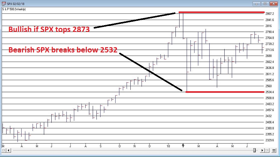
Investors who pay close attention to the financial markets by and large spend a fair amount of time being “perplexed.” If you take all the “news” related to the markets and combine that with all the day-to-day and week-to-week gyrations of the markets, there often seems to be no rhyme or reason for what goes on (hence the reason I generally advocate a slightly less hyper, more trend-driven approach).
But sometimes it all seems to come crystal clear. In the most recent fortnight most of the major market averages (with the Dow and S&P 500 being the primary exceptions) have touched or at least teased new highs. Facebook got crushed and the market didn’t tank. Tesla struggled mightily before bursting back into the bright sunlight – and the market didn’t tank. In fact, all kinds of things have happened and still the major U.S. averages march relentlessly higher backed by a strong economy, reasonably moderate inflation and higher, yet by no means high interest rates.
At this point, it appears “obvious” that there is no end in sight to the Great Bull Market. A number of momentum studies I have read lately seem to all confirm that the U.S. market will continue to march higher to significantly higher new highs.
And the fact that it is so “obvious” scares the $%^& out of me. Don’t misunderstand. This is not about to devolve into a hysterical “Sell Everything!” screed. The trend is bullish therefore so am I. But the “what could possibly go wrong” antennae still pop up from time to time. So here are some random views regarding all things stock market.
The Major Averages
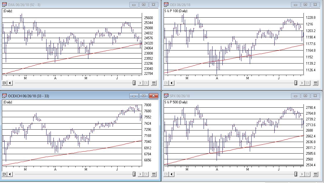
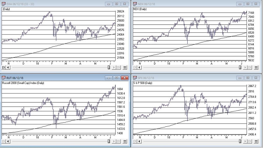
Figure 1 displays 4 major U.S. market averages. All are in uptrends above their respective 200-day moving averages and all are close to all-time highs. The big question is “what happens when they get there?” Do they all break through effortlessly? Or do we get a “struggle?”
(click to enlarge)
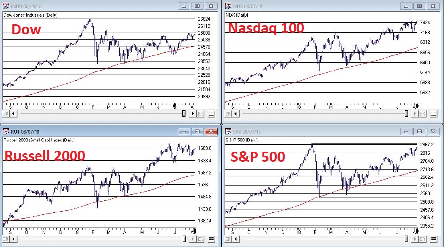
Figure 1 – The Major U.S. Averages; clearly in up trends, but… (Courtesy AIQ TradingExpert)
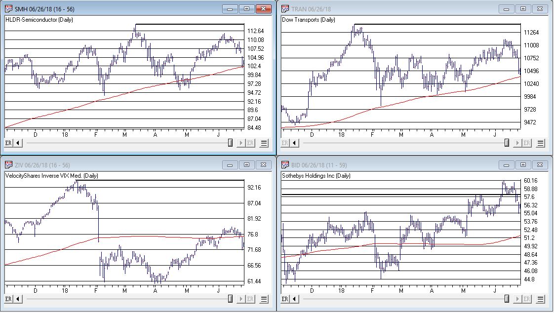
Figure 2 displays my own 4 market “bellwethers”, including the semiconductors (SMH), Dow Transports (TRAN), Inverse VIX ETF (ZIV) and Sotheby’s Holdings (BID). At the moment, none of these are actively “confirming” new highs and they each have a clear “line in the sand” resistance level overhead. So, for the moment they presently pose something of a minor warning sign.
 Figure 2 – Jay’s Market “Bellwethers”; stuck in “nowhere” (Courtesy AIQ TradingExpert)
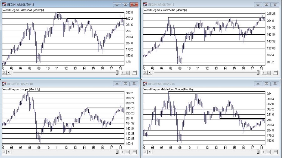
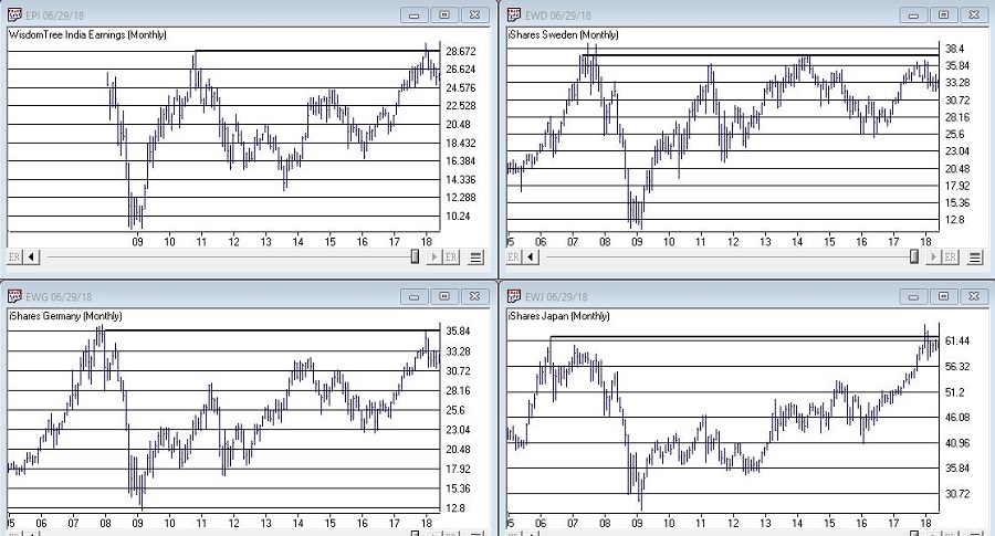
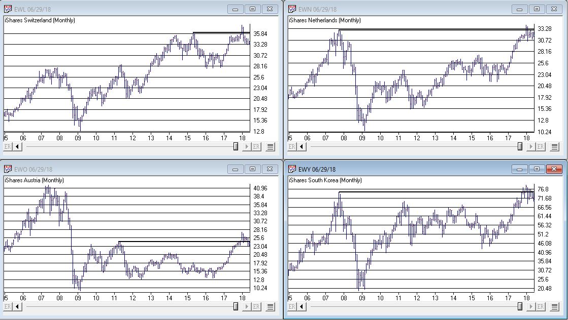
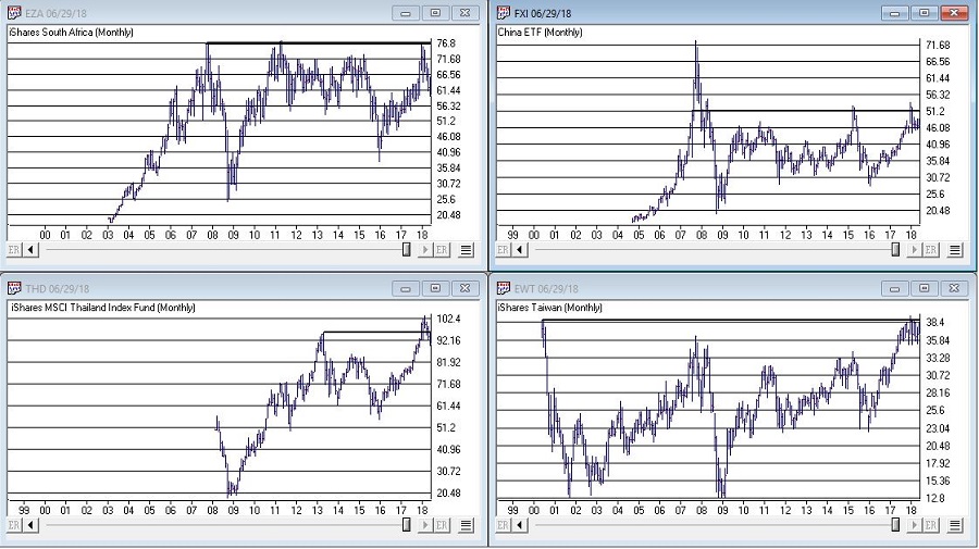
While the U.S. economy and stock market appear to be hitting on all cylinders, the rest of the world is sort of “chugging along.” Figure 3 displays 4 “Geographic Groups” that I follow – The Americas, Asia/Pacific, Europe and Middle East. The good news is that each group is presently holding above it’s respective 21-month moving average. So technically, the trend is “Up.” But the bad news is that each group has some significant overhead resistance, so the current uptrend is by no means of the “rip roaring” variety.
(click to enlarge)
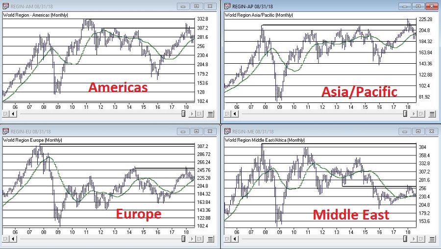
Figure 3 – Major Geographic Groups; Hanging onto uptrends but serious overhead resistance (Courtesy AIQ TradingExpert)
The VIX Index
Traders have been pretty much conditioned in recent years to assume that the VIX Index – which measures volatility and by extension, “fear” – is and will remain low as the market chugs higher. And that may prove to be true. But when everything gets to “obvious” (i.e., the U.S. market is “clearly” heading higher) and things get too quiet (VIX dropped below 11% for the 1st time in 3 months) it can pay to “expect the unexpected.”
Figure 4 is from www.sentimentrader.com and displays those instances in the past when the VIX Index fell below 11% for the first time in 3 months. Historically, VIX makes some kind of an up move in the 2 to 3 months following such occurrences.
(click to enlarge)
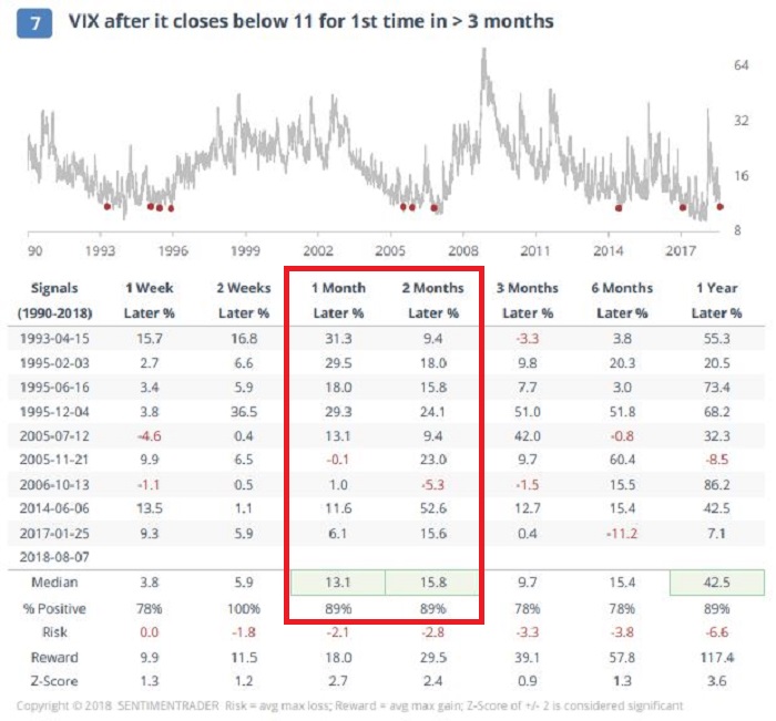
Figure 4 – VIX Index performance after VIX Index drops below 11% for 1st time in 3 months (Courtesy Sentimentrader.com)
Things may or may not play out “like usual” this time around, however, given that…
*The U.S. averages are “obviously” heading higher
*The market bellwethers are so far not confirming
*The rest of the worlds stock markets are nowhere near as strong
*VIX has a history of “spiking”, especially during the seasonally unfavorable months of August and September
…It might make sense to consider a long volatility play (NOTE: Long volatility plays using ticker VXX have a long history of not panning out as ticker VXX is essentially built to go to zero – for more information on VXX and the effects of “contango” please see www.Google.com. Long VXX trades are best considered).
One example appears in Figures 5 and 6. This trade involves:
*Buying 5 Oct VXX 31 calls @ $2.74
*Selling 4 Oct VXX 36 calls @ $1.82
(click to enlarge)
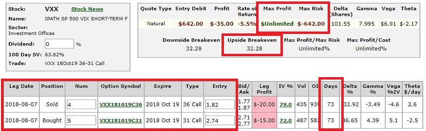 Figure 5 – VXX example trade particulars (Courtesy www.OptionsAnalysis.com)

The maximum risk is $642 if VXX fails to get above the breakeven price of $32.28 by October 19th. On the other hand, if something completely not “obvious” happens and volatility does in fact spike, the trade has significant upside potential.
(NOTE: As always, please remember that this is an “example” of a speculative contrarian trade, and NOT a “recommendation.” If the stock market rallies – as it “obviously” seems to want to do, this trade will likely lose money.)
Jay Kaeppel
Disclaimer: The data presented herein were obtained from various third-party sources. While I believe the data to be reliable, no representation is made as to, and no responsibility, warranty or liability is accepted for the accuracy or completeness of such information. The information, opinions and ideas expressed herein are for informational and educational purposes only and do not constitute and should not be construed as investment advice, an advertisement or offering of investment advisory services, or an offer to sell or a solicitation to buy any security.