Last week I wrote an article purporting to highlight significant levels of support and resistance across a variety of financial markets. Well, it turns out there are more.
More Notes on “Lines”
I certainly look at the markets more from the “technical” side than the “fundamental” side (not even a conscious choice really – I just never really had much success buying things based on fundamentals. That doesn’t mean I think fundamentals are useless or that they don’t “work” – they just didn’t work for me).
Once I settled on the technical side of things, I started reading books about technical analysis. All the classics. I learned about chart patterns and trend lines. By definition, a trend line is a line drawn on a price chart that connects two or more successive lows or highs.
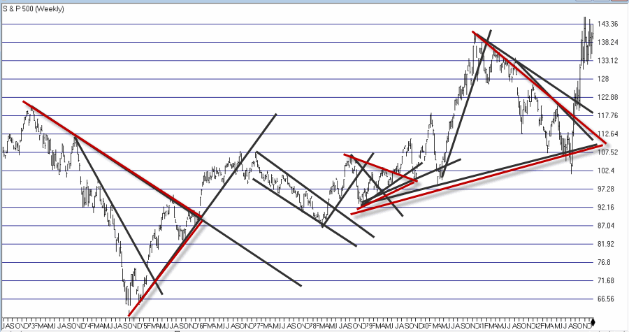
And then I got to work looking through charts and applying everything that I thought I had learned. And like a lot of “newbie” technicians – and a surprising number of seasoned ones – I typically ended up drawing “lines on charts” that would resemble something like what you see in Figure 1.
Figure 1 – “Important” trend lines (or not?) (Courtesy AIQ TradingExpert)
For a technical analyst this is sort of the equivalent of “throwing up” on a chart (and the real pisser was that back in the day a fresh updated booklet of charts would show up in the mail each week – so you had to “throw up’ all over all the charts again and redraw every #$^& “important” line!!).
At some point I realized that perhaps every “important” line that I was drawing on a multitude of charts was perhaps maybe not so “important” after all. This revelation led me to establish the following maxim (as much to force me to “fight the urge” as anything:
Jay’s Trading Maxim #18: If you draw enough lines on a bar chart, price will eventually hit one or more of them.
(See also JayOnTheMarkets.com: The Line(s) in the Sand for Everything)
True Confession Time
There are certain dirty little secrets that no respectable technician should ever utter. But just to “get a little crazy” (OK, at last by my standards – which are quite low, apparently) I’m going to put it down in print:
I hate trend lines
There, I said it. Now for the record, up sloping and down sloping trend lines are a perfectly viable trading tool if used properly. I personally know plenty of people trading successfully using trend lines drawn on a price chart. Sadly, I’m just not one of them.
So remember the lesson I learned the hard way – “There is no defense for user error.”
The full truth is that I have nothing against trend lines, and yes I understand that there are “objective” methods out there detailing the “correct” method for choosing which two points to connect to draw a proper trend line (DeMark, Magee, I think Pring to name a few). But I somehow seem to have failed that lesson.
One Line I Do Like
I still draw slanting trend lines from time to time. But the only lines I really like are lines that are drawn horizontally across a bar chart – i.e., “support” and “resistance” lines. A multiple top or a multiple bottom marks a level where the bulls or the bears made a run and could not break through. Now that’s an “important” price level. If that price level ultimately holds it means the charge failed and that a significant reversal is imminent. If it ultimately fails to hold it means a breakout and a possible new charge to ever further new highs or lows as the case may be (for the record, it could also mean that a false breakout followed by a whipsaw is about to occur. But, hey, that’s the price of admission).
I also like horizontal lines because even if very single horizontal line does not prove to be useful as a trading tool, it can still serve a purpose as a “perspective tool”. Rather than explaining that theory let’s just “go to the charts.”
More “Lines in the Sand”
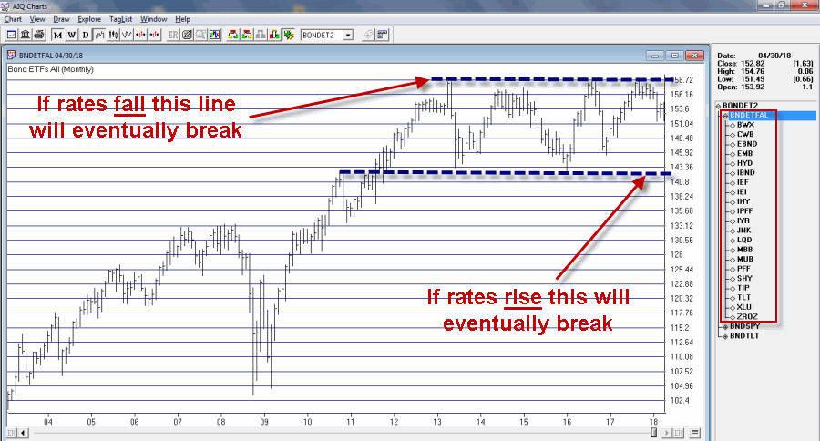
Figure 2 displays an index of bond and income related ETFs that I created. Roughly half of the ETFs have a higher correlation to treasury bonds and the other half to the S&P 500 Index (i.e., CWB – convertible bonds, JNK – high yield corporate, PFF – preferred stock and XLU – utilities all react to interest rates but are more correlated to the stock market than to treasury bonds).
Figure 2 – Bond and Income Related ETF Index (Courtesy AIQ TradingExpert)
This monthly chart clearly illustrates the struggle going on in the interest rate related sector. Interest rates mostly bottomed out in 2013 and have been grinding sideways to higher since. As you can see, interest rate related securities have been trapped in a sort of large trading range for years. Eventually, if the long-term trend in rates turns higher this chart should be expected to break through the lower (support) line Figure 2.
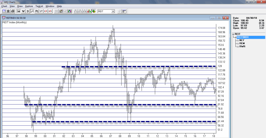
Still focusing on interest rate related sectors, Figure 3 displays a monthly index comprised of 3 REITs. Talk about a market sector trapped in a range.
Figure 3 – REIT Index; Monthly (Courtesy AIQ TradingExpert)
For what it is worth, Figure 4 displays a weekly chart of the same index with an indicator I call Vixfixaverage (code for this indicator appears at the end of the article). Typically, when this indicator exceeds 60 and then tops out, a decent rally often ensues (one word of warning, there is also often some further downside before that rally ensues to caution is in order).
Figure 4 – REIT Index; Weekly (Courtesy AIQ TradingExpert)
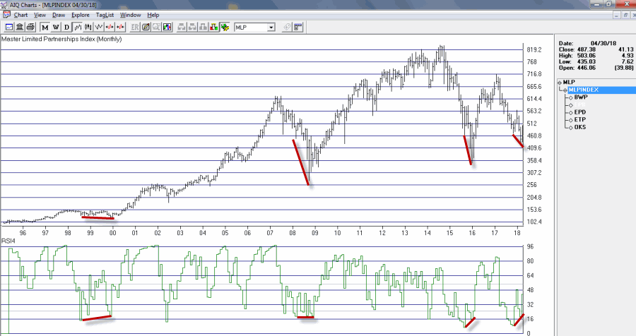
Speaking of oversold “things”, Figure 5 displays an index of Master Limited Partnerships (MLP’s). As you can see in Figure 5, a) divergences between price and the 4-month RSI are often followed by significant rallies, and b) a new such divergence has just been established. Does this mean that MLP’s are destined to rally higher? Not necessarily, but given the information in Figure 5 and the fact that everybody hates MLP’s right now, it’s something to think about.
Figure 5 – MLP Index (Courtesy AIQ TradingExpert)
AIQ TradingExpert Code for Vixfixaverage
hivalclose is hival([close],22).
vixfix is (((hivalclose-[low])/hivalclose)*100)+50.
vixfixaverage is Expavg(vixfix,3).
Jay Kaeppel
Disclaimer: The data presented herein were obtained from various third-party sources. While I believe the data to be reliable, no representation is made as to, and no responsibility, warranty or liability is accepted for the accuracy or completeness of such information. The information, opinions and ideas expressed herein are for informational and educational purposes only and do not constitute and should not be construed as investment advice, an advertisement or offering of investment advisory services, or an offer to sell or a solicitation to buy any security.


