Everybody likes it when an asset that they hold goes up in price. In fact, the more the better. But only to a point as it turns out. When price gets carried away to the upside – we trader types typically refer to it as a “going parabolic”, i.e., a situation when prices are essentially rising straight up – it almost invariably ends very badly. We have seen a couple of examples recently.
Palladium
Palladium is a metal that according to Bloomberg’s “About 85% of palladium ends up in the exhaust systems in cars, where it helps turn toxic pollutants into less-harmful carbon dioxide and water vapor. It is also used in electronics, dentistry, medicine, hydrogen purification, chemical applications, groundwater treatment, and jewelry. Palladium is a key component of fuel cells, which react hydrogen with oxygen to produce electricity, heat, and water.”
And it was pretty hot stuff for some time. At least until it wasn’t. As a proxy we will look at the ETF ticker symbol PALL, which attempts to track the price of palladium.
*From January 2016 into January 2018, PALL rose +139%
*In the next 7 months it declined by -26%
*And then the fun really began – Between August 2018 and February 2020 PALL rose +245%, with a +110% gain occurring in the final 5+ months of the advance
What a time it was. Until it wasn’t anymore.
Since peaking at $273.16 a share on 2/27/2020, PALL plunged -50% in just 12 trading days. To put it another way, it gave back an entire year’s worth of gains in just 12 trading days.
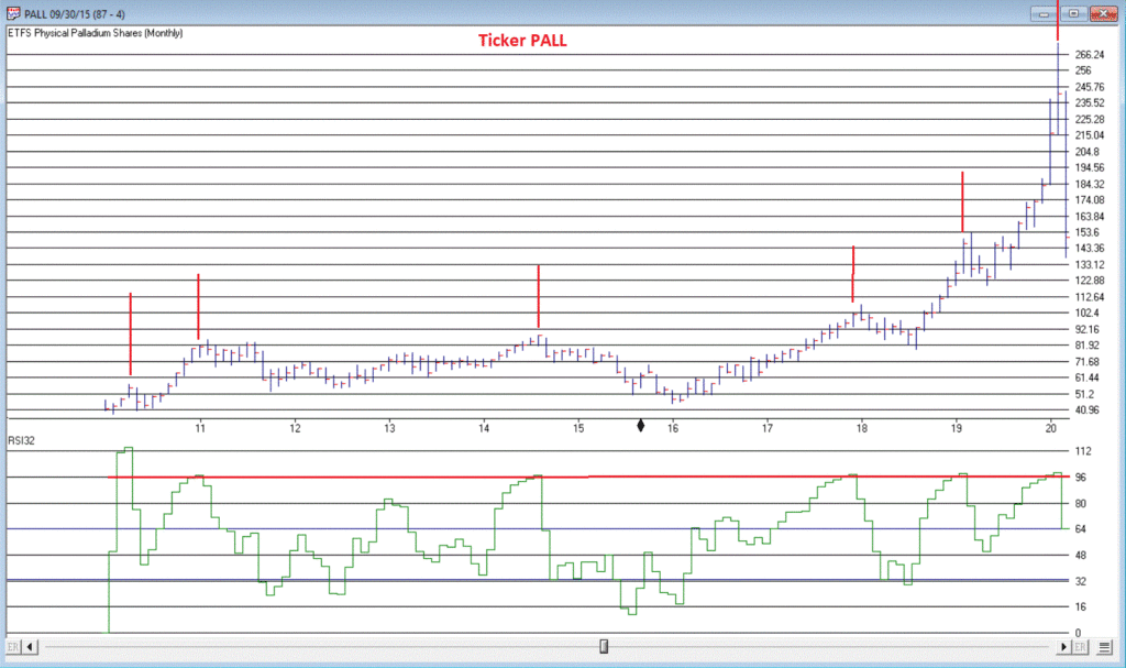
Was there any way to see this coming? Maybe. In Figure 1 we see a monthly chart with an indicator called “RSI32” in the bottom clip. This indicator is derived by taking the 2-month average of the standard 3-month Relative Strength Index (RSI).
Notice that historically when the RSI32 indicator gets above 96, trouble tends to follow pretty quickly. See Figure 2
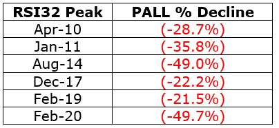
Figure 2 – PALL: Peaks in RSI32 and the subsequent maximum drawdown (Courtesy AIQ TradingExpert)
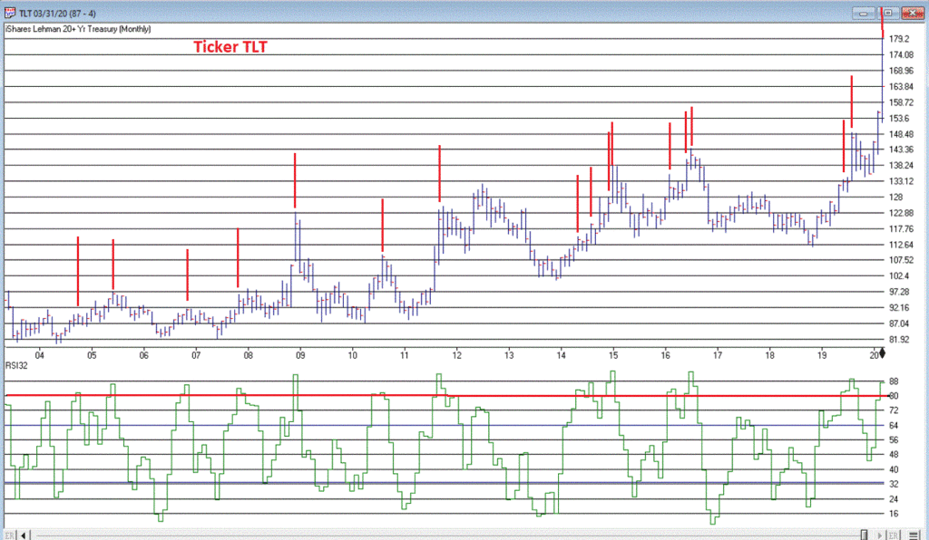
T-Bonds
During the panic sell-off in the stock market in recent weeks, treasury bonds became very popular as a “safe haven” as investors piled out of stocks and into the “safety” of U.S. Treasuries. What too many investors appeared to forget in their haste was that long-term treasury can be extremely volatile (for the record, short and intermediate term treasuries are much less volatile than long-term bonds and are much better suited to act as a safe haven). Likewise – just an opinion – buying a 30-year bond paying 1% per year is not entirely unlike buying a stock index fund when the market P/E Ratio is over 30 – there just isn’t a lot of underlying value there. So you are essentially betting on a continuation of the current trend and NOT on the ultimate realization of the underlying value – because there really isn’t any.
Anyway, Figure 3 displays a monthly chart of ticker TLT – an ETF that tracks the long-term treasury – with the RSI32 indicator in the bottom clip.
Bond price movement is typically not as extreme and volatile as Palladium, so for bonds a RSI32 reading above 80 typically indicates that potential trouble may lie ahead.
As of the close of 3/17/20, TLT was almost -15% off of its high in just 6 trading days. We’ll see where it goes from here.
Tesla (Ticker TSLA)
Anytime you see what is essentially a manufacturing company – no matter how “hot”, “hip”, or “cool” the product they build – go up 200% in 2 months’ time, the proper response is NOT giddy delight. The proper response is:
*If you DO own the stock, either set a trailing stop or take some profits immediately and set a trailing stop for the rest
*If you DO NOT own the stock, DO NOT allow yourself to get sucked in
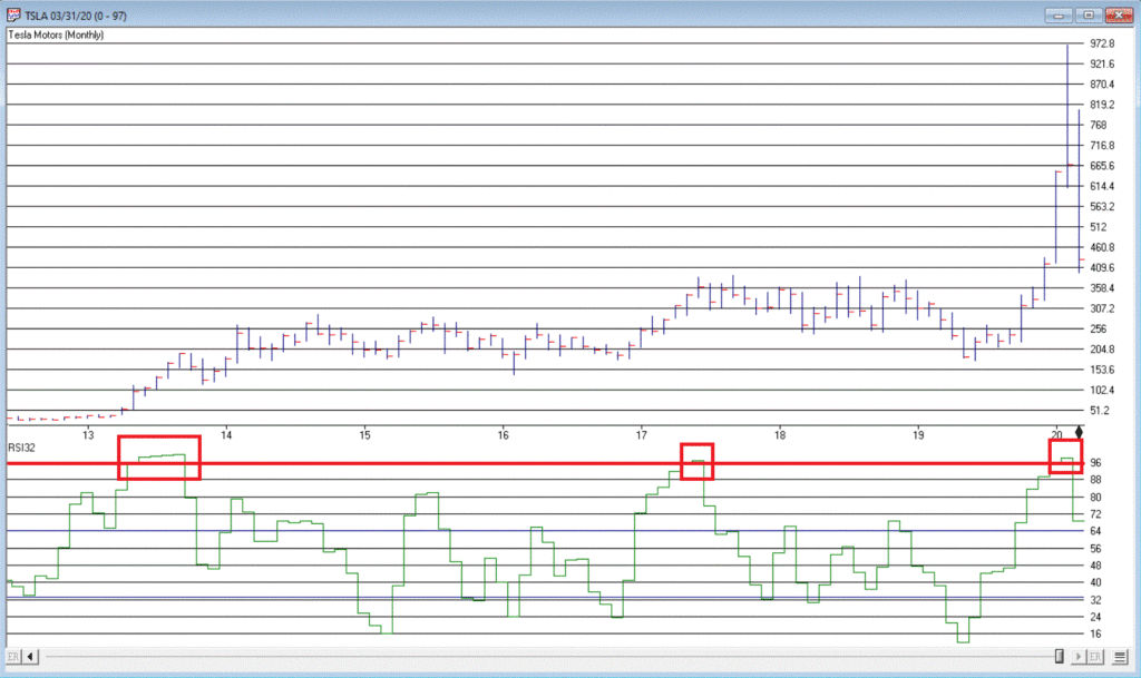
Take TSLA in Figure 4 for instance. By February 2020 TSLA was up almost 200% in 2 months and almost 450% in 8 months. The RSI32 indicator was above 96 – a stark warning sign.
19 trading days after making its closing high, TSLA is down -59%.
Typically, the security in question gives back months – or in some case, years – worth of gains in a shockingly short period of time.
Beware the parabola.
Jay Kaeppel
Disclaimer: The information, opinions and ideas expressed herein are for informational and educational purposes only and are based on research conducted and presented solely by the author. The information presented does not represent the views of the author only and does not constitute a complete description of any investment service. In addition, nothing presented herein should be construed as investment advice, as an advertisement or offering of investment advisory services, or as an offer to sell or a solicitation to buy any security. The data presented herein were obtained from various third-party sources. While the data is believed to be reliable, no representation is made as to, and no responsibility, warranty or liability is accepted for the accuracy or completeness of such information. International investments are subject to additional risks such as currency fluctuations, political instability and the potential for illiquid markets. Past performance is no guarantee of future results. There is risk of loss in all trading. Back tested performance does not represent actual performance and should not be interpreted as an indication of such performance. Also, back tested performance results have certain inherent limitations and differs from actual performance because it is achieved with the benefit of hindsight.
Over the last month the stock market has had one of its worst declines over the shortest periods of time in history. Not even did the 2008 declines beat the velocity of the declines we saw over the last month. In 2 days the NASDAQ fell over almost 11% because of the rightfully so, Corona Virus and its potential to not only kill people but mainly do disrupt the business process of selling and the supply lines to get product. Two things I do want to say is
1. You don’t base your long term financial goals based on a short term flu. 5 years from now this will be just another flu we had. People will have forgotten about it.
2. Over the last two months I have be saying to take profits as we were overvalued, I was getting Cautious with the Rising Wedge pattern and thought the S&P 500 would go to the 3280-3380 and top out. The S&P 500 topped at 3386 and fell through the trend lines to the 2900 area, down 13% from the 3380 level. As of this point I am still very Cautious, but looking for a bottom soon over the next 2 months.
This is why I do technical analysis. People can say that the Corona Virus did it, and it did contribute, but the market was positioning itself for a fall. I think the market will continue to be volatile and potentially fall more. With the outbreak just beginning the USA, the S&P should test the 2855 level it hit a week ago and either bounce from there but I feel it will probably break down below that and hit the 2600 to the 2750 level. There have only been less than 500 people who have gotten the tests. Once the US government opens the tests up to many more people there should be many many more people who have the virus. This will scare people to stop going out at restaurants, coffee shops, theatres, cruise ships, travel and more. It will take out a percentage out of the Gross Domestic Product, (GDP). It will probably cause the markets to fall another 5 to 10%+, but it will not kill Capitalism. It should only be a short term. Remember, if this is a flu where less than 1% of the people who contract it dies, then who are dying? The elderly and the sick who have immune problems. So protect yourself. Get the N95 masks on Amazon, get myricetin as a supplement people are recommending to build up your immune system. Talk to your doctor first. Call me to rearrange your portfolios with me and your 401(k). Remember too, this will pass, but I think we have more on the downside.
This is what’s happened over the last 20 years:
2000 Y2k is going to kill us all.
2001 Anthrax is going to kill us all.
2002 West Nile Virus is going to kill us all.
2003 SARS is going to kill us all.
2005 The Bird Flu is going to kill us all. 2008 The Great Recession is going to kill us all.
2010 BP Oil is going to kill us all.
2012 The Mayan Calendar is going to kill us all.
2013 North Korea is going to kill us all.
2014 Ebola is going to kill us all.
2015 Disney Measles and ISIS is going to kill us all.
2016 Zika virus is going to kill us all.
2020 Corona Virus is going to kill us all.
Now granted this is worse because it is a pandemic and it is worse than most of the others, not in life as we lose 30-60 thousand every year to the regular flu, but there is no vaccine yet, and it is creating FEAR. But mostly the FEAR is stopping people from spending money, this will cause the markets to fall. So FEAR is killing you. Protect yourself. Be smart. Use FEAR in the markets as an advantage. Over the last few months, go to the old Bartometers, I have been saying to take profits, the markets are too overbought, that we had a Rising Wedge formation that is a reversal pattern and I thought we could go down. Well now that that has happened, is the market a BUY yet? No, because I feel it will go down more, but it may bottom over the next month or two.
There may be buying opportunities that only come once every 10 years or so. With no guarantees, if the market goes below the 2855 level down to the 2600 level to the 2750 level you may want to call me for potential buying opportunities. Remember what Warren Buffet says, “ Buy when there is BLOOD in the STREETS” That’s when most make money over the long term, When Florida houses were plummeting in the 2008 recession, were there great BUYS? In the great recession, did stocks go so low that if you bought in early 2009 did you get unbelievable deals on stocks and funds? Yes… You make money in the bull markets by buying in the BEAR MARKETS. I am not saying to buy now but get your GREED hats on. You all need to contact me to discuss strategy now. Remember, can we go down more? YES and probably will. Can we go into a Recession because of this situation? Maybe and most likely, economists are giving it a 50-50% chance. Should you reduce equities more, possibly depending on your situation and how close you are to retirement? Last month I said to take money off the table because the markets were too high. Now it’s more of a shift between funds and change some of the bonds as if Oil keeps falling, you don’t want to have much in the High Yield Bond sector or Floating rate bond area. I am concerned, however, about the corporations continue to buy back their own shares while they are issuing debt to do it. This buying back of stock is building the asset bubble. This is one concern I have in addition Corona Virus.
An excerpt from Fundamental Economist Dr. Robert Genetski: from Classical Principles.com: Stock Market Volatile as the Virus Gains
Investors switched from euphoria to fear and back several times this past week. When the dust settled, the Nasdaq, Nasdaq 100 and S&P 500 rose 1%-3% while small cap stocks fell 1%-2%.
The reason I recommend caution is related to the expectation of a sharp increase in the virus in the US. The US conducted only 473 tests through March 1. The number of tests will increase dramatically in the period ahead. More testing means more confirmed cases. The latest figures for the US show 226 cases.
Outside the US infections are growing at a rate of 20% a day. The rate of increase has slowed in Korea, but has increased dramatically in Italy and throughout Europe.
There is some good news. The daily rate of increase in China has slowed to less than 0.2% for the four days ending March 5th. Flexport, a global freight logistics company, reports that 60% of China’s manufacturing capacity is now back on line. Since US companies depend on China for critical supplies and medicines, the threat of shortages should soon be less pressing. There was more good news this past week as surveys of business activity show the US economy remained remarkably strong in February. While various international companies are suffering greatly, recent indications show the US is weathering the storm well, at least through February. Amid the uncertainty over the spread of the virus in the US, it continues to make sense to be cautious about owning stocks.
Returns in 2020 Some of the INDEXES of the markets both equities and interest rates are below. The source is Morningstar.com up until March 7, 2020. These are passive indexes.
*Dow Jones -8.9% S&P 500 -8.2% NASDAQ Aggressive growth -4.4% I Shares Russell 2000 ETF (IWM) Small cap -12.84% Midcap stock funds -12.54% International Index (MSCI – EAFE ex USA -10.4% Moderate Mutual Fund Investment Grade Bonds (AAA) Long duration -4.70% High Yield Merrill Lynch High Yield Index -3.7%
Floating Rate Bond Funds -2.4% Short Term Bond +1.3% Fixed Bond Yields (10 year) .76% Yield
The average Moderate Fund is down -4.70% this year fully invested as a 65% in stocks and 35% in bonds and nothing in the money market.
Interest rates look stable going forward over the next 6 months
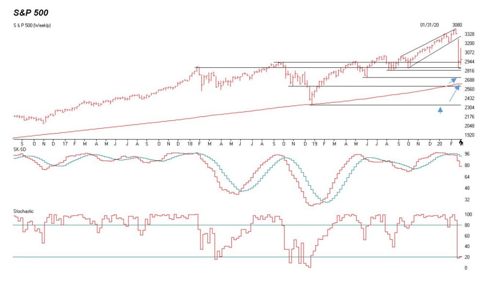
The S&P 500 is above. I used a weekly chart as I think the S&P will fall below 2855 and possibly hit the following support levels for support. 2822, 2721-2747, 2600-2630, and 2340.
These are points that investors are looking at as a support levels. I think we have more to go on the downside. The Blue arrows are areas that listed to the left I think the S&P can go too.
The middle graph is the SK-SD stochastics. This shows a breakdown, Last month I said anything over the 88 level is overbought. It’s 21 to 48 on the Daily, now it’s getting OVERSOLD but can go down more.
The third graph is the Stochastics chart. Anything below 20 is showing the market is very oversold. But can still trend lower.
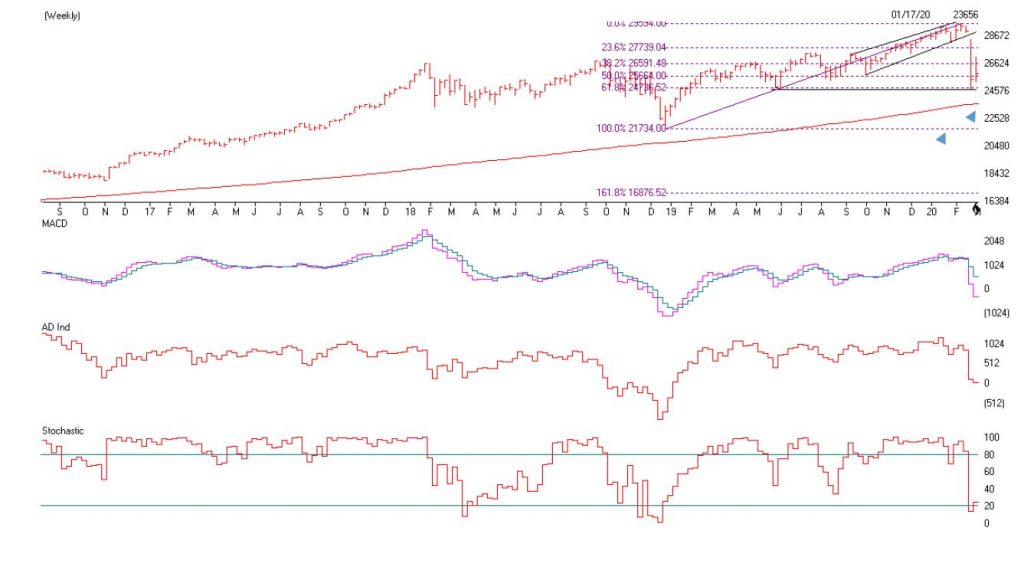
The Dow Jones is above. I drew the last three years and notice the that the 23576 is support right at the red line , but I believe the low will breakdown as it could test and breakdown and test its 200 week moving average at 23,587. If that doesn’t hold then the old lows of 21,734 are next.
This could be the capitulation investors are looking at to starting getting back into the markets. If this happens then there is a much greater chance that a Recession will occur. Please call me to Strategize your portfolio at 860-940-7020.
Support levels on the S&P 500 area are 2822, 2721-2747, 2600-2630 and 2340. These might be accumulation areas if you are a Long term investor. Support levels on the NASDAQ are 7658 to 7715, 7303, and 6861. On the Dow Jones support is at 23,587 (200 week moving average), 21,734, 19,794 and 17,863 These may be safer areas to get into the equity markets on support levels slowly.
THE BOTTOM LINE: Now that the markets have broken down the trend line I explained last month. I am more Cautious on the markets. The Corona Flu will scare people and they will pull in their horns towards traveling, going out and this act alone can cause a Recession. The market is starting to become somewhat oversold but I still would no Buy here, but wait until the Corona Virus Fear is nearing the worst it could get. That could be over the next 2 months or so. I think the S&P 500 and the markets could continue to fall as energy is also going down.
Best to all of you,
Joe Bartosiewicz, CFP® Investment Advisor Representative Contact information:
5 Colby Way Avon, CT 06001 860-940-7020 or 860-404-0408
SECURITIES AND ADVISORY SERVICES OFFERED THROUGH SAGE POINT FINANCIAL INC., MEMBER FINRA/SIPC, AND SEC-REGISTERED INVESTMENT ADVISOR.
Charts provided by AIQ Systems: Technical Analysis is based on a study of historical price movements and past trend patterns. There is no assurance that these market changes or trends can or will be duplicated shortly. It logically follows that historical precedent does not guarantee future results. Conclusions expressed in the Technical Analysis section are personal opinions: and may not be construed as recommendations to buy or sell anything.
Disclaimer: The views expressed are not necessarily the view of Sage Point Financial, Inc. and should not be interpreted directly or indirectly as an offer to buy or sell any securities mentioned herein. Securities and Advisory services offered through Sage Point Financial Inc., Member FINRA/SIPC, an SEC-registered investment advisor.
Past performance cannot guarantee future results. Investing involves risk, including the potential loss of principal. No investment strategy can guarantee a profit or protect against loss in periods of declining values. Please note that individual situations can vary. Therefore, the information presented in this letter should only be relied upon when coordinated with individual professional advice. *There is no guarantee that a diversified portfolio will outperform a non-diversified portfolio in any given market environment. No investment strategy, such as asset allocation, can guarantee a profit or protect against loss in periods of declining values.
It is our goal to help investors by identifying changing market conditions. However, investors should be aware that no investment advisor can accurately predict all of the changes that may occur in the market.
The price of commodities is subject to substantial price fluctuations of short periods and may be affected by unpredictable international monetary and political policies. The market for commodities is widely unregulated, and concentrated investing may lead to Sector investing may involve a greater degree of risk than investments with broader diversification.
Indexes cannot be invested indirectly, are unmanaged, and do not incur management fees, costs, and expenses.
Dow Jones Industrial Average: A weighted price average of 30 significant stocks traded on the New York Stock Exchange and the NASDAQ.
S&P 500: The S&P 500 is an unmanaged indexed comprised of 500 widely held securities considered to be representative of the stock market in general.
NASDAQ: the NASDAQ Composite Index is an unmanaged, market-weighted index of all over the counter common stocks traded on the National Association of Securities Dealers Automated Quotation System
(IWM) I Shares Russell 2000 ETF: Which tracks the Russell 2000 index: which measures the performance of the small capitalization sector of the U.S. equity market.
A Moderate Mutual Fund risk mutual has approximately 50-70% of its portfolio in different equities, from growth, income stocks, international and emerging markets stocks to 30-50% of its portfolio in different categories of bonds and cash. It seeks capital appreciation with a low to moderate level of current income.
The Merrill Lynch High Yield Master Index: A broad-based measure of the performance of non-investment grade US Bonds
MSCI EAFE: the MSCI EAFE Index (Morgan Stanley Capital International Europe, Australia, and Far East Index) is a widely recognized benchmark of non-US markets. It is an unmanaged index composed of a sample of companies’ representative of the market structure of 20 European and Pacific Basin countries and includes reinvestment of all dividends.
Investment grade bond index: The S&P 500 Investment-grade corporate bond index, a sub-index of the S&P 500 Bond Index, seeks to measure the performance of the US corporate debt issued by constituents in the S&P 500 with an investment-grade rating. The S&P 500 Bond index is designed to be a corporate-bond counterpart to the S&P 500, which is widely regarded as the best single gauge of large-cap US equities.
Floating Rate Bond Index is a rule-based, market-value weighted index engineered to measure the performance and characteristics of floating-rate coupon U.S. Treasuries, which have a maturity greater than 12 months.
Money Flow; The Money Flow Index (MFI) is a momentum indicator that measures the flow of money into and out of a security over a specified period. It is related to the Relative Strength Index (RSI) but incorporates volume, whereas the RSI only considers
SK-SD Stochastics. When an oversold stochastic moves up through its MA, a buy signal is produced. Furthermore, Lane recommends that the stochastic line be smoothed twice with three-period simple moving averages: SK is the three-period simple moving average of K, and SD is the three-period simple moving average of SK
Rising Wedge; A rising wedge is a technical indicator, suggesting a reversal pattern frequently seen in bear markets. This pattern shows up in charts when the price moves upward with pivot highs and lows converging toward a single point known as the apex
To put this piece in context please refer to Part I here.
Part I detailed the Good News (the stock market is still very much in a bullish trend and may very well continue to be for some time) and touched on one piece of Bad News (the market is overvalued on a long-term valuation basis).
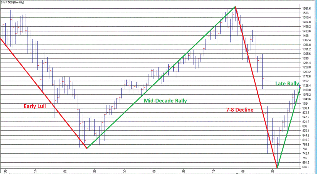
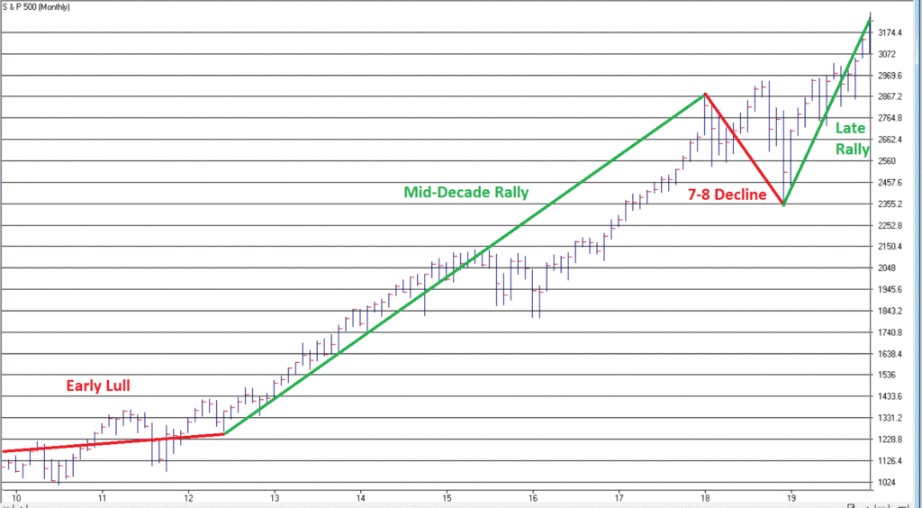
The Next Piece of Bad News: The “Early Lull”
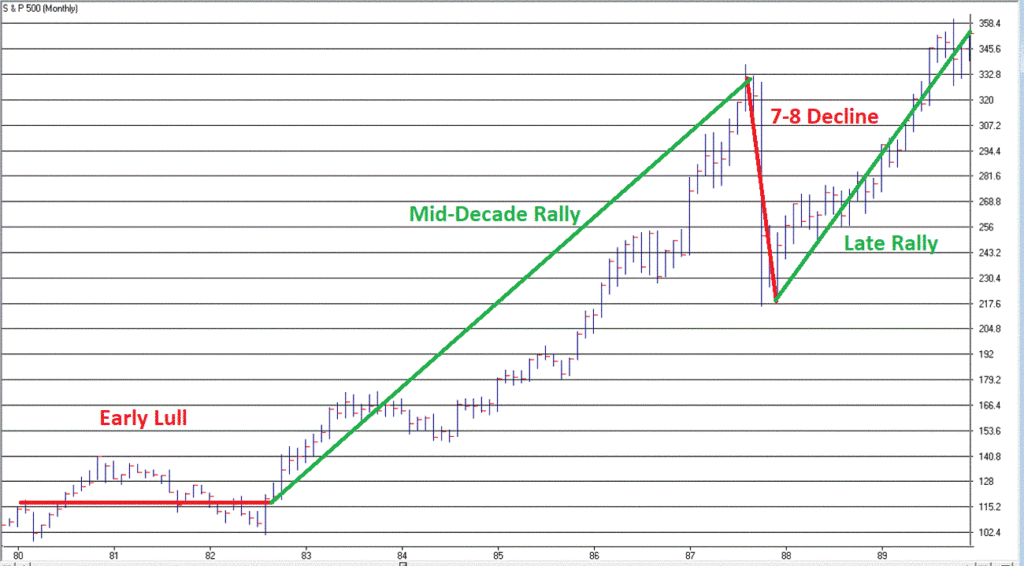
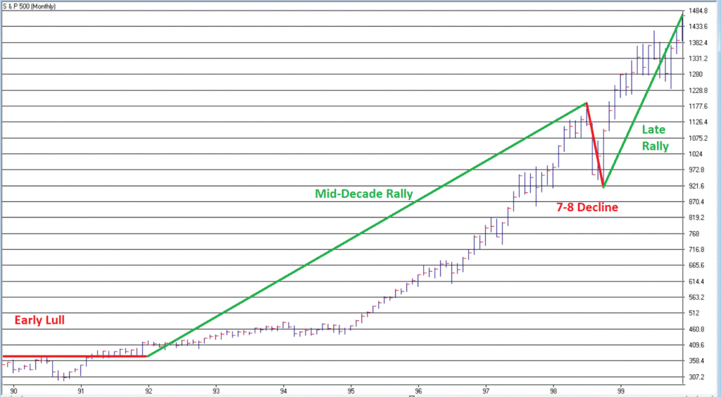
In my book, Seasonal Stock Market Trends, I wrote about something called the Decennial Pattern, that highlights the action of the stock market in a “typical” decade.
The Four Parts of the “Typical Decade” are:
The Early Lull: Market often struggles in first 2.5 years of a decade
The Mid-Decade Rally: Market typically rallies in the middle of a decade – particularly between Oct 1 Year “4” and Mar 31 Year “6”
The 7-8 Decline: Market often experiences a sharp decline somewhere in the Year “7” to Year “8” period
The Late Rally: Market often rallies strongly into the end of the decade.
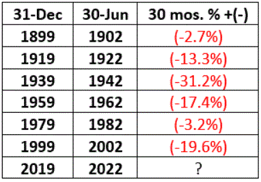
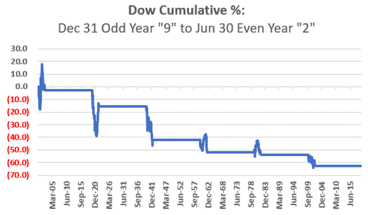
We are now in the “Early Lull” period. This in no way “guarantees” trouble in the stock market in the next two years. But it does offer a strong “suggestion”, particularly when we focus only on decades since 1900 that started with an Election Year (which is where we are now) – 1900, 1920, 1940, 1960, 1980, 2000.
As you can see in Figures 5 and 6, each of these 6 2.5-year decade opening periods witnessed a market decline – -14% on average and -63% cumulative. Once again, no guarantee that 2020 into mid 2022 will show weakness, but….. the warning sign is there
Figure 5 – Dow price performance first 2.5 years of decades that open with a Presidential Election Year (1900-present)
Figure 6 – Cumulative Dow price performance first 2.5 years of decades that open with a Presidential Election Year (1900-present)
Summary
Repeating now: the trend of the stock market is presently “Up”.
Therefore:
*The most prudent thing to do today is to avoid all of the “news generated” worry and angst and enjoy the trend.
*The second most prudent thing to do is to acknowledge that this up trend will NOT last forever, and to prepare – at least mentally – for what you will do when that eventuality transpires, i.e., take a moment to locate the nearest exit.
Stay tuned for Part III
Jay Kaeppel
Disclaimer: The information, opinions and ideas expressed herein are for informational and educational purposes only and are based on research conducted and presented solely by the author. The information presented does not represent the views of the author only and does not constitute a complete description of any investment service. In addition, nothing presented herein should be construed as investment advice, as an advertisement or offering of investment advisory services, or as an offer to sell or a solicitation to buy any security. The data presented herein were obtained from various third-party sources. While the data is believed to be reliable, no representation is made as to, and no responsibility, warranty or liability is accepted for the accuracy or completeness of such information. International investments are subject to additional risks such as currency fluctuations, political instability and the potential for illiquid markets. Past performance is no guarantee of future results. There is risk of loss in all trading. Back tested performance does not represent actual performance and should not be interpreted as an indication of such performance. Also, back tested performance results have certain inherent limitations and differs from actual performance because it is achieved with the benefit of hindsight.
Well that sounds like a pretty alarming headline, doesn’t it? But before you actually take a moment to locate the nearest exit please note the important difference between the words “Please locate the nearest exit” and “Oh My God, it’s the top, sell everything!!!”
You see the difference, right? Good. Let’s continue. First, a true confession – I am not all that great at “market timing”, i.e., consistently buying at the bottom and/or selling at the top (I console myself with the knowledge that neither is anyone else). On the other hand, I am reasonably good at identifying trends and at recognizing risk. Fortunately, as it turns out, this can be a pretty useful skill.
So, while I may not be good at market timing, I can still make certain reasonable predictions. Like for example, “at some point this bull market will run out of steam and now is as good a time as any to start making plans about how one will deal with this inevitable eventuality – whenever it may come”. (Again, please notice the crucial difference between that sentence and “Oh My God, it’s the top, sell everything!!”)
First the Good News
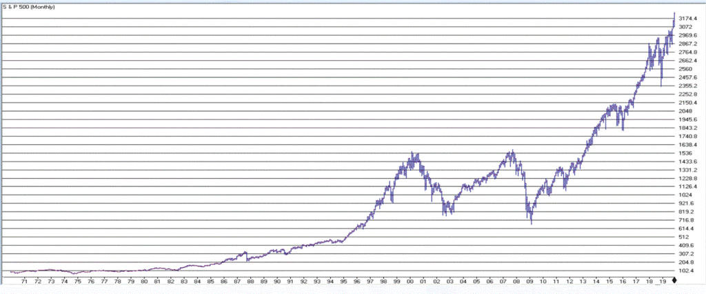
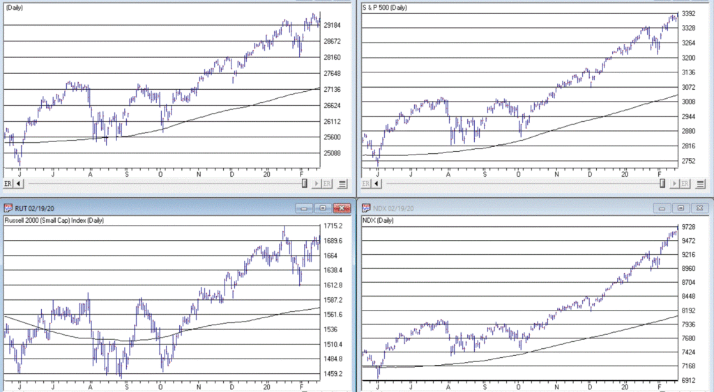
The trend in the stock market is bullish. Duh. Is anyone surprised by that statement? Again, we are talking subtleties here. We are not talking about predictions, forecasts, projected scenarios, implications of current action for the future, etc. We are just talking about pure trend-following and looking at the market as it is today. Figure 1 displays the S&P 500 Index monthly since 1971 and Figure 2 displays four major indexes (Dow, S&P 500, Nasdaq 100, Russell 2000) versus their respective 200-day moving averages.
Figure 2 – Dow, S&P 500, Nasdaq 100, Russell 2000 w respective 200-day moving average (Courtesy AIQ TradingExpert)
It is impossible to look at the current status of “things” displayed in Figures 1 and 2 and state “we are in a bear market”. The trend – at the moment – is “Up”. The truth is that in the long run many investors would benefit from ignoring all of the day to day “predictions, forecasts, projected scenarios, implications of current action for the future, etc.” that emanates from financial news and just sticking to the rudimentary analysis just applied to Figures 1 and 2.
In short, stop worrying and learn to love the trend. Still, no trend lasts forever, which is kind of the point of this article.
So now let’s talk about the “Bad News”. But before we do, I want to point out the following: the time to actually worry and/or do something regarding the Bad News will be when the price action in Figure 2 changes for the worse. Let me spell it out as clearly and as realistically as possible.
If (or should I say when?) the major U.S. stock indexes break below their respective 200-day moving averages (and especially if those moving average start to roll over and trend down):
*It could be a whipsaw that will be followed by another rally (sorry folks, but for the record I did mention that I am not that good at market timing and that I was going to speak as realistically as possible – and a whipsaw is always a realistic possibility when it comes to trend-following)
*It could be the beginning of a significant decline in the stock market (think -30% or possibly even much more)
So, the proper response to reading the impending discussion of the Bad News is not “I should do something”. The proper response is “I need to resolve myself to doing something when the time comes that something truly needs to be done.”
You see the difference, right? Good. Let’s continue.
The Bad News
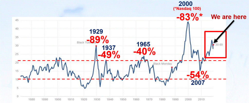
The first piece of Bad News is that stocks are overvalued. Now that fact hardly scares anybody anymore – which actually is understandable since the stock market has technically been overvalued for some time now AND has not been officially “undervalued” since the early 1980’s. Also, valuation is NOT a timing tool, only a perspective tool. So high valuation levels a re pretty easy to ignore at this point.
Still, here is some “perspective” to consider:
*Recession => Economic equivalent of jumping out the window
*P/E Ratio => What floor you are on at the time you jump
Therefore:
*A high P/E ratio DOES NOT tell you WHEN a bear market will occur
*A high P/E ratio DOES WARN you that when the next bear market does occur it will be one of the painful kind (i.e., don’t say you were not warned)
Figure 3 displays the Shiller P/E Ratio plus (in red numbers) the magnitude of the bear market that followed important peaks in the Shiller P/E Ratio.
Repeating now: Figure 3 does not tell us that a bear market is imminent. It does however, strongly suggest that whenever the next bear market does unfold, it will be, ahem, significant in nature. To drive this point home, a brief history:
1929: P/E peak followed by -89% Dow decline in 3 years
1937: P/E peak followed by -49% Dow decline in 7 months(!?)
1965: P/E peak followed by 17 years of sideways price action with a -40% Dow decline along the way
2000: P/E peak followed by -83% Nasdaq 100 decline in 2 years
2007: P/E peak followed by -54% Dow decline in 17 months
Following next peak: ??
As you can see, history suggests that the next bear market – whenever it may come – will quite likely be severe. There is actually another associated problem to consider. Drawdowns are one thing – some investors are resolved to never try to time anything and are thus resigned to the fact that they will have to “ride ‘em out” once in awhile. OK fine – strap yourself in and, um, enjoy the ride. But another problem associated with high valuation levels is the potential (likelihood?) for going an exceedingly long period of time without making any money at all. Most investors have pretty much forgotten – or have never experienced – what this is like.
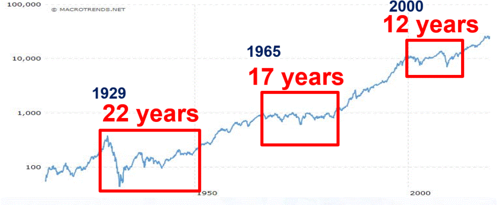
Figure 4 displays three such historical periods – the first associated with the 1929 peak, the second with the 1965 peak and the third with the 2000 peak.
Figure 4 – Long sideways periods often follow high P/E ratios
*From 1927 to 1949: the stock market went sideways for 22 years. Some random guy in 1947 – “Hey Honey, remember that money we put to work in the stock market back in 1927? Great News! We’re back to breakeven! (I can’t speak for anyone else, but personally I would prefer to avoid having THAT conversation.)
*From 1965 to 1982: the stock market went sideways. While this is technically a 0% return over 17 years (with drawdows of -20%, -30% and -40% interspersed along the way – just to make it less boring), it was actually worse than that. Because of high inflation during this period, purchasing power declined a fairly shocking -75%. So that money you “put to work” in that S&P 500 Index fund in 1965, 17 years later had only 25% as much purchasing power (but hey, this couldn’t possibly happen again, right!?).
*From 2000 to 2012: the stock market went sideways. With the market presently at much higher all-time highs most investors have forgotten all about this. Still, it is interesting to note that from 8/31/2000 through 1/31/2020 (19 years and 5 months), the average annual compounded total return for the Vanguard S&P 500 Index fund (ticker VFINX) was just +5.75%. Not exactly a stellar rate of return for almost 20 years of a “ride ’em out” in an S&P 500 Index fund approach).
The Point: When valuations are high, future long-term returns tend to be subpar – and YES, valuations are currently high.
You have been warned.
Stay tuned for Part II…
Jay Kaeppel
Disclaimer: The information, opinions and ideas expressed herein are for informational and educational purposes only and are based on research conducted and presented solely by the author. The information presented does not represent the views of the author only and does not constitute a complete description of any investment service. In addition, nothing presented herein should be construed as investment advice, as an advertisement or offering of investment advisory services, or as an offer to sell or a solicitation to buy any security. The data presented herein were obtained from various third-party sources. While the data is believed to be reliable, no representation is made as to, and no responsibility, warranty or liability is accepted for the accuracy or completeness of such information. International investments are subject to additional risks such as currency fluctuations, political instability and the potential for illiquid markets. Past performance is no guarantee of future results. There is risk of loss in all trading. Back tested performance does not represent actual performance and should not be interpreted as an indication of such performance. Also, back tested performance results have certain inherent limitations and differs from actual performance because it is achieved with the benefit of hindsight.
Last year was an excellent year for the markets in general, with the markets appreciating 19-38%, depending on the indexes. One of the best sectors was the large growth sector with stocks like Apple Computer going up 88% and Microsoft up 56% over the last year. That is why the NASDAQ went up 38% This year; the market is doing the same thing with Apple +5%, Microsoft +3%, Alphabet +6%, Facebook +6%, and Amazon +3%.
When stocks are so large, and they go up a significant amount, they skew the market averages and make people think the markets are doing very well when in fact, the small and midcap stock indexes are down .5% -1.6%.
The participation of this current rally is VERY NARROW, meaning just a small number of large stocks are pushing this market higher and when the markets are climbing on only a few stocks then either the small and midcap stocks have to catch up or the large growth and technology stocks have to fade.
On my December Bartometer, I thought the market would rally towards the rest of the year and I thought the FIRST level of resistance would be 3280 on the S&P 500. Friday, the S&P 500 hit 3281 intraday high and closed at 3265. Even though I am still Bullish longer term, I think the markets require some healthy pullback… Going up without a correction is not suitable for the markets especially when people are now throwing money at the market. It’s called FOMO, or the Fear of Missing Out. This sort of panic to throw money at the index funds shows me that psychologically people think the markets will continue to rise. That scares me a little.
The rise might continue and I am still relatively bullish as I think the S&P could hit 3400 later in the year, but I am worried that one of the only sectors that are moving is the large-cap technology sector. At this point, if you are in or nearing retirement and have more than 65% of your money in equities, you may want to scale back your equity exposure to below that amount. Remember the old saying; you don’t make it until you take it.
An excerpt from Fundamental Economist Dr. Robert Genetski: from Classical Principles.com:
Another week of good news and another week of record-high prices for the major stock indexes. Technology remains the most robust sector with both the Nasdaq and Nasdaq 100 gaining more than a percent. The S&P500 and Dow were up ½%. Small caps continue to languish.
Trump’s strategy in dealing with Iran increases the odds of his reelection. Iran looks even less competent for failing to protect Soleimani, having more than 50 people trampled to death at his funeral, and then possibly shooting down their civilian airplane.
With central banks around the world, creating liquidity, any correction in the bull market should be limited. Stay bullish on stocks.
Some of the INDEXES of the markets both equities and interest rates are below.
The source is Morningstar.com up until January 10th, 2020.
Dow Jones +1.1% S&P 500 +1.2% NASDAQ Aggressive growth +2.7% I Shares Russell 2000 ETF (IWM) Small cap – .47 of 1% Midcap stock funds -.48 of 1% International Index (MSCI – EAFE ex USA 1.0% Moderate Mutual Fund Investment Grade Bonds (AAA) Long duration +.56 of 1% High Yield Merrill Lynch High Yield Index +.46 of 1% Short Term Bond +.22 of 1% Fixed Bond Yields (10 year) +1.8.% Yield The average Moderate Fund is up .62 of 1% this year fully invested as a 65% in stocks and 35% in bonds and nothing in the money market.
Interest rates look stable going forward over the next 6 months
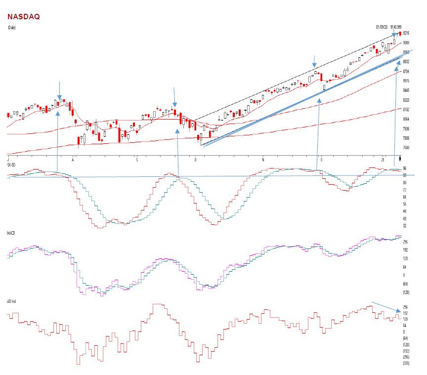
The Dow Jones Average is above. This index for the 5 largest stocks are Boeing, Apple, United healthcare, Goldman Sachs and Home Depot. They are the mix of American industry, but only contain 30 stocks. Even though the Dow is rising,
Look to the 3 graphs below the chart. You will see the horizontal blue line. When that is over 88 as it is, it shows that the market is OVERBOUGHT. Then when the green line falls below the green line you see the market selling off. It is there again, so be careful. The second graph shows Money flow/ Volume Accumulation. When this goes negative like it is below zero or the horizontal line, it shows that there is some distribution or selling pressure.
The last graph shows the Advance decline line. This is the number of stocks going up compared to the number of stocks going down on a running total. As you can see the Dow Jones is going up, but the Advance/decline is going DOWN. This means only a few stocks are going up. If this doesn’t change, the market could be ready for a little decline There is trend-line support at 28400 if it drops there. But unless the indicators change for the better, the market may fall and correct somewhat.
The NASDAQ is above. As you can see the NASDAQ is going up and is at the upper part of channel with-overbought and oversold indicators like the SK-SD stochastic indicators (the first graph) are very overbought. When the horizontal blue line is above 88 where the indicators are currently the market is overbought. Many times, when this indicator is above 88 you will see some sort of a correction or a give back.
See the last three times this indicator hit this level and crossed below it, the market fell. The NASDAQ can fall to the 8900 level where the bold trend line is above and still be bullish. It’s when we break that dark blue trend-line, then I will get very Cautious. Right now, the NASDAQ is overbought, and there are only a few stocks pushing this market higher. The third graph is the Advance decline Line. Notice, as the NASDAQ is going higher, it is going higher on a few stocks, that is why the Advance Decline Line is falling.
What is the Advance-Decline Line?
The advance/decline line (A/D) is a technical indicator that plots the difference between the number of advancing and declining stocks daily. The indicator is cumulative, with a positive number being added to the prior number, or if the number is negative, it is subtracted from the prior number.
The A/D line is used to show market sentiment, as it tells traders whether more stocks are rising or falling. It is used to confirm price trends in major indexes, and can also warn of reversals when divergence occurs.
The on-balance volume (OBV) is a technical analysis indicator intended to relate price and volume in the stock market. OBV is based on a cumulative total volume.[1] Money flow is calculated by averaging the high, low and closing prices, and multiplying by the daily volume. Comparing that result with the number for the previous day tells traders whether money flow was positive or negative for the current day. Positive money flow indicates that prices are likely to move higher, while negative money flow suggests prices are about to fall.
Source: Investopedia
A Support or support level is the level at which buyers tend to purchase or into a stock or index. It refers to the stock share price that a company or index should hold and start to rise. When the price of the stock falls towards its support level, the support level holds and is confirmed, or the stock continues to decline, and the support level must change.
Support levels on the S&P 500 area are 3248, 3217 area MAJOR Trend line support, 3182, 3119, and 3088. These might be BUY areas.
Support levels on the NASDAQ are 8900, 8655, and 8474.
On the Dow Jones support is at 28,420, 28245, 26093 (200-day moving average) and 27764
These may be safer areas to get into the equity markets on support levels slowly.
RESISTANCE LEVEL ON THE S&P 500 3280.
THE BOTTOM LINE:
The market is somewhat overbought and at FAIR VALUE. There are now some cracks in the dam showing as explained above, but my computer systems are still at a Hold for the market direction. I expected the S&P to hit 3280, it did last week and sold off very quickly to the 2165 area. The markets are rallying on large-cap growth and technology stocks and watching the other smaller to midcap companies decline. Either we start to see the small and midcap stocks begin to rally, or the market could begin to decline. The S&P could hit 3280 to 3400 later in the year. Earnings could potentially grow 6 to 7% or more this year and that is why there is the possibility that the S&P 500 could reach 3280 to 3400+ in 2020, a much smaller rise in the stock market than in 2019 but hopefully, a decent return, with obviously no guarantees expressed or implied.
Best to all of you,
Joe Bartosiewicz, CFP® Investment Advisor Representative 5 Colby Way Avon, CT 06001 860-940-7020 or 860-404-0408
SECURITIES AND ADVISORY SERVICES OFFERED THROUGH SAGE POINT FINANCIAL INC., MEMBER FINRA/SIPC, AND SEC-REGISTERED INVESTMENT ADVISOR.
Charts provided by AIQ Systems:
Technical Analysis is based on a study of historical price movements and past trend patterns. There is no assurance that these market changes or trends can or will be duplicated shortly. It logically follows that historical precedent does not guarantee future results. Conclusions expressed in the Technical Analysis section are personal opinions: and may not be construed as recommendations to buy or sell anything.
Disclaimer:
The views expressed are not necessarily the view of Sage Point Financial, Inc. and should not be interpreted directly or indirectly as an offer to buy or sell any securities mentioned herein. Securities and Advisory services offered through Sage Point Financial Inc., Member FINRA/SIPC, an SEC-registered investment advisor.
Past performance cannot guarantee future results. Investing involves risk, including the potential loss of principal. No investment strategy can guarantee a profit or protect against loss in periods of declining values. Please note that individual situations can vary. Therefore, the information presented in this letter should only be relied upon when coordinated with individual professional advice. *There is no guarantee that a diversified portfolio will outperform a non-diversified portfolio in any given market environment. No investment strategy, such as asset allocation, can guarantee a profit or protect against loss in periods of declining values. It is our goal to help investors by identifying changing market conditions. However, investors should be aware that no investment advisor can accurately predict all of the changes that may occur in the market. The price of commodities is subject to substantial price fluctuations of short periods and may be affected by unpredictable international monetary and political policies. The market for commodities is widely unregulated, and concentrated investing may lead to Sector investing may involve a greater degree of risk than investments with broader diversification. Indexes cannot be invested indirectly, are unmanaged, and do not incur management fees, costs, and expenses.
Dow Jones Industrial Average: A weighted price average of 30 significant stocks traded on the New York Stock Exchange and the NASDAQ. S&P 500: The S&P 500 is an unmanaged indexed comprised of 500 widely held securities considered to be representative of the stock market in general.
NASDAQ: the NASDAQ Composite Index is an unmanaged, market-weighted index of all over the counter common stocks traded on the National Association of Securities Dealers Automated Quotation System (IWM) I Shares Russell 2000 ETF: Which tracks the Russell 2000 index: which measures the performance of the small capitalization sector of the U.S. equity market.
A Moderate Mutual Fund risk mutual has approximately 50-70% of its portfolio in different equities, from growth, income stocks, international and emerging markets stocks to 30-50% of its portfolio in different categories of bonds and cash. It seeks capital appreciation with a low to moderate level of current income.
The Merrill Lynch High Yield Master Index: A broad-based measure of the performance of non-investment grade US Bonds MSCI EAFE: the MSCI EAFE Index (Morgan Stanley Capital International Europe, Australia, and Far East Index) is a widely recognized benchmark of non-US markets. It is an unmanaged index composed of a sample of companies’ representative of the market structure of 20 European and Pacific Basin countries and includes reinvestment of all dividends. Investment grade bond index: The S&P 500 Investment-grade corporate bond index, a sub-index of the S&P 500 Bond Index, seeks to measure the performance of the US corporate debt issued by constituents in the S&P 500 with an investment-grade rating. The S&P 500 Bond index is designed to be a corporate-bond counterpart to the S&P 500, which is widely regarded as the best single gauge of large-cap US equities.
Floating Rate Bond Index is a rule-based, market-value weighted index engineered to measure the performance and characteristics of floating-rate coupon U.S. Treasuries, which have a maturity greater than 12 months. Money Flow; The Money Flow Index (MFI) is a momentum indicator that measures the flow of money into and out of a security over a specified period. It is related to the Relative Strength Index (RSI) but incorporates volume, whereas the RSI only considers SK-SD Stochastics. When an oversold stochastic moves up through its MA, a buy signal is produced. Furthermore, Lane recommends that the stochastic line be smoothed twice with three-period simple moving averages: SK is the three-period simple moving average of K, and SD is the three-period simple moving average of SK
Rising Wedge; A rising wedge is a technical indicator, suggesting a reversal pattern frequently seen in bear markets. This pattern shows up in charts when the price moves upward with pivot highs and lows converging toward a single point known as the apex