Soybeans, Crude Oil and Gold, Oh My

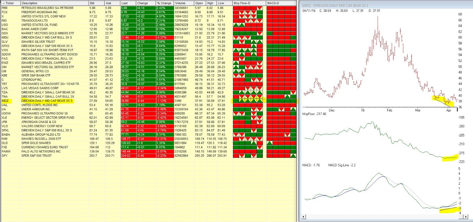
Well I have not been writing a lot lately.  The truth is I am a little “out of sync” with the markets these days.  And I prefer to write when I feel like I have at least some idea of what the heck is going on.  Which is a good thing I think.
So for today let’s just review and update some relevant things that I have written about in the past.
Soybeans
In this article I suggested a bullish position in May soybean futures.  Under the category of “One for the Good Guys”, beans have rallied nicely as shown in Figure 1.  
1
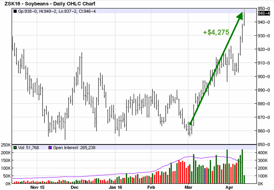
Figure 1 – May Soybeans (Courtesy: www.Barchart.com)
At this point a trailing stop – or selling half into strength and using a trailing stop on the remaining position – sounds like a good idea to me.  It should also be noted that “First Notice Day” for May soybeans is 4/29.  Bottom line, unless you want someone to dump 5,000 bushels of soybeans in your front yard (OK, it doesn’t really work like that but it is fun envision that it does), then you need to exit any and all long positions in May beans before that date.  This can involve taking profits, rolling into July or both.
Crude Oil (ETF ticker USO)
In this article I wrote about entering a somewhat bullish position using put options on ticker USO.  As you can see in Figure 2, it is “so far so good”.  At this point the trade has captured $588 of the initial $689 credit.
2
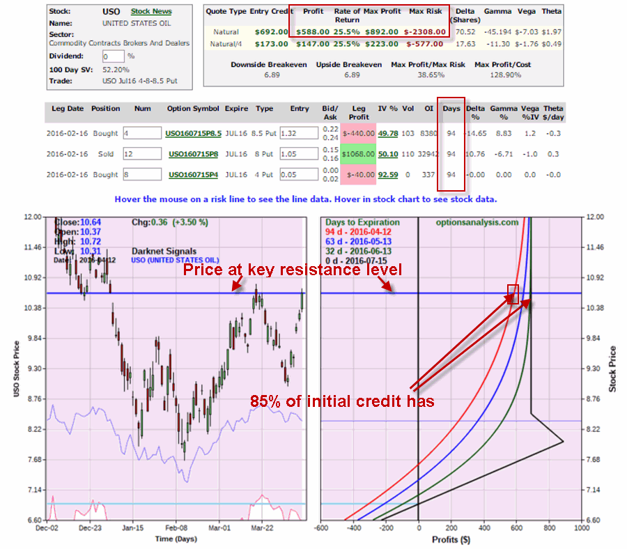
Figure 2 – USO put position (Courtesy www.OptionsAnalysis.com)
One position management note: USO is at a key price level as you can also see in Figure 2.  If USO fails to break through to the upside I would consider taking some (or even all) profits and moving on to the next trade, rather than waiting another 3 months in hopes of capturing the remaining profit potential.
Gold
In this article I wrote about a relatively crude moving average method I use to help identify the trend of gold.  As you can see in Figure 3, my “Anti-Gold” index recently flipped back to being “bullish” for gold (by virtue of the fact that the “anti-gold” index flipped to being bearish).3
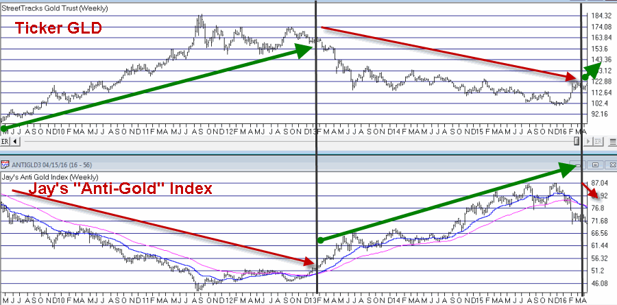
Figure 3 – Ticker GLD vs. Jay’s “Anti-Gold” Index (Courtesy AIQ TradingExpert)
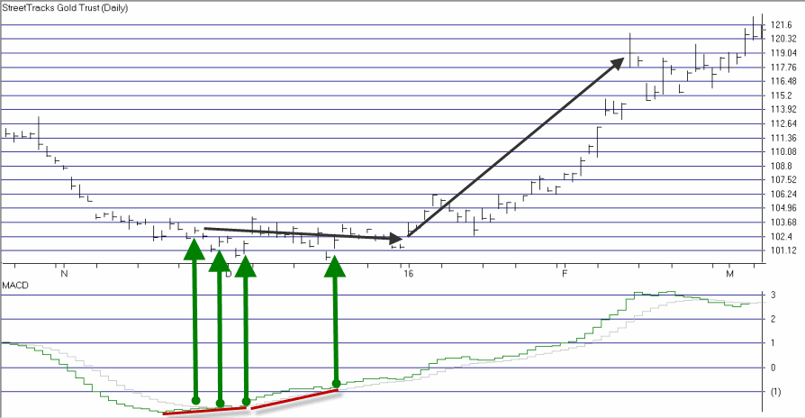
So does this mean it is “clear sailing” for all things gold related?  Not at all.  All moving average systems are susceptible to whipsaws.  This one is no exception.  In the short-term gold and gold stocks appear to be overbought.  Still, as you can see in Figure 4, the Elliott Wave count for ticker GLD is suggesting the possibility for higher prices in the not too distant future.
4
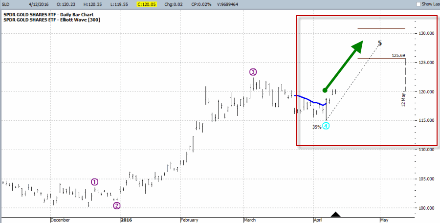
Figure 4 – Bullish Elliott Wave count for GLD (Courtesy ProfitSource by HUBB)
Jay Kaeppel
Chief Market Analyst at JayOnTheMarkets.com and TradingExpert Pro client

We’ve been watching MIDZ – Direxion Daily Mid Cap bear 3X

We’ve been watching MIDZ – Direxion Daily Mid Cap bear 3X in our barometer the last few trading days. This 3 x bearish ticker has been in a long down trend, but recently Moneyflow has begun to show signs of accumulation and the MACD diverged up when the price was still heading down.
The 5 day barometer readings on Moneyflow and MACD in our Quotes montage are showing some bullish signs either all green or green arrow up. Maybe times are a changing.
How do we do what we do? TRY US http://aiqeducation.com/

Back to Basics with MACD (Part 2)

In this article I detailed one relatively “simple” approach to using the MACD indicator to identify potentially bullish opportunities.  In this piece we will look at one to actually put those signals to use.
The Limited Risk Call Option
One possibility upon generating a bullish signal as described in the last article is to buy shares of the stock/ETF/index/etc in question.  Not a thing wrong with that.  But there is a less expensive alternative.
Figure 1 reproduces Figure 1 from the last piece showing ticker XLF.  Let’s look at the signal generated on 2/12/16.
1Figure 1 – Ticker XLF (Courtesy AIQ TradingExpert)
One alternative that I like is to use the “Percent to Double” routine at www.OptionsAnalysis.com to find an inexpensive call option that has lot of upside potential.  The input screen with a few key input selections highlighted appears in Figure 1a (if it looks intimidating please note that a reusable set of criteria can be captured in a “Saved Wizard”, which appear towards the lower right of of Figure 1a.  Once a set of criteria is saved it can be reused by simply clicking on the Wizard name and clicking “Load”.)
NOTE: My own personal preference is to consider options that have at least 45 days left until expiration (as time decay can become a very negative factor as option expiration draws closer).

1a

Figure 1a – Percent to Double Inputs (Courtesy www.OptionsAnalysis.com)

Figure 1b displays the output screen.
NOTE: For my own purposes I like to see a Delta of at least 40 for the option I might consider buying (nothing “scientific” here.  It is just that the lower the Delta the further out-of-the-money the option strike price is. I prefer to buy a strike price that is not too far from the current price of the stock; hence I look for a Delta of 40 or higher).  With XLF trading at $20.49, in Figure 1b I have highlighted the 2nd choice on the list – the April 21 call – which has a delta of 43.1bFigure 1b – Percent to Double Output (Courtesy www.OptionsAnalysis.com)
So a trader now has two alternatives:
*Buy 2 Apr 21 strike price XLF calls for $70 apiece ($140 total cost; 86 total deltas)
*Buy 86 shares of XLF at $20.49 apiece ($1,760 total cost, 86 total deltas)
Figure 1c displays the particulars for buying a 2-lot of the April 21 call for a total cost of $140.1cFigure 1c – XLF Apr 21 call (Courtesy www.OptionsAnalysis.com)
By 3/18 the shares had gained 11% and the Apr 21 call had gained 143%.  See Figure 1d.1dFigure 1d – XLF Apr 21 call (Courtesy www.OptionsAnalysis.com)
Summary
Obviously not every trade works out as well as this one.  Still, the key things to remember are:
*The option trade cost $140 instead of $1760
*The worst case scenario was a loss of $140.
Something to think about.
Chief Market Analyst at JayOnTheMarkets.com and TradingExpert Pro client

Back to Basics with MACD

One danger of getting “way to into” the financial markets is that you can find yourself progressing into some needlessly complicated stuff (“Hi, my name is Jay”).  I mean it is only natural to wonder “hey, what if I divided this indicator value by that indicator value” and such.  But once you start finding yourself taking an exponential moving average of a regression line with a variable lag time, well, you can find yourself “a tad far afield.”  (Trust me on this one).  Which leads us directly to:
Jay’sTradingMaxim #44: Every once in awhile it pays to remember that the end goal is simply to make money.  The more easily the better.
So today let’s go back to a simple “basic approach.”
The Bullish MACD Divergence
We will define an “asset” as any stock, ETF, commodity, index, etc. that can be traded on an exchange (and for my purposes, there should be a liquid market for options on that asset).
Step 1. An asset price falls to a new 20-day low and the MACD value is less than 0.  Note the MACD value on this date.
Step 2. Not less than one week but not more than 2 months later:
*Price closes below its closing level in Step 1
*The MACD indicator is above its level at the time of Step 1
Step 3. The next time the daily MACD indicator “ticks higher” a buy alert is triggered
Can it really be that simple?  The Good News is “Yes, it can.”  The Bad News is that “It isn’t always.”  To put it another way, like a lot of trading methods it can generate a surprising abundance of useful trading signals.  However, there is no guarantee that any given signal will turn out to be timely.  In other words:
This method gives you a good guideline for when to get in, but:
*It may be early at times (i.e., price will move lower still before advancing)
*It will at times be flat out wrong
*You still have to decide when to exit the bullish position.
*Call options are useful with this approach as it allows you to risk a limited amount of capital.
Examples
Figures 1 through 4 highlight some recent examples using this method.  Note that the charts show only entry points.  Exit points are “a separate topic”.
1
Figure 1 – Ticker XLF (Courtesy TradingExpert Pro)
2
Figure 2 – Ticker WMT (Courtesy TradingExpert)
3
Figure 3 – Ticker AAPL (Courtesy TradingExpert)
4
Figure 4 – Ticker GDX (Courtesy TradingExpert)
As you can see, some signals were quite timely while others were quite early.  For the record, I started getting bullish on gold and gold stocks early in 2016 based in part on the multiple alerts that appear in Figure 4.
Chief Market Analyst at JayOnTheMarkets.com and TradingExpert Pro client

The TradingExpert Pro Market Log – remember this?

The TradingExpert Pro Market Log

Trading and investing becomes clearer when you’re armed with this snapshot of the market and SP 500 stocks every day.
– AI rating on the market and how long it has been in place
– AI rating on all Sp 500 stocks percentage showing up ratings vs down ratings
– Bullish vs bearish levels on the market on multiple techncial indicators
– Bullish vs bearish percentage of SP 500 groups trending up vs down and the change from prior day
– Bullish vs bearish levels summary for all the SP 500 stocks on multiple indicators