With the price of the Dow Jones 30 (ticker INDU) in your AIQ reaching beyond 32760, your Market Chart may be experiencing a spike in Charts. A new updated file for INDU is now available for you at www.aiqsystems.com/INDU.dta
Close all open AIQ programs. Click the link above and Save INDU.dta to c:\wintes32\tdata, say yes when asked to overwrite. Once done, open Data Manager, click on Utilities, Rebuild Master Ticker List.
Over the last few weeks the markets have drifted lower with the NASDAQ actually negative for the year. The rest of the non tech sectors have performed relatively well as seen on the chart below. As investors are looking for continual growth in the overall economy—the sectors impacted hardest by Covid have started to bounce back. Cruise ships, manufacturing, and airline stocks are all seeing short term gains strengthened by the stimulus plan, increase in Covid vaccination distribution, and hope of future increased earnings. The large cap growth stocks like Apple, Amazon, Tesla, and Microsoft have flattened over the last 8 months. The small to mid-cap stocks, energy, and financials have kept the market upright and are still reasonable to be invested in with proper allocation. Energy stocks however, may continue to perform relatively well over the short term, longer term I don’t see a lot of growth as President Biden and the other nations strive to eliminate the need for fossil fuels replacing them with electric, solar, and alternate ways of generating power. In addition, financial stocks also have been doing well and should continue to perform as long as the economy is doing well and interest rates are rising. Even though the market is about 13% overvalued and in the short term could fall; the economy should rise throughout the rest of the year giving us a decent buying opportunity if the market falls. Interest rates should still push higher over the longer term, but short term the interest rate rise may stall growth.
Some of the INDEXES of the markets both equities and interest rates are below. The source is Morningstar.com up until March 07, 2021.
YTD Dow Jones +3.33% S&P 500 +2.61% EQUAL WEIGHTED S&P 500 +4.7% NASDAQ Aggressive growth -1.61% Large Cap Value +7.0% I Shares Russell 2000 ETF (IWM) Small cap +11.05% Midcap stock funds +7.52% International Index (MSCI – EAFE ex USA +2.5% International Emerging Markets +4% Financial stocks +14% Energy stocks +39% Healthcare Stocks -1.0%
Moderate Mutual Fund Investment Grade Bonds (AAA) Long duration +.5% High Yield Merrill Lynch High Yield Index +0.2%
Floating Rate Bond Funds +1.4% Short Term Bond +.2% Multi sector bond funds -.4%
Gold -11%
10 year Bond Yield 1.62%
As you can see above, the NASDAQ and the tech stocks, the leader over the last year is down for the year. They may be down, but don’t count them out. That sector is the growth engine of the world. They just need a rest short term.
Classicalprinciples.com and Robert Genetskis Excerpts
Market Outlook
Stock prices moved decisively lower this past week as all 5 key indexes lost ground. The Nasdaq and QQQs fell 3% bringing both indexes to 10% below their recent highs. Other indexes fell 1%-2½%.
In his analysis a month ago, my technical guru, Joe Bartosiewicz CFP, warned of potential problems due to a technical formation. Stocks have already gone through some of Joe’s support areas with the S&P500 below its 50-day average. His latest key levels for support are the 12,500 vicinity for the Nasdaq and 3671 for the S&P500.
Economic news remains mostly positive. Investors now appear concerned over too strong a recovery, higher inflation and increases in longer-term interest rates.
Current policies aren’t helping. Both Fed Chairman Powell’s insistence on further monetary ease and the pork-loaded $1.9 trillion “stimulus” bill are feeding concerns over higher inflation.
At yesterday’s close, the S&P500 was overvalued by 13%. As a result, stocks are still vulnerable to further declines. I continue to expect the Fed’s monetary ease to provide a tailwind for stocks to keep the S&P500 above its fundamental value. However, when psychology turns negative, there is no way to know how far a correction will go.
As for longer-term interest rates, they remain well below their fundamental level. We are at the beginning of what I expect will be a major upward move in long-term rates. Fixed-income portfolios should remain very defensive.
A Look Back
Today’s job report shows a gain of 465,000 private jobs in February, 355,000 of these were in leisure and hospitality. In spite of the gains, the number of jobs remains 6% below its peak of a year ago. The good news for jobs is also evident in initial unemployment claims. They averaged 791,000 in February, 50,000 less than the previous two months.
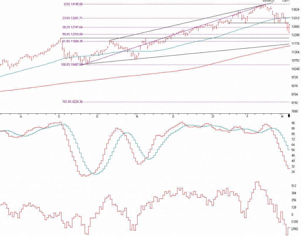
This is the index that contains Apple, Microsoft, Google, Tesla, and the aggressive tech stocks in general. Last month I said that the markets were overbought and that we had a Rising Wedge pattern. Not only a rising wedge but a Head and Shoulders top, with the neckline at 13015. If the NASDAQ closes above 13315 and stays there for 2 plus days, I will get more positive. Friday, AIQ gave a short term Buy signal on the daily charts. I am not totally convinced yet. I want to see it close above the 50 day moving average, 13315, for a day or two. There is support on the NASDAQ at 12,316(area), 12,104, 11,900, 11,743, 11,618, and 10,801
SK-SD stochastics is now somewhat Oversold, so long term investors may want to nibble here but there could be a lot more on the downside to come as it’s not very oversold.
The Advance Decline line is the number of stocks going up compared to the number of stocks going down on a running total. As you can see to the left, there are a lot of stocks in the NASDAQ that are falling. This year’s rally has been powered by the energy stocks, value and financials. This is why we diversify.
As I see it, interest rates have a lot of internal pressure to rise, meaning long term bonds can continue to get hit, but the economy should continue to get better and that should help stocks in general.
Support levels on the S&P 500 area are 3723, 3694, 3671, 3594, RESISTANCE on the S&P is 3887
NASDAQ Support, 12,214, 11,900, 11,618, and 10,801
Dow Jones 30310, 29782, 29217, and 29017
These may be safer areas to get into the equity markets on support levels slowly on the accumulation areas.
THE BOTTOM LINE:
The market has sold off over the last month, especially the aggressive tech and NASDAQ stocks. Value, energy, and financial stocks continue to rally this year. I still like financial and energy stocks, but not for long term holds as fossil fuels are reduced and even eliminated. Technology should do well over the long term and if the tech sector continues to sell, I will start to buy them myself as long term they are in the sweet spot. The Small Stocks have performed great this year and I think the Covid stocks that were hurt last year, like the restaurants, parks, cruise ships and more will come back as the economy gets stronger. Diversification is now important as the first 10 months of the recovery has been all large growth.
Best to all of you,
Joe Bartosiewicz, CFP® Investment Advisor Representative
Securities and advisory services offered through SagePoint Financial, Inc. (SPF), member FINRA/SIPC. SPF is separately owned and other entities and/or marketing names, products or services referenced here are independent of SPF. 800-552-3319 20 East Thomas Road Ste 2000 Phoenix AZ 85012
Technical Analysis is based on a study of historical price movements and past trend patterns. There is no assurance that these market changes or trends can or will be duplicated shortly. It logically follows that historical precedent does not guarantee future results. Conclusions expressed in the Technical Analysis section are personal opinions: and may not be construed as recommendations to buy or sell anything.
Disclaimer: The views expressed are not necessarily the view of Sage Point Financial, Inc. and should not be interpreted directly or indirectly as an offer to buy or sell any securities mentioned herein. Securities and Advisory services offered through Sage Point Financial Inc., Member FINRA/SIPC, an SEC-registered investment advisor.
Past performance cannot guarantee future results. Investing involves risk, including the potential loss of principal. No investment strategy can guarantee a profit or protect against loss in periods of declining values. Please note that individual situations can vary. Therefore, the information presented in this letter should only be relied upon when coordinated with individual professional advice. *There is no guarantee that a diversified portfolio will outperform a non-diversified portfolio in any given market environment. No investment strategy, such as asset allocation, can guarantee a profit or protect against loss in periods of declining values. It is our goal to help investors by identifying changing market conditions. However, investors should be aware that no investment advisor can accurately predict all of the changes that may occur in the market.
The price of commodities is subject to substantial price fluctuations of short periods and may be affected by unpredictable international monetary and political policies. The market for commodities is widely unregulated, and concentrated investing may lead to Sector investing may involve a greater degree of risk than investments with broader diversification.
Indexes cannot be invested indirectly, are unmanaged, and do not incur management fees, costs, and expenses.
Dow Jones Industrial Average: A weighted price average of 30 significant stocks traded on the New York Stock Exchange and the NASDAQ.
S&P 500: The S&P 500 is an unmanaged indexed comprised of 500 widely held securities considered to be representative of the stock market in general.
NASDAQ: the NASDAQ Composite Index is an unmanaged, market-weighted index of all over the counter common stocks traded on the National Association of Securities Dealers Automated Quotation System
(IWM) I Shares Russell 2000 ETF: Which tracks the Russell 2000 index: which measures the performance of the small capitalization sector of the U.S. equity market.
A Moderate Mutual Fund risk mutual has approximately 50-70% of its portfolio in different equities, from growth, income stocks, international and emerging markets stocks to 30-50% of its portfolio in different categories of bonds and cash. It seeks capital appreciation with a low to moderate level of current income.
The Merrill Lynch High Yield Master Index: A broad-based measure of the performance of non-investment grade US Bonds
MSCI EAFE: the MSCI EAFE Index (Morgan Stanley Capital International Europe, Australia, and Far East Index) is a widely recognized benchmark of non-US markets. It is an unmanaged index composed of a sample of companies’ representative of the market structure of 20 European and Pacific Basin countries and includes reinvestment of all dividends. Investment grade bond index: The S&P 500 Investment-grade corporate bond index, a sub-index of the S&P 500 Bond Index, seeks to measure the performance of the US corporate debt issued by constituents in the S&P 500 with an investment-grade rating. The S&P 500 Bond index is designed to be a corporate-bond counterpart to the S&P 500, which is widely regarded as the best single gauge of large-cap US equities.
Floating Rate Bond Index is a rule-based, market-value weighted index engineered to measure the performance and characteristics of floating-rate coupon U.S. Treasuries, which have a maturity greater than 12 months.
The stock market again continues its upward trend, but instead of the large stocks powering the markets higher, its been the small caps, up 13% since January 1. Over the last 4 Bartometers, I have been recommending a shift to small and midcap stocks, and they are now performing the best. I still like the small, midcap, and larger companies, but as long as the economy grows, the small and midcap stocks should continue to do relatively well. I am not saying that the larger companies won’t grow, but the market is now 16% overvalued based on interest rates and future projected growth. For the aggressive investor over the long term, I like the Block Chain technology sector, the new internet of things, the autonomous car sector, technology, and biotechnology for the dramatic growth potential ahead. As we come out of the Covid-19 malaise, the airlines, restaurants, amusement parks, cruise ships, real estate, and manufacturing, and more should rebound. I also see the fuel cell technology, international emerging markets, and international in general doing well. My computer models are still on a Hold signal but can change at any time as the market is very overbought,
A year from now, I anticipate the economy will be healthier than the current status. The more robust economy will be in part due to the availability of COVID vaccines from Pfizer, Moderna, and J&J and benefiting other hard-hit companies.
Some of the INDEXES of the markets both equities and interest rates are below. The source is Morningstar.com up until February 07, 2021. These are passive indexes.
Dow Jones +1.92% S&P 500 +3.70% EQUAL WEIGHTED S&P 500 +4.50% NASDAQ Aggressive growth +5.62% Large Cap Value +3.00% I Shares Russell 2000 ETF (IWM) (Small-Cap) +13.05% Midcap stock funds +7.52% International Index (MSCI-EAFE ex USA) +2.50% Financial Stocks +9.00% Energy Stocks +10.0% Healthcare Stocks +11.0% Moderate Mutual Funds Investment Grade Bonds (AAA) Long Duration +2.22% High Yield Merrill Lynch High Yield Index +0.30% Floating Rate Bond +0.70% Short-Term Bond +0.40% Multi sector bond funds +0.59% Gold -4.70% 10-year Bond Yield 1.00%
Classicalprinicples.com and Robert Genetskis Excerpts
Market Outlook
There was a combination of good news this week adding to the latest euphoria surrounding stocks. Positive news on economic growth, robust earnings reports, a sharp decline in COVID-19 cases, and progress in distributing the vaccine all helped lift stock prices.
The increase lifted the S&P500 back to 16% above its fundamental value. In my upcoming monthly report, we’ll look at how monetary policy has contributed to ending bull markets and highlight some of the early warning signals. At this time monetary policy continues to provide a strong tailwind for stocks. While investors are prone to react to any negative news, the tailwind from monetary policy should continue to limit any downward moves.
During the first half of this year the economy’s momentum should enable it to grow at an annual rate 4% or higher. Growth is likely to slow later this year and into the next year as new policies slow the economy’s upward momentum.
As the chart above shows, long-term interest rates have begun to move higher. Without the Fed’s manipulation, the yield on 10-Treasury Notes would likely be near 4%. As the economy heats up and inflation increases, we face the potential for a major increase in interest rates.
A Look Back
Today’s jobs report shows private industries added a net of only 6,000 jobs in January. There was a loss of 61,000 jobs in leisure and hospitality, an improvement from the loss of 531,000 in December. A sharp rise in government employment led to the gain of 49,000 total jobs.
In spite of the weakness in jobs, ISM business surveys for January show rapid growth in both manufacturing and service companies. Readings were in the high 50s. New orders were even stronger with readings in the low 60s.
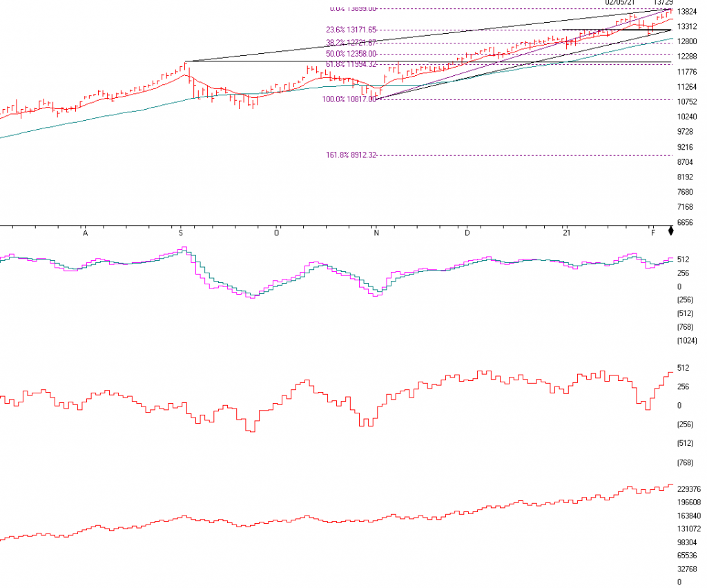
The NASDAQ is above and it contains the stocks like Apple Computer, Amazon, Microsoft, Shopify, Tesla and much more. This is the index that has been the growth engine of the markets over the last 10 years and I believe it should continue to grow over the long term. Short-term there is support at 13,171 to 13,200 right at the bottom Trend-line and the 23.6% Fibonacci Retracement If the NASDAQ breaks and closes BELOW 13171 I will become CAUTIOUS TO VERY CAUTIOUS ON THE MARKET as it is very overvalued at this time. I am however, still relatively Bullish but understand that market direction changes on a dime. If 13,171 breaks there is support at the 12,900 area or the 50-day moving average. If the NASDAQ closes below that Level I will become VERY CAUTIOUS and would expect the NASDAQ to fall to the 12,141 area. So, observance is now important. I am still bullish, but I realize the markets are now Very Overvalued.
Momentum is still positive as you can see the pink line above the blue line.
The ADVANCE – DECLINE Line is next. It shows the number of stocks going up as compared to the number of stocks going down on a running total and you can see it still looks relatively positive
On-Balance Volume is the last chart. This is confirming the upside as well and not showing any divergence or non- confirmation. It is confirming the upside as it is at a new high and so is the NASDAQ. Please call me at 860-940-7020 with questions.
S&P 500
S&P 500 Chart Source: AIQsystems.com
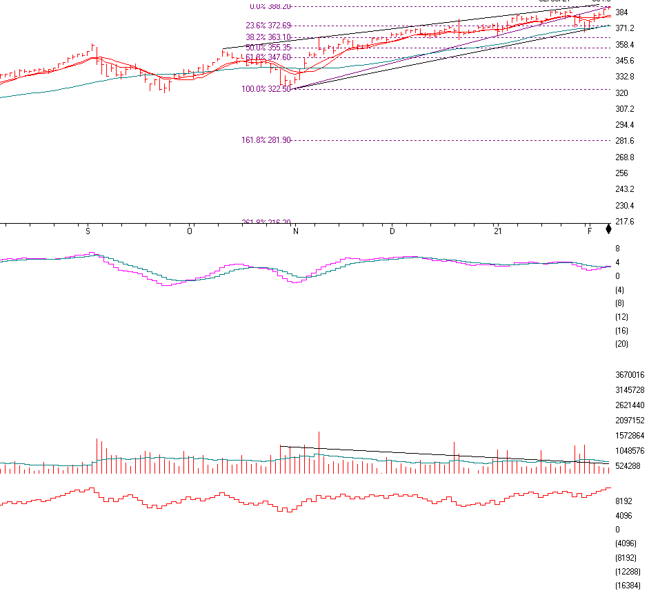
The S&P 500 is above. The S&P is now at a new high as it continues to go up in value. As the market continues to rise in anticipation of the economy rebounding it is perplexing many people on WHY it is rising so much. It is because earnings are coming in better than expected. Also, the market anticipates 6-9 months AHEAD of time. They think that by September the economy should be on its way to recovery. There is pattern above that I have mentioned before, and it is called A RISING WEDGE PATTERN.
A RISING WEDGE PATTERN is a Negative or a Bearish pattern. It rises up ward and goes to an APEX. This pattern rises on low volume and eventually breaks on the upside if it fails or the DOWNSIDE if it is a true Rising Wedge. This pattern now has to be watched and possibly act upon it if 371.2 on the SPY (S&P 500) tracking stock or 372.6 which is the 23.6% Fibonaccis level on the S&P. On the TRUE S&P 500 it’s 3744. So one is the SPY and one is the S&P. This is strange, the 50 day Moving average, the S&P Trend Line and the 23.6% Fibonacci Level is between 371 to 373 on the SPY or 3742 to 3744 on the S&P 500.This is extremely important to watch at this time as if they break and close below all 3 support levels, it could cause traders to SELL. I will be looking at these levels very keenly and will become VERY CAUTIOUS if they BREAK and CLOSE below those levels.
Momentum is the next chart and it shows that the market is getting a little tired.
Volume is the next indicator, and although volume is still relatively good, it is slowly declining on up days.
On-balance Volume is relatively good. So I will be watching these 3 major support levels to determine if the Market is in a SHORT TERM TOPPING ZONE. Call me to review your accounts.
Support levels on the S&P 500 area are 3743 to 3745 AREA, 3630, 3554, 3476 and 3225. NASDAQ Support, 13758, 13567, 13171 (EXTREMELY IMPORTANT), 12721, 12358, and 12109. Dow Jones 30681, 29559, 29215, 28018, 28482, and 27100 These may be safer areas to get into the equity markets on support levels slowly on the accumulation areas.
THE BOTTOM LINE:
The market has continued nicely over the last month mainly because of earnings of companies beating expectations and a recognition that the economy will eventually return to a growth pattern. The market looks to continue to grow and as the economy comes out of its recession, the small and midcap stocks as well as the large stocks could continue upward, BUT, the markets are forming a BEARISH RISING WEDGE and if 3743-3745 is broken and the S&P closes below the trend-line over the next few days or 2 weeks, I will get VERY CAUTIOUS. The Small Stocks have performed the best this year but starting to get a little tired. I am bullish over the long term but realize the markets have come so far, so fast. It may be time to reallocate money from stocks to a fixed account or other allocations to a more normalized allocation. Diversification is now important as the first 8 months of the recovery has been all large growth.
Joe Bartosiewicz, CFP® Investment Advisor Representative
92 High Street Thomaston, CT 06787
Securities and advisory services offered through SagePoint Financial, Inc. (SPF), member FINRA/SIPC. SPF is separately owned and other entities and/or marketing names, products or services referenced here are independent of SPF. 800-552-3319 20 East Thomas Road Ste 2000 Phoenix AZ 85012
Disclaimer: The views expressed are not necessarily the view of Sage Point Financial, Inc. and should not be interpreted directly or indirectly as an offer to buy or sell any securities mentioned herein. Securities and Advisory services offered through Sage Point Financial Inc., Member FINRA/SIPC, an SEC-registered investment advisor.
Past performance cannot guarantee future results. Investing involves risk, including the potential loss of principal. No investment strategy can guarantee a profit or protect against loss in periods of declining values. Please note that individual situations can vary. Therefore, the information presented in this letter should only be relied upon when coordinated with individual professional advice. *There is no guarantee that a diversified portfolio will outperform a non-diversified portfolio in any given market environment. No investment strategy, such as asset allocation, can guarantee a profit or protect against loss in periods of declining values. It is our goal to help investors by identifying changing market conditions. However, investors should be aware that no investment advisor can accurately predict all of the changes that may occur in the market.
The price of commodities is subject to substantial price fluctuations of short periods and may be affected by unpredictable international monetary and political policies. The market for commodities is widely unregulated, and concentrated investing may lead to Sector investing may involve a greater degree of risk than investments with broader diversification.
Indexes cannot be invested indirectly, are unmanaged, and do not incur management fees, costs, and expenses.
Dow Jones Industrial Average: A weighted price average of 30 significant stocks traded on the New York Stock Exchange and the NASDAQ.
S&P 500: The S&P 500 is an unmanaged indexed comprised of 500 widely held securities considered to be representative of the stock market in general.
NASDAQ: the NASDAQ Composite Index is an unmanaged, market-weighted index of all over the counter common stocks traded on the National Association of Securities Dealers Automated Quotation System (IWM) I Shares Russell 2000 ETF: Which tracks the Russell 2000 index: which measures the performance of the small capitalization sector of the U.S. equity market.
A Moderate Mutual Fund risk mutual has approximately 50-70% of its portfolio in different equities, from growth, income stocks, international and emerging markets stocks to 30-50% of its portfolio in different categories of bonds and cash. It seeks capital appreciation with a low to moderate level of current income.
The Merrill Lynch High Yield Master Index: A broad-based measure of the performance of non-investment grade US Bonds MSCI EAFE: the MSCI EAFE Index (Morgan Stanley Capital International Europe, Australia, and Far East Index) is a widely recognized benchmark of non-US markets. It is an unmanaged index composed of a sample of companies’ representative of the market structure of 20 European and Pacific Basin countries and includes reinvestment of all dividends.
Investment grade bond index: The S&P 500 Investment-grade corporate bond index, a sub-index of the S&P 500 Bond Index, seeks to measure the performance of the US corporate debt issued by constituents in the S&P 500 with an investment-grade rating. The S&P 500 Bond index is designed to be a corporate-bond counterpart to the S&P 500, which is widely regarded as the best single gauge of large-cap US equities.
Floating Rate Bond Index is a rule-based, market-value weighted index engineered to measure the performance and characteristics of floating-rate coupon U.S. Treasuries, which have a maturity greater than 12 months.
The importable AIQ EDS file based on Perry Kaufman’s article in this issue, “A Fresh Look At Short-Term Patterns (With And Without A Trend Filter),” can be obtained on request via email to info@TradersEdgeSystems.com. The code is also available below.
!A Fresh Look At Short-Term Patterns !Author: Perry J. Kaufman, TASC Jan 2021
!Coded by: Richard Denning 11/18/2020
C is [close].
C1 is valresult(C,1).
O is [open].
H is [high].
H1 is valresult(H,1).
L is [low].
L1 is valresult(L,1).
L2 is valresult(L,2).
TrendLen is 80.
ATRlen is 20.
OSD is offsettodate(month(),day(),year()).
HD if hasdatafor(ATRlen+20) >= ATRlen.
TR is Max(H - L,max(abs(C1 - L),abs(C1 - H))).
ATR is iff(HD,simpleavg(TR,ATRlen),0).
TR1 is valresult(TR,1).
TR2 is valresult(TR,2).
TR3 is valresult(TR,3).
TR4 is valresult(TR,4).
ATR1 is valresult(ATR,1).

!Key reversals a higher high followed by a lower close.
! We sell the lower close. The opposite for buy signals.

BearKeyR if H > H1 and C < C1.
BullKeyR if L < L1 and C > C1.

!Island reversals a gap higher followed by a lower close,
! but not filling the gap.
!We sell the lower close. The opposite for buy signals.

BearIslandR if L > H1 and C < O.
BullIslandR if H < L1 and C > O.

!Outside days a higher high and a lower low, but the  !close in the upper or lower 25% of the range.
!We buy if upper, sell if lower.

BearOutside if H > H1 and L < L1 and C < (L + (H-L)*0.25).
BullOutside if H > H1 and L < L1 and C > (H - (H-L)*0.25).

!Wide-ranging days the same as outside days, but  the
! true  range  must  exceed  1.5  ×  20-day average true range.

BearWide if H > H1 and L < L1 and C < (L + (H-L)*0.25) and TR > 1.5*ATR.
BullWide if H > H1 and L < L1 and C > (H - (H-L)*0.25) and TR > 1.5*ATR.

!Compression the most recent 3 days must each have a  ! true range smaller than the 4th previous day.
! We buy a breakout above the highest high of the  !last 3 days and sell a breakout below the lowest low of the past 3 days.

BearComp if TR4 > TR1 and TR4 > TR2 and TR4 >TR3 and L < lowresult(L,3,1).
BullComp if TR4 > TR1 and TR4 > TR2 and TR4 >TR3 and H > highresult(H,3,1).

!Gap openings must be larger than 0.5 × 20-day ATR.
! We buy or sell the close of the gap day in the direction of the opening gap.

BearGap if ((C1-O)/ATR1) > 0.5*ATR1 and O < C1. BullGap if ((O-C1)/ATR1) > 0.5*ATR1 and O > C1. !Trend Filter: SMATrend is simpleavg(C,TrendLen).
SMATrend1 is valresult(SMATrend,1). UpTrend if SMATrend > SMATrend1.
DnTrend if SMATrend < SMATrend1. !Patterns with Trend Filter: BearKeyRTrend if BearKeyR and DnTrend. BullKeyRTrend if BullKeyR and UpTrend.
BearIslandRTrend if BearIslandR and DnTrend. BullIslandRTrend if BullIslandR and UpTrend. BearWideTrend if BearWide and DnTrend.
BullWideTrend if BUllWide and UpTrend. BearCompTrend if BearComp and DnTrend.
BullCompTrend if BullComp and UpTrend. BearGapTrend if BearGap and DnTrend.
BullGapTrend if BullGap and UpTrend.
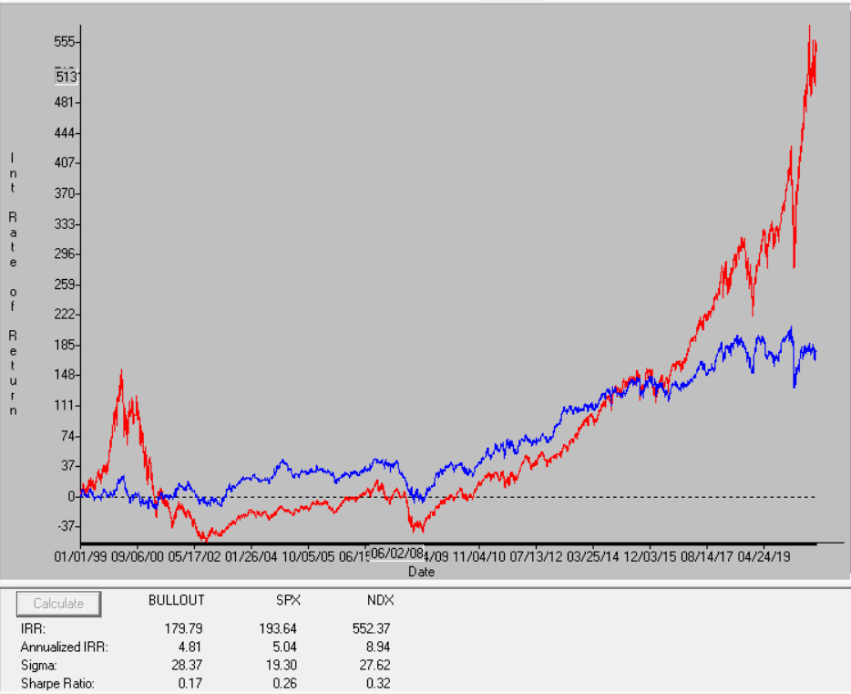
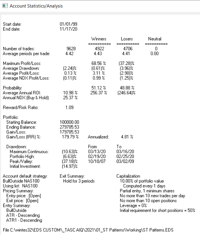
Code for short-term patterns in the article is included in the EDS file both with and without the trend filter. I ran a portfolio simulation trading NASDAQ 100 stocks with the Bull Outside Day pattern from 1999 to 2020. The equity curve (blue) compared to the NASDAQ index (red) is shown in Figure 13 and the ASA report for the test is shown in Figure 14.
FIGURE 13: AIQ. Equity curve (blue) for Bull Outside Day pattern compared to the NASDAQ 100 index (red) from 1999 to 2020, all trades closed on 4th bar’s open after entry.
FIGURE 14: AIQ. Account Statistics Analysis report for the portfolio simulation.
Over the last month the stock and bond markets have increased again finishing off the year near or at an all-time high. This year the small and midcap stocks are up the most rising 5% as compared to the large indexes which are up about 1.7%. If the stock market continues to rise throughout the year I think the small and midcaps as well as the international stocks are now in the sweet spot of the sectors to continue higher. Now that President Elect Biden is Commander in Chief, the markets will be addressing his policies, some are good and some are not so good for the corporations. I still like the stock markets here for a HOLD not an outright aggressive BUY as the stock market is now14% Overvalued. My Computer models are on a HOLD scenario, depending on your goals and objectives I would have more in the Small, Midcap and International Sectors. Over the next month I feel the markets can put in a Short term top and have a little setback, but Long term I am still bullish on the stock markets. I am NOT Bullish on outright average bond funds as interest rates could continue to rise depressing ordinary bonds. Because of that, Floating rate bonds, inflation-protected bonds and short-term bonds tend to hold up better. Long-term bonds, in my opinion, should be reallocated to the short term to intermediate bond, inflation-protected bond, and the floating rate sector. In the stock market, I still like growth stocks and value stocks. For the aggressive investor over the long term, I like the BlockChain technology sector, the new internet of things, the autonomous car sector, and more… My computer models are still on a Hold signal but can change at any time as the market is very overbought, so it is important to contact me to review your accounts at 860-940-7020.
One year from now I expect the economy to be much better than it is currently with the vaccine now being administered by Pfizer and other companies. This should benefit hard-hit restaurants, airlines, parks, and more.
Some of the INDEXES of the markets both equities and interest rates are below. The source is Morningstar.com up until January 08, 2021. These are passive indexes.
YTD Dow Jones +1.72% S&P 500 +1.97% EQUAL WEIGHTED S&P 500 +2.96% NASDAQ Aggressive growth +1.69% Large Cap Value +3.0% I Shares Russell 2000 ETF (IWM) Small cap +5.95% Midcap stock funds +4.83% International Index (MSCI – EAFE ex USA +2.7% International Emerging Markets +5.88% Financial stocks -5% Energy stocks -28% Healthcare Stocks +11%
Moderate Mutual Fund Investment Grade Bonds (AAA) Long duration -0.3% High Yield Merrill Lynch High Yield Index +0.1%
Floating Rate Bond Funds +.7% Short Term Bond +.1% Multi sector bond funds -.1%
Gold -2.81%
10 year Bond Yield 1%
Classicalprinicples.com and Robert Genetskis Excerpts
Market Outlook
With investors anticipating the free flow of new money and new spending to prime the economy, stocks are moving sharply higher.
One of Biden’s promises to Georgia was everyone would get $2,000 checks if they won the state. That’s for appetizers. Watch out for the main meal. Biden’s economic advisers assure him government can spend and borrow whatever is needed to get unemployment back down to 3½%. However, raising the federal minimum wage will make it more difficult to reduce unemployment. The Fed has already signed on to keep the money flowing.
What could go wrong?
The spike in longer-term interest rates following the outcome in Georgia is the canary in the coal mine. The Fed will try and hold interest rates down for a while, but the market will gradually win the tug of war with the Fed later this year. The S&P500 is now 14% above its fundamental value. The more overvalued it gets, the greater the risk of a correction. Even so, stocks remain preferable to fixed-income assets. The economy is surging as we start the new year. In spite of Covid and lockdowns, upcoming earnings reports as well as forward guidance should improve. Stay bullish.
A Look Back
Today’s employment report shows the job market remains weak amid a decline of 140,000 payroll jobs in December. The number was driven by a decline of ½ million jobs in leisure, hospitality, and government. The amazing thing is how strong the economy is performing in spite of the loss of jobs in these areas.
The S&P 500 is above. The S&P is now at a new high as it continues to go up in value. As the market continues to rise in anticipation of the economy rebounding it is perplexing many people on WHY it is rising so much. It is because earnings are coming in better than expectations. Also, the market anticipates 6-9 months AHEAD of time. They think that by September the economy should be on its way to recovery. So it’s like waiting in line for a great musical act. Many people wait in line hours before the concert to get the best seating. The markets are somewhat similar. They know the economy will recover so they are buying now in advance of the recovery and the earnings recovery as well.
The SK-SD Stochastics indicator. I use this indicator to determine when the market is overbought or oversold. When the markets are dramatically overbought, OVER 88, you might want to reduce equities somewhat and when it’s under 40 you may want to accumulate equities. It is at 80 now so it is not so bad, but be a little careful short term.
The RSI Wilder Index is next. When the index is over 70, the market is getting very overbought. In September it did just that and sold off quickly. The RSI Wilder index is at 69.7 now, so we have another indicator that equities are overbought.
The indicator POINT and Figure Chart is next. Point and figure charts are a way to visualize price movements and trends in an asset without regard to the amount of time that passes. P&F charts utilize columns consisting of stacked Xs or Os, each of which represents a set amount of price movement. The X’s illustrate rising prices, while Os represent a falling price.
Support levels on the
S&P 500 area are 3640, 3594, 3358, 3440 and 3201.
NASDAQ Support, 12971, 12751, 12600, 12217, 12089, and 11350.
Dow Jones 30681, 29559, 29215, 28018, 28482, and 27100
These may be safer areas to get into the equity markets on support levels slowly on the accumulation areas.
THE BOTTOM LINE:
The market has continued nicely over the last month mainly because of earnings of companies beating expectations and a recognition that the economy will eventually return to a growth pattern. The market looks to continue to grow and as the economy comes out of its recession, the small and midcap stocks as well as the large stocks should continue to do well over the next few years. The NASDAQ has done the best this year and should continue to do well IF the market continues higher. Now that the vaccine is a reality the value stocks should start to rise. I like international stocks as well. Diversification is now important as the first 5 months of the recovery have been all large growth.
Best to all of you,
Joe Bartosiewicz, CFP® Investment Advisor Representative
92 High Street Thomaston, CT 06787 and 7501 East MCDowell RD #2172 Scottsdale, AZ 85257
Securities and advisory services offered through SagePoint Financial, Inc. (SPF), member FINRA/SIPC. SPF is separately owned and other entities and/or marketing names, products or services referenced here are independent of SPF. 800-552-3319 20 East Thomas Road Ste 2000 Phoenix AZ 85012
Technical Analysis is based on a study of historical price movements and past trend patterns. There is no assurance that these market changes or trends can or will be duplicated shortly. It logically follows that historical precedent does not guarantee future results. Conclusions expressed in the Technical Analysis section are personal opinions: and may not be construed as recommendations to buy or sell anything.
Disclaimer: The views expressed are not necessarily the view of Sage Point Financial, Inc. and should not be interpreted directly or indirectly as an offer to buy or sell any securities mentioned herein. Securities and Advisory services offered through Sage Point Financial Inc., Member FINRA/SIPC, an SEC-registered investment advisor.
Past performance cannot guarantee future results. Investing involves risk, including the potential loss of principal. No investment strategy can guarantee a profit or protect against loss in periods of declining values. Please note that individual situations can vary. Therefore, the information presented in this letter should only be relied upon when coordinated with individual professional advice. *There is no guarantee that a diversified portfolio will outperform a non-diversified portfolio in any given market environment. No investment strategy, such as asset allocation, can guarantee a profit or protect against loss in periods of declining values.
It is our goal to help investors by identifying changing market conditions. However, investors should be aware that no investment advisor can accurately predict all of the changes that may occur in the market. What is the Advance-Decline Line? Point and figure charts are a way to visualize price movements and trends in an asset without regard to the amount of time that passes. P&F charts utilize columns consisting of stacked Xs or Os, each of which represents a set amount of price movement. The Xs illustrate rising prices, while Os represent a falling price
The price of commodities is subject to substantial price fluctuations of short periods and may be affected by unpredictable international monetary and political policies. The market for commodities is widely unregulated, and concentrated investing may lead to Sector investing may involve a greater degree of risk than investments with broader diversification.
Indexes cannot be invested indirectly, are unmanaged, and do not incur management fees, costs, and expenses.
Dow Jones Industrial Average: A weighted price average of 30 significant stocks traded on the New York Stock Exchange and the NASDAQ.
S&P 500: The S&P 500 is an unmanaged indexed comprised of 500 widely held securities considered to be representative of the stock market in general.
NASDAQ: the NASDAQ Composite Index is an unmanaged, market-weighted index of all over the counter common stocks traded on the National Association of Securities Dealers Automated Quotation System (IWM) I Shares Russell 2000 ETF: Which tracks the Russell 2000 index: which measures the performance of the small-capitalization sector of the U.S. equity market.
A Moderate Mutual Fund risk mutual has approximately 50-70% of its portfolio in different equities, from growth, income stocks, international and emerging markets stocks to 30-50% of its portfolio in different categories of bonds and cash. It seeks capital appreciation with a low to moderate level of current income.
The Merrill Lynch High Yield Master Index: A broad-based measure of the performance of non-investment grade US Bonds
MSCI EAFE: the MSCI EAFE Index (Morgan Stanley Capital International Europe, Australia, and Far East Index) is a widely recognized benchmark of non-US markets. It is an unmanaged index composed of a sample of companies’ representative of the market structure of 20 European and Pacific Basin countries and includes reinvestment of all dividends.
Investment-grade bond index: The S&P 500 Investment-grade corporate bond index, a sub-index of the S&P 500 Bond Index, seeks to measure the performance of the US corporate debt issued by constituents in the S&P 500 with an investment-grade rating. The S&P 500 Bond index is designed to be a corporate-bond counterpart to the S&P 500, which is widely regarded as the best single gauge of large-cap US equities.
Floating Rate Bond Index is a rule-based, market-value weighted index engineered to measure the performance and characteristics of floating-rate coupon U.S. Treasuries, which have a maturity greater than 12 months.