Category Archives: trading strategy

An Unusual 4 ETF Portfolio…That Seems to Work

I know I repeat it a lot but the purpose of this blog is not to offer recommendations but rather to share ideas.  So here is one that I am not quite sure about but am keeping an eye on.
The FourNonCorr Portfolio
Somewhere awhile back I started looking at trying to pair non correlated – or even inversely correlated – securities in a portfolio that had the potential to outperform the overall market. What follows is what I refer to as the FourNonCorr Portfolio.  For the record I do not trade this portfolio with real money.  I am still trying to figure out if there is something to it or not.  But given that it has outperformed the S&P 500 by a factor of 3-to-1 (granted, using hypothetical results) since December of 2007, I figure it might be worth monitoring for awhile.
The portfolio consists of four ETFs:
Ticker FXE – Guggenheim CurrencyShares Euro Trust
Ticker UUP – PowerShares DB US Dollar Index Bullish
Ticker TLT – iShares Barclays 20+ Yr Treas. Bond
Ticker XIV – VelocityShares Daily Inverse VIX ST ETN
The monthly charts for each appear in Figure 1.
1
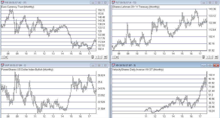
Figure 1 –The Four ETFs in The Four NonCorr Portfolio (Courtesy AIQ TradingExpert)
As you can see there is a lot of “zigging” by one accompanied by “zagging” for another.  No surprise that when the Euro rises the dollar falls and vice versa. Also, TLT often seems to move opposite XIV. That is essentially the purpose of these pairings.
Figure 2 displays the correlations between the four ETFs in the portfolio (using AIQ TradingExpert Matchmaker function from 8/31/2012 through 8/31/2017 using weekly data).  A reading of 1000 indicates a perfect correlation, a reading of -1000 indicates a perfectly inverse correlation.
FXE UUP TLT XIV
FXE (913) 77 (13)
UUP (913) (117) 43
TLT 77 (117) (234)
XIV (13) 43 (234)
Figure 2 – Correlations for the FourNonCorr Portfolio ETFs (Source: AIQ TradingExpert)
Clearly there is a whole lot of “not correlating much” going on.
Results
For testing purposes I used monthly total return data for each ETF from the PEP Database from Callan Associates.  The one exception is ticker XIV which did not start actual trading until December 2010.  For January 2008 through November 2010 I used index data for the index that ticker XIV tracks inversely (S&P 500 VIX SHORT-TERM FUTURES INDEX). Actual XIV ETF data is used starting in December 2010.
As a benchmark, I also tracked the cumulative total return for ticker SPY (that tracks the S&P 500 Index).
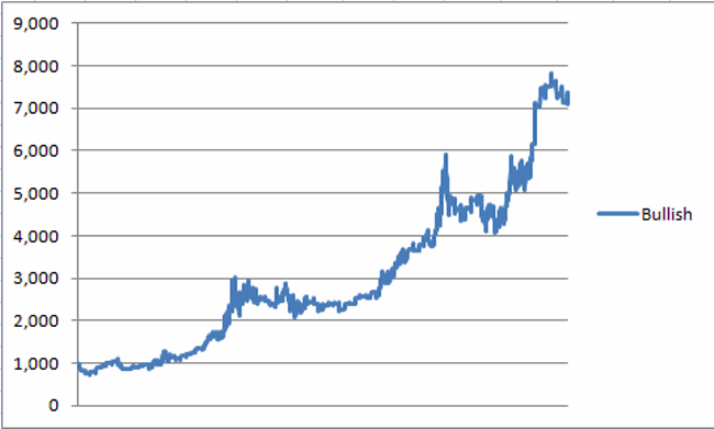
Figure 3 displays the cumulative percent gain or loss for both the FourNonCorr Portfolio and ticker SPY.3
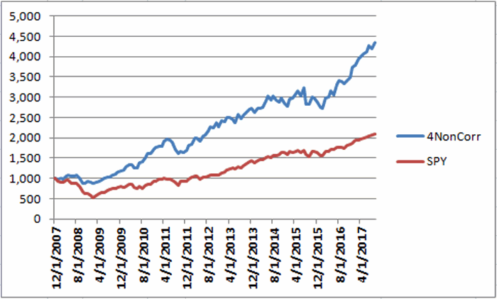
Figure 3 – Cumulative % gain/loss for The FourNonCorr Portfolio (blue) versus SPY (red); 12/31/2007-9/30/2017
Year-by-year results appear in Figure 4
4 NonCorr SPY Diff
2008 (6.0) (37.0) 31.0
2009 26.1 26.4 (0.3)
2010 45.2 14.9 30.3
2011 (1.3) 2.1 (3.4)
2012 34.3 15.8 18.5
2013 19.3 32.2 (12.9)
2014 5.3 13.5 (8.2)
2015 0.6 1.3 (0.8)
2016 21.0 11.8 9.2
2017* 24.4 14.1 10.2
Figure 4 – Year-by-Year Results
The results by the numbers appear in Figure 5.
4NonCorr SPY
Average 12mo % +/- 17.8 11.2
Median 12mo % +/- 14.9 15.0
Std. Deviation 17.1 16.8
Ave/Std. Dev. 1.04 0.67
Worst 12mo % (11.9) (43.2)
Max. Drawdown % (17.8) (48.4)
Figure 5 – By the numbers
All told The FourNonCorr Portfolio:
*Gained +334% versus +110% for SPY since 12/31/2007
*Experienced a maximum drawdown of -17.8% versus-48.4% for SPY
Thoughts
On paper, The FourNonCorr Portfolio looks pretty decent, particularly compared to the S&P 500 Index.  But you will recall that I stated earlier that I don’t actually trade this portfolio with real money.  Why not?  A few concerns:
*Interest rates tend to move in long-term waves up and down.  How beneficial will it be to have TLT in the portfolio if and when interest rates embark on a long-term wave up?
*I don’t entirely trust ticker XIV.  Because of the way it is built it seems to have the benefit of upward bias due to contango in the VIX futures market (the opposite of ticker VXX – please Google “VXX” and/or “contango” for an actual explanation) it also holds the potential to sell off in shocking fashion.  Using the index data as I did in order to replicate hypothetical performance from Jan 2008 through Nov 2010, XIV declined a stunning -72% between the end of May 2008 and the end of November 2008. It also experienced a -60% decline in 2015-2016. Need to give some thought to adding a security that is even capable of that to a permanent portfolio.
*On the flip side, XIV has been the driving force for gains in recent years and shows a cumulative gain of +416% since 12/31/2007.  If (and when?) we ever do see a bear market and/or a significant pickup in volatility will XIV have a large negative influence on performance?  That seems to be the $64,000 question.
Summary
As a thought experiment, The FourNonCorr Portfolio shows a pretty decent track record and seems to hold some interesting promise.  As a real money, real world experience – questions remain.
Stay tuned, tinker and experiment if you wish,and don’t be too quick to “dive in.”
Jay Kaeppel Chief Market Analyst at JayOnTheMarkets.com and AIQ TradingExpert Pro client.
Disclaimer:  The data presented herein were obtained from various third-party sources.  Whilne I believe the data to be reliable, no representation is made as to, and no responsibility, warranty or liability is accepted for the accuracy or completeness of such information.  The information, opinions and ideas expressed herein are for informational and educational purposes only and do not constitute and should not be construed as investment advice, an advertisement or offering of investment advisory services, or an offer to sell or a solicitation to buy any security.

March and April (and the Train Rolls On)

The stock market is off to a flying start in 2017.  We have a buy signal from the January Barometer, the 40-Week Cycle just turned bullish  and most of the major U.S. indexes soaring to new all-time highs.  See Figure 1.

1a

Figure 1 – Major U.S. Average hitting new highs (charts courtesy AIQ TradingExpert Pro)

With the turn of the month near, what lies ahead for March and April?  Well, it’s the stock market, so of course no one really knows for sure.  Still, if history is an accurate guide (and unfortunately it isn’t always – and I hate that part), the odds for a continuation of the advance in the months just ahead may be pretty good.

Figure 2 displays the growth of $1,000 invested in the Dow Jones Industrials Average ONLY during the months of March and April starting in 1946.

2a

Figure 2 – Growth of $1,000 invested in the Dow Jones Industrials Average ONLY during the months of March and April (1946-2016)

For the record, the months of March and April combined:

*Showed a gain 53 times (75% of the time)

*Showed a loss 18 times (25% of the time)

*The average UP year showed a gain of +5.2%

*The average DOWN year showed a loss of (-3.3%)

*The largest Mar/Apr gain was +15.9% (1999)

*The largest Mar/Apr loss was (-6.0%) (1962)

Summary

So is the stock market train sure to “roll on” during the March/April timeframe?  Not at all.  But with “all systems Go” at the moment and with a historically favorable period approaching – and despite a lot of overly bullish sentiment beginning to bubble up – I feel compelled to stay on board at least until the next stop..

Jay Kaeppel

Chief Market Analyst at JayOnTheMarkets.com and AIQ TradingExpert Pro (http://www.aiqsystems.com) client. http://jayonthemarkets.com/

Disclaimer:  The data presented herein were obtained from various third-party sources.  While I believe the data to be reliable, no representation is made as to, and no responsibility, warranty or liability is accepted for the accuracy or completeness of such information.  The information, opinions and ideas expressed herein are for informational and educational purposes only and do not constitute and should not be construed as investment advice, an advertisement or offering of investment advisory services, or an offer to sell or a solicitation to buy any security.

Exponential Standard Deviation Bands

The AIQ code based on Vitali Apirine’s article in the 2017 issue of Stocks & Commodities magazine, “Exponential Standard Deviation Bands”

Editor note: “Author Vitali Apirine presented a method intended to help traders see volatility while a stock is trending. These bands, while similar to Bollinger Bands, are calculated using exponential moving averages rather than simple moving averages. Like Bollinger Bands, they widen when volatility increases and narrow as volatility decreases. He suggests that the indicator can be used as a confirming indication along with other indicators such as the ADX. Here’s an AIQ Chart with the Upper, Lower and Middle Exponential SD added as custom indicators.”


To compare the exponential bands to Bollinger Bands, I created a trend-following trading system that trades long only according to the following rules:
  1. Buy when there is an uptrend and the close crosses over the upper band. An uptrend is in place when the middle band is higher than it was one bar ago.
  2. Sell when the low is less than the lower band.
Figure 8 shows the summary test results for taking all signals from the Bollinger Band system run on NASDAQ 100 stocks over the period 12/9/2000 to 12/09/2016. Figure 9 shows the summary test results for taking all signals from the exponential band system on NASDAQ 100 stocks over the same period. The exponential band system improved the average profit per trade while reducing the total number of trades.

Sample Chart

FIGURE 8: AIQ. Here are summary test results for taking all signals from the Bollinger Band system run on NASDAQ 100 stocks over the period 12/9/2000 to 12/09/2016.

Sample Chart

FIGURE 9: AIQ. Here are summary test results for taking all signals from the exponential band system run on NASDAQ 100 stocks over the period 12/9/2000 to 12/09/2016.
The EDS file can be downloaded from http://aiqsystems.com/EDS/Exponential_Standard_Deviation_Bands.EDS 
and is also shown here:
!Exponential Standard Deviation Bands
!Author: Vitali Apirine, TASC February 2017
!Coded by: Richard Denning 12/11/2016
!www.TradersEdgeSystems.com!INPUT:
xlen is 20.
numSD is 2.

!INDICATOR CODE:
ExpAvg is expavg([close],xlen).
Dev is [close] – ExpAvg.
DevSqr is Dev*Dev.
SumSqr is sum(DevSqr,xlen).
AvgSumSqr is SumSqr / xlen.
ExpSD is sqrt(AvgSumSqr).

!UPPER EXPONENTIAL SD BAND:
UpExpSD is ExpAvg + numSD*ExpSD.  !PLOT ON CHART

!LOWER EXPONENTIAL SD BAND:
DnExpSD is ExpAvg – numSD*ExpSD.   !PLOT ON CHART

!MIDDLE EXPONENTIAL SD BAND:
MidExpSD is ExpAvg.

!BOLLINGER BANDS FOR COMPARISON:
DnBB is [Lower BB].  !Lower Bollinger Band
UpBB is [Upper BB].  !Upper Bollinger Band
MidBB is simpleavg([close],xlen). !Middle Bollinger Band
!REPORT RULE TO DISPLAY VALUES:
ShowValures if 1.

!TRADING SYSTEM USING EXPPONENTIAL SD BANDS:
UpTrend if MidExpSD > valresult(MidExpSD,1).
BreakUp if [close] > UpExpSD.
BuyExpSD if UpTrend and BreakUp and valrule(Breakup=0,1).
ExitExpSD if [Low] < DnExpSD.  ! or UpTrend=0.

!TRADING SYSTEM USING BOLLINGER BANDS:
UpTrendBB if MidBB > valresult(MidBB,1).
BreakUpBB if [close] > UpBB.
BuyBB if UpTrendBB and BreakUpBB and valrule(BreakupBB=0,1).
ExitBB if [Low] < DnBB.  ! or UpTrend=0.

—Richard Denning
info@TradersEdgeSystems.com
for AIQ Systems

Out With The Old (Part 1)

Before moving on to 2017 I want to revisit a couple of “old” ideas I wrote about recently.
One 9/23/16 I wrote this article detailing a very aggressive bond trading strategy.  The model detailed essentially combined two other models that I have used for a number of years – one a “timing” model, the other  a “seasonal” model.  If either model is bullish then ticker TMF (a triple leveraged long-term treasury bond fund) is held.
As shown in Figure 1, the first model turns:
*Bullish for Bonds when the 5-week moving average for ticker EWJ drops below the 30-week moving average for ticker EWJ
*Bearish for Bonds when the 5-week moving average for ticker EWJ rises above the 30-week moving average for ticker EWJ
1a
Figure 1 – Bond Bull and Bear signals using ticker EWJ (Courtesy AIQ TradingExpert)
The second model simply holds bonds during the last 5 trading days of each month
The rules for Jay’s Very Risky Bond Model (JVRBM) are as follows:
Bullish for TMF if:
*Ticker EWJ 5-week MA < Ticker EWJ 30-week MA, OR
*Today is one of the last 5 trading days of the month
Bearish for TMF if:
*EWJ 5-week MA > EWJ 30-week MA AND today IS NOT one of the last 5 trading days of the month
Figure 2 displays the growth of $1,000 invested in TMF if the bullish conditions above apply since 4/16/2009 (when TMF started trading).
1
Figure 2 – Growth  of $1,000 invested in ticker TMF when JVRBM is Bullish (4/16/2009-12/30/2016)
Figure 3 displays the growth of $1,000 invested in TMF is the bearish conditions above apply since 4/16/2009 (when TMF started trading).
2
Figure 3 – Growth  of $1,000 invested in ticker TMF when JVRBM is Bearish (4/16/2009-12/30/2016)
For the record:
*During the Bullish periods in 2016 ticker TMF gained +72%
*During the Bearish periods in 2016 ticker TMF lost -43%
Figure 4 displays the growth of  $1,000 invested in ticker TMF during the Bullish versus Bearish periods in 2016.
3
Figure 4 – Growth of $1,000 invested in TMF during Bullish versus Bearish periods (12/31/2015-12/31/2016)
All in all not a bad year (Just don’t forget high degree of risk).
Summary
Make no mistake, this is a trading method that entails a great deal of risk.  One can reasonably ask if a long position in a triple leveraged fund of any kind is really a good idea.
But, hey, the phrase “high risk, high reward” exists for a reason.
Jay Kaeppel

Chief Market Analyst at JayOnTheMarkets.com and AIQ TradingExpert Pro (http://www.aiqsystems.com) client. http://jayonthemarkets.com/

The Trend, the Trend, the Trend

In real estate, it’s “Location, Location, Location.” In the financial markets it’s “the Trend, the Trend, the Trend.”  There is a great deal of certainty about what will happen next in stocks, bonds and gold.  But the key to successfully navigating these turbulent times starts not with predicting the future but rather with identifying the current trend in the here and now and going from there.  So let’s take a look at, well, what else, the trends.

I have certain trend-following models that I follow to help me to determine which way to be leaning in the markets.  Like any trend-following method they are far from perfect (my stock market model for example, suffered not one but two significant whipsaws in the last year+).  But for me there is no expectation that they will be perfect.  The only goal is to catch most of the upside during major bull markets, and miss much of the downside during major bear markets.
Stocks
For stocks I look at the 10-month and 21-month moving averages for the S&P 500 Index and use the following rules:
*A sell signal occurs when the S&P 500 closes 2 consecutive months below its 21-month moving average AND is also below its 10-month moving average
*Following a sell signal a new buy signal occurs when the S&P 500 registers a monthly close above its 10-month moving average
stock-trend
Figure 1 – Stock Market trend-following signals (Courtesy AIQ TradingExpert)
This method avoided much of the 1973-1974, 2000-2002 and 2008 bear market destruction.  That’s the good news.  The bad news is that it sold at the end of September 2015 and at the end of February 2016 – both just prior to powerful upside reversals (like I said, trend-following models ain’t perfect).
The most recent signal was a buy signal on 3/31/2016.  
So the trend for stocks is presently BULLISH
Bonds
I have written several posts about this in the past.  My favorite bond timing indicator is Japanese stocks.  No seriously.  They have a string tendency to trade inversely to the 30-yr US t-bond.  I track ticker EWJ and watch the 5-week and 30-week moving averages.  Because Japanese stocks and t-bonds trade inversely I use the following rules:
*A buy signal for bonds occurs when the 5-week moving average for EWJ drops below the 30-week moving average for EWJ
*A sell signal for bonds occurs when the 5-week moving average for EWJ rises above the 30-week moving average for EWJ
The most recent signal was a sell signal for t-bonds on 6/10/2016
So the trend for bonds is presently BEARISH
bond-trend
Figure 2 – Bond trend-following signals(Courtesy AIQ TradingExpert)
Gold
For gold I use two moving averages on a weekly chart for something I refer to as Jay’s Anti-Gold Index.  Rather than go into a long explanation I will link to the original article on the topic and offer a short explanation.  In AIQ TradingExpert I created a ticker comprised of 4 other tickers (GLL, RYSDX, SPX and YCS) which all trade in a negatively correlated manner to the price of gold (er, usually).
One moving average I call the “FrontWeighted36DayMA” (“FrontWeightedMA” for short.  The calculations are based on someone else’s work – unfortunately I cannot recall the person’s name so cannot give proper credit.  Hopefully Karma will work and somewhere that person will  Have a Nice Day without really knowing why.  The calculations are a bit long-winded so the AIQ TradingExpert code appears at the end of this article.
The other is the 55-week exponential moving average.
(CAVEAT: Because some of these tickers did not exist until 2006 trading signals began on 12/31/1996, so yes, it is by my standards a relatively short test period for a long -term moving average method.  To put it another way, don’t bet the ranch on  gold basedon this one indicator)
The trading rules are as follows:
*When the FrontWeightedMA closes a week BELOW the 55-week MA then a BUY signal for gold occurs.
*When the FrontWeightedMA closes a week ABOVE the 55-week MA then a BUY signal for gold occurs.
gold-signals-3
Figure 3 – Gold Trading Signals (Courtesy AIQ TradingExpert)
The most recent signal was a buy signal on 3/18/16.
So the trend for gold is presently BULLISH.
Summary
These indicators represent “my opinion as to where the markets are headed next” (because the truth is I don’t know).  There are objective, mechanical measures of where things stand today.  Nothing more, nothing less.
Also, none these indicators falls into the “World Beater” or “You Can’t Lose in Investing” categories.  But then again they are not really designed to (BTW if you do posses methods that do fit into either of the aforementioned categories, I would love to hear from you – off the record, of course).  What they do achieve is to offer a decent frame of reference during times of doubt.
And that is one of the most powerful tools any investor can possess.
So in sum, the current trend (at least according to what you’ve seen here) for stocks and gold is bullish and the current trend for bonds is bearish.
How long any of these trends will remain in place is anyone’s guess.  So enjoy them while they last.

Jay Kaeppel

Chief Market Analyst at JayOnTheMarkets.com and AIQ TradingExpert Pro (http://www.aiqsystems.com) client