Category Archives: jay kaeppel

The World is Your Oyster – 4 Days a Month

Some things are just plain hard to explain.  I did the following test using all 17 of the iShares single country funds that started trading 1996:
I tested the performance of each single country ETF on each specific trading day of the month (i.e., the 1st trading day of any month is TDM 1, the next day is TDM 2, etc.)
I also examined the last 7 trading days of the month counting backwards (i.e., the last trading day of the month is TDM -1, the day before that is TDM -2, etc.)
The basic idea was to see if there were any consistently favorable or unfavorable days of the month.  I wasn’t necessarily expecting much given that the stock markets of each of 17 different countries could  rightly be expected to “walk to the beat of their own drum”, given that the fundamentals underlying the stock market in any given country may be unique from that of other countries.
Or maybe not so much.
For what it is worth, the results from 3/25/1996 through 6/20/2016 appear in Figure 1.
(click to enlarge)
1
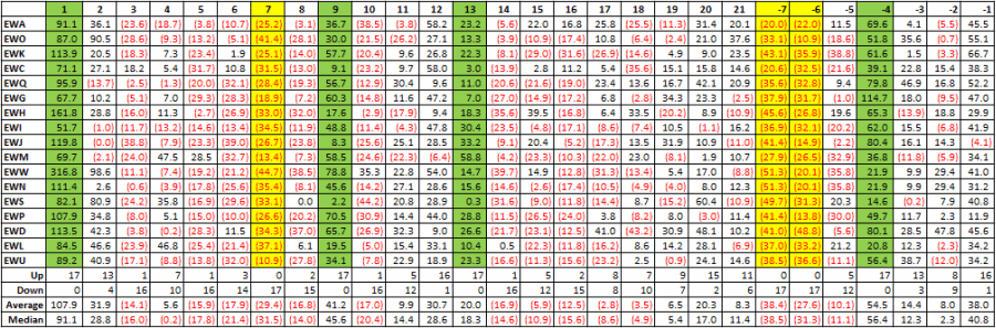
Figure 1 – Trading Day of Month Results for 17 iShares single country ETFs; 3/25/96 through 6/20/16
Each column displays the cumulative % return for each individual single country ETF if we held a long position in that ETF on only that particular trading day of the month.
As you can see – and what are the odds of this, I am not even sure how to calculate that – there are 4 days (highlighted in green in Figure 1) that were uniformly “favorable”, i.e., all 17 ETFs showed a net gain on that particular trading day of the month (for the record, there are three trading days – TDM #7 and TDMs -7 and -6 – during which all  17 ETFs showed a net loss (highlighted in yellow in Figure 1.  Go figure).
Using as a Strategy
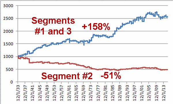
I am not recommended the following strategy, but wanted to test it out for arguments sake.  Figure 2 displays the results of the following test:
*Buy and hold an equally weighted position in all 17 single country ETFs only on TDM 1, 9, 13 and -4 (i.e., if Friday is the last trading day of the month then – barring a holiday – TDM -4 would be the Tuesday of that week), earn annualized interest of 1% per month while out of ETFs.
*Versus simply buying and holding all 17 single country ETFs from 3/25/1996 through 6/20/2016.
2
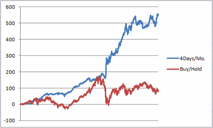
Figure 2 – Cumulative % return for holding all 17 single country ETF only 4 days a month (blue) versus buying and holding (red); 3/25/96 through 6/20/16
Summary
Yes, this model can probably be accused of being “curve fit”.  Also, does anybody really want to trade in and out of 17 single country ETFs 4 times a month?  I don’t know.  But the bigger points are:
*Why would all 17 single country ETFs all be up (or down) on a particular day of the month over a 20 year period?
*If I were considering buying and holding a cross section of individual country ETF’s, um, well, I can’t help but think that I would be haunted by the thought that there might be a better way.
Jay Kaeppel
Chief Market Analyst at JayOnTheMarkets.com and AIQ TradingExpert Pro (http://www.aiqsystems.com) client

Beware the Middle of May

The beginning of the month of May and the end of the month of May into early June have overall been a decent time to be in the stock market.  The middle of May, typically not so much.
For our purposes we will split May (into June) into three segments:
*Segment 1: The first 3 trading days of May (Bullish)
*Segment 2: May trading days #4 through #16 (Bearish)
*Segment 3: May trading day #17 through the 5th trading day of June
Figure 1 displays the growth of $1,000 invested in the Dow Jones Industrials Average only during the first three trading days of May since 1934.
1
Figure 1 – Growth of $1,000 invested in Dow Industrials during 1st three trading days of May (1934-present)
Figure 2 displays the growth of $1,000 invested in the Dow Jones Industrials Average only during trading days 4 through 16 of May since 1934.
2
Figure 2 – Growth of $1,000 invested in Dow Industrials during trading days 4 through 16 of May (1934-present)
Figure 3 displays the growth of $1,000 invested in the Dow Jones Industrials Average only from the close of May trading day #16 and the close of the 5th trading day of June.
3
Figure 3 – Growth of $1,000 invested in Dow Industrials during trading days #17 and higher during May and the 1st five trading days of June  (1934-present)
Combining and Comparing
In Figure 4 the blue line displays the growth of $1,000 invested in the Dow only during Segment #1 and Segment #3.  The red line displays the growth of $1,000 invested in the Dow only during Segment #2.
4
Figure 4 – Growth of $1,000 during Segments 1 and 3 (blue) versus Segment 2 (red)
*During Segments #1 and #3 the Dow gained +157.5%
*During Segment #2 the Dow lost -51.1%
During 2016:
*Segment #1 extends from the close on 4/29/16 through the close on 5/4/16
*Segment #2 extends from the close on 5/4/16 through the close on 5/23/16
*Segment #3 extends from the close on 5/23/16 through the close on 6/7/16
Summary
So is the Dow sure to gain ground during Segments #1 and 3 and to lose ground during Segment #2?  Not at all.  For the record:
*Segments 1 and 3 combined have gained an average of +1.2% with 65% of years showing a gain and 35% showing a loss
*Segments 2 has lost an average of (-0.8%) with 49% of years showing a gain and 51% showing a loss
So clearly there are no “sure things” being unveiled here.  Still, if the early days of May see the stock market register a meaningful gain it might make sense to avoid jumping on to the band wagon.
At least for another 13 trading days.….
Jay Kaeppel
Chief Market Analyst at JayOnTheMarkets.com and AIQ TradingExpert Pro (http://www.aiq.com) client

For Every Season, a Sector Fund Portfolio

In this article dated 1/28/16 I wrote about a simple two-fund portfolio that had somehow managed to make money from the end of January to the end of April, 27 years in a row.  OK, make that 28 years in a row.
The portfolio was 50% invested in retail stocks (via ticker FSRPX) and energy services stocks (via ticker FSESX).  As you can see in Table 1 below, FSRPX underperformed most of the major averages but FSESX far outperformed.  As a result, the 50/50 FSRPX/FSESX portfolio gained +12.8% from the end of January to the end of April.
1a
Figure 1 – Jay’s 2-Fund Portfolio versus Major Market Indexes
1
Figure 2 – Tickers FSESX and FSRPX; end of January through April (Courtesy AIQ TradingExpert)
This year’s gain (+12.8%) exceeded the historical average (+10.3%) and historical median (+10.1%).  So chalk one up for the good guys.
Moving on to May
In case you missed it, I also wrote recently about a “May portfolio” here. This portfolio is a bit more defensive in nature and consists of 25% in each of the four funds listed below:
FDFAX – Fidelity Select Consumer Staples
FSHCX – Fidelity Select Health Care Services
FSPHX – Fidelity Select Health Care
FGOVX – Fidelity Government Income Fund
This portfolio has showed a gain during the month of May in 22 of the past 27 years (or 81% of the time).
Jay Kaeppel
Chief Market Analyst at JayOnTheMarkets.com and AIQ TradingExpert Pro (http://www.aiq.com) client

A ‘Simple Hedge’ as Market ‘Bumps it’s Head’

The S&P 500 has “bumped its head” in a clear resistance level.  The VIX Index has dropped into a familiar support level.  Is the party over?  I hope not.  I would love to see the stock market keep heading higher.  But hey, warning signs are warning signs right?
So should we all panic?  Not necessarily.  Still – and fortunately – there is a difference between “being panicked” and “being prepared”.  So let’s talk about a simple hedge “just in case” the stock market decides to sell off in the not too distant future.
Figure 1 displays ticker SPY with a fairly obvious resistance range highlighted. As the verbiage on the chart asks, “will you be surprised if the market pauses or worse here?”1
Figure 1 – Ticker SPY at in resistance zone (Courtesy AIQ TradingExpert)
Figure 2 displays ticker VXX (the ETF that ostensibly tracks the VIX Index).  From a completely and entirely subjective point of view it can be argued that the VIX is in “the calm before the storm” mode.2
Figure 2 – Ticker VXX at support zone (Courtesy AIQ TradingExpert)
Figure 3 displays that the implied volatility for options on ticker VXX has fallen significantly and that VXX options are relatively cheap.3Figure 3 – VXX option implied volatility has fallen hard (Courtesy www.OptionsAnalysis.com)
So what about buying the June VXX 16 call for $200 as a hedge against the stock market suffering a hit between now and June option expiration?
Figure 4 displays the particulars and Figure 5 displays the risk curves.4Figure 4 – VXX June 16 call (Courtesy www.OptionsAnalysis.com)5Figure 5 – Risk curves for VXX June 16 call (Courtesy www.OptionsAnalysis.com)
Summary
As always I am not “recommending” this trade I am simply pointing out that several factors (S&P at resistance, VIX at support, option premiums relatively low, and don’t forget “Sell in May” which is just around the corner) may be coming together to make considering a hedge a reasonable idea.
The questions to ask yourself are:
*Do I think there is a chance/likelihood that the S&P will suffer a selloff in the next 7 weeks or so?
*Am I willing to risk $200 if it doesn’t?
Jay Kaeppel
Chief Market Analyst at JayOnTheMarkets.com and TradingExpert Pro client

The Value of the ‘Perspective’ Indicator

Not every indicator that you look at needs to generate exact buy and sell signals.  There are many useful indicators that offer “perspective” more than “precision market timing.”  It can be very helpful to track some of these. The downside of course is that the more indicators you follow the more you can be susceptible to “analysis paralysis” – plus at some point you do have to have “something” that tells you “make this trade NOW!”
But the basis for considering tracking certain “perspective indicators” is that they can help to keep you from falling for those age-old pitfalls, “fear” and “greed”.  As the market falls – and especially the harder it falls – the more likely an investor is to start to feel fear.  And more importantly, to start to feel the urge to “do something” – something like “sell everything” to alleviate the fear. On the flipside, when things are going great there is a tendency to ignore warning signs and to “hope for the best”, since the money is being made so easily.
In both cases a perspective indicator can serve as – at the very least – a slap upside the back of the head that says “Hey, pay attention!”
So today let’s review one of my favorites.
The JK HiLo Index
OK, I will admit it is one of my favorites because I developed it myself.  Although in reality the truth is that it simply combines one indicator developed long ago by Norman Fosback and another that I read about in a book my either Martin Pring or Gerald Appel.
I first wrote about this indicator in the October 2011 issue of Technical Analysis of Stocks and Commodities magazine and I believe it is available via Bloomberg.
The calculations are as follows:
A = the lower of Nasdaq daily new highs and Nasdaq daily new lows
B = (A / total Nasdaq issues traded)*100
C = 10-day average of B
D = Nasdaq daily new highs / (Nasdaq daily new highs + Nasdaq daily new lows)
E = 10-day average of D
JK Hi/Lo Index = (C * E) * 100
In a nutshell:
*High readings (90 or above) suggest a lot of “churning” in the market and typically serve as an early warning sign that a market advance may be about to slow down or reverse.  That being said, a close look at Figure 1 reveals several instances where high readings were NOT followed by lower prices.  However, as a perspective indicator note the persistently high reading starting in late 2014.  This type of persistent action combined with the “churning” in the stock market could easily have served as a warning sign for an alert investor.
*Low readings (20 or below) indicate a potential “washout” as it indicates a dearth of stocks making new highs.  Readings under 10 are fairly rare and almost invariably accompany meaningful stock market lows.
Figure 1 displays the Nasdaq Composite (divided by 20) with the JK Hi/Lo Index plotted since 2011.
1
Figure 1 – JK HiLo Index (red line) versus Nasdaq Composite (/20) since 2011
Regarding the difference between a “timing” indicator and a “perspective” indicator, note the two red lines in Figure 2.  The JK HiLo Index first dropped below 20 on the date marked by the first red line.  It finally moved back above 20 on the date marked by the second red line.  2
Figure 2 – JK HiLo Index (red line) versus Nasdaq Composite (/20) since 2015 (Courtesy AIQTradingExpert)
Can we say that the JK HiLo Index “picked the bottom with uncanny accuracy”?  Not really.  The Nasdaq plunged another 10% between the first date the indicator was below 20 until the actual bottom.
Still, can we also say that it was useful in terms of highlighting an area where price was likely to bottom?  And did it presage a pretty darn good advance?  I think a case can be made that the answers to those questions are “Yes” and “Yes”.
Summary
The bottom line is that while there was a great deal of fear building in the market during January and February, an indicator such as this one can help alert an investor the fact an opportunity may be at hand.
Jay Kaeppel
Chief Market Analyst at JayOnTheMarkets.com and TradingExpert Pro client