First the Bad News: There are no “magic bullets” when it comes to trading. There are people in this industry who have literally tested somewhere in the range of six bazillion “indicators” – give or take (“Hi. My name is Jay”). Every trend following indicator looks like a gold mine when it latches onto a huge trend and rides it (but not so much when it starts getting whipsawed). And every overbought/oversold indicator looks like a gift from heaven from time to time when it somehow manages to peak (or valley) and then reverses right at a high (or low). And then the next time the thing gets oversold the security in question just keeps plunging and the previously “amazingly accurate” indicator just gets more and more oversold.
Bottom line: what I am about to discuss is likely no better or worse than a lot of other indicators. And it is no holy grail. Still, I kinda like it – or whatever that is worth.
EDITORS NOTE an AIQ EDS file for this indicator with the 3 step rules outlined can be downloaded from here you will need to copy or save this file into your wintes32/eds strategies folder. Alternatively the code is available at the end of this article for copying and pasting into a new EDS file.
UpDays20
I call this indicator UpDays20 and I stole, er, learned it originally from Tom McClellan of McLellan Financial Publications. My calculation may be slightly different because I wanted an indicator that can go both positive and negative. For a given security look at its trading gains and losses over the latest 20 trading days.
UPDays20 = (Total # of Up days over the last 20 trading days) – 10
So if 10 of the last 20 trading days showed a gain then UpDays20 would read exactly 0.
If only 6 of the last 20 trading days showed a gain then UpDays20 would read -4
You get the idea (and proving once again that it “doesn’t have to be rocket science”). As a “trading method” it is always advised that this indicator – like most all other indicators – NOT be used as a standalone approach to trading. That being said, the way I follow this indicator is as follows.
Step 1) UpDays20 drops to at least -2
Step 2) UpDays20 rises 2 points from a low
Step 3) The security in question then rises above its high for the previous 2 trading days
It is preferable to follow this setup hen the security in question is above its 200-day moving average, but that is up to the trader to decide (the danger to using this with a security below its 200-day moving average is that it might just be in the middle of a freefall. The upside is that counter trend rallies can be fast and furious – even if sometimes short-lived).
Again, there is nothing magic about these particular steps. They are simply designed to do the following:
1) Identify an oversold condition
2) Wait for some of the selling pressure to abate
3) Wait for the security to show some sign of reversing to the upside
Like just about every other indicator/method, sometimes it is uncannily accurate and sometimes it is embarrassingly wrong (hence the reason experienced traders understand that capital allocation and risk management are far more important than the actually method you use to enter trades).
In this previous article (in Figures 3 and 4) I wrote about using this indicator with ticker TLT. Figure 1 and 2 display the “buy” signals generated using the rules above for tickers IYT and GLD.
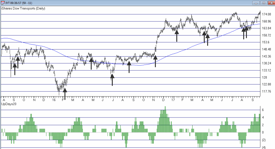 Figure 1 – UpDays20 “Buy” Alerts for ticker IYT (Courtesy AIQ TradingExpert)
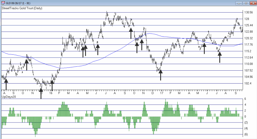 Figure 2 – UpDays20 “Buy” Alerts for ticker GLD (Courtesy AIQ TradingExpert)
Are these signals good or bad? That is in the eye of the beholder and not for me to say. One big unanswered question is “when do you exit”? That is beyond the scope of this “idea” article – however, “sell some at the first good profit and then use a trailing stop” looks like a decent approach to consider) but would have a profound effect on any actual trading results.
Some of the signals displayed in Figures 1 and 2 are obviously great, others are maybe not so hot. Interestingly, some of the signals in Figure 1 and 2 that don’t look to timely at first blush actually offered a profitable opportunity to a trader who was inclined to take a quick profit. Again, how you allocate capital and when you exit with a profit and when you exit with a loss would likely have as much impact on results as the raw “buy” signals themselves.
Summary
No one should go out and start trying to trade tomorrow based on UpDays20. No claim is being made that the steps detailed herein will result in profits nor even that this is a good way to trade.
But, hey, it’s one way.
Jay Kaeppel Chief Market Analyst at JayOnTheMarkets.com and AIQ TradingExpert Pro client.
Disclaimer: The data presented herein were obtained from various third-party sources. While I believe the data to be reliable, no representation is made as to, and no responsibility, warranty or liability is accepted for the accuracy or completeness of such information. The information, opinions and ideas expressed herein are for informational and educational purposes only and do not constitute and should not be construed as investment advice, an advertisement or offering of investment advisory services, or an offer to sell or a solicitation to buy any security.
EDITORS NOTE an AIQ EDS file for this indicator with the 3 step rules outlined can be downloaded from here you will need to copy or save this file into your wintes32/eds strategies folder. Alternatively the code is available at the end of this article for copying and pasting into a new EDS file.
! UpDays20 – I call this indicator UpDays20. For a given security look at its trading gains and losses over the latest 20 trading days.
! UPDays20 = (Total # of Up days over the last 20 trading days) – 10
! So if 10 of the last 20 trading days showed a gain then UpDays20 would read exactly 0.
! If only 6 of the last 20 trading days showed a gain then UpDays20 would read -4
Upday if [close]>val([close],1).
totalupdayslast20days is CountOf(upday,20).
updayindicator is totalupdayslast20days – 10.
! How to follow this indicator
! Step 1) UpDays20 drops to at least -2
! Step 2) UpDays20 rises 2 points from a low
! Step 3) The security in question then rises above its high for the previous 2 trading days
UpDays20rises2points if updayindicator>valresult(updayindicator,1) and valresult(updayindicator,1)>valresult(updayindicator,2).
updays20atminus2orlower if valresult(updayindicator,2)<=-2.
closesabovehighof2priordays if [close]>val([high],1) and [close]>val([high],2).
Upsignal if UpDays20rises2points and updays20atminus2orlower and closesabovehighof2priordays.