It’s January. It’s cold. And the ground in the Midwest is frozen (and getting more frozen by the moment I might #$%^ add). So of course, it is time to thinking about planting corn!
Wait, what!?
Well, yes as it turns out just about everyone involved in the agricultural industry has questions (doubts?) about corn planting in the spring and the eventual crop harvested in fall. And the big questions are, “How will planting go?” and “how much corn will be produced?” As it relates to corm the whole supply/demand thing you learned about way back when hinges on the ultimate answers to those two questions.
In a nutshell, there is “doubt.” No surprise really as there is absolutely not a single corn seed planted anywhere in the Midwest at this moment. So, who knows for sure?
One thing we do know for sure is that a lot of people are aware of this phenomenon in corn and feel compelled to “hedge their bets”, typically on an annual basis. Figure 1 displays an annual seasonal chart for corn futures from www.sentimentrader.com.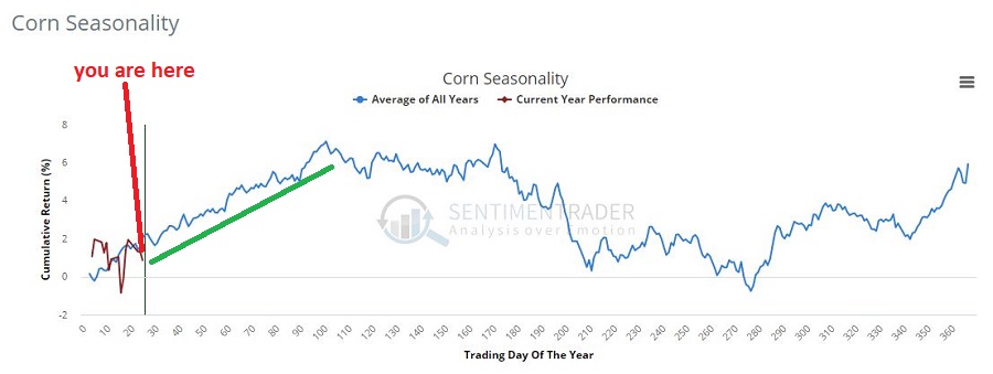 Figure 1 – Annual Seasonal trend for Corn (Courtesy Sentimentrader.com)
As you can see, price strength is typical in the first 4 to 5 months of the year. This should not be surprising because – as I described above – doubt about supply causes buying pressure (typically).
So for traders the real question is “should I be buying corn in anticipation of buying pressure?” The answer is “definitely, maybe!” Let’s take a closer look.
Figure 2 displays spot corn prices since 2001.

Figure 2 – Spot Corn prices (Courtesy ProfitSource by HUBB)
We can notice two things:
*Corn is presently in a fairly prolonged consolidation/compression range
*Previous consolidation/compression ranges have been followed by some significant advances
Despite this, one should not necessarily assume that corn is about to burst higher in price. So let’s look at things from a more technical/tactical trading point of view.
How to Play Corn
*The “purest’ play is corn futures. However, corn futures are not for most people. In Figure 2, corn is trading at “350”, which equates to $3.50 a bushel in corn futures parlance. Here is what you need to know:
If one were to buy a corn futures contract at $3.50 a bushel, a move to $4.50 a bushel would generate a gain of +$5,000 and a move to $2.50 a bushel would generate a loss of -$5,000.
In sum, a great way to make a lot of money if you are right and a great way to lose a lot of money if you are wrong. There is an alternative for the “average” investor.
*Ticker CORN is the Teucrium Corn ETF which allows investors to trade corn like they would trade shares of stock. Figure 3 displays a daily chart for ticker CORN.
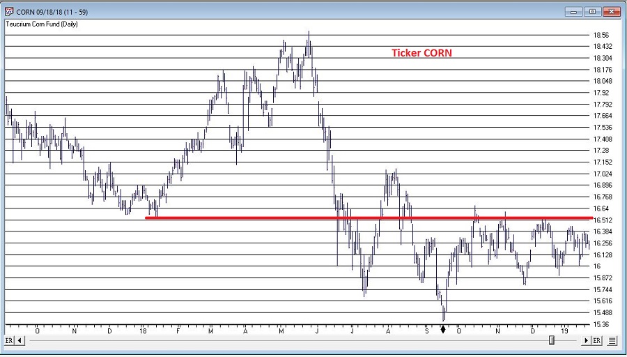
Figure 3 – Ticker CORN with a significant resistance level around $16.53 (Courtesy AIQ TradingExpert)
Note that I have drawn a horizontal line $16.53, which connect the January 2018 low and the December 2018 high. As with any line that one might arbitrarily draw on a bar chart, there is nothing “magic” about this price level. But it does represent a potential line in the sand that be utilized in the following “highly complex” manner:
*CORN above $16.53 = (Possibly) Good
*CORN below $16.53 = Bad
The Choices
So what’s an investor to do? As always, there are choices.
Choice #1 is flush this idea and forget all about corn.
Choice #2 is to buy now in hopes of an upside breakout, possibly with a stop-loss under the September 2018 low of $15.39.
Choice #3 is to wait for an upside breakout above $16.53 as confirmation that an actual bullish trend is forming.
Summary
I don’t make “recommendations” here at JOTM, so whether you prefer #1, #2 or #3 above is entirely up to you. The key points though are:
It appears that there may be an opportunity forming (higher seasonal corn prices based on perceptions of problematic weather for planting and a long consolidation/compression in price).
A trader considering this idea needs to make decisions regarding what to trade (futures or CORN ETF), when to actually get in (before the breakout or after) and where to place a stop-loss.
Jay Kaeppel
Disclaimer: The data presented herein were obtained from various third-party sources. While I believe the data to be reliable, no representation is made as to, and no responsibility, warranty or liability is accepted for the accuracy or completeness of such information. The information, opinions and ideas expressed herein are for informational and educational purposes only and do not constitute and should not be construed as investment advice, an advertisement or offering of investment advisory services, or an offer to sell or a solicitation to buy any security.