Category Archives: ETFS

Yes, the U.S. Dollar is at a Critical Juncture

If you have read any of my pieces lately you are already aware that as it relates to the financial markets a lot of things are presently at a critical juncture (including my sanity, but I digress).  Today let’s add the U.S. Dollar to that seemingly ever longer list of financial areas that appear to be at a crossroads.  And this one has some large implications simply because a lot of other markets are affected at least to some extent by what happens in the dollar.

Figure 1 displays the Spot U.S. Dollar on a monthly basis.

1

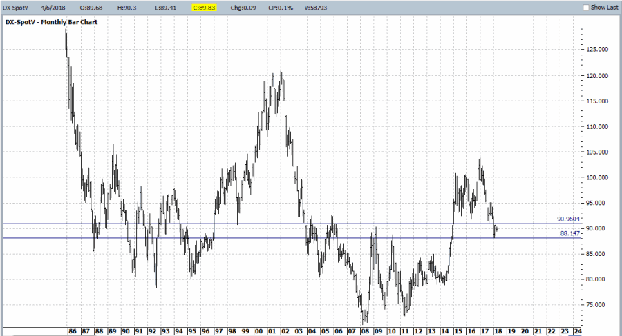
Figure 1 – U.S. Dollar Monthly (Courtesy ProfitSource by HUBB)

The reality is that there is no one definitive price at which to draw a “definitive” line in the sand.  So I arbitrarily picked two.  There is nothing “magical” about these two lines and a move above or below either does not technically “prove” anything.  Still, as far as this range goes, a lot of previous price moves have “gone here to die” so to speak.

Now this is the point in the article where a skilled analyst would explain in painstaking detail why the dollar is absolutely, positively destined to move higher (or lower) from here.  Sorry, folks I honestly don’t know. But there are two things I do know which might still prove useful:

1) For every prognosticator out there pounding the table that the dollar is sure to move higher there is another (equally slightly crazed) prognosticator averring that the dollar is destined to decline.  And the key thing to note is that they both can make a pretty compelling case.

2) A lot rides on which way the dollar goes from here, because there is no shortage of markets that react – at least in part – to the movements of the U.S. dollar.  This means that alot of trading opportunities will be affected/created by the next big move from the dollar.

A few examples appear in Figure 2 below which displays the inverse nature of the correlation between the U.S. Dollar (using ticker UUP as a proxy) and the market in question (for the record, a figure of 1000 means the market moves exactly like the dollar and a figure of -1000 means the market moves exactly inversely to the dollar).

2

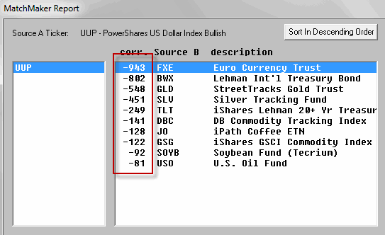
Figure 2 – Correlations to U.S. Dollar (Courtesy AIQ TradingExpert)

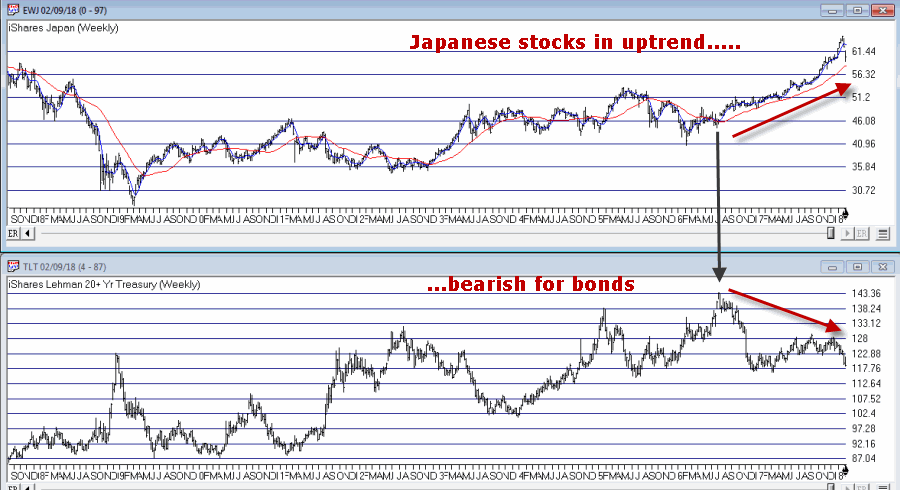
Now the fact that foreign currencies (ticker FXE – which tracks the Euro) move inversely to the U.S. Dollar is fairly obvious.  But note that on this list are:

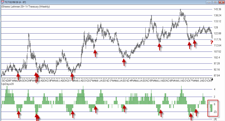
*Foreign Bonds and U.S. Bonds (BWX and TLT)

*Precious Metals (GLD and SLV)

*Commodities (like coffee, soybeans and crude oil)

*Broad Commodity Indexes (DBC and GSG)

This encompasses a pretty darn wide swath of the trading world.  And every single one of them will be influenced to some extent by which way the dollar goes from here.

As you can see in Figures 3 through 6 (click to enlarge any of the charts), what happens to the U.S. Dollar can matter a lot to what happens in these markets.

3

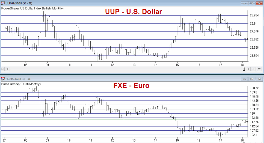
Figure 3 – Dollar vs. Euro (Courtesy AIQ TradingExpert)

4

Figure 4 – Dollar vs. Bonds (Courtesy AIQ TradingExpert)

5

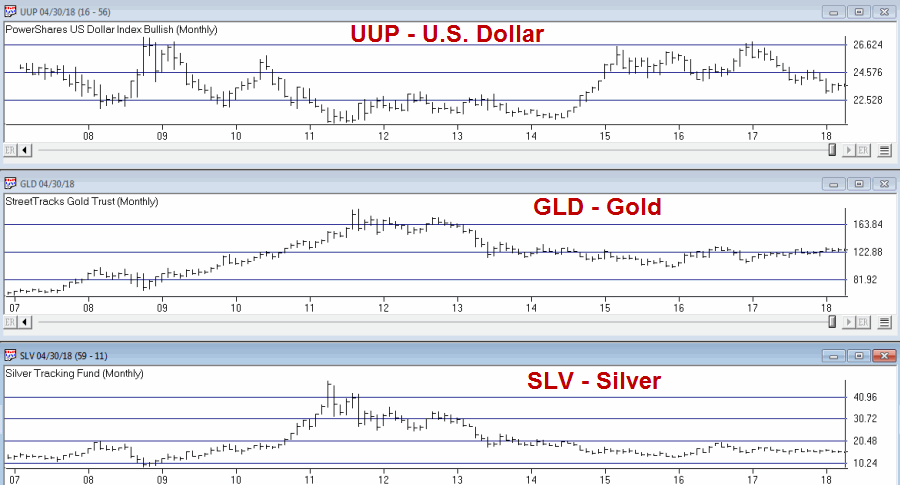
Figure 5 – Dollar vs. Metals (Courtesy AIQ TradingExpert)

6

Figure 6 – Dollar vs. Commodity Indexes (Courtesy AIQ TradingExpert)

Summary

So the bottom line is that I do not know which way the dollar goes from here.  But I do know that whichever way it goes a lot of “things” will likely go “the other way.”  And everything listed in Figure 2 represents a lot of trading opportunities.

This represents a good time to invoke:

Jay’s Trading Maxim #17: (with credit given to George and Tom at Optionetics back in the day): Investing success involves two “simple” steps. #1) Spot opportunity.  #2) Exploit opportunity.  Everything you do as a trader or investor falls into one of these two categories.

A bunch of opportunities may soon be spotted (assuming the dollar actually ever does get around to deciding which way it wants to go…).

So focus here, people, focus…

Jay Kaeppel

Disclaimer:  The data presented herein were obtained from various third-party sources.  While I believe the data to be reliable, no representation is made as to, and no responsibility, warranty or liability is accepted for the accuracy or completeness of such information.  The information, opinions and ideas expressed herein are for informational and educational purposes only and do not constitute and should not be construed as investment advice, an advertisement or offering of investment advisory services, or an offer to sell or a solicitation to buy any security.

Biotech + Gold (Updated)

In this article I wrote about an index I follow that combines the biotech sector with the gold stock sector. I also wrote about “one way” to trade that index.  This article builds on that piece and adds a new “rule” to create more trading opportunities.
The BIOGOLD Index
Figure 1 displays the index that I created using AIQ TradingExpert.  It combines ticker FBIOX (Fidelity Select Biotech) with ticker FSAGX (Fidelity Select Gold).
1
Figure 1 – Jay’s BIOGOLD Index (Courtesy AIQ TradingExpert)
Also included in the lower clip is an indicator referred to as RSI32, which is the 2-day average of the standard 3-day RSI.
The Old System
In the original article I tested an approach that works as follows using monthly data:
*When the RSI32 drops to 32 or below, buy BOTH FBIOX and FSAGX
*After a buy signal, sell both funds when RSI32 rises to 64 or higher
For results, please see the original article.
The New System
The “new rules” are as follows:
A “buy signal” occurs when either:
*The RSI32 drops to 32 or below
*The RSI32 drops below 50 (but not as low as 32) and then reverses to the upside for one month
After either of the buy signals above occurs, buy BOTH FBIOX and FSAGX
*After a buy signal, sell both funds when RSI32 rises to 64 or higher
Figure 2 displays the BIOGOLD Index with various buy and sell signals marked.
2
Figure 2 – Jay’s BIOGOLD Index with RSI32 signals (Courtesy AIQ TradingExpert)
To test results we will:
*Assume that after a buy signal both FBIOX and FSAGX are bought in equal amounts
*We will assume that both funds are held until RSI32 reaches 64 or higher (i.e., there is no stop-loss provision in this test)
For testing purposes we will not assume any interest earned while out of the market, in order to highlight only the performance during active buy signals. Figure 3 displays the hypothetical growth of $1,000 (using monthly total return data) using the “system”.
3
Figure 3 – Hypothetical Growth of $1,000 using Jay’s BIOGOLD System (1986-present)
Summary
For the record, I am not “recommending” that anyone go out and initiate trading biotech and gold based on what I have written here.  Before trading using any approach it is essential for a trader to do their own homework and carefully consider all of the pro’s and con’s associated with any specific approach.  For example, while the trade-by-trade results for the above look reasonably good, it should be noted that there have been 4 separate drawdown’s in excess of -19% along the way, including a maximum drawdown of -37% in 2008.  In considering any approach to trading it is essential to first think long and hard about how well one would “weather the storms”, BEFORE focusing on potential profitability.
To put it more succinctly is the simple phrase “Don’t cross the river if you can’t swim the tide.”
Jay Kaeppel
Disclaimer:  The data presented herein were obtained from various third-party sources.  While I believe the data to be reliable, no representation is made as to, and no responsibility, warranty or liability is accepted for the accuracy or completeness of such information.  The information, opinions and ideas expressed herein are for informational and educational purposes only and do not constitute and should not be construed as investment advice, an advertisement or offering of investment advisory services, or an offer to sell or a solicitation to buy any security.

Trend Following in One Minute a Month

In the article linked below, investor and Forbes columnist Kenneth Fisher writes about what to look for at a market top (How to Tell a Bull Market from a Bear Market Blip). One piece of advice that I have heard him offer before is to wait at least 3 months after a top in price to worry about whether or not we are in a bear market.  That is good advice and provided the impetus for a simple trend-following model I follow based on that “wait 3 months” idea.

First, a few key points:

*Trend-following is NOT about picking tops and bottoms or timing the market with “uncanny accuracy”.  So don’t expect any trend-following system to do so.

*The primary edge in any trend-following method is simply missing as much of the major soul – and capital – crushing bear markets as possible, with the understanding that you will miss some of the upside during bull markets.

The Good News:

*Starting in November 1970 this system has beaten a buy and hold strategy

*This system requires no math. There are no moving averages, etc.  Anyone can look at a monthly S&P 500 bar chart and generate the signals.  And it literally takes less than 1 minute per month to update.

The Bad News:

*Every trend-following method known to man experiences whipsaws, i.e., a sell signal followed by a buy signal at a higher price.  This system is no exception.

*Due to said whipsaws this system has significantly underperformed the S&P 500 buy-and-hold since the low in early 2009.

For what it’s worth, my educated guess is that following the next prolonged bear market, that will change.  But there are no guarantees.

OK, all the caveats in place, here goes.

Jay’s Monthly SPX Bar Chart Trend-Following System

*This system uses a monthly price bar chart for the S&P 500 (SPX) to generate trading signals.

*For the purposes of this method, no action is taken until the end of the month, even if a trend change is signaled earlier in the month.

*A buy signal occurs when during the current month, SPX exceeds its highest price for the previous 6 calendar months.

A sell signal occurs as follows:

a) SPX registers a month where the high for the month if above the high of the previous month. We will call this the “swing high”.

b) SPX then goes 3 consecutive monthly bars without exceeding the “swing high.” When this happens, note the lowest low price registered during those 3 months. We will call this price the “sell trigger price.”

c) An actual sell trigger occurs at the end of a month when SPX register a low that is below the “sell trigger price”, HOWEVER,

d) If SPX makes a new monthly high above the previous “swing high” BEFORE it registers a low below the “sell trigger price” the sell signal alert is aborted

Sounds complicated right?  It’s not.  Let’s illustrate on some charts.

In the charts that follow:

*An Up green arrow marks a buy signal

*A Down red arrow marks a sell signal

*A horizontal red line marks a “sell trigger price”.

Sometimes a sell trigger price is hit and is marked by a down red arrow as a sell signal.  Other times a sell trigger price is aborted by SPX making a new high and negating the potential sell signal.

spx trendf 1

Figure 1 – SPX signals 1970-1979 (Courtesy AIQ TradingExpert)

SPX trendf 2

Figure 2 – SPX signals 1980-1989 (Courtesy AIQ TradingExpert)

SPX trendf 3

Figure 3 – SPX signals 1990-1999 (Courtesy AIQ TradingExpert)

SPX trendf 4

Figure 4 – SPX signals 2000-2009 (Courtesy AIQ TradingExpert)

SPX trendf 5

Figure 5 – SPX signals 2010-present (Courtesy AIQ TradingExpert)

To demonstrate results we will use monthly close price data for SPX.  If the system is bullish then the system will hold SPX for that month.  If the system is bearish we will assume interest is earned at an annual rate of 1% per year.

Figure 6 displays the results of the System versus Buy and Hold starting with $1,000 starting November 1970 through 1994 (roughly 24 years).

6

Figure 6 – Growth of $1,000 invested using System versus Buy-and-Hold; Nov-1970 through Dec-1994

Figure 7 displays the results of the System versus Buy and Hold starting with $1,000 starting at the end of 1994 through the most recent close.

7

Figure 7 – Growth of $1,000 invested using System versus Buy-and-Hold; Dec-1994 through Feb-2018

Figure 8 displays the growth of $1,000 generated by holding the S&P 500 Index ONLY when the trend-following system is bearish.  In Figure 8 you will see exactly what I mentioned at the outset – that the key is simply to miss some of the more severe effects of bear markets along the way.

8

Figure 8 – Growth of $1,000 invested ONLY when trend-following model is Bearish; 1970-2018

Finally, Figure 9 displays trade-by-trade results (using month-end price data).

9

Figure 9 – Trade-by-trade results; Month end price data

Summary

So is this “The World Beater, Best Thing Since Sliced Bread” system?  Not at all.  If you had started using this system in real time in March of 2009 chances are by now you would have abandoned it and moved on to something else, as the whip saw signals in 2011-2012 and 2016 has the System performing worse than buy and hold over a 9 year period.

But here is the thing to remember.  Chances are prolonged bear markets have not been eradicated, never to occur again.  100+ years of market history demonstrates that bear markets of 12 to 36 months in duration are simply “part of the game”.  And it is riding these bear markets to the depths that try investors souls – and wipe out a lot of their net worth in the process.

Chances are when the next 12 to 36 month bear market rolls around – and it will – a trend-following method similar to the one detailed here may help you to “save your sorry assets” (so to speak).

Jay Kaeppel

Disclaimer:  The data presented herein were obtained from various third-party sources.  While I believe the data to be reliable, no representation is made as to, and no responsibility, warranty or liability is accepted for the accuracy or completeness of such information.  The information, opinions and ideas expressed herein are for informational and educational purposes only and do not constitute and should not be construed as investment advice, an advertisement or offering of investment advisory services, or an offer to sell or a solicitation to buy any security.

World Met Resistance

In this article titled “World, Meet Resistance” – dated 12/21/2017 – I noted the fact that many single country ETFs and regional indexes were closing in on a serious level of potential resistance.  I also laid out three potential scenarios.  So what happened?  A fourth scenario not among the three I wrote about (Which really pisses me off.  But never mind about that right now).

As we will see in a moment what happened was:

*(Pretty much) Everything broke out above significant resistance

*Everything then reversed back below significant resistance.

World Markets in Motion

Figure 1 displays the index I follow which includes 33 single-country ETFs. As you can see, in January it broke out sharply above multi-year resistance. Just when it looked like the index was going to challenge the all-time high the markets reversed and then plunged back below the recently pierced resistance level.

(click to enlarge)1

Figure 1 – Jay’s World Index broke out in January, fell back  below resistance in February (Courtesy AIQ TradingExpert)

The same scenario holds true for the four regional indexes I follow – The Americas, Europe, Asia/Pacific and the Middle East – as seen in Figure 2.

(click to enlarge)2

Figure 2 – Jay’s Regional Index all broke above resistance, then failed (Courtesy  AIQ TradingExpert)

So where to from here?  Well I could lay out a list of potential scenarios. Of course if history is a guide what will follow will be a scenario I did not include (Which really pisses me off.  But never mind about that right now).

So I will simply make a subjective observation based on many years of observation.  The world markets may turn the tide again and propel themselves back to the upside.  But historically, when a stock, commodity or index tries to pierce a significant resistance level and then fails to follow through, it typically takes some time to rebuild a base before another retest of that resistance level unfolds.

Here’s hoping I’m wrong

Jay Kaeppel

Disclaimer:  The data presented herein were obtained from various third-party sources.  While I believe the data to be reliable, no representation is made as to, and no responsibility, warranty or liability is accepted for the accuracy or completeness of such information.  The information, opinions and ideas expressed herein are for informational and educational purposes only and do not constitute and should not be construed as investment advice, an advertisement or offering of investment advisory services, or an offer to sell or a solicitation to buy any security.

Is a Reprieve for Bonds in the Offing?

The question on many investors’ minds is “are we in a bond bear market?”  Given that long-term treasuries have lost roughly 17% since July of 2016 it is a fair question.
The main model that I use is still bearish on bonds (more on this topic below).  Still, there are a few potential “lights at the end of the bond tunnel” – at least potentially in the near-term.
Long-Term Rates
My mega long-term “fail-safe” bond trend indicator appears in Figure 1.  It is the yield on 30 year treasuries (ticker TYX – which is multiplied by 10 for some unknown reason) with a 120-month exponential moving average.
0Figure 1 – 30-Yr. Treasury yields (Ticker TYX) with 120-month average (Courtesy AIQ TradingExpert)
When the day comes that TYX breaks out above the 120-month moving average I for one will officially designate the great bond bull market as “over.”  And that day is coming.  But for what it’s worth – it’s not quite here yet.
Metals Positive for Bonds
In this article I wrote about a bond timing model that uses the relationship between gold and copper.  Like a lot of timing models of all stripes it does a good job of differentiating good times for bonds from bad times for bonds, but is very far from perfect.
It goes like this:
A = Gold / Copper
B = 30-day moving average of A
C = 80-day moving average of A
D = B – C
If D > 0 = Bullish for bonds*
If D < 0 = Bearish for bonds*
*- with a 1-day lag
This indicator flipped to bullish at the close on 2/7/18 after being bearish since 7/10/2017.
Figure 2 displays the action of ticker TLT since the last “sell” signal in July 2017.  As you can see, in the end it ended up being “correct” as TLT was lower on 2/7/18 than it was on 7/10/17.  But that was not the case until the last week or so.  So for most of the time during this bearish period TLT traded higher.
1Figure 2 – Ticker TLT with recent Jay’s Metal Model signals (Courtesy AIQ TradingExpert)
What is most important however is to focus on the long-term results. In Figure 2 the blue line depicts the growth of equity achieved by holding long 1 t-bond futures contract ONLY when the model is bullish while the red line depicts the growth of equity achieved by holding long 1 t-bonds futures contract ONLY when the model is bearish (red line).
2aFigure 2 – T-bond futures $ gain/loss when Jay’s Metal Model is bullish (blue line) versus when model is bearish (red line)
The long-term difference in performance is fairly obvious.  That being said it should also be noted that the blue line is by no means a series of straight line advances, i.e., there is no guarantee that this latest bullish signal will prove fortuitous, especially given that we may be transitioning from a long-term bond bull market to a long-term bond near market.
One More Possible Piece of Good News
In this article I applied an indicator I originally learned from Tom McClellan at http://www.mcoscillator.com to weekly TLT.  This indicator looks at the number of times TLT has been up minus the number of times down over the past 20 weeks. Very often a drop to -2 or below followed by an upside reversal of 2 points (i.e., it drops to -2 then subsequently rises to 0, or drops to -3 then rises to -1 and so on) has presaged a favorable up move in bonds. This indicator applied to TLT recently fell to -2 and may flash a favorable signal soon (please note that it HAS NOT given a buy signal yet and that it  could take several weeks before it does).
3Figure 3 – Weekly TLT with UpDays20 Indicator (Courtesy AIQ TradingExpert)
One Piece of “Still Bad News”
In this article I wrote about one of the main bond models I use that uses the trend in Japanese stocks to trade bonds inversely, i.e., if Japanese stocks are bearish it is bullish for bonds and vice versa. I use a 5-week and 30-week moving average to quantify Japanese stocks as “bullish” or “bearish”.
In Figure 4 when the blue line in the top clip is above the red line this is considered bearish for bonds and when the blue line is below the red line it is considered bullish for bonds. For now the blue 5-week average line is still well above the red 30-week average, so this indicator still  designates the trend for bonds as “bearish”.
4aFigure 4 – Ticker TLT tends to trade inversely to ticker EWJ (Courtesy AIQ TradingExpert)
Summary
So are bonds due to rally?  Well, it seems like at least a short-term bounce could be in the offing.  That being said, with bonds breaking down sharply at the moment, 1) this “idea” is geared for “traders” who are not afraid of (and are unacquainted with) taking risks, 2) it might make sense to wait for the UpDays20 indicator discussed above to tick higher by two points – which could take up to several weeks to play out – before “taking the plunge.”
As always I am not “recommending” anything, just highlighting what I see.  For longer-term investors the “Boring Bond Index” bond strategy I wrote about here remains a viable  long-term approach to bond investing.
Jay Kaeppel
Disclaimer:  The data presented herein were obtained from various third-party sources.  While I believe the data to be reliable, no representation is made as to, and no responsibility, warranty or liability is accepted for the accuracy or completeness of such information.  The information, opinions and ideas expressed herein are for informational and educational purposes only and do not constitute and should not be construed as investment advice, an advertisement or offering of investment advisory services, or an offer to sell or a solicitation to buy any security.