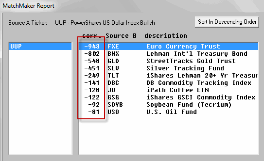
The question posed in the title is essentially, “does the fate of the stock market hinge on the action of Sotheby’s Holdings” (ticker BID)? Sotheby’s is the oldest stock on the NYSE and is the only publicly traded investment opportunity in the art market. As the art market is highly sensitive to the overall economy it has been argued that BID is a potential stock market “bellwether”.
Still, the most obvious answer to the question posed above is of course “No.” Of course the performance of the whole stock market does not come down to the performance of one stock. That’s the obvious answer.
The more curious answer is arrived at by first looking at Figure 1. Figure 1 displays a monthly bar chart for BID in the top clip and the S&P 500 Index in the bottom clip. What is interesting is that historically when BID tops out, bad things tend to follow for the broader stock market.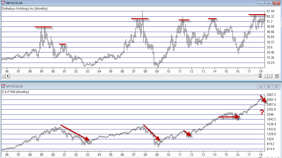
Figure 1 – BID tops often foreshadow SPX weakness (Courtesy AIQ TradingExpert)
Consider:
*The bear market of 2000-2002 was presaged by a dramatic top for BID in 1999, and confirmed again in late 2000.
*The great bear market of 2008 was also preceded by a top and breakdown in BID.
*The 2011 top in BID was followed by a quick but sharp -21% SPX decline.
*The 2013-2014 BID top was followed by roughly 2 years of sideways SPX price action.
*More recently the top in 2017-2018 top has been accompanied by much volatility and consternation in the broader market.
Figure 2 “zooms in” to recent years using weekly data.

Figure 2 – BID Weekly chart (Courtesy AIQ TradingExpert)
In Figure 2 we can see how poor performance for BID presaged an extended period of sideways trading for the SPX. At the far right we can also see that BID is at something of a critical juncture. If it punches through to the upside and moves higher it could be something of an “All Clear” sign for the market. On the other hand, if BID fails here and forms a clear multiple top, well, history suggests that that might be an ominous sign for the broader market.
Other Bellwethers
BID is one of four market “bellwethers” that I like to monitor. The other 3 are SMH (semiconductor index), TRAN (Dow Transports) and ZIV (inverse VIX). You can see the status of each in Figure 3.
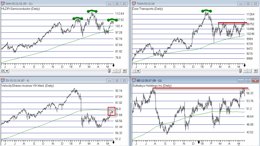
Figure 3 – Four stock market “Bellwethers” (Courtesy AIQ TradingExpert)
To sum up the current status of these bellwethers:
*All 4 (including ZIV as of the latest close) are above their respective 200-day moving average. So technically, they are all in “up trends.”
*All 4 are also threatening to create some sort of topping formation.
In sum, as long as all four of these bellwethers continue to trend higher, “Life is Good” in the stock market. At the same time, if some or all of these fail to break through and begin to top out, the broader market may experience more trouble.
Bottom line: Now is a good time to pay close attention to the stock market for “tells”.
Jay Kaeppel
Disclaimer: The data presented herein were obtained from various third-party sources. While I believe the data to be reliable, no representation is made as to, and no responsibility, warranty or liability is accepted for the accuracy or completeness of such information. The information, opinions and ideas expressed herein are for informational and educational purposes only and do not constitute and should not be construed as investment advice, an advertisement or offering of investment advisory services, or an offer to sell or a solicitation to buy any security.