Many of you may know me, I’m Steve Hill and I’m CEO of AIQ Systems. We’ve provided high end trading analysis tools for over 35 years. My good friend and, client for over 20 years, multi-millionaire investor, Darren Winters is holding a Crypto investing training session this Thursday October 14, 2021 1:30 PM – 2:45 PM EDT
1) The 6 criteria to look for when deciding which crypto to invest in
2) What could be the best performing investments this year
3) The process of how to buy for beginners and advanced investors
4) Why today, there is still massive potential in this market
He’ll also be talking about what he thinks could be one of the biggest crypto launches this year and how to get in early.
If you’re like me, and you’re still working on getting up to speed with how this burgeoning market works, Darren’s training is truly eye opening. Best of all it’s free.
Also you can forward this post to any friends / colleagues / relatives who you think would be interested.
It’s going to be a very valuable session, so they’ll be thanking you for it – plus you’ll have someone to share your thoughts with.
Just make sure you logon 5 minutes early as we might fill to capacity again!
Back in August I stated that the August through October time horizon is the season the stock market tends not to do well and it did just that. But now October is here and seasonal pressure is now to the upside starting in the 2-4th week of October. Does this mean the correction is over? Not at all. It just means that seasonal trends are higher through the end of the year and into January. Earnings and interest rates control the direction of the stock market over the long term. Currently the interest rate market is rising, bonds are declining, and stocks have bounced a little since Oct 1st, but still below its 50 day moving average. So I will not get Bullish until the S&P closes above 50 day moving average and stays there for 2-3 days. Up until then I am still short term Cautious.
If earnings control the direction of the stock markets over the long term then where are earnings expected to go? Earnings still are coming out better than expectations and interest rates should stay low for a while longer so any decline in the markets allow us to buy cheaper shares to redeem over the longer term. Below is the S&P 500 earnings growth chart.
S&P 500 Earnings Growth Chart
Source: S&P
83% percent of companies reporting earnings are beating their expectations. Over the last year earnings have risen 13.95% and are expected to continue to grow approximately 10.8% over the next year. If this happens and interest rates stay relatively low then markets tend to follow earnings over the long term. There are caveats that may disrupt this somewhat:
Covid-19 escalation as we are headed into the winter months
China problems, inflationary pressure, job growth reduction and more.
This is why financial planning is not a static process and needs to be looked at on a regular basis. A diversified portfolio in different asset classes may protect you somewhat. If interest rates are rising, then floating rate bonds that must pay more as interest rates rise may be better than regular bond funds. Financial stocks tend to do better when interest rates rise because their profits rise. If there are inflationary pressures then the typical investments that tend to benefit are ones that people should consider are metals, oil, real estate, inflation protected bonds, agricultural commodities etc.
Listed below are some of the INDEXES for both the equities and interest rate markets. The source is Morningstar.com up until October 9, 2021, these are passive indexes.
Dow Jones +15% S&P 500 +18.1% EQUAL WEIGHTED S&P 500 +21.3% NASDAQ Aggressive growth +15.1% Large Cap Value +15.0% I Shares Russell 2000 ETF (IWM) Small cap +13.2% Midcap stock funds +17% International Index (MSCI – EAFE ex USA +9% International Emerging Markets -1.22% Financial stocks +32% Energy stocks +53% Healthcare Stocks +13% High Yield Merrill Lynch High Yield Index +2.4% Short Term Bond +.12% Multi sector bond funds +2.1% Gold -7.92% 10 year Bond Yield 1.6% Moderate Fund +8.4% Average Disruptor Fund Aggressive growth -11%
Market Outlook
Stocks rebounded this past week with gains of 1% to 3%. The Nasdaq and QQQs were at the low end of this range while the S&P500, Dow and small caps were at the upper end.
While the rebound in stock prices is encouraging, most stock indexes remain below their 50-day averages with 10-day averages below the 50-day averages. Hence, technical (psychological) indicators remain negative.
The economic news this week came in better than I had expected. While advanced Markit business surveys suggested the economy was slowing, ISM business surveys pointed to continued strength. Markit also revised its advance September data to show stronger growth among service companies. On balance, the business surveys show September business activity remained strong
Businesses also reported near-record increases in prices in September. Concern over inflation is one of the clear forces putting upward pressure on interest rates. The yield on 10-year T-Notes is up 30 basis points since mid-September.
When interest rates surge as they have done in recent weeks, there is often a leveling off period. In spite of any potential leveling off, the upward pressure on rates should continue. As for stocks, the most likely outlook is for relatively stability before resuming their upward drift.
A Look Back
Today’s September employment report shows the economy remained strong last month. Private sector payroll jobs increased by 317,000, a 3% annual rate. Weekly hours worked and average hourly earnings rose at a 6% and 7% annual rates, respectively.
Economic Fundamentals: neutral
Stock Valuation: S&P500 over-valued 25%
Monetary Policy: expansive
Recommended Stock Exposure: 85%
CHART SOURCE:AIQSYSTEMS.COM
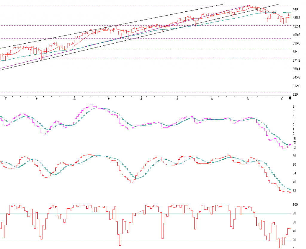
The S&P 500 is above. In August and September I went over the technical indicators and they were VERY OVERBOUGHT and I expected a 3-6% correction. The S&P 500 fell about 6% from its high. Now, it’s a different story, the markets are OVERSOLD, meaning it may be a better BUY. Seasonally the market is still in a weak time through October and could still fall as the S&P is still below its 10 and 50 day moving average. See the 10 day in red and the 50 day in green. We need to see the S&P 500 close above the 50 day moving average at the current price of 4430 in green and stay there for a few days for me to get bullish again. Current my AIQ computer models and other technical indicators are very oversold and any good news can drive this markets higher.
The next indicator is the MACD or momentum indicator. Since September it has trended downward. Now, the pink line is about to break out and through the green line and that would be a bullish trend break.
The next indicator is the SD-SK Stochastics indicator. It is an overbought or oversold indicator. In August and September I was saying that the market was overbought and should go down. Any price above 88 is overbought. Now that it is under 32, it’s somewhat over sold. This may be a good time for longer term investors to start to accumulate equities.
The last indicator is the stochastic indicator. A sell indicator is when it falls below 80 and the buy indicator is when it crosses 20 and it did a few days ago. We are not out of the woods yet, but the markets look a little better to enter then they did 2 months ago.
Support levels on the S&P 500 area are 4365, 4237, and 4044 Resistance at 4438. These may be safer areas to get into the equity on support levels slowly on the accumulation areas.
THE BOTTOM LINE:
Seasonally the markets are getting over its seasonal weakness between now and the end of October, and my computer models are starting to give Buy signals. But the S&P 500 needs to close above its 50 day moving average and stay there for a few days to set a new bottom. So over the next couple of weeks you may want to dollar cost average a little money into the markets and more if it breaks out above its 50 day moving average Caution is still key however.
Best to all of you, Joe Joe Bartosiewicz, CFP® Investment Advisor Representative
Disclaimer
Securities and advisory services offered through Sagepoint Financial, Inc. (SPF), member FINRA/SIPC. SPF is separately owned and other entities and/or marketing names, products or services referenced here are independent of SPF. 800-552-3319 20 East Thomas Road Ste 2000 Phoenix AZ 85012 Technical Analysis is based on a study of historical price movements and past trend patterns. There is no assurance that these market changes or trends can or will be duplicated shortly. It logically follows that historical precedent does not guarantee future results. Conclusions expressed in the Technical Analysis section are personal opinions: and may not be construed as recommendations to buy or sell anything. Disclaimer: The views expressed are not necessarily the view of Sage Point Financial, Inc. and should not be interpreted directly or indirectly as an offer to buy or sell any securities mentioned herein. Securities and Advisory services offered through Sage Point Financial Inc., Member FINRA/SIPC, an SEC-registered investment advisor. Past performance cannot guarantee future results. Investing involves risk, including the potential loss of principal. No investment strategy can guarantee a profit or protect against loss in periods of declining values. Please note that individual situations can vary. Therefore, the information presented in this letter should only be relied upon when coordinated with individual professional advice. *There is no guarantee that a diversified portfolio will outperform a non-diversified portfolio in any given market environment. No investment strategy, such as asset allocation, can guarantee a profit or protect against loss in periods of declining values. It is our goal to help investors by identifying changing market conditions. However, investors should be aware that no investment advisor can accurately predict all of the changes that may occur in the market.
The price of commodities is subject to substantial price fluctuations of short periods and may be affected by unpredictable international monetary and political policies. The market for commodities is widely unregulated, and concentrated investing may lead to Sector investing may involve a greater degree of risk than investments with broader diversification.
Indexes cannot be invested indirectly, are unmanaged, and do not incur management fees, costs, and expenses.
Dow Jones Industrial Average: A weighted price average of 30 significant stocks traded on the New York Stock Exchange and the NASDAQ.
S&P 500: The S&P 500 is an unmanaged indexed comprised of 500 widely held securities considered to be representative of the stock market in general.
NASDAQ: the NASDAQ Composite Index is an unmanaged, market-weighted index of all over the counter common stocks traded on the National Association of Securities Dealers Automated Quotation System
(IWM) I Shares Russell 2000 ETF: Which tracks the Russell 2000 index: which measures the performance of the small capitalization sector of the U.S. equity market.
A Moderate Mutual Fund risk mutual has approximately 50-70% of its portfolio in different equities, from growth, income stocks, international and emerging markets stocks to 30-50% of its portfolio in different categories of bonds and cash. It seeks capital appreciation with a low to moderate level of current income.
The Merrill Lynch High Yield Master Index: A broad-based measure of the performance of non-investment grade US Bonds
MSCI EAFE: the MSCI EAFE Index (Morgan Stanley Capital International Europe, Australia, and Far East Index) is a widely recognized benchmark of non-US markets. It is an unmanaged index composed of a sample of companies’ representative of the market structure of 20 European and Pacific Basin countries and includes reinvestment of all dividends.
Investment grade bond index: The S&P 500 Investment-grade corporate bond index, a sub-index of the S&P 500 Bond Index, seeks to measure the performance of the US corporate debt issued by constituents in the S&P 500 with an investment-grade rating. The S&P 500 Bond index is designed to be a corporate-bond counterpart to the S&P 500, which is widely regarded as the best single gauge of large-cap US equities.
Floating Rate Bond Index is a rule-based, market-value weighted index engineered to measure the performance and characteristics of floating-rate coupon U.S. Treasuries, which have a maturity greater than 12 months.
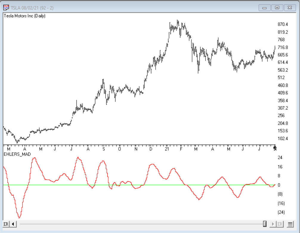
The importable AIQ EDS file based on John Ehlers’ article in the October issue of Stocks & Commodities, “Cycle/Trend Analysis And The MAD Indicator,” can be obtained on request via email to info@TradersEdgeSystems.com.
John Ehler introduces the moving average difference (MAD) indicator where the moving average lengths are different by approximately half the period of the dominant cycle in the data.
The code is also available below. Code for the author’s indicator is set up in the AIQ code file.
!CYCLE/TREND ANALYTICS AND THE MAD INDICATOR
!Author: John F. Ehlers, TASC Oct 2021
!Coded by: Richard Denning, 8/15/2021

!MAD (Moving Average Difference) Indicator
!(C) 2021 John F. Ehler

Shortlength is 8.
LongLength is 23.
MAD is 100*(simpleavg([Close], ShortLength) -
    simpleavg([Close], LongLength)) /
    simpleavg([Close], LongLength).
Figure 9 shows the MAD indicator on a chart of Tesla, Inc. (TSLA).
FIGURE 9: AIQ. This shows a chart of Tesla, Inc. with the MAD indicator applied.
I hope you all had a great summer and did some of the things you wanted after a long period with Covid. I am confident that our lives with get to some semblance of normalcy soon.
The market is now in the seasonally weak period of the year and I expect a continued short term volatility in the market. September is usually a volatile time of the year with October bottoming. November through January is usually a seasonally strong period. The Dow Jones has closed below the 50 day moving average a negative indication in the market. The S&P 500 sold off Friday and it is once again at the bottom of the trend line. My AIQ models are on a short term sell signal over the last 2 weeks and the Dow Jones support level is broken. Any close below 4413 on the S&P will get me Very Cautious on the market and short term there could be a break in the trendline pattern and start a correction in the market. Long Term I am very bullish but Short term traders get in and out of this market very quickly. They shift money in herds, buying and selling with large pools of money creating short term spikes in volatility. Long term investors need to stay the course and right now Volatility can cause declines in the portfolio. If you are over the age of 60 or nearing or in retirement I would reduce equities by 5-10%% if you are concerned about short term potential volatility that may happen. The markets are now 29% overvalued.
Earnings are still coming out better than expectations and interest rates should stay low for a while longer so any decline in the markets allow us to buy cheaper shares to redeem over the longer term. Expect Volatility.
Listed below are some of the INDEXES for both the equities and interest rate markets.
Dow Jones +14.58% S&P 500 +19.6% EQUAL WEIGHTED S&P 500 +21.65% NASDAQ Aggressive growth +20% Large Cap Value +18% I Shares Russell 2000 ETF (IWM) Small cap +13.4% Midcap stock funds +17% International Index (MSCI – EAFE ex USA +10% International Emerging Markets +2% Financial stocks +28% Energy stocks +28% Healthcare Stocks +17%
Moderate Mutual Fund Investment Grade Bonds (AAA) Long duration -2.5% High Yield Merrill Lynch High Yield Index +3.5%
Floating Rate Bond Funds +3.51% Short Term Bond +.9% Multi sector bond funds +2.9%
Gold -6.3%
10 year Bond Yield 1.23%
Moderate Fund +8.7%
Average Disruptor Fund Aggressive growth -2%
Dr. Robert Genetskis Economic Excerpts
Market Outlook
The market continues to ignore the Delta variant, supply-side constraints and the debacle in exiting Afghanistan. None of these potential headwinds were able to withstand the Fed Chairman’s assurance there would be no hike in interest rates until after next year’s election.
Chairman Powell said inflation is under control. He also indicated rising prices were the result of almost anything but the Fed pouring more money into the economy.
This is typical Fed speak. The Fed creates money with abandon, takes credit for a booming economy, then blames inflation on everything else. It’s called “modern monetary theory,” but it’s as old as money itself. Based on early business surveys, I had expected some of the economic news for August would show brief signs of a slowdown. However, the ISM survey for manufacturing indicates business was strong and new orders are signaling further strength.
The S&P500 is now 29% above its fundamental value. So far, the Fed’s monetary explosion is carrying stocks well above their fundamental value. So long as the Fed is able to keep interest rates well below their normal levels, stock prices will remain elevated.
A Look Back
August’s report shows only 243,000 private sector payroll jobs were added in August, well below the 800,000 additions in June and July. The smaller job gains are consistent with business surveys showing little or no job gains. The amazing thing is businesses are still rapidly expanding output in spite of employing 3½% fewer workers than at the pre-Covid peak. Economic Fundamentals: positive Stock Valuation: S&P500 over-valued 29% Monetary Policy: expansive Recommended Stock Exposure: 85%
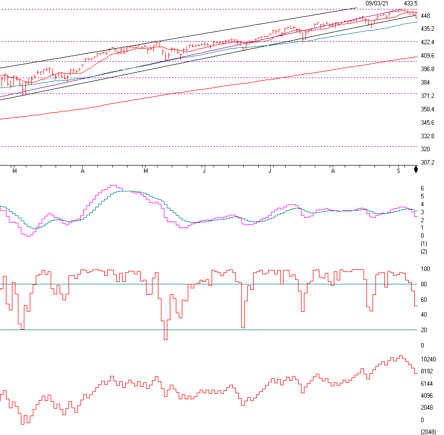
The S&P 500
The S&P 500 is above. If you look you can see that the S&P has broken the trend-line (negative) and is approaching its 50 day moving average. This is short term negative and I will get VERY Cautious if it breaks the 4413 level on a close. The Dow Jones Average closed below its 50 day moving average. This is why I am getting Cautious and believe some of you should be taking profits and or rebalancing if you have too much money in the stock market. September is usually a volatile month, but any decline of significance and I will get Bullish as I believe a major selloff would could be a major Buy if you are a long term investors. If you are trading stocks, then I would make sure your companies are solid with great earnings, revenues and balance sheets. Call me with questions but right now I am Cautious to possibly Very Cautious if 50 day moving average is broken on a close.
The graph under the price chart is Momentum and as you can see the pink line closed below the blue line, a negative.
The next chart is Stochastics. This shows over bought and oversold indexes. Sell signals are given when the Stochastics breaks below the 80 as it is showing now.
On Balance Volume is trending lower. This shows higher volume on sell offs. This is a negative.
CHART SOURCE: AIQ SYSTEMS.COM
Support levels on the S&P 500 area are 4413, 4224, 4010, and 4000. These may be safer areas to get into the equity on support levels slowly on the accumulation areas.
THE BOTTOM LINE:
Long term I am Bullish but over the VERY SHORT TERM I am getting Cautious to Very Cautious. As I stated last month, The August to October season tends to be seasonally weak and September tends to be the worst. The market is 29% overvalued, we are on short term sell signals and the Dow Jones has broken below its trend-line and its 50 day moving average. The NASDAQ looks ok but if the S&P 500 closes below it 50 day moving average over the next few days it can easily drop another 3-6% to the 4222 next level. If that breaks then the next level is its 200 moving average currently at 4090.
Best to all of you, Joe Bartosiewicz, CFP® Investment Advisor Representative
92 High Street Thomaston, CT 06787
Securities and advisory services are offered through SagePoint Financial, Inc. (SPF), member FINRA/SIPC. SPF is separately owned and other entities and/or marketing names, products or services referenced here are independent of SPF. 800-552-3319 20 East Thomas Road Ste 2000 Phoenix AZ 85012
Disclaimer: The views expressed are not necessarily the view of Sage Point Financial, Inc. and should not be interpreted directly or indirectly as an offer to buy or sell any securities mentioned herein. Securities and Advisory services offered through Sage Point Financial Inc., Member FINRA/SIPC, an SEC-registered investment advisor.
Past performance cannot guarantee future results. Investing involves risk, including the potential loss of principal. No investment strategy can guarantee a profit or protect against loss in periods of declining values. Please note that individual situations can vary. Therefore, the information presented in this letter should only be relied upon when coordinated with individual professional advice. *There is no guarantee that a diversified portfolio will outperform a non-diversified portfolio in any given market environment. No investment strategy, such as asset allocation, can guarantee a profit or protect against loss in periods of declining values. It is our goal to help investors by identifying changing market conditions. However, investors should be aware that no investment advisor can accurately predict all of the changes that may occur in the market
The price of commodities is subject to substantial price fluctuations of short periods and may be affected by unpredictable international monetary and political policies. The market for commodities is widely unregulated, and concentrated investing may lead to Sector investing may involve a greater degree of risk than investments with broader diversification. Indexes cannot be invested indirectly, are unmanaged, and do not incur management fees, costs, and expenses.
Dow Jones Industrial Average: A weighted price average of 30 significant stocks traded on the New York Stock Exchange and the NASDAQ. S&P 500: The S&P 500 is an unmanaged indexed comprised of 500 widely held securities considered to be representative of the stock market in general.
NASDAQ: the NASDAQ Composite Index is an unmanaged, market-weighted index of all over the counter common stocks traded on the National Association of Securities Dealers Automated Quotation System (IWM) I Shares Russell 2000 ETF: Which tracks the Russell 2000 index: which measures the performance of the small capitalization sector of the U.S. equity market.
A Moderate Mutual Fund risk mutual has approximately 50-70% of its portfolio in different equities, from growth, income stocks, international and emerging markets stocks to 30-50% of its portfolio in different categories of bonds and cash. It seeks capital appreciation with a low to moderate level of current income.
The Merrill Lynch High Yield Master Index: A broad-based measure of the performance of non-investment grade US Bonds
MSCI EAFE: the MSCI EAFE Index (Morgan Stanley Capital International Europe, Australia, and Far East Index) is a widely recognized benchmark of non-US markets. It is an unmanaged index composed of a sample of companies’ representative of the market structure of 20 European and Pacific Basin countries and includes reinvestment of all dividends.
Investment grade bond index: The S&P 500 Investment-grade corporate bond index, a sub-index of the S&P 500 Bond Index, seeks to measure the performance of the US corporate debt issued by constituents in the S&P 500 with an investment-grade rating. The S&P 500 Bond index is designed to be a corporate-bond counterpart to the S&P 500, which is widely regarded as the best single gauge of large-cap US equities.
Floating Rate Bond Index is a rule-based, market-value weighted index engineered to measure the performance and characteristics of floating-rate coupon U.S. Treasuries, which have a maturity greater than 12 months.
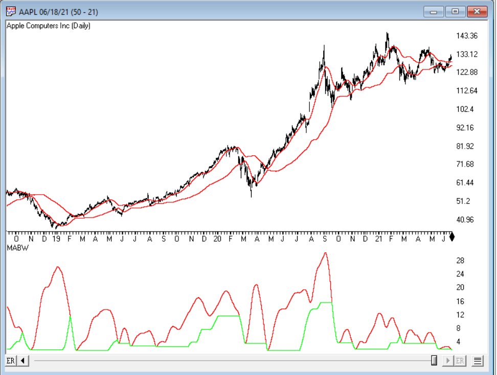
The importable AIQ EDS file based on Vitali Apirine’s two-part article, (“Moving Average Bands,” part 1, July 2021 issue, and “Moving Average Band Width,” part 2, August 2021 issue) in Stocks & Commodities magazine can be obtained on request via email to info@TradersEdgeSystems.com. The code is also shown below.
Vitali presents moving average bands (MAB), an indicator based on the distance between the bands. MAB width lines can foreshadow strong market moves or a change in trend…
!Moving Average Bands
!Moving Average Band Width
!Author: Vitali Aprine, TASC July & Aug 2021
!Coded by: Richard Denning, 6/14/2021
!INPUTS:
Len1 is 50.
Len2 is 10.
Mult1 is 1.
C is [close].
MA1 is expavg(C,Len1).
MA2 is expavg(C,Len2).
MAdiff is MA1 - MA2.
DV is sum(MAdiff*MAdiff,Len2) / Len2.
Dev is sqrt(DV)*Mult1.
MABup is MA1 + Dev. MABmid is MA1.
MABdn is MA1 - Dev.
MABW is (MABup - MABdn) / MABmid * 100. LowMABW is lowresult(MABW,Len1).
Figure 13 shows the MAB and MABW indicators on a chart of Apple, Inc. (AAPL).
FIGURE 13: AIQ. This shows the MAB and MABW indicators on a chart of Apple, Inc. (AAPL).