The energy sector – not just unloved, but pretty much reviled not that long ago – is suddenly everybody’s favorite sector. And why not, what with crude oil rallying steadily in the last year and pulling pretty much everything energy related higher with it?
Anecdotally, everything I read seems to be on board with a continuation of the energy rally. And that may well prove to be the case. But at least for the moment I am waiting for some confirmation.
Two Concerns
The first – which I mentioned in this article – is the fact that the best time of year for energy is the February into early May period. See Figure 1.
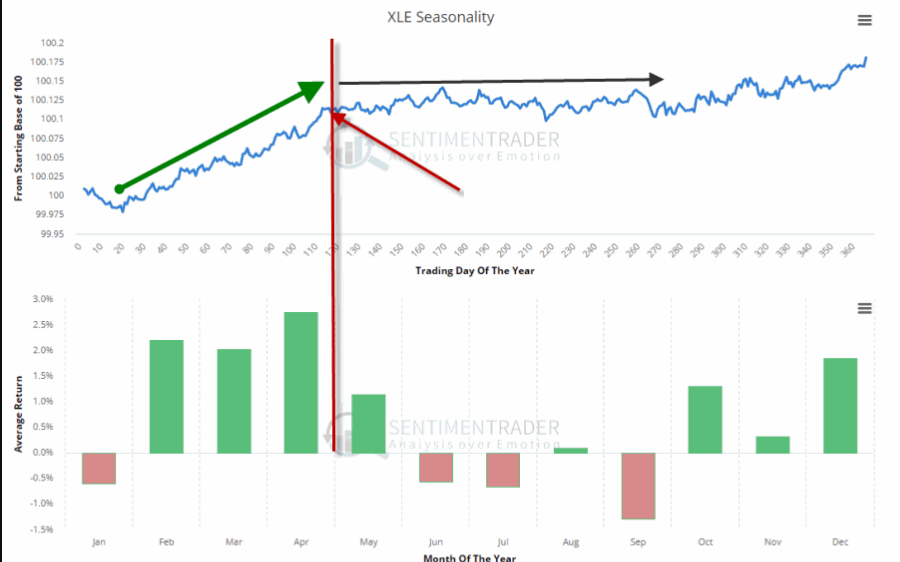
Figure 1 – Ticker XLE Seasonality (www.Sentimentrader.com)
With that period just about past it is possible that the energy sector may at least pause for a while.
The second concern is that a lot of “things” in the energy sector are presently “bumping their head” against resistance. Here is the point:
*This does not preclude a breakout and further run to higher ground.
*But until the breakout is confirmed a little bit of caution is in order.
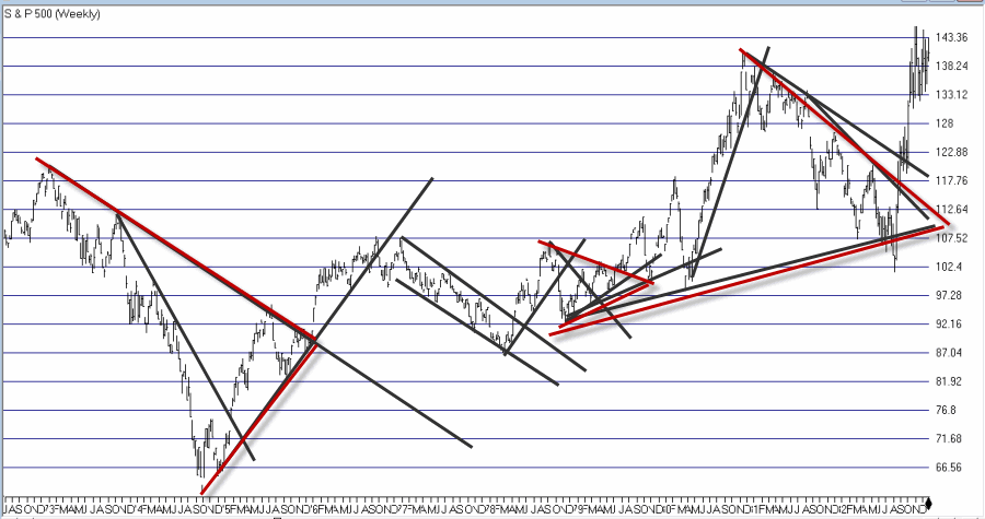
I created an index comprised of a variety of energy related ETFs. As you can see in Figures 2 through 4 that index recently was turned away at a significant resistance level.
Figure 3 shows the same information on a weekly chart.
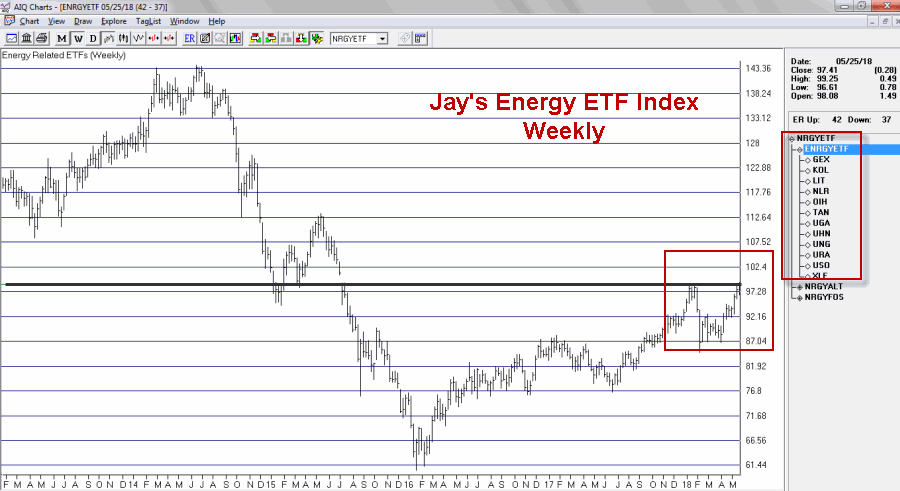
Figure 3 – Jay’s Energy ETF Index – Weekly (Courtesy AIQ TradingExpert)
Figure 4 zooms in to view the action on a daily basis.
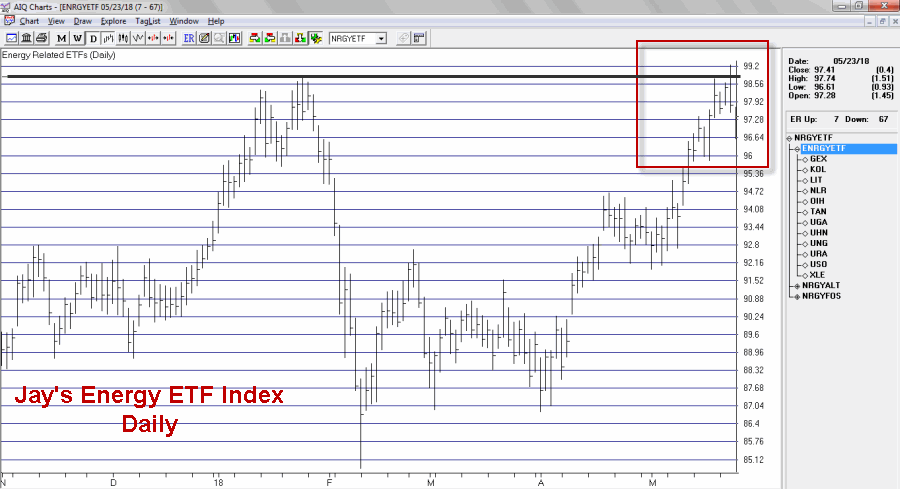
Figure 4 – Jay’s Energy ETF Index – Daily (Courtesy AIQ TradingExpert)
As you can see in Figure 4, the index made an effort to break out above the January high then reversed and closed lower before declining a little bit more the next day.
The action displayed in the charts above may prove to be nothing more that “the pause that refreshes.” If price breaks out to the upside another bull leg may well ensue. But note also in Figure 5 that ticker XLE – the broad-based SPDR Energy ETF – demonstrated the same type of hesitation as the ETF Index in the previous charts.
It too faces it’s own significant resistance levels as seen in Figure 5.

Figure 5 – Ticker XLE faces resistance (Courtesy AIQ TradingExpert)
Summary
Energies have showed great relative strength of late even in the context of a choppy stock market overall. So there is no reason to believe that the rally can’t continue. But two things to watch for:
1. If energy related assets clear their recent resistance levels a powerful new upleg may ensue.
2. Until those resistance levels are pierced, a bit of caution is in order. Energy has been the leading sector of late. Any time the leading sector runs into trouble it pays to “keep an eye out” for trouble in the broader market.
No predictions one way or the other – just some encouragement to pay close attention at a potentially critical juncture.
Jay Kaeppel
Disclaimer: The data presented herein were obtained from various third-party sources. While I believe the data to be reliable, no representation is made as to, and no responsibility, warranty or liability is accepted for the accuracy or completeness of such information. The information, opinions and ideas expressed herein are for informational and educational purposes only and do not constitute and should not be construed as investment advice, an advertisement or offering of investment advisory services, or an offer to sell or a solicitation to buy any security.