Category Archives: ETFS

The Bartometer

April 7, 2020

Hello Everyone,

The 2020 COVID-19 Virus has adversely affected the entire world, and this will go down as one of the most volatile years in the stock and bond market in generations and even more volatile than the 2008 Bear Market.

CURRENT MARKET CONDITIONS:

This reason is that the declines came over eight days and not like the 2007-2009 decline which took a year and one half. The great recession of 2008 was a humanmade financial problem and this is a virus where very few are working. In the Recession of 2008, people were at least going to work and going out and spending money to support the economy. Now we are all destined to stay in the house unless we have an essential business. But the U.S. Government is doing everything it can to give grants and forgivable loans so that the economy doesn’t totally crash. That is better than in 2008. It is still serial to be confined to your house or go for a walk.

When we get our statement of our investments from our 401(k) s or from these accounts, you will see pretty large drops in values in the investment account and you will wonder if this is all worth it to stay in it or are we all destined just to make 1-3% in a savings account or a 3% fixed annuity with me. Right now getting 3% with no fees looks pretty good.

If you believe that good stocks and funds from successful growing businesses do well over the long term and this sell-off in the markets are BUYING opportunities over the next few months you may want to dollar cost average into the markets. If you believe that this COVID-19 virus will soon be over within months and that 1 to 3 years from now the markets will be higher than they are now is it worth holding on OR Buying more when markets are lower? The question is if you are buying or investing for the next 1-20 years. Do you like suitable stock and bond investments that are cheap now or more expensive? If your answer is yes, than you may want to average into the markets over the next few months as it is down during this pandemic.

MARKET RECAP:

On my last 3 Bartometers I was getting and got Very Cautious about the stock and bond markets, but did I expect this? Not really. I said if the NASDAQ broke 9200, I will get very Cautious but a 25 to 35% decline I did not expect. The markets had rallied 20%+ from the low hit a couple of weeks ago but still, the markets are down 17-20% into 2020. Are we in a recession now? I’d say yes, but it is forced because of COVID-19, but it will be one just because of the number of people laid off.

In the following pages are discussions of the long term of the markets, what do in a Bear market and my technicals of the markets going forward. But above I would like to say that even though American Capitalism is under fire, and also though the market got hurt as well as our portfolios, we will rise to the COVID-19 challenge like any other war or attack on the United States of America going back to the Revolutionary War to WW1, WW2, and all the other wars we had in our history. This country and its citizens will find a vaccine to this virus and I believe in my heart that 1 to 2 years from now this market should be nicely higher. Dollar-cost averaging currently buying a lower priced shares of good companies should, with no guarantees expressed or implied, be a good deal higher over the next few years. What do you think? Have we gone down this much over the last 50 years? Yes, many times. Has it recovered each time? Yes. Because capitalism works and good companies over the long term make money.

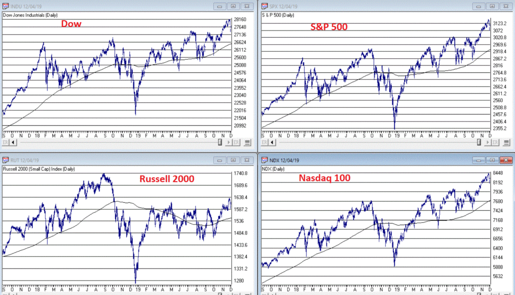
Some of the INDEXES of the markets both equities and interest rates are below. The source is Morningstar.com up until April 7, 2020. These are passive indexes.
*Dow Jones -20%
S&P 500 -17%
NASDAQ Aggressive growth -9%
I Shares Russell 2000 ETF (IWM) Small cap -31%
Midcap stock funds -29%
International Index (MSCI – EAFE ex USA -22%
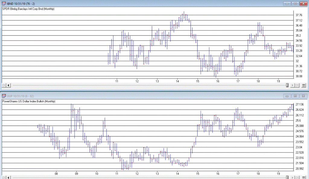
Investment Grade Bond -4%
High Yield Bond -13%
Government bond +4%
The average Moderate Fund is down -16% this year fully invested as a 65% in stocks and 35% in bonds and nothing in the money market.

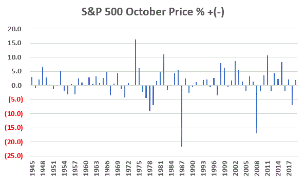
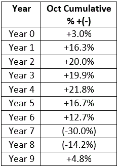
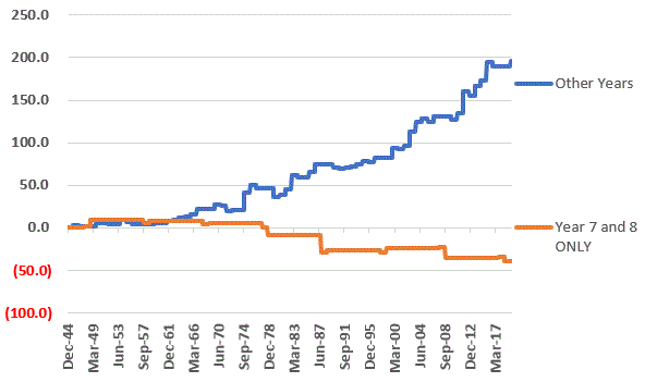
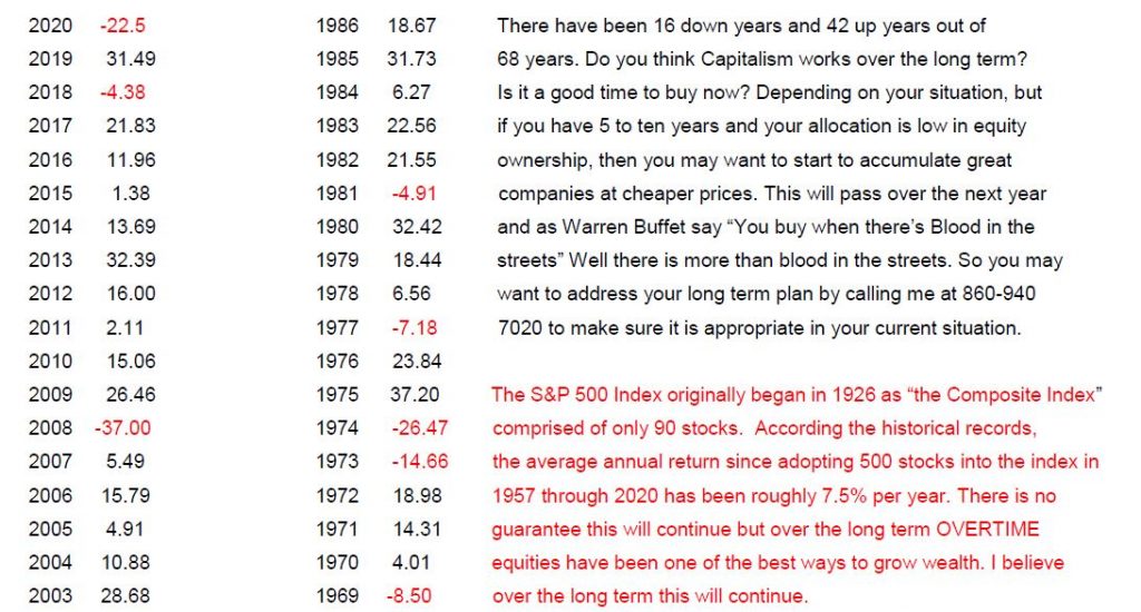
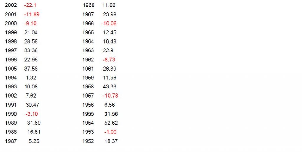
WANT TO SHOW YOU THE YEAR BY YEAR RETURNS OF THE S&P 500 TOTAL RETURNS BY YEAR

WHAT HAPPENED TO THE MARKETS DURING THE PANDEMIC AND SPANISH FLU IN 1917-1918:

The stock market today is looking a lot like it did a century ago, and if Great Hill Capital’s Thomas Hayes’s interpretation of the trendlines is on point, the bottom could be approaching.

“Just as the market started discounting the worst-case scenario in 1917,” he wrote, “it was already discounting a recovery months before the worst-case scenario occurred in 1918.”

What was going on in 1917? The Spanish Flu was just starting to bubble up, with the deadliest month of the whole pandemic not hitting until October 1918 — by then, as you can see from this chart, the Dow Jones Industrial Average DJIA, -1.68% had already begun to heal.


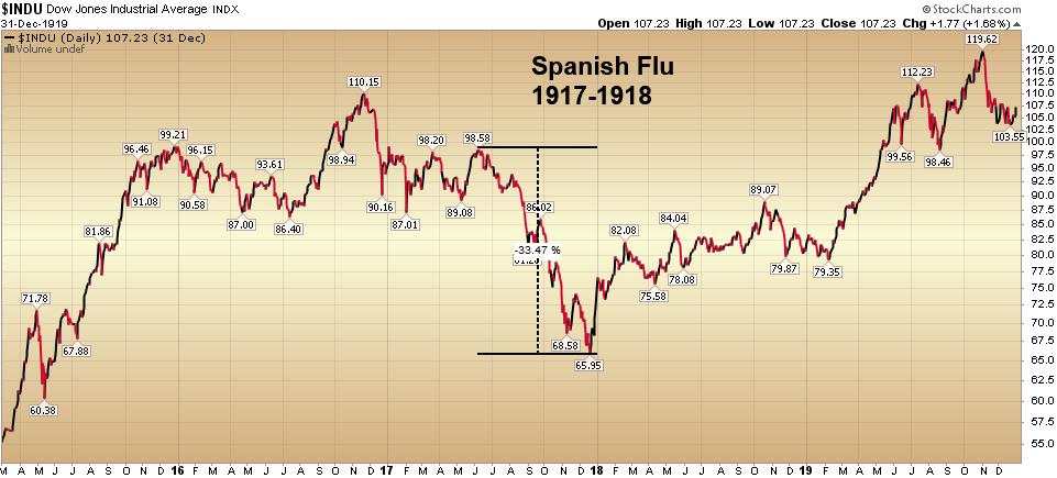
Hayes then posted this chart of the modern-day market plunge, noting that the nasty drawdowns amid the early stages of both pandemics were virtually the same.

More than 51 million people died globally in the Spanish Flu Pandemic, and the market rebounded more than 80% in the following two years from its bottom to top. This is no guarantee the market will rally that much or at all, but the USA is now better equipped to handle a massive Pandemic then in 1918 to 1919. Also, many companies are internet companies that could do well as people shop and do business over the internet; in addition, it is much more diversified and global than it was in 1918. For these reasons and more, I believe that the long term is more promising now for a recovery over the next 1 to 2 years.

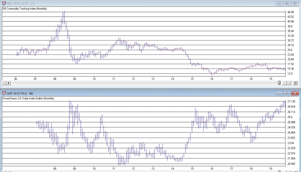
There is one caveat; the Commodity index is right near its low of 2009, where it found it at a 29-year support level. If that breaks through that level, then we can go into a deeper recession for a more extended period.
The market rebound depends on how quickly the government fixes this problem and people go back to work. I am optimistic over the next two years; but understand a recession should happen at least for a few quarters. I think the Recession should be relatively short term.

Since this graph was made a week ago, look at the next page and it is up to date. COMPARE the next graph to the Pandemic of 1918 and it is starting to look more like it. There is no guarantee expressed or implied, but look at the Pandemic and then the updated Dow on the next page.

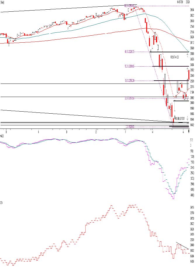
The Dow Jones is above. This is the Daily Chart. As you can see, the decline of the Dow Jones Average was relatively very quick. Current is sitting at 22653 right BELOW THE 50% Fibonacci retracement level. A normal BEAR market usually tops on a countertrend rally right at a 50% or 61.8% Fibonacci level and declines or puts in a short top. So if this is true in this case there could be resistance at 23,901 or 25,236 area. There is also some resistance at the 200 day moving average at 26,660 and sloping downward. My AIQ models gave a BUY on 3/24/2020, but only a short term Buy not a longer term Weekly Buy. So even though the market is somewhat short term Bullish, there could be a short term top at 23,901, 25,236 or the 26,660 areas.

Momentum is good but can change quickly on the downside after earnings come out that will be bad. A buy signal is giving when the lavender line crosses blue line and Sell signal when it does it on the downside

One thing I don’t like is the On Balance Volume Line. Notice as the market is going up it is going up on low relative volume. This is somewhat negative. Over all I think the market should be higher when this is all done and when there is a vaccine and people go on living their normal lives it should be better. This market will be volatile. The market may continue on the upside but over the short term I think the rally is limited to the levels I said above on the Fibonacci levels and the 200 day moving average. In addition, the market may not like the earnings numbers over the next couple of weeks and the market could drop again towards 20000 or below again.

Key investor Points to remember in a Bear Market:

  • Stay calm and keep a long-term perspective.
  • Maintain a balanced and broadly diversified portfolio.
  • Balance equity portfolios with a mix of dividend-paying companies and growth stocks.
  • Choose funds with a strong history of weathering market declines.
  • Use high-quality bonds to help offset equity volatility.
  • Advisors can help investors navigate periods of market volatility

THE BOTTOM LINE:

The market has had its worst decline in 10 years. It has recovered about 35% of the loss over the last week. It is not a time to sell during this decline in my opinion but for some of you it would a great time to start to nibble in your mutual funds on setbacks because the COV19 virus should be controlled over the next year and if you look at all of the virus pandemics we have had, it has been a good time to Buy if your goals are longer term. It is not a time to throw caution to the wind but call me to make selective dollar-cost average buys. In addition, when EARNINGS come out in the next 2 weeks the stock market could go back down again. Remember you buy when there is blood in the streets. Bonds should be more in the investment-grade or short- term investment grade side. If you are a long-term investor and have 20 years+ towards retirement use sell-offs to add through dollar-cost averaging. Diversification is essential but portfolios should be somewhat safer.

Best to all of you,

Joe Bartosiewicz, CFP®
Investment Advisor Representative
5 Colby Way
Avon, CT 06001
860-940-7020 or 860-404-0408


SECURITIES AND ADVISORY SERVICES OFFERED THROUGH SAGE POINT FINANCIAL INC., MEMBER FINRA/SIPC, AND SEC-REGISTERED INVESTMENT ADVISOR.

Charts provided by AIQ Systems:

Technical Analysis is based on a study of historical price movements and past trend patterns. There is no assurance that these market changes or trends can or will be duplicated shortly. It logically follows that historical precedent does not guarantee future results. Conclusions expressed in the Technical Analysis section are personal opinions: and may not be construed as recommendations to buy or sell anything.

Disclaimer: The views expressed are not necessarily the view of Sage Point Financial, Inc. and should not be interpreted directly or indirectly as an offer to buy or sell any securities mentioned herein. Securities and Advisory services offered through Sage Point Financial Inc., Member FINRA/SIPC, and an SEC-registered investment advisor.

Past performance cannot guarantee future results. Investing involves risk, including the potential loss of principal. No investment strategy can guarantee a profit or protect against loss in periods of declining values. Please note that individual situations can vary. Therefore, the information presented in this letter should only be relied upon when coordinated with individual professional advice. *There is no guarantee that a diversified portfolio will outperform a non-diversified portfolio in any given market environment. No investment strategy, such as asset allocation, can guarantee a profit or protect against loss in periods of declining values.
It is our goal to help investors by identifying changing market conditions. However, investors should be aware that no investment advisor can accurately predict all of the changes that may occur in the market.
The price of commodities is subject to substantial price fluctuations of short periods and may be affected by unpredictable international monetary and political policies. The market for commodities is widely unregulated, and concentrated investing may lead to Sector investing may involve a greater degree of risk than investments with broader diversification.
Indexes cannot be invested indirectly, are unmanaged, and do not incur management fees, costs, and expenses.

Dow Jones Industrial Average: A weighted price average of 30 significant stocks traded on the New York Stock Exchange and the NASDAQ.
S&P 500: The S&P 500 is an unmanaged indexed comprised of 500 widely held securities considered to be representative of the stock market in general.

NASDAQ: the NASDAQ Composite Index is an unmanaged, market-weighted index of all over the counter common stocks traded on the National Association of Securities Dealers Automated Quotation System
(IWM) I Shares Russell 2000 ETF: Which tracks the Russell 2000 index: which measures the performance of the small capitalization sector of the U.S. equity market.

A Moderate Mutual Fund risk mutual has approximately 50-70% of its portfolio in different equities, from growth, income stocks, international and emerging markets stocks to 30-50% of its portfolio in different categories of bonds and cash. It seeks capital appreciation with a low to moderate level of current income.

The Merrill Lynch High Yield Master Index: A broad-based measure of the performance of non-investment grade US Bonds

MSCI EAFE: the MSCI EAFE Index (Morgan Stanley Capital International Europe, Australia, and Far East Index) is a widely recognized benchmark of non-US markets. It is an unmanaged index composed of a sample of companies’ representative of the market structure of 20 European and Pacific Basin countries and includes reinvestment of all dividends.
Investment grade bond index: The S&P 500 Investment-grade corporate bond index, a sub-index of the S&P 500 Bond Index, seeks to measure the performance of the US corporate debt issued by constituents in the S&P 500 with an investment-grade rating. The S&P 500 Bond index is designed to be a corporate-bond counterpart to the S&P 500, which is widely regarded as the best single gauge of large-cap US equities.

Floating Rate Bond Index is a rule-based, market-value weighted index engineered to measure the performance and characteristics of floating-rate coupon U.S. Treasuries, which have a maturity greater than 12 months.

Money Flow; The Money Flow Index (MFI) is a momentum indicator that measures the flow of money into and out of a security over a specified period. It is related to the Relative Strength Index (RSI) but incorporates volume, whereas the RSI only considers SK-SD Stochastics. When an oversold stochastic moves up through its MA, a buy signal is produced. Furthermore, Lane recommends that the stochastic line be smoothed twice with three-period simple moving averages: SK is the three-period simple moving average of K, and SD is the three-period simple moving average of SK

Rising Wedge; A rising wedge is a technical indicator, suggesting a reversal pattern frequently seen in bear markets. This pattern shows up in charts when the price moves upward with pivot highs and lows converging toward a single point known as the apex

Thoughts on the Energy Sector (just in case we ever leave our homes again)

In a few recent articles (for example here) I suggested that one day we would look back on this period as a terrific buying opportunity for energy related issues.  At the same time, I still have yet to become comfortable “pulling the trigger”.  Thank goodness for small favors.

Anyway, the overall sentiment still holds.  Energy is dirt cheap as are shares of most energy related stocks/ETFs etc.  Again, that doesn’t necessarily mean that now is the exact moment to “load up”.  To say that there is a wee bit of uncertainty regarding the future would be about the greatest understatement one could presently make.  Still, it is important to plan ahead and to be prepared when the time comes.  So, what follows should be considered “food for thought” and not “an immediate call to action.”

A Few Things Energy

Ticker TAN

According to conventional wisdom, the future is “green”.  I’ll be candid – I am all for green energy, as long as when I flip the switch the lights come on AND when I look at my energy bill I don’t faint.  So, let’s start with a “green” play.

Turth be told, ticker TAN (Invesco Solar Energy ETF) has never been much of a performer.  Still, its in the solar business which people keep telling me is “the future.”  In reality the primary thing it has going for it is that it hasn’t completely cratered to the same degree as just about every other stock in the energy sector.  As you can see in Figure 1, TAN actually bottomed out at $12.60 in 2012 and – despite a near 50% decline during the recent panic – is presently trading around $26 a share.  Not necessarily a screaming buy signal, but a nice relative performance as we will see in a moment.

Figure 1 – Ticker TAN (Courtesy AIQ TradingExpert)

Ticker UGA

In a sure “Sign of the Times”, the Good News is that gasoline prices are at their lowest levels in year, while the Bad News is that we don’t have anywhere to drive to except the grocery store.  Figure 2 displays the chart for ticker UGA – the United States Gasoline Fund, and ETF that tracks the price of gasoline.

While attempting to “pick a bottom” is a fool’s errand, the primary point is that it is not that hard to envision the price of this ETF being significantly higher at some point in the years ahead.  Whether an investor has the fortitude to weather whatever the short-term uncertainty and the patience to see how the long-term plays out are the primary issues associated with contemplating this ticker at the moment.

Figure 2 – Ticker UGA (Courtesy AIQ TradingExpert)

Ticker XLE

Ticker XLE is a play on the broad (mostly fossil fuel related) energy sector.  As you can see in Figure 3, XLE has plunged to price levels not since 2004. In addition, it presently yields roughly 8.8%.  That being said, an investor has to realistically expect that dividend payments in the hard-hit energy sector will see some significant cuts as things play out in the months ahead. 

With an oil price war in full swing, not to mention a sharp decline in demand for the foreseeable future due to the coronavirus pandemic, the fundamentals for this sector are unlikely to improve soon.  Nevertheless, the reality is that – at least for the time being – the world runs on crude oil.  As a result, the current price range may one day be looked back upon as a once-in-a-generation buying opportunity.

Figure 3 – XLE (Courtesy ProfitSource by HUBB)

Ticker PAGP

OK, let’s throw in one obscure, totally speculative – yet fundamentally intriguing – thought for consideration.  Ticker PAGP (Plains GP Holdings, L.P.).  Here is what they do (straight from their website):

“Plains engages in the transportation, storage, terminalling, and marketing of crude oil and refined products, as well as in the storage of natural gas, and the processing, transportation, fractionation, storage, and marketing of natural gas liquids.

Assets include:

*17,965 miles of active crude oil and NGL pipelines and gathering systems (emphasis mine as these things will continue to function as long as crude and NG need to be moved – which they do)

*50 barges and 20 transport tugs

*109 million barrels of storage capacity

*1,600+ trucks and trailers

*9,100 rail cars”

The bottom line is that as long as crude oil and natural gas needs to be moved, PAGP has a niche in which to operate.  For the record, at $6.35 a share the stock’s present dividend comes to a yield of 22.7%.  Certainly, the prospect of a significant dividend cut is a Signiant risk associated with this stock.  But for the moment anyway the price is near an all-time low and the dividend yield is attractive.

Figure 4 – Ticker PAGP (Courtesy ProfitSource by HUBB)

Summary

As allows, DO NOT look upon what I have written as “recommendations.”  Particularly in the current environment.  They are simply “food for thought.”

Given current fundamentals:

*An ongoing oil price war (making drilling and refining unprofitable for many companies)

*An economy on shutdown (which cripples demand)

*An existential struggle between “green” energy and “traditional” fossil fuel-based sources (which creates uncertainty about future expectations)

All combine to make the energy sector a giant question mark at the present time.  But if the old adage that the time to buy is when there is “blood in the streets”, than investors might be well served in the long run to start thinking now about how much capital they might be willing to commit to energy, and what type of catalyst might prompt them to actually “take the plunge.”

Jay Kaeppel

Disclaimer: The information, opinions and ideas expressed herein are for informational and educational purposes only and are based on research conducted and presented solely by the author.  The information presented does not represent the views of the author only and does not constitute a complete description of any investment service.  In addition, nothing presented herein should be construed as investment advice, as an advertisement or offering of investment advisory services, or as an offer to sell or a solicitation to buy any security.  The data presented herein were obtained from various third-party sources.  While the data is believed to be reliable, no representation is made as to, and no responsibility, warranty or liability is accepted for the accuracy or completeness of such information.  International investments are subject to additional risks such as currency fluctuations, political instability and the potential for illiquid markets.  Past performance is no guarantee of future results.  There is risk of loss in all trading.  Back tested performance does not represent actual performance and should not be interpreted as an indication of such performance.  Also, back tested performance results have certain inherent limitations and differs from actual performance because it is achieved with the benefit of hindsight.

How Do You Handle a Problem Like October?

OK, so this particular piece clearly does NOT qualify as “timely”.  Hey, they can’t all be “time critical, table-pounding, you must act now” missives.  In any event, as part of a larger project regarding trends and seasonality in the market, I figured something out – we “quantitative analyst types” refer to this as “progress.”

So here goes.

The Month of October in the Stock Market

The month of October in the stock market is something of a paradox.  Many investors refer to it as “Crash Month” – which is understandable given the action in 1929, 1978, 1979, 1987, 1997, 2008 and 2018.  Yet others refer to it as the “Bear Killer” month since a number of bear market declines have bottomed out and/r reversed during October.  Further complicating matters is that October has showed:

*A gain 61% of the time

*An average monthly gain of +0.95%

*A median monthly gain of +1.18%

Figure 1 displays the monthly price return for the S&P 500 Index during every October starting in 1945.

Figure 1 – S&P 500 Index October Monthly % +(-)

Figure 2 displays the cumulative % price gain achieved by holding the S&P 500 Index ONLY during the month of October every year starting in 1945.

Figure 2 – S&P 500 Index Cumulative October % +(-)

So, you see the paradox.  To simply sit out the market every October means giving up a fair amount of return over time (not to mention the logistical and tax implications of “selling everything” on Sep 30 and buying back in on Oct 31).  At the same time, October can be a helluva scary place to be from time to time. 

One Possible Solution – The Decennial Pattern

In my book “Seasonal Stock Market Trends” I have a section that talks about the action of the stock market across the average decade. The first year (ex., 2010) is Year “0”, the second year (ex., 2011) is Year “1”, etc.

In a nutshell, there tends to be:

The Early Lull: Often there is weakness starting in Year “0” into mid Year “2”

The Mid-Decade Rally: Particularly strong during late Year “4” into early Year “6”

The 7-8-9 Decline: Often there is a significant pullback somewhere in the during Years “7” or “8” or “9”

The Late Rally: Decades often end with great strength

Figures 3 and 4 display this pattern over the past two decades.

Figure 3 – Decennial Pattern: 2010-2019

Figure 4 – Decennial Pattern: 2000-2009

Focusing on October 

So now let’s look at October performance based on the Year of the Decade.  The results appear in Figure 5.  To be clear, Year 0 cumulates the October % +(-) for the S&P 500 Index during 1950, 1960, 1970, etc.  Year 9 cumulates the October % +(-) for the S&P 500 index during 1949, 1959, 1969, 1979, etc.

Figure 5 – October S&P 500 Index cumulative % +(-) by Year of Decade

What we see is that – apparently – much of the “7-8-9 Decline” takes place in October, as Years “7” and “8” of the decade are the only ones that show a net loss for October.

Let’s highlight this another way.  Figure 6 displays the cumulative % return for the S&P 500 Index during October during all years EXCEPT those ending “7” or “8” versus the cumulative % return for the S&P 500 Index during October during ONLY years ending in “7” or “8”.

Figure 6 – S&P 500 cumulative October % +(-); Years 7 and 8 of decade versus All Other Years of Decade

For the record:

*October during Years “7” and “8” lost -39%

*October during all other Years gained +196%

Summary

So, does this mean that October is now “green-lighted” as bullish until 2027?  Not necessarily.  As always, that pesky “past performance is no guarantee of future results” phrase looms large. 

But for an investor looking to maximize long-term profits while also attempting to avoid potential pain along the way, the October 7-8 pattern is something to file away for future reference.

Jay Kaeppel

Disclaimer: The information, opinions and ideas expressed herein are for informational and educational purposes only and are based on research conducted and presented solely by the author.  The information presented does not represent the views of the author only and does not constitute a complete description of any investment service.  In addition, nothing presented herein should be construed as investment advice, as an advertisement or offering of investment advisory services, or as an offer to sell or a solicitation to buy any security.  The data presented herein were obtained from various third-party sources.  While the data is believed to be reliable, no representation is made as to, and no responsibility, warranty or liability is accepted for the accuracy or completeness of such information.  International investments are subject to additional risks such as currency fluctuations, political instability and the potential for illiquid markets.  Past performance is no guarantee of future results.  There is risk of loss in all trading.  Back tested performance does not represent actual performance and should not be interpreted as an indication of such performance.  Also, back tested performance results have certain inherent limitations and differs from actual performance because it is achieved with the benefit of hindsight.

Where We Are (and One Thing to Watch For)

I haven’t written a lot lately.  Mostly I guess because there doesn’t seem to be a lot new to say.  As you can see in Figure 1, the major market indexes are in an uptrend.  All 4 (Dow, S&P 500, Russell 2000 and Nasdaq 100) are above their respective 200-day MA’s and all but Russell 2000 have made new all-time highs.

Figure 1 – 4 Major Market Indexes (Courtesy AIQ TradingExpert)

As you can see in Figure 2, my market “bellwethers” are still slightly mixed.  Semiconductors are above their 200-day MA and have broken out to a new high, Transports and the Value Line Index (a broad measure of the stock market) are holding above their 200-day MA’s but are well off all-time highs, and the inverse VIX ETF ticker ZIV is in a downtrend (ideally it should trend higher with the overall stock market).

Figure 2 – Jay’s 4 Market “Bellwethers” (Courtesy AIQ TradingExpert)

As you can see in Figure 3, Gold, Bonds and the U.S. Dollar are still holding in uptrends above their respective 200-day MA’s (although all have backed off of recent highs) and crude oil is sort of “nowhere”.

Figure 3 – Gold, Bonds, U.S. Dollar and Crude Oil (Courtesy AIQ TradingExpert)

Like I said, nothing has really changed.  So, at this point the real battle is that age-old conundrum of “Patience versus Complacency”.  When the overall trend is clearly “Up” typically the best thing to do is essentially “nothing” (assuming you are already invested in the market).  At the same time, the danger of extrapolating the current “good times” ad infinitum into the future always lurks nearby. 

What we don’t want to see is:

*The major market averages breaking back down below their 200-day MA’s.

What we would like to see is:

*The Transports and the Value Line Index break out to new highs (this would be bullish confirmation rather the current potentially bearish divergence)

The Importance of New Highs in the Value Line Index

One development that would provide bullish confirmation for the stock market would be if the Value Line Geometric Index were to rally to a new 12-month high.  It tends to be a bullish sign when this index reaches a new 12-month high after not having done so for at least 12-months.

Figure 4 displays the cumulative growth for the index for all trading days within 18 months of the first 12-month new high after at least 12-months without one.

Figure 4 – Cumulative growth for Value Line Geometric Index within 18-months of a new 12-month high

Figure 5 displays the cumulative growth for the index for all other trading days.

Figure 5 – Cumulative growth for Value Line Geometric Index during all other trading days

In Figure 4 we see that a bullish development (the first 12-month new high in at least 12 months) is typically followed by more bullish developments. In Figure 5 we see that all other trading days essentially amount to nothing.

Figure 6 displays the Value Line Geometric Index with the relevant new highs highlighted.

Figure 6 – Value Line Geometric Index (Courtesy AIQ TradingExpert)

Summary

The trend at this very moment is “Up.”  So sit back, relax and enjoy the ride.  Just don’t ever forget that the ride WILL NOT last forever.  If the Value Line Geometric Index (and also the Russell 2000 and the Dow Transports) joins the party then history suggests the party will be extended.  If they don’t, the party may end sooner than expected.

So pay attention.

Jay Kaeppel

Disclaimer: The information, opinions and ideas expressed herein are for informational and educational purposes only and are based on research conducted and presented solely by the author.  The information presented does not represent the views of the author only and does not constitute a complete description of any investment service.  In addition, nothing presented herein should be construed as investment advice, as an advertisement or offering of investment advisory services, or as an offer to sell or a solicitation to buy any security.  The data presented herein were obtained from various third-party sources.  While the data is believed to be reliable, no representation is made as to, and no responsibility, warranty or liability is accepted for the accuracy or completeness of such information.  International investments are subject to additional risks such as currency fluctuations, political instability and the potential for illiquid markets.  Past performance is no guarantee of future results.  There is risk of loss in all trading.  Back tested performance does not represent actual performance and should not be interpreted as an indication of such performance.  Also, back tested performance results have certain inherent limitations and differs from actual performance because it is achieved with the benefit of hindsight.

Keep a Close Eye on the U.S. Dollar

As the primary currency recognized around the globe, the U.S. Dollar is pretty important.  And the trend of the dollar is pretty important also.  While a strong dollar is good in terms of attracting capital to U.S. shores, it makes it more difficult for U.S. firms that export goods.  One might argue that a “steady” dollar is generally preferable to a very strong or very weak dollar.

Speaking of the trend of the dollar, a lot of things move inversely to the dollar.  In fact, one can typically argue that as long as the dollar is strong, certain “assets” will struggle to make major advances.  These include – commodities in general, metals specifically, foreign currencies (obviously) and international bonds (strongly). 

Let’s first take a look at the state of the dollar.

Ticker UUP

For our purposes we will use the ETF ticker UUP ( Invesco DB US Dollar Index Bullish Fund) to track the U.S. Dollar.  Figure 1 displays a monthly chart and suggests that UUP just ran into – and reversed at least for now – in a significant zone of resistance.

Figure 1 – UUP Monthly (Courtesy ProfitSource by HUBB)

Figure 2 displays a weekly chart which suggests the possibility that UUP has completed a 5-wave advance.

Figure 2 – UUP Weekly (Courtesy ProfitSource by HUBB)

Figure 3 displays a daily chart and paints a more potentially bullish picture, looking for a 5th Wave up.

Figure 3 – UUP Daily (Courtesy ProfitSource by HUBB)

Which way will things go?  It beats me.  But I for one will be keeping a close eye on UUP versus the resistance levels highlighted in Figures 1 and 2.  So will traders of numerous other securities.

Inverse to the Buck

Figure 4 displays the 4-year weekly correlation for 5 ETFs to ticker UUP (a correlation of 1000 means they trade exactly the same a UUP and a correlation of -1000 means they trade exactly inversely to UUP).

Figure 4 – 4-Year Correlation to ticker UUP (Courtesy AIQ TradingExpert)

In the following charts, note the inverse relationship between the dollar (UUP on the bottom) and the security in the top chart. When the dollar goes way down they tend to go way up – and vice versa.

Note also that in the last year several of these securities went up at the same time the dollar did. This is a historical anomaly and should not be expected to continue indefinitely.

Figure 5 – Ticker DBC (Invesco DB Commodity Index Tracking Fund) vs. UUP (Courtesy  AIQ TradingExpert )

Figure 6 – Ticker SLV (iShares Silver Trust) vs. UUP (Courtesy  AIQ TradingExpert )

Figure 7 – Ticker GLD (SPDR Gold Shares) vs. UUP (Courtesy 
AIQ TradingExpert )

Figure 8 – Ticker BWX (SPDR Bloomberg Barclays International Treasury Bond) vs. UUP (Courtesy  AIQ TradingExpert )

Figure 9 – Ticker IBND (SPDR Bloomberg Barclays International Corporate Bond) vs. UUP (Courtesy  AIQ TradingExpert )

Figure 10 – Ticker FXE (Invesco CurrencyShares Euro Currency Trust) vs UUP (Courtesy  AIQ TradingExpert )

Summary

If the dollar fails to break out of it’s recent resistance area and actually begins to decline then commodities, currencies, metals and international stocks and bonds will gain a favorable headwind. How it all actually plays out, however, remains to be seen.

So keep an eye on the buck. Alot is riding on it – whichever way it goes.

Jay Kaeppel

Disclaimer:  The data presented herein were obtained from various third-party sources.  While I believe the data to be reliable, no representation is made as to, and no responsibility, warranty or liability is accepted for the accuracy or completeness of such information.  The information, opinions and ideas expressed herein are for informational and educational purposes only and do not constitute and should not be construed as investment advice, an advertisement or offering of investment advisory services, or an offer to sell or a solicitation to buy any security.