One More Cry of ‘Wolf’

If I were the type to make bold proclamations I would probably consider “taking my shot” right here and shout “This is the Top” and/or “The Market May Crash.”  Unfortunately, on those occasions (well) in the past when I would make bold public predictions of what was about to happen in the financial markets I would almost invariably end up looking pretty stupid. So even if I did make a “bold proclamation” it wouldn’t necessarily mean that anyone should pay any attention.
Besides all that the last thing I want is for “the party to end”.  Even if you do think the market is about to tank it’s a pretty crummy thing to have to root for.  Even if you did manage to “call the top”, the ripple effect of the ramifications associated with a serious stock market decline can have pretty negative effect on just about everyone’s life.
So let’s put it this way: I am concerned – and prepared to act defensively if necessary – but still have money in the market and am still hoping for the best.
Reasons for Caution (Indexes)
Figure 1 displays four major indexes. The Dow keeps hitting new highs day after day while the others – at the moment – are failing to confirm.  That doesn’t mean that they won’t in the days ahead.  But the longer this trend persists the more negative the potential implications.
1
Figure 1 – Dow at new highs, small-caps, Nasdaq and S&P 500 not quite (Courtesy AIQ TradingExpert)
Reasons for Caution (Bellwethers)
Figure 2 displays 4 “bellwethers” that I follow which may give some early warning signs.
2
Figure 2 – Market Bellwethers possibly flashing some warning signs (Courtesy AIQ TradingExpert)
*SMH soared to a high in early June and has been floundering a bit since.
*Dow Transports tried to break out to the upside in July but failed miserably.
*XIV is comfortably in new high territory.
*BID tried to break out in July and then collapsed.  It is presently about 12% off of its high.
In a nutshell – 3 of the 4 are presently flashing warning signs.
Reasons for Caution (Market Churn)
In this article I wrote about an indicator that I follow that can be useful in identify market “churn” – which can often be a precursor to market declines.  Spikes above 100 by the blue line often signify impending market trouble
It should be noted that the indicators signals are often early and occasionally flat out wrong.  Still, a churning market with the Dow making new highs has often served as a “classic” warning sign.
3
Figure 3 – JK HiLo Index (blue) versus Nasdaq Compsite / 20 (red); 12/31/2006-present
Summary
Again, and for the record, I do not possess the ability to “predict” the markets.  But I have seen a few “warning signs” flash bright red at times in the past.  As a general rule, it is best to at least pay attention – and maybe make a few “contingency plans” – you know,  just in case.
Here’s hoping my gut is wrong – again.
Jay Kaeppel Chief Market Analyst at JayOnTheMarkets.com and AIQ TradingExpert Pro (http://www.aiqsystems.com) client. 
Disclaimer:  The data presented herein were obtained from various third-party sources.  While I believe the data to be reliable, no representation is made as to, and no responsibility, warranty or liability is accepted for the accuracy or completeness of such information.  The information, opinions and ideas expressed herein are for informational and educational purposes only and do not constitute and should not be construed as investment advice, an advertisement or offering of investment advisory services, or an offer to sell or a solicitation to buy any security.

Detecting Swings

The AIQ code based on Domenico D’Errico’s article in the May 2017 issue of Stocks & Commodities issue, “Detecting Swings,” is provided here.

I tested the author’s four systems using the NASDAQ 100 list of stocks on weekly bars, as did the author, from 3/16/2005 through 3/14/2017. Figure 7 shows the comparative metrics of the four systems using the four-week exit. The results were quite different than the author’s, probably due to a different test portfolio and also a 10-year test period rather than the author’s 20-year period. In addition, my test results show longs only, whereas the author’s results are the average of both the longs and shorts.

Sample Chart

FIGURE 7: AIQ. As coded in EDS, this shows the metrics for the author’s four systems run on NASDAQ 100 stocks (weekly bar data) over the period 3/16/2005 to 3/14/2007.

The Bollinger Band (Buy2) system showed the worst results, whereas the author’s results showed the Bollinger Band system as the best. The pivot system (Buy1) showed the best results, whereas the author’s results showed the pivot system as the worst. I am not showing here the comparative test results for the Sell1 thru Sell4 rules, as all showed an average loss over this test period.

!DECTECTING SWINGS
!Author: Domenico D'Errico, TASC May 2017
!Coded by: Richard Denning, 3/15/17
!www.TradersEdgeSystems.com

!Set to WEEKLY in properties

Low is  [low].
Low1  is valresult(Low,1).
Low2  is valresult(Low,2). 
High is [high].
High1  is valresult(High,1).
High2  is valresult(High,2). 
PivotLow if Low1 < Low2  and Low1 < Low.
PivotHigh if High1 > High2  and High1 > High.

Buy1 if  PivotLow.  
Sell1 if  PivotHigh.    

!Set parameter for bollinger bands to 12 with 2 sigma (weekly) in charts:
Buy2 if [close] > [Lower BB] and valrule([close] <= [Lower BB],1).
Sell2 if [close] < [Upper BB] and valrule([close] >= [Upper BB],1).

!Set parameter for Wilder RSI to 5 (weekly) in charts:
Buy3 if [RSI Wilder] > 40 and valrule([RSI Wilder] <= 40,1).
Sell3 if [RSI Wilder] < 60 and valrule([RSI Wilder] >= 60,1).

Buy4 if [RSI Wilder] < 40  And Low > Low1.
Sell4 if [RSI Wilder] > 60  And High < High1.    

Exit if {position days} >= 4.

The code and EDS file can be downloaded from http://aiqsystems.com/detectingswings.EDS

—Richard Denning

info@TradersEdgeSystems.com

for AIQ Systems

Respect the Trend, But Beware

It is hard to look at Figure 1 and argue that the trend of the stock market is anything but bullish.  Major averages making new all-time highs is essentially the very definition of a bull market.  And indeed the market may continue to push higher indefinitely.
1
Figure 1 – Four Major Averages all at or near all-time highs (Courtesy AIQ TradingExpert)
Trying to “pick a top” usually ends with an embarrassed prognosticator.  Particularly when the major market averages are posting new highs.  Still, there comes a time when it can pay to pay close attention for signs of “Trouble in Paradise”.  That time may be now.
Four Bellwethers
In this article I wrote about 4 “bellwethers” that I follow for potential “early warning signals”.  So far no “run for cover” signals have appeared.  Two of the four have confirmed the new highs in the market averages and the other two have not.  If and when 3 or 4 of them fail to confirm that may signal trouble ahead.
2
Figure 2 – XIV and BID confirm news highs; SMH and TRAN so far have not (Courtesy AIQ TradingExpert)
XIV and BID have confirmed new highs in the major averages (although the parabolic nature of XIV’s run is somewhat troubling to me) while SMH and the Dow Transports have not.
Post-Election/Year “7” Bermuda Triangle
have written about this a few times but it bears repeating here.  Post-Election Years and Years ending in “7” (1907, 1917, etc.) have typically witnessed “trouble” in the second half of the year.  Figures 3 and 4 are posted courtesy of a Twitter post from Larry McMillan of the Option Strategist.
Figure 3 highlights the fact that the 2nd half of “Years 7” have often witnessed “trouble.”
Figure 4 show that each “7” year posted a high during the 2nd half of the year (or in June) and then suffered a decline.  This does not guarantee a repeat this year but it is a warning sign.
Year 7 1
Figure 3 – Decade Pattern for the Dow Jones Industrials Average (Courtesy: Options Strategist)
Year 7 2
Figure 4 – Years “7” (Courtesy: Options Strategist)
Also, during years that are both “post-election” years AND “Years ending in 7”, the August through October results have been brutal- as depicted in Figure 5 – with an average 3-month decline of -15%.2
Figure 5 – August/September/October of Post-Election Years that also End in “7”
Nothing in Figures 3 through 5 “guarantee” an imminent market decline.  They do however, constitute the reason the word “Beware” appears in the headline.
Valuation
Last week I witnessed a presentation where a quite knowledgeable gentleman posted a chart of the Schiller PE Ratio.  He made note of the fact that the Schiller PE Ratio has only been higher twice in modern history – 1929 and 2000.  The 1929 peak was followed by an 89% decline by the Dow and the 2000 peak was followed by an 83% decline by the Nasdaq.  So are we doomed to experience a devastating decline?  Not necessarily.  At least not necessarily anytime soon.  The stock market became “overvalued” in 1995 and then continued to  rally sharply higher for another 4+ years.  Likewise, the market as theoretically been “overvalued” since 2013 – and so far so good.
Figure 6 shows the price action of the Dow Jones Industrials Average since 1901 in blue and the movements of the Schiller PE Ratio in green.
The peaks in the Schiller PE ratio in:
1901
1929
1937
1965
1995-2000
2003-2008
Were all followed by “something bad”.
While the exact timing is unknowable, as you can see in Figure 6, history does suggest that ultimately a “happy ending” is unlikely.
PE Ratio chart
Figure 6 – A History Lesson in High Shiller PE Ratio Readings: Dow Jones Industrials Average (blue line) and Schiller PE Ratio (green line); 1901-present
Summary
I absolutely, positively DO NOT possess the ability to “predict” what is going to happen in the financial markets.  I have gotten pretty good however, at identifying when risk is unusually high or low.
Current Status: Risk High
Because I don’t offer investment advice on this blog – and because my track record of “market calls” is so bad, no one should interpret anything in this article as a call to “Sell Everything”, especially since I  haven’t even done that myself  – us “trend-followers” usually take awhile to give up the ghost.  In reality, I hope that stocks continue to rally and that this article ends up making me looking stupid, er, I mean “overly cautious”.
But the real point is simply that having plans, mechanisms, etc. to reduce risk in your portfolio makes sense.
Jay Kaeppel Chief Market Analyst at JayOnTheMarkets.com and TradingExpert Pro client. 
Disclaimer:  The data presented herein were obtained from various third-party sources.  While I believe the data to be reliable, no representation is made as to, and no responsibility, warranty or liability is accepted for the accuracy or completeness of such information.  The information, opinions and ideas expressed herein are for informational and educational purposes only and do not constitute and should not be construed as investment advice, an advertisement or offering of investment advisory services, or an offer to sell or a solicitation to buy any security.

A Focus on the Trends in Stocks, Bonds and Gold

In the end it is not so much about “predicting” what will happen next in the financial markets, but rather recognizing – and being prepared for – the potential risks, that makes the most difference in the long run.  So let’s start by looking at current trends.
Stocks
Let’s start with a most simple trend-following model that works like this:
-A sell signal occurs when the S&P 500 Index (SPX) registers two consecutive monthly closes below its 21-month moving average
-After a sell signal, a buy signal occurs when SPX register a single monthly close above its 10-month moving average.
Figure 1 displays recent activity.
1
Figure 1 – SPX Trend-Following signals (Courtesy AIQ TradingExpert)
The good news is that this model does a good job of being out of stocks during long bear markets (1973-74, 2000-2002, 2008-2009).  The bad news is that – like any trend-following model – it gets “whipsawed” from time to time.  In fact the two most recent signals resulted in missing out on the October 2015 and March 2016 rallies.
But note the use of the phrase “simple trend-following model” and the lack of phrases such as “precision market timing” and “you can’t lose trading the stock market”, etc.
For now the trend is up.  A few things to keep an eye on appear in Figures 2 and 3.  Figure 2 displays four major averages.  Keep an eye to see if these averages break out to the upside (see here) or if they move sideways to lower.
2Figure 2 – Four Major Market Averages (Courtesy AIQ TradingExpert)
In addition, I suggest following the 4 tickers in Figure 3 for potential “early warnings” – i.e., if the major averages hit new highs that are not confirmed by the majority of the tickers in Figure 3.3
Figure 3 – Four potential “Early Warning” tickers  (Courtesy AIQ TradingExpert)
Bonds
My main “simple bond trend-following model” remains bearish.  As you can see in Figure 4, a buy signal for bonds occurs when the 5-week moving average for ticker EWJ (Japanese stocks) drops below its 30-week moving average and vice versa.
4
Figure 4 – Ticker EWJ 5-week and 30-week moving average versus ticker TLT (Courtesy AIQ TradingExpert)
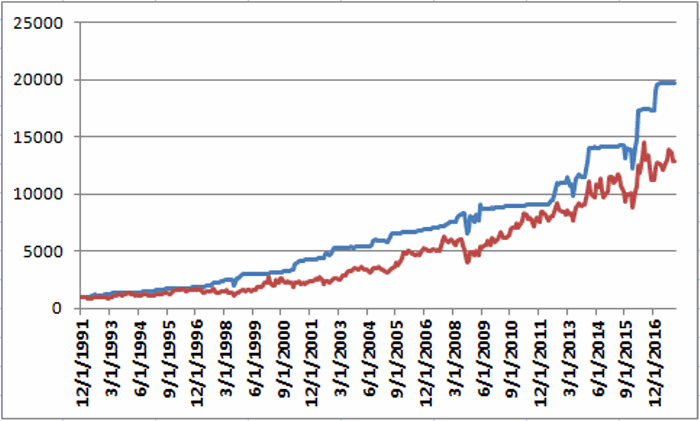
A 2nd model using metals to trade bonds has been bullish of late but is close to dropping back into bearish territory.  Figure 5 displays the P/L from holding a long position of 1 t-bond futures contract ONLY when both the EWJ AND Metals models are bearish (red line) versus when EITHER model is bullish (blue line)
5
Figure 5 – T-bond futures $ gain/loss when EWJ OR Metals Models are Bullish (blue line) versus when EWJ AND Metals Models are both Bearish (red line); August 1990-present
Gold
My most basic gold trend-following model is still bearish.  This model uses my “Anti-Gold Index” (comprised of tickers GLL, SPX, UUP and YCS).  It is bullish for gold when a Front-Weighted Moving Average (detailed here) is below the 55-week exponential moving average and vice versa.
6
Figure 6 – Jay’s “Anti-Gold Index” versus ticker GLD (Courtesy AIQ TradingExpert)
Summary
So at the moment the stock model is bullish and the bond and gold models are bearish.  Are these trends certain to persist ad infinitum into the future?  Definitely not.  Will the models detailed here provide timely signals regarding when to get in or out the next time around?  Sorry, but it doesn’t always work that way with trend-following.
But as for me I prefer “riding the trend” to “predicting the future.”
Some painful lessons just stick with you I guess.
Jay Kaeppel  Chief Market Analyst at JayOnTheMarkets.com and AIQ TradingExpert Pro (http://www.aiqsystems.com) client. 
Disclaimer:  The data presented herein were obtained from various third-party sources.  While I believe the data to be reliable, no representation is made as to, and no responsibility, warranty or liability is accepted for the accuracy or completeness of such information.  The information, opinions and ideas expressed herein are for informational and educational purposes only and do not constitute and should not be construed as investment advice, an advertisement or offering of investment advisory services, or an offer to sell or a solicitation to buy any security.

Summer Fun with Biotech and Real Estate

Studies suggest that buying an upside breakout can be a good strategy.  It sure can be scary though.  There is always that underlying fear of looking like “the last fool in” if the security in question experiences only a false breakout and then reverses back to the downside (and I hate it when that happens).  Still, for a stock to go from $50 to $100 it first has to go to $50.01, then $50.02, etc.
Buying into an impending breakout can be an even dicier proposition since this involves buying into what is essentially a “topping formation.”  I recently wrote about consolidation patterns in biotech and real estate.  These sectors appear to be getting closer to a resolution.  Consider tickers XBI (biotech ETF) and IYR (real estate ETF) as shown in Figure 1.
1Figure 1 – Biotech and Real Estate (Courtesy AIQ TradingExpert)
XBI appears to be breaking out to the upside – at least for now.  IYR is close to breaking out – however, one could look at it in an exactly opposite manner and claim that it is “running into resistance near the old highs and therefore may be forming a top.”
Ah, the eye of the beholder.
A Seasonal Play in Biotech and Real Estate
It is pretty widely known at this point that the summer months tend not to be very favorable for the stock market overall (although July of this year might be an exception to the rule).  But biotech and real estate often provide a summer trading opportunity.
The seasonally favorable period extends from:
*The close on June trading day #17 (6/23/2017 this year)
*Through the close on July trading day #21 (7/31/2017 this year)
Figure 2 displays the growth of $1,000 split evenly between ticker FBIOX (Fidelity Select Biotech) and ticker FRESX (Fidleity Select Real Estate) every since 1989 during this period.
2Figure 2 – Growth of $1,000 split between FBIOX and FRESX during seasonally favorable summer period (1989-2016)
Figure 3 displays a summary of the results since 1989.
Measure Result
# Years UP 22 (79%)
# Years DOWN 6 (21%)
Average All Years +3.3%
Average UP Year +5.0%
Average DOWN Year (-2.9%)
Best UP Year +14.9% (2009)
Worst DOWN Year (-4.3%) (2004)
Figure 3 – Summary Results
One thing to  note is the lack of downside volatility despite the fact that both biotech and real estate can be quite volatile (worst down period was -4.3% in 2004).
Year-by-Year Results Appear in Figure 4.  For comparisons sake the annual performance for the Dow Jones Industrials Average (DJIA) during the same period is included.
  Year        FBIOX/FRESX    DJIA    Diff
1989 4.8 5.1 (0.3)
1990 2.8 2.1 0.7
1991 5.8 3.6 2.2
1992 7.0 3.2 3.7
1993 0.8 2.1 (1.3)
1994 (0.6) 1.8 (2.4)
1995 3.5 2.7 0.8
1996 (4.1) (4.1) 0.1
1997 2.9 6.4 (3.5)
1998 1.8 2.2 (0.5)
1999 4.4 (0.1) 4.5
2000 0.3 1.1 (0.8)
2001 (3.6) 0.1 (3.8)
2002 (1.5) (4.9) 3.4
2003 8.0 1.0 7.0
2004 (4.3) (2.9) (1.4)
2005 9.6 2.1 7.5
2006 4.0 1.8 2.2
2007 (3.2) (1.0) (2.1)
2008 6.7 (1.9) 8.6
2009 14.9 10.0 4.9
2010 2.0 1.6 0.4
2011 3.0 0.8 2.2
2012 5.7 4.0 1.7
2013 12.6 5.2 7.5
2014 1.1 0.4 0.7
2015 0.6 (2.2) 2.8
2016 8.6 2.3 6.2
Figure 4 – Annual Results for FBBIOX/FRESX during seasonally favorable  summer period versus Dow Jones Industrials Average
For the record,during the seasonally favorable summer period:
*The FBIOX/FRESX combo has outperformed the Dow in 19 out of 28 years.
*$1,000 invested in FBIOX/FRESX grew to $2,440
*$1,000 invested in the Dow Industrials grew to $1,505
Summary
So is biotech and real estate the place to be in the month ahead?  Well, that’s “the thing” about seasonal trends – there’s no way to know for sure what it’s going to be “this time around.”
On a cautionary note, it should be pointed out that the FBIOX/FRESX combo has registered a gain during the seasonal summer period – and outperformed the Dow – in each of the last 9 nine years.
So is it “Away We Go” or this the year that “Murphy’s Law” exacts its revenge?  As always, time will tell.
Jay Kaeppel  Chief Market Analyst at JayOnTheMarkets.com and AIQ TradingExpert Pro (http://www.aiqeducation.com) client. 
Disclaimer:  The data presented herein were obtained from various third-party sources.  While I believe the data to be reliable, no representation is made as to, and no responsibility, warranty or liability is accepted for the accuracy or completeness of such information.  The information, opinions and ideas expressed herein are for informational and educational purposes only and do not constitute and should not be construed as investment advice, an advertisement or offering of investment advisory services, or an offer to sell or a solicitation to buy any security.