Every trading day, the price of a stock is determined by a struggle between supply and demand. In technical analysis, charting a security is critical because it shows the interaction of supply and demand. The demand fluctuates at any given moment from a variety of factors, some rational and some irrational.
As a stock enters into a period of fluctuation, one of several traditional chart patterns may emerge. The pattern we’ll focus on in this article is the Symmetrical Triangle.
The Symmetrical Triangle pattern has two sloping trendlines that converge to each other. That is, a stock fluctuates up and down but each move is smaller than its predecessor. The descending tops in the price movement are defined by a downward sloping boundary line (resistance line) and the low points in the fluctuation can be defined by an upward sloping line (support line). The top and bottom boundaries need not be of equal length.
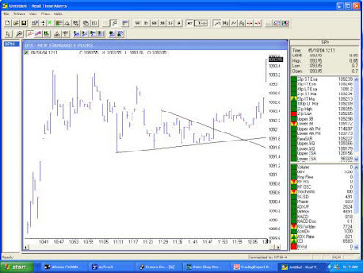
With the Symmetrical Triangle pattern, it’s seldom that a clue is given on the chart indicating which direction will eventually be broken. This is an attractive pattern for day-traders. That’s because good tradable moves come after a period of reduced volatility and because the pattern lends itself to tight stops. I’ll explain with an example. The chart below shows a one-minute chart of the S&P 500 Notice that after rallying in the morning, the S&P 500 stalls and begins to move sideways. In the 11:00 hour the index enters the Symmetrical Triangle pattern. Each rally is less than the previous rally and each decline is less than the previous decline.
As the pattern develops, volatility falls. The eventual break came to the upside. After the break, investors had several minutes to act on the signal before the S&P 500 jumped higher. Once the pattern is broken, a tight stop can be placed using trendlines. In this case, the break was to the upside so the stop is placed just below the support trendline (lower trendline). If the break occurred to the downside, the stop would be placed just above the resistance trendline.
Realtime Point & Figure charts can help identify this pattern. Unlike bar charts where the vertical coordinate is based on price and the horizontal coordinate is based on time, the Point and Figure chart is only concerned with price. Since time is not a factor, small fluctuations in price are often not charted. Without these disturbances, it is easier to spot emerging patterns.
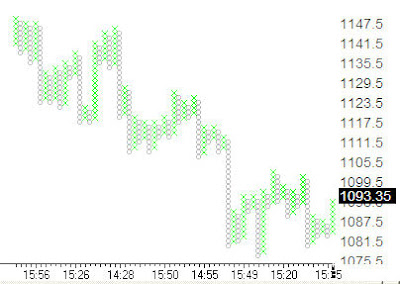
The figure below shows the S&;P 500’s Point & Figure chart using the same date as the first chart. The Symmetrical Triangle is seen at the very end of the pattern.
Looking at the last five columns, each rally (the Xs in the chart) is less than or equal to the previous rally and each decline (the Os in the chart) is greater than or equal to the previous decline. In this chart I elected to have a small box size (1.5 S&P 500 points per box) to make the chart more responsive and appropriate for active trading. It is also the reason behind the small Xs and Os. By increasing the box size, the Xs and Os will appear larger on the monitor.
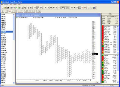
The figure below shows Bed Bath & Beyond (BBBY) using a $0.20 box size. The larger Xs and Os make it easy to spot the Symmetrical Triangle pattern.
In the center of the pattern, BBBY enters a period where each rally is less than the previous rally and each sell-off is less than the previous sell-off. The bearish signal came once BBBY fell below the pattern and the column of Os fell below the previous column of Os. The Symmetrical Triangle pattern is an attractive pattern for active traders because tradeable moves often come after periods of reduced volatility and because the pattern allows for time stops. You can identify the pattern using traditional bar charts or with the real-time Point & Figure charts. Most people find it is easier to identify the pattern using the Point & Figure technique.


