The importable AIQ EDS file based on Vitali Apirine’s article in the April Stocks & Commodities issue, “On-Balance Volume Modified,” can be obtained on request via email to info@TradersEdgeSystems.com. The code is also available below.
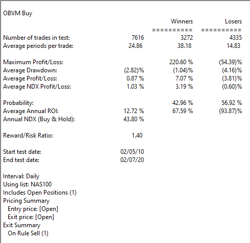
I coded the indicator described by the author and also coded a simple buy-sell on crossovers of the indicator. I tested the long side in the AIQ EDS module. Figure 5 shows the backtest results over the last 10 years using the Nasdaq 100 list of stocks.
FIGURE 5: AIQ. Sample backtest results are shown for the last 10 years using the Nasdaq 100 list of stocks.
!ON-BALANCE VOUUME MODIFIED (OBVM)
!Author: Vitali Apirine, TASC Apr 2020 !Coded by: Richard Denning 2/9/20 !www.TradersEdgeSystems.com
!ON BALANCE VOLUME:
C is [close].
C1 is val([close],1).

!OBV THAT HAS SAME SHAPE AS BUILT-IN OBV INDICATOR
DaySum is hasdatafor(2000).
F  is iff(C > C1,1,iff(C < C1,-1,0)).
VolSum1  is Sum([volume] / 1000 * F, DaySum).
VolSum2  is 1000 + VolSum1.
OBVv1  is iff(FirstDataDate() >= Reportdate(),1000,VolSum2).

!ON BALANCE VOLUME MODIFIED:
!Hard coded version:
len1 is 7. len2 is 10.
VVV is expavg(OBVv1,len1).
SigVVV is expavg(VVV,len2).

!ON BALANCE VOULUME MODIFIED (***preferred version***):
!Using built-in OBV indicator (runs much faster)
pd1 is 7.
pd2 is 10.
OBVM is expavg([OBV],pd1).
sigOBVM is expavg(OBVM,pd2).
The old saying that “It Doesn’t Have to be Rocket Science” when it comes to the markets got to be an old saying by being true for all these years. Despite all of the increases in technology and computer speed, in the end it mostly comes down to “Is price rising or falling?” Let’s consider one the simpler approaches.
The Trend
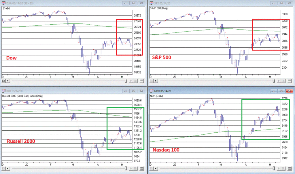
Figure 1 displays four major indexes – The Dow, the S&P 500, the Nasdaq 100 and the Russell 2000.
There is a great deal of useful information contained in these four charts. To wit:
*3 of the 4 are presently below their respective 200-day moving averages, i.e., in “downtrends”
*The 200-day moving average for all but the Nasdaq has now “rolled over” and is declining
Interpretation can be fairly simple:
*If these trends do not change, more trouble lies ahead
That wasn’t so difficult, was it?
Of course, for most people that’s “not good enough.” We want to know in advance IF these trends will or will not persist. My candid reply is “Good luck with that.”
My other response is “be patient, and keep a close eye on these indexes and these moving averages”:
*If the indexes fail to get back above these moving average, more pain is likely to unfold (see here and here)
*If the Nasdaq fails to hold above its moving average and joins the others, chances are serious defensive action (i.e., raise cash, hedge, etc.) is in order
*If the 3 down trending indexes follow the Nasdaq higher (and also this) then the worst is likely over and a much more aggressive investment stance would be warranted.
In the immortal words of Tom Petty: “The waiting is the hardest part.”
Disclaimer: The information, opinions and ideas expressed herein are for informational and educational purposes only and are based on research conducted and presented solely by the author. The information presented represents the views of the author only and does not constitute a complete description of any investment service. In addition, nothing presented herein should be construed as investment advice, as an advertisement or offering of investment advisory services, or as an offer to sell or a solicitation to buy any security. The data presented herein were obtained from various third-party sources. While the data is believed to be reliable, no representation is made as to, and no responsibility, warranty or liability is accepted for the accuracy or completeness of such information. International investments are subject to additional risks such as currency fluctuations, political instability and the potential for illiquid markets. Past performance is no guarantee of future results. There is risk of loss in all trading. Back tested performance does not represent actual performance and should not be interpreted as an indication of such performance. Also, back tested performance results have certain inherent limitations and differs from actual performance because it is achieved with the benefit of hindsight.
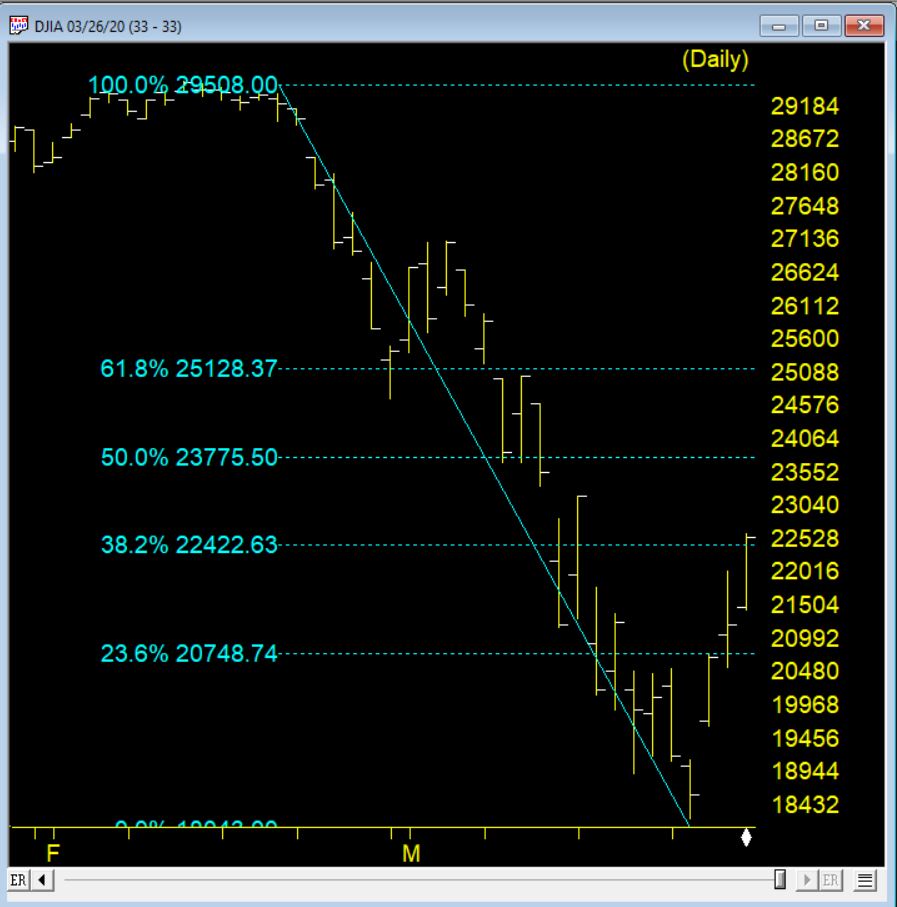
3-26-20 saw the market on the third day of a rebound from the low of 18213 on 3-23-20. The chart below shows the Fibonacci retracements from the recent high to this low.
The retracement hit the 38.2% level and this level can offer resistance. The market is down again and could be we are headed down to retest at or near the last low.
If we rally passes the 38.2% the next resistance level will be at 23775 or so at the 50% retracement level.
AIQ Market Timing signals
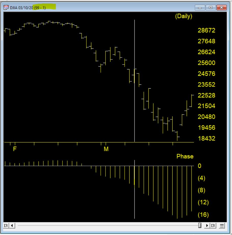
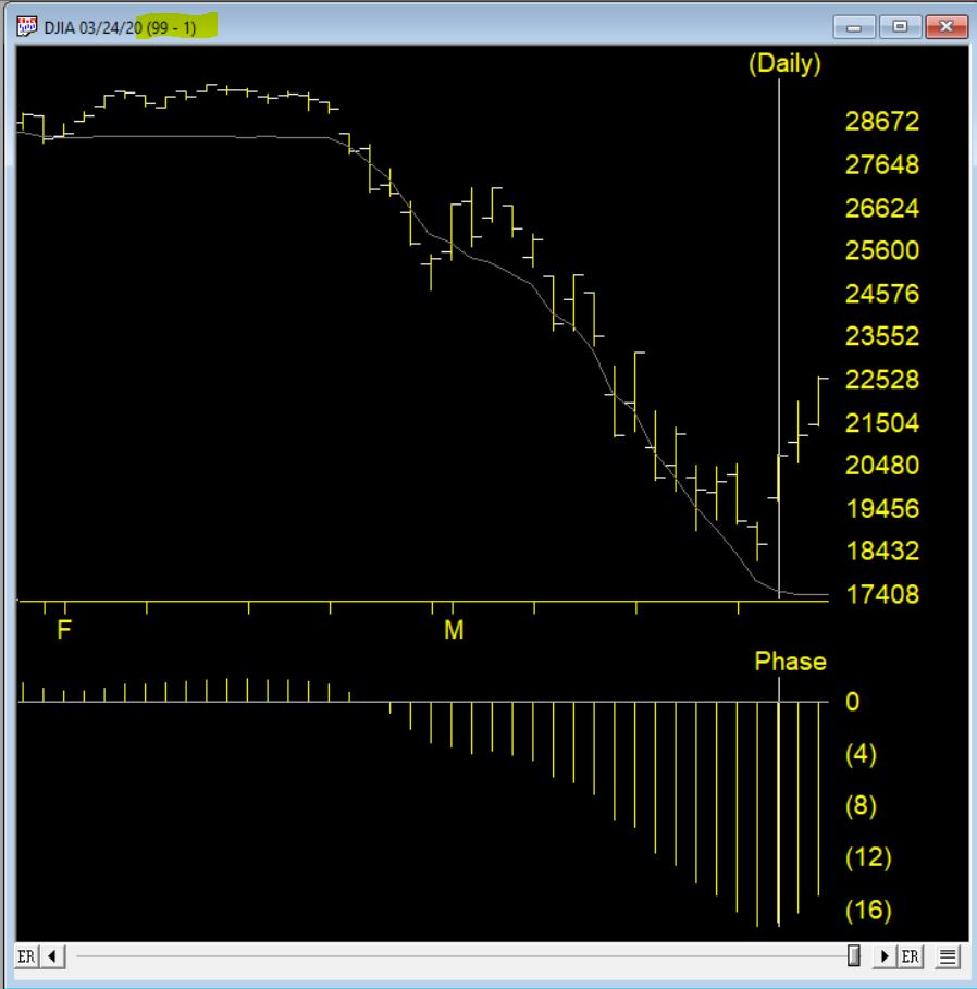
The AIQ Market Timing system issued a 99-1 up signal on 3-10-20, the chart below shows the signal. The Phase indicator changing direction in the direction of the signal (moving down then moves up) provides confirmation market Timing signals. IN this case that didn’t happen.
Another up signal 99-1 fired on 3-24-20 and this time the phase turned up the same day and confirmed the signal.
Here are 3 of the bullish rules that fired to create this high up signal
The 21 day stochastic has advanced and crossed the 20% line and the price phase indicator is also increasing. In this weakly downtrending market this is taken as a strong bullish signal suggesting an increase in prices.
Volume accumulation percentage is increasing and the 21 day stochastic has moved above the 20% line. In this downtrending market, this is taken as a strong bullish signal that could be followed by an upward price movement.
The price phase indicator is negative but volume accumulation has started to advance. This is a non-conformation that, regardless of the type of market, is a bullish signal which usually results in an upward movement of the market.
The counter trend AI system that generates these signals can be early in their firing.
The old adage is that we should “buy when there is blood in the streets.” It basically means to buy when things look their worst. Well, for the record I am not actually a fan of this intonation. While it is probably a fair statement, I for one prefer to see some sign of hope – some sign of a trend reversal at the very least – before taking the plunge.
One historically useful indicator suggests we may be nearing that point.
I refer to this indicator as JKHiLo. I included my initials in the acronym because I “developed” it. OK, all I really did was take one guy’s useful indicator and multiply it by another guy’s useful indicator and voila.
In a nutshell JKHilo multiplies Norman Fosback’s HiLo Logic Index by Gerald Appel’s High/Low Indicator.
The Fosback HiLo Logic Index (FHLLI)
I wrote two articles here and here about this indicator. In short, a very low number of stocks making new lows is bullish for the stock market – it indicates that stocks overall are going up and is bullish. At the same time, a very low number of stocks making new highs is also (typically) ultimately bullish going forward, as it tends to signal a “washed out” market.
So this indicator:
*takes the lower of new highs and new lows each day
*divides that number by the total number of issues trades
*takes a 10-day moving average of daily readings
Specifically, the Fosback HiLo Logic Index (HLLI) is calculated as follows:
A=Daily Nasdaq New Highs
B=Daily Nasdaq New Lows
C=The lower of A and B
D=The total number of Nasdaq issues traded
E = (C / D) * 100
FHLLI = 10-day average of E
Readings above 2.15% are considered a sign of “churning”, i.e., a lot of new highs AND new lows. Reading below 0.40% are considered “bullish” because either new highs OR new lows is very low.
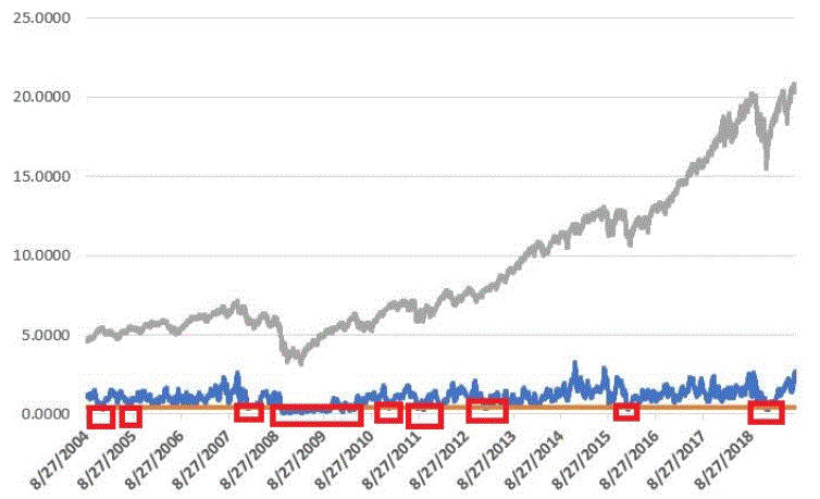
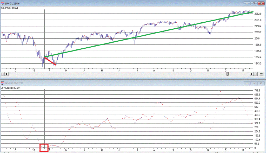
The Fosback HiLo Logic Index finally dropped below 0.40% on 3/23/20. Figure 1 displays the OTC Composite Index with this indicator through 12/31/2019.
Figure 1 – Fosback HiLo Logic Index
The Appel High/Low Indicator
This indicator (heretofore AHLI) is more of a trend-following indicator. It simply divides the number of new highs each day by the total of new highs AND new lows, then takes a 10-day average.
The AHLI is calculated as follows:
A=Daily Nasdaq New Highs
B=Daily Nasdaq New Lows
C = A / (A+B)
AHLI = 10-day average of C
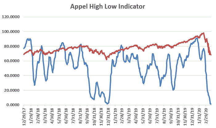
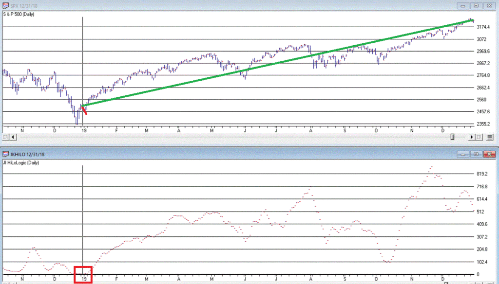
Figure 2 displays this indicator versus the OTC Composite from 12/29/17 through 3/23/20.
Figure 2 – Appel High/Low Indicator (x100; blue line) with OTC Composite (/100; red line); Dec17 through 3/23/20
Extremely low readings tend to highlight oversold market conditions. For the record, an actual “buy signal” for this indicator occurs when it drops below 0.20 (or 20 in Figure 3 since the blue line is the indicator x 100) and then rises back above that level.
The JK Hilo Index (JKHiLo)
So then one day some young punk comes along and multiplies the Fosback indicator by the Appel indicator and has the audacity to add his own initials. Some people. Anyway:
JKHiLo = (FHLLI x AHLI) x 500
A “12-month Buy Signal” occurs when this indicator:
*drops below 5.00
*then turns higher for one day
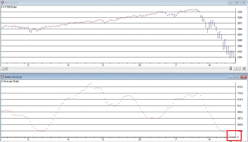
The first part of this signal has happened. As of the close on 3/23/20 JKHL has plunged to 1.8.
Let’s look at previous instances when JKHL fell below 5.00 and then ticked higher for one day.
IMPORTANT: This upside reversal technically constitutes a “12-month buy signal”. What does that mean? It means:
*We expect the market to be higher 12-months later
*HOWEVER, it is NOT an “All Clear, Everything is Great, You Can’t Lose” signal
The bottom line is that it typically does NOT mark the actually bottom. In most cases, another new low or at least a retest of the low follows within a few months. But not always.
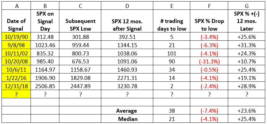
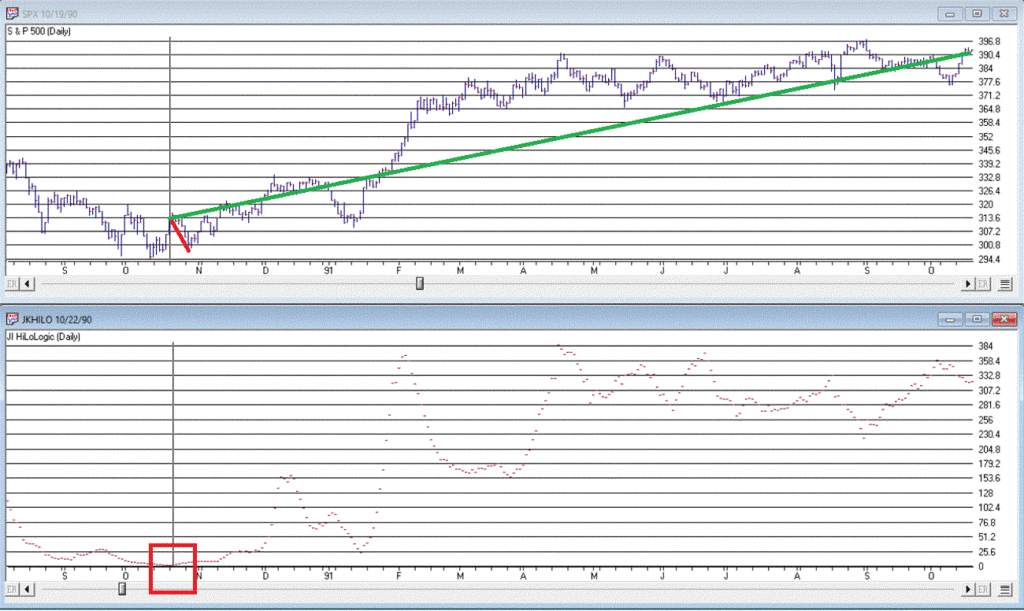
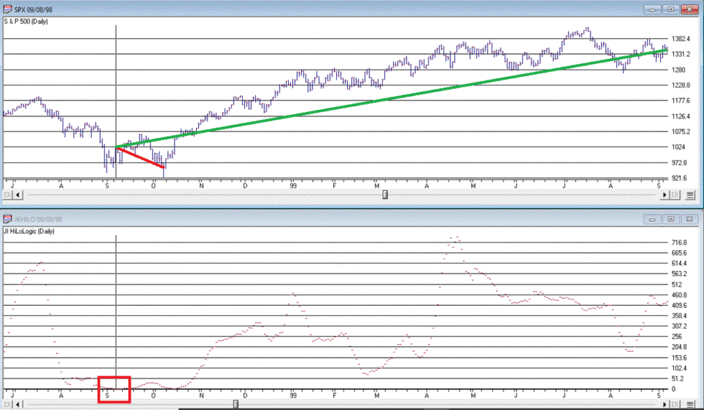
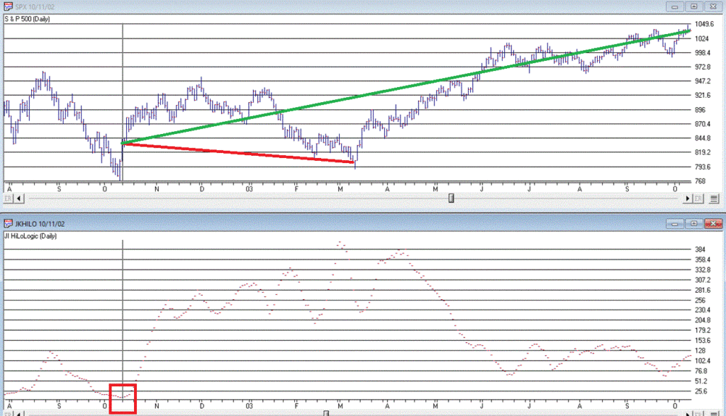
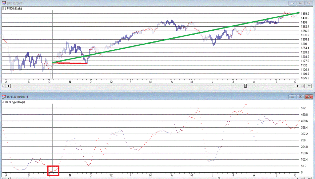
Figure 3 displays the 7 buy signals that have occurred since 1990.
A = Date of signal – i.e., date the JKHL indicator ticked up one day after dropping below 5
B = SPX closing price on date of signal
C = Subsequent low closing price for SPX
D = SPX closing price 12 months after signal date
E = # of trading days between date of signal and ultimate low
F = % decline by SPX from date of signal to ultimate low
G = % change in SPX closing price 1 year after date of signal
Figure 3 – JKHL 12-month buy signals
It is important to note that each previous “buy signal” was followed by further downside price movement prior to the ultimate low. It ranged from 2 trading days in 2018 to 101 trading days in 2008. 6 of the 7 signals saw a further decline of no more than -6.3%. But the 2008 signal saw the market continue to plunge another -31% of the following 3+ months.
So, like I said earlier, even when this indicator does turn up and generate a new signal, that DOES NOT mean “All Clear”. Still, to get an idea of what we might expect, each of the previous signals are displayed in the Figures below.
We DO NOT have a new signal yet, but JKHiLo is below 5, so it is just a matter of waiting for the daily value to tick higher for one day (and then – if history is a guide – waiting for the ultimate low to be put in before a subsequent rally).
Are we on the cusp of a new opportunity? Or on the edge of a cliff? In this time of unprecedented uncertainty, I can’t pretend to know the answer. So, I rely on objective indicators to guide me.
At this moment in time the “trend-following” indicators are bearish and so caution is undoubtedly in order. But other indicators such as the one discussed here remind us to remain alert to new opportunities.
Jay Kaeppel
Disclaimer: The information, opinions and ideas expressed herein are for informational and educational purposes only and are based on research conducted and presented solely by the author. The information presented does not represent the views of the author only and does not constitute a complete description of any investment service. In addition, nothing presented herein should be construed as investment advice, as an advertisement or offering of investment advisory services, or as an offer to sell or a solicitation to buy any security. The data presented herein were obtained from various third-party sources. While the data is believed to be reliable, no representation is made as to, and no responsibility, warranty or liability is accepted for the accuracy or completeness of such information. International investments are subject to additional risks such as currency fluctuations, political instability and the potential for illiquid markets. Past performance is no guarantee of future results. There is risk of loss in all trading. Back tested performance does not represent actual performance and should not be interpreted as an indication of such performance. Also, back tested performance results have certain inherent limitations and differs from actual performance because it is achieved with the benefit of hindsight.
Over the last month the stock market has had one of its worst declines over the shortest periods of time in history. Not even did the 2008 declines beat the velocity of the declines we saw over the last month. In 2 days the NASDAQ fell over almost 11% because of the rightfully so, Corona Virus and its potential to not only kill people but mainly do disrupt the business process of selling and the supply lines to get product. Two things I do want to say is
1. You don’t base your long term financial goals based on a short term flu. 5 years from now this will be just another flu we had. People will have forgotten about it.
2. Over the last two months I have be saying to take profits as we were overvalued, I was getting Cautious with the Rising Wedge pattern and thought the S&P 500 would go to the 3280-3380 and top out. The S&P 500 topped at 3386 and fell through the trend lines to the 2900 area, down 13% from the 3380 level. As of this point I am still very Cautious, but looking for a bottom soon over the next 2 months.
This is why I do technical analysis. People can say that the Corona Virus did it, and it did contribute, but the market was positioning itself for a fall. I think the market will continue to be volatile and potentially fall more. With the outbreak just beginning the USA, the S&P should test the 2855 level it hit a week ago and either bounce from there but I feel it will probably break down below that and hit the 2600 to the 2750 level. There have only been less than 500 people who have gotten the tests. Once the US government opens the tests up to many more people there should be many many more people who have the virus. This will scare people to stop going out at restaurants, coffee shops, theatres, cruise ships, travel and more. It will take out a percentage out of the Gross Domestic Product, (GDP). It will probably cause the markets to fall another 5 to 10%+, but it will not kill Capitalism. It should only be a short term. Remember, if this is a flu where less than 1% of the people who contract it dies, then who are dying? The elderly and the sick who have immune problems. So protect yourself. Get the N95 masks on Amazon, get myricetin as a supplement people are recommending to build up your immune system. Talk to your doctor first. Call me to rearrange your portfolios with me and your 401(k). Remember too, this will pass, but I think we have more on the downside.
This is what’s happened over the last 20 years:
2000 Y2k is going to kill us all.
2001 Anthrax is going to kill us all.
2002 West Nile Virus is going to kill us all.
2003 SARS is going to kill us all.
2005 The Bird Flu is going to kill us all. 2008 The Great Recession is going to kill us all.
2010 BP Oil is going to kill us all.
2012 The Mayan Calendar is going to kill us all.
2013 North Korea is going to kill us all.
2014 Ebola is going to kill us all.
2015 Disney Measles and ISIS is going to kill us all.
2016 Zika virus is going to kill us all.
2020 Corona Virus is going to kill us all.
Now granted this is worse because it is a pandemic and it is worse than most of the others, not in life as we lose 30-60 thousand every year to the regular flu, but there is no vaccine yet, and it is creating FEAR. But mostly the FEAR is stopping people from spending money, this will cause the markets to fall. So FEAR is killing you. Protect yourself. Be smart. Use FEAR in the markets as an advantage. Over the last few months, go to the old Bartometers, I have been saying to take profits, the markets are too overbought, that we had a Rising Wedge formation that is a reversal pattern and I thought we could go down. Well now that that has happened, is the market a BUY yet? No, because I feel it will go down more, but it may bottom over the next month or two.
There may be buying opportunities that only come once every 10 years or so. With no guarantees, if the market goes below the 2855 level down to the 2600 level to the 2750 level you may want to call me for potential buying opportunities. Remember what Warren Buffet says, “ Buy when there is BLOOD in the STREETS” That’s when most make money over the long term, When Florida houses were plummeting in the 2008 recession, were there great BUYS? In the great recession, did stocks go so low that if you bought in early 2009 did you get unbelievable deals on stocks and funds? Yes… You make money in the bull markets by buying in the BEAR MARKETS. I am not saying to buy now but get your GREED hats on. You all need to contact me to discuss strategy now. Remember, can we go down more? YES and probably will. Can we go into a Recession because of this situation? Maybe and most likely, economists are giving it a 50-50% chance. Should you reduce equities more, possibly depending on your situation and how close you are to retirement? Last month I said to take money off the table because the markets were too high. Now it’s more of a shift between funds and change some of the bonds as if Oil keeps falling, you don’t want to have much in the High Yield Bond sector or Floating rate bond area. I am concerned, however, about the corporations continue to buy back their own shares while they are issuing debt to do it. This buying back of stock is building the asset bubble. This is one concern I have in addition Corona Virus.
An excerpt from Fundamental Economist Dr. Robert Genetski: from Classical Principles.com: Stock Market Volatile as the Virus Gains
Investors switched from euphoria to fear and back several times this past week. When the dust settled, the Nasdaq, Nasdaq 100 and S&P 500 rose 1%-3% while small cap stocks fell 1%-2%.
The reason I recommend caution is related to the expectation of a sharp increase in the virus in the US. The US conducted only 473 tests through March 1. The number of tests will increase dramatically in the period ahead. More testing means more confirmed cases. The latest figures for the US show 226 cases.
Outside the US infections are growing at a rate of 20% a day. The rate of increase has slowed in Korea, but has increased dramatically in Italy and throughout Europe.
There is some good news. The daily rate of increase in China has slowed to less than 0.2% for the four days ending March 5th. Flexport, a global freight logistics company, reports that 60% of China’s manufacturing capacity is now back on line. Since US companies depend on China for critical supplies and medicines, the threat of shortages should soon be less pressing. There was more good news this past week as surveys of business activity show the US economy remained remarkably strong in February. While various international companies are suffering greatly, recent indications show the US is weathering the storm well, at least through February. Amid the uncertainty over the spread of the virus in the US, it continues to make sense to be cautious about owning stocks.
Returns in 2020 Some of the INDEXES of the markets both equities and interest rates are below. The source is Morningstar.com up until March 7, 2020. These are passive indexes.
*Dow Jones -8.9% S&P 500 -8.2% NASDAQ Aggressive growth -4.4% I Shares Russell 2000 ETF (IWM) Small cap -12.84% Midcap stock funds -12.54% International Index (MSCI – EAFE ex USA -10.4% Moderate Mutual Fund Investment Grade Bonds (AAA) Long duration -4.70% High Yield Merrill Lynch High Yield Index -3.7%
Floating Rate Bond Funds -2.4% Short Term Bond +1.3% Fixed Bond Yields (10 year) .76% Yield
The average Moderate Fund is down -4.70% this year fully invested as a 65% in stocks and 35% in bonds and nothing in the money market.
Interest rates look stable going forward over the next 6 months
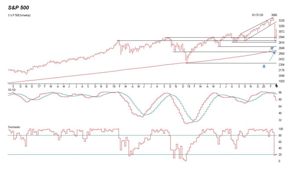
The S&P 500 is above. I used a weekly chart as I think the S&P will fall below 2855 and possibly hit the following support levels for support. 2822, 2721-2747, 2600-2630, and 2340.
These are points that investors are looking at as a support levels. I think we have more to go on the downside. The Blue arrows are areas that listed to the left I think the S&P can go too.
The middle graph is the SK-SD stochastics. This shows a breakdown, Last month I said anything over the 88 level is overbought. It’s 21 to 48 on the Daily, now it’s getting OVERSOLD but can go down more.
The third graph is the Stochastics chart. Anything below 20 is showing the market is very oversold. But can still trend lower.
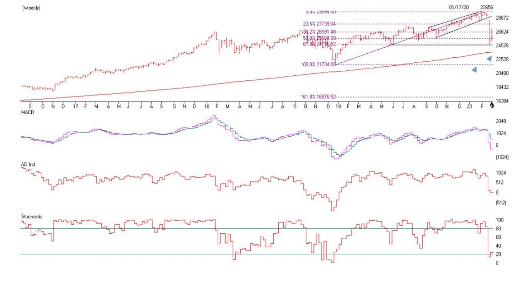
The Dow Jones is above. I drew the last three years and notice the that the 23576 is support right at the red line , but I believe the low will breakdown as it could test and breakdown and test its 200 week moving average at 23,587. If that doesn’t hold then the old lows of 21,734 are next.
This could be the capitulation investors are looking at to starting getting back into the markets. If this happens then there is a much greater chance that a Recession will occur. Please call me to Strategize your portfolio at 860-940-7020.
Support levels on the S&P 500 area are 2822, 2721-2747, 2600-2630 and 2340. These might be accumulation areas if you are a Long term investor. Support levels on the NASDAQ are 7658 to 7715, 7303, and 6861. On the Dow Jones support is at 23,587 (200 week moving average), 21,734, 19,794 and 17,863 These may be safer areas to get into the equity markets on support levels slowly.
THE BOTTOM LINE: Now that the markets have broken down the trend line I explained last month. I am more Cautious on the markets. The Corona Flu will scare people and they will pull in their horns towards traveling, going out and this act alone can cause a Recession. The market is starting to become somewhat oversold but I still would no Buy here, but wait until the Corona Virus Fear is nearing the worst it could get. That could be over the next 2 months or so. I think the S&P 500 and the markets could continue to fall as energy is also going down.
Best to all of you,
Joe Bartosiewicz, CFP® Investment Advisor Representative Contact information:
5 Colby Way Avon, CT 06001 860-940-7020 or 860-404-0408
SECURITIES AND ADVISORY SERVICES OFFERED THROUGH SAGE POINT FINANCIAL INC., MEMBER FINRA/SIPC, AND SEC-REGISTERED INVESTMENT ADVISOR.
Charts provided by AIQ Systems: Technical Analysis is based on a study of historical price movements and past trend patterns. There is no assurance that these market changes or trends can or will be duplicated shortly. It logically follows that historical precedent does not guarantee future results. Conclusions expressed in the Technical Analysis section are personal opinions: and may not be construed as recommendations to buy or sell anything.
Disclaimer: The views expressed are not necessarily the view of Sage Point Financial, Inc. and should not be interpreted directly or indirectly as an offer to buy or sell any securities mentioned herein. Securities and Advisory services offered through Sage Point Financial Inc., Member FINRA/SIPC, an SEC-registered investment advisor.
Past performance cannot guarantee future results. Investing involves risk, including the potential loss of principal. No investment strategy can guarantee a profit or protect against loss in periods of declining values. Please note that individual situations can vary. Therefore, the information presented in this letter should only be relied upon when coordinated with individual professional advice. *There is no guarantee that a diversified portfolio will outperform a non-diversified portfolio in any given market environment. No investment strategy, such as asset allocation, can guarantee a profit or protect against loss in periods of declining values.
It is our goal to help investors by identifying changing market conditions. However, investors should be aware that no investment advisor can accurately predict all of the changes that may occur in the market.
The price of commodities is subject to substantial price fluctuations of short periods and may be affected by unpredictable international monetary and political policies. The market for commodities is widely unregulated, and concentrated investing may lead to Sector investing may involve a greater degree of risk than investments with broader diversification.
Indexes cannot be invested indirectly, are unmanaged, and do not incur management fees, costs, and expenses.
Dow Jones Industrial Average: A weighted price average of 30 significant stocks traded on the New York Stock Exchange and the NASDAQ.
S&P 500: The S&P 500 is an unmanaged indexed comprised of 500 widely held securities considered to be representative of the stock market in general.
NASDAQ: the NASDAQ Composite Index is an unmanaged, market-weighted index of all over the counter common stocks traded on the National Association of Securities Dealers Automated Quotation System
(IWM) I Shares Russell 2000 ETF: Which tracks the Russell 2000 index: which measures the performance of the small capitalization sector of the U.S. equity market.
A Moderate Mutual Fund risk mutual has approximately 50-70% of its portfolio in different equities, from growth, income stocks, international and emerging markets stocks to 30-50% of its portfolio in different categories of bonds and cash. It seeks capital appreciation with a low to moderate level of current income.
The Merrill Lynch High Yield Master Index: A broad-based measure of the performance of non-investment grade US Bonds
MSCI EAFE: the MSCI EAFE Index (Morgan Stanley Capital International Europe, Australia, and Far East Index) is a widely recognized benchmark of non-US markets. It is an unmanaged index composed of a sample of companies’ representative of the market structure of 20 European and Pacific Basin countries and includes reinvestment of all dividends.
Investment grade bond index: The S&P 500 Investment-grade corporate bond index, a sub-index of the S&P 500 Bond Index, seeks to measure the performance of the US corporate debt issued by constituents in the S&P 500 with an investment-grade rating. The S&P 500 Bond index is designed to be a corporate-bond counterpart to the S&P 500, which is widely regarded as the best single gauge of large-cap US equities.
Floating Rate Bond Index is a rule-based, market-value weighted index engineered to measure the performance and characteristics of floating-rate coupon U.S. Treasuries, which have a maturity greater than 12 months.
Money Flow; The Money Flow Index (MFI) is a momentum indicator that measures the flow of money into and out of a security over a specified period. It is related to the Relative Strength Index (RSI) but incorporates volume, whereas the RSI only considers
SK-SD Stochastics. When an oversold stochastic moves up through its MA, a buy signal is produced. Furthermore, Lane recommends that the stochastic line be smoothed twice with three-period simple moving averages: SK is the three-period simple moving average of K, and SD is the three-period simple moving average of SK
Rising Wedge; A rising wedge is a technical indicator, suggesting a reversal pattern frequently seen in bear markets. This pattern shows up in charts when the price moves upward with pivot highs and lows converging toward a single point known as the apex