Coming this fall there will be some new features coming to AIQ, one feature is the Heiken-Ashi chart. Heikin-Ashi, which means “average bar” in Japanese, is a charting technique used to help traders identify and analyze market trends. It is particularly useful for making candlestick charts more readable and for providing clearer signals regarding market trends. Here are some key points and takeaways about Heikin-Ashi charts:
- Signal Interpretation:
- Heikin-Ashi charts provide traders with specific signals to identify market trends. The five primary signals used in Heikin-Ashi charts are:
- Doji Candle: This signal suggests market indecision.
- Bullish Candle: Indicates a potential uptrend.
- Bearish Candle: Suggests a potential downtrend.
- Heikin-Ashi Bullish Continuation: Signals the continuation of an existing uptrend.
- Heikin-Ashi Bearish Continuation: Signals the continuation of an existing downtrend.
- Trend Identification:
- Heikin-Ashi charts are particularly useful for identifying trends and trend reversals.
- Traders can use these charts to stay in trades as long as a trend persists and exit when the trend pauses or reverses.
- Calculation Method:
- Heikin-Ashi candles are calculated differently from traditional candlesticks. They are based on the average price values of the open, high, low, and close prices for each period.
- The formula for calculating Heikin-Ashi candles involves smoothing the price data to create a more consistent representation of price movement.
In summary, Heikin-Ashi charts are a valuable tool for traders to analyze trends and make trading decisions. They are especially effective for traders who prefer a smoother representation of price action and want clearer signals for trend identification. By understanding and correctly interpreting Heikin-Ashi charts, traders can improve their ability to predict market trends and make informed trading choices.
Here’s a comparison of the chart of NVDA. The first chart is a regular candlestick. The second chart is a Heiken-Ashi for NVDA for the same period. Note how the trends are far clearer in the Heiken-Ashi chart.
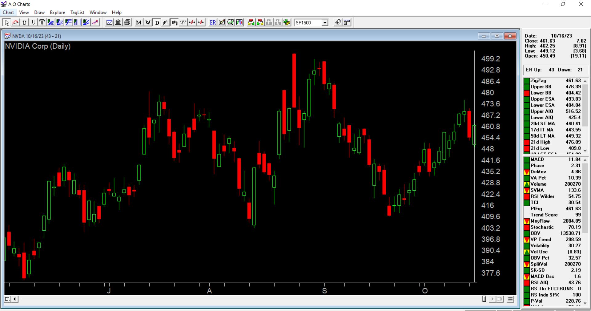
NVDA regular candlestick chart through 10/16/23
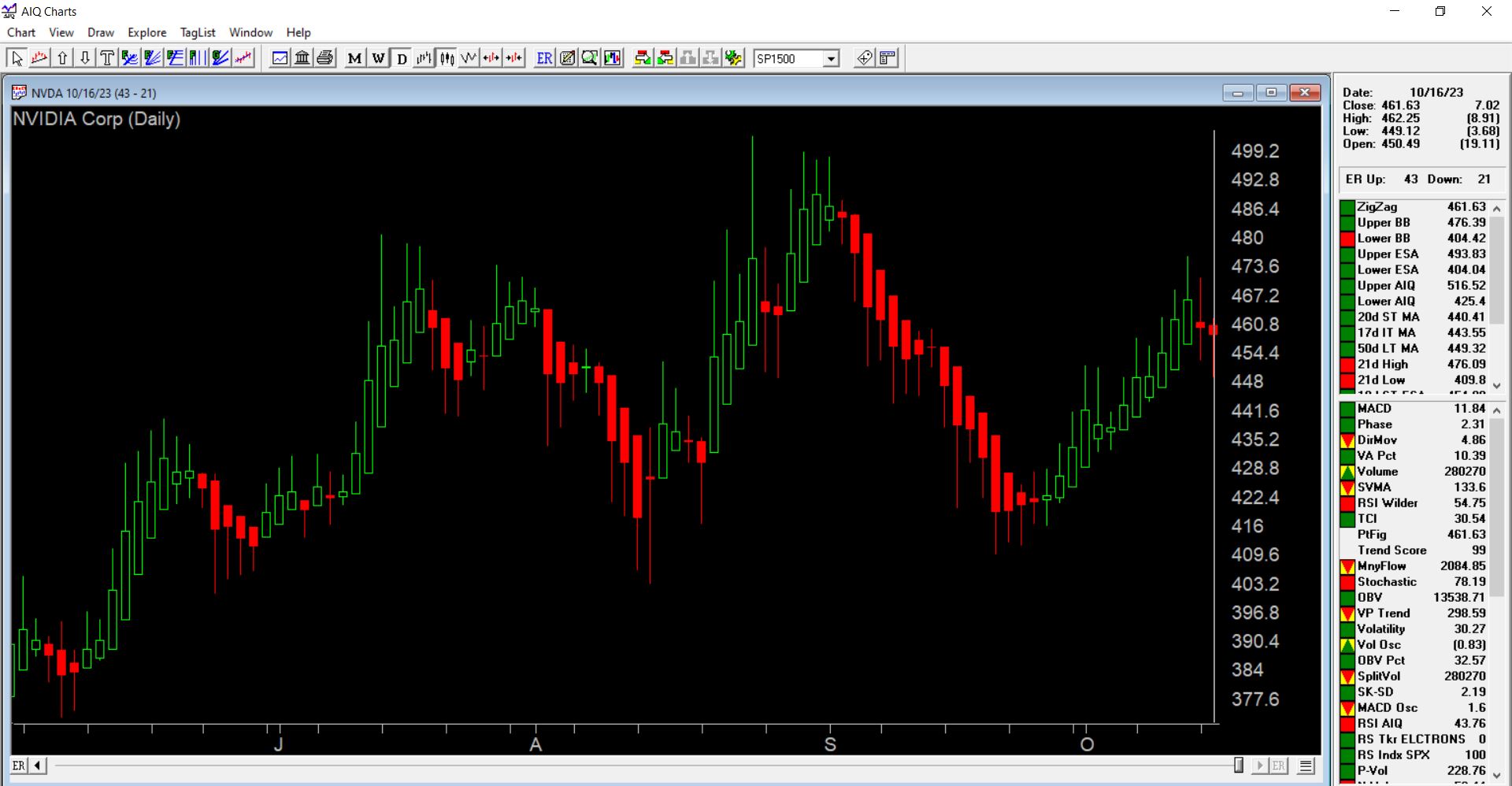
NVDA Heiken-Ashi chart, note how the trends are far clearer.
Heikin-Ashi charts exhibit several differences compared to traditional candlestick charts, as highlighted below:
- Smoother Look:
- Heikin-Ashi charts have a smoother appearance because they are derived from an average of price movements over time. This averaging process reduces the noise and volatility seen in regular candlestick charts.
- Color Consistency:
- In Heikin-Ashi charts, there is a tendency for the candles to remain predominantly red during downtrends and green during uptrends. This is because Heikin-Ashi candles take into account the average price movement, making them more consistent in color. In contrast, traditional candlesticks may alternate colors even when the price is dominantly moving in one direction.
- Price Scale Variation:
- In a regular candlestick chart, the current price displayed corresponds to the actual market price of the asset, and it usually matches the closing price of the candlestick (or the current price if the bar hasn’t closed yet).
- With Heikin-Ashi, the current price on the candle may not necessarily match the real-time market trading price. This is because Heikin-Ashi uses an average calculation that can lag behind the actual market price.
- To address this discrepancy, AIQ shows only the actual open high low, and close in the control panel of a chart for Heiken Ashi rather than the Heiken Ashi value.
These differences make Heikin-Ashi charts a valuable tool for traders who prefer a more visually consistent representation of price trends and are willing to accept a slight lag in price information in exchange for smoother and clearer signals. Traditional candlestick charts, on the other hand, provide more immediate and precise price information but can be noisier and less consistent in appearance. The choice between the two chart types depends on a trader’s preferences and trading strategy.