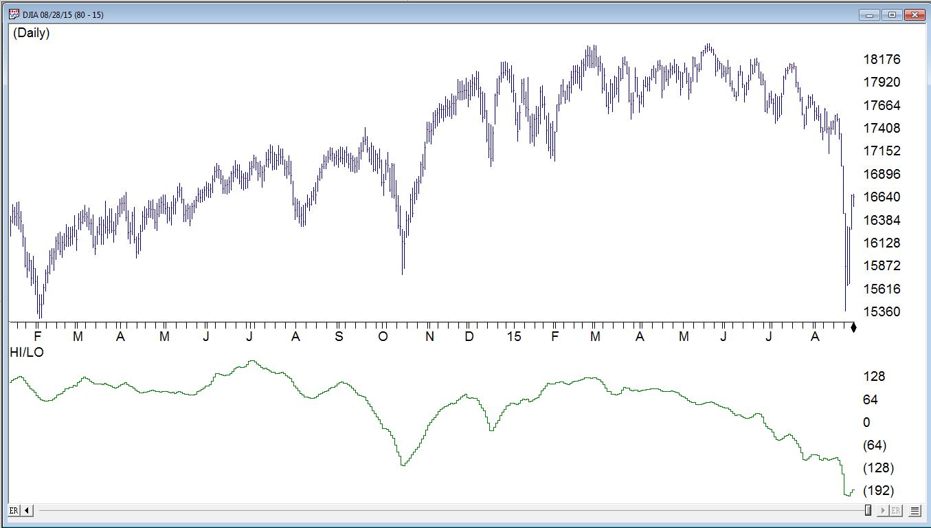
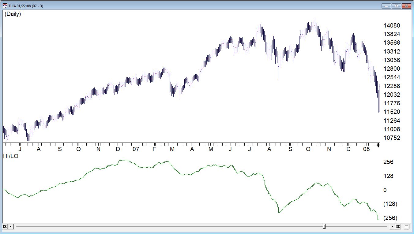
Now whether you believe history repeats itself or not, there are plenty of reasons to look at what happened in prior turning points in the market. Here we’ll look at the 2008 financial crisis tipping point and compare to price action through August 28th, 2015.
The first chart below uses the lock overlay feature in AIQ TradingExpert Pro that allows us to move one chart’s history back and forward in time while keeping the second chart ‘locked’ at a certain date. In the chart below the purple chart is the ‘locked’ price action of the Dow 30 index through 8-28-2015. The black chart is the Dow 30 index with the right hand date set to 1-23-2008 right is at the first major correction of the 2008 market.
Some statistics
10/11/07 to 1/23/08 Dow fell from 14279 to 11530 a 19% correction over 70 days
05/20/15 to 08/24/15 Dow fell from 18351 to 15370 a 16% correction over 65 days
Figure 1: In purple is the Dow 30 index through 8-28-2015, overlaid in black is the Dow 30 index from 1-23-2008
Chart patterns being what they are and somewhat subjective, lets take a look at some of the breadth data off the NYSE for both periods.
The Hi/Lo indicator measures the number of stocks on NYSE making a new high vs a new low.
This is averaged over 39 periods. Whats interesting is the peak in Hi/Lo indicator back in December 2006 way before the 2008 bear market in figure 2 below. The indicator never exceeded that peak, diverging from price action for the majority of the time until the market eventually came down. Compare that to the bottom chart of the current market. Hi/Lo indicator peaked in June 2015 and has also largely diverge from price action since.
Figure 2: Top chart is Dow 30 index through 1-23-2008 vs Dow 30 index through 8-28-2015 both with with Hi/Lo indicator of NYSE stocks
The AD Line is the difference between the day’s advances and the day’s declines summed to the previous day’s total. The Advance/Decline Line is a very good indicator of the overall strength of the total market. It tracks the entire market, and tends to lead the indices in market direction. A break in the A/D Line tends to indicate a future break in average prices and nonconformations and divergences with the price action of the market. In both time periods we are comparing, the AD Line has not shown any major break, divergences or nonconformations.
Figure 3: Top chart is Dow 30 index through 1-23-2008 vs Dow 30 index through 8-28-2015 both with with AD Line indicator of NYSE stocks
Finally a study of the 2008 bear market reveals an interesting retracement from the initial fall in prices. The market fell from the peak of the 2007 at around 14279 to the low on 1/22/08 around 11508. Subsequent rally was a classic Fibonacci retracement to 61.8% level before falling again in May 2008. After that failed turnaround the markets fully entered bear territory.