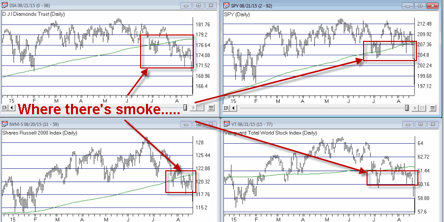
If you have been in the markets for any length of time, then you have seen this movie before:
*The market is moving along swimmingly. A few brave souls shout “The End is Near” as the Dow catapults a couple thousand points higher and then starts to level off.
*Suddenly [the financial press agrees on] one or more “causes” (circa 2015, think “China”), um, “cause” the market to plummet.
*We see the obligatory BOLD HEADLINES reading “Dow Down [-xxx] Points” accompanied by the also obligatory pictures of “worried traders” (who are these guys anymore anyway, hired actors? I thought everyone traded electronically now? Seems like they should show a picture of a guy sitting at his computer with his mouth wide open, palm to forehead, with that WTF look on his face) standing and staring up at some distant screen, dumbfounded.
*Soon comes the (I am thinking about trademarking this phrase)“Obligatory Technical Bounce”, accompanied by the equally obligatory “Dow [+xxx] Points – Is the Worst Over?” headline.
*Shortly thereafter we see the resounding answer – “No, the worst is not over”!
*And over a period of months the stock market becomes an endless roller-coaster, alternating with extreme volatility between “swooning and soaring”.
*Each “soar” is accompanied by more “Is The Worst is Over?” headlines and a lot of “Brace for more trouble” articles.
*Each “swoon” is accompanied by more “Dow Down [-point value here]” headlines and more “forlorn trader” photos.
And so it goes and so it goes. To wit:
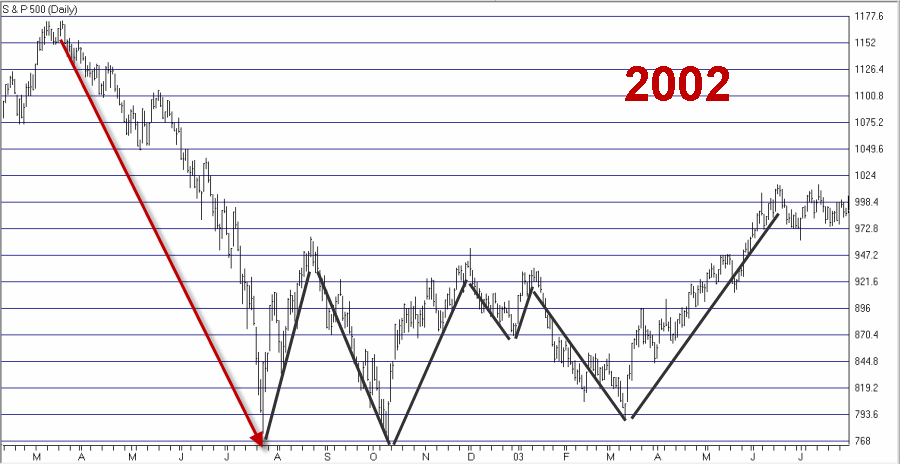
Figure 1 – 2002 (Courtesy: AIQ TradingExpert)
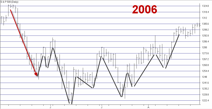
Figure 2 – 2006 (Courtesy: AIQ TradingExpert)
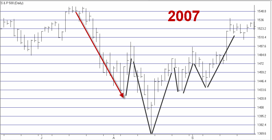
Figure 3 – 2007 (Courtesy: AIQ TradingExpert)
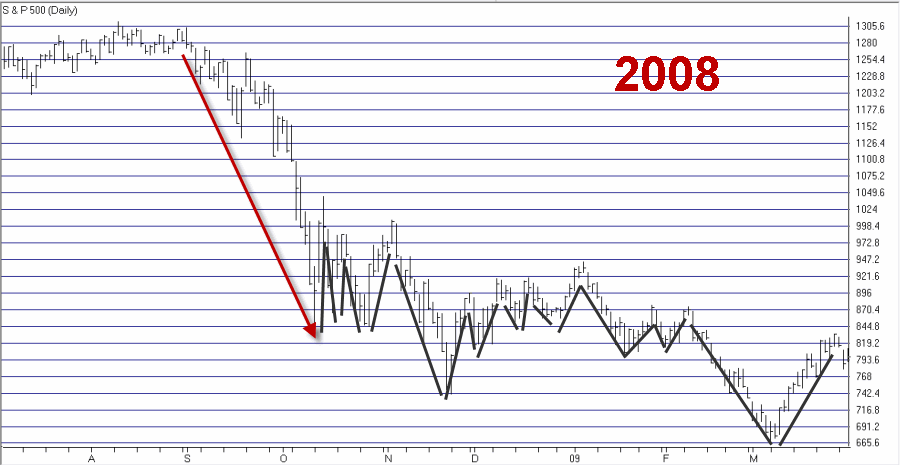
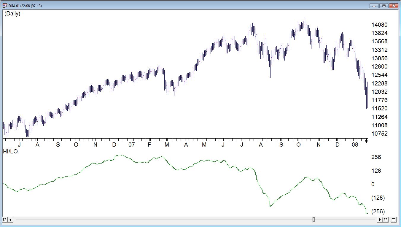
Figure 4 – 2008 (Courtesy: AIQ TradingExpert)
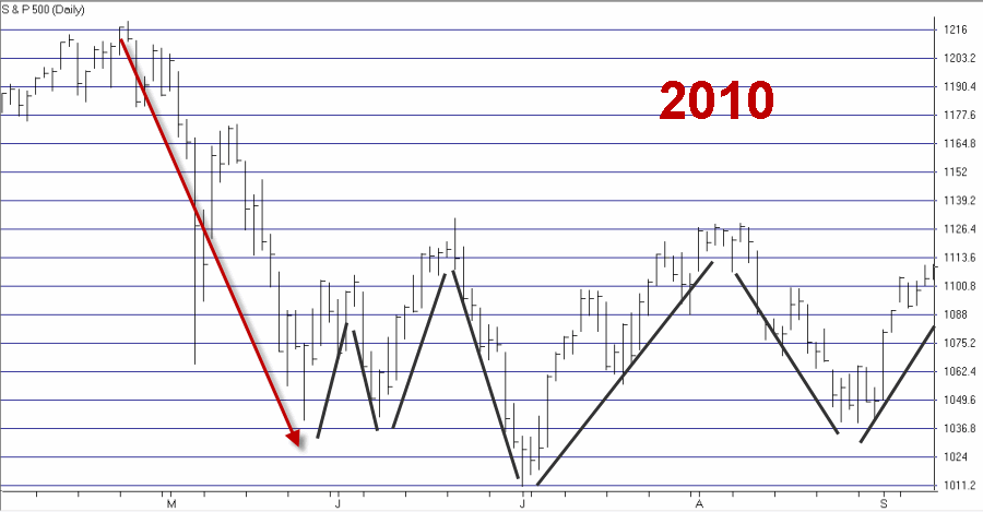
Figure 5 – 2010 (Courtesy: AIQ TradingExpert)
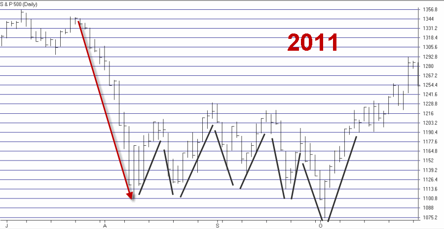
Figure 6 – 2011 (Courtesy: AIQ TradingExpert)
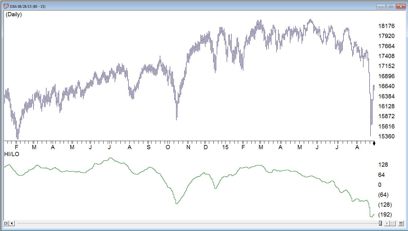
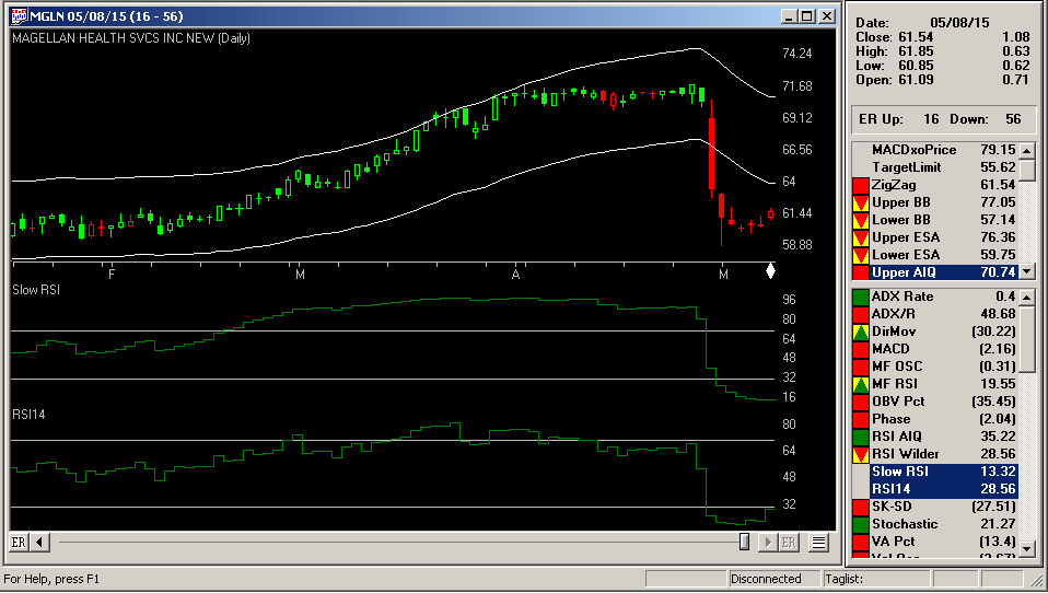
As you can see in Figure 7, the 2015 decline is “off to a good start” (“off to a good start” being defined as “big drop” followed by “soar” followed by “swoon”).
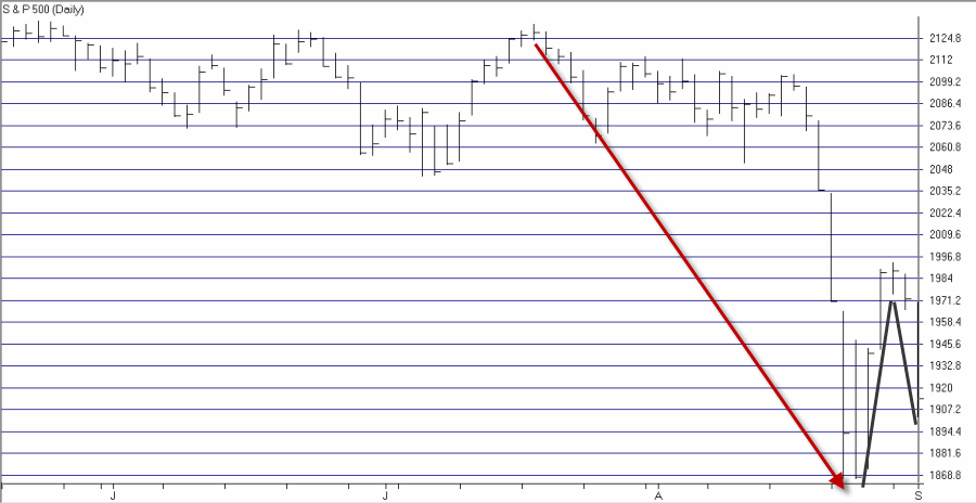
Figure 7 – 2015 (Courtesy: AIQ TradingExpert)
Summary
Expect big prices swings by the major stock market averages. Also expect to have the financial press raise your hopes that “The Worst is Over” each time the averages “soar” and to attempt to scare the crud out of you each time the averages “swoon.”
In the meantime:
*If you are an excellent short-term trader then there is the opportunity to make a lot of money.
*If you are a poor short-term trader then there is the opportunity to lose shocking sums of money in an incredibly short period of time (so assess your skills carefully before attempting to ride each “swoon” and/or “soar”).
*If you are a more traditional investor then the reality is that you should continue to follow your investment plan (you do have one, right? Right?) and not “react” every time you see a picture of a dumbfounded trader juxtaposed to be staring at the latest “Dow Down [xxxx] Points” headline. Remember:
Jay’s Trading Maxim #29: If you had a trading plan that you were following yesterday, you should continue following it today.
Jay Kaeppel
Chief Market Analyst at JayOnTheMarkets.com and AIQ TradingExpert Pro (http://www.aiq.com) client