OK, let’s be candid about this title. The reality is that no one ever “has to pick a bottom.” In fact, we are advised time and again to avoid this very activity as it is considered to be “dangerous”, “foolhardy” and/or “unlikely to succeed”, depending on the person dispensing the wisdom.
Still, if you are reading this article then chances are you are doing so because at some point in your (checkered?) trading past you have either been tempted to “pick a bottom (and/or top)” or you have actually tried to do so.
So you know deep down that it is probably not a very good idea. Still, it sure is tempting isn’t it? I mean let’s be honest here. Who doesn’t want to be able to say they “picked the bottom” in, well, something, whatever. And you sure can make a lot of money if you get in at exactly the right moment.
So let’s dispense with niceties and conventional wisdom and acknowledge the fact that we are in fact imperfect beings, complete with foibles, faults, bad habits and extremely subject to human nature (and isn’t that a pain in the rear). So if you consider yourself to be a “trader” it may be hard to look at the recent free-fall in oil and perhaps gold prices and not say “Man, this thing is due to bounce. I wonder if there is a way to play this?” So let’s take a look at one way to play a potential bounce in crude oil.
A Few Important Caveats
1) I haven’t the slightest idea if crude oil will bounce soon or not. In fact, if my gut told me that it was then my first reaction would likely be to ignore it (but enough about my own personal psychoses’).
2) Regardless of whatever the rest of this article says the cold hard reality is that this exact moment in time is probably not the moment that crude oil will bottom out. In fact, it could continue to fall precipitously for some time to come.
3) Yes, trying to pick a bottom in anything is in fact analogous to attempting to catch a falling knife. It’s a really cool trick if it works, but it can get a little messy otherwise.
So I am NOT “predicting” that crude is about to bounce and I am NOT recommending that you take the trade I will discuss in a moment.
So what is the point? The point is this: There is a right way and a wrong way to do everything, no matter how wise or foolish the current “thing” in question may be. If you are going to pick a bottom then you want to do two things:
1) Understand going in that you are playing a long shot so prepare yourself mentally in advance to fail (in fact you might even want to go ahead and prepare yourself to kick yourself and say “What the heck was I thinking about?”).
2) Do everything possible to minimize your risk based on current circumstances.
One Way to Play a Bounce in Crude
OK, all caveats out of the way, let’s now go ahead and “take the plunge.” A few key factors:
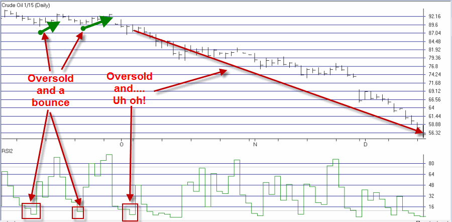
1) My own personal opinion is that any trade that attempts to pick a top or bottom should involve the use of options. Why? Simple – limited risk. To better appreciate this, imagine the poor schlub who bought a January 2015 crude oil futures contract on 10/3 when the 2-day RSI (which I like by the way) dropped below 5, thus strongly suggesting that crude oil was “oversold”. As you can see in Figure 1, since that time, Jan2015 CL has fallen from 87.87 to 55.91. At $1,000 a point, that works out to a loss of -$32,900 per contract. Ouch. And thanks for playing our game.
Figure 1 – “Oversold” Crude Oil not such a Bargain (Courtesy: AIQ TradingExpert)
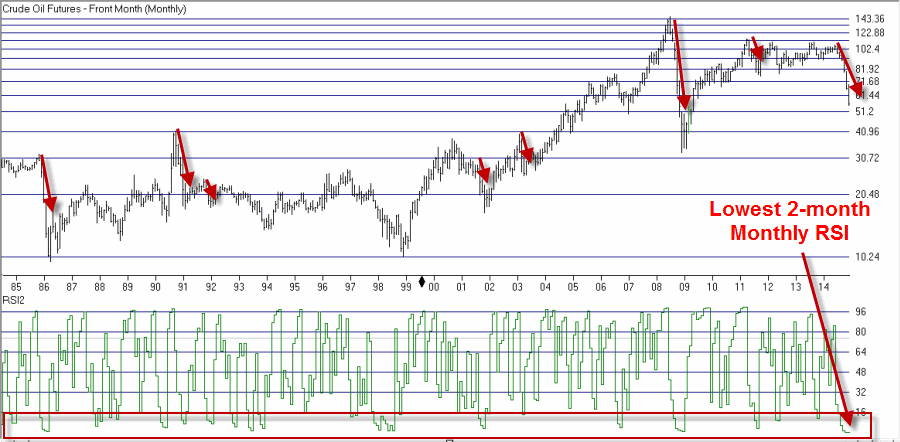
2) The current “waterfall” decline in crude is not without precedent. In Figure 2 – which displays a continuation chart of crude oil futures – you can see several occasions when the bottom dropped out of crude oil, so to speak. In the past these types of declines have typically lasted 3 to 8 months. The current decline is in its 6 month. Likewise, as of 12/16, the monthly 2-month RSI was at its lowest reading in 30+ years of trading. The point here is not to argue that a reversal is imminent, only that it isn’t entirely crazy to think that a bounce is possible.
Figure 2 – Crude Oil “waterfall declines” past and present (Courtesy: AIQ TradingExpert)
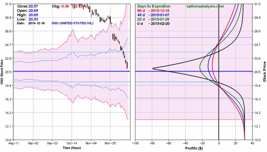
The least expensive way to play a potential bounce in crude oil is via options on ticker USO, the ETF that tracks (more or less) the price of crude oil. In Figure 3 you see the USO bar chart with the 90+ day implied option volatility plotted.
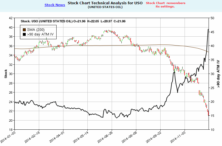
IV has spiked to its highest level in years. This has important implications for option traders. High implied volatility simply tells us that there is a lot of time premium built into the price of USO options. As a result, traditional bullish strategies such as buying calls or bull call spreads may be poor choices for someone looking to play a bounce. This is because implied volatility typically (albeit not always) declines when a security bounces higher off of a panic selling bottom. Selling a bull put spread might make sense as an alternative. However, I personally don’t advocate that strategy in the face of an ongoing waterfall decline. A bull put spread is best used when there is some sort of support level that a trader can use as an “uncle” point.
So what to do?
What to Do
Well as I stated earlier, for the vast majority of traders the best course is to “do nothing” and NOT attempt to pick a bottom in crude. However, we are talking about what actions a trader might consider if he or she has decided to “take a flyer”. So here is one possibility – a “Reverse Call Calendar Spread.”
As long as we are breaking all the rules I think it is OK to point out that a reverse calendar spread is a strategy that most traders will never use, and in most cases should never use. But every tool has its use. What we are looking for in this case is:
1) Price movement between now and the first week of February, and;
2) A decline in implied volatility
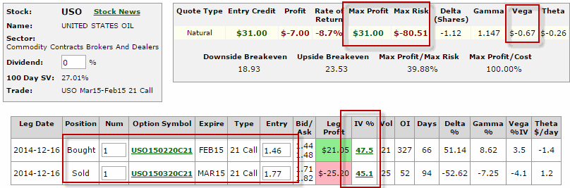
So one way to play is:
*Buy 1 Feb 2015 21 Call @ 1.46
*Sell 1 Mar 2015 21 Call @ 1.77
The prospects for this trade appear in Figures 4 and 5.
A few key things to note for starters:
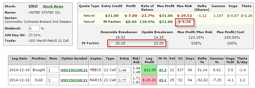
1) Assuming this trade is held until February expiration and implied volatility remains unchanged this trade (based on a 1-lot) has $31 of profit potential and $80 of risk.
2) “Vega” represents the amount that the trade will gain or lose if implied volatility rises by 1 percentage point. This trade has a Vega of $-0.67. This means that if volatility keeps rising lose potential may also increase. However, if IV falls the profit potential for this trade will increase. If IV falls 10 percentage points the profit on this trade will increase (roughly) $6.70.
3) Implied volatility for the options in this trade are extremely high (45% or more) on a historical basis.
4) From a risk management perspective the most important thing to note is that this trade should NOT be held until February option expiration. By planning to be out no later than two weeks prior to expiration (i.e., by Feb. 6) we completely eliminate that potential of experiencing the maximum potential loss, and in fact reduce the worst case scenario significantly.
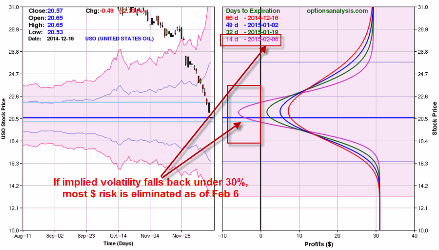
Let’s make the following assumptions to highlight exactly what this trade is designed to achieve. The information in Figures 6 and 7 assume:
1) That the trade will be held no later than Feb. 6, and;
2) That implied volatility falls 40% from current level (i.e., current IV x 0.6)
In Figures 6 and 7 you clearly see the potentially positive implications for a meaningful decline in implied volatility.
In this scenario, the maximum risk declines to roughly -$5 on 1-lot and the break-even range is greatly compressed thus significantly raising the probability of a profitable trade.
Summary
So all in all, it is typically a bad idea to try to pick a top or bottom in the financial markets. But all of us are human, and human nature can occasionally lead a trader to “feel the urge.” If the urge is too great and you feel you must act, then remember to do everything in your power to limit your risk.
If your bottom picking trade works out, great (but don’t let it go to your head). And if it does not, then at least you didn’t “bet the ranch.”
Jay Kaeppel
Chief Market Analyst at JayOnTheMarkets.com and AIQ TradingExpert Pro (http://www.aiq.com) client
http://jayonthemarkets.com/
Jay has published four books on futures, option and stock trading. He was Head Trader for a CTA from 1995 through 2003. As a computer programmer, he co-developed trading software that was voted “Best Option Trading System” six consecutive years by readers of Technical Analysis of Stocks and Commodities magazine. A featured speaker and instructor at live and on-line trading seminars, he has authored over 30 articles in Technical Analysis of Stocks and Commodities magazine, Active Trader magazine, Futures & Options magazine and on-line at www.Investopedia.com.