Is it “ByeOtech” or “BuyOTech”?

I am not sure I know the answer to the question posed in the headline.  But I do know one thing – biotech stocks are getting killed.  If only somebody had warned us that something like this might happen…..Oh, wait, somebody did.
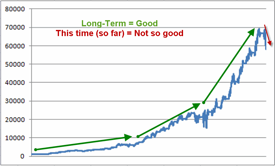
In case you were not aware, biotech stocks (using Fidelity Select Biotech, ticker FBIOX as a proxy) are now 43% off of the high made on July 17th, 2015.  On July 17, 2015 I posted an article that included the ominous chart that appears in Figure 1.
2
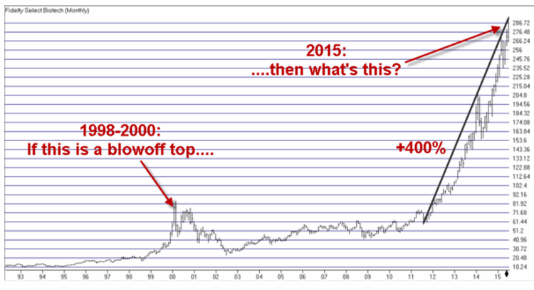
Figure 1 – Chart from July 17, 2015 article
Now here’s the interesting paradox. Technically I could argue that I did in fact “call the top”.  But if you reread that article you will note that I never actually said “Sell.”  It pains me to say it but the fact that FBIOX topped on the very day I wrote the above article is coincidence not prescience.  The point of that article was not to “call the top” but simply to warn that danger appeared to be imminent.  Imminent indeed.
The other point is that if you are in this business long enough (for example, from say the “Hair Era” in your life to the “Not So Much Hair Era”, but I digress) you will see that various patterns repeat, um, repeatedly (See here and here).  If you are paying attention and not afraid to act you can actually do yourself some good (regardless of whether the S&P 500 is rising or falling).
The Difference Between Theory and Reality
There is an important distinction to be made between “theory” and “reality” when it comes to investing and trading.  In theory, picking a top sounds like a great idea.  In reality, attempting to “call the top” is typically foolish.  However, in reality, recognizing danger when it exists is one of the most valuable skills you can develop.
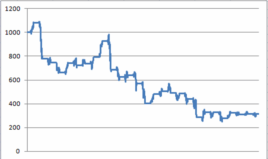
So speaking of reality, consider this example. The chart that appears in Figure 1 provides a warning of danger.  Now just suppose you applied something as simple, basic and mundane as a 9-month moving average to FBIOX and decided to sell if and when price drops below said moving average.  As you can see in Figure 2, you might have sold FBIOX at the end of August 2015 and avoided a further -32% decline in price from that point.
3
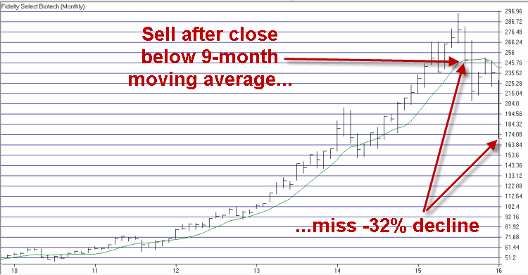
Figure 2 – FBIOX with a 9-month moving average (Courtesy AIQ TradingExpert)
The bottom line: It really doesn’t have to be rocket science.
Jay Kaeppel
Chief Market Analyst at JayOnTheMarkets.com and AIQ TradingExpert Pro (http://www.aiq.com) client

Seasonality in Housing Stocks

Alright, first the Bad News: A) The trend I am going to discuss is not necessarily “timely”, and B) technically, one could say that it is “not working” at this exact moment in time.  The Good News is that on a rolling five-year return basis, this trend has yet to show a loss (at least not since I started tracking Fidelity Select Construction & Housing (ticker FSHOX) in 1988.
Bullish Period versus Bearish Period
*The “bullish” period for housing stocks (using FSHOX as a proxy) begins at the close of trading on October Trading Day #7 and extends through the end of the 2nd trading day the following June.
*The “bearish” period for housing stocks (using FSHOX as a proxy) begins at the close of trading on the 2nd trading day of June and extends through the end of the 7th trading day in October.
The Periods at a Glance
Figure 1 displays the annual seasonal chart for FSHOX.  As you can see, the tendency has been to stage a strong advance during the so-called “bullish” period and to lose ground during the so-called bearish period.1Figure 1 – FSHOX Seasonal Pattern
To illustrate the difference in performance more clearly, Figure 2 displays the growth of $1,000 invested in FSHOX only during the bullish period every year since December 1988.  To date, $1,000 has grown to $60,159 (+5,916%).  That’s the good news. The bad news is that since 10/9/15 FSHOX is down -11.6%.2Figure 2 – FSHOX performance during “Bullish” periods (12/1988-present)
Figure 3 displays the growth of $1,000 invested in FSHOX only during the bearish period every year since December 1988.  To date, $1,000 has declined in value to $316 (-68%).3Figure 3 – FSHOX performance during “Bearish” periods (12/1988-present)
As you can see in Figure 3 it is not as though FSHOX declines each and every year during the “bearish” period.  Still, a gain of +5,915% for the bullish periods versus a loss of -68% for the bearish periods is what we “quantitative types” refer to as “statistically significant”.
Long-Term Perspective: 5-Year Rolling Returns
Figure 4 starts at the end of 1993 and shows the total return over the previous 5-years for both bullish and bearish seasonal periods using FSHOX.
The bullish periods appear in blue and the bearish periods in red.4
Figure 4 – 5-Yr. % return for Bullish Periods (Blue) versus Bearish Periods (Red)
There are two key things to note from Figure 4:
*The “bullish” period for FSHOX has gained ground over a 5-year period 100% of the time
*The “bullish” period for FSHOX has outperformed the “bearish” period over a 5-year period 100% of the time
Other figures to note:
*The median 5-year gain for the “bullish” period is +118.4%
*The median 5-year loss for the “bearish” period is (-19.1%)
*The “bullish” period has showed a 5-year gain 100% of the time
*The “bearish” period has show a 5-year gain only 17.4% of the time
One Precedent of Interest
The October 2008-June 2009 period is shown in Figure 5.5Figure 5 – FSHOX 2008-2009 Bullish Period (Courtesy AIQ TradingExpert)
2015-2106 so far appears in Figure 6.6
Figure 6 – FSHOX 2015-2016 Bullish Period (so far) (Courtesy AIQ TradingExpert)
Summary
The tendency for housing and construction stocks to outperform between early October and early June (in a significant way) is one of the more persistent seasonal trends ?I have seen.  That’s the Good News.
The Bad News is that this trend isn’t doing anybody any good this time around (with FSHOX down -11.6% since October 9th).  So that leads to one of two possibilities:
*Housing and construction stocks are just having not able to perform in the current market environment, or;
*Housing and construction stocks may be poised for a decent advance between now and June.
If we are in fact on the brink of a worldwide economic meltdown then there isn’t much chances that building stocks are going to look too good.  But if not – and certainly from a contrarian point of view – then these stocks may be worth a look.
Jay Kaeppel
Chief Market Analyst at JayOnTheMarkets.com and AIQ TradingExpert Pro (http://www.aiq.com) client

Professor’s Comments Update 1/20/16 Here’s the latest update from the Professor.

I
bought some Kinder Morgan (KMI) earlier this morning at 11.27. Last April, KMI
was trading at $44.
I
didn’t buy KMI because of the indicators. There is NOTHING in any indicator I
monitor that tells me that the stock is going up.
I
bought it because at 11 bucks a share, the market is telling me that it doesn’t
need pipelines or storage tanks. At eleven, it’s telling me that gas and oil
are going to be so plentiful, that they’re going to store it on the ground. And
when you need some gasoline, you will be able to go behind your house with a
bucket and fill your car.
I
don’t believe that!
Sometimes
when the indicators are EXTREMELY oversold, you need to use logic and reason.
I
don’t believe the market will test the August lows without some sort of rally.

The Professor
All of the commentary expressed in this site and
any attachments are opinions of the author, subject to change, and provided for
educational purposes only. Nothing in this commentary or any attachments should
be considered as trading advice. Trading any financial instrument is RISKY and
may result in loss of capital including loss of principal. Past performance is
not indicative of future results. Always understand the RISK before you trade.

AIQ Data Power packs FREE scans and lists – January 2016 scan

Each month we’ll be providing one or two insightful scans with accompanying list files where appropriate that you can download and use in your TradingExpert Pro.

January’s scan background information is below. We’ll need your name and e-mail address to get you access to the AIQ list files and scan results. 

Visit the AIQ home page at http://aiqsystems.com and fill out the form titled 
                Yes please I’d like to receive AIQ Data Power 
                       Packs FREE scans or list each month
_________________________________________________________________________________
January 2016 scan – stocks with a Price to Sales ratio below the median for its Industry

I’m going to focus on the Price to Sales ratio for finding great stocks at great values. The Price to Sales ratio is a great valuation metric. And given the recent run-up in stocks, value, to me, is becoming more and more important. In fact, if I could only use one item to screen and pick stocks with, this item would be the one.

Definition

Let’s first start with a definition. The Price to Sales ratio is simply: Price divided by Sales If the Price to Sales ratio is 1, that means you’re paying $1 for every $1 of sales the company makes. A price to sales ratio of 2 means you’re paying $2 for every $1 of sales the company makes. As you might have guessed, the lower the Price the Sales ratio, the better. A price to Sales ratio of .5 means you’re paying 50 cents for every $1 of sales the company makes. And paying less than a dollar for a dollar’s worth of something is a good bargain.

Study

One of the reasons I like the Price to Sales ratio is because it looks at sales rather than earnings, like the P/E ratio does. And sales are harder to manipulate on an income statement than earnings. Secondly, I’d be hard pressed to find a screen where adding the Price to Sales ratio didn’t improve it. My personal preference is to look for stocks with a Price to Sales ratio under 1. Although, I’m willing to go up to 4, depending on the industry. In my testing, as the illustration below shows, those with a Price to Sales ratio of 1 or less produced the best returns. Between 1 and 2 also outperformed pretty significantly. But once you got over 4, the odds were against you. 

P/S range greater than or equal to 0 and less than or equal to 1: Average Annual Return: 17.8%
P/S range greater than 1 and less than or equal to 2: Average Annual Return: 11.1%
P/S range greater than 2 and less than or equal to 3: Average Annual Return: 7.3%
P/S range greater than 3 and less than or equal to 4: Average Annual Return: 3.8%
P/S range greater than 4: Average Annual Return: -7.9%

The best way to use this is to find stocks with a Price to Sales ratio below the median for its Industry. And that’s what we’ll be focusing on in this screen.

Screen Parameters

• Projected Growth Rate >= Projected Growth Rate for the S&P 500 (Above market growth rates.)
• Last Earnings Surprise > 0 (Positive EPS Surprise)
• Last Sales Surprise > 0 (Positive Sales Surprise)
• Average Broker Rating <= 2.00 (Only stocks with an ABR of a Strong Buy or Buy get through.)
• Price to Sales <= Median Price to Sales for its Industry (Valuations that are lower than their Industry.)
• Price >= $5

• Avg. 20 Day Volume >= 85,000 


Professor’s Comments January 7, 2016

The Dow fell 252 points, closing at 16,907. Volume was extremely heavy, coming in at 139 percent of its 10-day average. There were 47 new highs and 263 new lows.
Since traders returned for the New Year, volume on the NYSE has been increasing as prices decline. This is what you would expect if Major Wave 3 down is starting. It’s exactly what happened just prior to the market crash last August.Rising volume on declining prices is never a good thing if you’re Bullish.
Last night China closed its markets early after another 7 percent decline. It was the second day this week that trading was halted after a 7 percent decline. This will likely cause another down day on Wall Street once trading begins today. One of the reasons for this is Apple.
In early December, I talked about Apple (AAPL) after Emeritus highlighted the stock as a short for the Honor Roll. The stock was a concern because it appeared to be forming a major Hockey Stick pattern. Here’s what I actually said:
“Although the stock has rallied along with the market during the past few months, it is still in a downtrend. The recent high made earlier this month (November) looks more like a retracement wave than the start of a new Bullish pattern. Students might want to watch the 111 level as it will be critical to the performance of AAPL during the next few months. As long as the stock stays above 111, the odds suggest a move toward 122.69. However, IF 111 is broken, it would signal the start of a decline in the technology sector.”
AAPL was trading at 117.81 when it was first mentioned. It closed at 100.7 yesterday after declining just over 2 points. Yesterday Apple announced a 30 percent reduction in the production of iPhones. The reason cited was the slowing of China’s economy which is Apple’s second largest market. Apple’s stock is part of the three major U.S. market indexes, so another 7 percent decline in China’s market will likely send U.S markets reeling today.
APPL reached a low of 92 during the 24 August market crash. I would expect this low to be re-tested and broken in the days ahead as APPL leads the overall market and technology stocks lower.
Yesterday I mentioned that Tuesday’s small retracement rally appeared to be minor wave 2 of Major Wave 3 down. I said that if this was the case, wave 3 of 3 down could be ready to start. I also said that this next down wave should be impulsive. Yesterday the Dow fell 252 points. That’s impulsive!
Just remember that the Wave 3 decline will NOT be straight down. It might feel like a crash, especially during the heart of the impulse wave. But once minor wave 3 completes, there should be a wave 4 rally before wave 5 of Major 3 down takes the Dow below last summer’s low. I’m currently expecting minor wave 3 of Major 3 down to complete near the 16,000 level. This is where the Ending Diagonal Pattern started back on 29 September, so it’s a likely first target.
I continue to establish positions in inverse index ETFs from the Dean’s List, and in individual stocks highlighted as shorts on the Honor Roll. A chart showing a trade in Mellanox Tech (MLNX) that I made yesterday is attached as an example. I’m entering these positions using the shorter term bars, like the 10, 15, or 60s. But now that the impulse wave appears to be underway, I’m entering larger positions initially, and taking a few bucks off the table when I have a profit and then letting the rest of the position ride.
 
One note of caution. Remember that even though it’s likely that Major Wave 3 down is underway, we need to be concerned about the President’s Plunge Protection Team (PPT. If panic starts to develop, expect the PPT to step in and try to arrest the decline.
I’m not sure that they have the tools to do this right now, but they will probably try. This intervention could spark a sharp rally or two during the decline as traders are forced to buy back their shorts.
This is why I believe students should continue to take some money off the table when they have a profit and let the rest ride. Basically I’m entering my short positions exactly like I would if I were scalping, only now once I have a profit, I’m selling about half the position and letting the rest ride. I feel the risk-reward is heavily in favor of the downside now, so I’m willing to hold a few shares overnight.
All of the commentary expressed in this site and any attachments are opinions of the author, subject to change, and provided for educational purposes only. Nothing in this commentary or any attachments should be considered as trading advice. Trading any financial instrument is RISKY and may result in loss of capital including loss of principal. Past performance is not indicative of future results. Always understand the RISK before you trade.