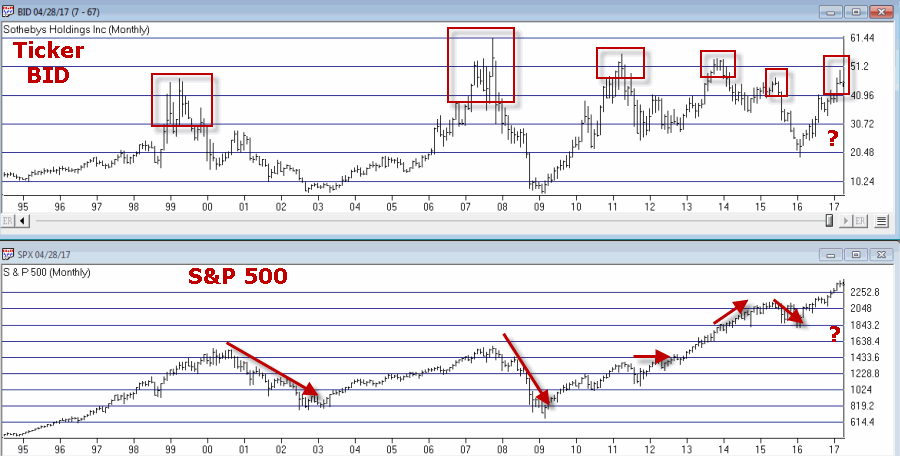
I keep hearing that investors are “skittish” and “concerned” about the markets and the economy and so forth. But the recent action in a relatively obscure ETF jumped out at me and seems to suggest that this is not necessarily the case – at least not among those who are active in the markets. From what I can tell these people don’t have a care in the world. See what you think.
What is Ticker SVXY?
A few key concepts:
*Implied volatility (IV) essentially measures the level of time premium built into the price of a given option or series of options on a given security. In anxious times implied volatility will rise – sometimes sharply – as an increase in demand by speculators rushing to buy options to protect / hedge / speculate / etc in a given security, causes time premium to inflate. When traders are less worried or more complacent then implied volatility will typically fall as decreased option buying pressure results in lower time premiums.
In sum, high and/or sharply rising IV typically signals fear, low and or declining IV typically signals a lack thereof.
*The VIX Index (see Figure 1) measures the implied volatility of options for the S&P 500 Index traded at the CBOE. Typically when the stock market declines – especially when it declines sharply – the VIX index tends to “spike” as fearful traders rush in and bid up S&P 500 Index option prices
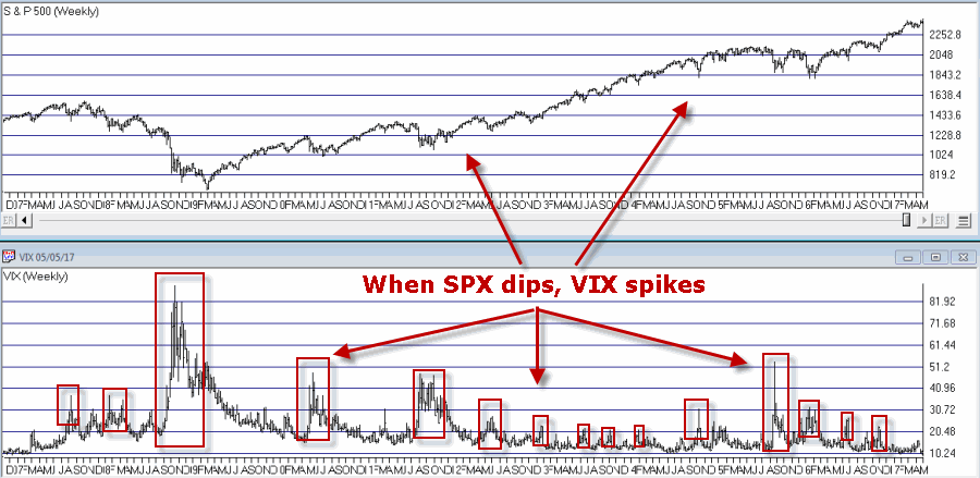
*In essence, the VIX Index is “inversely correlated” to the stock market.
*Ticker SVXY is an ETF that is designed to track the “inverse” of the VIX Index. In other words, when VIX rises, SVXY falls and vice versa. This also means the following:
*Ticker SVXY is highly correlated to the SP 500 Index. In other words, as the stock market moves higher SVXY typically also moves higher and vice versa.
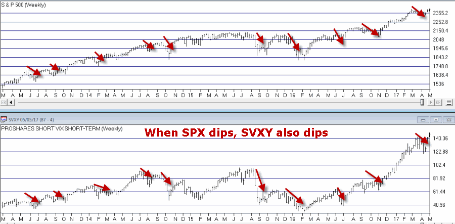
In sum, a declining trend in the price of SVXY shares typically signals fear, while a rising trend in the price of SXVY typically signals a lack thereof.
Now to My Concern
Hopefully some of that made sense. In a nutshell, the key takeaways are that when fear is low:
*SVXY rises
*Implied volatility declines
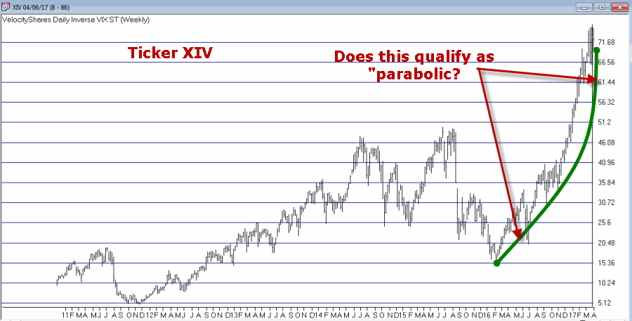
But what if both go to extremes? Is that a bad thing? The reason I ask appears in Figure 3. 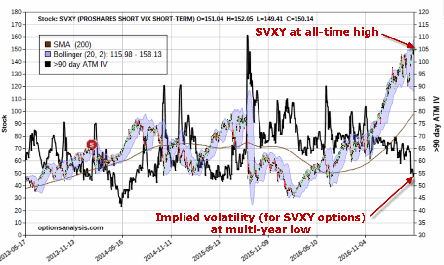
Figure 3 – Ticker SVXY at an all-time high with implied volatility for options on ticker SVXY plunging (both pointing to a lack of fear)
As far as I can tell, this is what a lack of fear looks like:
*Ticker SVXY is rising dramatically
*Implied volatility (SVXY options) is plunging
In the last 4 years there has never been a bigger disparity between these two measures of “fear” – and they are both pointing to “no fear.”
Summary
So the obvious question now is – does any of this matter? I mean this is more of a “perspective” indicator (“where we are now”) than a “timing’ indicator (“where we are headed next”). I cannot presently point out a way to use this to generate specific buy and sell signals.
In addition, as a trend-follower I am not the type to make any “Aha, the End is Near” type pronouncements. As long as the market wants to keep running higher I am happy to “go along for the ride.”
But the less I see my fellow riders being concerned about the market, the more concerned I become.
In the long run that instinct has served me well.
(Here’s hoping that my instinct is wrong this time)
Jay Kaeppel
Chief Market Analyst at JayOnTheMarkets.com and AIQ TradingExpert Pro (http://www.aiqsystems.com) client. http://jayonthemarkets.com/
Disclaimer: The data presented herein were obtained from various third-party sources. While I believe the data to be reliable, no representation is made as to, and no responsibility, warranty or liability is accepted for the accuracy or completeness of such information. The information, opinions and ideas expressed herein are for informational and educational purposes only and do not constitute and should not be construed as investment advice, an advertisement or offering of investment advisory services, or an offer to sell or a solicitation to buy any security.