A better title for this article might be “How to Avoid Losing 98% in Disney.”
The recent dip in the price of Disney stock may ultimately prove to be a buying opportunity. But for reasons detailed below I am going to let this one pass.
If you have read my stuff in the past you know that I look a lot at seasonal trends. This is especially true for sectors and commodities – which in some cases can be tied to recurring fundamental factors. I have occasionally looked at individual stocks (
here and
here and
here), but tend to think that an individual company’s fundamentals can change so drastically over time that a persistent seasonal trend is less likely.
It appears that there are exceptions to every rule.
In Figure 1 below we see that after a strong run up from its 2009 low, Disney finally topped out in August of 2015. Since that time it’s been a string of large moves up and down – with the latest being down. This might prompt one to consider the latest dip as a buying opportunity. And in fact, maybe it is. But I won’t be making that play myself based simply on a seasonal trend in DIS stock that was highlighted by Brooke Thackray in his book
Thackray’s 2017 Investor’s Guide.
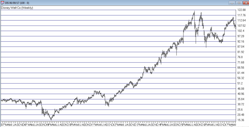
Figure 1 – Is latest dip in DIS a buying opportunity? Maybe, but history suggests we look elsewhere….(Courtesy
AIQ TradingExpert)
When NOT to Own Disney Stock
In his book, Thackray highlights the period from June 5th through the end of September as an “unfavorable” period for DIS stock. He also listed a specific “favorable” period that I’ll not mention here. For purposes of this article I made the following changes:
*The “unfavorable” period begins at the close on the 5th trading day of June and ends at the close on the last trading day of September.
*The rest of the year – i.e., end of September until the close on the 5th trading day of June – is considered the “favorable” period.
Also, the test uses price data only. No dividends are included nor is any interest assumed to be earned while out of DIS stock.
The results are fairly striking. From the end of 1971 through the end of 2016:
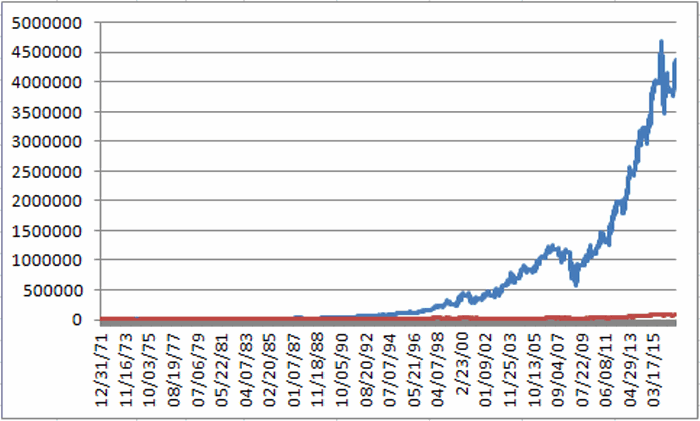
*$1,000 invested in DIS on a buy-and-hold basis grew +8,042% to $81,422 (average annual +/- = +15.8%)
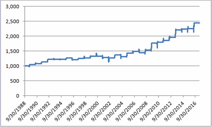
*$1,000 invested in DIS only during the “favorable” period grew +430,874% to $4,309,735 (average annual +/- = +25.0%)
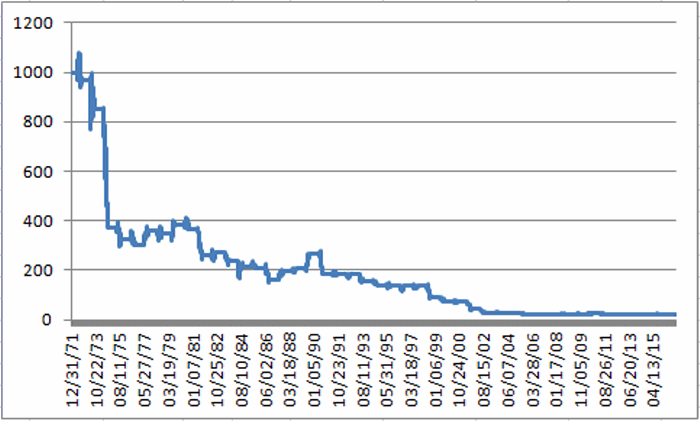
*$1,000 invested in DIS only during the “unfavorable” period declined -98% to $18.89 (average annual +/- = (-6.9%))
It’s sort of hard to ignore the difference between +430,784% and -98%.
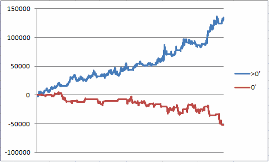
Figure 1 displays the cumulative performance during the unfavorable period from 1971 through 2016.
Figure 1 – Growth of $1,000 invested in DIS only from close of June Trading Day #5 through the end of September (1971-2016)
Figure 2 displays the growth of $1,000 during the favorable period (blue line) versus a buy-and-hold approach (red line).
Figure 2 – Growth of $1,000 invested in DIS only from the end of September through June Trading Day #5 (blue) versus Buy-and-Hold (red); 1971-2016
*The favorable period showed a net gain in 39 out of 45 years (87%)
*The unfavorable period showed a net gain in only 13 out of 45 years (29%)
*Buy-and-hold showed a net gain in 28 out of 45 years (62%)
Figure 3 displays year-by-year results.
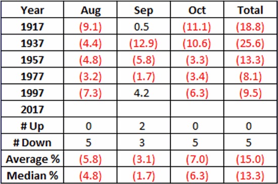
| Year |
Favorable |
Unfavorable |
Buy/Hold |
| 1972 |
78.1 |
(3.5) |
71.9 |
| 1973 |
(53.5) |
(12.0) |
(59.1) |
| 1974 |
4.4 |
(56.4) |
(54.4) |
| 1975 |
175.6 |
(12.4) |
141.5 |
| 1976 |
5.2 |
(6.9) |
(2.0) |
| 1977 |
(28.2) |
19.1 |
(14.4) |
| 1978 |
4.6 |
(3.3) |
1.2 |
| 1979 |
1.2 |
10.5 |
11.9 |
| 1980 |
20.8 |
(5.8) |
13.8 |
| 1981 |
42.8 |
(28.7) |
1.9 |
| 1982 |
16.0 |
4.4 |
21.1 |
| 1983 |
(5.7) |
(11.6) |
(16.7) |
| 1984 |
25.6 |
(9.6) |
13.6 |
| 1985 |
94.4 |
(3.3) |
88.0 |
| 1986 |
98.3 |
(23.0) |
52.8 |
| 1987 |
14.6 |
20.1 |
37.6 |
| 1988 |
4.2 |
6.5 |
10.9 |
| 1989 |
32.7 |
28.3 |
70.3 |
| 1990 |
28.4 |
(29.4) |
(9.3) |
| 1991 |
14.4 |
(1.5) |
12.8 |
| 1992 |
51.3 |
(0.7) |
50.2 |
| 1993 |
16.0 |
(14.5) |
(0.8) |
| 1994 |
23.2 |
(12.4) |
7.9 |
| 1995 |
27.7 |
0.3 |
28.0 |
| 1996 |
18.4 |
0.0 |
18.4 |
| 1997 |
43.3 |
(0.9) |
41.9 |
| 1998 |
36.9 |
(33.6) |
(9.1) |
| 1999 |
15.8 |
(15.8) |
(2.5) |
| 2000 |
4.0 |
(4.8) |
(1.1) |
| 2001 |
23.6 |
(42.1) |
(28.4) |
| 2002 |
12.6 |
(30.1) |
(21.3) |
| 2003 |
50.9 |
(5.2) |
43.0 |
| 2004 |
28.9 |
(7.6) |
19.2 |
| 2005 |
(2.5) |
(11.6) |
(13.8) |
| 2006 |
41.8 |
0.8 |
43.0 |
| 2007 |
(6.2) |
0.4 |
(5.8) |
| 2008 |
(24.4) |
(7.0) |
(29.7) |
| 2009 |
29.1 |
10.1 |
42.1 |
| 2010 |
16.1 |
0.2 |
16.3 |
| 2011 |
30.4 |
(23.4) |
(0.0) |
| 2012 |
15.9 |
14.6 |
32.8 |
| 2013 |
54.3 |
(0.6) |
53.4 |
| 2014 |
17.2 |
5.2 |
23.3 |
| 2015 |
20.4 |
(7.3) |
11.6 |
| 2016 |
5.0 |
(5.6) |
(0.8) |
| 2017 |
? |
? |
? |
| # Years UP |
39 |
13 |
28 |
| # Years DOWN |
6 |
32 |
17 |
| Average % +/- |
25.0 |
(6.9) |
15.8 |
Figure 3 – Year-by-Year Results
Summary
Brooke Thackray found an extremely interesting and robust “unfavorable” seasonal trend in DIS stock. Of course none of the data above guarantees that DIS stock is doomed to languish and/or decline in the months ahead. But I for one do not intend to “buck the odds” and play the long side of DIS for a while.
Disclaimer: The data presented herein were obtained from various third-party sources. While I believe the data to be reliable, no representation is made as to, and no responsibility, warranty or liability is accepted for the accuracy or completeness of such information. The information, opinions and ideas expressed herein are for informational and educational purposes only and do not constitute and should not be construed as investment advice, an advertisement or offering of investment advisory services, or an offer to sell or a solicitation to buy any security.